Top 6 Mobile CTA Buttons That Drive More Clicks & Conversions in 2026
 Krunal Vaghasiya|Apr 8, 2024
With an estimated 4.88 billion mobile users worldwide, mobile devices have become many people’s primary means of accessing the internet.
As a result, an optimized mobile call to action drives more conversions and click-through rates.
A call-to-action button can draw attention, create a sense of urgency, and guide them to take a specific action, such as purchasing, subscribing today for a newsletter, downloading an app, creating a free account, or requesting more information.
A good CTA can influence the target audience and ensure users are easily engaged.
The mobile CTA button serves the same purpose as traditional CTAs: whether you are an eCommerce store owner, a service provider, or a content creator, these strategies can help you create compelling mobile-friendly CTAs that compel your mobile users to take action.
This blog post will explore the top 7 mobile c, all-to-action buttons that can help your business achieve its mobile goals.
H3: Understanding the Impact of Mobile CTAs on User Engagement
As mobile devices become integral to daily lives, companies must optimize mobile experiences and maximize user engagement.
One key element of mobile optimization is implementing effective call-to-action buttons.
Mobile CTAs profoundly affect user behavior and are a crucial link between a company’s message and the desired user action.
Conversely, a poorly crafted CTA button can significantly confuse visitors, leading to lower engagement rates and missed opportunities.
Moreover, the placement, design elements, and language of CTAs can significantly impact user engagement and the success of mobile marketing campaigns.
Best Practices for Mobile CTA Design
Crafting copy that effectively communicates and motivates users to take action is important to ensure the mobile call to action button is effective.
The copy should be concise, inspiring users to check out more.
The mobile screen has limited spaces, so make sure the CTA is clear and communicates the intended action without overwhelming the user.
Avoid cluttering the CTA with unnecessary content and stick to one CTA to prevent fatigue decisions.
Related: 12 CTA Mistakes to Avoid That 90% of Marketers Make
However, make sure to prioritize user experience and accessibility to all users, grab users’ attention, and convey the right marketing messages, whether on landing pages, mobile apps, or a CTA pop-up notification.
Technologies like iOS Universal Links and Android App Links can enhance this experience by routing users to the relevant in-app content when the CTA is tapped. If the app isn’t installed, these automatically open the app store page, reducing friction and helping increase conversions.
Let’s dive into more examples and steps to craft a compelling mobile call to action button.
Top 7 Mobile CTA Buttons Examples
Let’s examine examples of Mobile CTA buttons that effectively drive user engagement, conversions, and actions on mobile platforms.
Each CTA is designed to be clear, visually appealing, and accessible, enhancing the mobile user experience.
1. E-Commerce App: “Flash Sale Ends Tonight”
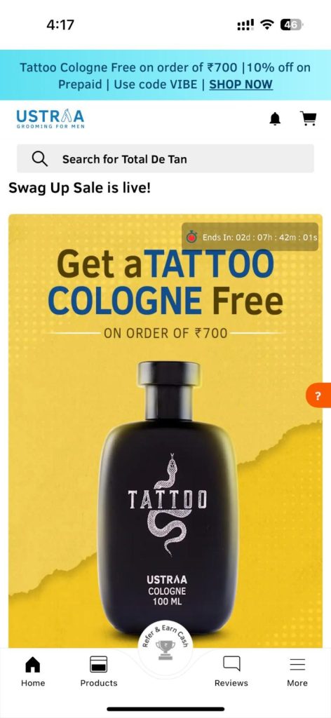
Scenario: This CTA is prominently displayed on the app’s main screen during a limited-time sale, using urgency and the incentive of a discount to encourage immediate shopping.
Here’s an example from Ustraa.
The CTA displayed on the Ustara app showcases a limited-time offer, creating urgency for the shoppers to take immediate action and grab the offer before it ends.
2. Fitness App: “Start 7 Day Free Trial”
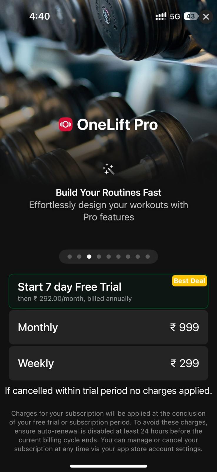
Scenario: This CTA is aimed at new users upon app installation.
It offers a risk-free way to explore premium features, highlighting the app’s value proposition with clear action.
Here’s an example from One Lift Pro:
They offer a 7-day free trial to let you enjoy the premium features and let them decide later on.
It gives them clear action and offers the next step.
3. Travel Booking App: “Unlock Exclusive Deals”
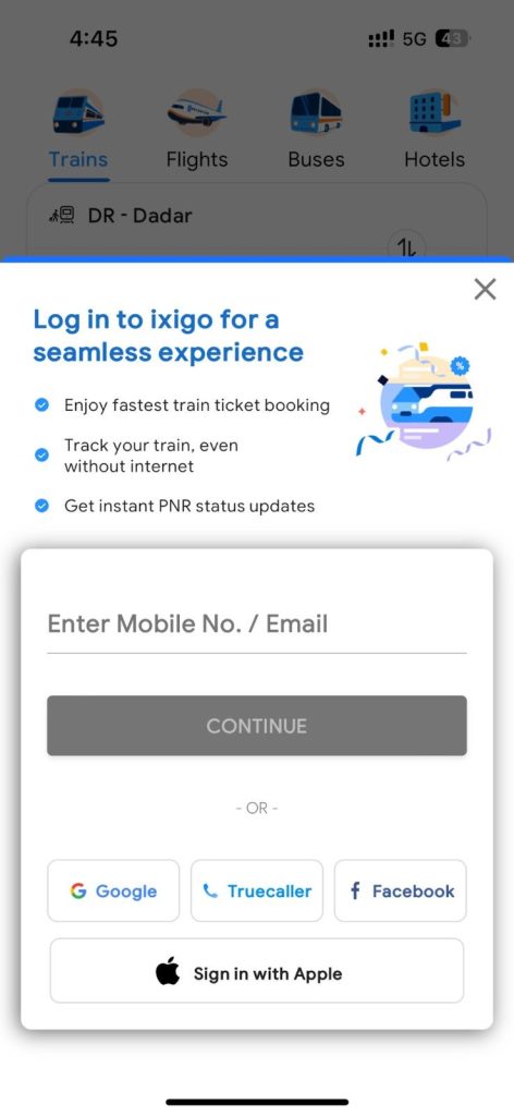
Scenario: Encourages users to create an account or sign in, promising exclusive benefits and personalized offers, thereby increasing user registrations and data collection for personalized marketing.
Here’s an example from Ixigo:
It offers more exclusive offers and experiences on signing in like faster booking, offers, deals, and tracking options.
Check out: How To Write An Impactful Call To Action
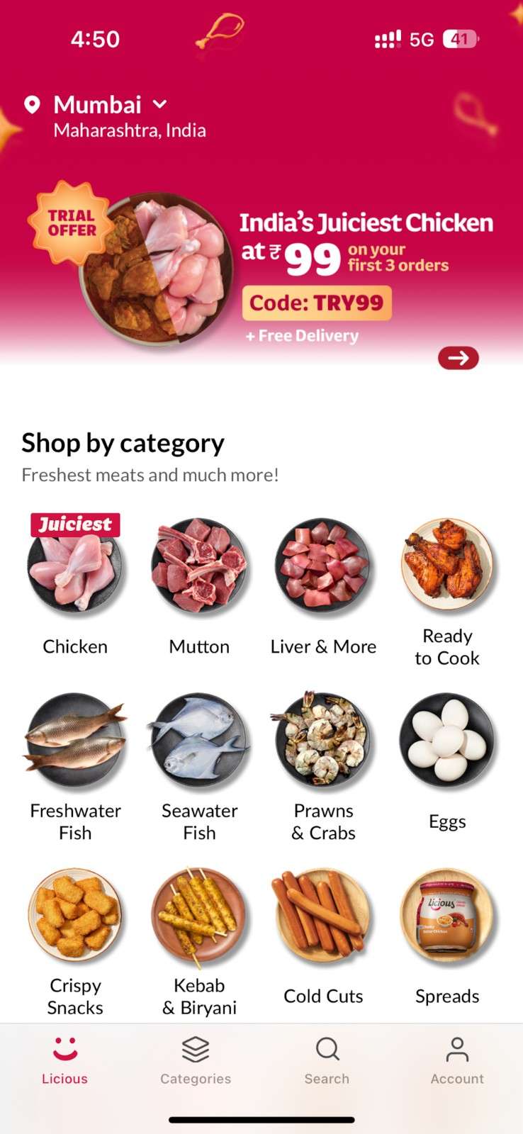
4. Food Delivery App: “Trial Offer on Your first 3 Orders”
Scenario: Targets new app users with a tempting discount on their first order, converting first-time site visitors into paying customers.
Here’s an example from the Licious mobile app.
The app offers a trial offer at a low price for the first three orders to encourage users to try it out and take action.
The offer is valid for the first three orders, and new visitors can be attracted to it.
5. Learning Platform App: “Discover Courses Customized for You”

Scenario: Uses user data to provide personalized course recommendations, encouraging users to engage with content that matches their interests and goals.
Here’s a pop-up notification from Unacademy.
Related: 10 Impactful Push Notification CTA Examples to Use in 2025
Once you sign up and choose the stream you want to learn about, Unacademy creates a customized learning journey.
This encourages users to achieve their goals and enhances their personalized experience.
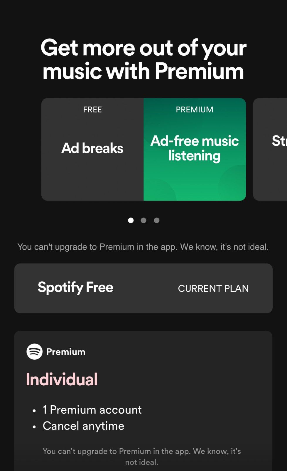
6. Music Streaming App: “Upgrade to Premium for Ad-Free Listening”
Scenario: Positioned at moments of friction (e.g., during ad interruptions), this CTA offers a clear solution to a common user pain point, encouraging upgrades to a premium account.
An example from Spotify offers a clear CTA on what the user will get after upgrading to premium.
By showcasing premium features and adding value, Spotify clearly encourages users to take action.
Build trust & FOMO
Highlight real-time activities like reviews, sales & sign-ups.


Designing Effective Mobile CTA Buttons
Here are the best practices to craft compelling calls to action –
Keep it Clear and Concise
The mobile CTA text should use concise, action-oriented language communicating the user’s need to act.
Avoid unclear language and use action words to ensure the CTA stands out from the rest of the content on your website or landing page.
Related: 150+ Powerful Call to Action Phrases for Conversion in 2025
They have limited white space, so the CTA should be easy to understand and not cluttered with unnecessary details, even in the dark background.
Optimize Button Shapes and Sizes for Touchscreens
Consider both usability and aesthetics when choosing the shape of the CTA button for mobile phones.
From rectangular to round, a custom-shaped button offers creative flexibility to enhance engagement and user experience.
Further, ensure the CTA button is large enough to be clickable without accidental taps but not so large that it takes up extra space on the entire screen.
Test your CTA on different devices to ensure it is optimized for different screen sizes and fits in the given space.
Using Contrasting Colors to Make CTAs Stand Out
The CTA button color should be eye-catching and contrast the page’s background color.
Different colors help users spot the CTA quickly and draw their attention.
A perfect example is using bold and bright colors for your CTA with a white background.
Don’t use the same color as the background; that can get lost among other page elements.
A perfect call to action uses a contrasting color that grabs the user’s attention, helping it stand out from the other elements of the mobile content.
Strategic Placement of CTA Buttons on Mobile Screens
Position the CTA in a location that is easily accessible and visible to the user without excessive scrolling.
Typically, it is recommended to be placed above the fold so site visitors can understand the deal and then take the desired action.
However, experiment with placing CTAs strategically to guide user’s eyes in the right direction.
Test and Iterate
Finally, testing and iterating multiple CTAs with different colors, sizes, placements, and text is important to see what works best for your audience and improve the mobile experience.
Use A/B testing to compare variations and track their performance with Google Analytics and other tools.
Following these tips and best practices, you can design highly visible and effective CTAs to drive user engagement.
Make sure to test multiple options to maximize marketing outcomes.
Must Go: 10 Best Call To Action (CTA) Tools to Help Raise Conversions
Leveraging WordPress for Mobile CTA Optimization
Regarding optimizing CTAs for mobile apps, WordPress offers several features and plugins that improve user engagement and conversion rates.
Here’s how WordPress facilitates mobile CTA optimization –
Mobile-friendly CTA Buttons with WordPress
The CTA buttons are a gateway that entices customers or visitors to take the desired action that aligns with your marketing goals.
By implementing the right strategies, you can optimize the CTA to encourage clicks and conversions and improve sales.
Here are some ways to optimize CTAs for mobile users:
- Choose Mobile Responsive Themes – Make sure to select a WordPress theme that is mobile responsive to ensure optimal viewing experience on different devices.
- Place CTAs Strategically – Make sure to position CTAs strategically within the mobile interface and make them easily accessible.
- Use Plugins – Different plugins can help you improve conversions and get more leads. Different plugins, such as floating CTA buttons, stick plugins, and more, can help you out.
- Optimize Button – Use clear and concise language that communicates, creates a sense of urgency, and makes visitors take immediate action, such as “Buy Now,” “Sign Up,” and “Learn More.”
- Test Across Devices – Test your CTA and monitor their performance using analytic tools and make adjustments to your CTA buttons as needed.
Related: 30 Lead Generation CTA Examples To Learn From in 2025
Plugins to Enhance Mobile CTAs on WordPress
WordPress offers a wide range of plugins designed to enhance mobile usability and optimize CTAs for mobile apps.
These plugins offer features such as mobile-specific pop-ups, sticky headers, or customizable mobile CTAs that make it easy to craft mobile-friendly CTAs without the need for an expert or any code.
In addition, WordPress offers responsive design options that ensure CTA automatically adjusts its size, layout, and appearance to fit the screen sizes and resolutions.
By leveraging plugins, you can craft CTAs that are responsive and customizable and optimize them for performance as well.
Moreover, these plugins help to optimize performance by improving the loading page and overall site performance on mobile phones.
That ensures CTA loads quickly and is easily accessible to mobile users, minimizing bounce rate and maximizing conversion.
Boost Conversion Instantly
Add Social Proof & Urgency to your website
Conclusion
Implementing CTAs effectively can significantly increase conversion rates and clicks on your mobile apps.
Make sure to keep it simple, clear, and engaging for your visitors to convert and take action.
As CTA is a major component of every marketing campaign, make sure to make it conversion-focused.
To optimize your CTA for different devices, take inspiration from these examples and tips, including languages, design, shape, color, and placement on your website and app.
Additionally, make sure it aligns with your branding and marketing goals to drive more business.
By considering these examples, tips, and tricks make sure to continually test and experiment with multiple CTAs to achieve your marketing goals.
If you wanna read more examples, here is the blog of 20+ Killer Call to action examples
Krunal Vaghasiya is a marketing tech expert who boosts e-commerce conversion rates with automated social proof and FOMO strategies. He loves to keep posting insightful posts on online marketing software, marketing automations, and improving conversion rates.