Best CTA Button Colors That Actually Convert (2026)
 Krunal Vaghasiya|May 1, 2024
If you’re wondering which color works best for your CTA button, here’s the short answer: orange and green tend to convert well for most businesses.
Red works for urgency. Blue builds trust. But the color that actually wins for you depends on your page, your audience, and what you’re asking them to do.
I’ll break all of that down below. Ten colors, what each one communicates, real brand examples, and a simple way to pick the right one for your situation.
Why Button Color Affects Conversions More Than You’d Expect
Color isn’t decoration. It’s communication.
Before a visitor reads your button copy, their eyes have already processed the color.
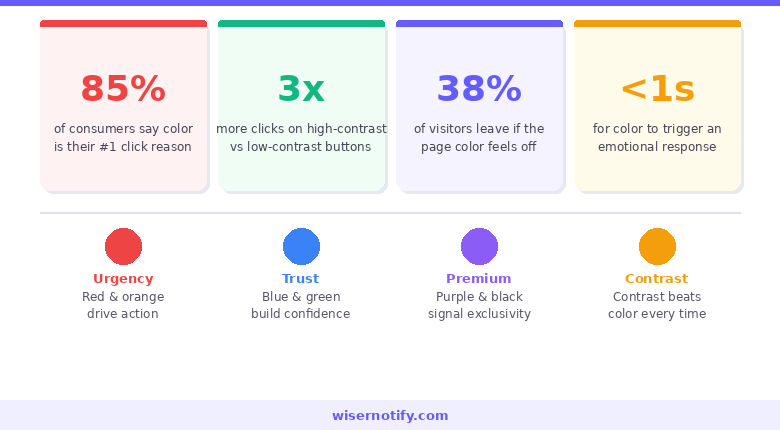
That processing happens in milliseconds and triggers an emotional response before any conscious thought kicks in. The color either creates urgency, calm, trust, or excitement, and that emotion shapes whether someone clicks.
The data on CTA performance consistently shows that button color changes, when paired with strong copy and good placement, can shift conversion rates by meaningful percentages.
Not because one color is universally better than another, but because the right color in the right context creates visual priority. Your button needs to win the attention competition every time someone lands on your page.
Here’s what choosing the right color actually accomplishes:
- Creates enough contrast so the button is the first thing eyes land on
- Triggers the emotion that matches the action you’re asking for
- Reinforces brand identity without competing with other design elements
- Signals interactivity so visitors know exactly what to click
No color does all four perfectly in every situation. That’s why this guide exists, and why testing always comes after the initial choice.
Build trust & FOMO
Highlight real-time activities like reviews, sales & sign-ups.


The Color Psychology Behind High-Converting CTAs
Color psychology in marketing isn’t mysterious. It’s pattern recognition built up from a lifetime of associations. Red means stop, danger, urgency. Green means go, growth, safety. Blue means sky, water, calm authority. These aren’t random. They’re conditioned responses that fire faster than conscious processing.
- In CTA design, speed is an advantage. By the time a visitor consciously reads your button text, the color has already done its emotional work. It’s either primed them to act or told them to slow down.
- One important caveat before we get into the colors: context changes everything. Red on a white background reads as urgent and bold.
Red on a page already heavy with red imagery gets lost. Orange on a consumer ecommerce site feels energetic and fun. Orange on a financial services platform feels off-brand.
The color alone isn’t the variable. The relationship between the color, the background, the brand, and the action is what determines whether it converts.
With that framing, here are the 10 colors that show up most in high-performing CTAs and what each one actually does.
10 Best CTA Button Colors and When to Use Each
1. Red: Urgency and Excitement

Red is impossible to ignore. It’s the most attention-commanding color in design, and there’s a physiological reason for that. It slightly elevates heart rate and triggers a sense of alertness. In CTA terms, that translates directly to urgency.
It’s the go-to color for “Buy Now,” “Limited Time Offer,” and flash sale buttons. The urgency it creates is real when paired with genuine scarcity or deadline messaging. Without that context, red can feel aggressive rather than exciting. So pair it with copy that justifies the urgency.
Netflix, Coca-Cola, and YouTube all use red as their dominant brand color and lean into it for CTAs. Creating urgency works best when the design and copy reinforce each other, and red does the heavy lifting on the design side.
Best for: Ecommerce flash sales, event signups, impulse-driven purchases, limited-time offers.
Skip it when: Your page already uses heavy red tones. The button will vanish rather than pop.
2. Green: Approval and Comfort
Green means go. Traffic lights have been training every human brain for over a century. The association between green and forward movement, permission, and progress is hardwired at this point.
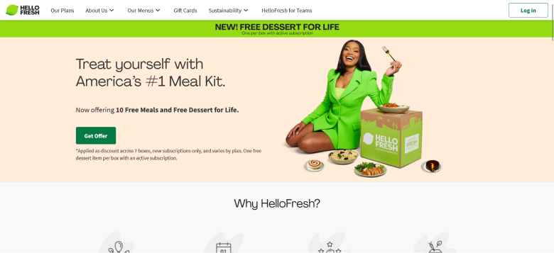
HelloFresh uses a bright green CTA that perfectly reinforces their health-forward brand. Spotify’s green runs throughout their entire interface because it signals growth and momentum.
Best for: Subscriptions, wellness brands, finance platforms, eco-friendly products.
Skip it when: Your brand palette already leans heavily green.
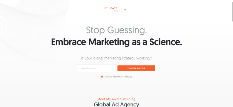
3. Blue: Trust and Security
Blue is the world’s most universally liked color. It consistently tops preference surveys across demographics, genders, and cultures. And in branding, that broad appeal makes it the dominant color in finance, healthcare, technology, and enterprise software.
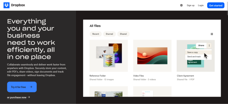
Dropbox’s blue “Try it for free” button is one of the most cited examples in CTA design. PayPal, Chase, LinkedIn, and American Express all lead with blue.
Best for: SaaS, banking, healthcare, insurance, enterprise products.
Skip it when: You need excitement or urgency. Blue is calming, not energizing.
Also check: How to Increase Landing Page Conversion Rates
4. Orange: Confidence and Fun
Orange sits between red’s urgency and yellow’s optimism. It’s energetic without being aggressive, approachable without being soft. And in A/B testing, it punches above its weight consistently.
Amazon uses orange for its primary cart and buy buttons. For consumer-facing products with a warm, energetic brand voice, orange is often my first recommendation.
Best for: Ecommerce, lead generation, free trials, consumer products.
Skip it when: You’re targeting premium or luxury buyers.
Build trust & FOMO
Highlight real-time activities like reviews, sales & sign-ups.

5. Yellow: Optimism and Attention-Grabbing
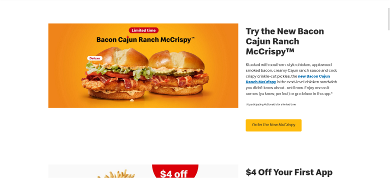
Yellow is the highest-visibility color to the human eye in daylight conditions. The emotional associations are positive: optimism, warmth, creativity, playfulness. But yellow is one of the trickiest colors to work with in CTA design. On white backgrounds, it can disappear.
McDonald’s “Order the New McCrispy” button is a textbook yellow CTA done right. IKEA also uses yellow CTAs that match their broader brand palette perfectly.
Best for: Food brands, retail, creative industries, youth-oriented products.
Skip it when: Your background is white or very light.
6. Pink: Fun and Youthful
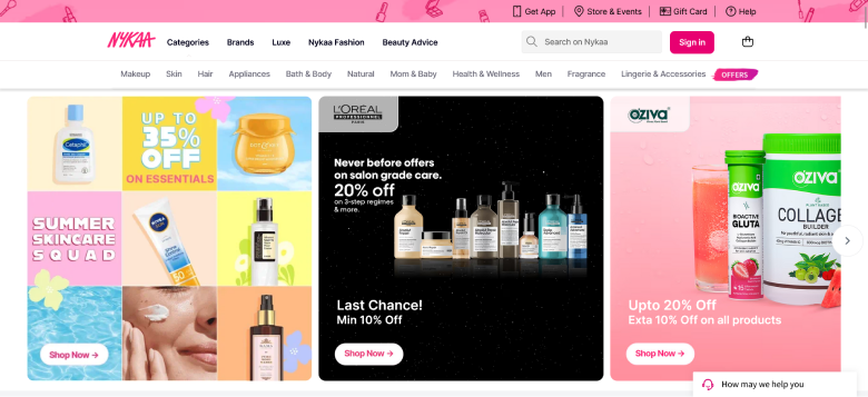
Pink has moved well beyond exclusively feminine branding. It now shows up across lifestyle, beauty, fashion, wellness, and direct-to-consumer brands targeting audiences that respond to a warmer, more personal tone.
Nykaa uses pink CTAs throughout their beauty platform to near-perfect effect.
Best for: Beauty, fashion, wellness, dating platforms, brands targeting younger audiences.
Skip it when: Your broader brand palette is neutral, corporate, or dark.
Also check: Call to Action Statistics: What the Data Says About Clicks and Conversions
7. Purple: Creativity and Luxury
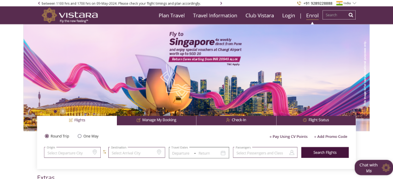
Purple signals premium quality, imagination, and sophistication. It’s also underused in mainstream ecommerce, which makes it a differentiator when deployed deliberately.
Vistara Airlines uses a purple CTA that immediately signals premium service. Cadbury’s deep purple branding is one of the most recognized luxury color associations in consumer goods globally.
Best for: Premium services, creative industries, arts, design agencies.
Skip it when: You need urgency or speed. Purple is contemplative, not action-driving.
8. Black: Sleek and Powerful
Black communicates sophistication, exclusivity, and authority. Apple’s design philosophy leans heavily on black and white contrast to guide attention without feeling promotional.
Best for: Luxury goods, premium fashion, high-end services.
Skip it when: Your page uses dark backgrounds. Black on dark is invisible.
9. Grey: Neutral and Calm
Grey is rarely the right choice for a primary CTA. For secondary CTAs and “learn more” buttons it earns its place, but without strong contrast support it gets skipped.
Best for: Secondary CTAs, professional service brands, de-emphasized actions.
Skip it when: It’s your only CTA and your page has visual complexity.
Build trust & FOMO
Highlight real-time activities like reviews, sales & sign-ups.

10. White: Pure and Simple
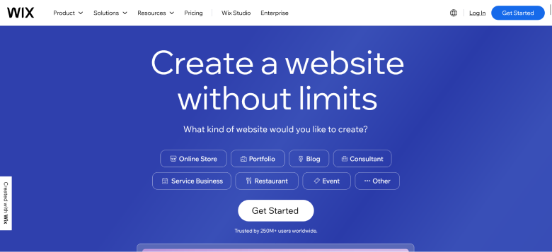
White CTAs only work on dark or heavily saturated backgrounds. On a white page, the button vanishes entirely.
Wix uses white CTAs in their hero sections because their backgrounds are typically bold and dark.
Best for: Dark background sections, minimal editorial aesthetics, secondary CTAs.
Skip it when: Your background is white or light. The button won’t be visible.
Boost Conversion Instantly
Add Social Proof & Urgency to your website
The Contrast Rule: This Matters More Than the Color You Pick
Here’s the thing most CTA color guides don’t say clearly enough: contrast matters more than the color itself.
A green button on a green-heavy page converts worse than a grey button on a clean white background. A red button on a design already saturated with red is invisible. The color you choose only works if it creates enough visual separation from everything around it.
Button against background. Your CTA should be the most visually distinct element in its section. On white backgrounds, warm colors (orange, red) and cool saturated colors (blue, green) both work well. On dark backgrounds, lighter colors (white, yellow, orange) stand out.
Text against button. The copy on your button needs to be readable at a glance. Accessibility standards (WCAG 2.1) call for a minimum contrast ratio of 4.5:1 for body text and 3:1 for large button text.
Also check: Call to Action Guide: Examples, Tips, and Proven Best Practices
How to Choose the Right CTA Color for Your Brand
Understanding color psychology gets you to a strong starting hypothesis. These five questions get you to the right choice for your specific situation.
What action are you asking for? Urgency-driven actions favor warm colors: red, orange. Trust-driven actions favor cool colors: blue, green. Premium or aspirational actions favor purple or black.
What’s your existing brand palette? Your CTA color should contrast with your brand colors, not duplicate them. If your logo and nav are blue, a blue CTA blends in and gets ignored.
Who is your audience? Color preferences vary meaningfully by demographic. Younger audiences respond to brighter, more saturated palettes. Cultural associations matter too.
What do your competitors use? If every brand in your category uses blue, a well-placed orange button immediately differentiates you.
What does your own data say? The most reliable answer is the one your own A/B test produces.
A/B Testing CTA Colors: How to Do It Right
Most businesses run color tests wrong. Here’s the approach that actually produces useful results.
Test one variable at a time. Color only. Keep everything else identical across both versions.
Run it long enough. You need enough traffic to reach statistical significance (95% confidence) and enough time to account for day-of-week variation. Two to four weeks is typical.
Test meaningful alternatives. Don’t test two shades of blue. Test colors that represent different psychological positions: red vs. green, orange vs. blue.
Measure conversions, not clicks. Track the full event: completed purchase, form submission, trial activation.
Build a testing practice. Every test result feeds the next test. The goal is a compounding body of audience-specific data.
Quick CTA Color Reference by Industry
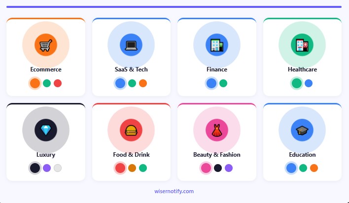
If you want a starting point based on what tends to work by category, here’s the practical breakdown.
Ecommerce: Orange and green are consistent performers. Red for urgency-driven sale events. Avoid grey and white as primary CTAs on product and category pages.
SaaS and Tech: Blue for trust-focused free trial CTAs. Green for “get started” or “sign up” actions. Orange for higher-energy lead generation pages.
Finance and Insurance: Blue dominates for well-documented reasons. Green works for positive, forward-looking action framing. Use red carefully.
Healthcare: Blue and green both signal safety, calm, and trustworthiness. Avoid red (emergency connotations). Avoid black (too corporate).
Luxury and Premium: Black, purple, and white on dark backgrounds. These signal exclusivity and restraint. Avoid orange and yellow.
Food and Beverage: The red and yellow combination from fast food brands isn’t accidental. Both colors trigger appetite and speed-of-decision simultaneously.
Beauty and Fashion: Pink for female-oriented consumer brands. Black and purple for premium positioning.
Education and Online Courses: Blue for credibility. Green for progress-oriented messaging. Orange for accessible, friendly course platforms.
Common CTA Color Mistakes I See Constantly
These show up across thousands of pages and they’re all fixable.
Using your brand’s primary color as your CTA color. If your logo is blue, your nav is blue, and your links are blue, a blue CTA disappears into the design. Pick a color that contrasts with your palette.
Ignoring background contrast. Print the page in greyscale. If the button disappears in greyscale, it’s going to underperform in the real world.
Inconsistent CTA colors across pages. When your primary CTA is always orange, orange becomes the “click this” signal across your entire site. Changing colors between pages breaks that conditioning.
Choosing based on personal preference. You are not your customer. Let the data guide the decision.
Ignoring accessibility. Around 8% of men and 0.5% of women experience some form of color vision deficiency. Always check contrast ratios.
Build trust & FOMO
Highlight real-time activities like reviews, sales & sign-ups.

Wrapping Up
There’s no single winning CTA color. What there is: a set of psychological associations you can use to make a strong starting choice, contrast rules that determine whether the color works in context, and testing that tells you what your specific audience actually responds to.
Start with the psychology: warm colors for urgency, cool colors for trust, premium colors for exclusivity. Apply the contrast rule: your button needs to visually dominate the section it lives in. Then test against a meaningful alternative and let the data tell you what to do next.
Color is one piece of a high-converting CTA strategy. The copy on the button, where it sits on the page, the whitespace around it, and the offer behind it all contribute.
Krunal Vaghasiya is a marketing tech expert who boosts e-commerce conversion rates with automated social proof and FOMO strategies. He loves to keep posting insightful posts on online marketing software, marketing automations, and improving conversion rates.