
40 Call to Action Statistics That Actually Move Conversion (2026)
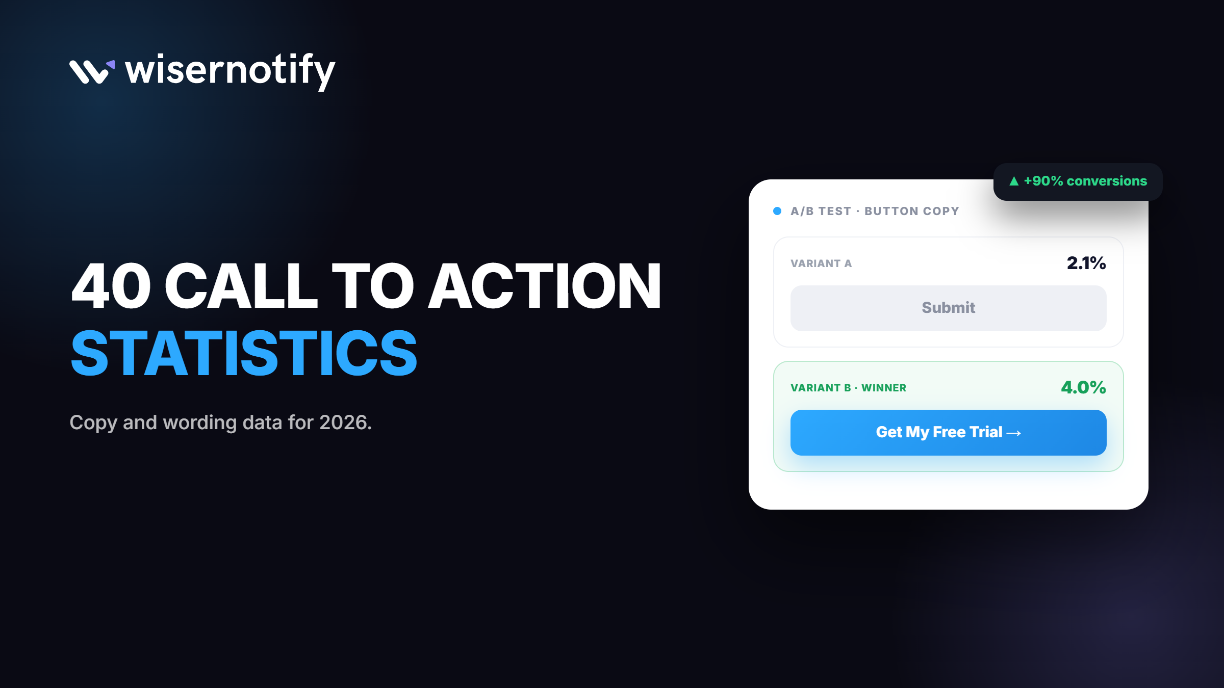
Most CTA advice stops at colour and size. The real lever is the words on the button, and small changes there move conversion more than people expect.
Even one word swap, like changing “your” to “my,” can shift results in a real, testable way. Yet most buttons still say something plain like “Submit.”
This page has 40 up-to-date call to action statistics. You will see what wording works, how many CTAs a page should have, and what placement and personalization do to clicks.

Boost Conversion Instantly
Add Social Proof & Urgency to your website
Key Call to Action Statistics
Ten numbers that sum up CTA performance right now. Figures are current as of August 2026, based on the latest published data from each source.
| Metric | Latest Figure |
|---|---|
| Conversion lift from first-person copy (“my” vs “your”) | Up to 90% |
| Conversion swing from a single word change | 10 to 30% |
| Personalized CTAs vs generic CTAs, conversion lift | 202% better |
| Single-CTA landing page conversion rate | 13.5% |
| Three-plus-CTA landing page conversion rate | 10.5% |
| Average word count of a high-converting button | 3.4 words |
| “Submit” underperforms benefit-driven copy by | Up to 60% |
| Placement swing across a page (best vs worst spot) | 15 times |
| Color-only tests that reach statistical significance | 1 in 7 |
| Mobile drop-offs traced to misclicks or small buttons | 48% |
What CTA Wording Wins?
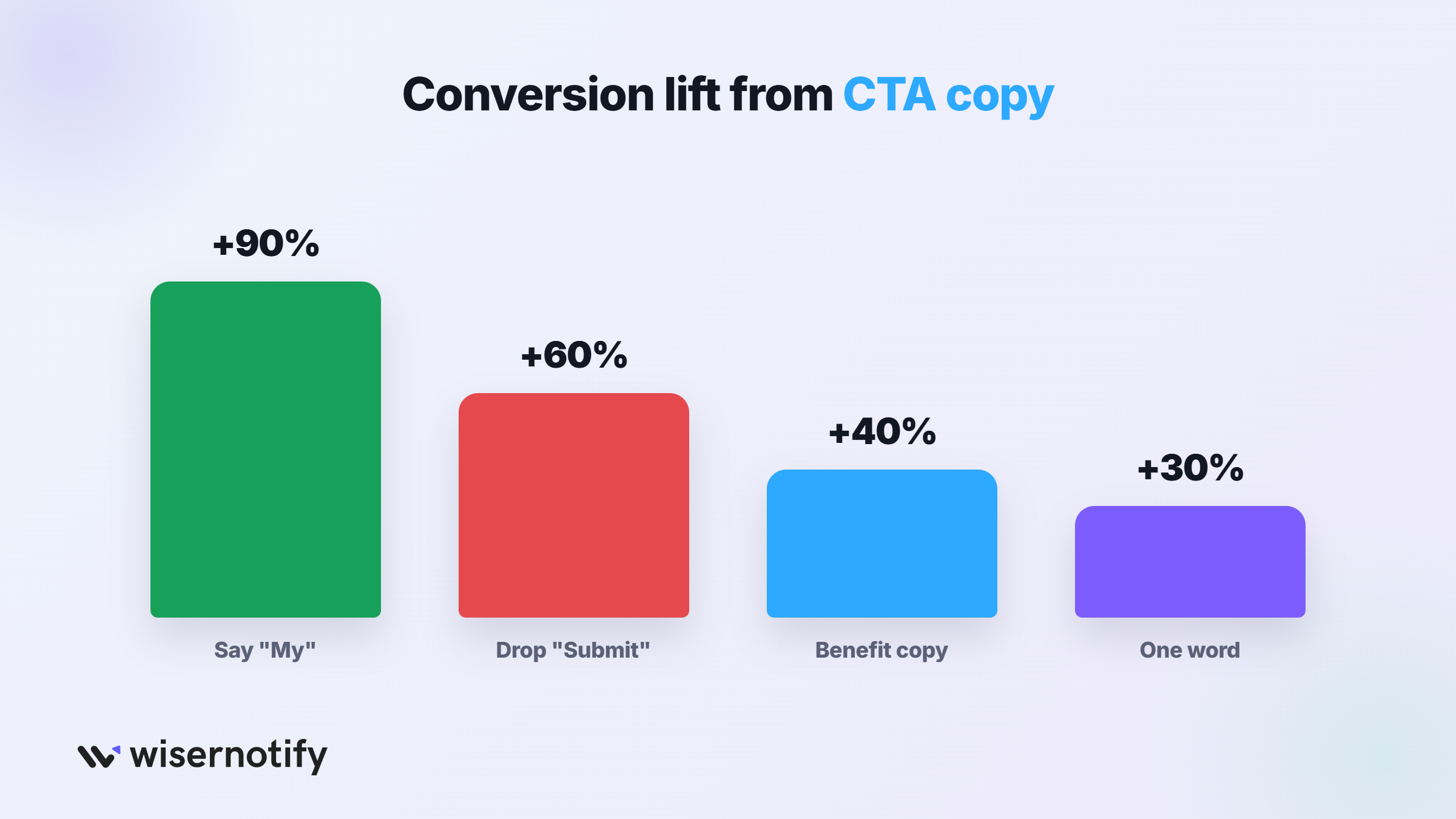
The words on the button matter more than most teams think, and the winning pattern shows up across dozens of independent tests.
1. Changing “Start Your Trial” to “Start My Trial” increased conversions by 90% in a widely cited controlled test.
2. First-person button copy outperforms second-person copy by 10 to 90% across most A/B tests run on this wording.
3. A single word change in CTA button copy can swing conversion rates by 10 to 30%.
4. Benefit-driven copy like “Get My Free Audit” outperforms plain instructions like “Submit” by 30 to 40%.
5. “Submit” underperforms benefit-focused copy by as much as 60%, making it one of the weakest button labels tested.
6. The words “Get,” “Free,” and “Now” appear most often in high-converting CTAs across independent analyses.
7. The average high-converting CTA button runs 3.4 words, short enough to read at a glance.
8. Buttons written like a full sentence, six or more words, consistently convert worse than short, direct copy.
Ownership is the mechanism behind most of this. “My” implies the visitor already has it, “your” still frames it as something they have to go get. See our call to action examples for more wording that follows this pattern.
Boost Conversion Instantly
Add Social Proof & Urgency to your website
How Many CTAs Should One Page Have?
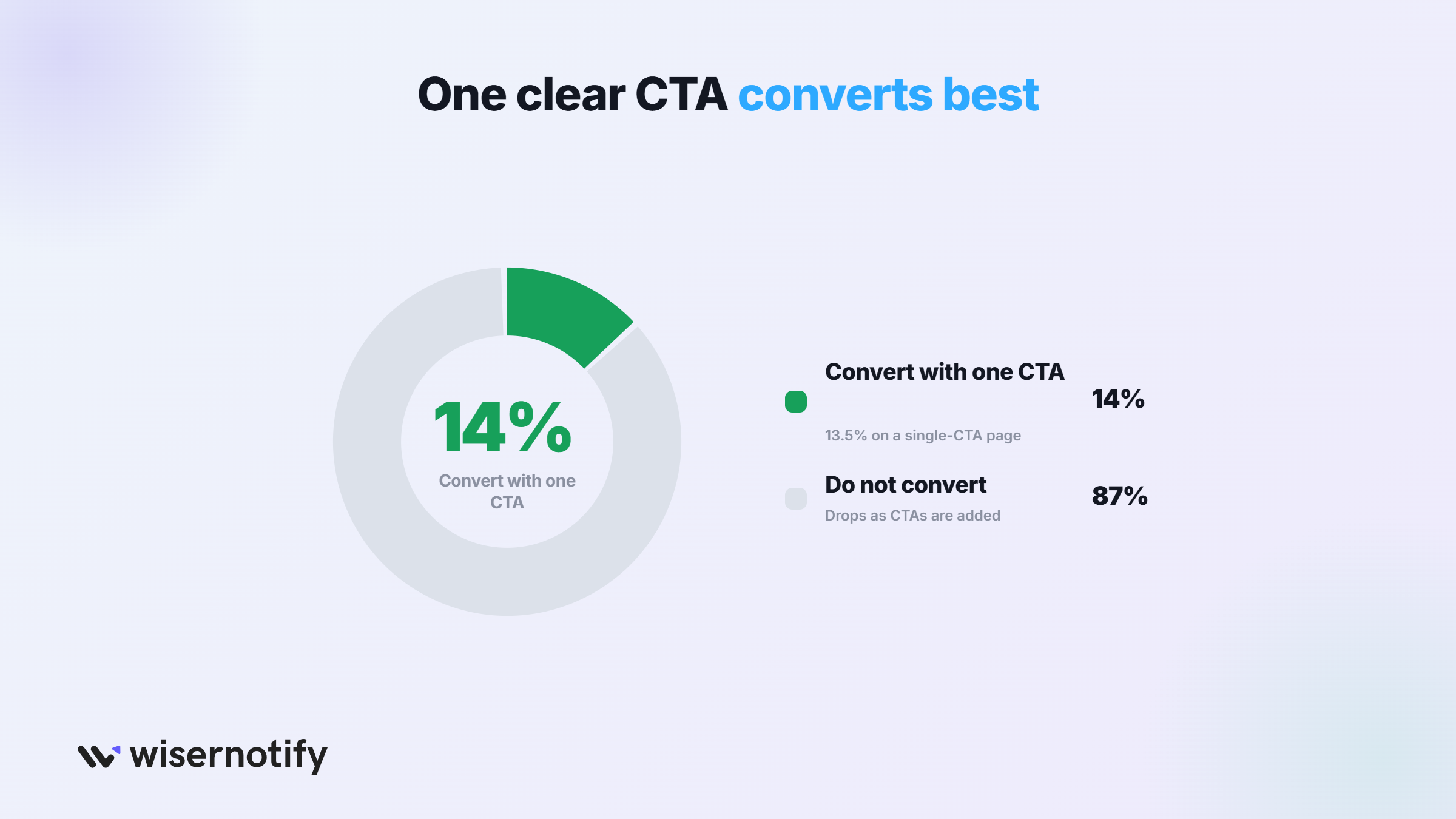
Fewer is measurably better, and the drop-off from adding CTAs is steep and consistent.
9. Landing pages with a single, clear CTA convert at 13.5% on average.
10. Pages with two competing CTAs drop to about 11.9%.
11. Pages with three or more CTAs fall further, to around 10.5%.
12. Reducing a page from several CTAs down to one has been shown to lift conversion by up to 266%.
13. Multiple buttons pointing to the same single goal, like three “Book a Demo” buttons at different scroll depths, do not count as competing CTAs.
14. Emails limited to a single CTA see clicks rise by up to 371%, and some campaigns report sales increases as high as 1,617%.
More options do not mean more conversions, they mean more hesitation.
One clear next step consistently beats several good ones competing for attention, a pattern covered in our types of CTAs guide.
How Much Does CTA Placement Matter?
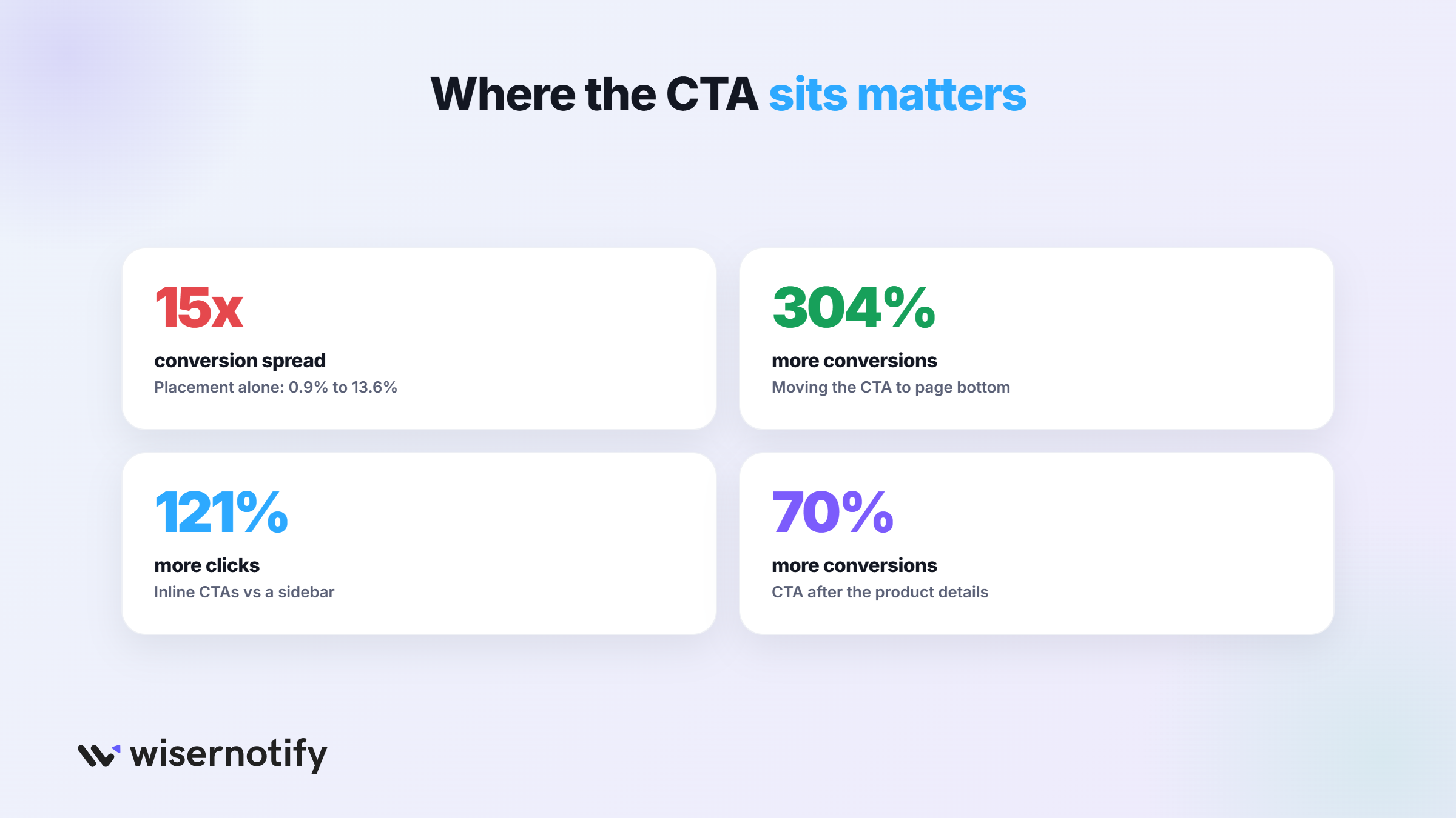
Where the button sits can matter more than anything printed on it.
15. Conversion rate can range from 0.9% for a bottom-of-page banner to 13.6% for a full-page popup, a 15 times spread from placement alone.
16. One well-known test moved a CTA to the bottom of a long landing page and saw conversion improve by 304%.
17. CTAs placed above the fold outperform those placed below the fold in most direct comparisons.
18. Internal, inline CTAs generate 121% more clicks than the same offer placed in a sidebar.
19. Centered CTAs draw significantly more attention than left- or right-aligned ones in eye-tracking studies.
20. Placing a CTA at the end of a product page, after the visitor has read the details, can increase conversions by 70%.
Placement decides whether a visitor even sees the offer at the moment they are ready to act. Get that timing wrong on your landing page and no amount of clever copy will save the click.
Boost Conversion Instantly
Add Social Proof & Urgency to your website
Do Personalized CTAs Convert Better?
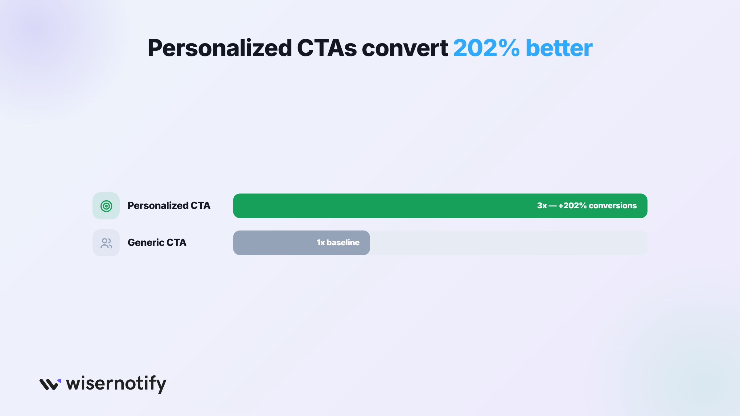
Yes, by a wide and consistent margin, whether the personalization is based on the visitor, the traffic source, or where they are in the funnel.
21. Personalized CTAs convert 202% better than generic, one-size-fits-all CTAs.
22. Targeted CTAs turn 42% more viewers into leads than untargeted versions of the same offer.
23. A returning visitor shown “Continue Your Trial” instead of “Start Free Trial” responds to the CTA that matches where they are.
24. Traffic-source-aware CTAs, matched to what a visitor searched or clicked to arrive, close more of the gap between intent and offer.
25. Lifecycle-aware CTAs, different for leads than for existing customers, avoid pitching a free trial to someone who already bought.
Personalization outperforms every design tweak on this list because it fixes a mismatch, not just a button. See our personalized CTA guide for how to set this up.
What Is a Good CTA Conversion Rate?
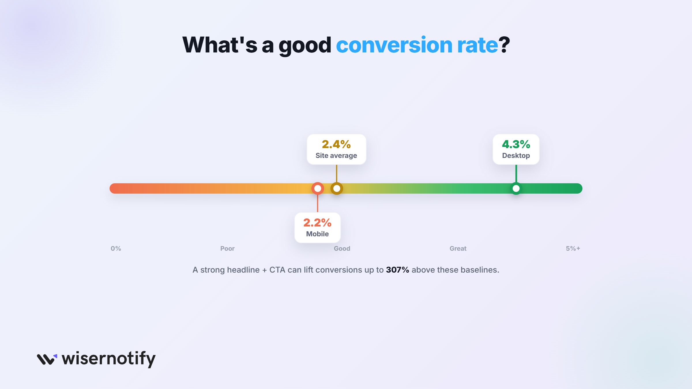
Benchmarks vary sharply by device and industry, so context matters more than chasing a single target number.
26. Desktop landing pages convert at an average of 4.3%, against 2.2% on mobile.
27. The average conversion rate for a landing page CTA overall sits around 2.35%.
28. The average conversion rate across a typical website, CTAs included, is close to 2.4%.
29. A strong, well-tested CTA can push a page’s conversion rate well above these baseline averages.
30. An effective headline paired with the right CTA has been shown to lift conversions by up to 307% together, more than either change alone.
Use these numbers as a starting line, not a finish line. A page converting near the average has real room to improve with wording and mobile CTA changes alone, before any redesign.
Boost Conversion Instantly
Add Social Proof & Urgency to your website
Which CTA Mistakes Cost the Most Conversions?
A handful of mistakes show up again and again in the data, and most of them are quick to fix once you know to look for them.
31. Vague labels like “Click Here” or “Learn More” leave visitors guessing what happens next, which measurably suppresses clicks.
32. Color changes alone reach statistical significance in only about 1 out of every 7 tests run.
33. Teams that test color before copy and placement are optimizing the part of the CTA that matters least first.
34. 48% of mobile conversion drop-offs trace back to misclicks or buttons too small to tap accurately.
35. Optimizing a CTA specifically for mobile screens can improve conversion rates by 32.5%.
Fix the biggest problems first. Wording, placement, and mobile usability move the numbers far more than the color debate that eats up most meeting time.
How Do CTAs Perform in Video and Gamified Formats?
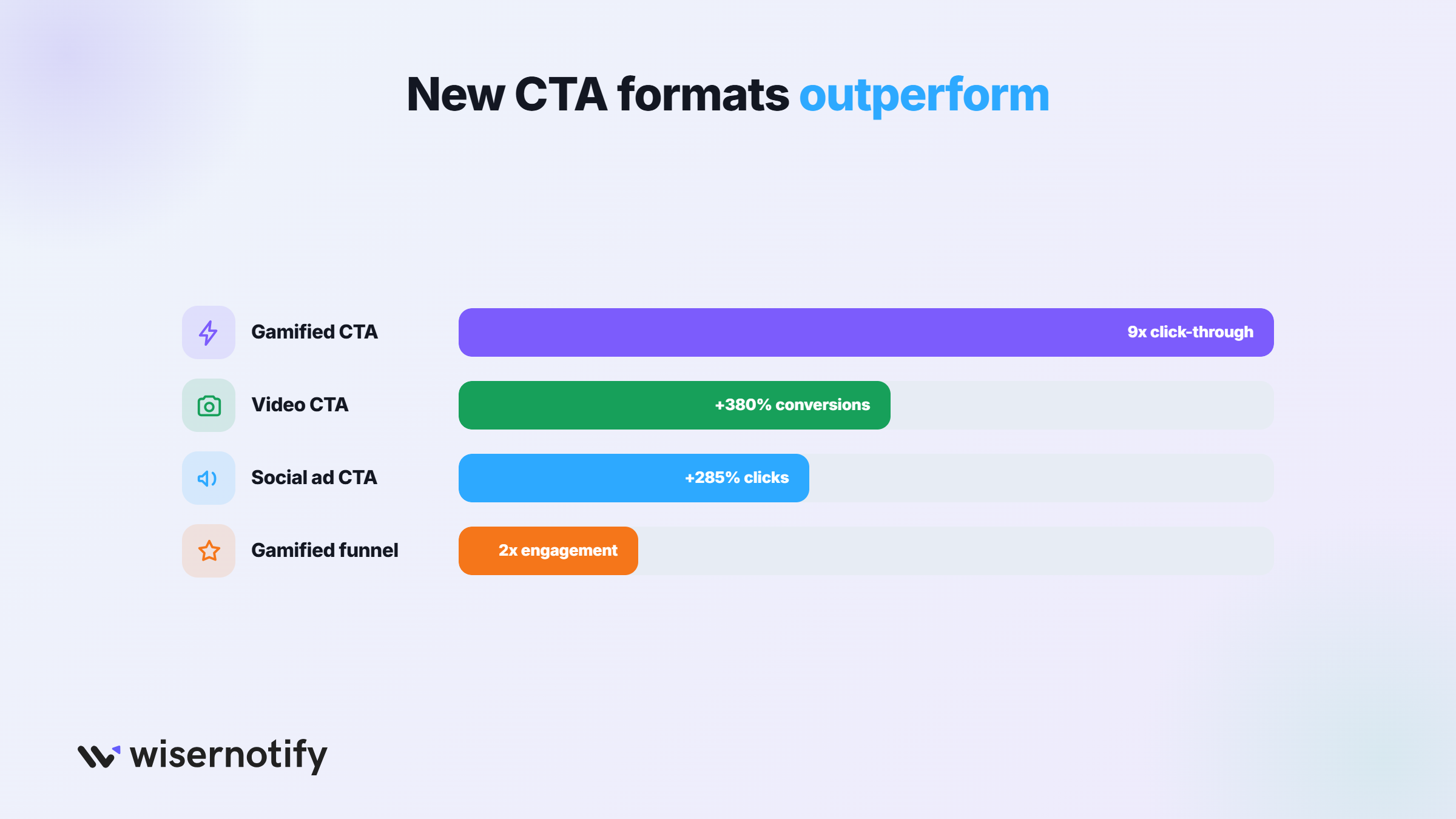
Newer formats are outperforming static buttons in the channels where they have been tested.
36. Including a CTA inside video content can drive up to 380% more conversions than the same CTA placed in a sidebar.
37. 23% of customers say they prefer a video CTA paired with a direct link to purchase.
38. Gamified CTAs, like a spin-to-win prompt, have produced click-through rates up to 9 times higher than a standard button in some tests.
39. Brands using gamification in their sales funnel reported engagement roughly doubling as a result.
40. Social ads with a clear CTA see click-through rates up to 285% higher than ads with vague or ambiguous prompts.
These formats work because they add a reason to click beyond the words on the button itself. A quick game or a face on video lowers the same friction that copy and placement address elsewhere.
How to Use These Numbers
Test wording before anything else. Swap “your” for “my,” cut the button to a few words, and replace generic labels like “Submit” with a specific benefit.
Cut down to one clear CTA per page, and place it where the visitor is ready to act. Personalize it by traffic source or stage where you can.
Our call to action phrases and writing guide cover the wording piece in more depth.
Boost Conversion Instantly
Add Social Proof & Urgency to your website
Wrap Up
The CTA button carries more weight than almost anything else on the page. The words on it matter more than the color.
Small changes make a big difference here. One word, one pronoun, or cutting from three buttons to one can move conversion more than a full redesign.
Test the wording and placement first. Personalize where you can, and leave color for last.
Sources
Foundry CRO | Flint | Apexure | Kissmetrics | Upward Engine | Heurilens
Frequently Asked Questions
Does using "my" instead of "your" in a CTA actually help?
Yes. First-person copy like “Start My Trial” outperforms “Start Your Trial” by up to 90%.
How many CTAs should a landing page have?
One. Pages with a single clear CTA convert at 13.5%, against 10.5% for pages with three or more.
Do personalized CTAs convert better than generic ones?
Yes, by up to 202% better, whether based on visitor, source, or funnel stage.
How long should a CTA button be?
About 3.4 words on average. Buttons written like a full sentence convert worse.
Does CTA button color matter as much as wording?
No. Only about 1 in 7 color tests reaches statistical significance, far less than copy or placement.

Krunal Vaghasiya is a marketing tech expert who boosts e-commerce conversion rates with automated social proof and FOMO strategies. He loves to keep posting insightful posts on online marketing software, marketing automations, and improving conversion rates.




 Capterra