
What Is a Call to Action? Types, Examples and How to Write One
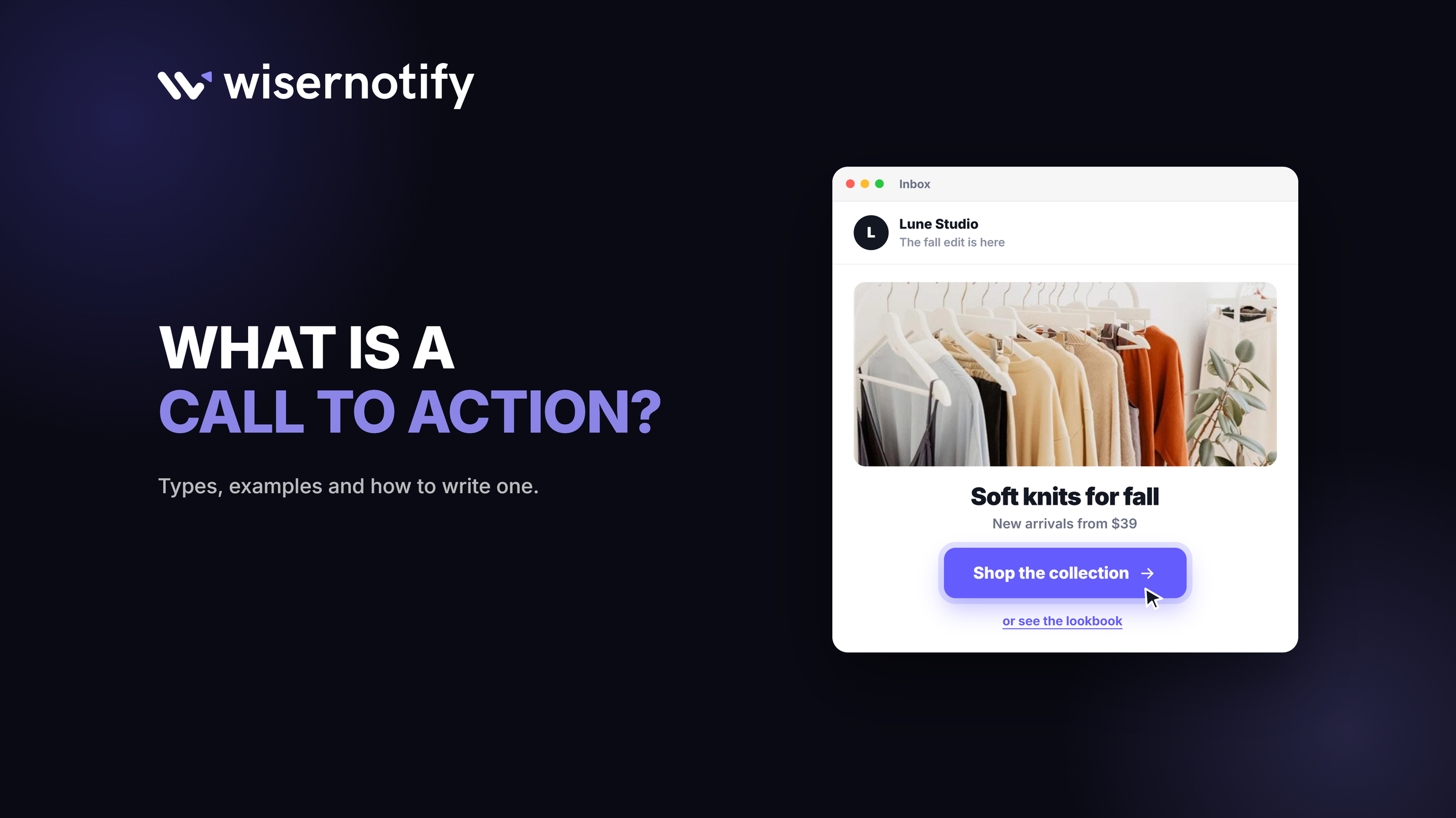
A call to action (CTA) is the short instruction that tells someone what to do next, like “Start your free trial,” “Add to cart” or “Download the guide.”
It usually sits on a button or link, and it is where a page turns a reader into a lead or a customer.
Below are the main types of CTA, real examples, a step-by-step way to write one, and where to place it so people click.
Key takeaways
- One page, one main action. Every extra choice splits attention.
- Start with a verb and name the payoff, like “Get the free guide.”
- Place the CTA right after you have shown the value, not before.
- Test one change at a time and judge it by the action that follows the click.
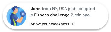
Build trust & FOMO
Highlight real-time activities like reviews, sales & sign-ups.


What Is a Call to Action?
A call to action is any prompt that asks a visitor to take a specific next step. In marketing, it is the point where interest becomes an action you can measure.
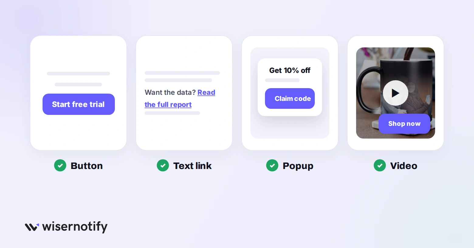
CTAs come in a few formats:
- Buttons: the most common, used for signups, trials and purchases.
- Text links: inside articles and emails, like “read the full report.”
- Popups and bars: timed or exit-intent offers that appear on top of a page.
- Video and voice: a closing line or on-screen button at the end of a video.
Why Calls to Action Matter
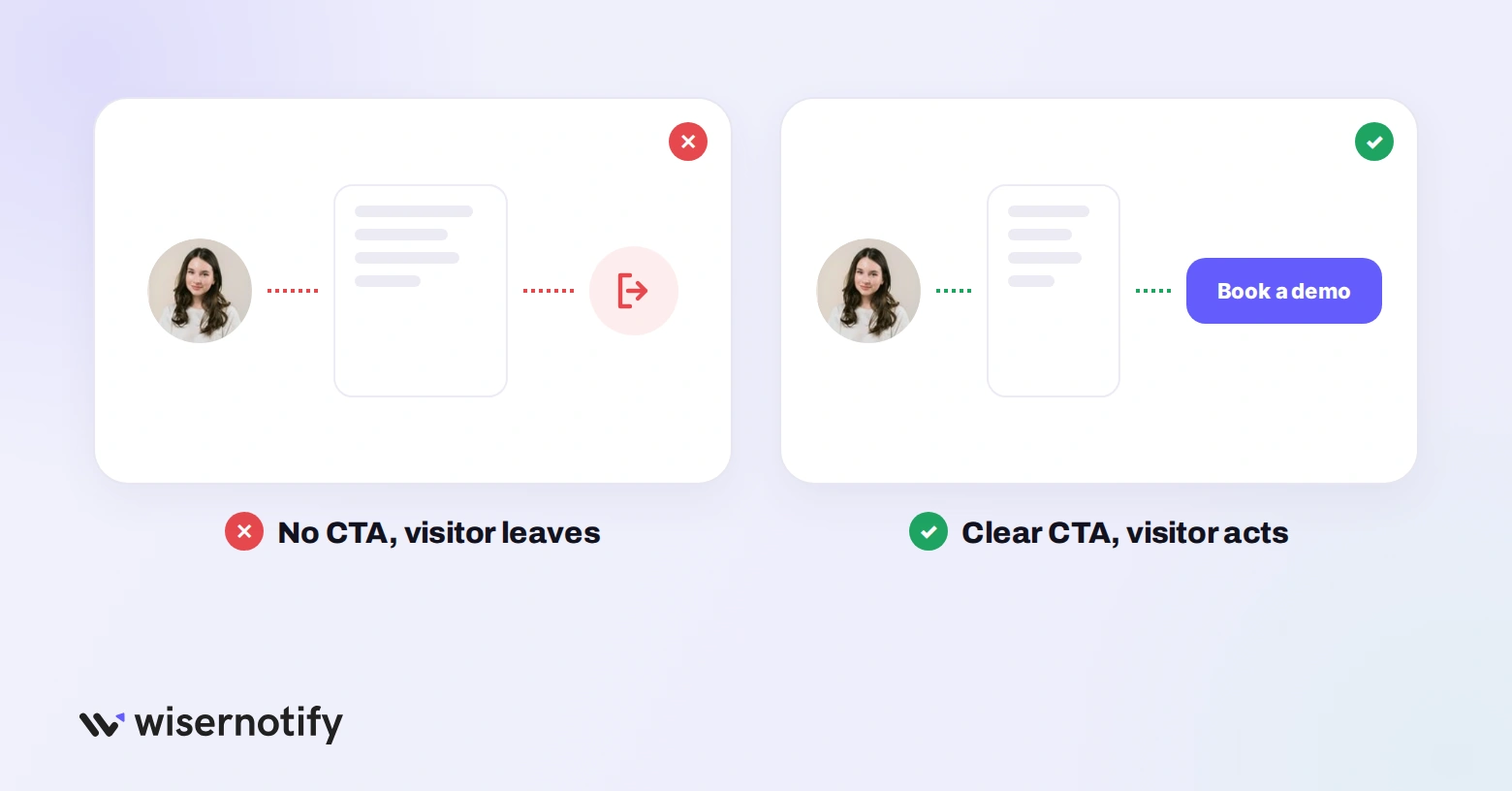
- They remove guessing: visitors know exactly what to do next.
- They turn traffic into results: without a CTA, a good page still leaves people with nowhere to go.
- They make results measurable: clicks on a CTA show which pages and offers work.
- They guide the journey: early pages ask for an email, later pages ask for the sale.
Types of Calls to Action
Each type does a different job, so match it to the goal of the page.
| CTA type | Example wording | Where it goes | Metric to watch |
|---|---|---|---|
| Lead generation | “Get the free checklist” | Blog posts, popups, landing pages | Signup rate |
| Free trial or demo | “Start your free trial” | Homepage hero, pricing page | Trial starts |
| Purchase | “Add to cart” | Product pages, ads | Add-to-cart rate |
| Lead nurturing | “See how Glow Studio did it” | Emails, case study pages | Click-through rate |
| Social | “Follow us on Instagram” | Footer, emails, posts | Follows and shares |
| Event | “Save my seat” | Event pages, emails | Registrations |
| Re-engagement | “Finish your order” | Cart reminder emails | Recovered carts |
For wording ideas by goal, see these call to action phrases. For layout and button styles, see these call to action designs with examples and our guide to call to action colors.
Call to Action Examples From Real Brands
These captures show how well-known brands handle the main CTA on a page.
Shopify
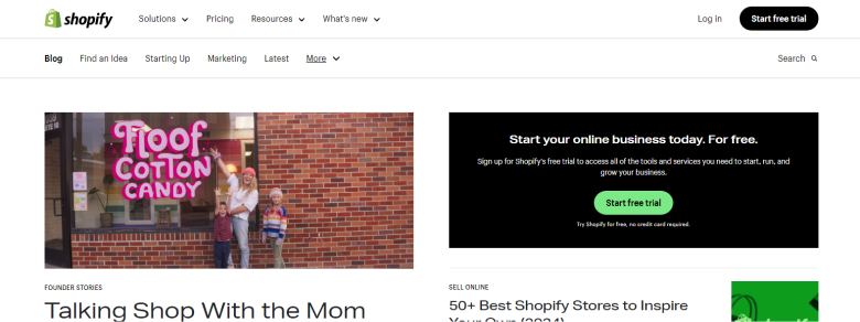
Shopify keeps one action front and centre: start a free trial. The button sits next to the email field, so signing up takes one step.
Coursera

Coursera splits its audience with two buttons, “Enroll today” for individuals and “For your organization” for teams. Each visitor picks the path that fits.
WiserNotify
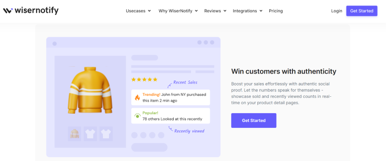
Our own homepage pairs one high-contrast button with a short line about what you get, so the next step and the payoff sit together.
Campaign Monitor
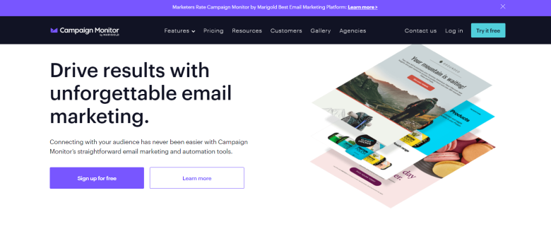
Campaign Monitor uses a filled primary button and a lighter secondary one. The visual weight tells visitors which action matters most.
Zapier
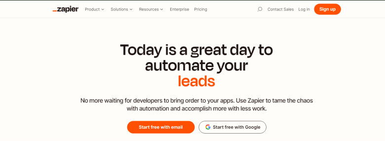
Zapier lowers the effort to sign up by offering “Sign up with Google” next to the email option. Fewer fields means fewer people dropping off.
How to Write a Call to Action
Work through these steps for any button, link or popup.
1. Pick one action per page
Decide the single thing this page should get people to do. If there is a second action, make it visibly secondary.
2. Start with a strong verb
Open with the action: get, start, join, book, claim, download. “Submit” and “Click here” say nothing about what happens next.
3. Name the payoff
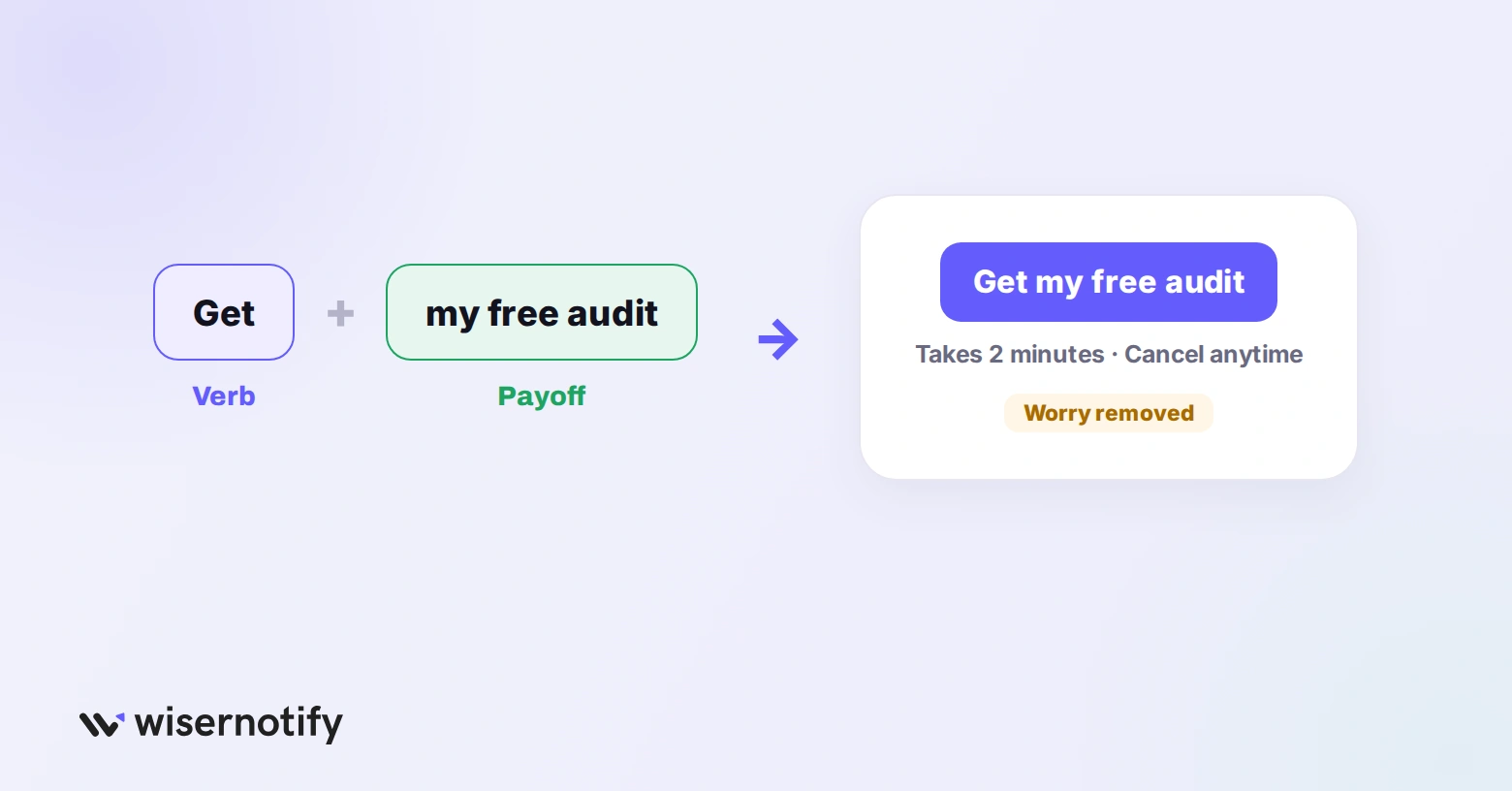
Say what they get, in their words. “Get my free audit” beats “Request audit” because it describes the result, not the task.
4. Remove the main worry
Add one short line under the button that answers the biggest doubt, such as “Cancel anytime” or “Takes 2 minutes.”
5. Add urgency only if it is real
A real deadline or limit, like a sale that ends Friday, gives people a reason to act now. Use limited time offers only when they are genuine.
6. Make it easy to see
- Contrast: use a button color that stands out from the rest of the page.
- Size: large enough to tap with a thumb on a phone.
- Space: leave white space around it so nothing competes.
- Text: short, bold and readable, usually two to five words.
Where to Place Your Call to Action
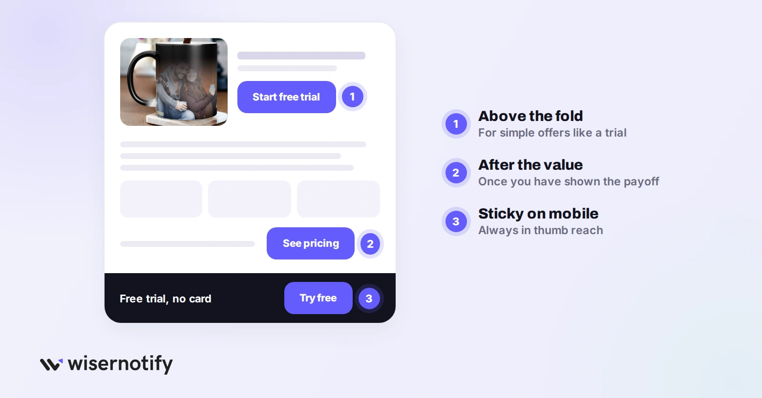
- After the value: put the CTA right after you show what the visitor gets.
- Above the fold for simple offers: a free trial or newsletter can sit at the top.
- Lower for complex offers: expensive products need proof and detail before the ask.
- At the end of posts and videos: readers who finish are the most ready to act.
- In a sticky bar on mobile: it keeps the action in reach as people scroll. See these mobile call to action examples for layouts.
Advanced Call to Action Ideas
Personalized CTAs

A personalized CTA changes based on who is looking. A returning visitor might see “Pick up where you left off,” while a first-timer sees “Start your free trial.”
Segment by visit count, location or past purchases, then test the tailored version against your default.
Push Notification CTAs
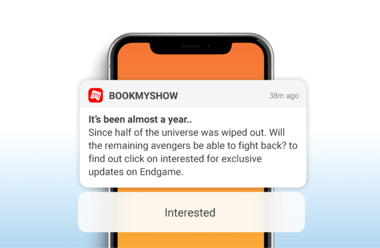
Push notifications work when they are timely and specific, like a price drop on an item someone viewed. Keep the CTA to a few words and limit how often you send.
Video CTAs
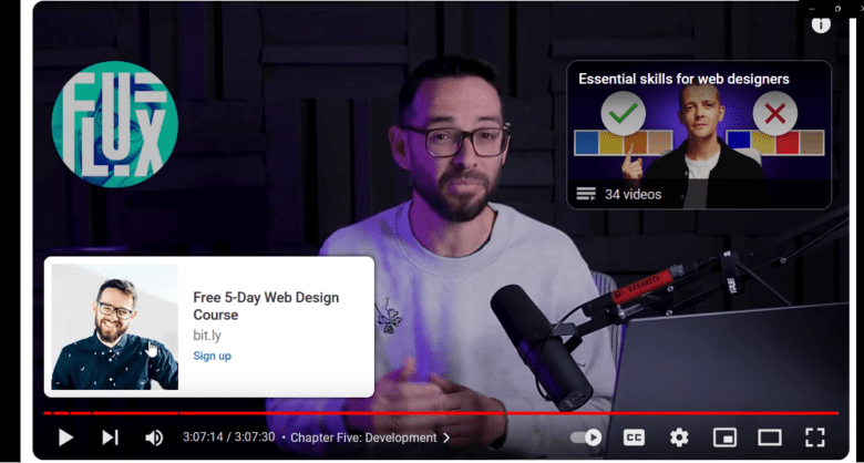
Add the CTA where viewers are most engaged, often near the end. An on-screen button plus a spoken line works better than either alone.
Primary and Secondary CTAs
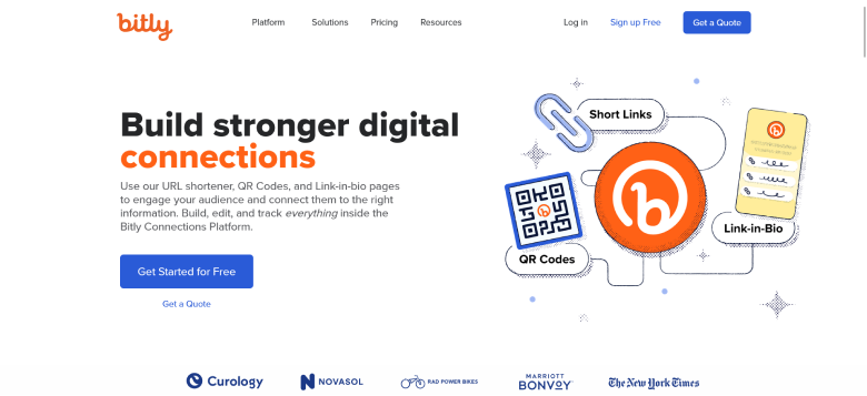
Two CTAs work when they serve different stages, like “Get started free” for ready buyers and “Get a quote” for larger teams. Make one clearly primary so visitors are not stuck choosing.
Build trust & FOMO
Highlight real-time activities like reviews, sales & sign-ups.
Tools That Help You Write CTAs
If you are stuck on wording, these tools can generate CTA ideas to test. Treat their output as a first draft.
Copy.ai
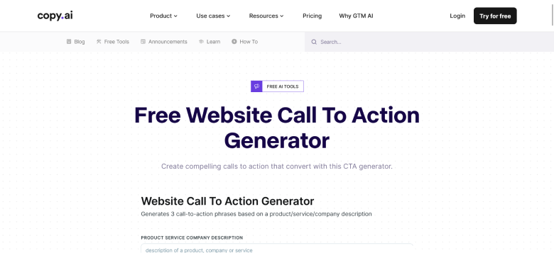
Copy.ai generates short marketing copy, including button text and headlines, from a description of your product.
Frase
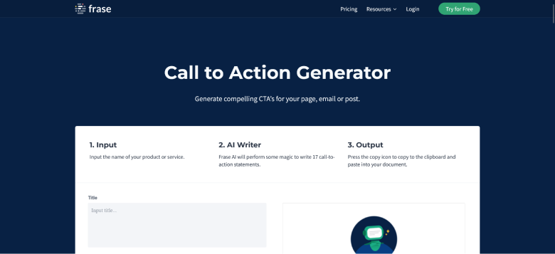
Frase offers a free call to action generator. Enter your product or offer and it returns a list of CTA lines you can edit.
HubSpot CTAs
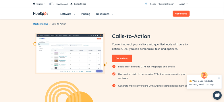
HubSpot lets you build CTA buttons and popups inside its marketing tools, with reporting on clicks and conversions.
Rytr
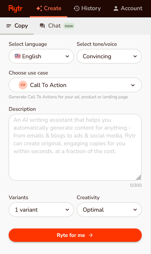
Rytr writes CTA copy using formulas like AIDA and PAS. You pick the language, tone and a short description, and it drafts options.
How to Test and Improve Your CTA
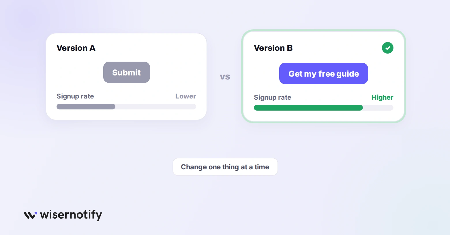
- Change one thing at a time: wording, color or placement, so you know what made the difference.
- Judge by the next step: a click that never becomes a signup or sale is not a win.
- Give tests enough traffic: stop early and you will pick the wrong winner.
- Check mobile separately: a button that works on desktop can sit below the fold on a phone.
For benchmarks to compare against, see our call to action statistics.
Common Call to Action Mistakes
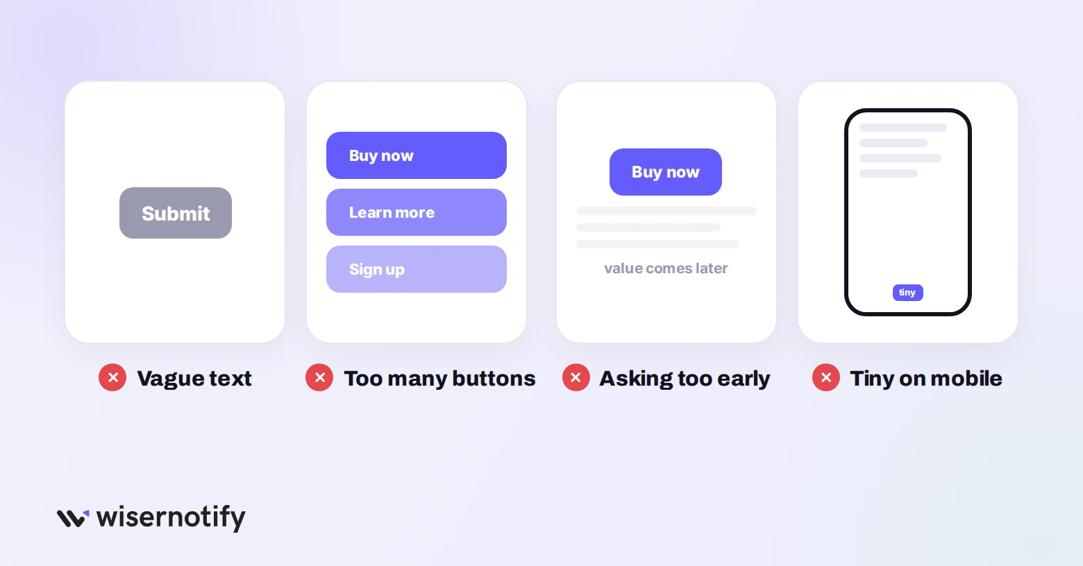
- Vague text: “Submit” or “Learn more” gives no reason to click.
- Too many buttons: three equal CTAs split attention and lower clicks on all of them.
- Asking too early: a “Buy now” before any value is shown gets ignored.
- Broken promises: a button that says “free guide” but lands on a pricing page loses trust.
- Ignoring mobile: tiny buttons or CTAs pushed far down the screen cost taps.
Wrap Up
A good call to action asks for one clear step and makes the payoff obvious. Start with a verb, place it after the value and test it against the action that follows the click.
Pick one page this week, rewrite its main CTA using the steps above and compare the results.

Boost Conversion Instantly
Add Social Proof & Urgency to your website
Frequently Asked Questions
What is a call to action?
A short instruction that tells someone what to do next, like “Start your free trial.” It usually sits on a button or link.
What is an example of a call to action?
“Add to cart,” “Get the free guide” and “Book a demo” are all calls to action.
Where should a call to action go?
Right after you show the value of the offer. Simple offers can sit above the fold, while complex ones need detail first.
How many CTAs should a page have?
One main CTA per page. A second one is fine if it serves a different stage and looks clearly secondary.

Krunal Vaghasiya is a marketing tech expert who boosts e-commerce conversion rates with automated social proof and FOMO strategies. He loves to keep posting insightful posts on online marketing software, marketing automations, and improving conversion rates.




 Capterra