Steal These 20 Call-to-Action Examples (No Judgment!)
 Krunal Vaghasiya|Mar 26, 2024
A strong call to action (CTA) can turn casual website visitors into loyal customers.
To be effective, a CTA should make people feel special and excited about taking the next step.
So, do you know that a well-placed CTA can increase conversions by up to 42%? That’s a huge number!
This blog will encourage users to explore different calls to action (CTA) examples across various industries to inspire their next marketing campaign.
We will highlight effective and simple CTA examples and demonstrate how these CTAs are designed to be clear, engaging, and action-oriented.
Call to Action Examples by Industry
Call to Action Examples in eCommerce
1. Amazon: “Buy Now with 1-Click”

Amazon’s “Buy Now with 1-Click” exemplifies efficiency and convenience, directly converting interest into purchase.
Also, Amazon’s “Add to Cart” button is a great example of a clear and compelling CTA.
Why is it an Effective CTA?
The user knows exactly what the button does.
The button is on product pages, so it’s easy to find.
The button is user-friendly, with a visual cue to where the user will be taken.
2. Sephora – “Shop to Redeem”
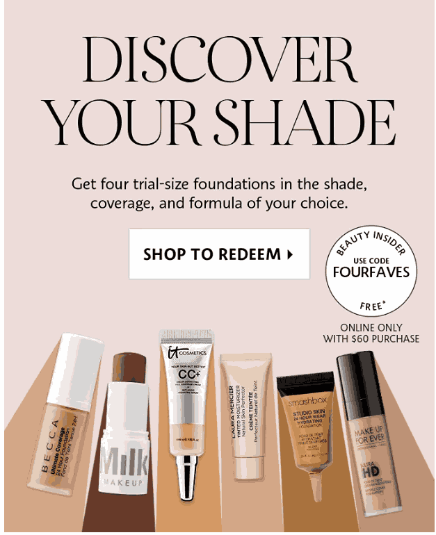
Sephora’s “Discover Your Shade” solves a customer pain point. The 15% discount creates urgency and encourages customers to buy now.
Why is it an Effective CTA?
The CTA is about a solution; customers love customized products and redemption on their favorite products.
It solves a common problem in the beauty industry: finding the right shade for your skin tone.
3. Sephora: “Wishlist Now”
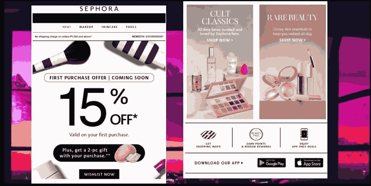
Sephora’s “15% off Valid on your first purchase” CTA is a great incentive for prospective customers to add more to their cart. It’s often on the checkout page.
Why is it an Effective CTA?
The free shipping motivates customers to spend more to qualify for the offer.
The offer creates a sense of urgency to complete the purchase before the offer expires.
Free shipping is a big deal for online shoppers, making this CTA attractive.
Call to Action Examples in SaaS
4. HubSpot – “Start free trial”
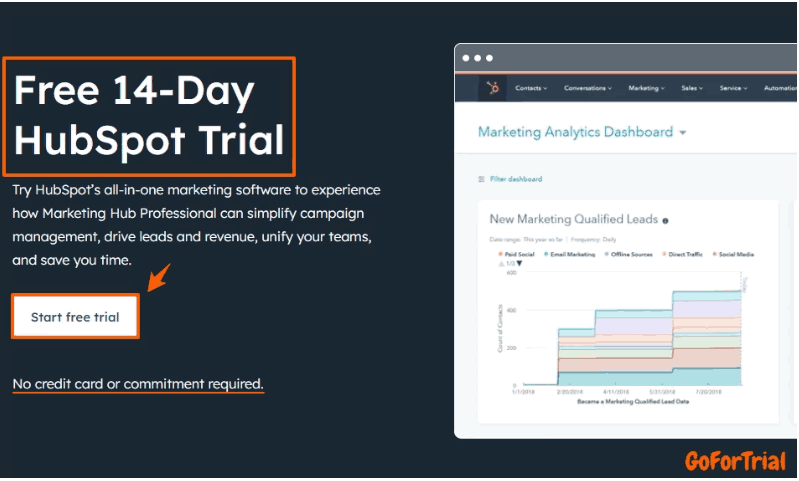
You can start a free trial and explore its features for 14 days to get the most out of start free trial of Hubspot.
Why is it an Effective CTA?
A free trial removes risk for the prospect, so it’s easier to convert.
The CTA button is often front and center and visually distinct.
5. Slack – “Try for Free”
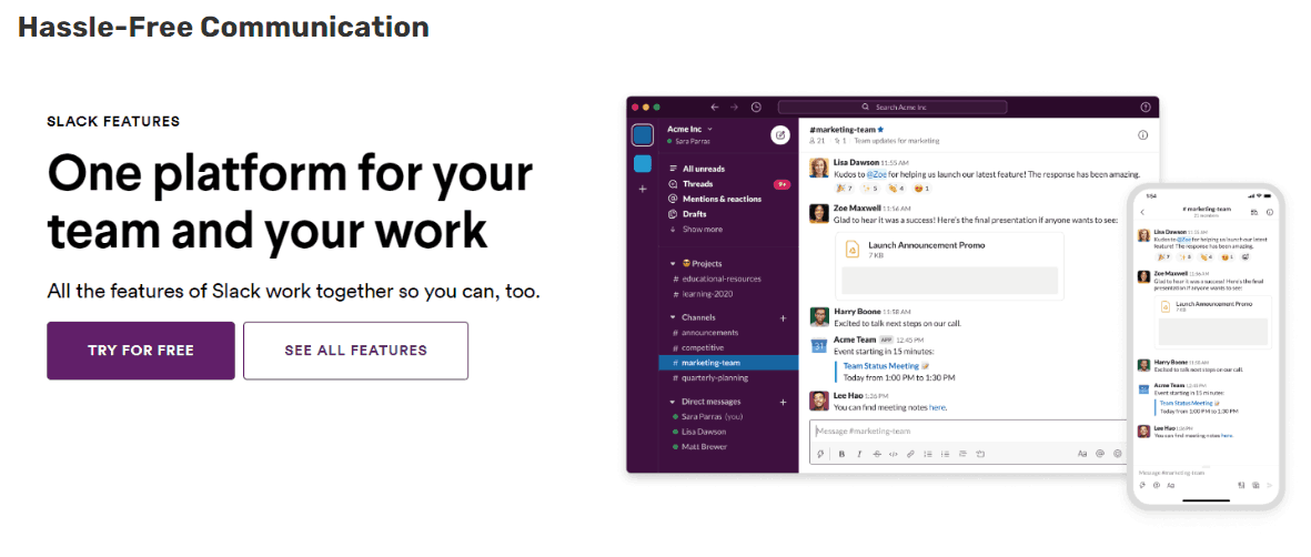
Slack’s Try for Free shows the value without the commitment.
Why is it an Effective CTA?
The word “Try” implies getting to try the product without commitment.
Like HubSpot, a free trial removes the barrier to entry.
CTA is consistent across all marketing channels and touchpoints.
Build trust & FOMO
Highlight real-time activities like reviews, sales & sign-ups.


6. Wisernotify – “Start Selling More”
Wisernotify’s Start Selling More aligns with the product benefit and gets you to act.
Why is it an Effective CTA?
It is Direct as it States what you want the user to do.
Aligns with Wisernotify’s core value of increasing sales.
Simple and punchy, so easy to remember.
Call to Action Examples in Online Coaching
7. MasterClass – “Explore Classes”
MasterClass’ Start Your Journey Today sparks curiosity and a sense of urgency.
Why is it an Effective CTA?
It creates a sense of urgency as today implies it’s timely and important.
Learning something new is interesting and makes you want to click.
MasterClass is about learning from the best; this CTA matches that.
8. BetterUp – “Request a demo”
BetterUp’s Request a Demo is a low-risk way to learn more.
Why is it an Effective CTA?
The CTA offers a free consultation and free proposal so potential clients can learn more about BetterUp without any commitment.
The word “demo” reduces perceived risk so potential clients can take the next step.
Offering a free consultation shows BetterUp is confident in its services and willing to help.
9. Noom – “Let’s do this!”
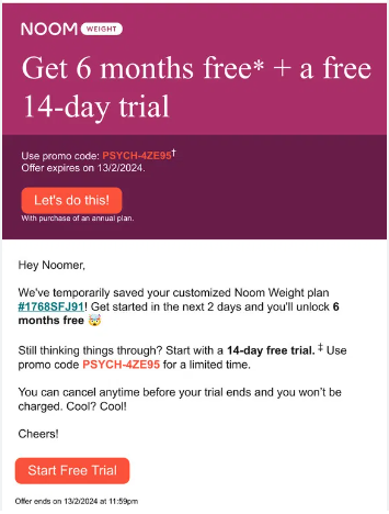
Noom’s Get 6 months free*+ a 14-day free trial combines incentives and urgency to get you to sign up.
Why is it an Effective CTA?
The “free trial” offer removes financial risk so potential customers can try Noom.
The word “Get” implies the opportunity to begin is available now and may not be available later.
It gets potential customers to take the first step toward their health and well-being.
Call to Action Examples in Gym & Fitness Centers
10. OrangeTheory Fitness – “First Class Free”

OrangeTheory Fitness’ First Class Free removes barriers to entry and gets you to try.
Why is it an Effective CTA?
It’s a simple and straightforward call to action that is easy to read.
Allows the prospect to try OrangeTheory for themselves and increases conversion.
Although not explicitly stated, the free class creates a sense of FOMO to try it before the offer expires.
11. Planet Fitness – “Join Now”
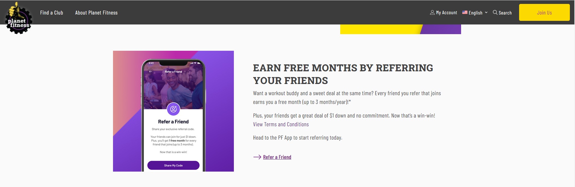
Why is it an Effective Personalized CTA?
CTA tells the user what to do next.
The implied benefit is access to the gym.
Planet Fitness is a budget option, so “Join Now” appeals more to price-sensitive consumers.
Build trust & FOMO
Highlight real-time activities like reviews, sales & sign-ups.
CTA Button Examples in Marketing Agencies and Consulting Firms
13. Neil Patel – “Hire My Agency”
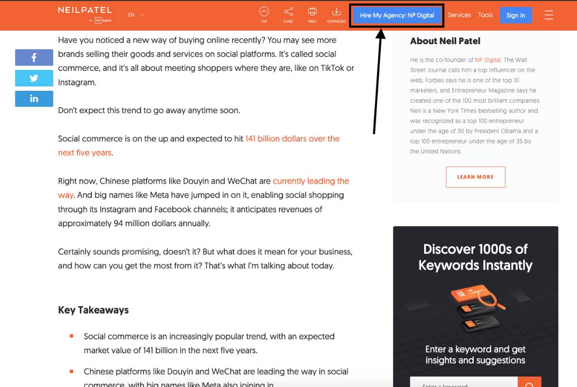
Why is it an Effective CTA?
Simple and to the point
Friendly and approachable
Builds trust
14. Lasik MD – “Book Your Free Consult”
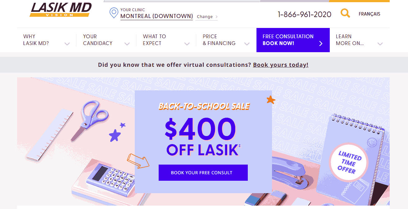
Lasik MD’s CTA is on the main menu, blue, and hard to miss. Book an appointment is key in a service industry like healthcare. The wording is clear on the call to action (book an appointment) and the benefit (it’s free).
Why is it an Effective CTA?
The blue color makes the button stand out from the rest of the website, attention-grabbing.
It explains the action’s benefit—free consultation—addressing the customer’s cost and commitment pain points.
The combination of clear text and visible design encourages visitors to take action now, resulting in more engagement and conversions.
CTA Examples in Non-Profit Organizations
15. The Nature Conservancy – “Donate”
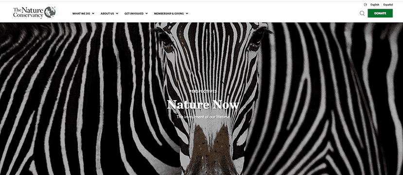
Why is it an Effective CTA?
The CTA is short and sweet, creating a sense of urgency.
It speaks directly to the organization’s mission —to protect nature.
A strong action verb like “Donate” prompts the visitor to act now.
16. The American Red Cross – “Make an Appointment”
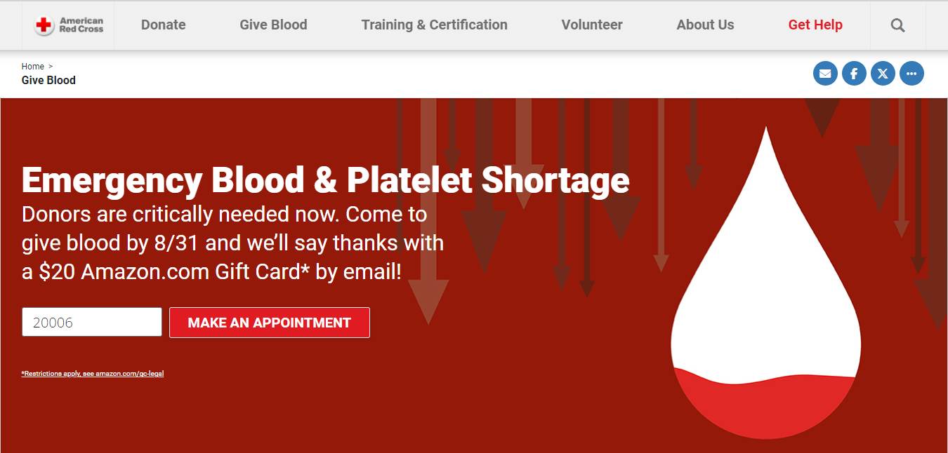
Why is it an Effective CTA?
This CTA is simple and speaks to the immediate impact a donor can have.
It’s a strong call to action that taps into people’s desire to help others.
The CTA is easy to understand and act on.
17. The Humane Society – “Learn More”
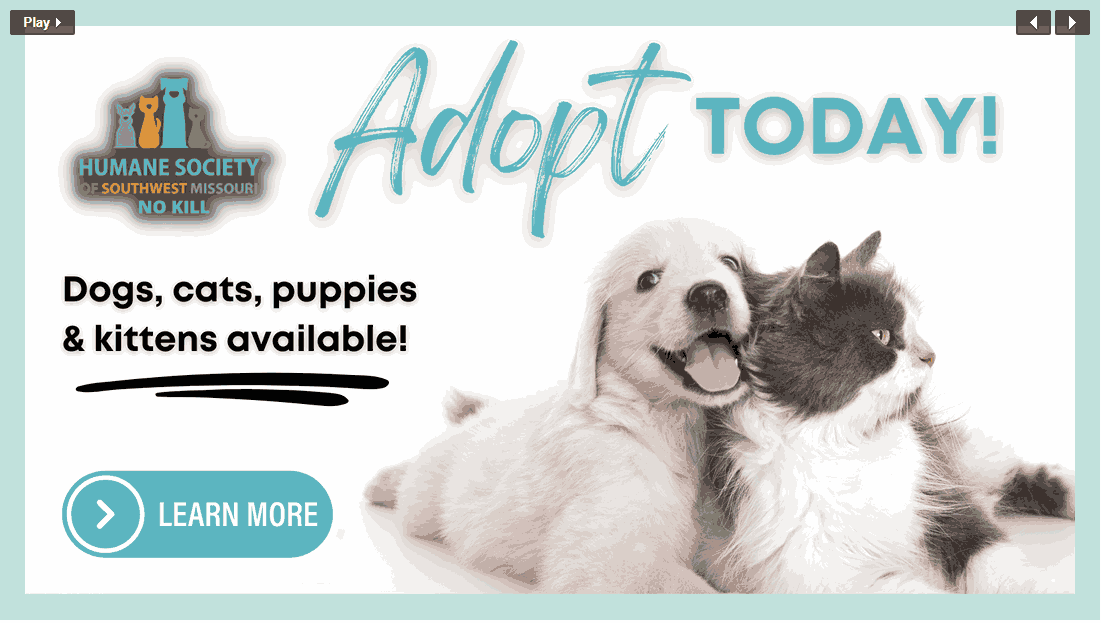
Why is it an Effective CTA?
This CTA speaks to a positive outcome for both the animal and the adopter.
It creates a sense of fulfillment and satisfaction and encourages the visitor to give a loving home to a needy pet.
Build trust & FOMO
Highlight real-time activities like reviews, sales & sign-ups.
Call to Action Examples in Real Estate
18. Zillow – “Browse homes, See your options, and Find rentals”
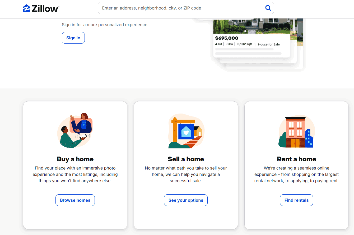
Why is it an Effective CTA?
This informative CTA encourages users to investigate the property further.
It satisfies the visitor’s curiosity and leads them further into the buying process.
19. Redfin – “Schedule Tour”
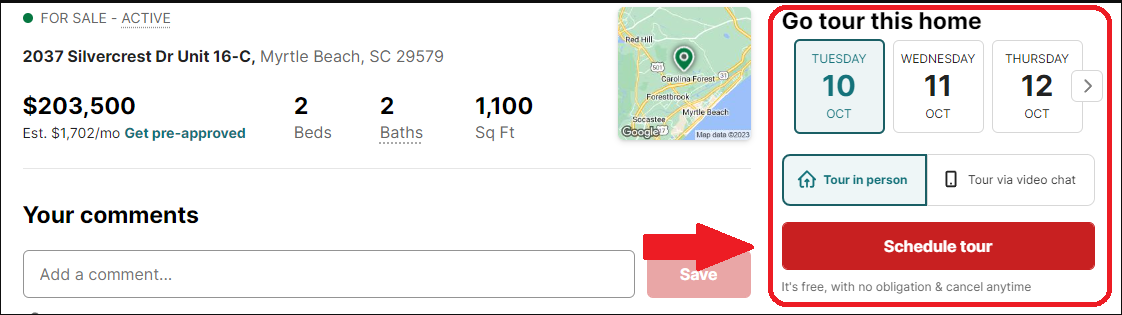
Why is it an Effective CTA?
This CTA creates a sense of urgency and scarcity.
It implies the property is in demand and encourages the visitor to take the next step to ownership.
20. Realtor – “Connect with an Agent”
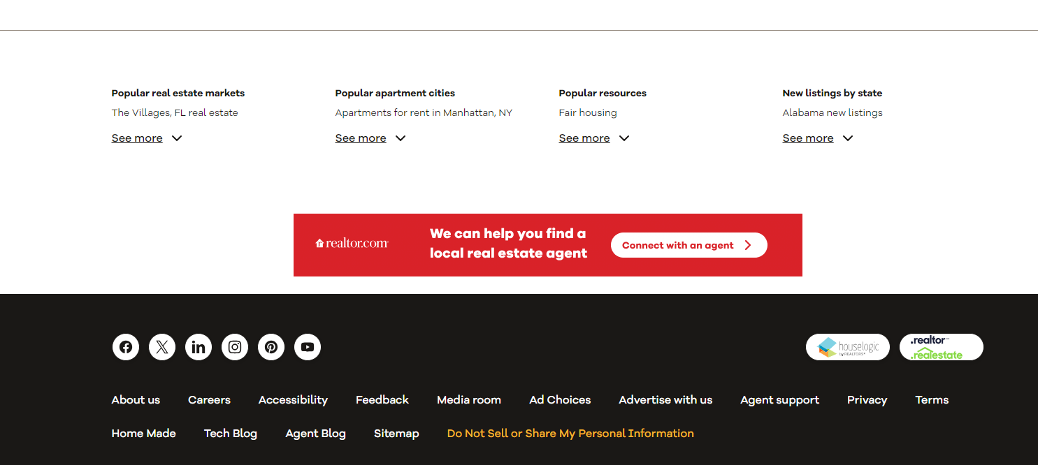
Realtor’s Connect with an Agent provides support throughout the home buying process.
Why is it an Effective CTA?
This CTA connects visitors with real estate agents.
It offers support and guidance throughout the buying process and builds trust with the user.
Boost Conversion Instantly
Add Social Proof & Urgency to your website
Wrap up
Here are all the examples of the best CTAs. So, Crafting good calls to action to drive conversions and hit your marketing goals is the best approach.
By knowing your audience and telling them what’s in it for them to take the desired action, you can boost sales, sign-ups, or donations.
CTAs need to be tailored to the industry and audience. Experimentation is critical; test different approaches to see what works for your target market.
Always put your audience first when crafting CTAs. Clarity, benefits, and audience understanding will get you CTAs that drive action and results.
Krunal Vaghasiya is a marketing tech expert who boosts e-commerce conversion rates with automated social proof and FOMO strategies. He loves to keep posting insightful posts on online marketing software, marketing automations, and improving conversion rates.