

Is your website attracting and converting mobile website visitors into customers?
At least 79% of smartphone users have purchased online using their mobile devices, which means mobile eCommerce has been on an upward trend for a long time.
If that’s not enough to deliver a mobile-optimized experience, significantly more research is carried out on mobile phones (64%) than on the desktop (35%). All this concludes that mobile commerce is rapidly rising.
A high conversion rate means more leads, sales, and, ultimately, revenue. Therefore, it’s crucial to understand different strategies to enhance mobile user experiences. Meanwhile, 80% of shoppers used a mobile phone inside of a physical store to compare prices or look up product reviews.
That’s why mobile eCommerce stores need to optimize the mobile experience and increase mobile conversion rates. As mobile users’ behaviors differ from those of desktop users, it’s crucial to use different strategies for both.
In this blog, we’ll discuss proven tips that help to increase mobile conversion rates.
Let’s go!!!
Build trust & FOMO
Highlight real-time activities like reviews, sales & sign-ups.


Why Mobile Conversion Rate Optimization is Crucial for Your Business
- Mobile conversion rate optimization is more about improving conversions and influencing visitors to take a desired action, such as purchasing, signing up for a newsletter, or filling out a form on mobile devices.
- Mobile conversion optimization is essential because it directly impacts your sales. A well-optimized mobile experience can significantly increase user engagement, reduce bounce rate, and drive more sales.
- As mobile commerce continues to grow, businesses should ensure a seamless experience that boosts user satisfaction and helps their business grow. Optimizing mobile websites can help them attract more traffic, engage with wider audiences, and drive more action.
The mobile CRO should focus on the speed and accuracy of the mobile device; neglecting these small details can cause you to lose customers. Let’s explore 20 strategies to increase mobile conversion rates.
Also See : 15 Simple Ways to Increase Free Trial Conversion in 2026
20 Mobile Conversion Rate Optimization Strategies
Now, let’s break down each strategy mobile eCommerce store owners can use to increase mobile conversions.
1. Speed Up your Mobile Site
Slow page speed can make your visitors leave before taking any step and reduce your conversion rate. That’s why it’s important to optimize the site’s load times.
Faster loading speeds keep visitors engaged and affect your site’s ranking on search engines’ ranking pages, leading to a lower bounce rate and more mobile traffic. You can use online tools like Google’s Page Speed Insights to test the speed and take simple steps to boost the site’s loading speed for mobile devices.
2. Use high-quality images and Videos
High-quality images and videos are crucial for creating engaging and visually appealing mobile sites. A good mobile experience comes with optimized images.

Visual content helps users understand your products or services and make informed purchasing decisions. Make sure to use clear and high-resolution images that showcase your products from multiple angles.
Use alt-text for images to improve accessibility and SEO. High-quality images can enhance user experience and engagement and boost conversions on your mobile site.
Pro Tips:
Compress your images and videos, ensuring they load quickly to avoid users leaving your site. Optimize file sizes and formats using tools like TinyPng and enable lazy load to ensure images don’t break.
3. Offer Personalized Experience
Customize your offers and promotions for individual visitors by considering their behavior and demographics. This personalized approach can significantly enhance the conversion rate on your mobile site.
Leverage data like past purchases, browsing history, and user preferences to tailor the customer’s shopping journey, showcase on-page product recommendations, offer special deals, or customize homepage content based on the user’s interest.
Personalized experiences make users feel valued and understood, which significantly boosts engagement and conversions. The more relevant and customized the experience, the more likely the users are to purchase.
Offering personalized experiences can lead to higher satisfaction and loyalty among mobile shoppers.
4. SEO Practices to Increase Conversion Rate
Optimize your mobile site for search engines that help rank on mobile search pages and attract the right audiences. Mobile SEO ensures your site is mobile-friendly, loads quickly, and provides a seamless experience.
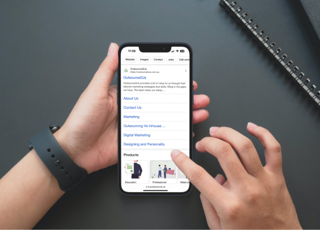
Using mobile-specific keywords can help improve site visibility in search results. Update content, ensure easy navigation, and have a simple interface to improve search engine rankings, drive more traffic, and increase the likelihood of conversions.
A slow site can distract users by focusing on high-quality, relevant images, responsive design, and minimizing code to improve load times.
5. Retargeting Mobile Users to Maximize Mobile Conversions
The average mobile session time is only 72 seconds. Thus, the odds that visitors will click through your ads, read your content on the landing page, and convert are lower. Retargeting is a powerful way to re-engage with visitors and increase the chances of conversions.
Personalized ads are more effective in retargeting those customers and maximizing your mobile traffic’s value.
For example, if the customers have left the product in the cart, show them the ads featuring those products with special offers and discounts. Track and retarget mobile users that significantly increase conversion rates by reminding users what interests them.
6. Simplify Mobile Checkout to Boost Mobile Conversions
A streamlined mobile checkout process can convert visitors into customers. Start by minimizing the steps required to complete the purchase and provide auto-fill features to save users time when entering their information.
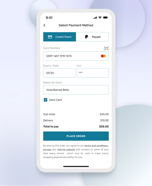
Also, offer them guest checkout options to reduce friction for first-time buyers. Ensure your checkout forms are simple, easy to navigate, and consume less time to make sure they can make a purchase faster and quickly.
Provide them with multiple payment options, including e-wallet payment methods, and show a progress indicator highlighting the steps left in the checkout process. Simplifying the checkout process can reduce cart abandonment, increase the likelihood of completing the purchase, and boost mobile conversions.
7. Prioritize Trust & User Privacy
User Privacy and security are priorities for mobile users, who need assurance that their personal and professional information is safe. Enhancing mobile site security helps build trust and encourage users to complete transactions.
Start by implementing HTTP to encrypt users’ data and protect information. By displaying security badges like SSL and trust seals, especially on checkout and payment pages, assures customers that the site has been safe and secured.
Update your site and security protocols regularly to protect against vulnerabilities and threats. Adding the extra layer of security creates a safe and trustworthy environment that encourages mobile users to make purchases on your site.
8. Showcase Social Proof
Social proof helps build credibility and encourage conversions from visitors to your mobile site. To do this, showcase user-generated content, reviews, ratings, and testimonials to showcase positive experiences from your previous customers.

Display social proof on different pages, such as landing pages, checkout pages, and product pages, to create a sense of authenticity and make users confident in their purchasing decisions. Leveraging social proof helps build trust, attract more users, and increase conversions on your mobile site.
Also see: 25 Elite Conversion Rate Optimization Experts & Consultants
9. Designing for Mobile Screens: Simplifying User Interface
Make sure to use simple and user-friendly designs for mobile screens, ensuring the site is responsive and can adapt
to different screen sizes seamlessly. User a clean and uncluttered design to make navigation easy and space different elements adequately to avoid mess.
With limited screen space, minimize popups and other intrusive elements that can frustrate users. Mobile visitors love user-friendly interfaces that encourage them to take action, ultimately boosting conversions.
Unlike desktop users who can easily click small buttons, mobile users face limitations when interacting with smaller screens. Ensure your buttons are easy to locate and large enough to be tapped comfortably with a thumb.
10. Leveraging Mobile Analytics for Insightful User Behavior Analysis
Integrating analytics tools is essential to understanding the behavior of a mobile audience that interacts and engages with your site. Tracking metrics like duration, bounce rate, and navigation paths can help gather valuable insights into user behavior.
Use tools like Google Analytics, which can help you segment audiences based on demographics, age, device type, and more. This allows you to track more insights into user behavior. Frequently reviewing and analyzing this data helps you make informed decisions, optimize your mobile site, and improve customer mobile experience.
Build trust & FOMO
Highlight real-time activities like reviews, sales & sign-ups.

11. Push Notifications
Push notifications remind users of abandoned carts, exclusive offers, new products, or member-only events to foster engagement and catalyze conversions among your mobile apps. It’s one way to re-engage with users and drive more engagement.
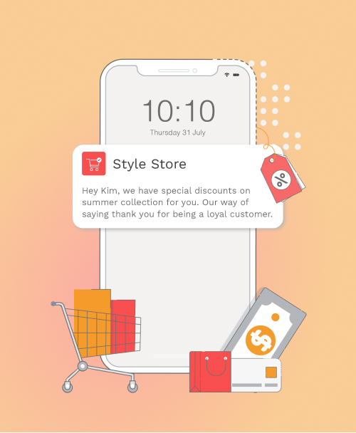
Ensure your notifications are timely, relevant, and concise, with a personalized message to make them more engaging and valuable for the user. Provide clear and compelling calls to action to encourage users to return to your site and complete their purchases.
12. Implement Mobile Friendly Payment Options
It makes it convenient for users not to input payment information when purchasing. Integrating different payment options, such as Google Pay, Apple Pay, PayPal, or e-wallet payment options, speeds up the checkout process for customers.
Easy payment options offer a convenient and efficient way to make transactions, eliminating the need to share information and go through time-consuming steps. With payment options, users can choose the more convenient one, reducing wait time and encouraging repeat business.
13. Engaging Product Descriptions
Making the product description engaging, clear, and conscious is crucial because mobile users have a small number of screens. The product’s main features, benefits, and specifications should be easy to read and highlight the USP, differentiating your product from competitors.
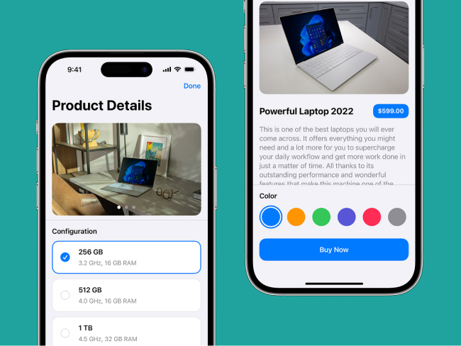
Do not only discuss your product’s features. Highlight how it can help customers solve their problems, explain the benefits, and explain why they should purchase it. Keep the content short and structured instead of long paragraphs.
14. Optimizing Mobile Pages for Better Conversions
Ensure your mobile site is responsive, with clear navigation and clickable buttons. The content should also be concise and easy to read for small screens, with short paragraphs, bullet points, and ample white space to break the text.
To save users time, keep the form fields, large input fields, and auto-fill options easy to tap. Regularly test and optimize your web page using A/B testing to compare different versions and identify which elements perform best.
15. Add Live Chat
Integrate a live chat on your site that significantly boosts customer satisfaction and support in real-time, leading to happier customers and a better conversion rate.

Helping customers answer queries can increase the conversion rate by 40%, making it a valuable strategy for eCommerce sites. In addition, live chat helps gather feedback, answer quick questions, and understand customers’ pain points, enabling them to improve customer experience.
16. Create Urgency
Creating FOMO and urgency is a marketing technique that helps boost conversion rates. It uses scarcity and time-limited offers to influence consumers to take action quickly before they lose an offer.
Use flash sales, countdown timers, limited-time offers, exclusive promotions, and low-stock alerts to influence customers and create FOMO and a sense of urgency among them.
17. Collect Emails
Sometimes, converting visitors into customers might take more than one session. Instead, nurture them and try converting them into email subscribers first, then use email deliverability tools to make sure your messages reach their inbox, not spam.
And you can easily ask them by offering something valuable.
Mobile screens always have limited space, and you don’t want to take up all the free space with your lead forms. Be less intrusive when collecting emails on your mobile site.
18. Create Mobile-Specific Campaigns
Mobile users are more likely to get converted. Mobile-specific campaigns are tailored to the unique behaviors and preferences of mobile users. Their campaigns can effectively drive more engagement and conversions by leveraging the strengths of mobile platforms.
Offer exclusive discounts and promotions to mobile users through push notifications, SMS, and in-app messages. Utilize geo-location data to deliver personalized offers and content based on the user’s location.
19. Leveraging AI for Predictive Mobile Conversion Optimization (H3)
Artificial Intelligence (AI) can be a game-changer for mobile conversion optimization. By analyzing vast data, AI can predict user behavior and provide insights into improving mobile experiences.
AI-driven chatbots can enhance customer service by providing instant, personalized assistance to users and answering their queries in real-time.
20. Testing and Optimizing
A/B testing compares two versions with elements like content, buttons, and CTAs. Analyzing A/B results helps you make informed decisions to increase conversion rates. For effective A/B testing, consider elements such as colors, button sizes, visuals, content, and design.
Start to test elements that impact customer behavior, such as landing pages, headlines, CTA buttons, or images. Create different versions of your web page with changes to the selected elements and use different tools to run your tests.
Boost Conversion Instantly
Add Social Proof & Urgency to your website
Conclusion
Optimizing your mobile conversion rate is a continuous process that involves understanding customer behavior, implementing the latest technologies, and consistently refining your strategies. An efficient conversion rate optimization strategy helps to generate revenue, build a loyal customer base, and stay ahead of competitors.
This guide offers 20 tips on best practices to help you improve the conversion rate for your mobile eCommerce site. These tips include building responsive websites, improving site speed and user interaction, simplifying complicated checkout processes, and other elements that influence target customers to take specific actions.
However, to increase your conversion rate, always provide a seamless shopping experience to your customers and address their concerns.
