
The call to action is merely more than a button, It guides the target audience to take a specific action, whether making a purchase, subscribing to a newsletter, or downloading an eBook.
A good CTA button can make all the difference between a passive visitor and an active customer, making it a critical component of your marketing materials.
In marketing strategy, a call to action (CTA) is a word or phrase that tells your target audience what to do next. It can be a plain copy, a clickable button, or a video CTA. Writing and designing CTAs is not always straightforward.
You want your CTA to stand out but don’t want to make it look salesy or desperate.
These CTAs can deliver marketing messages on landing pages, web pages, social media marketing, email campaigns, or any other marketing campaign.
This article will guide you through different sections to master creating a call-to-action button that compels users to take action, increases sales, or drives more traffic to your website.
Let’s dive in…
What Is Call To Action in Marketing?
A call to action (CTA) in marketing is a prompt or instruction aimed at the audience to elicit an immediate response, typically involving some form of consumer action.
Call to Action (CTA) is a common marketing term used to describe the text or message that prompts someone to take a specific action. A CTA can be a button, a link, or just text that urges the viewer to take a specific action, like Buy Now, Call Today, Subscribe, or Learn More.
CTAs are typically found on websites, emails, advertisements, and other marketing materials. Effective CTAs are clear, concise, and persuasive. They use strong verbs and create a sense of urgency. They also make it easy for the recipient to take the desired action, often by including a button or link.
Importance of Using Strong CTA and Its Impact on Conversions
The main goal of a call to action is to drive engagement and improve conversion rates for your brand. Providing a clear CTA helps convert visitors into potential customers. Here is why the call to action button is important for conversions –
Guiding User Behaviour: The CTA serves as a sign, guiding users to the next step after connecting with your brand. This step might be subscribing to social media, downloading an eBook, making a purchase, or signing up for a newsletter; the CTA directs users to specific actions.
Increase Engagement: A well-crafted call to action captures visitors’ attention and encourages users to interact with the content or offerings. The CTA highlights the value proposition, influencing users to click and improving overall engagement with your brand.
Creates FOMO: Effective CTAs in digital marketing often leverage psychological triggers and evoke emotions like fear of missing out or urgency tactics to prompt immediate action.
Generate Leads and Sales: A compelling CTA encourages users to take the next step, whether it’s contacting sales, visiting the product page, or landing page, resulting in more conversions and revenue for your business.
Enhance User Experience: Well-placed and well-designed CTA buttons improve user experience by guiding them through a web page or landing page. They make navigation easier, helping users find what they’re looking for quickly and easily, leading to positive interaction with your brand.
Types of Calls to Action
Call to action is not a one-size-fits-all tool. Different CTAs serve different purposes, and their effectiveness varies based on the content, target audiences, and marketing goals. Here are a few important types of CTAs:
Lead Generation CTA: Using lead generation CTAs is crucial to generating leads from your website. They help turn visitors into leads and grab their attention. Phrases like Subscribe to our newsletter or Sign up for free trial can be helpful.
Lead Nurturing CTA: A lead nurturing CTA can help you connect with the audience more deeply and build trust among them before asking for their business. Using phrases like Unlock the secrets, Explore success stories or Download Exclusive Reports can help you out.
Sales Conversion CTA: This call to action is more sales-focused, encouraging visitors to purchase or subscribe to your service. The aim is to close deals and turn leads into customers directly.
Social CTAs: When your primary goal is to improve social media engagement, Social CTAs encourage users to share your content with their followers. They also influence users to follow your social platforms and engage with your brand.
These few types of CTAs can help you achieve your business goals, Optimize call-to-action buttons according to your marketing strategy and business goals.
Explore in Detail: 12 Types of Calls to Action You Should Be Aware Of
How To Write A Best CTA?
The copy of your call to action button should influence visitors to take action. Crafting an effective CTA button is more than just color and shape; it’s about using powerful action words to entice your visitors’ minds and take them to your door.
1. Using Action Words
Start your CTA with action-oriented words, phrases, and strong command verbs that influence visitors to take immediate action. The words should build a meaningful connection with the audience and give them a clear next step.
Avoid using jargon or complex words that might confuse users. Keep it simple and straightforward to communicate the desired action. For example, Buy Now, Reserve my spot or Discover your niche are more effective ones.
2. Create a sense of Urgency
Creating a sense of urgency or provoking fear of missing out motivates visitors to take immediate action. CTAs involving time-limited offers or promotions can make users act quickly before grabbing the offer. For example, Limited Time Offer, Act Now or Last Chance to Grab Your Seat prompt readers to act quickly instead of procrastinating.
3. Focus on the Value Proposition
Ensure your CTA promises value and benefits visitors will get after engaging with the button. Understand the audience’s preferences and needs, and use language that can directly speak to them and address their problems to provoke emotion and action. For example, Free Test Drive or Risk-Free can inspire action among them.
Check Out: 20+ Inspiring Call to Action Design Ideas with Examples
4. Eye-Catching Design
Crafting a compelling call to action button includes designing visually appealing visitors’ attention. These include tips like –
- Colors: Color psychology is key in influencing users and evoking their emotions. Use contrasting colors that help the CTA button stand out from the rest of your site’s color scheme.
- Size and Shape: Use unique shapes and large enough sizes to make it easier for the audience to notice and to make it look professional.
- Utilize White Space: Make sure to use white space around your CTA to make it stand out from the rest of your website content and elements. Avoid cluttering the area around your CTA with too many elements.
- Bold Fonts: Use bold and easily readable fonts to make your CTA text prominent on your digital platforms. Experiment with different weights and sizes to find the one that draws your customer’s attention to your CTA.
- Elements: Incorporate relevant icons, elements, animations, or hover effects to make your CTA stand out. Make sure to use brand elements that add visual interest and convey a message.
These design tips can help you create CTAs that capture user’s attention and effectively prompt users to take action.
Explore in Detail: How To Write An Impactful Call To Action
Top Tools for Make Great CTAs
Effective CTAs can be a game changer in converting visitors into customers. However, crafting a CTA copy that helps raise sales and conversions for your business can be time-consuming. That’s where call to action tools exist to make your designing process easier and faster.
They offer pre-design templates, customization options, and A/B testing functionality to optimize multiple CTAs and draw your audiences’ attention. Here are some of the tools to craft compelling CTAs.
1. Copy.Ai
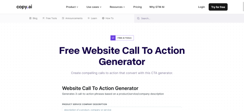
Copy.ai is a free website call-to-action generator that helps you craft compelling CTA phrases to grab and attract audience attention. You enter website or product descriptions, and the tool will generate customized CTAs.
2. Frase
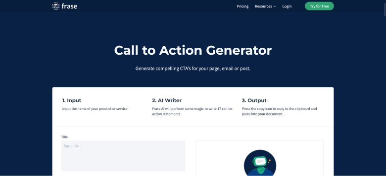
Frase is an AI-driven call-to-action generator tool that helps you craft the best CTAs for your website and blog content. The tool is easy to use and generates a perfect call to action that improves conversion and sales. Just input the name of the product or service, and it will provide you with 17 call-to-action statements that you can personalize according to your marketing goals.
3. Hubspot Calls to Action
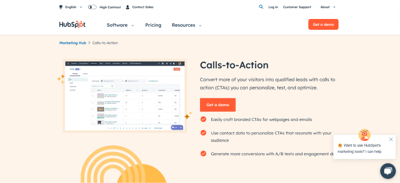
Hubspot offers a free tool to generate personalized CTA that drives the target audience by triggering their emotions and urgency. The user-friendly tool can be used on web pages, landing pages, blog posts, or email marketing messages to craft a compelling CTA.
4. Rytr
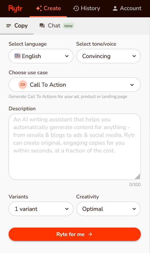
Rytr uses AIDA and PAS models to create compelling CTA copies within a few seconds and enhance the impact of your marketing efforts. The high-quality content and CTA crafted by Rytr can emotionally trigger the audience to take action.
Rytr is an easy-to-use tool, that generates CTA copies with just four steps: select language, select tone, choose case, and add a description.
These CTA tools can enhance your business by boosting sales and conversion rates with compelling CTAs that prompt your audience to act.
Our Top Picks: 10 Best Call To Action Tools to Help Raise Conversions
Impressive Call to Action Examples
Call to action can help your audiences to take specific action and gain more engagement. From visual design to compelling texts and position can boost conversions and sales for your brand. Here are a few examples of CTA buttons from different brands:
Shopify
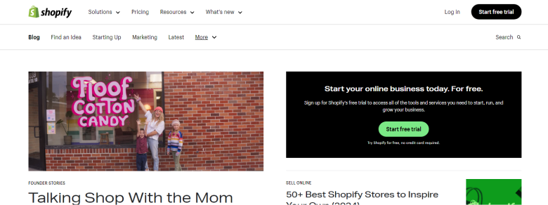
Here’s an example from Shopify that influences target audiences who want to start their online store by offering them a free trial. The position and the visuals grab the audience’s attention with the text “Start Free Trial.”
Coursera

Here’s another example from Coursera, which offers personalized options to audiences with two CTA options: “Enroll Today” or “For your Organization.” The blue CTA color with the white background makes it eye-catching and influences them to take specific action.
WiserNotify
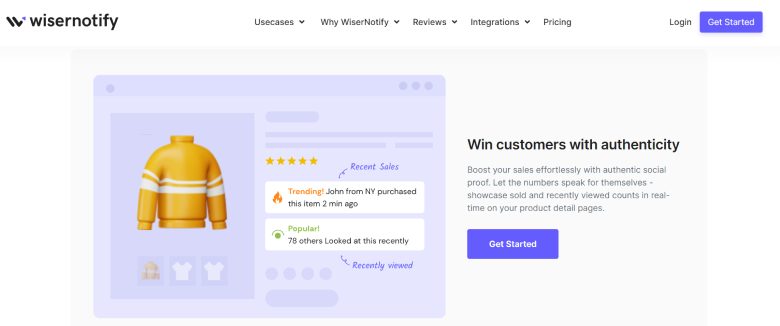
Here’s another example from Wisernotify that offers audiences immediate action to try the Social Proof Notification services. The color and the text evoke emotions that influence them to take action.
Campaign Monitor
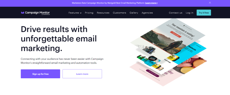
Campaign Monitor’s CTA offers two personalized calls to action that help users sign up, try out the services, or learn more about their offers. The contrasting colors help grab the audience’s attention and make the text clear and concise.
Zappier
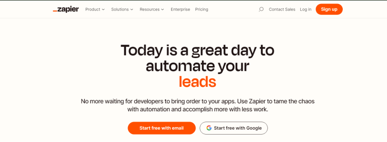
Zappier allows audiences a personalized way to sign up for the services. The CTA allows audiences to sign in with “Google” or another email option, making it easier. The color and design visually attract the audiences and influence them to take desired action.
Read More: 20+ Call to Action Examples with Action Points
Optimization and Testing
Optimizing call to action (CTA) helps you determine which performs better in conversion, click-through, and engagement rates. By conducting A/B testing, you can compare multiple CTAs and gain insights into which resonates with your audience and brings more results for your marketing efforts.
Here are some tips to Optimize and Test your multiple CTAs.
Make it visually appealing
A CTA guides your audience to the next step, so you want to ensure it is visually appealing. Like a STOP Sign, your CTA should also grab users’ attention and stand out from the other elements.
Consider the shape, color, size, and other elements that will ensure you grab the audience’s eye and click to convert. Test two different versions of a call to action button with different elements and tracks, generating higher conversion rates.
Multivariate Testing
Test multiple elements of your CTAs simultaneously to understand the impact of different combinations. Testing different variations of CTA text and other elements can help you find which combination brings better results.
Optimize for Mobile Devices
Ensure that your CTAs are designed to adapt seamlessly to different sizes and resolutions, providing a great user experience across all devices. Responsive devices allow you to adjust the size, layout, and spacing of your CTAs for optimal display on mobile screens.
Personalization
Make sure your CTAs are personalized based on user data such as past interactions, purchase history, preferences, and demographics to enhance relevancy and increase the chances of conversion. Ensure the call to action defines the goals and values the user will get after taking the specific action.
In addition to the above points, frequently monitor CTA performance and optimize it based on your audiences’ data, analysis, and feedback. Ensure that CTAs are optimized for various devices and platforms, including desktop, mobile devices, and browsers.
Build trust & FOMO
Highlight real-time activities like reviews, sales & sign-ups.


Advanced Strategies To Optimize CTA
Once you know the basics of crafting an effective CTA, let’s explore advanced techniques for optimizing CTAs to evoke emotions and influence the target audience to take action.
Personalized CTAs
A personalized CTA is a message tailored to individuals’ preferences, interests, and behavior with your brand. Instead of using a one-size-fits-all approach, crafting a personalized call to action button can increase engagement.
Personalized CTAs consider location, purchase history, past interaction with your brand, and browsing, making them more relevant and appealing. A well-crafted personalized CTA can help boost conversions, encourage readers, and influence perspectives.
Utilizing analytic tools to gather visitor data, segment visitors according to demographics, set up triggers, and ensure personalized CTAs by testing different variations of CTAs.
Here are some of the best personalized CTA examples from Hubspot, which target the right audience and grab their attention to influence them to take action.
Read More: Personalized Call to Action: Get More Clicks and Sales
Push Notification CTAs
Push notification CTAs are powerful tools that encourage users to take the desired action directly and compellingly. Marketers can send the latest updates, time-sensitive offers, events, and more at the click of a button.
Notification calls to action can serve as timely reminders to encourage users to take specific action by delivering personalized and relevant push notifications. Keep the CTA copy clear and concise, promoting the desired action. In addition, the timing and frequency can impact engagement, so analyze data for the optimal time.
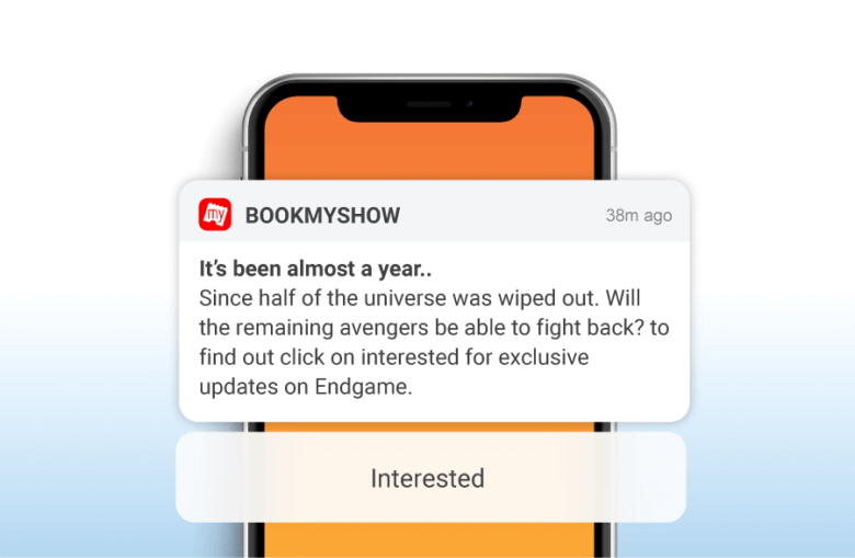
Here’s an example of a Notification CTA from Book My Show: a personalized notification based on a user’s behavior.
Read More: 10 Impactful Push Notification CTA Examples to Use
Video CTAs

Video marketing is booming, and adding CTA to your videos can increase engagement and sales and convert viewers into leads. A video Call to action can be added at the start, end, or throughout to encourage viewers to take action, such as likes, shares, subscriptions, and customers that help grow your business.
Using the best strategies, such as highly actionable verbs, creating urgency, adding interactive buttons, and using multiple CTAs, can craft a strong call to action that guides users to take action and increases conversions.
Video CTAs are potent tools that drive more engagement, capture attention more effectively, evoke emotions, incorporate more interactive elements, and reach wider audiences to take specific action. Here’s an example of a Video CTA from Flux Academy
Multiple CTAs
Using multiple calls to action or a secondary CTA allows you to tailor your messaging address to the specific interest of each segment audience and increase engagement. With multiple CTAs, users can choose the action that best suits their needs.
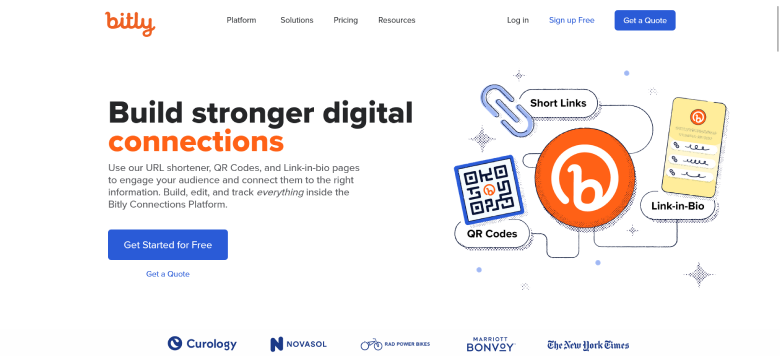
If you are prompting different products, services, or offers, using multiple CTAs enables you to promote each one to ensure users encounter them at different stages of their journey. Here’s an example from Bitly using two different CTAs, “Get Started for Free” and “Get a Quote,” that influence different users according to their funnel stage.
These advanced CTA strategies can be used on different platforms, such as social media platforms, a Facebook ad, email marketing, a blog post, and other marketing campaigns, to deliver a marketing message that acts like a sales person to draw users’ attention and influence them to take further action.
Common Mistakes to Avoid
Call to action is a crucial element of your website and marketing strategies. A well-designed website or a landing page with an unoptimized call to action can be a costlier mistake. Here are a few mistakes to avoid.
- Using Generic Text: Unscrupulous language can create confusion among potential customers and make them leave without taking any action. Use clear and conscious language to trigger emotions and tell them the next action.
- Overloading with too many CTAs: It’s important to balance the quantity and quality of your CTAs. Offering audiences too many CTAs can overwhelm them and bring poor results to your marketing efforts.
- Placing CTA in the Wrong Position: Only visually appealing CTAs won’t help you improve conversion; placing a call to action in the right place is crucial to grab their attention. Don’t make it hard for the audience to find the CTA; instead, place it to get noticed easily and stand out from the rest of your content. For example, place it above the fold, at the end of the video, and on the images.
- Neglecting Mobile Optimization: One common mistake is not optimizing it for different devices. While most audiences interact using mobile devices, ensure the CTA is mobile-friendly and provides a positive user experience.
- lacking a clear Value: Another common mistake is not effectively conveying the benefits the user gains after taking the action. Ensure the CTA communicates the unique benefits and values influencing them to click and act.
These are a few common mistakes that can be avoided to increase the quality of your marketing efforts. In addition, make sure the call to action is clear and aligned with your business goals, sales, and conversions.
Also See: 12 CTA Mistakes to Avoid That 90% of Marketers Make
Boost Conversion Instantly
Add Social Proof & Urgency to your website
Conclusion
Mastering the call to action is crucial as it helps increase sales, maximize conversions, and drive business success. In this guide, we’ve explored different strategies, techniques, practices, tools, and examples to help you craft a clear CTA that resonates with your audience and prompts action.
In addition, make sure to keep your call to action clear and conscious, optimize it for different devices, A/B test different variants, and use tools that can help you craft compelling messages and evoke emotions among your audience.
By implementing these strategies and tips outlined in this blog, you can refine your call to action by understanding your audiences, their preferences, and their interaction to achieve long-lasting results for your marketing strategies.
