
12 Psychological Sales Triggers (With Examples, 2026)
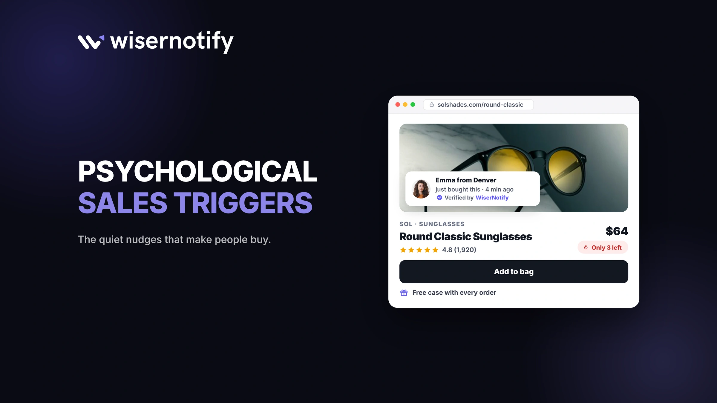
Psychological sales triggers are the mental shortcuts that move someone from browsing to buying. The 12 that do the most work are social proof, authority, risk reversal, scarcity, urgency, FOMO, anchoring, loss aversion, reciprocity, belonging, curiosity, and instant gratification.
Each one taps a predictable part of how people decide when they’re unsure. This guide explains each trigger, shows what it looks like on a real website, and names the simplest way to add it.
What Are Psychological Sales Triggers?
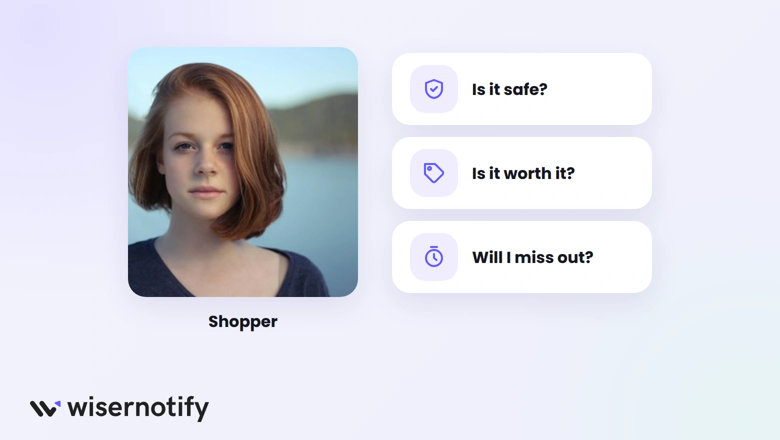
A sales trigger is a cue that answers a buyer’s unspoken question at the moment of decision. Is this safe? Is it worth it? Will I miss out? When the cue answers it, people act faster.
Many of these triggers trace back to Robert Cialdini’s book Influence. It named six principles of persuasion, and a later edition added a seventh:
- Reciprocity
- Commitment and consistency
- Social proof
- Authority
- Liking
- Scarcity
- Unity
Copywriter Joe Sugarman went further. His book Triggers lists 30 psychological triggers for personal selling, including curiosity, instant gratification, and the desire to belong.
The list below keeps the triggers that work best online and adds the pricing ones sellers use every day.
12 Psychological Triggers at a Glance
| Trigger | On-site example | Widget that adds it |
|---|---|---|
| 1. Social proof | “Sarah from Austin just bought this” | Recent sales notification |
| 2. Authority | Expert reviews and press logos near the button | Review notification |
| 3. Risk reversal | “Free returns within 60 days” | Announcement bar |
| 4. Scarcity | “Only 4 left in stock” | Limited stock notification |
| 5. Urgency | “Sale ends in 02:14:36” | Countdown timer |
| 6. FOMO | “38 people are viewing this” | Live visitor count |
| 7. Anchoring | Original price crossed out beside the sale price | Your store’s compare-at price |
| 8. Loss aversion | “Your 10% code expires tonight” | Latest offers widget |
| 9. Reciprocity | A free guide or sample for an email address | Subscribe widget |
| 10. Belonging | “1,240 people joined this week” | Sign-up counter notification |
| 11. Curiosity | “Spin to reveal your discount” | Spin-the-wheel widget |
| 12. Instant gratification | “Order in 2 hours for same-day dispatch” | Announcement bar |
Every widget in the last column is part of WiserNotify, except the compare-at price, which your store platform shows on its own.
Trust Triggers
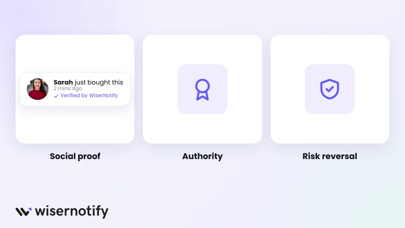
Trust triggers answer the first question every new visitor has: can I trust this store? Until that’s settled, no discount or deadline will move them.
1. Social Proof
When people aren’t sure what to do, they copy what others are doing. Seeing other buyers removes the fear of being the first to take a chance.
Ways to show it on your site:
- Recent purchase or sign-up notifications on product pages
- Star ratings next to the product title
- Customer photos and short reviews near the Add to cart button
- A customer count on your homepage, such as “Trusted by 20,000 stores”
Example: Schmicko, an Australian mobile car care service, shows recent bookings to new visitors. Calls and messages from leads grew 18% in its first three months. Read the Schmicko case study.
For more tactics, see our guide to social proof marketing.
2. Authority
People defer to experts, which Cialdini calls the authority principle. A recommendation from a doctor, a well-known publication, or a certified professional carries more weight than any claim a brand makes about itself.
How to add authority without overdoing it:
- List only the certifications or awards your product holds.
- Show press logos only for outlets that have covered you.
- Quote an expert by name and title, not “experts say.”
- Place these signals near the price or the button, where doubt peaks.
Authority works best when it’s specific. “Recommended by dermatologists” is vague. “Developed with a board-certified dermatologist, Dr. Jane Lee” is checkable.
3. Risk Reversal
Buying online feels risky because you can’t touch the product. Risk reversal moves that risk from the buyer to you, so saying yes feels safe.
Example: Zappos offers free shipping and free returns within 60 days. The policy is front and center, so shoppers know a wrong size costs them nothing.
Common forms of risk reversal:
- Money-back guarantees with a clear time limit
- Free returns or exchanges
- Free trials for software and subscriptions
- Warranties that outlast competitors’
Put the guarantee next to the button, not buried in the footer. A guarantee nobody sees does nothing.
Build trust & FOMO
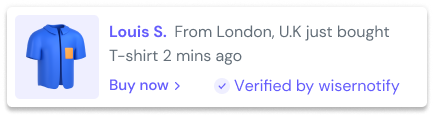
Highlight real-time activities like reviews, sales & sign-ups.

Urgency Triggers
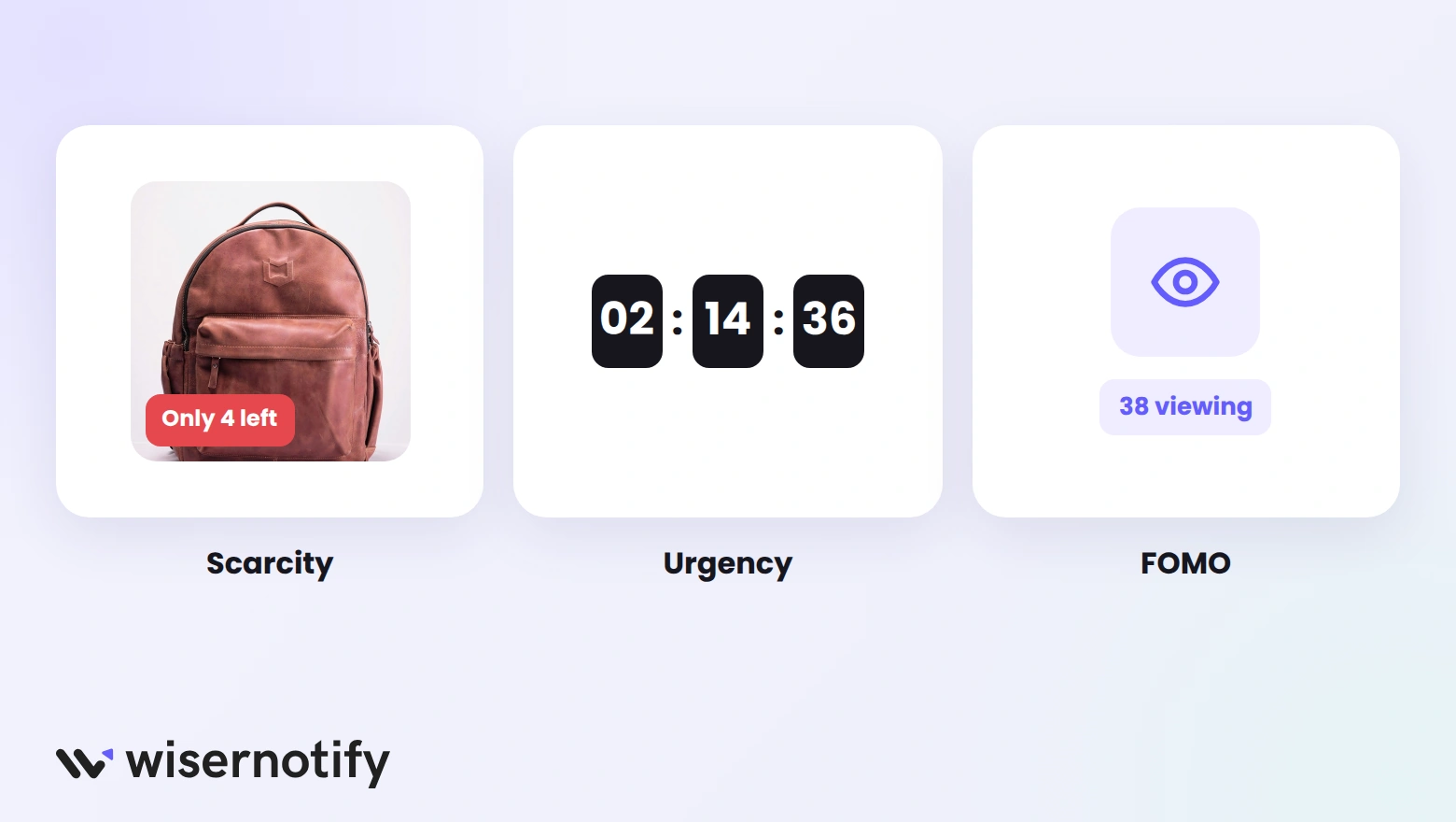
Urgency triggers answer a different question: why buy now instead of later? They only work when the limit is true. Fake ones teach shoppers to ignore you.
4. Scarcity
People value what’s hard to get. When stock is low, the item suddenly feels more desirable, and putting off the decision feels costly.
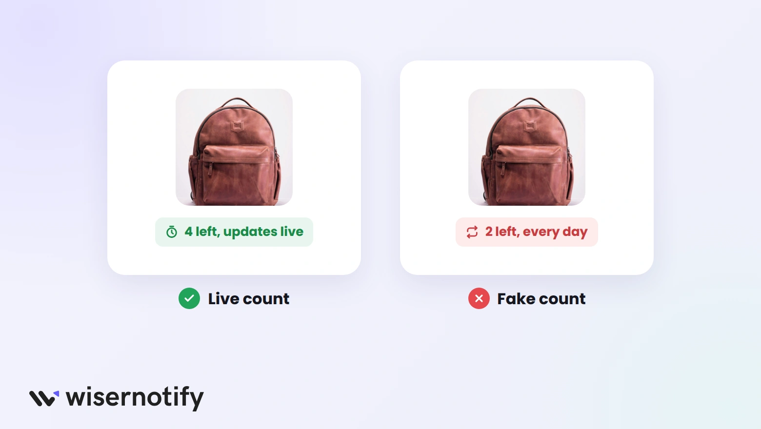
| Honest scarcity | Fake scarcity |
|---|---|
| Count pulled from your inventory | “Only 2 left” on every product, every day |
| Shown only when stock is low | Shown on items with thousands in stock |
| Drops as items sell | Never changes |
Shoppers notice when a count never moves. Our list of scarcity marketing tactics covers more honest options.
5. Urgency
A deadline gives people a reason to decide today. Without one, “I’ll think about it” often turns into never.
A countdown timer is the clearest way to show a deadline, as long as it follows three rules:
- It marks an actual event, such as a sale ending or an announced price change.
- It shows the same deadline to every visitor and doesn’t reset on refresh.
- It disappears when the offer ends.
These countdown timer examples show how stores display deadlines without looking desperate.
6. FOMO
Fear of missing out is the worry that others will get something you don’t. It combines scarcity and social proof: lots of people want this, and there may not be enough.
On a website, FOMO usually shows up as live activity:
- A live count of people viewing the same product
- A “sold in the last 24 hours” counter
- Alerts when an item lands in someone else’s cart
Use one of these at a time. Stacking all three makes a page feel pushy.
Build urgency
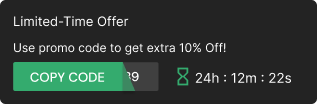
Add floating offers with countdown timer & coupon code.
Value Triggers
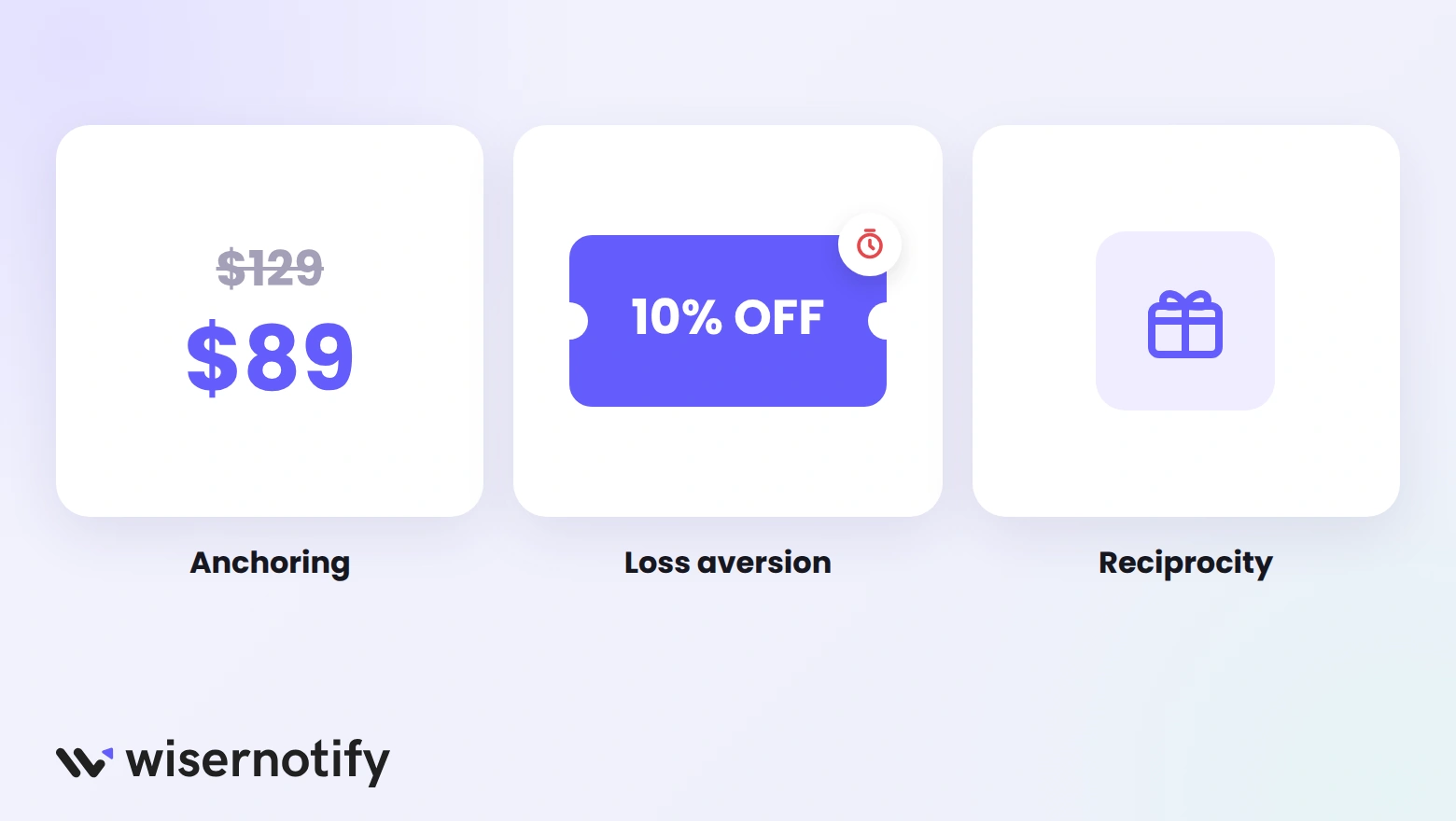
Value triggers shape how a price feels. The same $49 can look cheap or expensive depending on what sits next to it and how the offer is framed.
7. Anchoring
The first number people see becomes the reference point for every number after it. A $49 plan looks reasonable next to a $129 plan, even if $49 was the plan you wanted to sell all along.
Three common ways stores use anchoring:
- Compare-at price: show the original price crossed out beside the sale price.
- Tiered pricing: place a premium plan next to the plan you expect most people to choose.
- Bundle value: list the separate prices of the items in a bundle before the bundle price.
Keep the anchor honest. A compare-at price should be one you charged before the sale.
8. Loss Aversion
Losing something hurts more than gaining the same thing feels good. So “Don’t lose your 10% discount” often works better than “Get 10% off.”
Ways to frame an offer around loss:
- Remind visitors of a discount code that’s about to expire
- Show items left in the cart, with the savings they’d give up
- Point out what waiting costs, such as a price rise next month
Our guide to loss aversion marketing covers more ways to use this without sounding negative.
9. Reciprocity
When someone gives us something, we feel a pull to give back. A useful free gift makes visitors more open to buying later.
How to set up a reciprocity offer:
- Pick something your visitors want, such as a sizing guide, a sample, or a checklist.
- Offer it in exchange for an email address, with no catch.
- Deliver it instantly, so the goodwill is fresh.
- Follow up with one helpful email before you pitch.
The gift has to be useful on its own. A thin PDF that is just an ad works against you.
Emotional Triggers
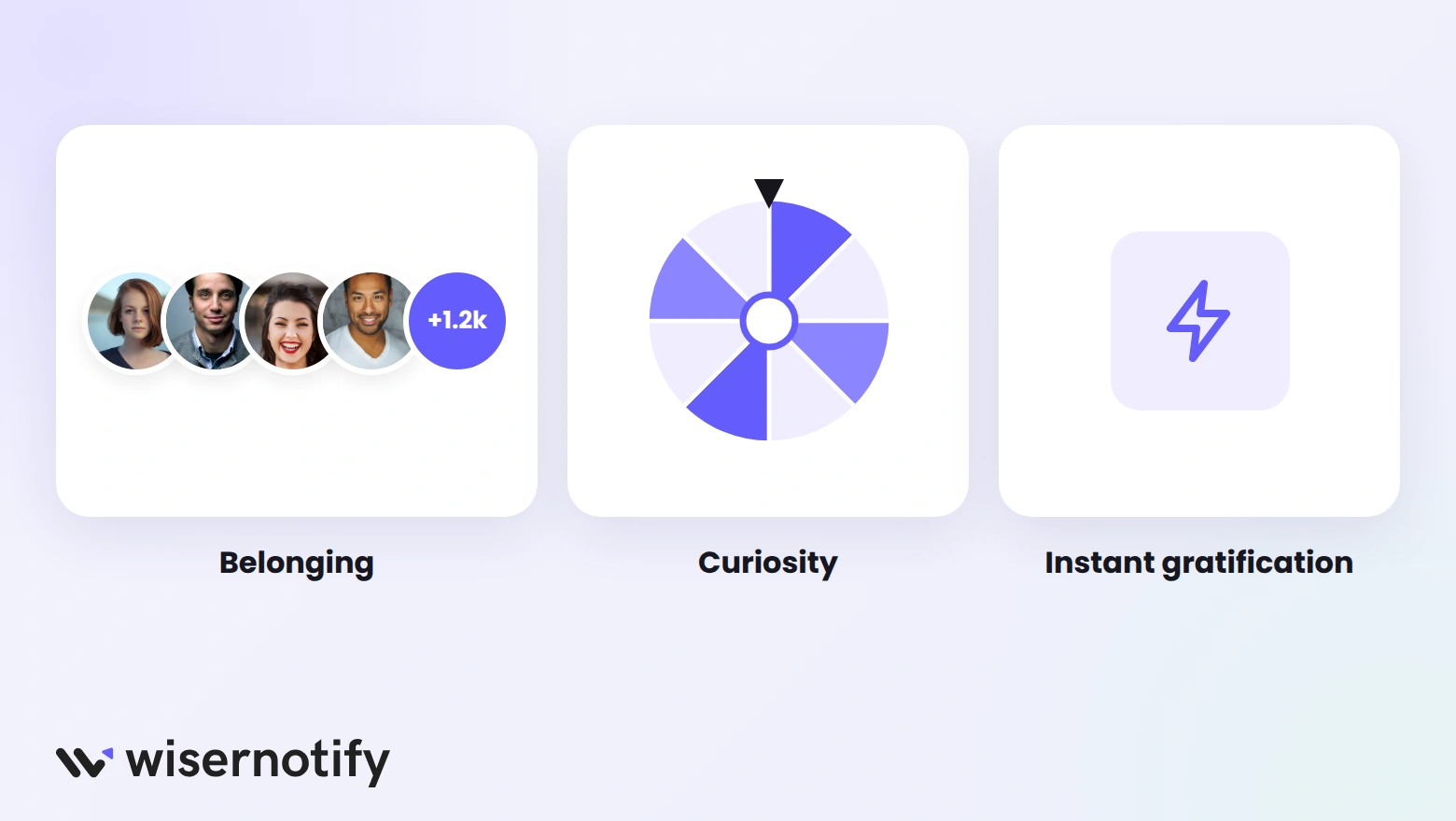
Emotional triggers connect a purchase to how people want to feel: included, intrigued, or rewarded right away. They’re the reason people buy things they could easily live without.
10. Belonging
People want to be part of a group they admire. A brand that offers that feeling sells membership, not just products.
Example: Harley-Davidson’s Harley Owners Group gives riders local chapters, rallies, and free entry to the Harley-Davidson Museum. Buying the bike means joining the community.
Smaller brands can build belonging too:
- Show how many people have joined, such as “1,240 sign-ups this week”
- Feature customer photos and stories on product pages
- Give customers a name, a private group, or member-only perks
11. Curiosity
An open question is hard to ignore. When people sense there’s something they don’t know yet, they keep reading or clicking to find out.
Ways to use curiosity on a website:
- A spin-the-wheel offer that reveals a discount
- Teasers for a product launch with a sign-up for early access
- Headlines that promise a specific answer, such as “The one setting most stores forget”
Always pay off the curiosity. A teaser that leads nowhere feels like a trick, and visitors won’t click the next one.
12. Instant Gratification
People want rewards now, not later. The shorter the wait between paying and getting something, the easier the decision feels.
How to offer instant gratification:
- Show a shipping cut-off, such as “Order in 2 hours for same-day dispatch”
- Deliver digital products and discount codes immediately
- Offer express checkout, so buying takes one or two taps
- Show the delivery date on the product page, not just at checkout
A clear delivery date answers “when will I get it?” before the shopper has to ask.
Where to Use Each Trigger
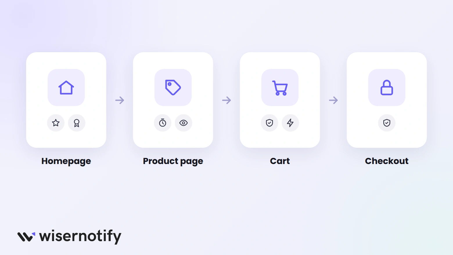
Each page of your site answers a different doubt, so each needs a different trigger. Using the right one in the right place beats adding all of them everywhere.
- Homepage: social proof and authority, such as customer counts and press logos.
- Product pages: scarcity, FOMO, and reviews close to the Add to cart button.
- Cart: risk reversal and instant gratification, such as free returns and delivery dates.
- Checkout: keep it calm, with only a guarantee and secure payment badges.
- Exit moment: loss aversion or reciprocity, such as a reminder of an unused discount.
Words matter as much as placement. This list of trigger words helps you write labels and buttons that match each trigger.
How to Use Triggers Without Losing Trust
Triggers speed up a decision the buyer was already close to making. They can’t make a weak offer good, and using them dishonestly costs more than it earns.
- Use live data only. Every count, timer, and stock level should match what is happening in your store.
- Pick one or two per page. A countdown, a stock alert, and a popup on one page cancel each other out.
- Match the trigger to the doubt. New visitors need trust triggers first; returning visitors respond to urgency.
- Test before you keep. Run each trigger against a version without it and compare conversions.
The same rules apply in sales calls. Our guide on how to create urgency in sales covers the honest version for conversations.

Boost Conversion Instantly
Add Social Proof & Urgency to your website
Wrap Up
Psychological triggers work because they answer the questions buyers already have. Start with trust, add urgency only when the limit is true, and frame value so the price makes sense.
Pick the one or two triggers that fit each page, keep them honest, and test what changes.
Frequently Asked Questions
What are psychological sales triggers?
They are mental shortcuts, like social proof, scarcity, and reciprocity, that help people decide faster when they’re unsure about buying.
What are the main emotional buying triggers?
The most common are belonging, curiosity, fear of missing out, and instant gratification, which tie a purchase to how people want to feel.
Which sales trigger is easiest to add to a website?
Social proof, such as reviews and recent purchase notifications, because it works on almost every page and needs no special offer.
Are psychological sales triggers manipulative?
Not when they’re honest. Accurate stock counts, deadlines, and reviews help buyers decide, while fake ones damage trust.
What are Cialdini's principles of persuasion?
Reciprocity, commitment and consistency, social proof, authority, liking, scarcity, and unity, from Robert Cialdini’s book Influence.
How many triggers should one page use?
One or two. Each page answers a different doubt, and stacking too many triggers makes a page feel pushy.

Krunal Vaghasiya is a marketing tech expert who boosts e-commerce conversion rates with automated social proof and FOMO strategies. He loves to keep posting insightful posts on online marketing software, marketing automations, and improving conversion rates.




 Capterra