
8 Best Pop-up Examples to Learn From in 2026
Do you struggle to capture visitors’ attention and keep them engaged on your website?
Statistics show that popups can improve attention time and conversions by 42%
In the fast-paced digital world, standing out from competitors and grabbing customers’ attention is harder than ever. But what if you can capture customers’ attention and drive engagement?
You read that right.
That’s where website pop-ups come in. From simple opt-in forms to interactive games, pop-ups are a powerful tool for marketers and website owners to grab attention and increase conversions and customer engagement.
Popups can help improve engagement, and pop-ups appear on the landing page, the home page, blog post, or any other web pages that increase visitor clicks, email subscribers, showcase exclusive deals, and many more.
This article will discuss some of the most creative and attention-grabbing popup examples that can deliver impressive results.
Whether you are a small business owner or a digital marketer, these popup examples will inspire you to think outside the box and create popups that truly grab your audience’s attention.
Build trust & FOMO
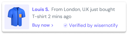
Highlight real-time activities like reviews, sales & sign-ups.

8 Best Website Pop-Up Examples
Entry popups appear as the page loads or a few seconds after. Because they reach every visitor, including people who haven’t read a word yet, they need the clearest offer.
The upside is reach. The downside is timing, since a weak offer shown that early gets closed on reflex.
1. Boy Smells (Instant 15% Off)
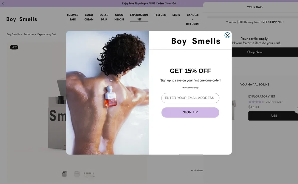
Boy Smells shows its offer almost as soon as the homepage loads. In our desktop visits, it appeared between 2 and 6 seconds in. On a phone-sized screen, it waited about 20 seconds.
The copy is short. “Get 15% off. Sign up to save on your first one-time order.” One email field, one lilac button, and a small note that exclusions apply.
That “one-time order” wording is smart. It tells subscription customers up front that the code isn’t for them, which saves an awkward support ticket later.
2. Seed (Reveal-Code Button)
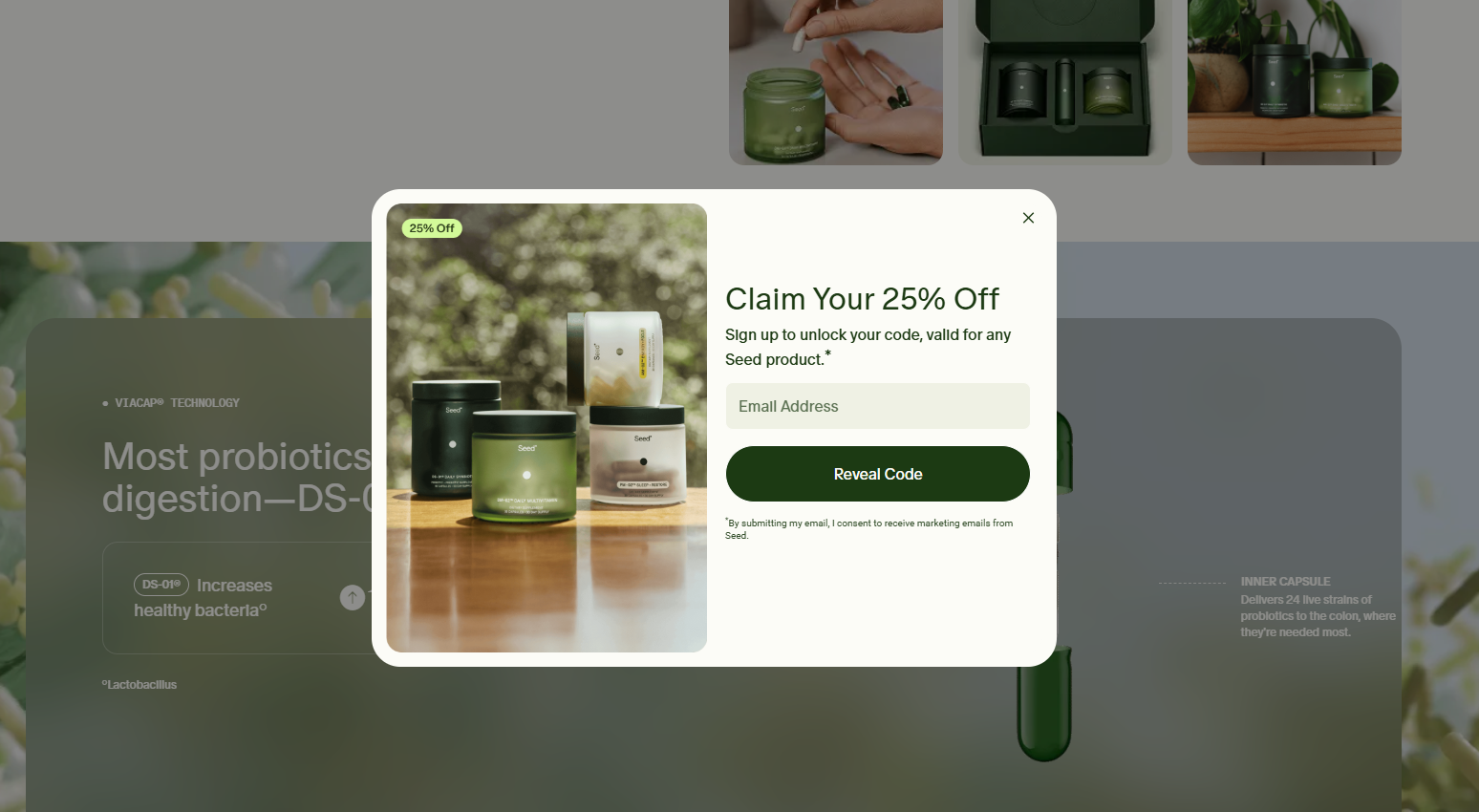
Seed’s popup appears about halfway down the homepage. It reads “Claim your 25% off,” and the button says “Reveal Code” instead of “Subscribe.”
That button label does quite work. “Reveal code” describes what the visitor gets. “Subscribe” describes what they’re agreeing to.
A product photo and a small “25% off” tag keep the offer clear even for someone who only glances at it.
3. Caraway ($50 Off Order Two)
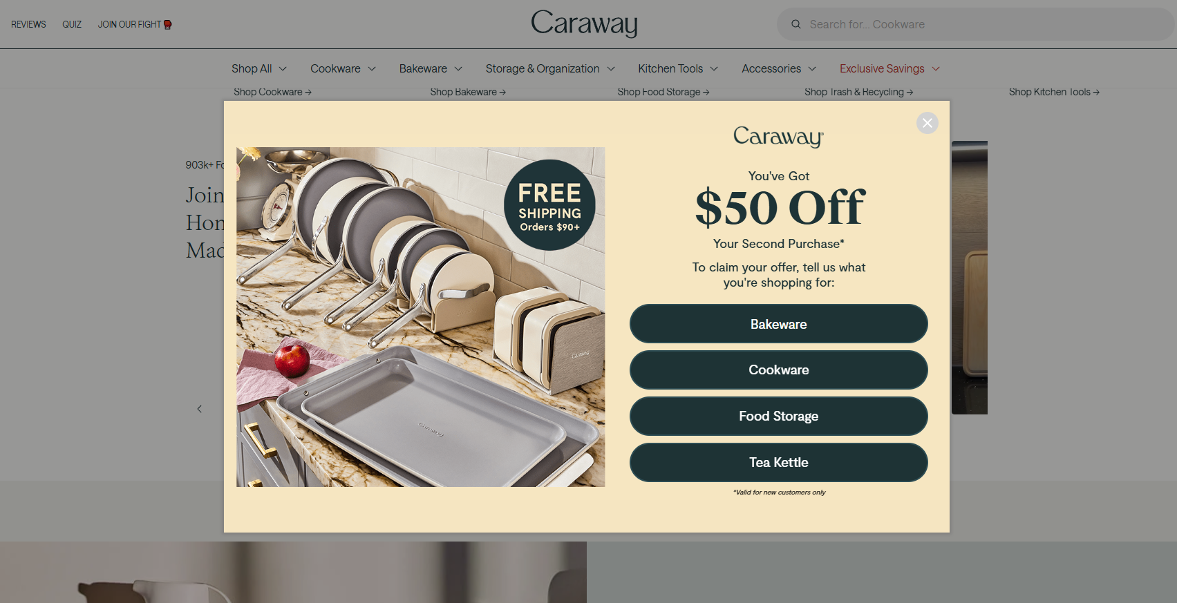
Caraway flips the usual welcome offer. Its popup gives $50 off your second purchase, not the first.
To claim it, you tell Caraway what you’re shopping for: bakeware, cookware, food storage, or a tea kettle. Those four buttons sort every new subscriber before they type a thing.
The second-order offer protects margin on the first sale and gives new customers a reason to come back. The image also carries a free-shipping badge for orders over $90.
4. Liquid Death (Humor and a Gift)
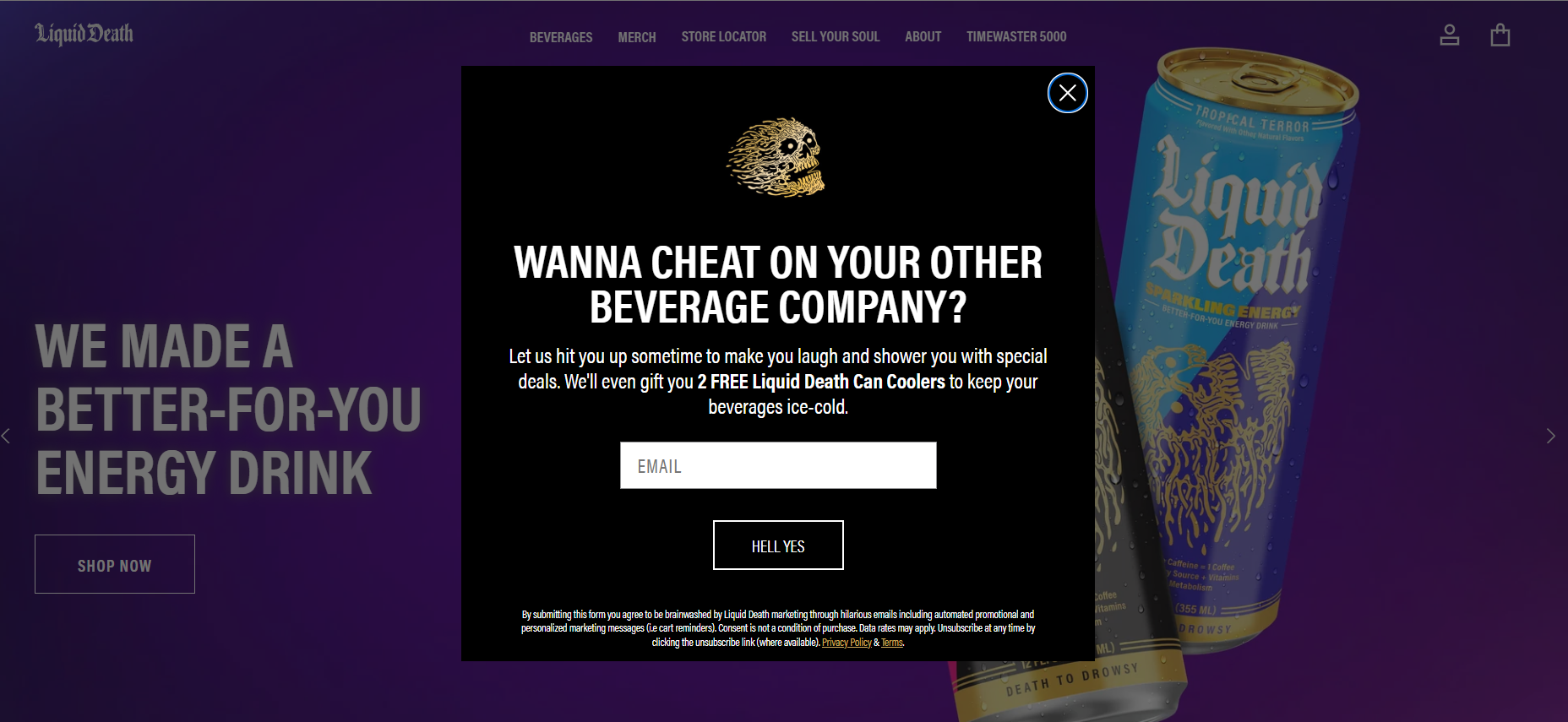
Liquid Death’s popup sounds like the rest of the brand. “Wanna cheat on your other beverage company?”
The offer is two free can coolers, not a percentage. The button says “Hell yes.” Even the consent text jokes that you’re agreeing to be brainwashed by hilarious emails.
It appeared at 15 to 26 seconds on desktop and about 24 seconds on mobile, where it fills the screen.
5. KiwiCo (40% Off, Ages First)
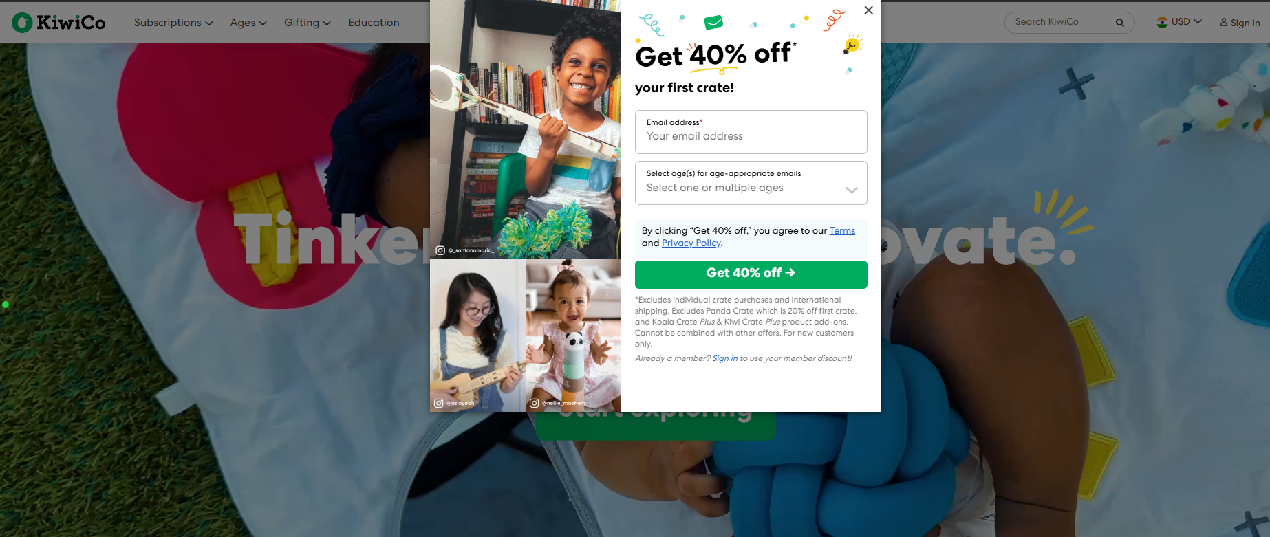
KiwiCo’s popup never showed while we sat on the homepage for a full minute. Start scrolling through the crate lines and it opens: “Get 40% off your first crate!”
Next to the email field sits a dropdown asking for your kids’ ages “for age-appropriate emails.” That one question lets KiwiCo send a toddler crate to one parent and a teen engineering kit to another.
The fine print is long, since some crates and add-ons are excluded. But it’s all there under the button, not saved for checkout.
6. Momentous (Email 15%, Text 20%)
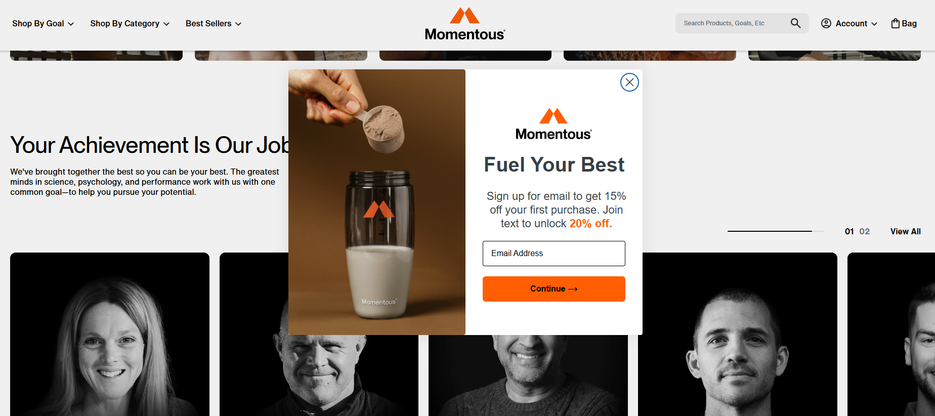
Momentous, the sports nutrition brand, waits for a scroll before showing “Fuel your best.” The offer comes in two levels: 15% off for an email, 20% off if you also join by text.
Stacking the offer like this is how many stores grow an SMS list now. The email ask stays small, and the bigger discount does the selling for the phone number.
Left idle, the homepage never showed it. Once we scrolled about halfway down, it opened within a few seconds.
7. Stumptown
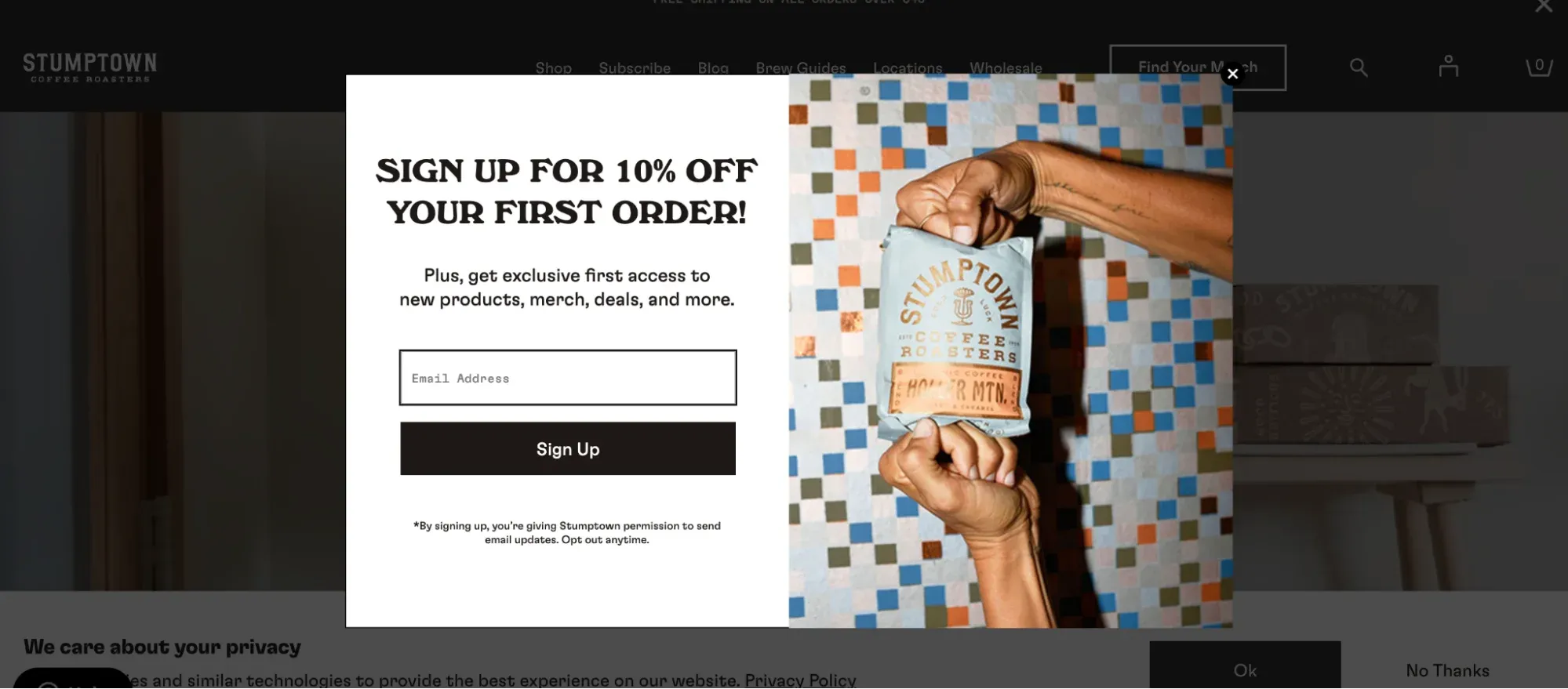
Stumptown Coffee Roasters opens with one easy question: “Do you want 10% off your first order?” Two buttons follow, “Yes” and “No thanks,” next to a photo of its coffee bags on a burlap sack.
Click “Yes” and step two appears: “Sign up with email to receive your discount,” with one field and a Continue button. Across our visits it showed anywhere from about 6 to 26 seconds after landing.
An older version of this popup went straight to the email field. The yes/no step in front is the same pattern Cotopaxi uses, and it asks for nothing until the visitor says yes.
8. Perfect Keto
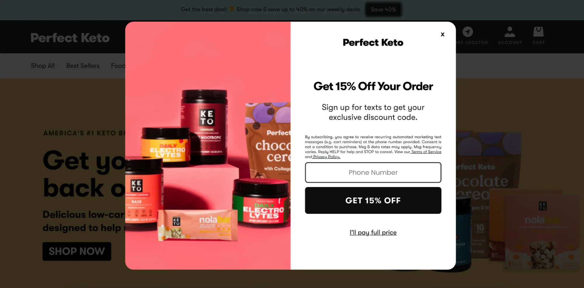
Perfect Keto frames its welcome code as urgent: “Limited Time 15% Off.” The pitch goes past the discount, too, promising “exclusive offers, health tips, recipes & more.”
There’s one email field and a black “Unlock 15% off” button. A photo of its collagen peptides and protein bars fills the left half. It appeared between about 8 and 24 seconds after landing.
An earlier version asked for a phone number only, with an “I’ll pay full price” link to decline. The current one asks for an email and drops the guilt-trip link.
Type of Pop-Up.
There are now various types of pop-ups, including lightbox pop-ups, slide-in pop-ups, countdown pop-ups, and exit intent pop-ups. Each pop-up type has its unique purpose and can be used for different marketing objectives.
Popups come in different types and can be used to share coupons, discount coupons, notifications, Countdown timers, surveys, and Spin-to-win. Here are different pop-ups:
- Lightbox Popups:

Lightbox Popup These are common popups that appear on top of a webpage when a user is browsing. It can display various content, such as promotions, newsletter signups, and product offers. It includes a floating bar, fullscreen, Slide-In popups, Yes/No popups, and Yes/Yes popups.
- Video popups:

video popup Video popups can instantly grab customers’ attention and provide users with necessary product or service reviews. It is easier to watch a video that shows the product from each side, demonstrates its capabilities, and describes its benefits rather than reading several pages.
Also See : 10 Working Cross Promotion Examples & Ideas to Must Try
- Countdown popups:

countdown popup Countdown pop-ups are designed to create a sense of urgency by counting down to a specific event, such as a sale’s end or a new product’s release. These pop-ups can encourage users to take action quickly before the countdown expires.
- Exit Intent Pop-up:

Exit-Intent popup Exit intent pop-up triggers one user who decides to leave your website just about when the user is about to leave and clicks the red cross. The popup can help to retain the customers by grabbing their attention before they leave and increasing the chances of retaining the visitors.
- Slide-In popups:

Slide-In popup These popups slide onto the screen from the side or bottom of the pages and can display similar content to Lightbox. These are less intrusive and don’t take up much space.
- Gamified Popups:

Gamified Popup These popups allow visitors to win exciting prizes like free shipping, coupon codes, or discounts. They are usually eye-grabbing with bright colors and features like games. These popup templates help to improve conversion rates and add more subscribers to your email list.
- Product Recommendation Popups:

Product Recommendation Popup These popups display relevant products that reduce shoppers’ time to find something. You can recommend popular or relevant product items by tracking their browsing.
- Cart Abandonment Popups:

Cart Abandonment Popup These are specific popups or trigger popups that target users who have added items to their online shopping cart but have not completed the purchase. These popups appear when website visitors have added items to the cart and are about to close the tab; the cart abandonment popup is triggered.
- Social Proof popups:

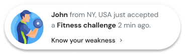
Social Proof popup Simple pop-ups like social proof popups can help you build trust among visitors because they gain more interest when people talk about your brand. Add relevant testimonials that act like lead magnets for your popups.
These are some common types of popups that appear; they can potentially increase your conversion rates.
Build trust & FOMO
Highlight real-time activities like reviews, sales & sign-ups.
Popups on Mobile and Google’s Rules
Google says popups that cover a page’s main content can hurt search performance, and it recommends small banners instead. Its guidance on intrusive interstitials and dialogs was last updated in December 2025.
In plain terms, Google’s guidance treats these as risky:
- A popup or dialog that covers the whole page.
- Sending visitors to a separate page just to collect their input or consent.
And these as fine:
- Small banners that take up a slim part of the screen.
- Legally required dialogs, like age checks, which Google handles separately.
Our phone test showed how many brands still go big on mobile. Nine of the 12 brands we retested showed a popup, and four of those filled the entire screen.
The good news is that none of them fired in the first five seconds. Boy Smells waited about 20 seconds on mobile against 2 to 6 on desktop.
SKIMS, Seed, and Ridge didn’t show a popup on the phone at all.
If you only change one thing, add a longer delay on mobile and use a bottom sheet or banner instead of a full-screen box. Our guide to mobile conversion rate optimization goes deeper.
Read More: Cross-Promotion 101: Strategies to Grow Your Business
Tips for Creating Effective Pop-Ups
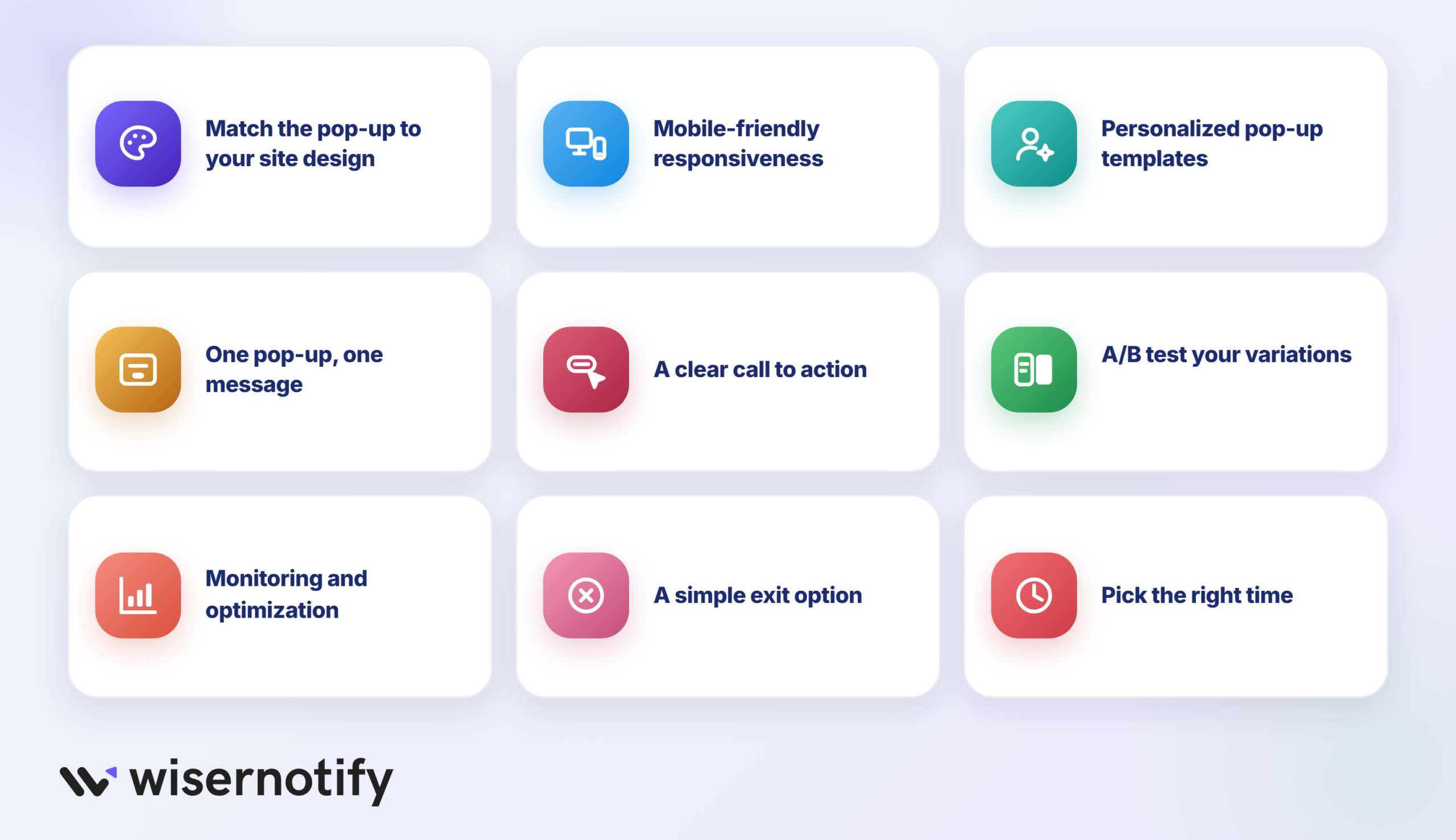
A basic popup can convert at least 3% of average viewers and have an excellent conversion rate. Here are a few tips for creating effective pop-ups, irrespective of whether you have designed several or it’s your first pop-up. Let’s go-
Match Popup Design with Your Website
The pop-up format should match your site’s design to maintain consistency and avoid confusing visitors.
Use similar colors, fonts, and images that resonate with your website; visitors are more likely to interact with it.
Mobile-Friendly Responsiveness
Ensure your pop-up is fully responsive and optimized for all devices, from mobile to small screens.
With more visitors using different devices to search, it’s crucial that the pop-up displays correctly and is easy to interact with across screen sizes.
Personalized Popup templates
Personalization is a powerful tool that brings more engagement and influences visitors to take action. You can analyze visitor data, like browsing history, and create a personalized popup template for specific user interests.
It helps to create a more relevant user experience and drive more conversions and goals.
One Popup – One Message
Ensure the message is clear and focused on one thing, like a signup or discount code.
Multiple messages can confuse visitors and reduce the effectiveness of the popup. Focus on the benefits your visitors will receive by taking action on the popup.
Clear CTA
Use a clear and visually appealing call-to-action button that stands out from the rest of the pop-up.
The CTA should convey the action you want visitors to take, such as “Sign Up Now” or “Get a Free Discount Code.”
A/B Testing
Test different pop-up variations to optimize performance. Experiment with different headlines, copy, designs, CTAs, or triggering mechanisms to identify what works best for your audience and objectives.
Monitoring and Optimization
Use analytics and conversion tracking to monitor your pop-ups’ performance and optimize them.
Analyze metrics such as conversion rate, engagement rate, and bounce rate to identify areas for improvement and refine your pop-up strategy to improve those metrics.
Include a Simple Exit Option
Even if popups are a great conversing tool, they can frustrate visitors, including simple exit options, such as clear and visible “exit” or “X” buttons.
It can help improve user experience by allowing users to exit the popup without taking action, such as subscribing to an email or making a purchase, which can reduce frustration.
Pick the Right Time
Timing plays a crucial role in the success of your popups. If they appear too early or too often, they can annoy and frustrate visitors, leading to a negative experience.
So, choosing the right timing is essential to ensure popups are well received.
Build trust & FOMO
Highlight real-time activities like reviews, sales & sign-ups.

Wrap Up
The popups that work in 2026 aren’t louder than the ones that don’t. They show up at a better moment, ask for less, and offer something the visitor wants on that page.
Pick one example from this list that fits your site and copy the idea behind it, not the design. A yes/no step, a fit guide behind a click, or a refund reminder on exit is a good place to start.
Then test it, check it on your phone, and change it when the numbers say so. If you still need a tool to build it, start with the free plans in this list of popup builders.
Frequently Asked Questions
What are some effective ways to use pop-ups on my website?
Popups are a great way to improve conversion and engagement on your website. Here are some ways to effectively use them on your website-
- Capture Email subscribers
- Promote special offers and events
- Upsell and cross-sell
- Gather customer feedback
- Showcase new products or relevant products
- Reduce Cart Abandonment
- Improve social media engagement
- Content Promotion
- Exit offers
- Event registrations or provide free content
How can I design a pop-up that will grab users' attention?
Designing an effective popup that can grab users’ attention requires careful consideration of various elements. Here are some effective tips-
- Clear and compelling headline
- Eye-catching visuals
- Bold and resonating contrasting color
- Attention-grabbing animation
- Engaging content
- Responsive mobile-friendly design
- A/B testing and Optimization
- Personalized content
- Clear CTA
Are pop-ups still effective in driving conversions?
Yes, popups effectively drive conversation when used with proper strategy and implementation. Studies have shown that targeted popups can effectively capture att
ention, engage visitors, and influence them to take desired actions.
Here are a few reasons why popups can still be effective-
- Attention-grabbing
- Personalized and relevance
- Conversion rate Optimization
- Generating leads and building email subscribers
- Behavioral triggers
What are the best practices for implementing pop-ups on my website?
Here are some best practices to follow to implement popups on your website-
- Timing and Triggering
- Clear and Personalized messaging
- Responsive design
- Simplified form fields
- Segmentation and Targeting options
- Compliance with regulations
- Testing and Optimization
- Design and visually appealing
How can I personalize pop-ups for different segments of my audience?
Personalized popups can improve the effectiveness and relevance of your popups for your target audience. Here are some ways to personalize your popups-
- Segment your audience based on behavior
- Based on referral source, whether they have arrived from a social platform or search engine
- Based on location, show location-based offers, events, or information
- Based on purchase history, show relevant or recommend products based on their past purchase
- Customize based on demographic such as age, gender, or occupation
- Based on email subscribers, share special offers, content, or event details with your email subscribers
- Based on the customer sales funnel journey, at what stage of the funnel is your visitor?

Krunal Vaghasiya is a marketing tech expert who boosts e-commerce conversion rates with automated social proof and FOMO strategies. He loves to keep posting insightful posts on online marketing software, marketing automations, and improving conversion rates.




 Capterra