Latest WordPress Mobile Optimization Tips and Strategies in 2026
 Krunal Vaghasiya|Apr 14, 2023
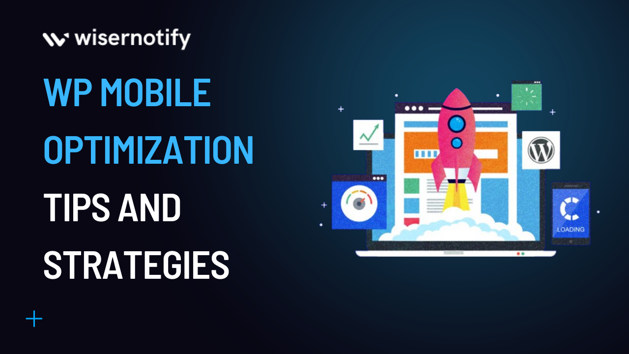
Mobile optimization is crucial as internet traffic from mobile users surges. Optimizing website content for smartphones and tablets improves user experience, regardless of the device. The article 2023 WordPress Mobile Optimization Tips and Strategies offer valuable techniques to make your site mobile friendly. Through these tips and techniques, you can help your mobile website to stand out among competitors. Dive into the optimization world to transform your site into a mobile-friendly powerhouse, ensuring smooth access and engagement for your audience.
What is WordPress Mobile Optimization?
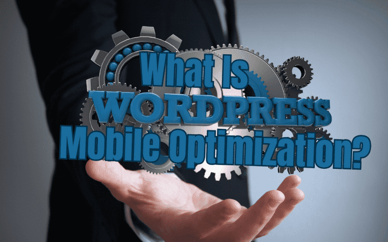
WordPress mobile optimization is fine-tuning your WordPress website to ensure it performs optimally on mobile devices. With the rapid growth of smartphone and tablet usage, it has become crucial for websites to be mobile-friendly. This involves making adjustments such as optimizing layout, design, and functionality to provide a smooth experience for users on smaller screens.
Hence, they load quickly and don’t negatively impact your WordPress website’s overall performance. By focusing on mobile site optimization, you can significantly improve user experience and drive more traffic to your WordPress site.
Build trust & FOMO
Highlight real-time activities like reviews, sales & sign-ups.


Why is WordPress Mobile Optimization Important?

With the rise of mobile users and mobile traffic, WordPress mobile optimization is vital. Search engines like Google prioritize mobile-friendly websites, affecting your site’s visibility and ranking. Ensuring your mobile site is optimized for mobile users can attract more mobile visitors and customers.
Optimizing how a user accesses your website enhances loading speed, content display, and navigation, ultimately helping to enhance user experience. By focusing on mobile optimization, you cater to the growing mobile audience, improve search engine ranking, and create an enjoyable experience for your mobile visitors.
The Impact of Mobile Optimization on User Experience

Mobile optimization plays a significant role in shaping the user experience on a website. Implementing a mobile-friendly theme ensures that your website is visually appealing and easy to navigate on smaller screens. This is crucial because a well-designed site can make all the difference in retaining visitors and converting them into loyal customers.
Creating a mobile-optimized version or site mobile friendly version of your WordPress website for mobile focuses on tailoring the layout, navigation, and content specifically for mobile devices. This helps mobile sites provide a seamless browsing experience for users, regardless of their device.
One essential component of mobile optimization is mobile design. This involves designing a website that automatically adapts to different screen sizes and resolutions on a mobile phone. Implementing a responsive design is a popular approach for achieving this, as it allows the website to automatically adjust its layout based on the mobile phone or device being used.
Mobile optimization has a profound impact on your web server and user experience. By adopting a mobile-friendly theme, optimizing the design, and implementing responsive layouts, you can ensure that your website caters to the needs of an ever-growing mobile audience while providing a seamless and enjoyable browsing experience.
The Impact of Mobile Optimization on Search Engine Ranking

Search engine rankings are heavily influenced by mobile optimization. Ensuring your site is mobile-ready with quick load times, easy navigation, and proper content display boosts visibility. Search engines evaluate core web vitals and performance metrics focusing on site speed and user experience, which can be improved with mobile optimization. A responsive mobile version or a separate mobile site adapting to screen sizes and resolutions is essential for higher rankings and catering to the growing number of mobile users. Prioritizing mobile optimization can attract more organic traffic and potential customers.
Build trust & FOMO
Highlight real-time activities like reviews, sales & sign-ups.

Test Your WordPress Website for Mobile Optimization

Before exploring the mobile theme and optimization strategies, assess your WordPress website’s mobile performance to identify issues. The following section will explore the best tools and methods for testing your WordPress website for mobile optimization.
Best Tools for testing WordPress on mobile
To ensure your website is optimized for mobile devices, it’s essential to utilize the right tools for testing its performance. One of the most popular and reliable options is the Google Mobile-Friendly Test. This free tool lets you quickly check if your website meets the mobile-friendly criteria set by Google, significantly impacting your search engine ranking.
Another valuable resource for assessing your website’s mobile optimization is Google Analytics. This powerful platform provides in-depth insights into your site’s performance, including mobile traffic, bounce rates, and user behavior. By analyzing this data, you can identify areas that
require improvement and measure the effectiveness of your mobile optimization efforts.
Interpreting Mobile Optimization Test Results
After testing your website for mobile optimization, interpret the results to understand your site’s mobile friendliness. Examine the mobile view in test results to identify design or layout issues and compare it with the desktop version for consistency. Follow recommendations to make your WordPress site mobile friendly, such as optimizing images, implementing responsive design, or addressing technical issues. Understanding and addressing these results can significantly improve your website’s mobile optimization.
Some Common Problems that Affect Mobile Optimization
Common issues impacting mobile optimization include render-blocking resources like CSS and JavaScript files, which delay page rendering and increase loading times. Unused CSS rules can affect performance; removing them reduces file size and improves performance. Large or unoptimized JavaScript files can slow down your website; minifying and compressing them enhances loading times and user experience. Numerous HTTP requests can cause slow loading on mobile devices; reducing requests by combining files, using sprites, or implementing lazy loading significantly improves mobile optimization.
Follow these Steps to Optimize WordPress for Mobile

This section will guide you through practical steps to optimize your WordPress website for an exceptional mobile user experience.
Use a Responsive WordPress Theme

Choose a responsive theme to optimize your WordPress site and ensure optimal display and functionality on various devices, including smartphones, tablets, and desktops. Responsive themes adapt layout and design elements based on screen size and resolution, simplifying mobile-friendliness and maintaining consistency. Prioritize themes with a robust responsive design. Numerous free and premium themes are available in the WordPress repository, catering to different niches and preferences. Opting for a responsive theme significantly enhances mobile optimization and user experience.
Optimizing Images for Mobile Devices

Optimizing images for mobile devices is crucial for improving loading times and overall user experience. To effectively optimize images, consider these strategies:
- Choose the right file format, such as JPEG for photographs and PNG for transparent graphics, to reduce file sizes without losing quality.
- Use image compression tools like TinyPNG or WP Smush to decrease image file sizes further.
- Implement responsive images with the srcset attribute in your HTML code. This allows browsers to load the most suitable optimized version of an image based on the device’s screen size and resolution.
- Employ lazy loading techniques to load images only when they’re within the viewport, improving page load times, particularly for image-heavy pages. By implementing these image optimization tactics, you can significantly enhance your website’s performance on mobile devices, offering visitors a faster and more enjoyable browsing experience.
Build trust & FOMO
Highlight real-time activities like reviews, sales & sign-ups.

Create a Mobile-friendly Navigation Menu

A well-designed mobile-friendly navigation menu is crucial for a seamless user experience on mobile devices. Ensure your theme includes an easy-to-use mobile navigation menu that adapts to different screen sizes.
Tips for creating a mobile-friendly navigation menu:
- Simplify your menu: Keep menu items to a minimum and prioritize important pages, avoiding overcrowding.
- Use clear labels: Use descriptive, concise text for menu items to ensure readability on smaller screens.
- Implement a hamburger menu: This collapsible menu represented by three horizontal lines saves screen space while providing easy access to mobile navigation items.
- Utilize plugins: Use WordPress plugins like WP Mobile Menu to create a mobile-friendly navigation menu with customization options that integrate easily into your existing theme. By designing a mobile-friendly navigation menu, you can significantly improve user experience, making it easier for visitors to navigate on mobile devices.
Implement Mobile Caching on Your WordPress Site

Mobile caching improves WordPress site performance on mobile devices by storing static content for quicker access. To implement mobile caching:
1) Optimize your server infrastructure with a reliable, fast hosting server supporting mobile caching.
2) Use mobile-specific caching plugins for optimal performance.
3) Leverage a content delivery network (CDN) to store cached content on global servers, improving load times.
4) Consult your web host or hosting provider for guidance and tailored recommendations.
Implementing mobile caching reduces load times, enhancing user experience and potentially boosting search engine ranking.
Install Mobile-specific Plugins
Mobile-specific WordPress plugins enhance your site’s functionality and performance on mobile devices. To install them:
1) Research plugins targeting mobile optimization, checking compatibility with your theme and other plugins.
2) Prioritize essential features like navigation, image optimization, and caching.
3) Test your mobile site on various devices to ensure the proper functioning and mobile theme performance.
4) Regularly update plugins for bug fixes, new features, and ongoing improvements.
Installing and maintaining mobile-specific plugins optimizes your WordPress site, ensuring a seamless browsing experience and better performance for mobile users.
Enable AMP on Your WordPress Site

Accelerated Mobile Pages (AMP) is an open-source project to improve web pages’ loading speed and performance on mobile devices. By enabling AMP on your WordPress site, you can provide faster-loading mobile pages, enhancing the user experience.
To enable AMP on your WordPress site, follow these steps:
- Install an AMP plugin: Several WordPress plugins, like the official AMP plugin by Google, make it easy to add AMP support to your site. Install the plugin and activate it.
- Configure the plugin: Customize the plugin settings according to your preferences, such as selecting the types of pages and posts to enable AMP and configuring the appearance of your AMP pages.
- Validate your AMP pages: Use the AMP Validator tool to ensure your AMP pages are correctly formatted and free from errors. By enabling AMP on your WordPress site, you can provide a faster, more streamlined browsing experience for mobile users, potentially improving your site’s search engine performance and user engagement.
Build trust & FOMO
Highlight real-time activities like reviews, sales & sign-ups.

Enable PWA on Your WordPress Site

Progressive Web Apps (PWA) combine the benefits of websites and native mobile apps, offering app-like experiences while maintaining website accessibility. Enabling PWA on your WordPress site allows users to install your site as a mobile app on their devices, improving engagement.
To enable PWA on your WordPress site, follow these steps:
- Choose a PWA plugin: Select a reputable WordPress plugin to enable PWA functionality on your site. Install and activate it.
- Configure the plugin: Customize the settings to match your site’s branding and desired features, such as push notifications and offline access.
- Create an app manifest: The app manifest contains metadata about your PWA, like app name, icons, and theme colors. Most PWA plugins manage the manifest for you.
- Set up a service worker: Service workers enable key PWA features. Configure the service worker settings within the plugin to meet your needs. By enabling PWA on your WordPress site, you offer users the convenience of web apps while enhancing their overall experience and encouraging increased engagement with your content.
Optimizing the Server Configuration for Mobile

Optimizing your server can significantly enhance your WordPress site’s mobile performance. To optimize your server configuration,
1) Choose a reliable hosting provider or web host with a strong reputation for speed, uptime, and support, offering scalable solutions.
2) Leverage a content delivery network (CDN) to store copies of your site’s content globally, ensuring faster delivery and reduced load times for mobile users.
3) Optimize server-side caching to store frequently accessed content in memory, speeding up mobile page loads.
4) Enable Gzip compression and minify HTML, CSS, and JavaScript files to improve mobile load times.
Optimizing your server infrastructure ensures a faster and more enjoyable mobile user experience.
Best Practices for WordPress Mobile Optimization

In this section, we’ll explore the best practices for WordPress Mobile Optimization to ensure the mobile version of the website delivers an exceptional experience for mobile users and maintains optimal performance.
Stay Updated with WordPress
Regularly updating your website is crucial for ensuring optimal performance and security. By staying current with the latest updates, you can benefit from new features, bug fixes, and security patches. Updates often include performance improvements that directly impact the mobile user experience. Keeping your WordPress core, themes, and plugins up to date also helps maintain compatibility between different components, ensuring a seamless browsing experience for your mobile users. Staying updated with WordPress is a vital practice for mobile optimization, guaranteeing the best possible experience for your mobile audience.
Using a Mobile-optimized WordPress Theme

A user-friendly theme is essential for delivering an excellent user experience on mobile devices. A mobile-optimized theme is designed with responsive design principles, ensuring your website automatically adapts to different screen sizes and resolutions. This means your content is easily readable and navigable on various devices, including smartphones and tablets.
When choosing a theme, look for features such as flexible layouts, touch-friendly navigation, and optimized images. By using a mobile-optimized WordPress theme, you can ensure a seamless browsing experience for your mobile users, improving engagement and contributing to better search rankings.
Give Attention to Mobile Font Sizes and Line Heights

When optimizing your website for mobile devices, paying attention to font sizes and line heights is essential. Text that is easily readable on desktop versions might be too small or cramped on a mobile screen. To ensure legibility, choose font sizes and line heights that are suitable for mobile phones and other devices.
Aim for a font size of at least 16 pixels for body text and adjust line height to provide comfortable reading space between lines. By carefully considering font sizes and line heights, you can create a more enjoyable and accessible browsing experience for mobile users, encouraging them to engage with your content.
Build trust & FOMO
Highlight real-time activities like reviews, sales & sign-ups.

Have Mobile-specific Calls-To-Action

To improve engagement and conversion rates for your mobile visitors, it’s essential to incorporate mobile-specific calls-to-action (CTAs) on your website. CTAs designed for desktop users might be less effective for mobile users, who interact with content differently due to varying screen sizes and touch input.
Create clear, concise, and easily accessible CTAs for mobile users by ensuring they are prominently displayed and touch-friendly. Additionally, consider using action-oriented language tailored to mobile users, such as “Call Now” or “Get Directions.” By implementing mobile-specific CTAs, you can encourage your mobile audience to engage with your content and take desired actions on your website.
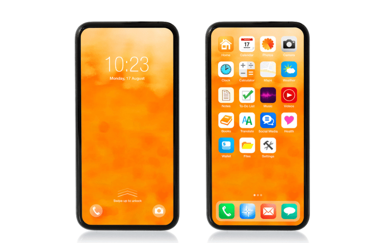
Add Mobile-specific Buttons and Icons
Incorporating mobile-specific buttons and icons is crucial for creating an effective mobile design . Due to the smaller screen sizes and touch interactions on mobile devices, it’s essential to make buttons and icons easily visible and tappable for users.
For your mobile version, consider using larger buttons and icons with sufficient spacing to prevent accidental taps. Opt for clear, simple, and recognizable designs that intuitively convey their purpose and function. Also, ensure that buttons and icons are consistently styled and placed throughout your website to create a cohesive mobile user experience.
By adding mobile-specific buttons and icons, you can enhance the usability of your website for mobile users, leading to increased engagement and higher conversion rates.
Try to Decrease Mobile Page Load Times

Reducing mobile page load times is essential for improving user experience and retaining visitors. To optimize your website’s page speed and load time on mobile devices, consider implementing the following strategies:
- Lazy loading: This technique loads images and other media only when they’re in the user’s viewport, reducing the initial load time and saving bandwidth.
- Remove unused CSS: Eliminate unnecessary or unused CSS rules from your stylesheets, as they can cause delays in rendering your web pages. By decreasing mobile page load times, you can provide your mobile users with a faster and more seamless experience, increasing user satisfaction and better search rankings.
Implementing a mobile-friendly search bar

Incorporating a mobile-friendly search bar is an essential aspect of creating a mobile-friendly website. Mobile users often rely on search functionality to quickly find the content they need, making it vital to optimize the search bar for their experience.
A mobile-friendly search bar should be easily accessible and visible on your website’s header or menu. Ensure it has an appropriate size and touch-friendly design to accommodate various mobile screen sizes. Additionally, optimize the search functionality to deliver fast and relevant results, as site speed is critical to user satisfaction on mobile devices.
Implementing a mobile-friendly search bar can enhance your website’s usability and help mobile users find the information they’re looking for quickly and efficiently.
Boost Conversion Instantly
Add Social Proof & Urgency to your website
Conclusion
Implement various strategies discussed in this article, such as using a mobile responsive WordPress theme, optimization of images, installing mobile-specific plugins, enabling AMP and PWA, and following best practices like adjusting font sizes and line heights, incorporating mobile-specific CTAs, and implementing a mobile-friendly search bar.
By adopting these tips and strategies, you can cater to the growing number of mobile users, providing a seamless and enjoyable browsing experience on mobile phones. This will increase engagement, internet traffic, and conversions and positively impact your online presence.
Investing time and effort in WordPress mobile optimization is crucial for staying competitive in today’s digital landscape. Embrace these mobile optimization strategies and watch your website thrive as it adapts to the ever-evolving world of mobile technology.
Krunal Vaghasiya is a marketing tech expert who boosts e-commerce conversion rates with automated social proof and FOMO strategies. He loves to keep posting insightful posts on online marketing software, marketing automations, and improving conversion rates.
 Capterra