The #1 Social Proof Tool
Build trust and urgency to
boost sales instantly.


Start increase conversion rates in minutes.
- Quick and easy setup.

Social proof software for every industry
Boost conversions for any website instantly
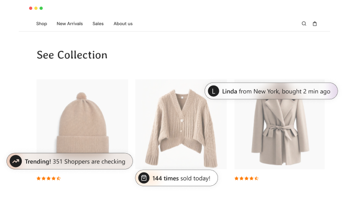
Show what’s trending and drive more sales
Nudges like recently viewed, sold, and counters build trust, create urgency, and drive conversions.
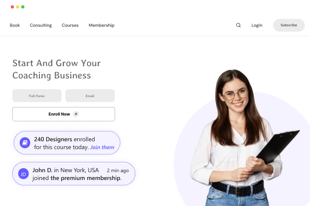
Optimize your funnel with urgency and proof
Showcasing recent downloads, recent memberships & enrollments build confidence and drives action.
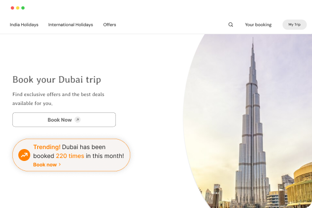
Make booking decisions easier with live proof
Show recent bookings and popularity to build trust, spark FOMO, and drive action.
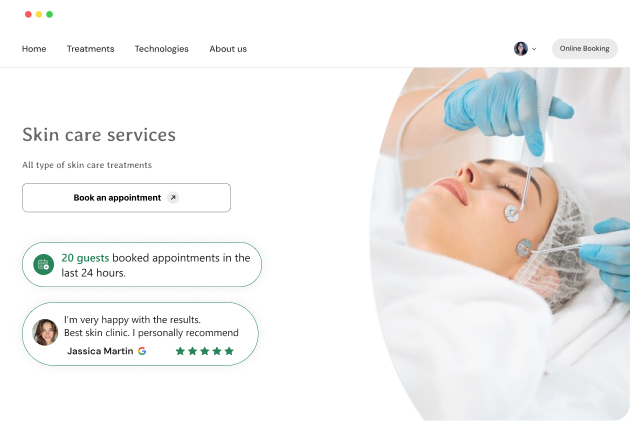
Turn inquiries into customers with trust
Visitors hesitate without proof. Show reviews, sign-ups, and bookings to build trust.


Easy use, best support, amazing results
Testimonials from customers

Answers to my social proof needs
“Wisernotify- The social proof tool has really helped us gain traction in a very saturated market. We have thousands of reviews now, and it’s helped to push us above the competition. It’s particularly good for launching new products and getting that instant trust from prospects.”

Theresa B. 
CEO, Professional Training & Coaching

Meets All Your Needs
“Till date, I have an outstanding experience with WiserNotify and their team. They have given excellent support throughout. Their UI of this social proof software’s backend is also very intuitive. There are some other pros like its ease of use and its readily available integrations.”

Sai B.
CEO, Professional Training & Coaching

Excellent Support & Advanced Customization
“Great social proof tool, very easy to use and customize with many advanced settings too for granular control. We switched to this app from another one and never looked back. Developers and support team also is top notch…”

Raj A.
Owner, E-Commerce & Retail

Doubled Conversion of an eCommerce Site
“We managed to doubled up (98% uplift) the conversion rate to an e-commerce site just by using this social proof & FOMO marketing tool. What better and cheaper way to increase your sales!”

George M.
Founder, Marketing Agency

Great Tool for Sharing Social Proof
“It offers impressive features, including social proof pop-ups that boost conversions. Their website now provides ample resources like videos, examples, etc. With intuitive variable testing and numerous customization options, it’s a game-changer for converting.”

Kathy A.
Director of Marketing, Merchandising & Purchasing

Influence visitors
Drive sales with social proof and FOMO widgets.
Sales activities
Create urgency and motivate users to make a purchase by showcasing recent sales and sales counter.


Leads activities
Influence visitors to take action by showing free trials, sign-ups, downloads and newsletter subscriptions.


Reviews
Show what your customers say about you on Google, Facebook & other review platforms


Social media activities
Highlight number of followers and recent posts to foster a sense of community around your brand.


Visitor counter
Build trust among customers by showing the number of live visitors on landing pages or offer pages


Urgency & promotions
Create scarcity and generate FOMO with ready-to-use widgets like free delivery, timers, announcements, and more.


Who benefits most from WiserNotify?
WiserNotify is the best social proof software for entrepreneurs, marketers, and agencies.

Entrepreneurs
Helping them to reduce acquisition cost

Marketers
Maximise conversions on your website

Marketing Agencies
Increase conversion rate of your clients

Alexis L
CEO, CCNA Desde Cero
“Our sale increased 250% after using Wisernotify. It not only increases trust but time users spend on the website which indirectly also improves SEO.”
250% Lift from wisernotify
Automate social proof
Plugged with ecommerce, built for your entire marketing stack


Reviews & Social Media
show your customer reviews or user-generated content

Form builders & Billing Apps
Automate email subscription & buying actions into social proof

CRM & Billing platforms
Show other people have purchased & signups
Say goodbye to onboarding headache


Install code
Easy installation, no tech skill required
Time required: 1 minute

Create notification
Let your inner designer go wild with ready to use notifications.
Time required: 1 minute

Go live
Start popping social proof notifications in your website
Time required: 1 minute
What we delivered
102K+
Total notifications created till now
20K+
Total websites using notifications
40M+
Total monthly impressions
17%
Avg. increase in conversion rate
Increase visitor engagement & online
conversions upto 17%
Insights and tips from WiserNotify

Social Proof Marketing
6 Winning Social Proof Tactics To Boost Sales (2026)
From 4 years of experience running my SAAS business, I’ve learned that while marketing and branding can get those leads to your storefront, it’s social proof that seals the deal. What’s the first thing you do when you’re unsure about a purchase? You check out the reviews, right? You want to see what other customers […]

eCommerce Marketing
I Tested 21 Review Management Software (Here Are the Top 5 for 2026)
Over the last 6 years, I have tested 21 different review management software tools. Some were built for local businesses. Some were built for ecommerce brands. Some promised “AI-powered deep analytics.” Some barely sent a review request correctly. A few stood out. In this guide, I’m breaking down the top 5 review management tools that […]
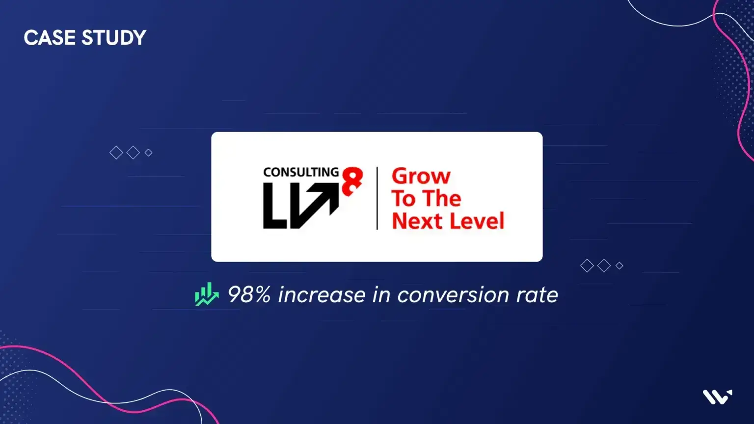
Case Study
Lv8- Marketing agency reports 98% increase in conversion rate
“We managed to double up the conversion rate to an e-commerce site just by using WiserNotify and only 2 notifications! What better and cheaper way to increase your sales!” About Lv8 lv8 – Consulting a digital marketing agency Lv8 is a digital marketing agency founded by George Chatzicharalampous and George Margaritis. The company is based […]