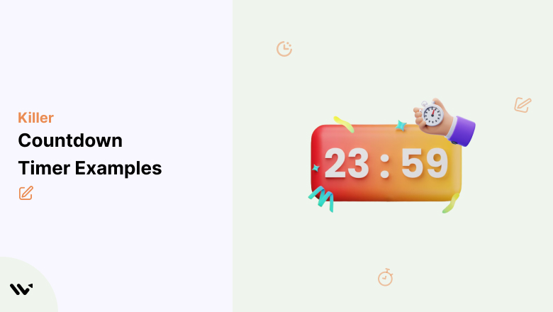
Countdown timers are one of the simplest conversion tools in ecommerce.
A ticking clock creates urgency, triggers FOMO, and pushes visitors to act now instead of “maybe later.”
I’ve seen countdown timers increase conversion rates by 300% or more when used correctly.
But most brands use them poorly. They slap a generic timer on a page with no context, no clear deadline, and no real consequence for missing it.
The result? Customers learn to ignore them.
The 21 countdown timer examples below show how to use timers strategically across websites, emails, popups, and product pages.
Whether you need website countdown examples for your ecommerce store, countdown timer ideas for email campaigns, or countdown timer ecommerce strategies for product pages, I’ll break down what makes each one work and what you can steal for your own campaigns.
These are the best countdown examples I’ve found across industries.
Build urgency
Add floating offers with countdown timer & coupon code.


What Is a Countdown Timer?
A countdown timer is a visual clock that counts down from a set time to zero.
In marketing, it creates urgency by showing customers exactly how much time they have left to take action, whether that’s completing a purchase, claiming a discount, or signing up before a deadline.
Countdown timers work because of loss aversion. People are more motivated to avoid missing out than they are to gain something new.
A ticking clock makes the potential loss feel real and immediate.
There are two main types of countdown timers:
Fixed deadline timers count down to a specific date and time. Everyone sees the same countdown. These work best for sales events, product launches, and seasonal promotions. Black Friday sales, end-of-season clearances, and event registrations all use fixed deadlines.
Evergreen timers start a fresh countdown for each individual visitor. If you set a 2-hour timer, every new visitor gets their own 2-hour window. These work best for limited-time offers on landing pages, first-purchase discounts, and cart abandonment recovery.
The key difference: fixed timers build collective urgency around shared events. Evergreen timers create personal urgency for individual visitors.
Also check: The #1 Countdown Timer Widget for Your Website
21 Countdown Timer Examples That Actually Convert
1. ConvertFlow (Cart Page Timer)
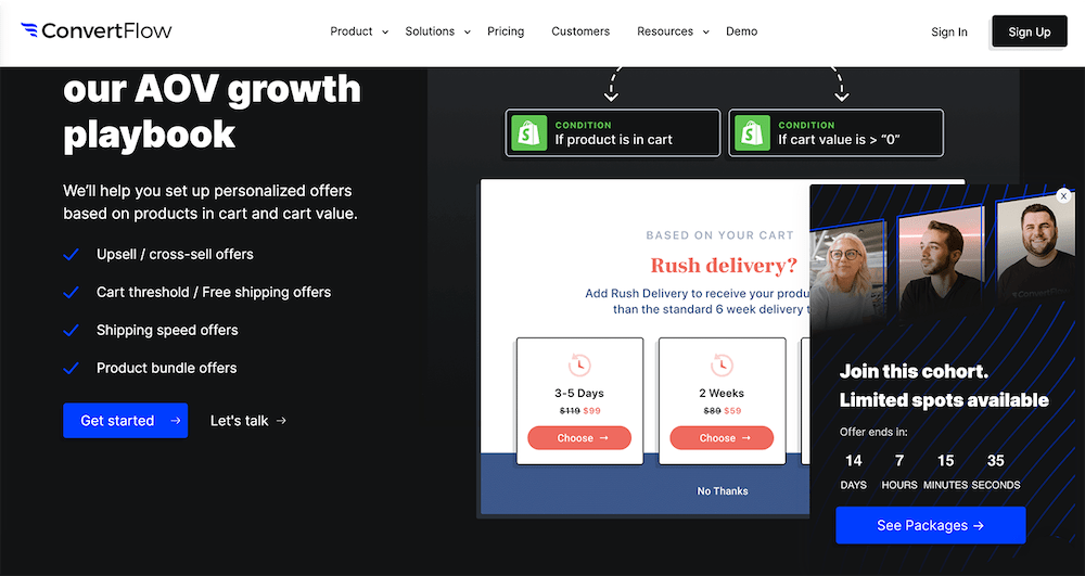
ConvertFlow uses a countdown timer on its cart page, paired with personalized rush-delivery options.
The timer doesn’t just say “hurry up.” It shows specific delivery windows that change based on how quickly you complete checkout.
Why it works: Tying the countdown to a tangible benefit (faster delivery) gives the timer real meaning. Customers aren’t rushing because of artificial pressure. They’re rushing because waiting means slower shipping. This is one of the best countdown timer examples for ecommerce checkout pages.
Boost Conversion Instantly
Add Social Proof & Urgency to your website
2. Journeys (Email Popup Timer)
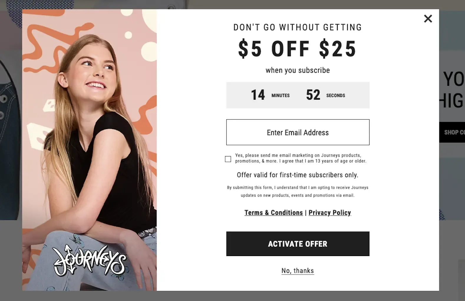
Journeys uses a pop-up with a countdown timer offering $5 off a $25 purchase.
The timer creates urgency around the discount while the pop-up captures email addresses.
Why it works: Combining a countdown timer with an email capture pop-up serves two goals simultaneously: it builds the email list and drives immediate purchases. The $5/$25 threshold is specific enough to feel real, not like a permanent “sale.”
3. Moosend (Seasonal Popup Timer)
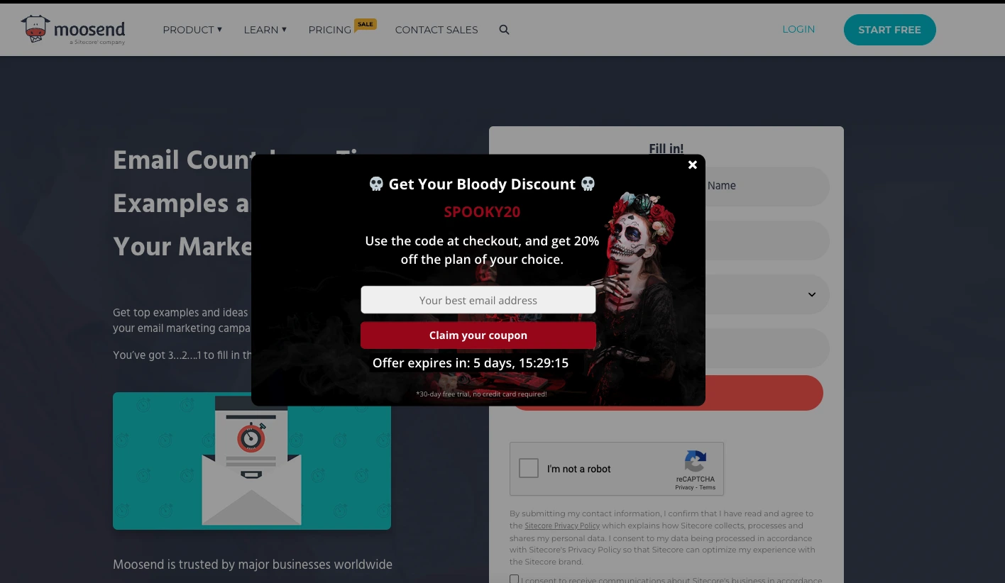
Moosend’s Halloween pop-up offers 20% off with a countdown timer showing just over 5 days remaining.
The seasonal design (Halloween theme) makes the promotion feel event-driven rather than always-on.
Why it works: Seasonal countdown timers feel more authentic than evergreen ones because they’re tied to a real calendar event. Customers know Halloween actually ends, so the deadline is believable. The themed design reinforces the urgency visually.
4. Mercedes-Benz (Product Launch Email Timer)
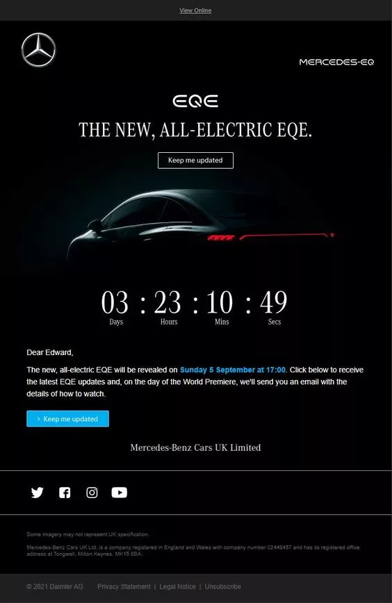
Mercedes-Benz uses a countdown timer in an email to build anticipation for the launch of the new all-electric EQE.
This isn’t a discount timer. It’s a hype timer counting down to a reveal.
Why it works: Countdown timers aren’t just for sales. Product launch countdowns build anticipation and keep your brand top of mind. Mercedes uses the timer to make recipients feel like they’re part of an exclusive event, not just a marketing email.
5. Buoy (Extended Sale Email Timer)
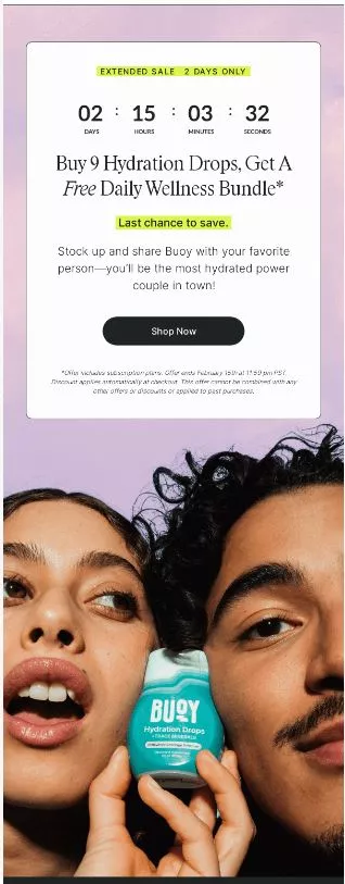
Buoy’s email promotes an extended sale with a countdown timer.
Buy Hydration Drops and get a free Daily Wellness Bundle, but only while the timer runs.
Why it works: The “gift with purchase” offer, combined with a countdown timer, is more compelling than a simple discount. Customers feel like they’re getting extra value rather than just paying less. The timer prevents the offer from feeling permanent.
6. Surfdome (Website Banner Timer)
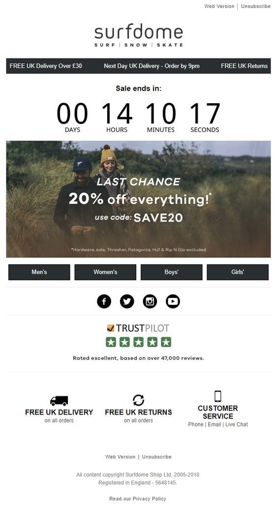
Surfdome places a bold countdown timer on their website for a 20% off sale, clearly displaying days, hours, minutes, and seconds.
The timer sits prominently at the top of the page.
Why it works: The four-unit display (days, hours, minutes, seconds) creates a sense of precision. It feels more urgent than a vague “sale ending soon” banner. The prominent placement ensures every visitor sees it immediately. This is a classic website countdown example that works for any ecommerce store.
Also check: 17 Best Flash Sale Examples
7. The Turmeric Co. (Popup Timer with Short Window)
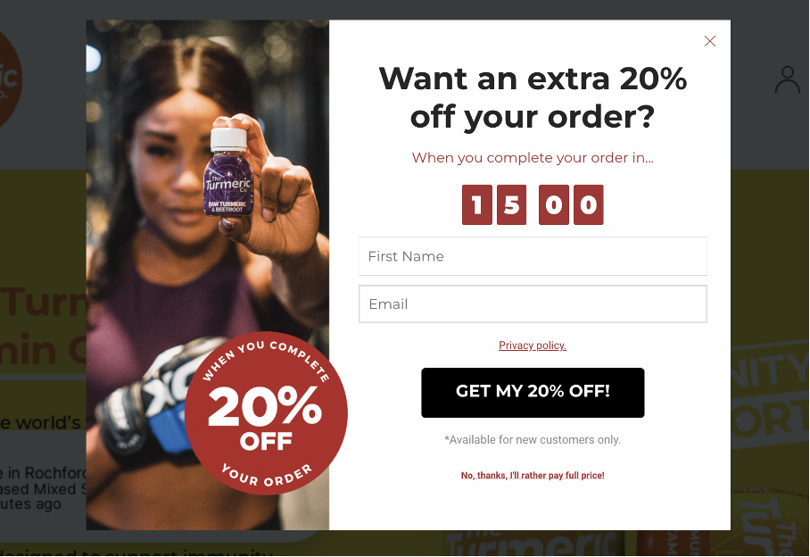
The Turmeric Co. uses a 15-minute countdown timer pop-up that offers 20% off for orders placed within that window.
Fifteen minutes is aggressive but effective.
Why it works: Short countdown windows (under 30 minutes) create intense urgency because the decision window is genuinely small. This works best for products with lower price points, where the purchase decision is fast. For high-consideration products, a longer timer is more appropriate.
8. Suiteness (Contest Email Timer)
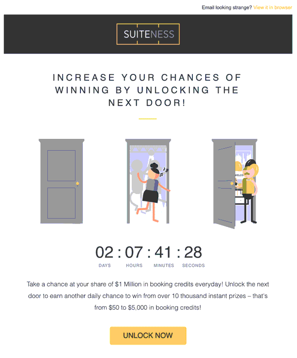
Suiteness uses a countdown timer in an email to give users a chance to win up to $5,000 in booking credits.
The timer is set for just over 2 days, creating urgency around contest participation.
Why it works: Contest countdowns drive engagement differently than sale countdowns. The “you might win” element adds excitement on top of the urgency. The short 2-day window prevents procrastination. This is a smart countdown timer idea for travel and hospitality brands.
9. AppSumo (Black Friday Event Timer)
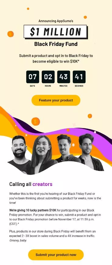
AppSumo’s email uses a countdown timer for their Black Friday event, with a week left to submit products for a chance to win $10,000 and gain exposure during the sale.
Why it works: This timer targets sellers, not buyers. It creates urgency for product submissions to a major sales event. The $10,000 prize and “massive exposure” create multiple layers of motivation beyond just the ticking clock.
10. Amazon (Product Deal Timer)
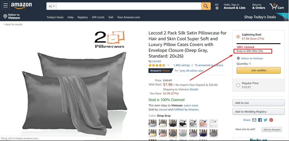
Amazon’s product page shows a countdown timer for a time-limited deal, with just over 3 hours to buy silk satin pillowcases at a reduced price.
The timer sits directly below the discounted price.
Why it works: Amazon’s placement is perfect: timer right next to the price and “Add to Cart” button. Customers see the savings, the deadline, and the action button in one view. No scrolling required. This is the gold standard for product page countdown timers in ecommerce.
Also check: 11 Killer Product Landing Page Examples
11. Molton Brown (Collection Launch Timer)
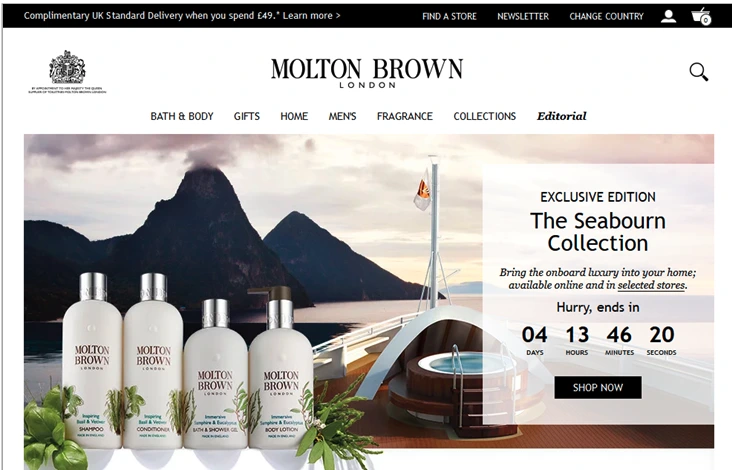
Molton Brown uses a countdown timer for the Seabourn Collection, with just over 4 days to purchase from the limited collection before it’s gone.
Why it works: Limited collection countdowns combine scarcity (limited products) with urgency (limited time). This double pressure is more effective than either element alone. The premium brand positioning makes the exclusivity feel genuine.
12. Amazon (Stock Scarcity Indicator)
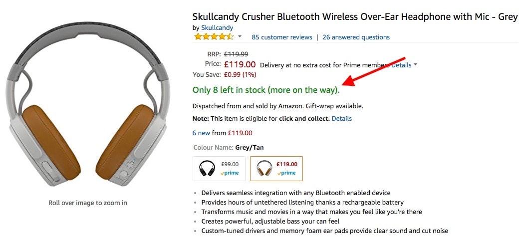
Amazon’s “Only 8 left in stock” message on the Skullcandy headphones page functions as a countdown, though it counts inventory rather than time.
The orange text creates visual urgency.
Why it works: Stock countdowns are a different form of countdown timer that triggers the same FOMO psychology. Instead of “time is running out,” it’s “units are running out.” Both create the same fear of missing out. The specific number (“8 left”) feels more credible than vague “limited stock” claims.
13. AirBaltic (Travel Sale Timer)

AirBaltic’s website features a Mega Sale with a countdown timer showing 27 days, 8 hours remaining to book discounted flights.
Why it works: Travel purchases require more time to consider than a t-shirt, so the longer countdown (27 days) matches the decision complexity. The timer gives customers enough time to plan but still creates a clear deadline. For high-consideration purchases, longer countdowns convert better than aggressive short ones.
Boost Conversion Instantly
Add Social Proof & Urgency to your website
14. MacPaw (Email Sale Timer)
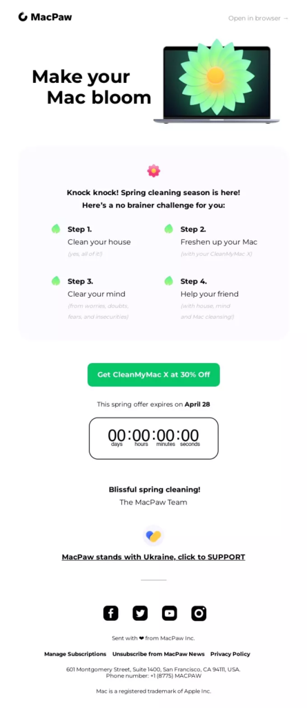
MacPaw’s email features a 30% off CleanMyMac X offer with a countdown timer for their spring sale.
The email design is clean and focused entirely on the single offer.
Why it works: Single-product, single-offer emails with countdown timers convert better than cluttered emails with multiple CTAs. MacPaw keeps the focus tight: one product, one discount, one timer, one button. No distractions.
15. PositiviTees (Header Bar Timer)

PositiviTees places a countdown timer in the header bar, offering 10% off for new customers, with just over 3 days to claim the deal.
The timer persists across all pages as visitors browse.
Why it works: Persistent header bar timers maintain urgency throughout the entire browsing session. Unlike pop-up timers that disappear, the header bar reminds customers on every page that the clock is ticking. This is especially effective for stores where customers browse multiple products before making a purchase.
16. NIBBI (Product Page Timer)
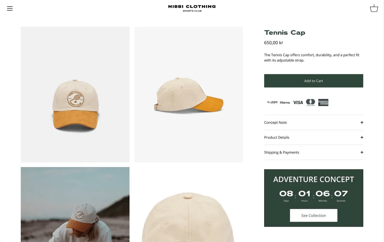
NIBBI Clothing shows a countdown timer directly on the product page for their Tennis Cap, with 8 days left to buy from the Adventure Concept collection at the sale price.
Why it works: Product-level timers are more specific than site-wide timers. They tell the customer that THIS particular product has a deadline, not just a generic sale. Product-specific countdown timers feel more authentic and create stronger purchase intent.
17. Boots (Seasonal Sale Timer)
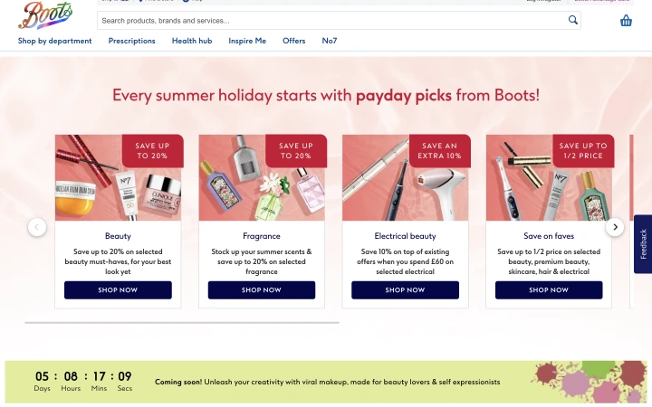
Boots uses a countdown timer for summer holiday deals, with 5 days remaining to save on beauty, fragrance, and electrical beauty products.
The seasonal framing ties the urgency to a real event.
Why it works: Category-specific seasonal timers work better than generic “site-wide sale” timers because they target customers who are already shopping for that category. Someone looking at beauty products during summer sees a directly relevant offer with a clear deadline.
18. Casper (Last Chance Email Timer)
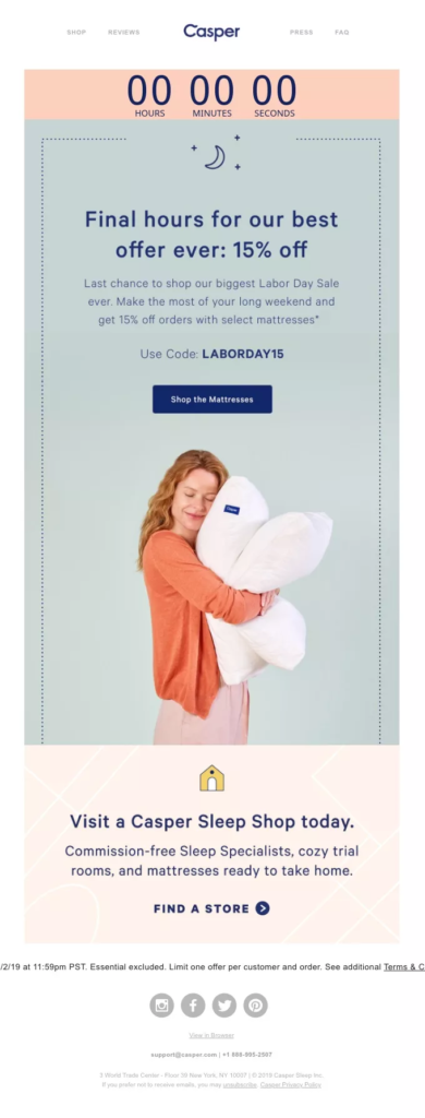
Casper’s email uses a countdown timer for its Labor Day Sale, with “last-minute” framing, offering 15% off select mattresses.
The urgency is amplified by the “last chance” positioning.
Why it works: “Last chance” emails with countdown timers at the end of a sale perform better than the original sale announcement. Customers who saw the first email but didn’t act now face a genuine deadline. The combination of reminder + countdown + “last minutes” creates peak urgency.
19. Festifice (Top-of-Page Timer)

Festifice places a Halloween Sale countdown at the very top of the page with just 2 hours remaining.
The extremely short window creates maximum urgency.
Why it works: Sub-3-hour countdowns work as “final push” timers for sales that are genuinely ending. The short window creates panic buying, which is effective for impulse-purchase categories like fashion and seasonal items. Use sparingly because overuse erodes trust.
20. Fashion Nova (BOGO Timer)

Fashion Nova’s website shows a Buy One, Get One Free offer with a countdown timer showing 7 hours remaining.
The BOGO offer paired with the timer creates a strong value-plus-urgency combination.
Why it works: BOGO already feels like exceptional value. Adding a countdown timer on top means customers face losing a genuinely good deal, not just a standard discount. The 7-hour window is aggressive enough to create urgency but long enough for customers to browse and choose their items.
21. WiserNotify (Customizable Website Timer)
WiserNotify offers customizable countdown timer widgets you can add to any website. You can choose between fixed deadline and evergreen timers, customize the design to match your brand, and place them as header bars, popups, or inline elements.
Why it works: Having a dedicated countdown timer tool means you can test different timer types, placements, and durations without developer resources. WiserNotify also includes social proof notifications that pair with countdown timers to create a sense of urgency and build trust simultaneously.
Boost Conversion Instantly
Add Social Proof & Urgency to your website
Where to Place Countdown Timers
Placement determines whether your countdown timer is converted or ignored. Here are the highest-impact positions:
Product pages (near the “Add to Cart” button). This is the most effective placement for ecommerce. The timer creates urgency at the exact moment the customer is deciding whether to buy. Amazon’s placement (a timer next to the price and CTA) is the model to follow.
Homepage or header bar. Site-wide timers in the header bar maintain urgency across the entire browsing session. PositiviTees’ persistent header bar is a strong example. This works best for site-wide sales events, such as flash sales and seasonal promotions.
Cart and checkout pages. Timers here reduce cart abandonment by reminding customers their discount or reserved items have a deadline. Keep the timer gentle here because aggressive urgency at checkout can backfire.
Landing pages (above the fold). Campaign-specific landing pages benefit from timers that match the promotion. Place the timer above the fold so visitors see the deadline before scrolling.
Email campaigns. Animated countdown GIFs in emails drive click-through rates by creating visual urgency in the inbox. Pair the timer with a clear CTA button.
Popups and overlays. Countdown timers in exit-intent popups are particularly effective because they catch visitors who are about to leave and give them a time-sensitive reason to stay.
Also check: 20 Sales Promotion Techniques That Actually Work (2026)
Countdown Timer Best Practices
Use real deadlines. If your sale ends Friday at midnight, the timer should count down to that time. Timers that reset on page refresh destroy trust. Customers who catch fake urgency won’t trust your future offers. This is the most important rule for any countdown campaign.
Match the timer to the offer value. A flash sale on low-cost items can use a 2 to 4-hour timer. A seasonal sale on higher-priced products should run for days. A 30-minute timer on a $2,000 mattress feels manipulative. A 30-minute timer on a $15 t-shirt feels exciting.
Keep it visible but not overbearing. One well-placed timer per page is enough. Multiple competing timers create confusion and fatigue. Use contrasting colors that match your brand so the timer stands out without clashing with the page design.
Make the consequence clear. “Sale ends in…” or “This price expires in…” tells customers exactly what they lose when the sale ends. A timer with no context (just numbers counting down) creates confusion, not urgency.
Consider time zones for global audiences. If you have international customers, use timers that adjust to the visitor’s local time zone, or clearly state the time zone in your messaging.
Common Countdown Timer Mistakes
Fake urgency that resets. Timers that restart every visit train customers to ignore all your future urgency signals. If someone sees a “2 hours left” timer on Monday and the same “2 hours left” timer on Wednesday, you’ve lost their trust permanently.
Too many timers on one page. Multiple countdown timers competing for attention dilute the urgency of each one. Pick your most generous offer and give it to a one timer in the best position.
Timers with no context. A countdown with no explanation of what happens at zero is meaningless. Always pair the timer with a clear message about the offer, the deadline, and what the customer should do.
Wrapping Up
The best countdown timer examples share three things: a real deadline, a clear benefit for acting now, and strategic placement near the point of decision.
Whether you use them on product pages, in emails, as popups, or in header bars, the psychology is the same.
People act faster when they know exactly how much time they have left.
Start with a timer on your highest-traffic page. Test whether a fixed deadline or an evergreen timer converts better.
Measure the results before rolling out timers across your site.
One well-placed, honest countdown timer will always outperform five generic ones scattered across your pages.
