33 Shopping Cart Page Design Examples I Actually Learned From (2026)
 Krunal Vaghasiya|Dec 5, 2024
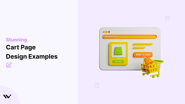
I’ve looked at hundreds of ecommerce stores over the years, and the shopping cart page is almost always the most neglected page on the site.
Brands spend serious budget on homepage design, product photography, and paid ads – then send hard-won traffic to a cart page that was set up once and never touched again.
That’s a problem, because the cart page is where purchase intent is highest, and friction is most dangerous. A shopper who reaches your cart has already decided they want the product. Your cart page’s job is not to talk them out of it.
I’ve pulled together 33 real cart page designs from brands doing this well. For each one, I’ve broken down the specific design decision worth stealing. Whether you’re building from scratch or optimizing what you have, these examples give you a concrete starting point.
What Makes a Cart Page Design Actually Work
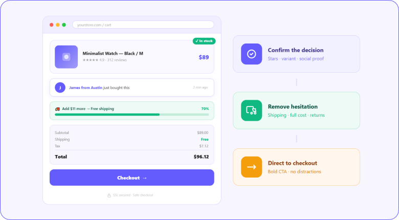
Before getting into the examples, it’s worth understanding what separates high-converting cart pages from ones that leak revenue. The difference isn’t visual polish. It’s clarity and confidence.
A cart page that converts does three things: it confirms the shopper’s decision was correct, removes every reason to hesitate, and makes the path to checkout impossible to miss. Every design element either supports or undermines one of those three things.
The two main formats are a separate dedicated cart page (more space for upsells, trust signals, and detailed order summaries) and a cart preview or slide-out panel (faster to access, keeps shoppers on the product page).
Neither is universally better. The right choice depends on your product type, average order value, and how much upselling you want to do.
Also check: 15 Checkout Page Design Examples That Actually Convert
Build trust & FOMO
Highlight real-time activities like reviews, sales & sign-ups.


Two Types of Cart Page Design: Which One Do You Need
Every cart page falls into one of two categories, and choosing the wrong one for your store is a more consequential decision than most brands realize.
Separate cart page
A dedicated full-page cart gives you space to do more. You can show detailed product summaries, surface upsells and cross-sells, add trust signals, display shipping calculators, and present the full order breakdown without crowding.
It’s the right choice for stores with higher average order values, complex products, or significant upsell opportunities.
The trade-off is friction. Navigating to a new page interrupts the browsing flow, and some shoppers use it as a natural pause point to reconsider. If your abandonment data shows shoppers leaving from the cart page rather than at checkout, a cart preview might reduce that exit rate.
Cart preview or slide-out
A slide-out panel or mini-cart keeps the shopper on the current page. They can add to the cart and confirm the addition without losing their place in the product catalog.
It’s faster and lower-friction, which makes it the better choice for impulse purchases, lower-priced products, and stores where multi-item orders are common.
The limitation is space. A slide-out cart has room for the essentials but not much more. Complex upselling, detailed shipping options, and extended trust signals are harder to fit without overwhelming the format. For stores that depend heavily on cart-stage upselling, the separate page usually wins.
33 Shopping Cart Page Design Examples
These aren’t just screenshots. Each example has a specific design principle behind it that you can apply to your own store.
1. Aura Bora
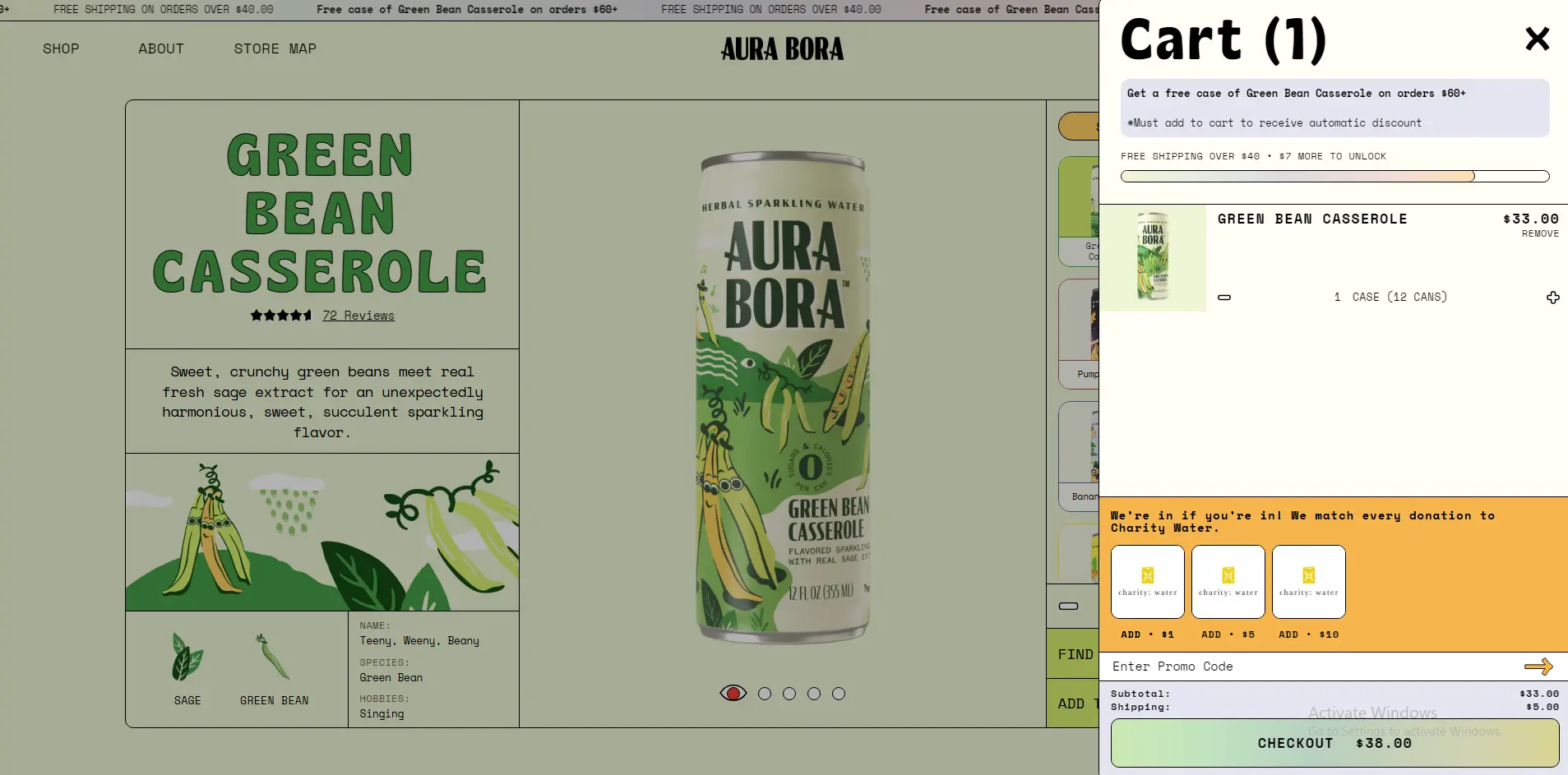
Aura Bora sells sparkling water, and their cart page reflects the brand’s playful personality all the way through. The color usage, tone of voice in the microcopy, and overall visual energy match the product page exactly. There’s no jarring shift when you land in the cart.
What to steal: Brand consistency through the cart. When your cart looks like a different website from your store, it creates a subtle trust gap. Carry your brand colors, fonts, and voice all the way to the final click.
2. John Lewis
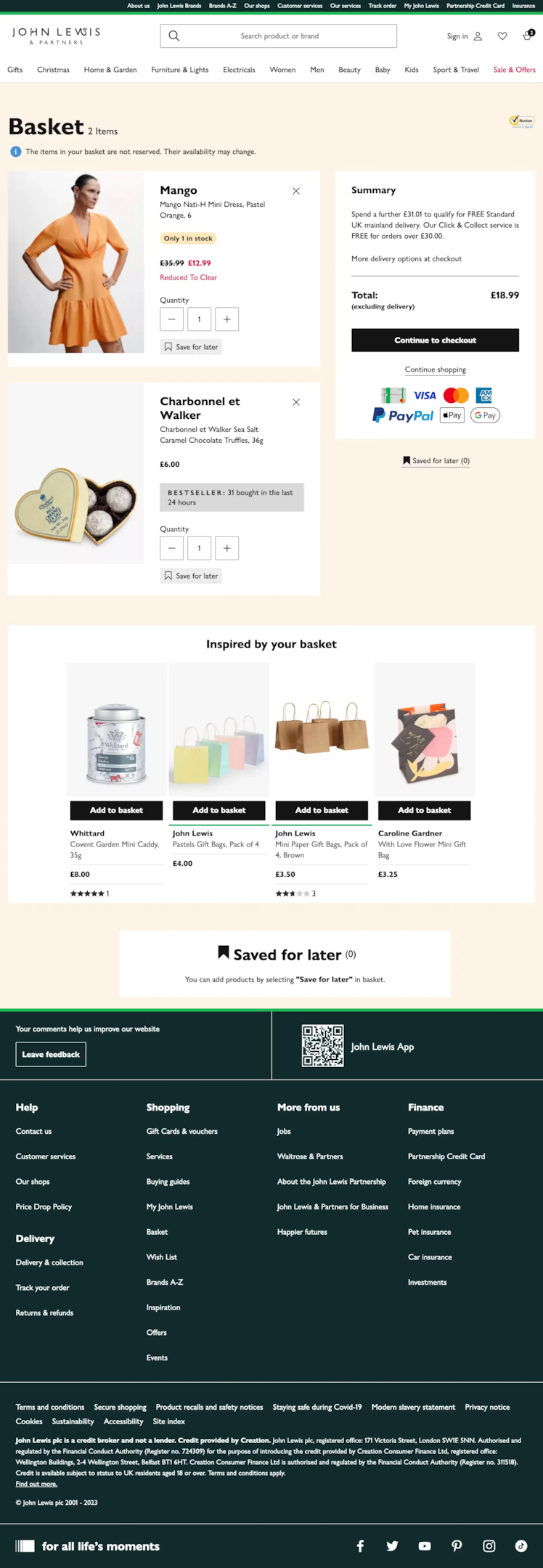
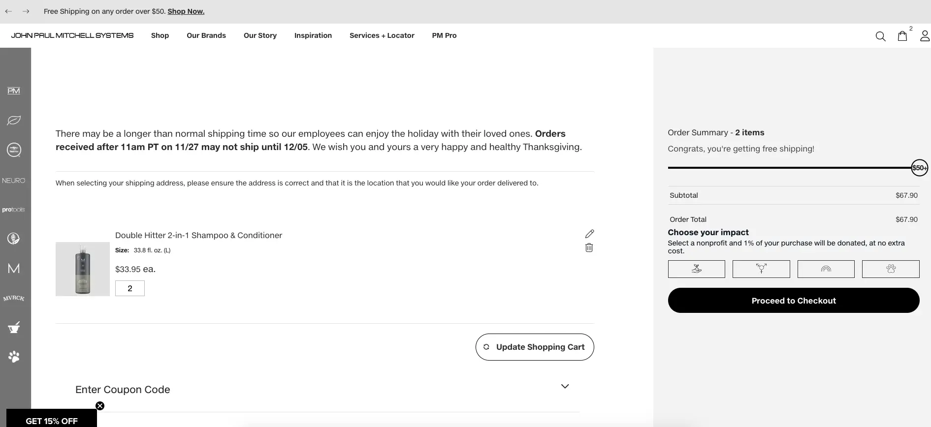
John Lewis is a British department store with a wide product mix, and their cart handles complexity well. The order summary is clean and itemized, delivery options are clearly presented, and the price breakdown leaves nothing ambiguous. No hidden costs revealed at checkout.
What to steal: Full cost transparency on the cart page itself. Show shipping, tax, and any fees before the shopper reaches checkout. Surprises at payment are the leading cause of cart abandonment.
Build trust & FOMO
Highlight real-time activities like reviews, sales & sign-ups.

3. Anyday
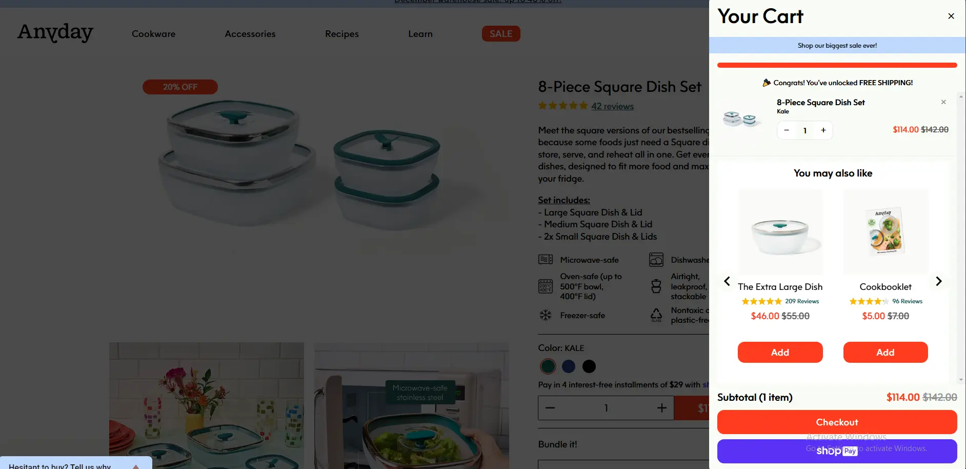
Anyday sells cookware and their cart page leans into the premium positioning. Clean white space, high-quality product imagery, and a minimal form factor that puts the checkout button front and center. Nothing competing with the primary action.
What to steal: Ruthless subtraction. Every element on a cart page that isn’t helping the shopper complete the purchase is potentially hurting it. Remove banners, promotional noise, and anything that distracts from the checkout CTA.
4. Northern Tools
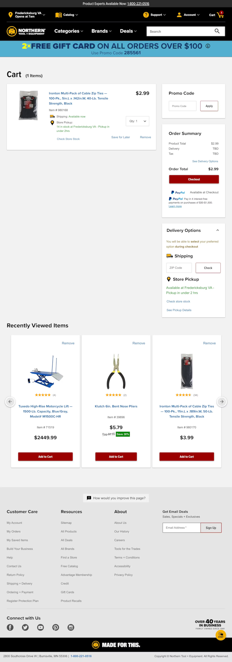
Northern Tools serves a trade and DIY audience who care about specs, not aesthetics. Their cart page shows detailed product information, including SKU numbers, specifications, and availability status. It’s information-dense but organized for the audience it serves.
What to steal: Match your cart page information density to your buyer. Impulse-purchase audiences need fast, clean carts. Considered-purchase audiences (tools, electronics, furniture) need product details in the cart to confirm they’ve chosen correctly.
5. Brilliant Earth
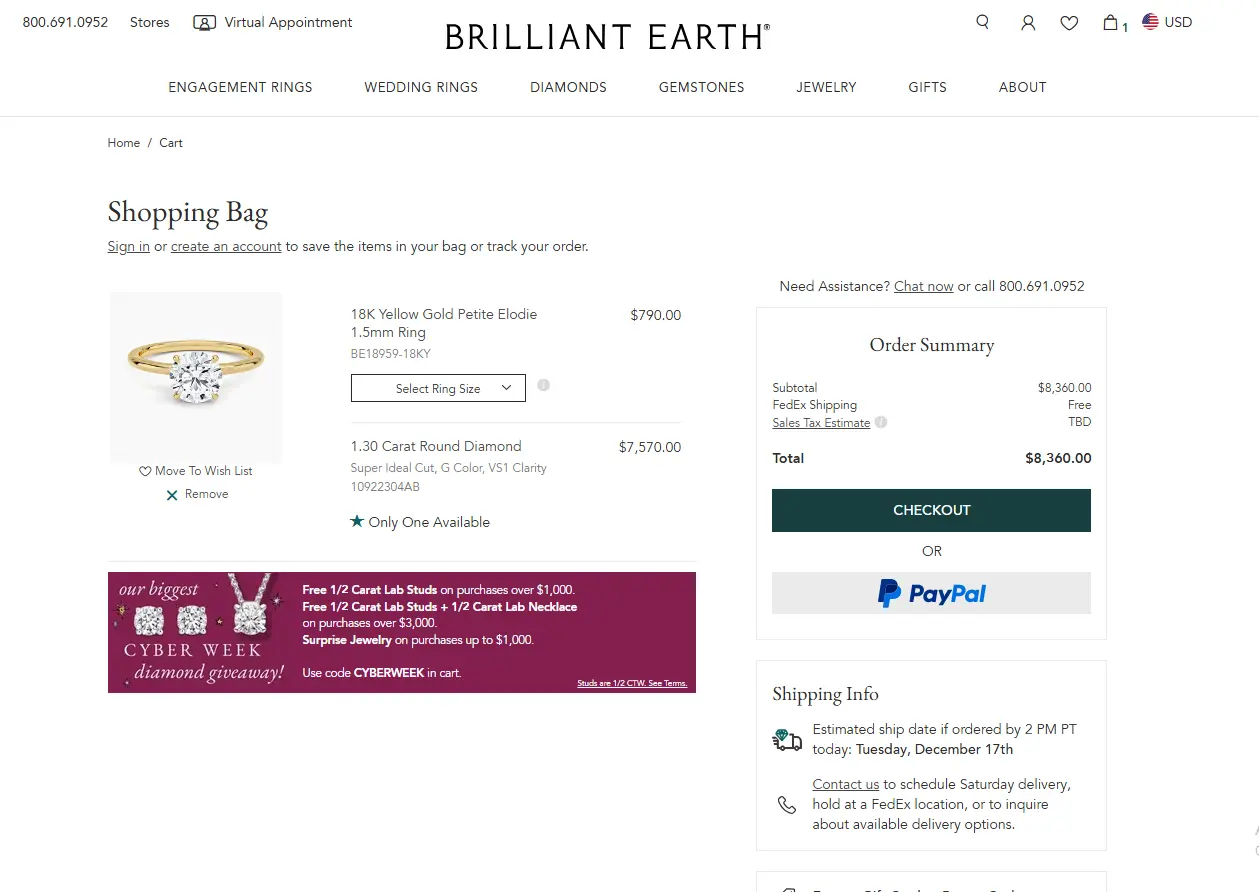
Brilliant Earth sells fine jewelry, and their cart page handles high-ticket anxiety well. Trust badges are prominently placed, free shipping and returns are called out explicitly, and the imagery is detailed enough to confirm the shopper knows exactly what they’re getting.
What to steal: For high-ticket products, put trust signals directly in the cart. Security badges, return policies, and free shipping callouts do more conversion work on a $500 purchase than a $30 one. Place them near the checkout button.
Also check: The Best Trust Badges for Ecommerce Stores
6. Living Space
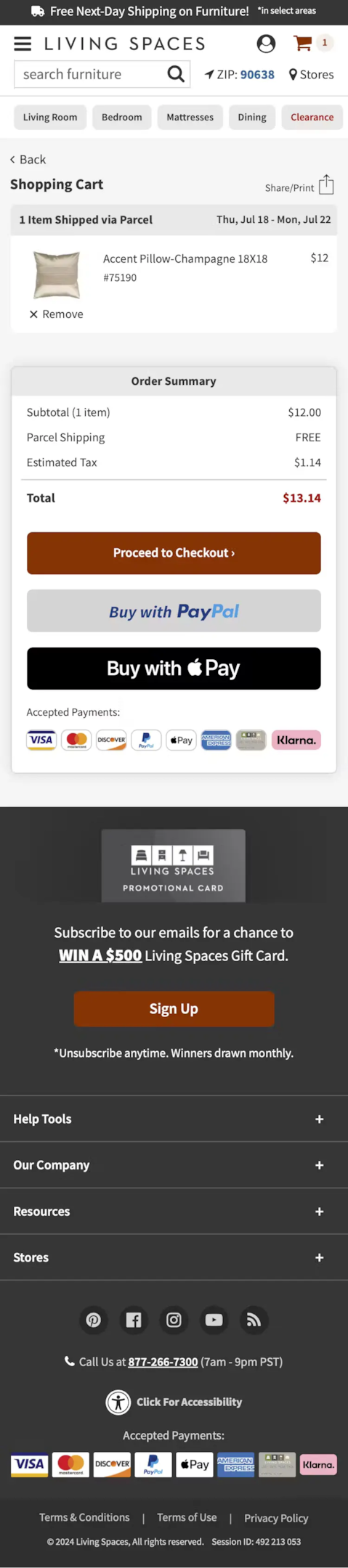
Living Space sells furniture, and their cart page solves a specific problem: shoppers often need to confirm delivery details before committing to a large item. Delivery timelines, shipping method options, and estimated dates are surfaced right on the cart page – not hidden in checkout.
What to steal: Surface delivery information on the cart page for large or heavy products. A shopper who needs to know when a sofa arrives shouldn’t have to start checkout to find out. Give them the information on where they are.
Also check: I Studied 11 Order Review Pages (Here’s What Converts)
Build trust & FOMO
Highlight real-time activities like reviews, sales & sign-ups.

7. Nutribullet
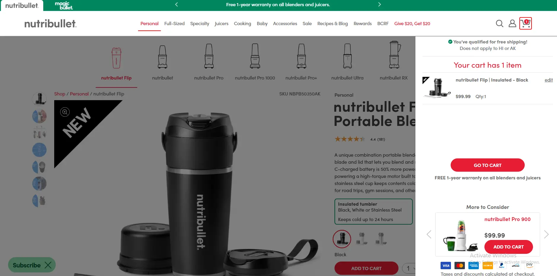
Nutribullet uses the cart page to reinforce product value after the add-to-cart decision. Key product benefits appear alongside the cart item summary, reminding the shopper why they chose this blender. It’s a smart way to reduce buyer’s remorse before it starts.
What to steal: Reinforce the buying decision in the cart. A short benefit line under the product name addresses the “did I make the right choice?” anxiety that peaks right before payment.
8. ASOS
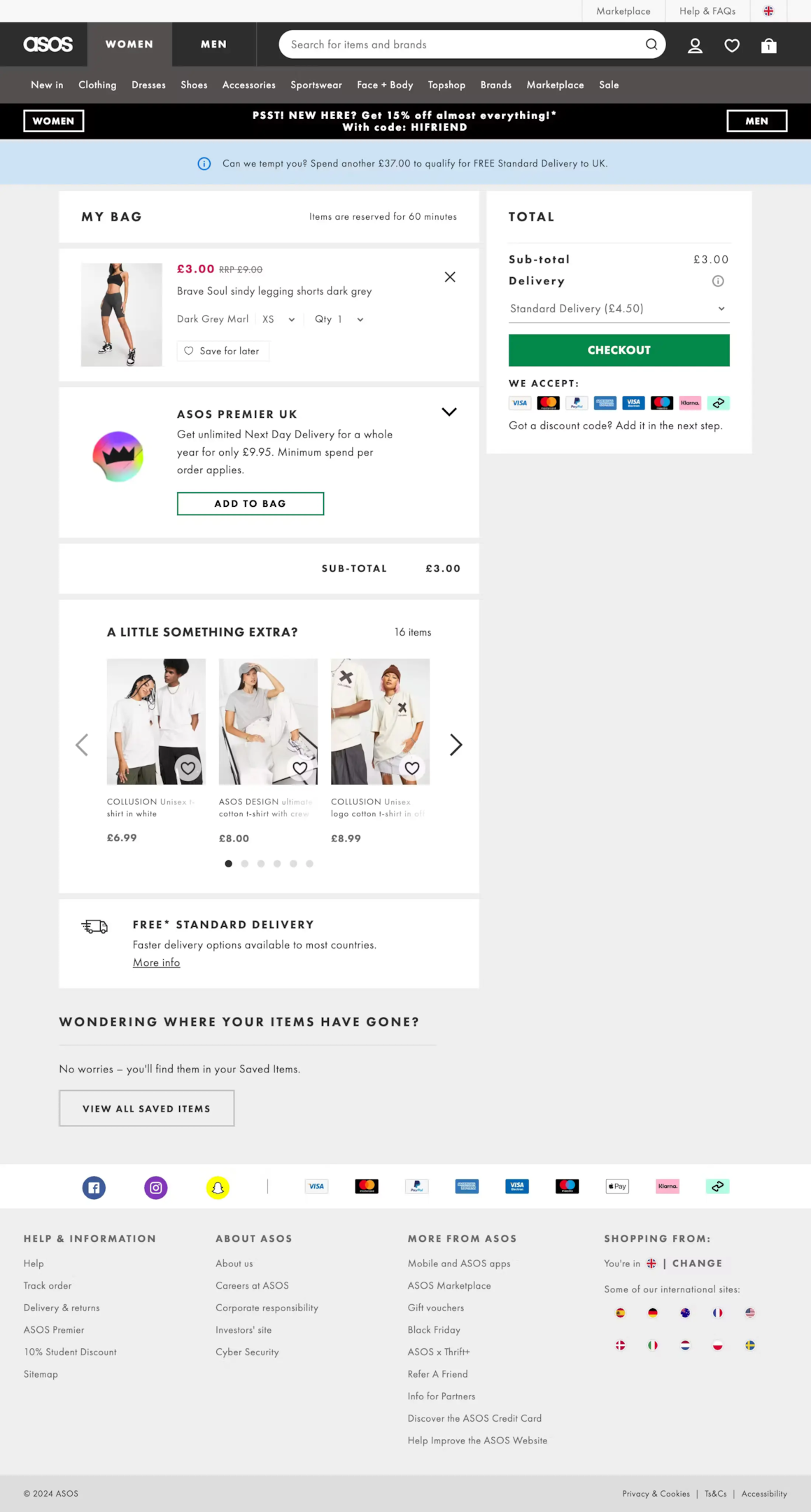
ASOS handles multi-item carts better than almost any fashion retailer. Product images are large and clear, size and color variants are confirmed in the cart, and the “save for later” option is prominently available. Shoppers don’t need to re-navigate to remember what they’re buying.
What to steal: Always confirm variant details (size, color, style) in the cart item row. A shopper who added a medium blue shirt should see “Medium / Blue” confirmed in the cart. Ambiguity at this stage creates hesitation.
9. H&M
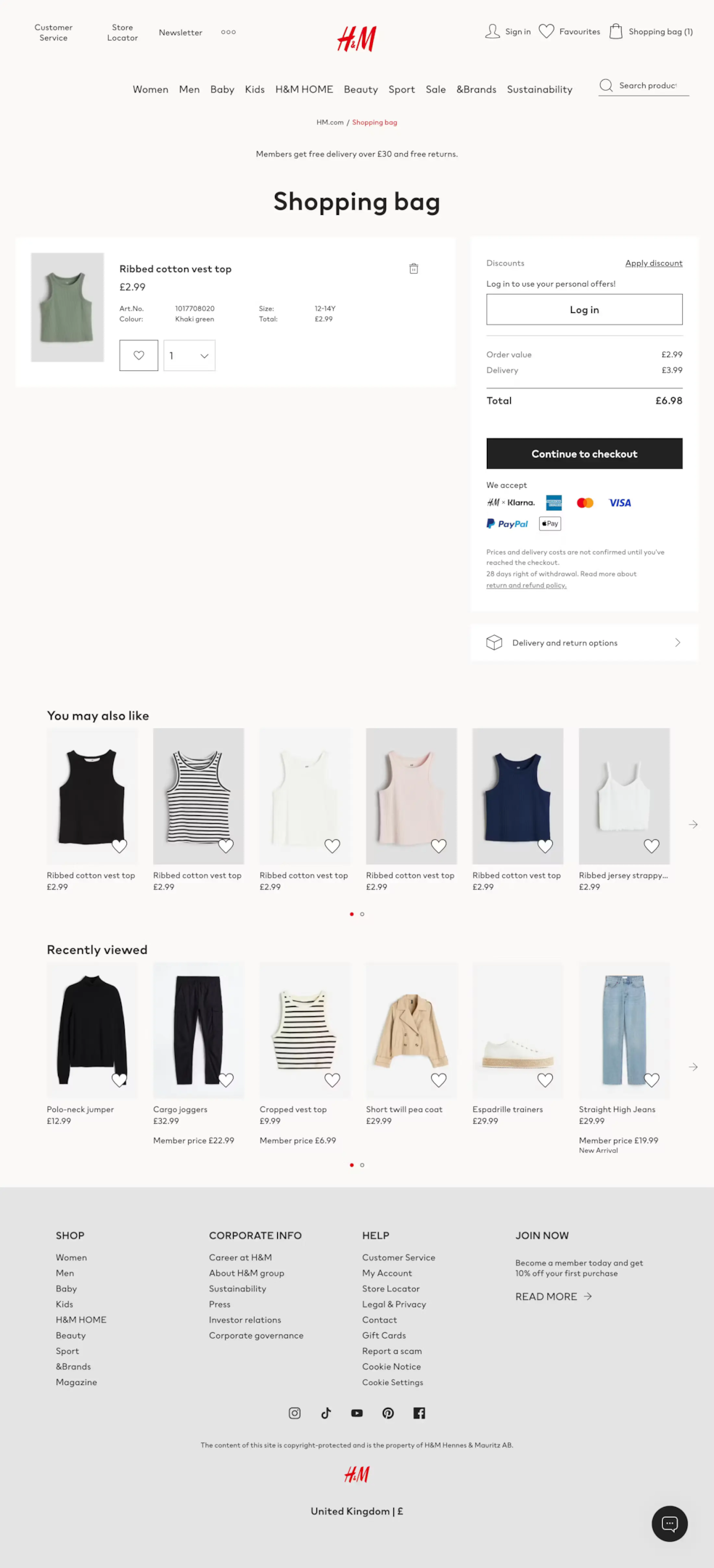
H&M keeps their cart page exceptionally clean given the volume of products they carry. The two-column layout puts cart items on the left and the order summary sticky on the right, so the checkout button is always visible regardless of how far the shopper scrolls.
What to steal: Make the checkout button sticky. On longer cart pages with multiple items, the primary CTA should follow the user as they scroll rather than requiring them to scroll back to the top or bottom to proceed.
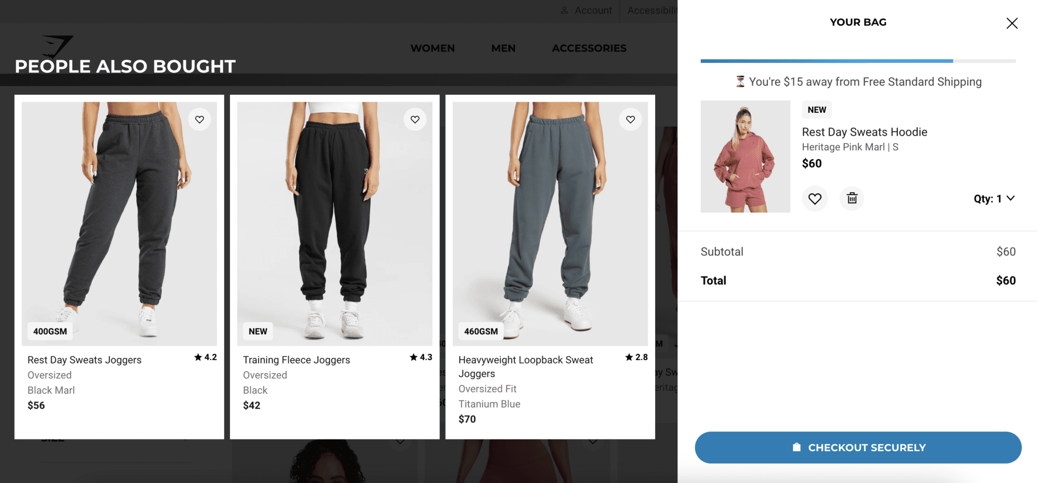
10. Urban Outfitters
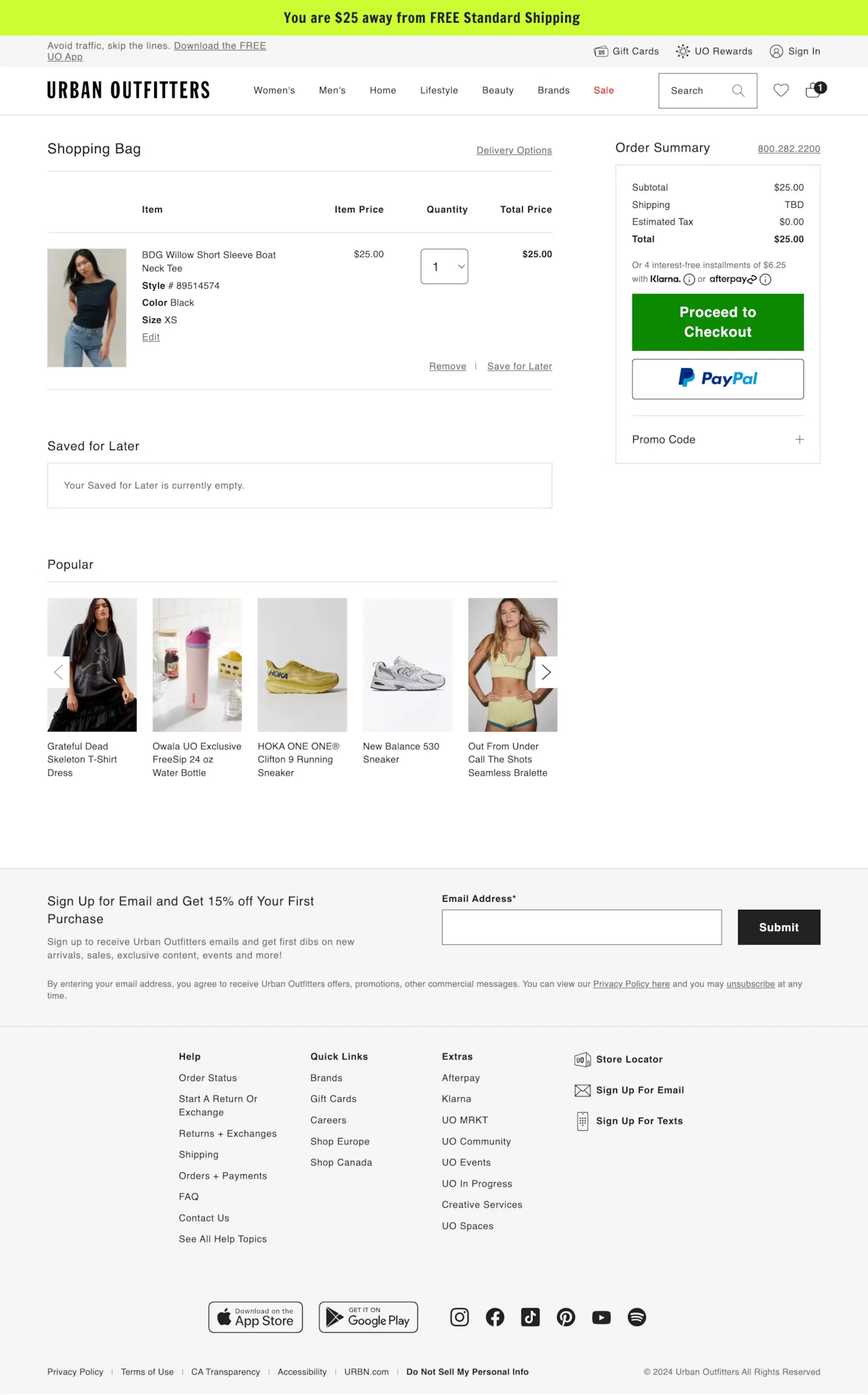
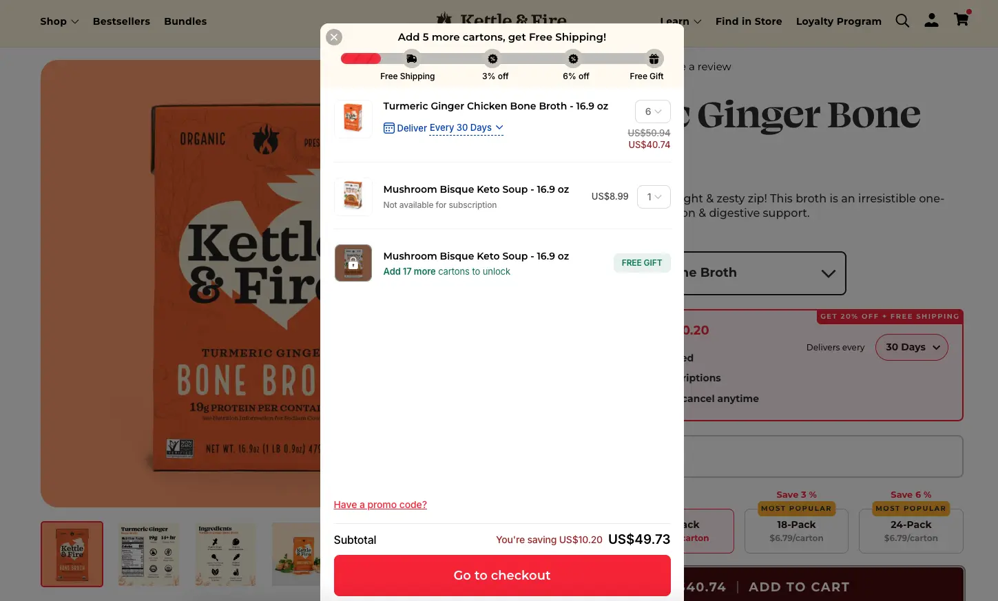
Urban Outfitters targets a younger demographic and their cart page reflects that with a more editorial feel. The free shipping threshold is surfaced as a progress bar rather than a text callout, showing shoppers exactly how close they are to unlocking free shipping.
What to steal: Use a free shipping progress bar on the cart page. “You’re $12 away from free shipping” displayed visually as a progress bar converts far better than the same message in text. It creates a specific, achievable goal.
Build trust & FOMO
Highlight real-time activities like reviews, sales & sign-ups.

11. Solo Stove
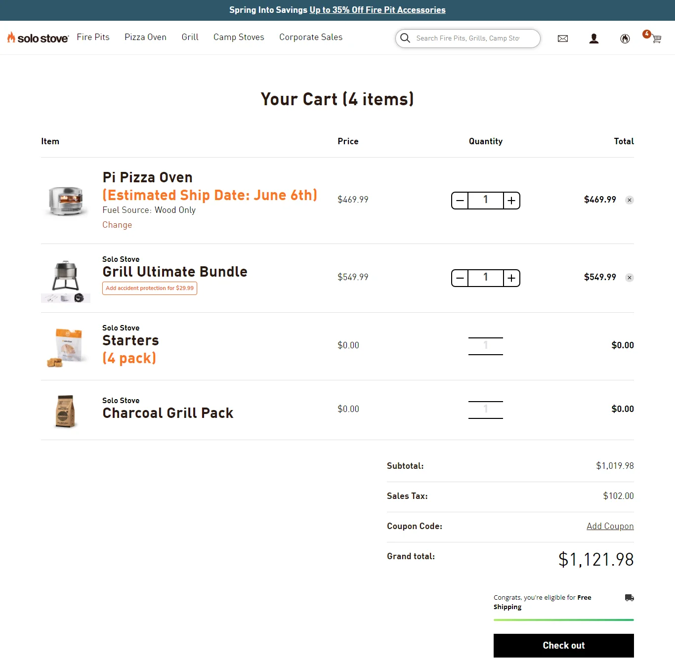
Solo Stove sells outdoor fire pits at a premium price point. Their cart page uses customer review snippets directly under the cart item, pulling verified buyer feedback into the purchase confirmation moment. It’s social proof at exactly the right stage.
What to steal: Add a review snippet to the cart item row for your key products. A 5-star quote from a verified buyer right next to the product addresses last-minute hesitation better than any badge or icon.
12. Sierra Designs
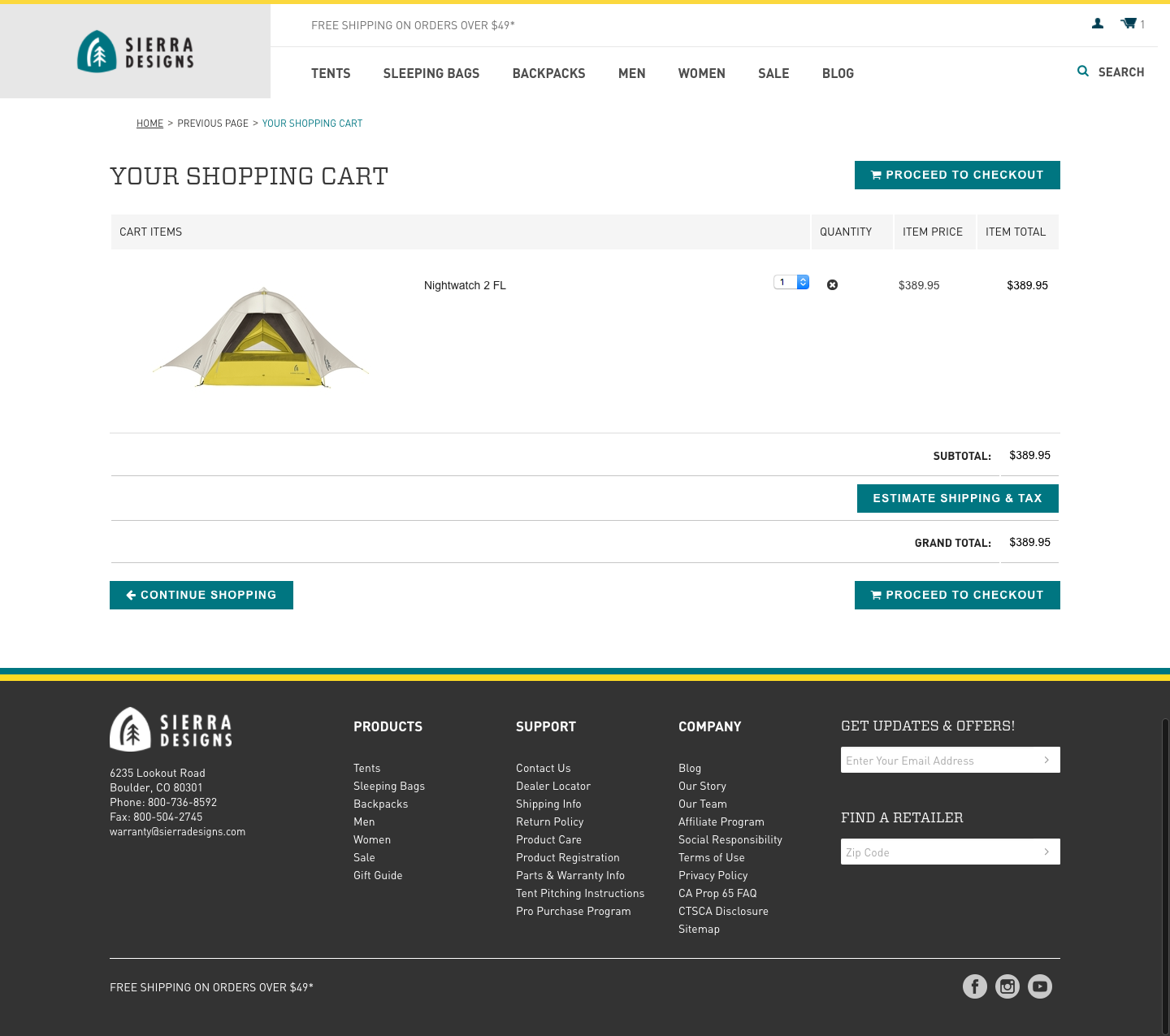
Sierra Designs is an outdoor apparel brand whose cart page handles a common pain point: size uncertainty. A size chart link appears directly in the cart item row so shoppers can confirm their size choice without leaving the cart to re-check the product page.
What to steal: Put size guides in the cart item row for apparel. A shopper who isn’t sure about their size will leave the cart to check the product page – and some won’t come back. Putting the size guide one click away from the cart keeps them in the flow.
13. Walgreens
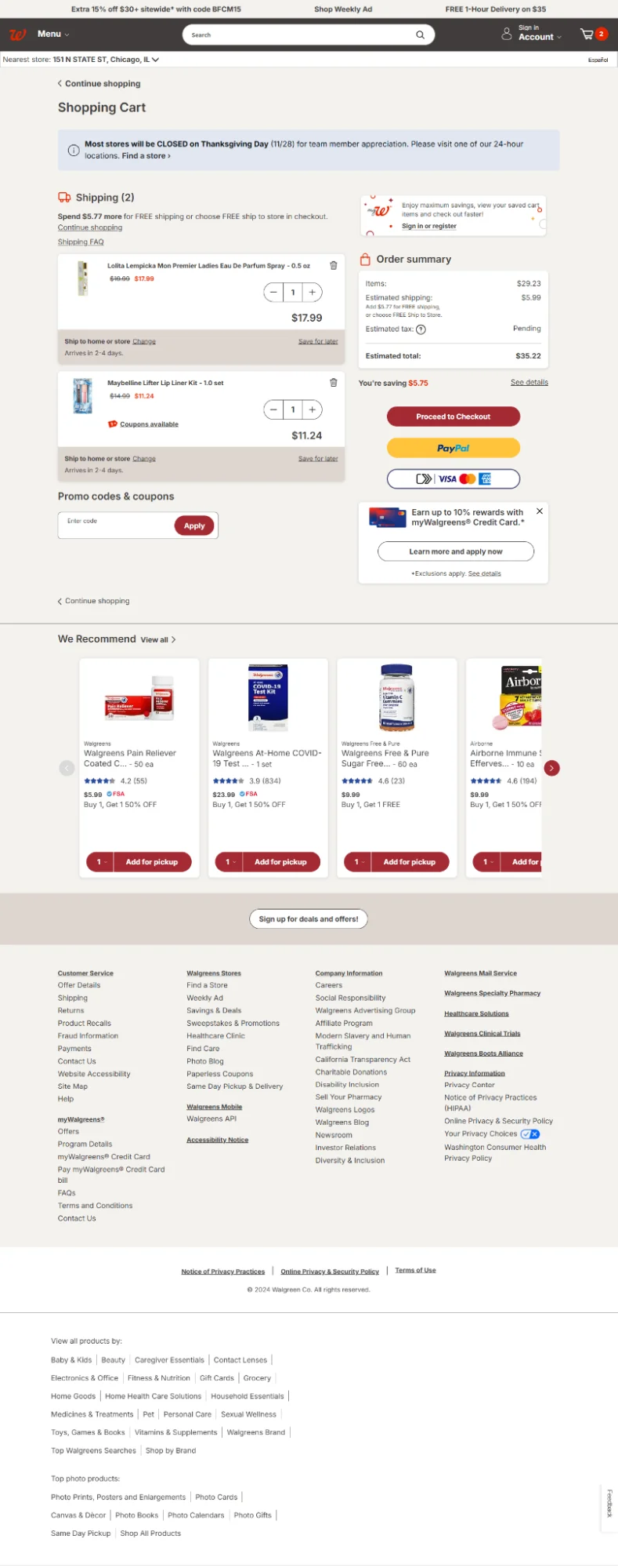
Walgreens handles pharmacy and health products with a cart page that’s built around trust and clarity. The order summary is detailed, loyalty points earned on the order are prominently shown, and pickup vs. delivery options are clearly differentiated.
What to steal: Show loyalty points earned on the current order in the cart. “You’ll earn 340 points with this order” gives shoppers an additional reason to complete the purchase and reinforces the value of your loyalty program at the right moment.
14. The Eagle
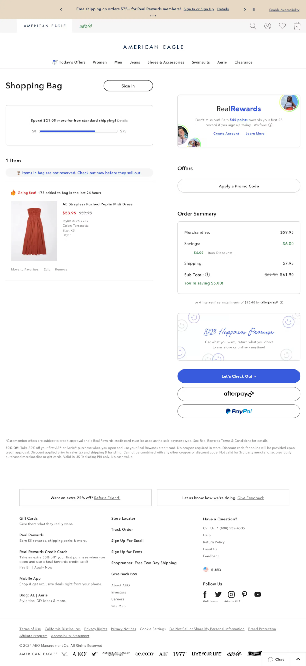
The Eagle keeps their cart page exceptionally minimal. Product image, name, size, price, quantity selector, and remove option. That’s it. The checkout button fills the full width of the right column. No noise, no distractions, just a very obvious path forward.
What to steal: Consider going more minimal than you think you should. Most cart pages have elements that feel necessary but don’t actually help conversions. The Eagle’s cart proves you can strip it back significantly and still convert effectively.
Build urgency
Add floating offers with countdown timer & coupon code.

15. M&A
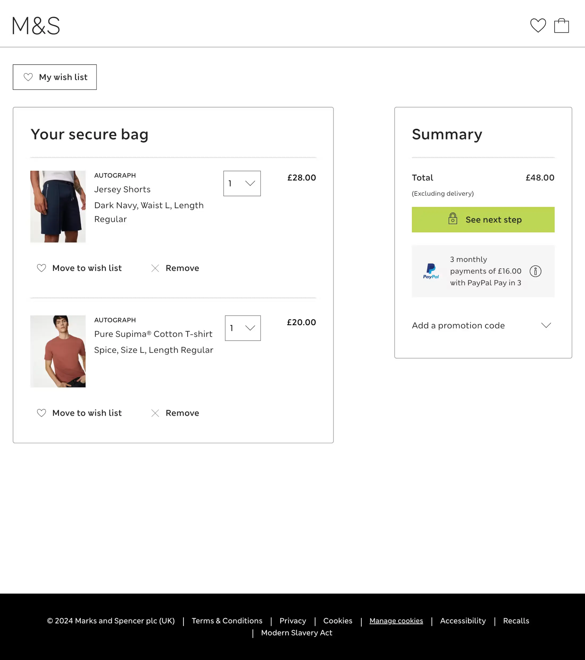
M&A’s cart page handles multiple item types within a single order cleanly. Items are grouped logically, the price breakdown is itemized, and the gift message option is surfaced on the cart page rather than buried in checkout – a smart move for a gifting-heavy product range.
What to steal: Surface gift options on the cart page if you have a significant gifting audience. A shopper buying a gift who doesn’t see a gift message option until checkout will wonder if they missed it earlier – and that uncertainty costs conversions.
16. Harry’s
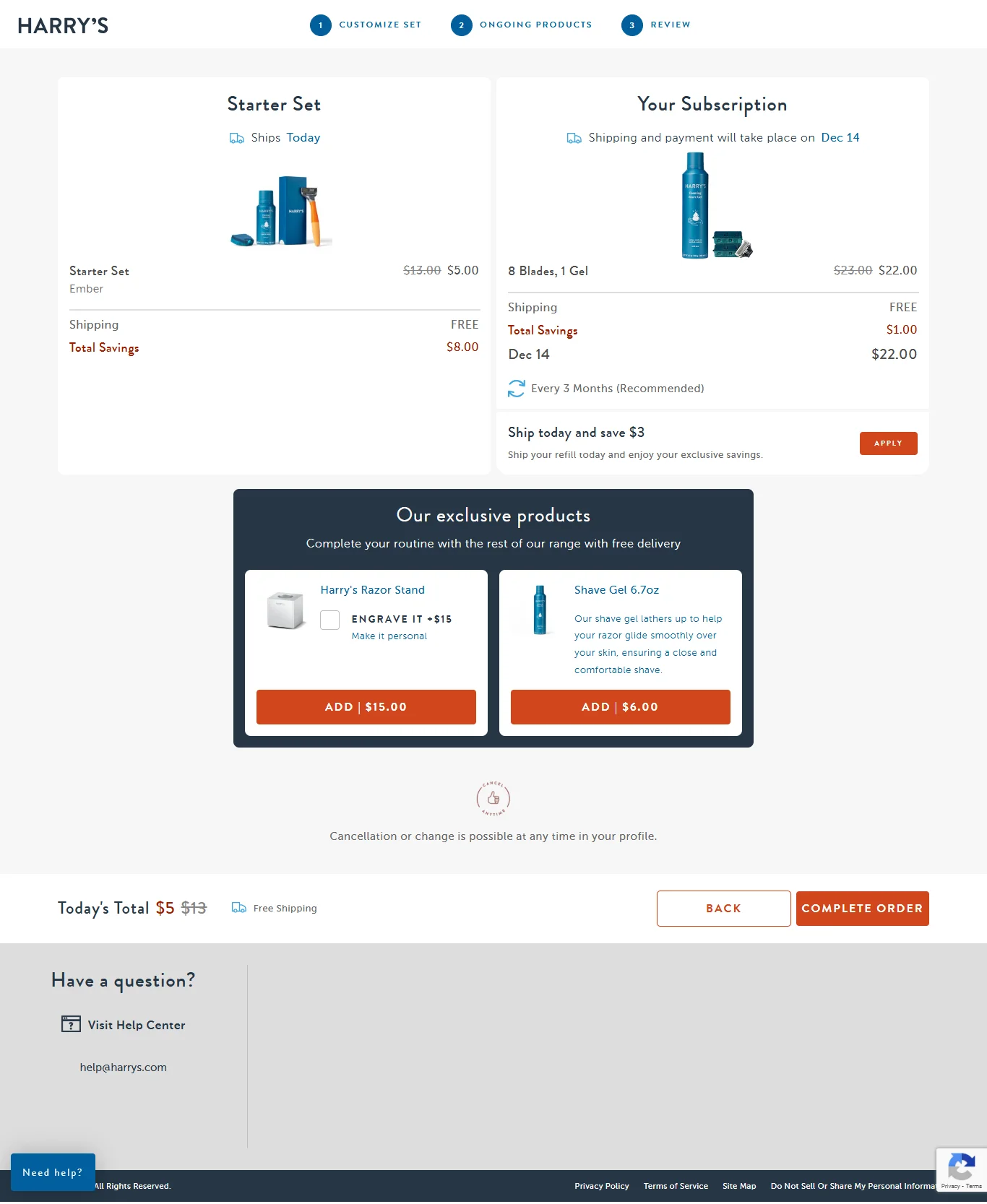
Harry’s uses the cart page to pitch their subscription option with a clear value comparison. The one-time price and the subscription price are shown side by side with the savings calculated and called out. It’s an upsell that actually helps the shopper rather than just inflating their order.
What to steal: If you have a subscription model, the cart page is the best place to present it. The shopper is already committed to the product. Show the subscription savings at that moment when intent is highest and the value comparison is most compelling.
17. MeUndies
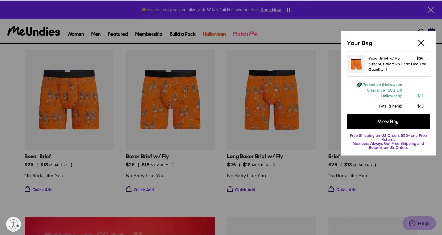
MeUndies makes membership central to their cart experience. The cart page clearly shows what membership gets you versus buying at standard price, and the upgrade prompt is designed to feel like helpful information rather than an aggressive upsell. Brand voice carries through the entire page.
What to steal: Frame membership or subscription upgrades as information rather than sales pitches. “Members pay $12 instead of $18” presented factually with the math visible is far more effective than a promotional banner urging shoppers to join now.
18. Sephora
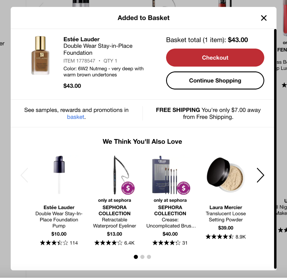
Sephora’s cart page is a masterclass in upselling done right. The “Frequently Bought Together” and “You May Also Like” sections are product-specific rather than generic, based on the actual items in the cart. The samples selection feature – where shoppers choose three free samples – is a genuinely delightful cart feature that increases completion rates.
What to steal: Make cart recommendations specific to what’s in the cart, not generic bestsellers. “People who bought this foundation also bought this setting spray” is far more relevant and converting than a generic trending products widget.
19. Lululemon
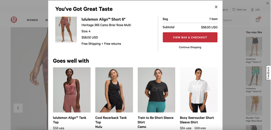
Lululemon greets cart additions with “You’ve got great taste” – a simple but effective bit of copywriting that reinforces the shopper’s decision immediately. Their cart page also surfaces product bundling suggestions which increases average order value without feeling pushy.
What to steal: Use affirming microcopy when shoppers add to cart. “Good choice” or “You’ve got great taste” takes two seconds to write and creates a moment of positive reinforcement that subtly increases the shopper’s commitment to their decision.
20. Godiva
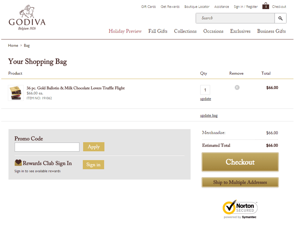
Godiva sells premium chocolates and their cart page handles the gifting use case elegantly. Gift wrapping, personalized messages, and delivery date selection are all surfaced on the cart page rather than in checkout. The product imagery maintains the luxury feel of the brand throughout.
What to steal: For gifting products, treat the cart page as a gift customization step rather than just an order review. Shoppers buying gifts need to feel the gift is ready to send – wrapping options and personalization on the cart page serve that need directly.
21. Gymshark
Gymshark’s cart page is clean, fast, and mobile-optimized first. The layout collapses gracefully on smaller screens with large tap targets on the quantity selectors and remove buttons. The checkout CTA is full-width on mobile. Nothing requires precise tapping or zooming.
What to steal: Design your cart for mobile first, desktop second. With over 70% of ecommerce traffic coming from mobile devices, a cart page that requires pinch-zooming or precise tapping on small controls is losing conversions every day.
Build trust & FOMO
Highlight real-time activities like reviews, sales & sign-ups.
22. Disney
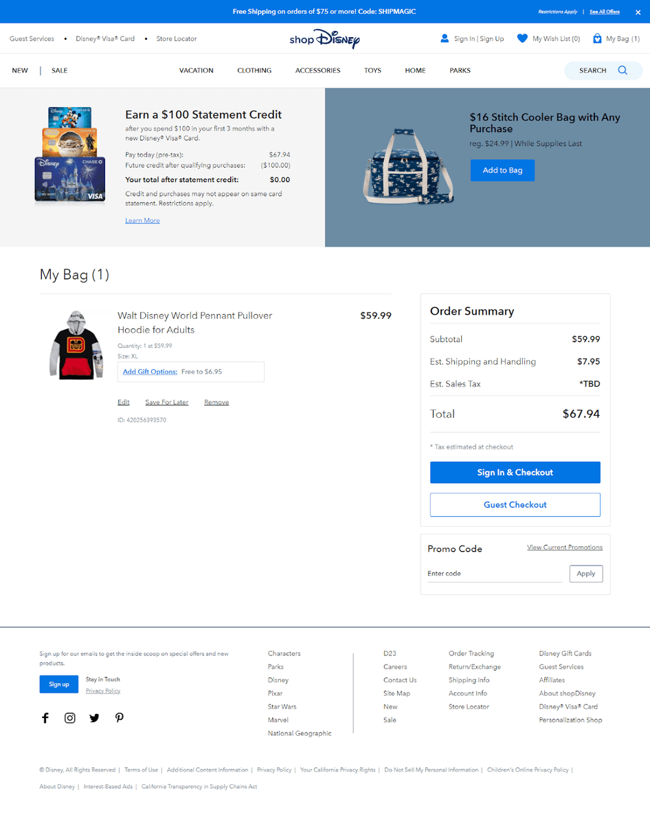
Disney’s cart page maintains the brand’s magical experience even at the most transactional stage of the journey. The visual design, character imagery, and copywriting voice are all consistent with the rest of the site. Shopping at Disney feels like Disney even when you’re reviewing your order.
What to steal: Don’t treat the cart page as a functional afterthought. If your brand has a strong identity, that identity should be present at every stage including the cart. It’s the last brand impression before the purchase is made.
23. Chubbies
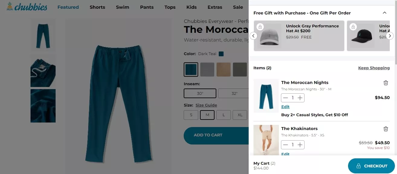
Chubbies is known for its humor-forward brand voice, and their cart page doesn’t drop that personality when it matters most. The copy is funny without being distracting, and the checkout path is clear despite the brand character. They’ve proven you can have personality and conversion in the same place.
What to steal: Brand voice in cart microcopy. The text on your quantity selector, remove button, and empty cart state are all opportunities to reinforce your brand character. These details take minutes to write and signal to shoppers that someone actually cared about this page.
24. Natori
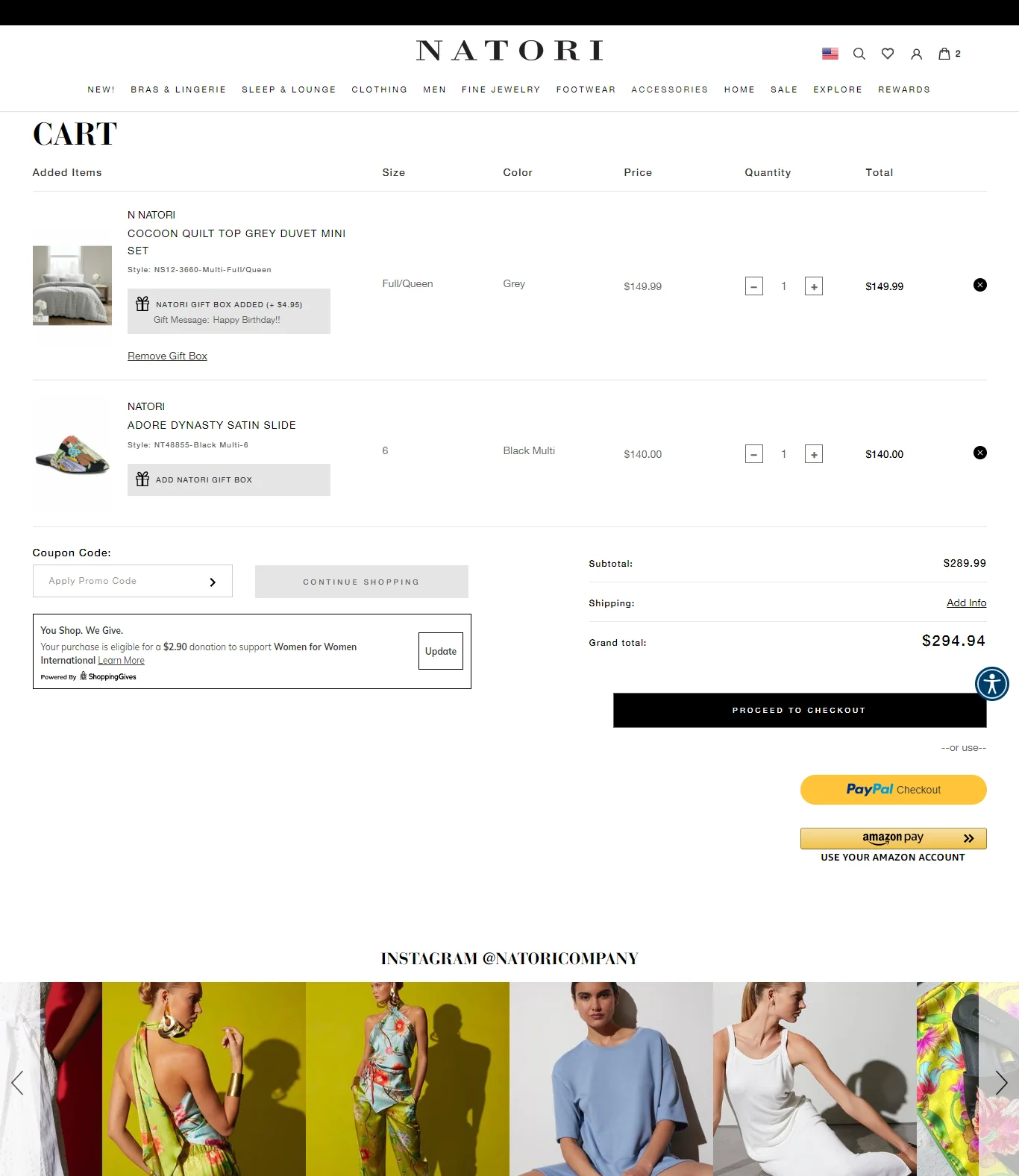
Natori sells luxury lingerie and their cart page incorporates charitable giving through a non-intrusive pop-up that lets customers choose a cause to support with part of their purchase. The social media integration and gift options are handled through lightweight pop-ups that don’t interrupt the flow.
What to steal: Use in-page pop-ups for secondary features rather than cluttering the cart layout. Gift options, charity donations, and loyalty enrollment work better as triggered pop-ups than as permanent page elements competing with the checkout CTA.
25. Ugmonk
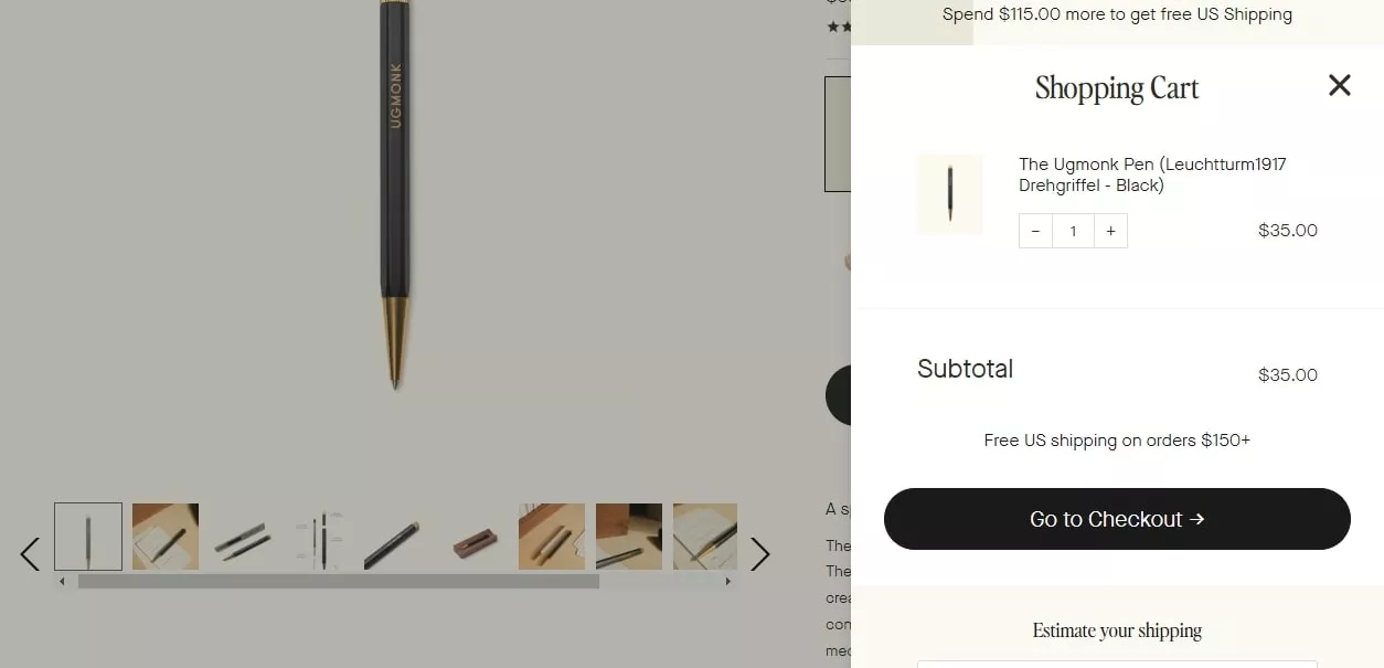
Ugmonk designs minimalist products and their cart page reflects that philosophy exactly. It’s one of the cleanest cart pages I’ve seen – almost no visual noise, just the product, the price, and the checkout path. The white space is deliberate and it works.
What to steal: If your brand is built on simplicity, let that extend to the cart. A cart page that’s visually calm signals to shoppers that your brand is thoughtful and trustworthy. Clutter, even well-intentioned promotional clutter, works against that.
26. Crate & Barrel
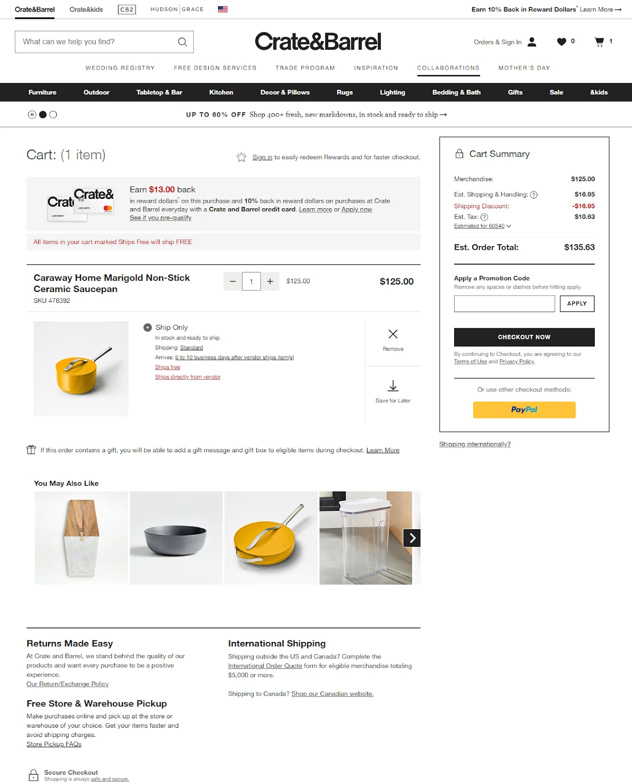
Crate & Barrel surfaces shipping information in four different ways on their cart page: a ships-free tag above the summary, a tag next to each product, an estimated delivery date, and a separate shipping calculator. For high-consideration home goods purchases, this level of shipping clarity prevents checkout abandonment caused by delivery uncertainty.
What to steal: For large or expensive items, surface shipping information multiple times on the cart page. A shopper who isn’t sure about delivery timing won’t proceed to checkout to find out – they’ll leave. Proactively answering the delivery question keeps them moving forward.
Boost Conversion Instantly
Add Social Proof & Urgency to your website
27. Wandering Bear Coffee
Wandering Bear sells cold brew coffee and their cart page uses a subscription toggle directly on the cart item. The savings are shown instantly when the subscription option is selected, with the price updating in real time. It’s frictionless conversion from one-time to recurring revenue.
What to steal: If you sell consumables, put a subscription toggle directly on the cart item with real-time price updates. Showing the saving instantly rather than asking shoppers to navigate to a separate subscription page dramatically increases subscription conversion rates.
28. Topicals
Topicals is a skincare brand that targets a Gen Z audience. Their cart page uses bright colors, inclusive imagery, and educational content about how to use the products together. It’s a cart page that functions as both an order review and a product education moment.
What to steal: For skincare and beauty products, include brief usage instructions or how-to-use-together notes in the cart. Shoppers who understand how to use their products are more likely to complete the purchase and more likely to be satisfied with it.
29. Grub Club
Grub Club handles event ticket purchases through a cart page that surfaces all the event details – date, venue, time, what’s included – directly in the cart item view. There’s no need to go back to the event listing to confirm any details. Everything needed to commit is right there.
What to steal: For event or experience products, put all the key details in the cart item row. Date, time, location, what’s included. A shopper reviewing an event ticket in their cart should never need to navigate back to the listing to check something.
30. HBO
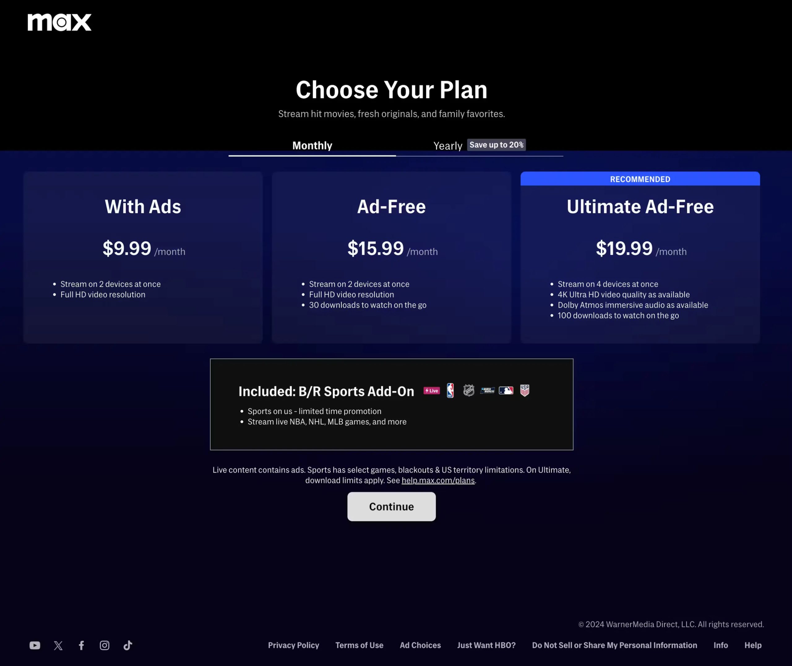
HBO’s cart page for subscription plans shows a clear plan comparison with what’s included in each tier. The currently selected plan is highlighted, but the higher-tier option is shown with its additional features in a way that makes upgrading feel obvious rather than pushy.
What to steal: Show plan comparisons on the subscription cart page. When a shopper can see what they’d get by upgrading one tier, some percentage will do it without any sales pressure. The information itself does the conversion work.
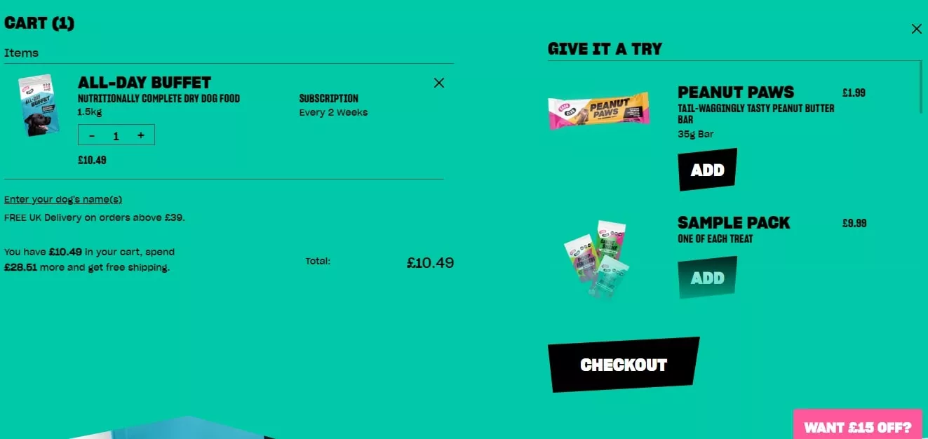
31. Zooplus
Zooplus is a European pet supplies retailer that handles international shipping particularly well. Country and currency selection are surfaced at the start of the cart experience, and estimated delivery dates are calculated and shown for the selected location. No checkout surprises about international shipping.
What to steal: For international stores, let shoppers select their country on the cart page and show location-specific shipping estimates immediately. A shopper who doesn’t know their delivery timeline won’t proceed to checkout on an unfamiliar international site.
32. Wayfair
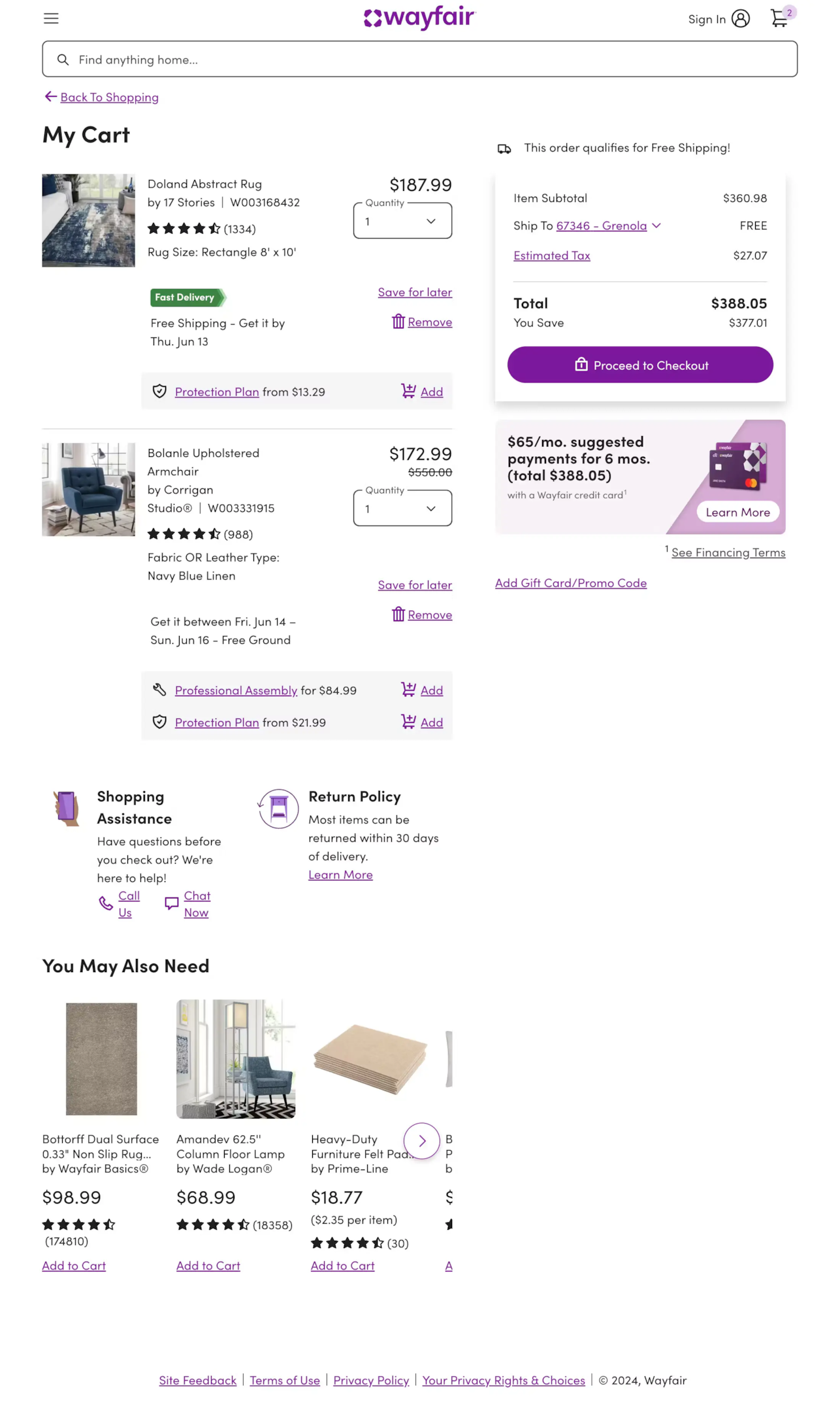
Wayfair’s cart page handles large furniture purchases with assembly service options, delivery scheduling, and detailed product specs all accessible from the cart item. The “Frequently Bought Together” section is furniture-specific – room bundles rather than generic recommendations.
What to steal: For furniture and home goods, bundle complementary items at the cart stage. “Complete the room” recommendations that pair a sofa with a coffee table and rug work far better than generic upsell widgets because they present a coherent vision rather than unrelated products.
33. DigiKey
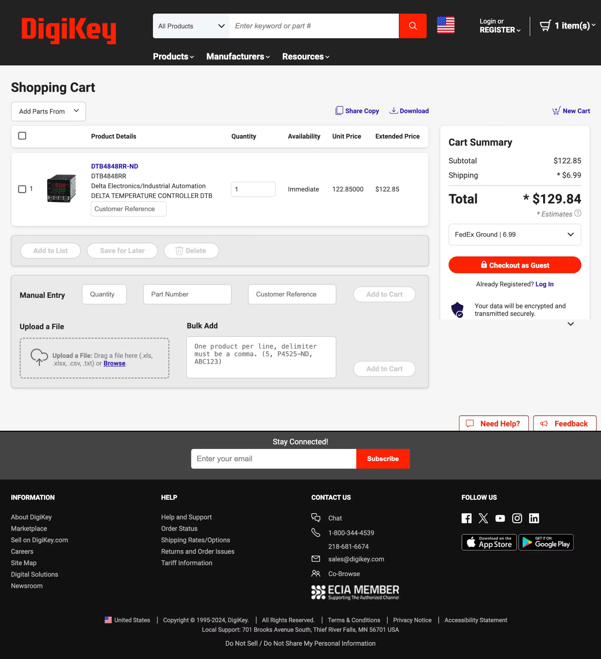
DigiKey sells electronic components to engineers and buyers who need absolute precision about what they’re ordering. Their cart page shows full part numbers, specifications, package types, and availability – the maximum possible product detail for an audience where ordering the wrong component has real consequences.
What to steal: Match your cart detail level to the cost of a mistake. For technical products where ordering the wrong spec matters, put the full specifications in the cart item row. For your audience, that information is a confidence signal, not clutter.
Also check: The Complete Ecommerce Checkout Flow Guide
Build trust & FOMO
Highlight real-time activities like reviews, sales & sign-ups.
How WiserNotify Helps You Convert More at the Cart Stage
Design gets shoppers to the cart. What keeps them there – and pushes them through to checkout – is confidence. Confidence that they made the right choice, that the product is worth what they’re paying, and that other people are buying it right now.
That’s exactly what WiserNotify delivers. It’s a social proof and FOMO platform trusted by over 11,000 ecommerce stores worldwide to build real-time trust, create genuine urgency, and convert hesitant shoppers at the moments that matter most.
Here’s a full breakdown of what it does and how each feature applies specifically to the cart page.
Recent Sales Notifications

WiserNotify connects to your store’s order data and displays recent purchases as floating popup notifications in real time.
When a shopper reviewing their cart sees “Marcus from London just bought this 4 minutes ago,” something changes in their psychology. The second-guessing stops. Someone else made this decision, and they made it recently.
What makes this work better than a generic trust badge is specificity. A real name, a real city, a real timestamp – these details read as human, not manufactured.
WiserNotify pulls this data directly from your actual transactions. Key details about how it works:
- Connects to 200+ platforms including Shopify, WooCommerce, BigCommerce, and Kajabi
- Displays real customer names, locations, and product names from actual orders
- Fully customizable display timing – show after 10 seconds, 30 seconds, or on scroll
- Target specific pages, products, or visitor segments
- Works on desktop and mobile without any performance impact
Live Visitor Counter

Showing “38 people viewing this product right now” on a cart page does something no discount can replicate: it makes the shopper feel like they’re in a crowd of buyers rather than alone on a page.
That crowd signal is one of the most powerful psychological triggers in retail – physical or digital.
WiserNotify’s live visitor counter pulls real-time traffic data and updates continuously. You can display it directly on the cart page alongside the checkout button, turning a moment of hesitation into a moment of competitive urgency. Configuration options include:
- Set minimum and maximum visitor thresholds to display (e.g. only show when 10+ people are viewing)
- Choose between exact counts or ranges (“30-50 people” vs “43 people”)
- Custom message copy – “viewing this” / “browsing now” / “looking at this right now”
- Display on cart page, product page, or both simultaneously
- Works with both organic and paid traffic sources
Countdown Timers and Offer Widgets

A countdown timer is the most direct urgency tool available. But a timer that fires for every visitor on every page loses credibility fast.
WiserNotify’s countdown timers are conditionally triggered – they appear only when the conditions you define are met, which means the urgency always feels earned rather than manufactured.
Use cases that work particularly well at the cart stage:
- Flash sale timer showing an offer expires in 2 hours
- Low stock countdown: “Only 3 left – offer ends when stock runs out”
- Cart reservation timer: “Your cart is reserved for 15 minutes”
- First-time visitor offer: trigger only for new sessions, not returning customers
- Paused-session nudge: appear only when a shopper has been idle on the cart for 45+ seconds
Announcement Bar
The announcement bar sits at the top of the page and handles the two questions that cause the most cart abandonment: “how much is shipping?” and “what if I need to return it?” Answering both persistently as the shopper reviews their cart removes the motivation to leave and search for that information elsewhere.
WiserNotify’s announcement bars are page-specific and configurable by session, so you can show different messages at different stages:
- Cart page: free shipping threshold or “Free returns within 30 days”
- Product page: promotional offer or new arrival highlight
- Checkout page: security guarantee or satisfaction promise
- Rotating messages: cycle through 3-4 key value propositions automatically
- Countdown integration: embed a live timer directly inside the bar
Social Proof Review Notifications
Purchase notifications show that people are buying. Review notifications show that people are happy they bought. Both matter, but they work at different stages of the decision process.
At the cart stage – where the shopper has already decided to buy but hasn’t yet committed to payment – review-based social proof directly addresses product quality anxiety.
WiserNotify pulls review data from your connected review platform and displays snippets as timed popups during cart review. What makes this powerful is targeting precision:
- Show only reviews that mention shipping speed on the cart page
- Display reviews specific to the product currently in the cart
- Pull from Google Reviews, Trustpilot, Shopify reviews, or your own platform
- Set minimum star rating thresholds (4-star and above only)
- Rotate multiple reviews to surface the most relevant one per session
Inline Social Proof Widgets
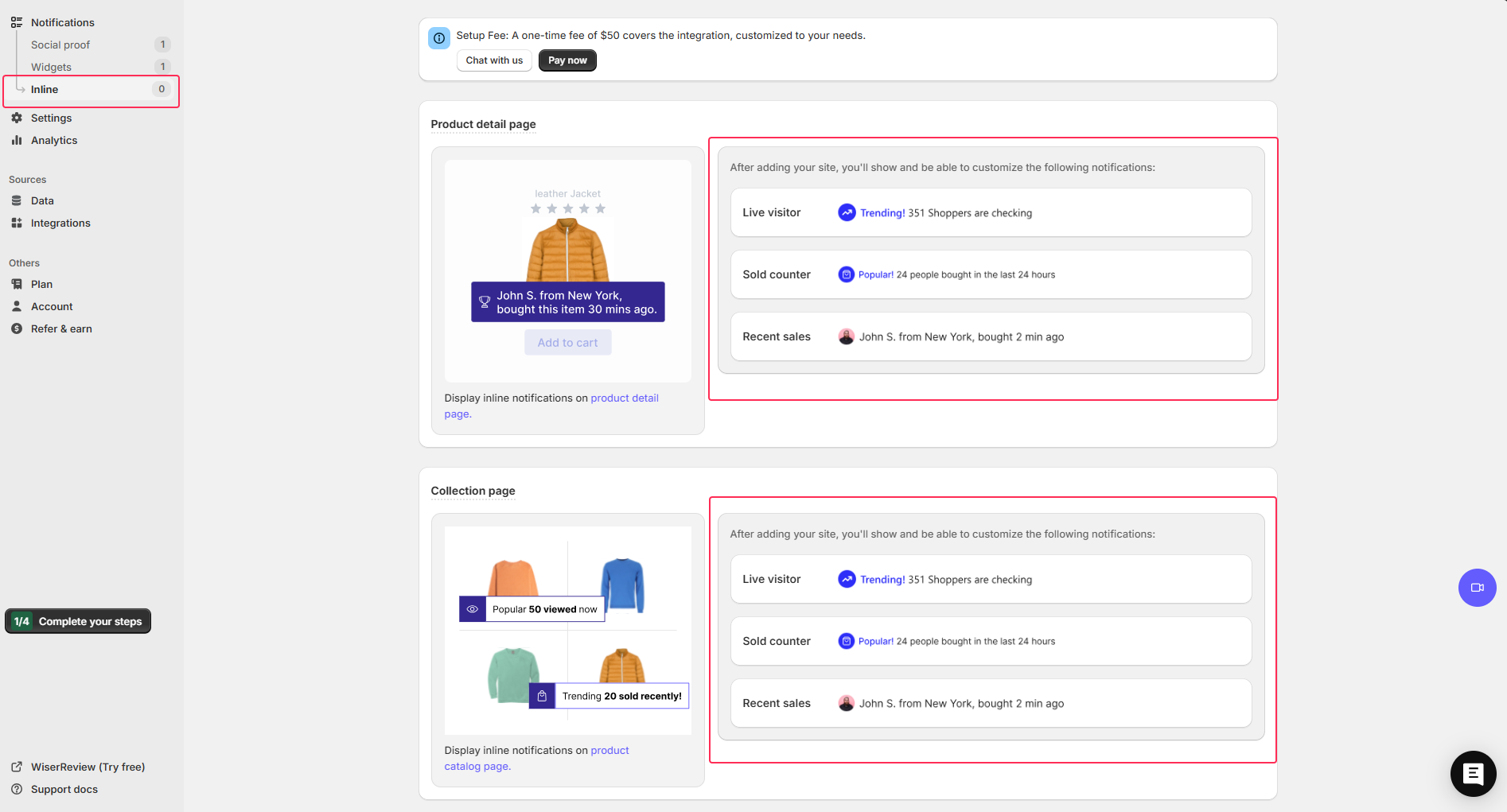
Beyond floating popups, WiserNotify offers inline social proof widgets that embed directly inside your page layout rather than appearing as overlays.
These are particularly effective on cart pages where you want the social proof to feel like a natural part of the design rather than a notification interrupting the experience.
Inline widgets can be placed anywhere in the page layout and include:
- Purchase counters: “2,847 orders this month” embedded next to the product name
- Star rating displays pulled from your review platform, shown inside the cart item row
- Stock level indicators: “Only 5 left” displayed as an inline alert
- Social proof bars showing total customers served or orders completed
- Subscriber or member count widgets for brands with loyalty programs
A/B Testing and Analytics
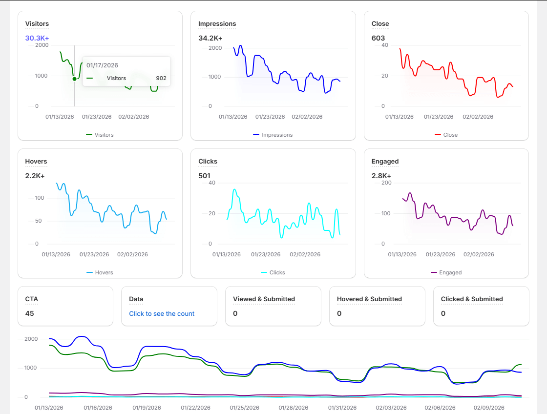
Every feature described above can be A/B tested directly within WiserNotify’s dashboard.
You can compare notification copy, display timing, placement, and trigger conditions to find the combination that produces the highest cart completion rate for your specific audience.
The analytics dashboard tracks performance at the notification level, not just the page level. You can see exactly which social proof message produced the most clicks, which urgency trigger produced the most checkouts, and which review snippet reduced abandonment most effectively.
That granularity turns social proof from a one-time setup into a continuously improving conversion system.
Key analytics capabilities include:
- Views, clicks, and conversion rate per notification
- A/B test performance comparison with statistical confidence indicators
- Goal tracking tied to specific checkout completion events
- Device breakdown (mobile vs desktop performance by notification type)
- Time-of-day and day-of-week performance analysis
Pricing
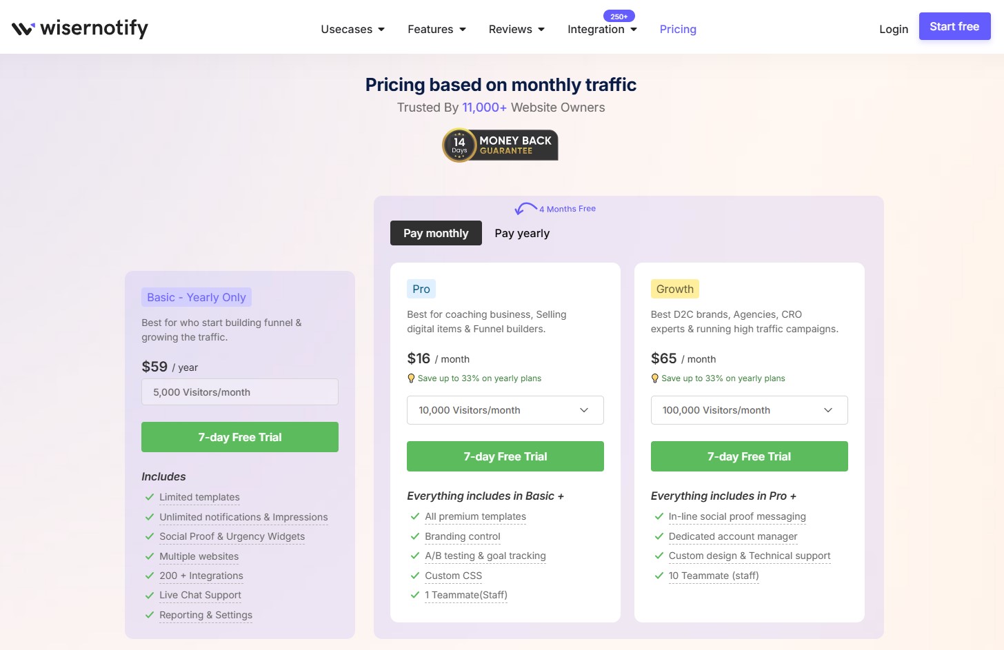
WiserNotify pricing is based on monthly visitor traffic, which means you only pay for the traffic you’re actually getting.
Every plan includes a 7-day free trial with no credit card required – you can set up notifications, see them running on your live store, and measure their impact before spending anything.
All three plans include the 7-day free trial. You can start your free trial here – no credit card required, no commitment.
Also check: How to Reduce Shopping Cart Abandonment
Boost Conversion Instantly
Add Social Proof & Urgency to your website
5 Cart Page Design Mistakes That Kill Conversions
The examples above show what works. These are the patterns that consistently cause cart abandonment – and all of them are fixable.
1. Hiding shipping costs until checkout
This is the single most damaging cart page mistake. Research shows unexpected costs at checkout are responsible for 39% of cart abandonments.
Shoppers who discover a $15 shipping charge at the payment screen feel deceived, even if the charge is standard.
Show shipping costs on the cart page. If you can’t calculate them exactly, show an estimate based on the shopper’s general location or display a clear message about when they’ll be calculated.
2. No guest checkout option
Forcing account creation before purchase loses 19% of shoppers at checkout.
Most shoppers don’t want a relationship with your brand before they’ve had a first purchase.
Offer guest checkout as the primary option and invite account creation on the confirmation page after the sale is done.
3. Poor mobile cart experience
Quantity selectors that are too small to tap accurately, remove buttons that are tiny targets, and checkout buttons that require scrolling to find all cost you mobile conversions.
Design your cart for a thumb on a 375px screen. Test it on an actual phone, not a browser’s mobile simulation. The two experiences are meaningfully different.
4. No ability to edit from the cart
Shoppers who need to change a size, update a quantity, or remove an item should be able to do it from the cart page without navigating back to the product page.
Every navigation away from the cart is a risk. Keep quantity adjustments, variant changes, and item removal all accessible from the cart view.
5. Weak or buried checkout CTA
The checkout button should be the most visually prominent element on the cart page.
It should appear at the top and bottom of longer carts, and ideally be sticky so it’s always visible as the shopper reviews their items.
If a shopper has to search for the checkout button, something has gone wrong with the layout.
Conclusion
The cart page is the highest-intent moment in your entire ecommerce funnel. The shopper chose your product, found the size or variant they wanted, and clicked add to cart.
Everything that happens on the cart page either confirms that decision or creates doubt about it.
The 33 examples above cover a range of approaches from minimal to information-rich, from playful to serious, from single-product to complex multi-item orders.
What they have in common is deliberateness. Every design decision serves either the shopper’s confidence or the path to checkout.
Pick two or three patterns from this list that fit your product type and audience. Test them against what you have.
The cart page rewards iteration – small changes in trust signal placement, shipping information, and CTA visibility consistently produce measurable conversion improvements.
Krunal Vaghasiya is a marketing tech expert who boosts e-commerce conversion rates with automated social proof and FOMO strategies. He loves to keep posting insightful posts on online marketing software, marketing automations, and improving conversion rates.