
Most ecommerce stores neglect the order review page.
They spend weeks on the homepage and product pages, then slap a generic template on the last checkout step.
That’s expensive. Baymard Institute found that poor review page design causes up to 10% mobile checkout abandonment.
Customers leave thinking their order was already placed.
I analyzed 11 order review pages from brands that get this step right. Here’s what they do and what you can steal.
Boost Conversion Instantly
Add Social Proof & Urgency to your website
What Is an Order Review Page?
An order review page is the final checkout step where customers verify their items, shipping address, payment method, and total cost before placing the order.
It’s also a legal requirement. The FTC requires online sellers to disclose the full cost of a purchase before charging the customer.
This page is how most ecommerce sites comply.
One important distinction: don’t confuse it with the order confirmation page.
The review page comes before the purchase.
The confirmation page comes after. I’ve seen stores where customers couldn’t tell the difference, and it cost them real sales.
11 Order Review Page Examples (With Breakdowns)
I spent over 8 hours analyzing these examples. Each one does something specific to reduce friction, build trust, or drive conversion at the final checkout step.
1. Gap
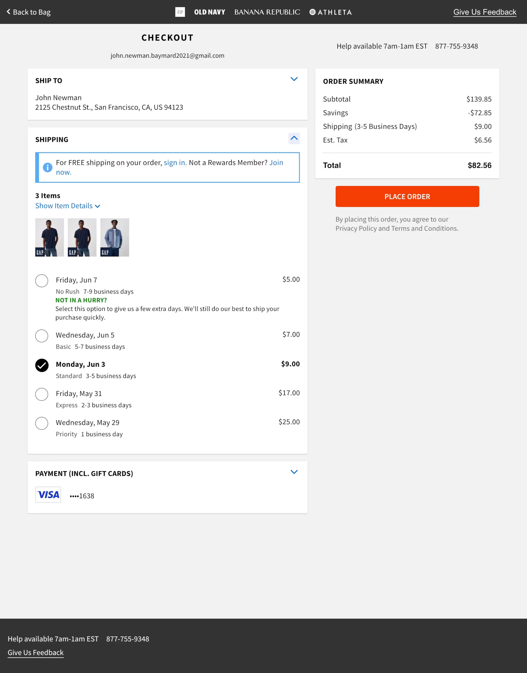
What they nail: Gap keeps the layout dead simple. Items, shipping address, and total cost are all visible without scrolling. The free shipping prompt for rewards members is smart because it gives customers a reason to join the loyalty program at the exact moment they’re most engaged with the brand.
Steal this: If you have a loyalty or rewards program, promote it on the review page with a tangible benefit (“Join now for free shipping on this order”). The conversion rate for loyalty sign-ups is highest at checkout.
2. Everlane
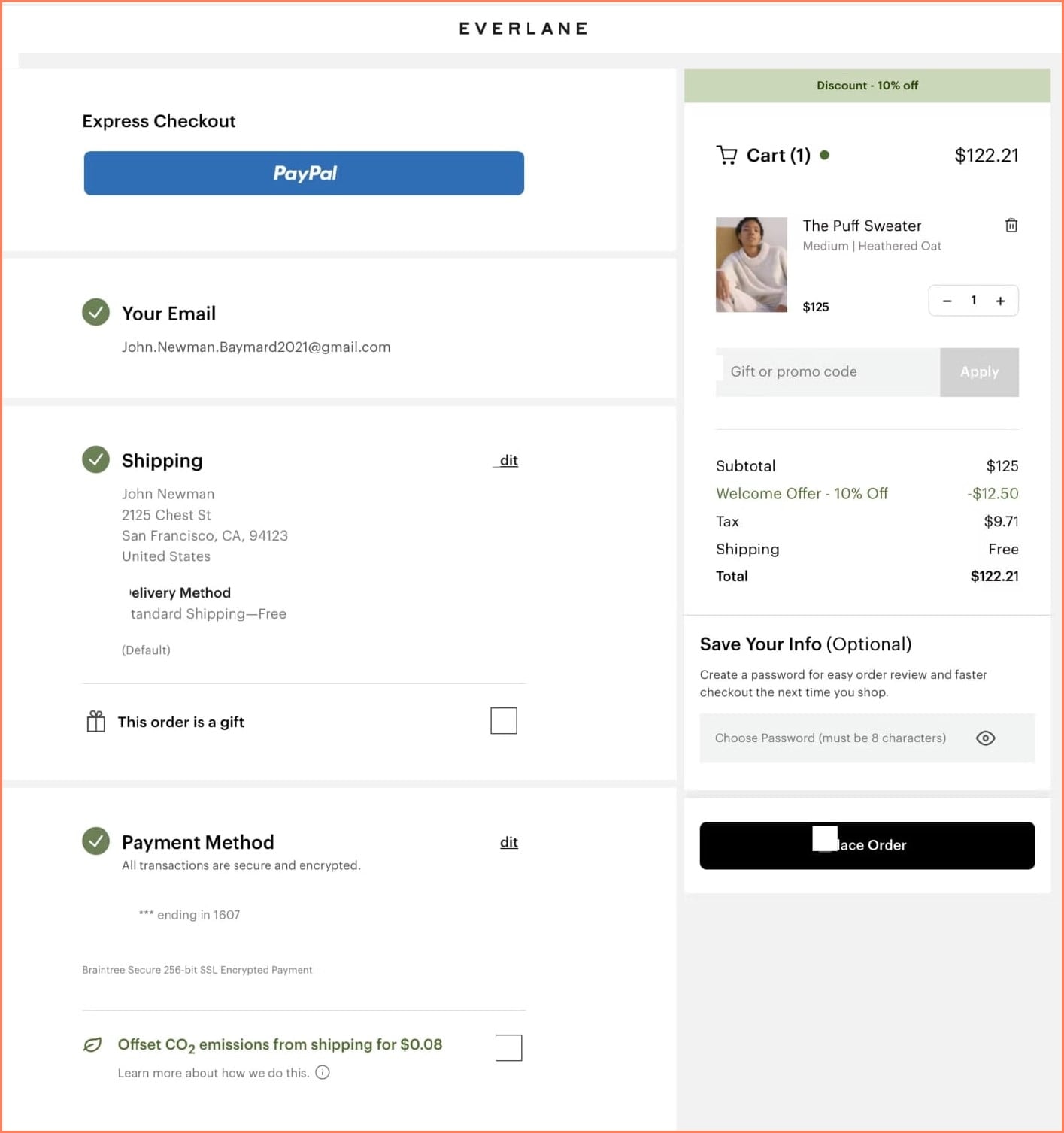
What they nail: Clean, modern design with a sustainability angle. The “offset shipping emissions” option isn’t just good for the planet. It aligns with Everlane’s brand values and makes customers feel good about their purchase. They also save customer info for faster checkout next time.
Steal this: Add one value-aligned option to your review page (carbon offset, charity donation, or sustainable packaging). It reinforces brand identity at the most critical conversion moment and can actually increase completion rates because customers feel better about the purchase.
Build urgency
Add floating offers with countdown timer & coupon code.


3. Zalando
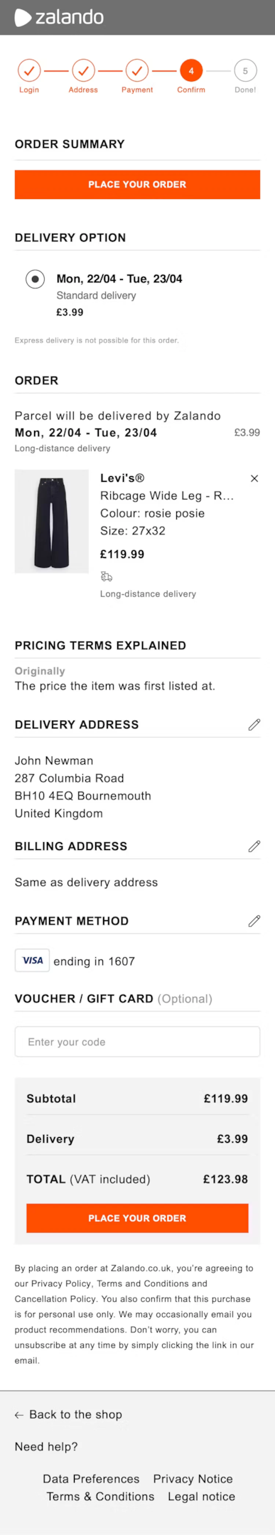
What they nail: Zalando includes a “Pricing Terms Explained” section directly on the review page. This is brilliant for transparency. When customers understand exactly how the total was calculated, they’re less likely to abandon. Clear delivery dates are shown for each item, and the voucher input field is easy to find.
Steal this: Add a small “How is my total calculated?” expandable section. It doesn’t need to be long. A quick breakdown of subtotal, shipping, taxes, and discounts in plain language reduces sticker shock and builds trust.
4. Living Spaces
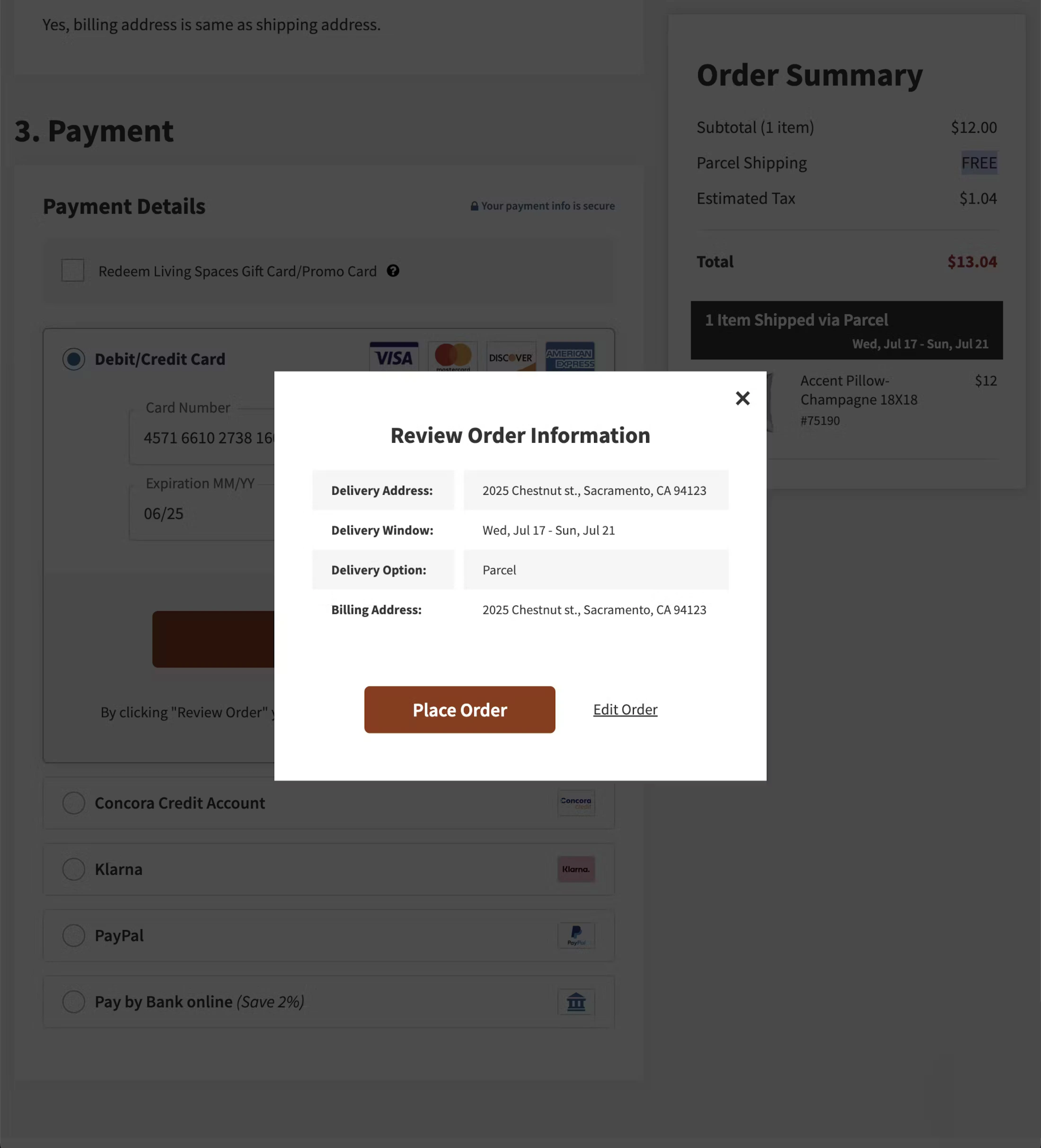
What they nail: Living Spaces uses a pop-up modal for the order review instead of a separate page. This keeps customers in the flow and reduces the feeling of “how many more steps?” They also clearly show multiple payment options, including financing for larger purchases.
Steal this: For high-ticket items, displaying financing options (buy now, pay later) on the review page can recover customers who hesitate at the total. If your AOV is over $200, consider adding a BNPL option directly on the review step.
5. Northern Tool
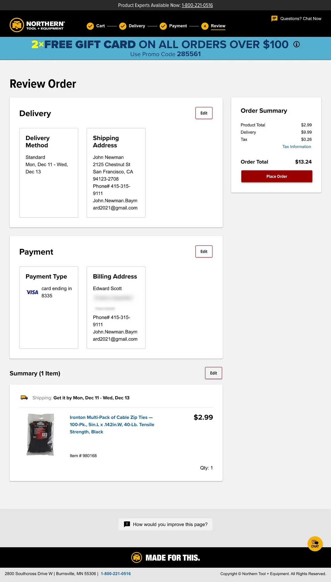
What they nail: Clear sections for delivery, payment, and order summary with easy “Edit” links next to each section. Baymard Institute found that 68% of ecommerce sites send users back in the checkout flow when they try to edit information at the review step, leading to significant abandonment. Northern Tool avoids this by letting customers edit inline.
Steal this: Never send customers back to a previous step to make edits. Use inline editing or expandable sections so they can fix a shipping address or payment method without losing their place. This single change can reduce review-step abandonment by double digits.
Also check: 11 Killer Product Landing Page Examples
6. Apple
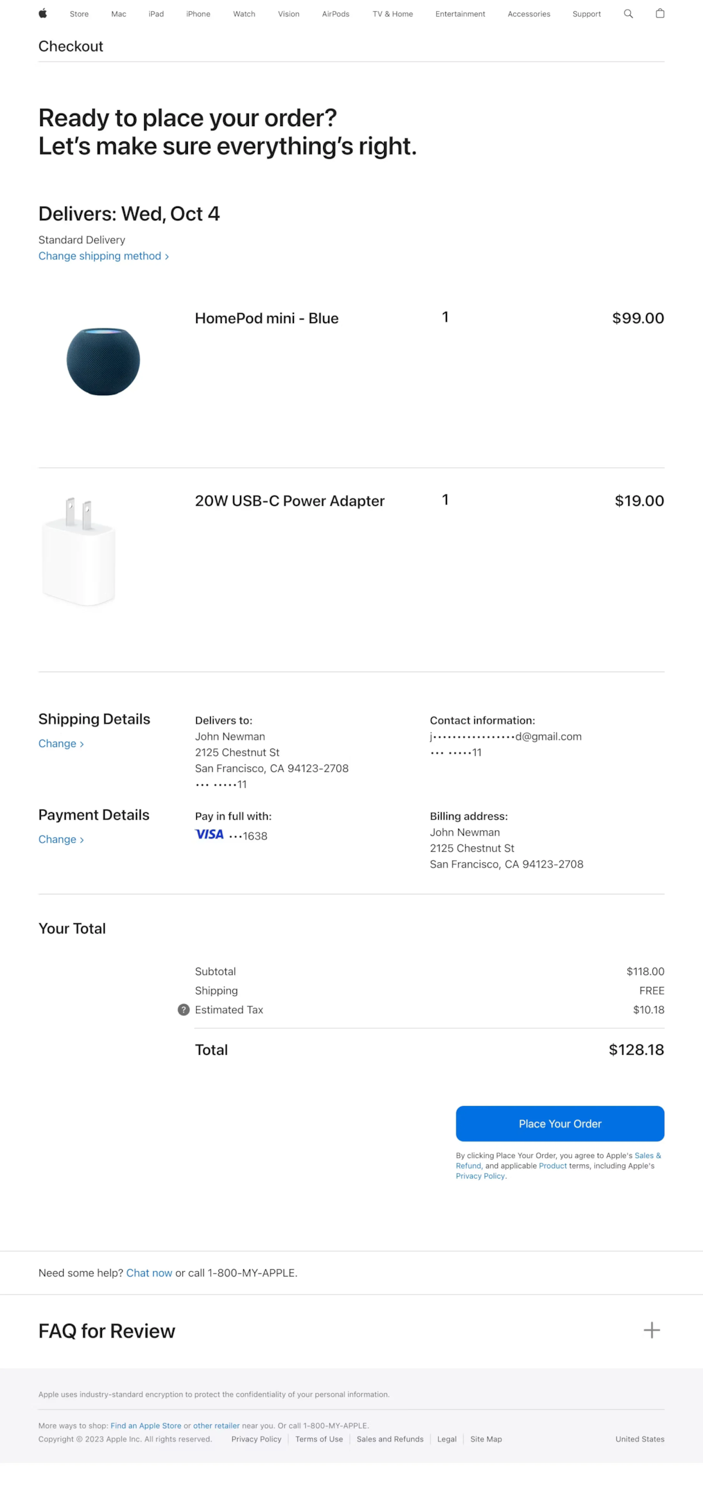
What they nail: Minimalist design with zero clutter. Apple shows only what matters: your item, your address, your payment, and your total. The FAQ section at the bottom answers common pre-purchase questions without cluttering the main review area. The “Place Order” button is impossible to miss.
Steal this: Reduce your review page to only the essential information. Every element that isn’t helping the customer confirm their order is a potential distraction. If you need to include policies or FAQs, put them below the fold or in an expandable section.
Build trust & FOMO
Highlight real-time activities like reviews, sales & sign-ups.

7. B&H Photo
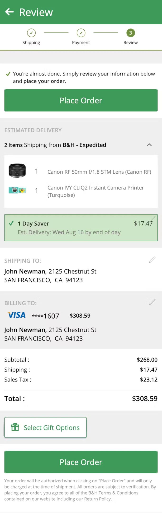
What they nail: B&H clearly shows delivery dates, product images, and individual item prices. For a store that sells high-ticket electronics, showing the exact product image on the review page is crucial. Customers need visual confirmation that they’re ordering the right model, color, and configuration.
Steal this: Always include product images on the review page. It sounds obvious, but many stores only show item names and prices. A customer buying a $2,000 laptop needs to see the product one more time before making a commitment. Visual confirmation reduces post-purchase buyer’s remorse and return rates.
8. Progressive
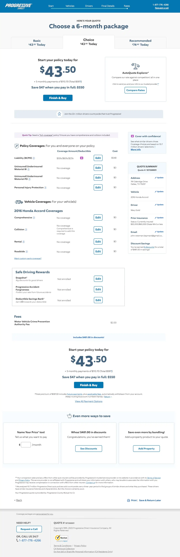
What they nail: Progressive’s review page handles a complex product (insurance) by letting customers customize their coverage and see costs update in real time. For products with configurable options, showing the cost impact of each choice on the review page eliminates surprises.
Steal this: If your products have configurable options (size, color, warranty, add-ons), show how each selection affects the final price. Real-time price updates on the review page build confidence because customers can see exactly what they’re paying for.
Also check: 33 Brilliant Shopping Cart Page Design Examples
Boost Conversion Instantly
Add Social Proof & Urgency to your website
9. Bound Tree Medical
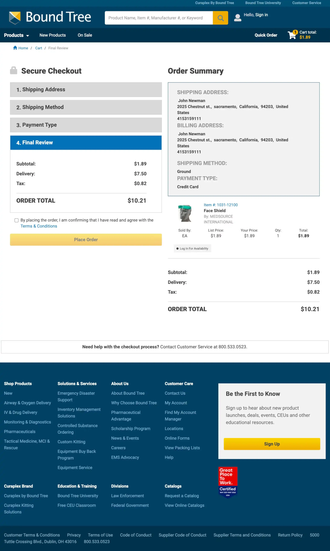
What they nail: A clear step-by-step progress indicator at the top. Customers can see exactly where they are in the checkout flow: shipping, payment, review, done. This reduces anxiety about “how much longer is this going to take?” and keeps them moving forward.
Steal this: Add a progress bar or step indicator to your checkout flow. It’s one of the simplest UX improvements you can make. Customers who can see the finish line are less likely to abandon the process midstream.
10. Zooplus
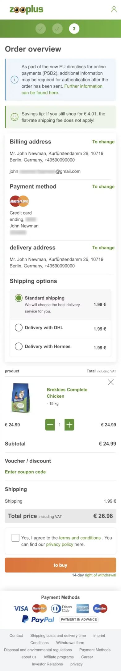
What they nail: Zooplus includes a “Savings tip” on the review page that shows customers how they can save on shipping by adjusting their order. This is clever because it doesn’t push upsells. It helps the customer save money, which builds goodwill at the critical conversion moment.
Steal this: Add a contextual savings tip. “Add $12 more for free shipping” or “Subscribe and save 15% on this order” works because it feels helpful, not pushy. Place it near the order total where the customer is already looking at the price.
Also check: 13 Stunning Ecommerce Landing Pages Examples
11. Smyths
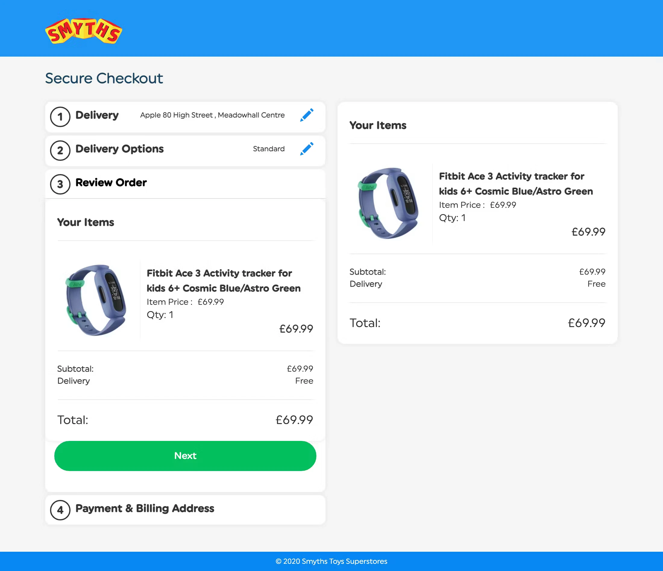
What they nail: Smyths keeps it clean with a step-by-step checkout process and a review page that shows items, delivery info, and total cost without any distractions. For a toy retailer (where purchases are often gifts), prominently displaying the delivery date reduces anxiety about whether the order will arrive on time.
Steal this: If your store sells products that are frequently purchased as gifts (toys, jewelry, flowers, electronics), make the estimated delivery date the most prominent element on the review page. Gift buyers care more about timing than almost anything else.
Essential Elements Every Order Review Page Needs
After analyzing these 11 examples and working with hundreds of ecommerce stores, here are the elements that separate great review pages from mediocre ones.
Complete order summary with product images. Item name, quantity, price, and a thumbnail image for every product. Customers need visual confirmation that they’re ordering the right thing. Don’t make them rely on text alone.
Editable shipping and billing details. Inline editing is ideal. If a customer spots a typo in their address, they should be able to fix it right there, not navigate back three steps. Baymard’s research found that sending users backward is one of the top causes of review-step abandonment. It doesn’t have to be complicated. A simple “Edit” link that expands the field works.
Transparent cost breakdown. Subtotal, shipping charges, taxes, discounts, and final total. All visible and clearly labeled. No hidden fees, no surprises. This isn’t just good UX. In the US, it’s legally required by the FTC.
Estimated delivery date. Customers want to know when their order will arrive. Show a specific date (“Arrives March 25”) instead of a vague range (“3-7 business days”) whenever possible. They’ll appreciate the specificity.
Clear, prominent CTA button. “Place Order” or “Complete Purchase” in a contrasting color that stands out from everything else on the page. Don’t bury it below the fold. It shouldn’t require scrolling to find.
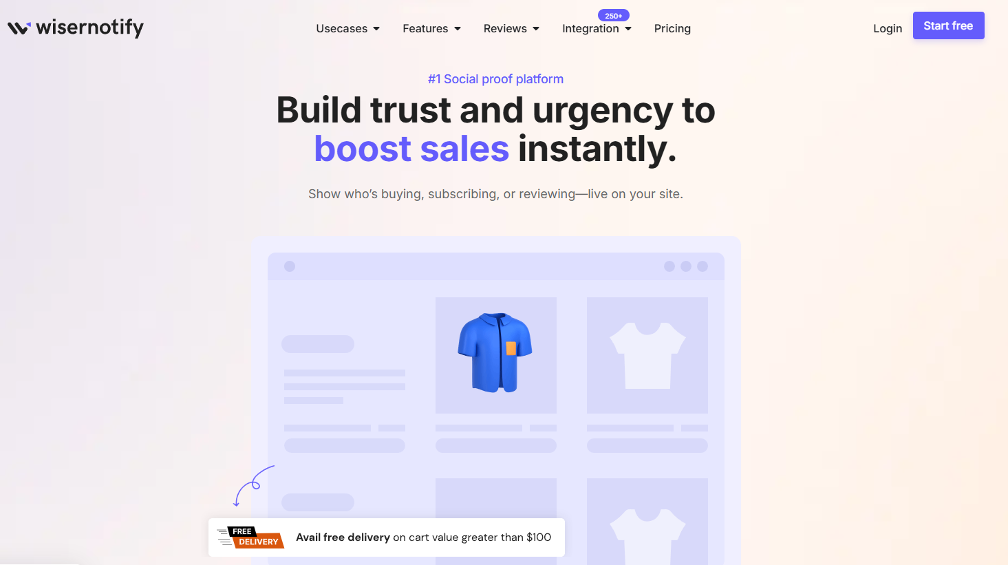
Trust signals. Secure payment badges, satisfaction guarantees, and easy return policies. The review page is the moment when buyer’s anxiety peaks. Social proof signals like “1,247 orders placed today” or a real-time purchase notification can tip hesitant buyers over the edge. WiserNotify automatically adds these trust signals, including on checkout and review pages.
Progress indicator. A simple bar or step counter (Step 3 of 4) that shows customers where they are in the checkout process. It reduces “how much longer?” anxiety.
Order Review Page Mistakes That Kill Conversions
I’ve seen these mistakes cost stores thousands of dollars in lost sales. They’re all avoidable.
Making the review page look like a confirmation page. This is the biggest one. Baymard Institute found that on mobile, some review page designs look so similar to confirmation pages that customers leave thinking their order was already placed. That causes up to 10% mobile checkout abandonment. Your review page should clearly say “Review Your Order” (not “Your Order”) and have a prominent “Place Order” button. The confirmation page should display “Order Confirmed” and the order number.
Hiding total costs until the last second. Slipping in extra fees, shipping charges, or taxes that weren’t visible earlier in the checkout process is the fastest way to lose a sale. Research shows unexpected costs are the #1 reason for cart abandonment. Show the full price breakdown clearly.
Forcing account creation before placing the order. Some stores still require customers to create an account before they can complete checkout. That’s adding friction at the worst possible moment. Offer guest checkout and let customers create an account after the purchase if they want to. Don’t gate the sale behind a registration form.
No mobile optimization. Over 70% of ecommerce traffic is mobile. If your review page has tiny text, buttons too close together, or information that requires horizontal scrolling, you’re losing mobile conversions. It’s not enough to be “responsive.” You need to actually test the experience on a real phone.
Sending users backward to make edits. If a customer needs to change their shipping address, don’t send them back to step 1 of checkout. 68% of ecommerce sites make this mistake (according to Baymard). Use inline editing so customers can fix details without losing their place. It’s one of the simplest fixes with the biggest impact.
Too many distractions. The review page isn’t the place for promotional banners, newsletter sign-ups, or social media links. Every element that doesn’t help the customer confirm and complete their order is a potential exit point.
How Social Proof Reduces Review Page Abandonment
The order review page is where the buyer’s anxiety is at its peak. Customers are staring at the total, second-guessing whether they really need this, and looking for reasons to close the tab.
It’s the worst moment for doubt to creep in.
Social proof signals work because they counter that anxiety with evidence that other people are buying the same thing.
A notification like “37 people purchased this today” or “Maria from Denver just ordered the same item” provides validation at exactly the right moment. It’s not manipulation. It’s reassurance.
I’ve seen stores add real-time purchase notifications to their checkout pages and see a measurable reduction in review-step abandonment.
It’s not a huge change to implement, but the psychological impact is significant.
WiserNotify can automatically display these notifications across your entire site, including checkout and order review pages.
Recent purchases, live visitor counts, and review popups that match your brand and build trust at the moment it matters most.
Boost Conversion Instantly
Add Social Proof & Urgency to your website
Getting Started
Your order review page doesn’t need to be complicated.
Start with the basics: accurate order details, clear cost breakdown, product images, and an easy “Place Order” button.
Then add one trust element (a satisfaction guarantee, a delivery date, or a real-time social proof notification) and test the impact on your completion rates.
The stores I’ve seen get the most from their review pages treat them with the same care they give their landing pages.
Because everyone who reaches this page is already a qualified buyer. They’ve browsed, compared, and decided. Your only job is to make sure nothing stops them from clicking that final button.
