I Studied 17 Order Confirmation Pages (Here’s What Works)
 Krunal Vaghasiya|Dec 9, 2024
Most ecommerce stores treat the order confirmation page as an afterthought. A generic “thank you” message, an order number, and that’s it.
That’s a massive missed opportunity.
I’ve worked with thousands of online stores through WiserNotify, and here’s what I’ve noticed: the order confirmation page is the moment your customer is most engaged with your brand.
- They just gave you money.
- They’re excited.
- They’re paying attention.
Smart stores use this moment to reduce support tickets, encourage repeat purchases, collect reviews, grow their email list, and build loyalty.
The ones that don’t? They leave revenue on the table every single day.
I’ve collected 17 examples of order confirmation pages from real brands that get this right.
For each one, I’m showing you what they do and why it works.
Boost Conversion Instantly
Add Social Proof & Urgency to your website
What Is an Order Confirmation Page?
An order confirmation page (also called a thank you page) is the page customers see immediately after completing a purchase.
It confirms that the order went through and shows key details such as the order number, items purchased, shipping address, and estimated delivery date.
But that’s just the baseline. The best order confirmation pages go further.
They reduce buyer’s remorse, set expectations for what happens next, and create opportunities to keep the customer engaged.
Think of it this way: your homepage gets visitors, your product pages get them interested, and your checkout converts them. But the confirmation page starts the relationship.
It’s the first touchpoint of the post-purchase experience, and it sets the tone for everything that follows (shipping updates, review requests, repeat purchases).
17 Order Confirmation Page Examples (With Breakdowns)
I spent over 10 hours collecting and analyzing these examples. Each one does something specific that you can learn from and apply to your own store.
1. Wayfair
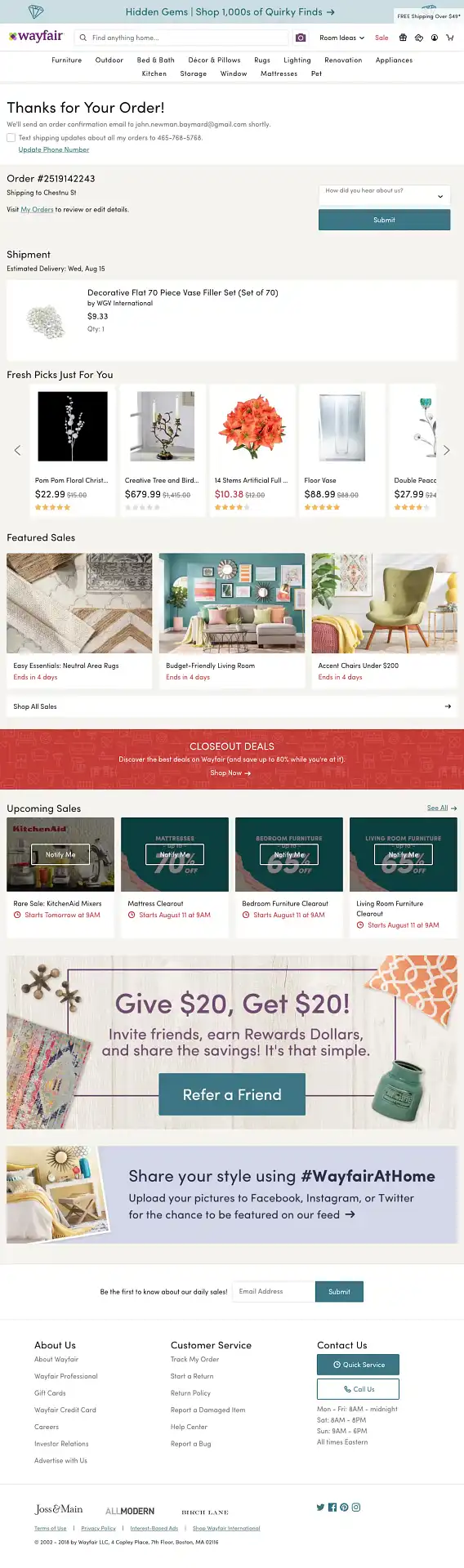
What they do right: Wayfair’s confirmation page is clean with complete order details, but the smart move is the personalized product recommendations and referral program CTA right on the page. The customer just bought a couch. Now they’re seeing matching throw pillows and a coffee table. That’s cross-selling done right.
Steal this: Add personalized product recommendations based on the customer’s most recent purchase. According to Amazon’s data, 35% of their revenue comes from cross-selling on pages like this.
2. Harry’s
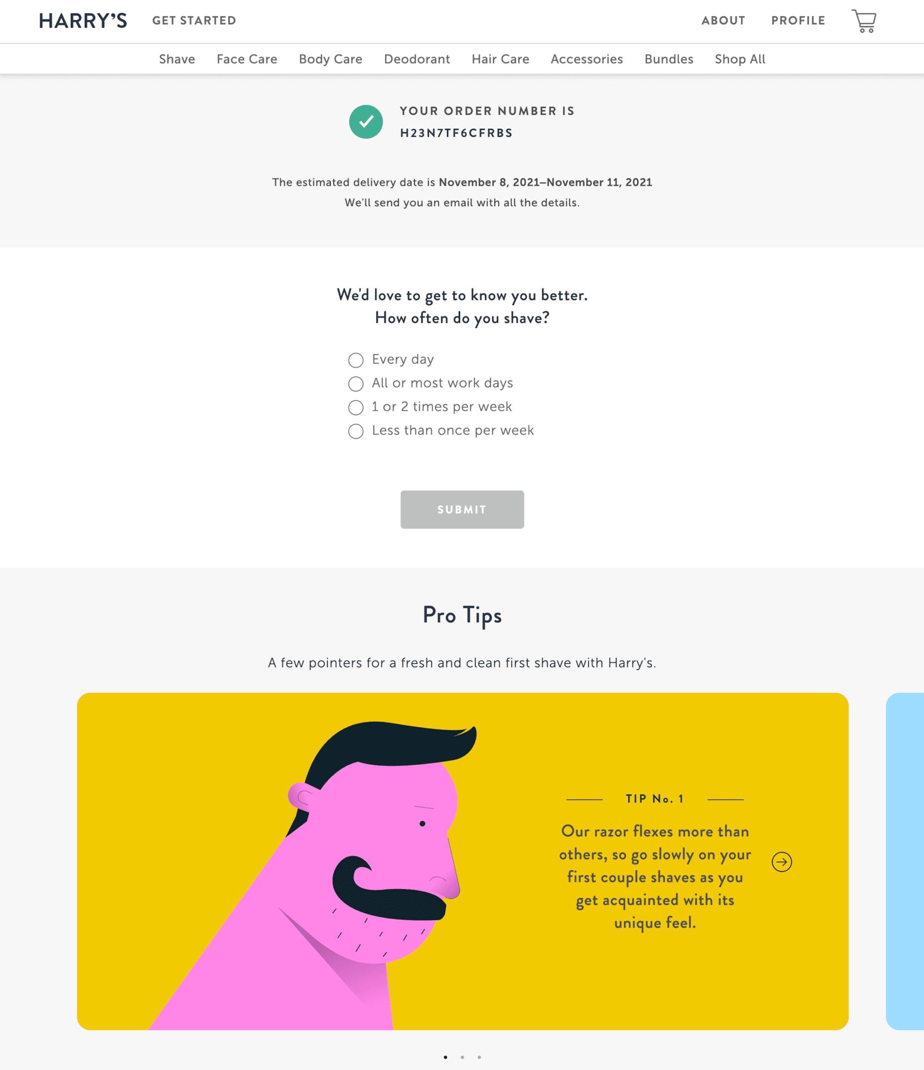
What they do right: Harry’s keeps the design minimal, but adds a quick customer feedback survey directly on the confirmation page. This is brilliant timing because the purchase experience is fresh in the customer’s mind, and they haven’t even received the product yet, so the feedback is about the buying experience, not the product.
Steal this: Add a 1-2 question survey to your confirmation page. “How was your checkout experience?” captures feedback you’d never get if you waited to ask by email.
Build urgency
Add floating offers with countdown timer & coupon code.


3. ASOS
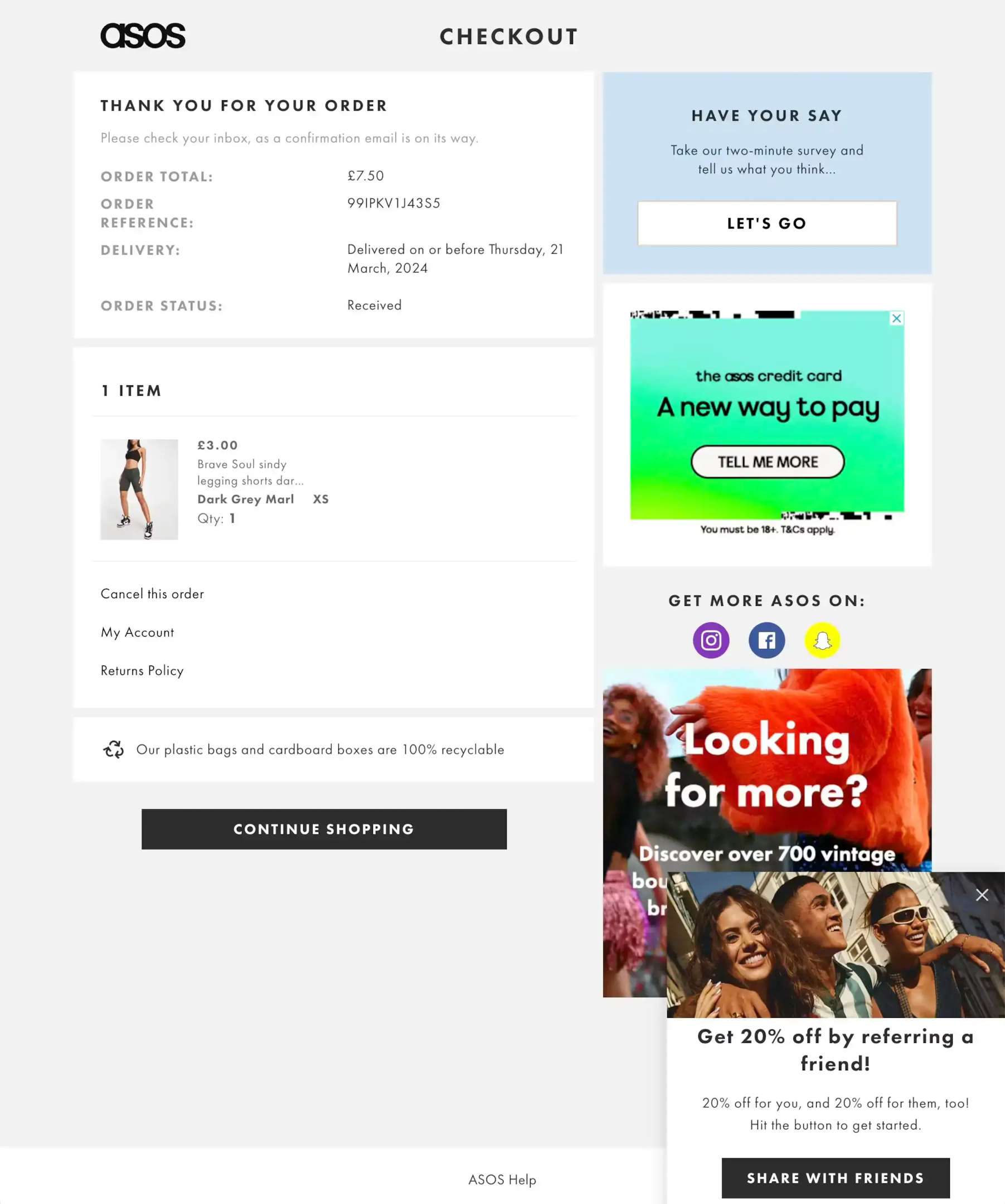
What they do right: ASOS pairs a clean confirmation with a pop-up that promotes its referral program. “Give your friends 20% off and get $20 for yourself.” The timing is perfect because the customer is happy about their purchase and more likely to share.
Steal this: Referral programs convert best when triggered at the peak of customer satisfaction, which is right after a purchase. Place your referral CTA on the confirmation page, not buried in a settings menu.
4. Away
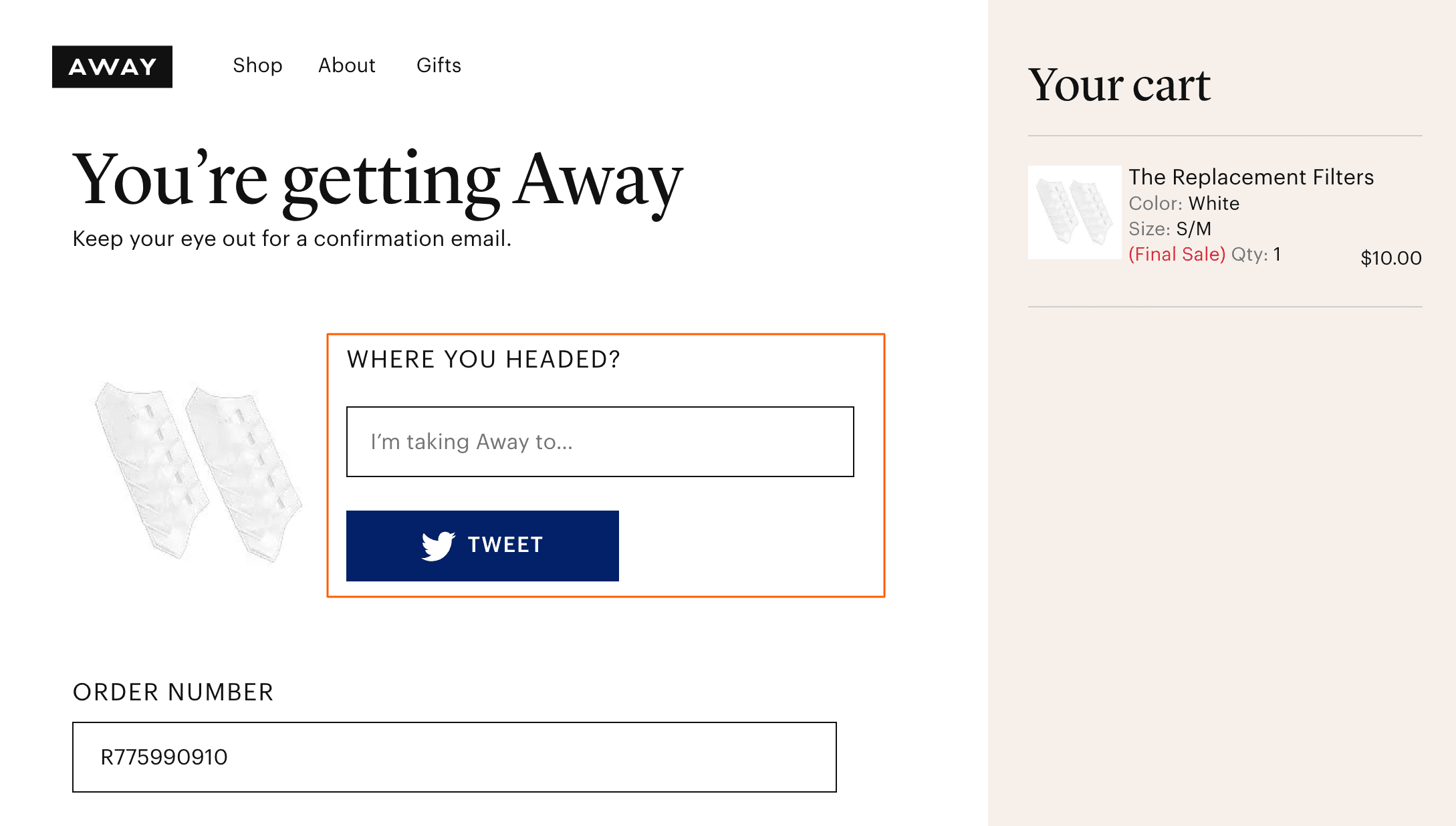
What they do right: Away builds excitement with their “You’re getting Away!” headline. Then they encourage customers to tweet about their upcoming trip. For a luggage brand, this is genius because travel purchases are naturally shareable.
Steal this: If your product is aspirational (travel, fashion, fitness, home improvement), add social sharing buttons to the confirmation page. People love announcing exciting purchases.
5. H&M
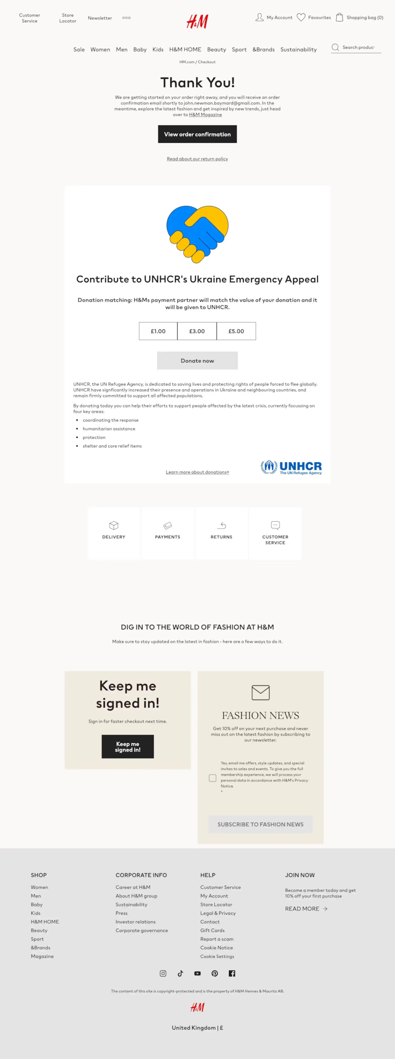
What they do right: H&M uses the confirmation page to promote its charity partnerships. “Your purchase helps support [cause].” This resonates with socially conscious shoppers and reinforces the brand values that attract H&M’s target audience.
Steal this: If your brand supports a cause, the confirmation page is the perfect place to mention it. The customer just supported your business. Showing them their purchase also supports something bigger creates a feel-good moment.
Build trust & FOMO
Highlight real-time activities like reviews, sales & sign-ups.

6. Uber Eats
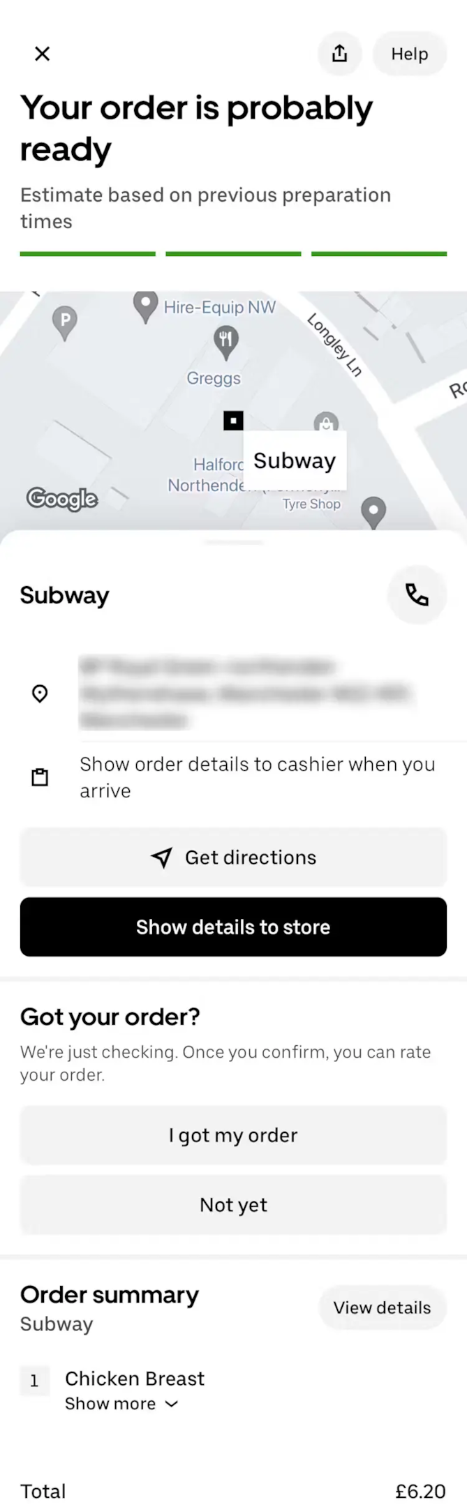
What they do right: Uber Eats focuses on the immediately useful: pick-up instructions, real-time order status, and directions to the store. For a food delivery app, this is exactly what the customer needs in this moment. No fluff, no upselling. Just the information that reduces anxiety.
Steal this: For service-based or delivery-based businesses, prioritize “what happens next” information above everything else. The customer’s primary concern right after ordering food is “when do I get it?” Answer that first.
Also check: I Studied 11 Order Review Pages (Here’s What Converts)
7. Marks & Spencer
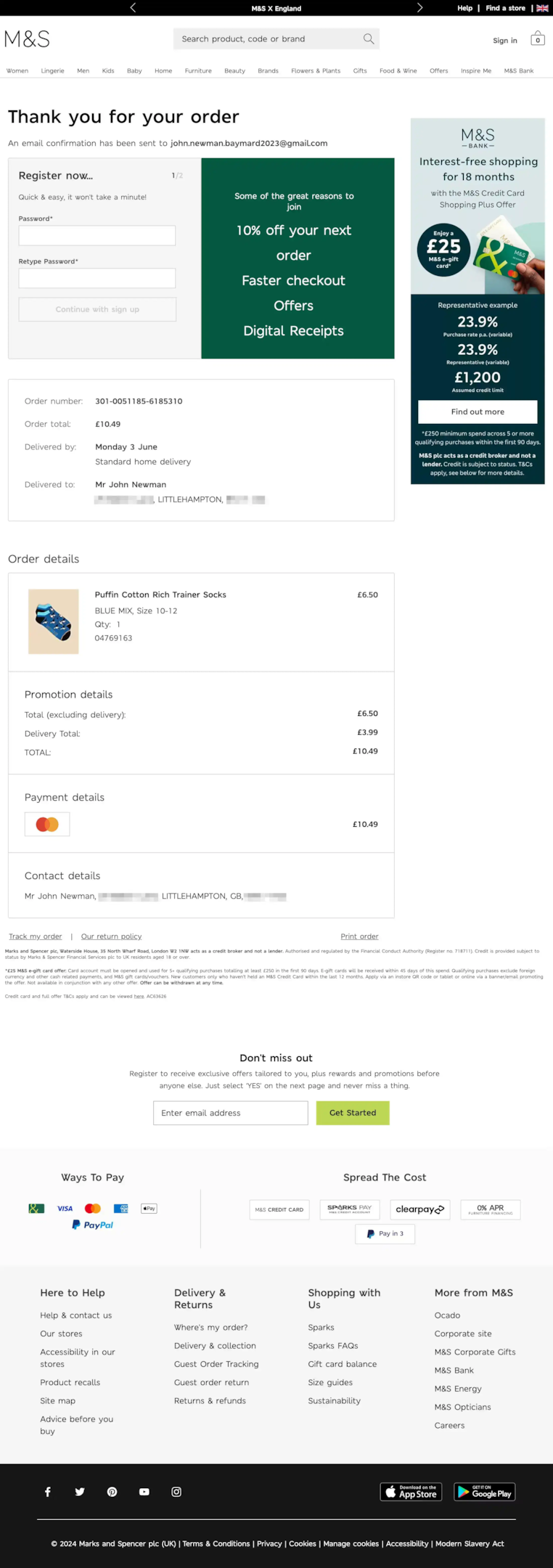
What they do right: M&S uses the confirmation page to promote account creation. “Create an account for faster checkout and exclusive offers.” This is smarter than asking for account creation during checkout (which adds friction). After the purchase is complete, the customer has no reason to rush. They’re more open to it.
Steal this: If you allow guest checkout, use the confirmation page to encourage account creation. Offer a clear incentive (faster future checkout, order tracking, exclusive offers) and pre-fill the form with the details they already entered.
Build trust & FOMO
Highlight real-time activities like reviews, sales & sign-ups.

8. Dollar Shave Club
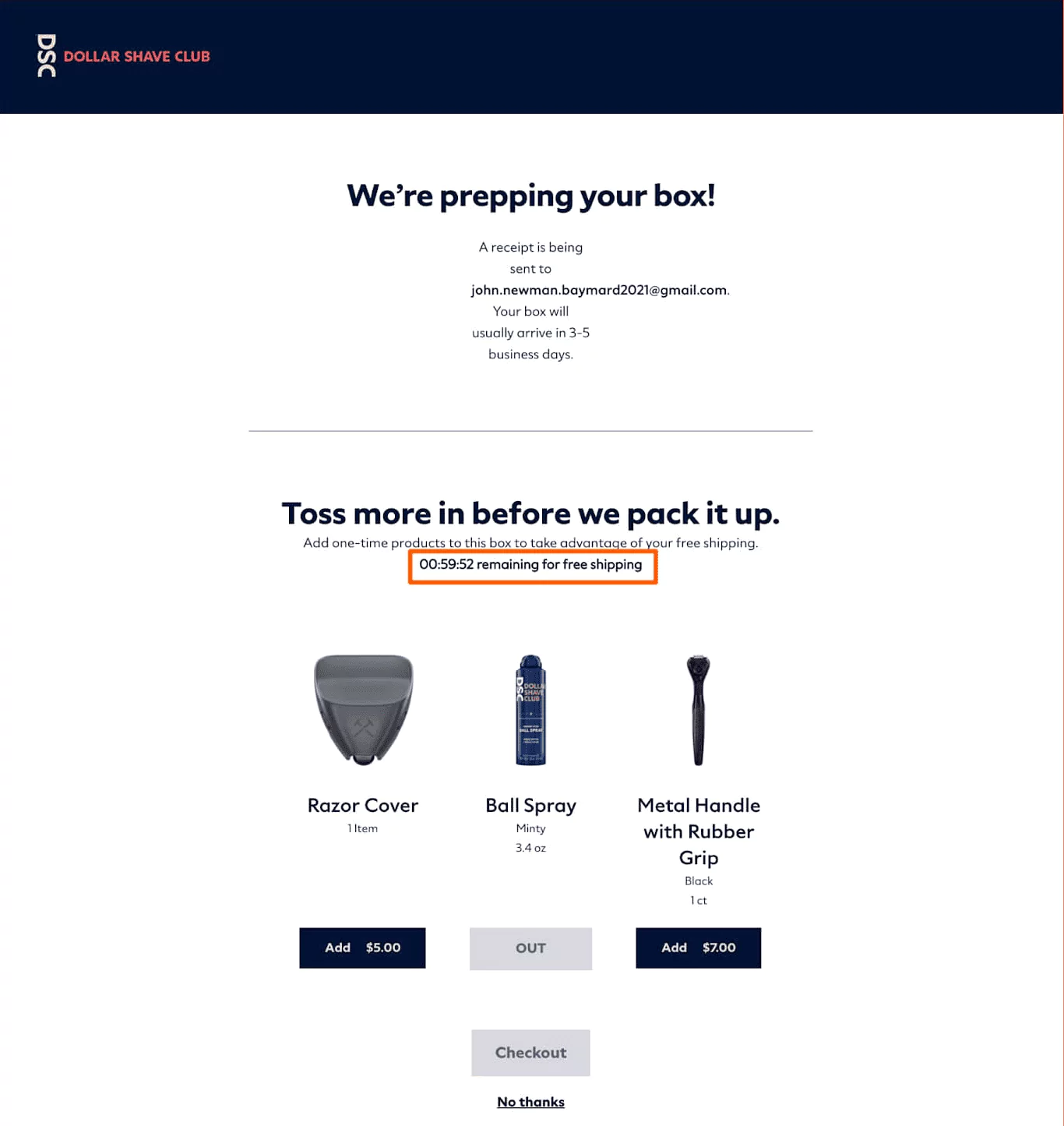
What they do right: Dollar Shave Club uses the confirmation page for a last-minute upsell. “Add these to your order and get free shipping.” The urgency is real (the order is about to ship), and the incentive (free shipping) makes it feel like a deal rather than a pushy upsell.
Steal this: Post-purchase upsells on the confirmation page can increase average order value by 10-15%. The key is to make the add-on genuinely complementary and to offer an incentive (free shipping, a small discount) to reduce friction.
9. Zalando
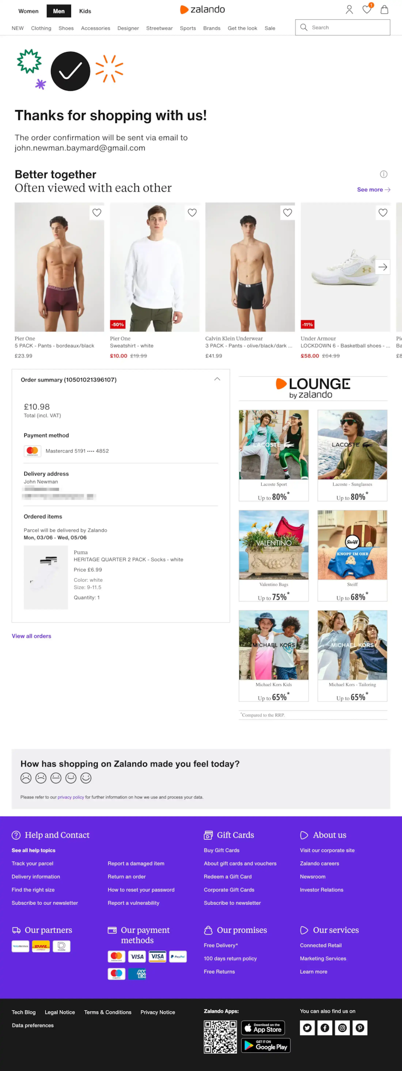
What they do right: Zalando has a “Better Together” section that shows related items and includes a simple emotional-response survey (happy face, neutral face, sad face). It takes one tap and gives Zalando instant feedback on the purchase experience.
Steal this: One-tap sentiment surveys (emoji-based) have much higher completion rates than traditional surveys. Three options: happy, neutral, sad. That’s all you need to gauge post-purchase satisfaction.
10. Chewy
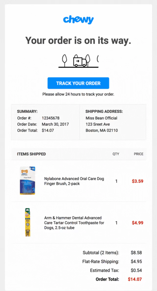
What they do right: Chewy’s confirmation page has a prominent “Track Your Order” button. For pet supplies (which customers often need on a schedule), knowing exactly when the order arrives reduces anxiety and builds trust.
Steal this: Make order tracking the most visible CTA on your confirmation page. A Loqate study found that 41% of deliveries are delayed due to address errors. A prominent tracking button helps catch issues early.
11. Best Western
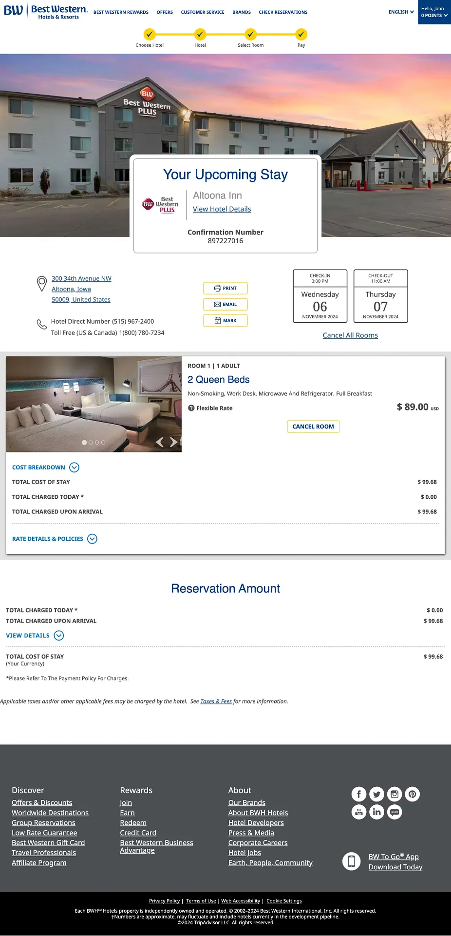
What they do right: Best Western’s hotel confirmation shows reservation details, dates, room specifics, and a cost breakdown. Then it promotes their rewards program. For a hotel chain, getting a customer into the loyalty program from their first booking is the most valuable long-term action.
Steal this: If you have a loyalty or rewards program, the confirmation page is the highest-converting place to promote sign-ups. The customer just committed to your brand. Strike while the iron is hot.
12. World of Hyatt
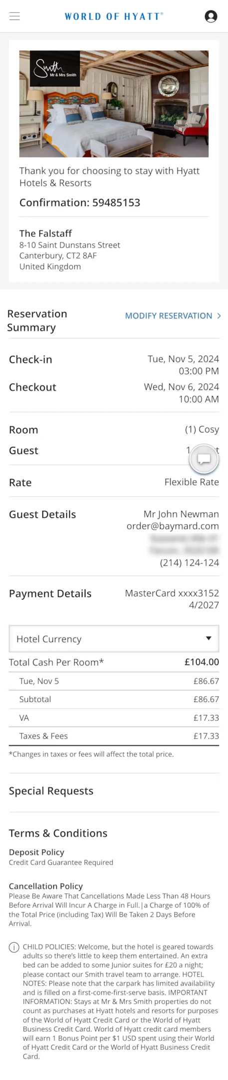
What they do right: Hyatt highlights important policies and special requests alongside the reservation summary. Check-in times, cancellation policies, and guest preferences are all visible. This reduces pre-trip anxiety and support calls.
Steal this: Include relevant policies on your confirmation page (return policy, warranty info, care instructions). This reduces “Did I make the right choice?” anxiety and preempts the most common support questions.
13. Dropbox
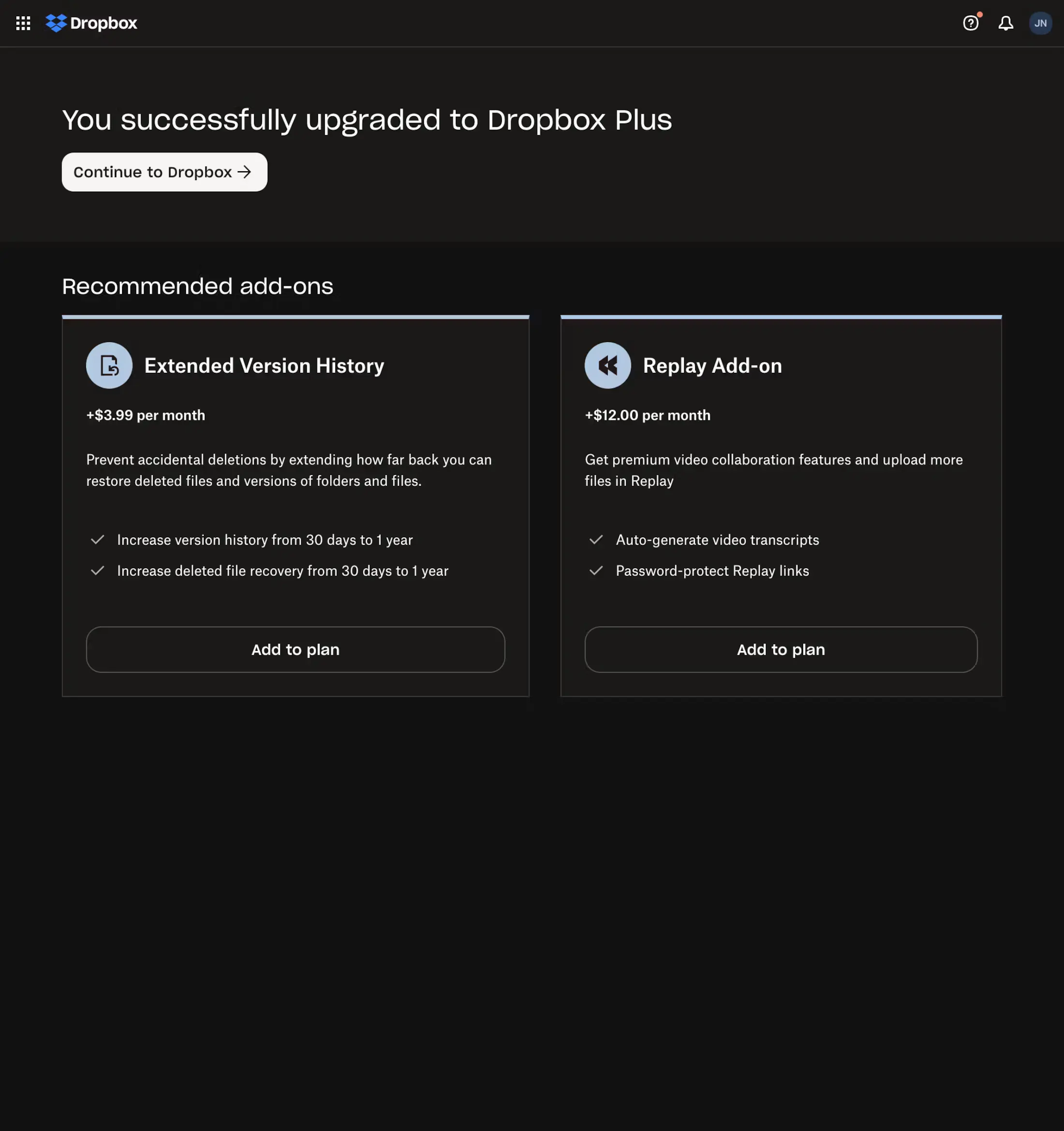
What they do right: After upgrading to Dropbox Plus, the confirmation page immediately promotes relevant add-ons with clear pricing and feature comparisons. For a SaaS product, this is the perfect post-upgrade upsell moment.
Steal this: For SaaS and subscription products, the confirmation page should show what the customer just got AND what they could get next. Make the upgrade path visible but not aggressive.
Boost Conversion Instantly
Add Social Proof & Urgency to your website
14. Home24
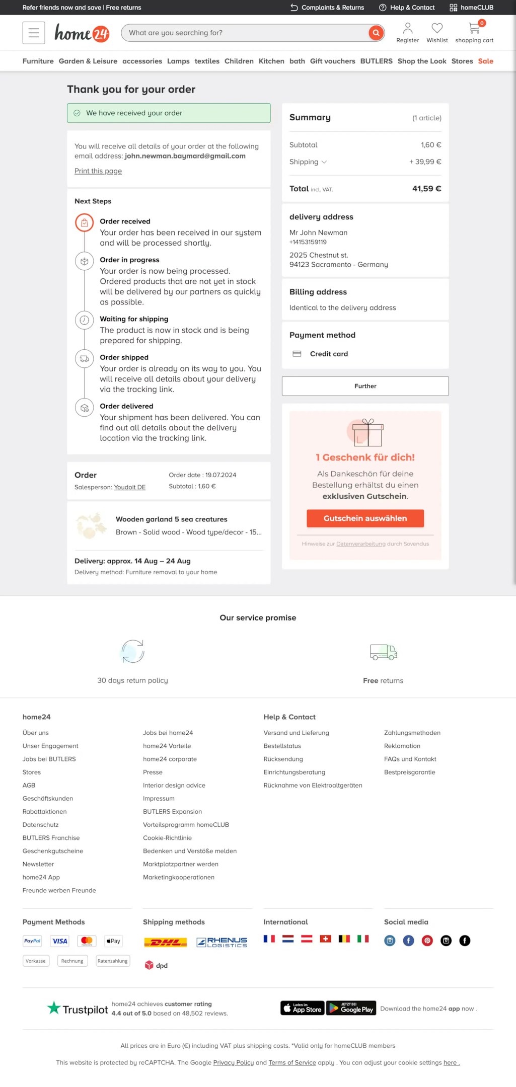
What they do right: Home24 shows an order timeline with clear “next steps” and includes a gift voucher for the next purchase. The timeline reduces uncertainty (“What happens now?”), and the voucher creates a reason to come back.
Steal this: A visual order timeline (Order Placed → Processing → Shipped → Delivered) gives customers a sense of progress and control. Pair it with a next-purchase incentive, and you’ve built a retention loop.
15. Lululemon
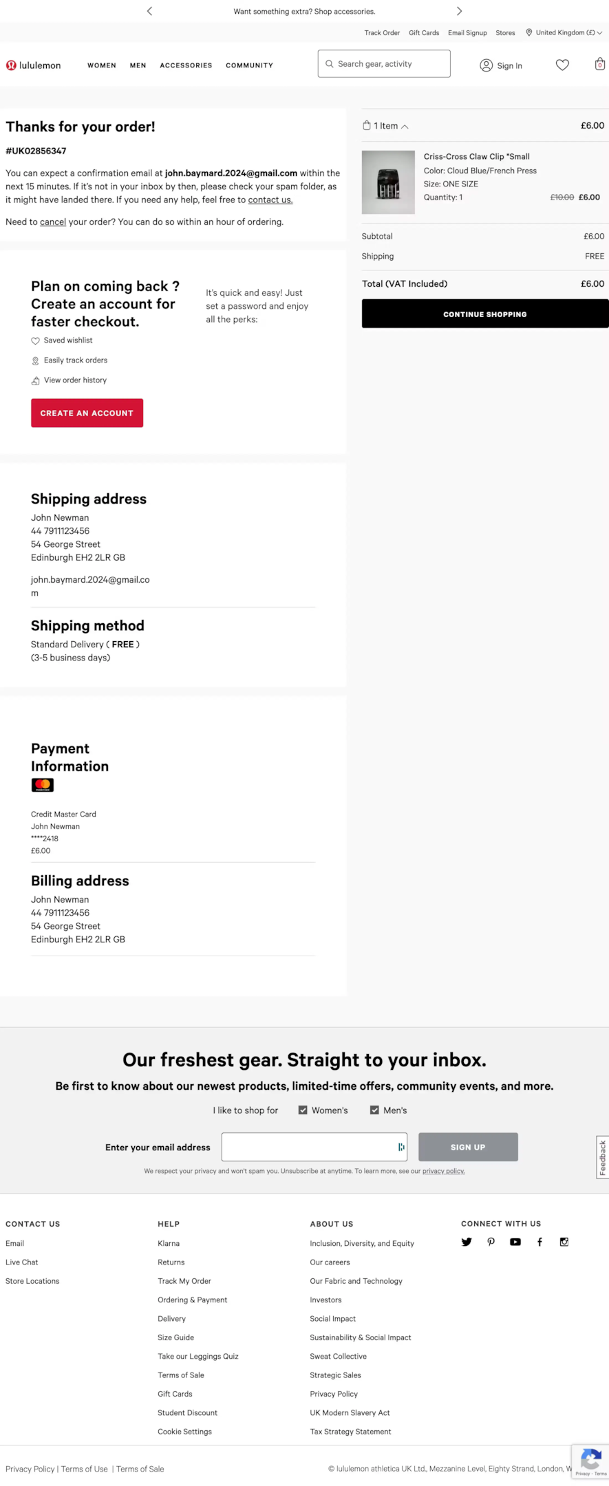
What they do right: The confirmation page promotes account creation and email subscription. For a brand like Lululemon with frequent new releases, getting customers on the email list is a high-value post-purchase action.
Steal this: The confirmation page is the best place to grow your email list. Customers who have just purchased are much more likely to subscribe than random website visitors. Offer a clear benefit (new arrivals, exclusive access, styling tips).
16. B&H
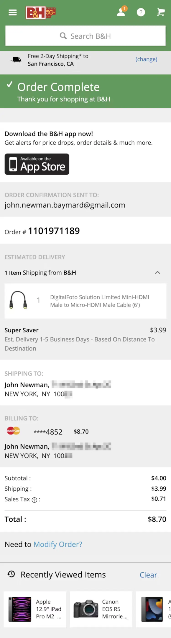
What they do right: B&H promotes their mobile app for order tracking and alerts, and shows recently viewed items. The app push is smart because mobile app users have 3x higher lifetime value than web-only customers.
Steal this: If you have a mobile app, the order confirmation page is your highest-converting prompt for app downloads. The customer needs to track their order, and the app makes it easier. That’s a genuine value proposition, not a generic “download our app” ask.
17. Wild Rover Tours
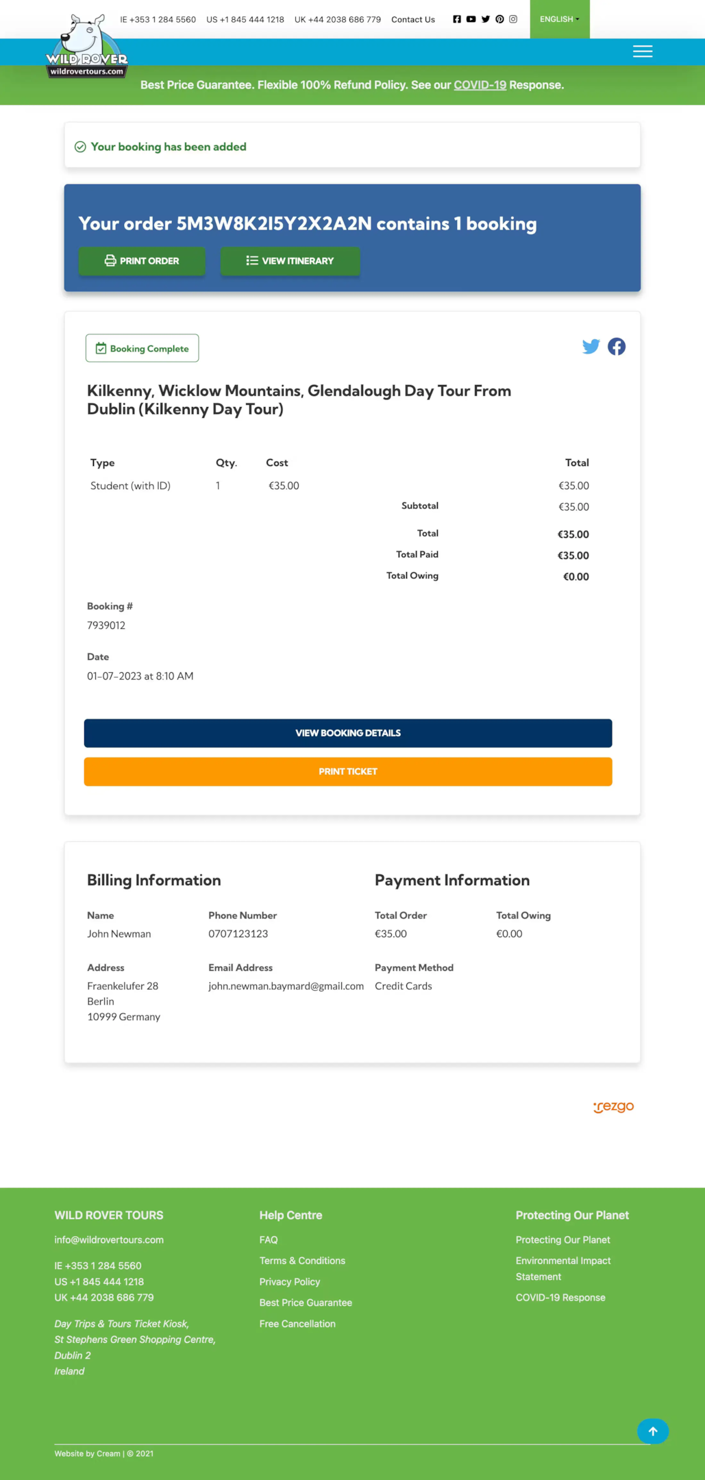
What they do right: Wild Rover shows booking details with a printable ticket and encourages social media sharing. For a tour company, the booking confirmation IS the product preview. Making it shareable turns every booking into free marketing.
Steal this: For experience-based businesses (travel, events, classes), make the confirmation shareable and visually appealing. Customers naturally want to share exciting upcoming experiences.
Also check: 15 Checkout Page Design Examples That Convert
9 Order Confirmation Email Examples
The confirmation page is the instant touchpoint. The confirmation email is the permanent record. Here are 9 examples that go beyond a basic receipt.
1. Dr. Squatch

Playful, on-brand tone with clear order details. Promotes SMS sign-up for marketing updates. The personality matches the brand perfectly.
2. Cult Beauty

Vibrant design with product images in the order breakdown. Encourages completing a beauty profile for personalized recommendations.
3. Codeverse

For a free trial class booking. Includes a location map and encourages direct replies for changes. Simple and functional.
4. Haoma

Highlights environmental impact (“a tree planted with your purchase”). Turns the confirmation into a feel-good brand moment.
5. Fitbit

Enthusiastic tone with a prominent tracking number. The excitement in the copy matches how the customer feels about getting a new fitness tracker.
Boost Conversion Instantly
Add Social Proof & Urgency to your website
6. Athletic Greens

Welcomes the customer to the “AG family,” including a customer testimonial. Builds community from the very first email.
7. Zulily

Playful “here it comes!” headline with fun visuals. Builds anticipation for delivery.
8. Burst

Bright visual style with animation to build excitement. Clear order summary and tracking link.
9. Crocs

Clean order summary with barcode for in-store returns and links to customer support. Practical and customer-friendly.
Essential Elements of a High-Converting Order Confirmation Page
After analyzing these 17 examples and working with hundreds of ecommerce stores, here are the elements that matter most.
Order details front and center. Order number, items with images, shipping address, estimated delivery date, and total price. This is non-negotiable. Display it in a scannable format with clear headings. According to ecommerce research, 88% of customers won’t return after a bad user experience. A confusing confirmation page counts as a bad experience.
Order tracking that’s immediately accessible. Don’t make customers hunt for tracking info. A big, prominent “Track Your Order” button reduces both anxiety and support tickets. Consider adding a visual progress bar (Order Placed → Processing → Shipped → Delivered).
Cross-sell with context. Show products related to what the customer just bought. A phone case after a phone purchase. Throw pillows after a couch. The key: recommendations should feel helpful, not pushy. Keep them below the order details so they don’t overshadow the confirmation itself.
Post-purchase engagement hooks. Account creation prompts, email subscription forms, loyalty program sign-ups, referral program CTAs, and feedback surveys. Pick 1-2 that matter most for your business and place them on the confirmation page. Don’t try to do all of them at once.
Social proof to reinforce the decision. The moment after a purchase is when buyer’s remorse is highest. Showing a social proof notification, such as “237 people bought this today,” or a quick customer testimonial reinforces that the customer made a good choice. WiserNotify can automatically display these real-time signals.
Clear next steps. Tell the customer exactly what happens next. “You’ll receive a shipping confirmation email within 24 hours.” “Your estimated delivery is March 25.” Remove uncertainty, and you remove anxiety.
Brand-consistent design. Your confirmation page should look and feel like the rest of your site. Same colors, same fonts, same tone. A generic template feels impersonal. A branded confirmation page feels like a continuation of the shopping experience.
Order Confirmation Page Mistakes to Avoid
Generic “Thank You” with no useful information. A blank page with “Thanks for your order!” and nothing else. Show the order details, tracking info, and next steps. The customer needs reassurance, not a greeting card.
No mobile optimization. Over 60% of ecommerce purchases happen on mobile. If your confirmation page breaks on a phone screen (tiny text, buttons too close together, images not loading), you’re starting the post-purchase relationship on the wrong foot.
Too many CTAs competing for attention. Referral program, loyalty sign-up, app download, social sharing, product recommendations, survey, email subscription. All on one page. Pick 1-2 post-purchase actions and commit to them. Trying to do everything means nothing gets done.
Missing or incorrect order information. Double-check that your confirmation page pulls accurate data: correct items, correct prices, correct shipping address. Errors here destroy trust instantly and flood your support team.
No link to customer support. If something is wrong with the order, the customer needs to know how to fix it immediately. A support link, FAQ section, or live chat widget on the confirmation page helps prevent panic and reduce frustration.
How Social Proof Enhances Your Confirmation Page
The order confirmation page is the perfect place to reinforce the customer’s decision with social proof signals.
“1,247 orders placed today,” next to their confirmation, tells the customer they’re part of something bigger. A recent 5-star review quote builds confidence. A live purchase notification (“Maria from Denver just ordered the same product”) creates validation.
These signals fight buyer’s remorse at the exact moment it’s strongest.
WiserNotify’s social proof tools automatically add these notifications, including on your order confirmation page.
Recent purchases, review popups, and visitor counts that match your brand and build post-purchase confidence.
The stores that treat the confirmation page as a conversion opportunity (not just a receipt) consistently see higher repeat purchase rates, stronger email list growth, and lower support ticket volume.
Boost Conversion Instantly
Add Social Proof & Urgency to your website
Getting Started
Your order confirmation page doesn’t need all 17 strategies at once. Start with the basics: accurate order details, clear tracking, and brand-consistent design.
Then add one engagement element (a referral CTA, cross-sell recommendations, or a feedback survey) and measure its impact.
The stores I’ve seen get the most from their confirmation pages treat them the way they treat their landing pages: designed, tested, and optimized.
Because every customer who buys from you will see this page. That’s 100% of your customers, engaged, at the peak of their relationship with your brand.
Don’t waste that moment.
Krunal Vaghasiya is a marketing tech expert who boosts e-commerce conversion rates with automated social proof and FOMO strategies. He loves to keep posting insightful posts on online marketing software, marketing automations, and improving conversion rates.