
I’ve spent 5+ years building social proof tools at WiserNotify (10,000+ businesses and counting). And the pattern is always the same: the landing pages that convert best aren’t the ones with fancy designs or clever copy.
They’re the ones where other people do the selling.
A study from Northwestern University’s Spiegel Research Center found that displaying reviews can boost conversion rates by up to 270%.
But slapping a few testimonials on your page isn’t enough. Where you place social proof, which type you use, and how it matches your audience’s buying stage all matter.
I’ve tested this across hundreds of landing pages. Here’s exactly what works, with real examples you can steal.
Boost Conversion Instantly
Add Social Proof & Urgency to your website
Why Social Proof Makes or Breaks Your Landing Page
Based on WiserNotify customer data
Based on WiserNotify customer data
Last time you bought from an unknown brand, you probably checked reviews, looked for familiar logos, or scanned for a “trusted by X customers” badge.
That’s social proof bias, and we all do it.
A landing page has one job: get the visitor to act. Without social proof, they’re deciding based on YOUR claims alone.
Social proof flips that from “trust me” to “look at what these people experienced.”
I’ve seen pages jump from 2% to 5%+ conversion just by placing the right proof in the right spots.
Our WiserNotify customer Nicholas Scalice saw a 32% increase in signups after adding social proof notifications to his opt-in page.
That kind of lift doesn’t come from redesigning your hero section. It comes from proof.
10 Types of Social Proof That Actually Work on Landing Pages
Not all social proof is created equal. What works for a SaaS product won’t necessarily work for a coaching program. What converts on an ecommerce page might fall flat on a B2B landing page.
Here are the 10 types I’ve seen work best, with real examples from brands doing it right.
1. Customer Testimonials
This is the most common type, and for good reason. When a real person says, “This product solved my problem,” it carries weight that no marketing copy can match.
But there’s a big difference between weak and strong testimonials.
Weak: “Great product! Would recommend.” (Who is this person? What problem did it solve? Zero specifics.)
Strong: “We switched from [Competitor] to [Product] and cut our onboarding time from 3 weeks to 4 days.” (Specific result, named comparison, quantifiable outcome.)
FlutterFlow does this well on its landing page. They feature real customer quotes with names, photos, and specific outcomes. That combination (face + name + result) makes testimonials feel authentic instead of manufactured.
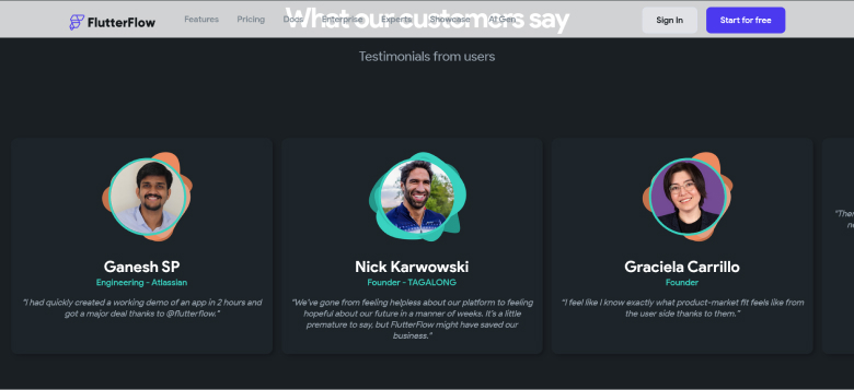
Quick tip: Place your best testimonial above the fold, near your CTA. According to A/B testing data from WikiJobs, adding just three short testimonials to a landing page increased purchases by 34%.
Build trust & FOMO
Highlight real-time activities like reviews, sales & sign-ups.


2. Case Studies and Success Stories
Testimonials tell visitors that something worked. Case studies show them HOW it worked.
If you’re selling a high-ticket product or a complex service, case studies are probably your most powerful social proof tool.
They give potential customers a story they can relate to: “This company had the same problem I have, and here’s how they fixed it.”
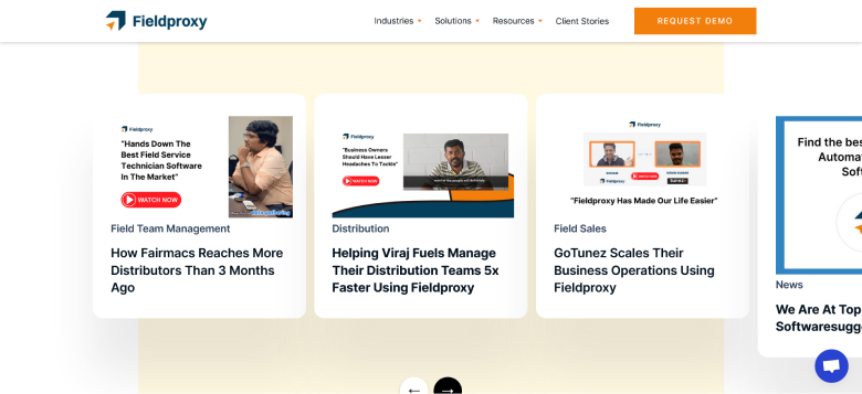
Fieldproxy nails this on their landing page. They share detailed customer stories with specific metrics, including revenue growth, time saved, and efficiency gains. Each case study reads like a mini success blueprint.
The trick is keeping case studies scannable on your landing page. Nobody wants to read a 2,000-word case study when they’re deciding whether to click “Start Free Trial.”
Pull the key numbers into bold callouts and link to the full story for those who want more depth.
3. Company Logos (Trust Bar)
This one’s almost too simple. But it works incredibly well, especially for B2B landing pages.
A row of recognizable logos signals: “Big, successful companies trust us. You can too.”
Tally does this perfectly. Right below their headline, they display logos from Notion, Buy Me a Coffee, Glovo, and other well-known brands, with a note that over 200,000+ teams use their platform.
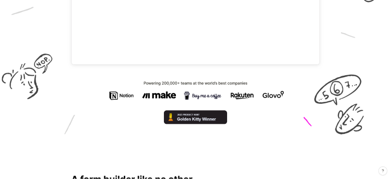
What makes this work: The logos are instantly recognizable. If your clients include smaller companies, a logo bar might not have the same impact. In that case, pair logos with the total number of customers (like “Trusted by 10,000+ businesses”) to create a quantity signal instead.
4. Social Media Mentions
When people tweet about your product or post about it on LinkedIn without you asking, that’s some of the most authentic social proof you can get.
Screen Studio embeds actual customer Twitter posts directly on their landing page. These aren’t polished testimonials that went through a marketing team.
They’re raw, real reactions from users who genuinely love the product.
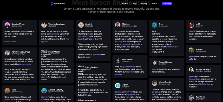
I like this approach because it’s nearly impossible to fake. Visitors can click through to the actual tweet and verify it’s real. That level of transparency builds trust faster than anything else.
Pro tip: Create a branded hashtag and encourage customers to share their experiences. Then embed those posts on your landing page. GoPro has built an entire marketing engine around user-generated content this way.
5. Awards and Recognition Badges
Awards are third-party validation on steroids. When G2, Capterra, TrustRadius, or an industry body recognizes your product, it signals quality that goes beyond what any customer can say.
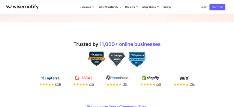
Here at WiserNotify, we display our awards and badges prominently. We’ve been recognized across multiple platforms, and showcasing those badges tells potential customers: “We didn’t just claim we’re good. Independent reviewers confirmed it.”
Position award badges near pricing sections or CTAs. That’s where visitors experience the most hesitation, and a trust badge right there can tip the scales.
6. Customer Data and Metrics
Numbers don’t lie. And big numbers are persuasive.
“Trusted by 225,000+ customers.” “4.2 billion emails sent.” “100,000+ stores powered.”
These are impact metrics that show scale and reliability without requiring visitors to read a single word of copy.
HubSpot is a master at this. Their landing pages feature specific customer data points, including the number of businesses served, revenue generated, and countries reached.
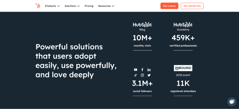
The key is to make the numbers specific. “Thousands of customers” is vague. “11,247 businesses” feels real and believable. Round numbers actually look less trustworthy because they seem to be estimates.
Also check: 6 Winning Social Proof Tactics to Boost Sales
7. Trust Badges and Security Certifications
If your product handles sensitive data or processes payments, trust badges aren’t optional. They’re essential.
Calendly displays GDPR, ISO 27001, PCI DSS, and SOC 2 badges on its landing page. For enterprise buyers evaluating the platform, these certifications answer the unspoken question: “Is my data safe?”
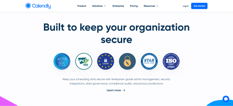
I’ve seen ecommerce stores increase checkout conversions by 15-20% just by adding payment security badges near the buy button.
For SaaS companies, compliance badges (SOC 2, GDPR, HIPAA) work the same way on signup pages.
Build trust & FOMO
Highlight real-time activities like reviews, sales & sign-ups.

8. Real-Time Social Proof Notifications
This is where things get really interesting (and yes, this is exactly what WiserNotify does, so I’m biased, but the data speaks for itself).
Social proof notifications are those small popups that appear on your page showing real-time activity. “Sarah from New York just signed up.” “47 people are viewing this page right now.” “John left a 5-star review 12 minutes ago.”
Studio 331 uses real-time notifications to display recent customer interactions on their pages, including purchases, visitor counts, and review activity.
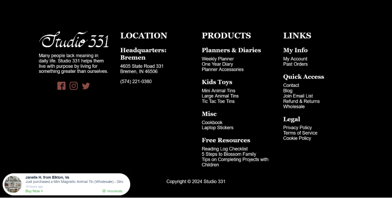
These notifications work because they create two psychological triggers simultaneously: social proof (“others are buying”) and urgency (“this is happening right now”).
One of our customers at WiserNotify reported a 39% conversion rate on a launch promotion page after adding real-time notifications. That was his best conversion rate ever.
9. Star Ratings and Review Aggregates
There’s a reason every major platform (Amazon, Google, Yelp) uses star ratings. They’re a universal shorthand for quality.
Juro displays aggregated star ratings from Google and Capterra right on its homepage. You don’t need to read a single review to get the message: this product is highly rated by many people.
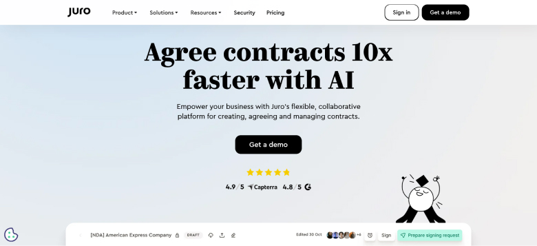
Important detail: Show the number of reviews alongside the rating. A 4.8-star rating from 3 reviews isn’t impressive. A 4.8-star rating from 1,200 reviews? That’s compelling. The combination of a high rating and a high volume builds real confidence.
10. Video Testimonials
Video is the highest-trust format for social proof. Period.
When a real person looks into the camera and talks about their experience, it’s incredibly hard to fake.
Viewers can pick up on body language, tone, enthusiasm, and sincerity in ways that written text simply can’t convey.
Recruit Rockstars features video testimonials from customers on its landing page. Each video is short (under 2 minutes), focused on a specific result, and feels genuinely unrehearsed.
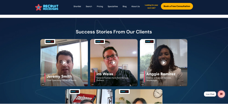
If you only have the budget for one type of premium social proof content, make it video testimonials. Even 2-3 good ones can transform your landing page performance.
Build urgency
Add floating offers with countdown timer & coupon code.

Where to Place Social Proof on Your Landing Page (Placement Strategy)
Most guides tell you WHAT social proof to use. Almost none tell you WHERE to put it. And placement makes a massive difference.
Here’s the framework I use after testing across hundreds of landing pages:
Above the fold (hero section): One strong testimonial quote or a “trusted by X customers” counter. This hits visitors immediately. Don’t overwhelm them here; pick your single best proof point.
Near the CTA button: Star ratings, review counts, or trust badges. This is where hesitation peaks, so reassurance matters most. Putting a “4.8/5 from 2,000+ reviews” badge right next to your signup button reduces friction.
Mid-page (after you’ve explained features): Case studies and detailed testimonials. By this point, visitors understand what your product does. Now they need proof that it actually works.
Near pricing or checkout: Trust badges (security, compliance) and customer data metrics. This is where people worry about risk. Certifications and big numbers calm that fear.
Footer area: Award badges and logo bars. These serve as a final confidence boost before the visitor either scrolls back up to convert or leaves.
Throughout the page: Real-time social proof notifications. These work as ambient trust signals that reinforce activity without interrupting the reading experience.
Also check: 15 Tips to Raise Landing Page Conversion Rates
How to Collect Social Proof for Your Landing Pages
You can’t display social proof if you don’t have any. Here’s how to build your library from scratch, even if you’re just starting out.
Send post-purchase emails. Timing matters. Send a review request 3-7 days after purchase or onboarding, while the experience is fresh. Keep it simple: “How’s it going? We’d love a quick review.” Include a direct link so they can respond in under 60 seconds.
Make it easy to leave reviews. If your review process requires account creation, email verification, and a 5-paragraph minimum, nobody’s doing it. Show examples of what a helpful review looks like. One or two sentences is fine.
Use incentives strategically. A small discount code or an entry into a monthly giveaway can significantly boost review submissions. Just be transparent about it (most platforms require disclosure of incentivized reviews anyway).
Monitor social media mentions. Set up Google Alerts or use a social listening tool to catch mentions of your brand organically. These unasked-for mentions make the most authentic social proof because they’re completely spontaneous.
Record video testimonials during calls. If you do customer success calls or demo calls with happy customers, ask if you can record a 60-second clip for your website. Most people say yes when you catch them in a positive moment.
Pull data from review platforms. If you’re already listed on G2, Capterra, Trustpilot, or Google Business, you can embed those ratings directly on your landing page. Third-party ratings feel more trustworthy than self-hosted reviews.
Boost Conversion Instantly
Add Social Proof & Urgency to your website
Common Mistakes That Kill Your Social Proof
I’ve audited hundreds of landing pages, and these are the mistakes I see over and over.
Using fake or obviously manufactured testimonials. If every testimonial reads as if it were written by the same copywriter, visitors will notice. Generic praise like “Amazing product! 10/10!” with no photo, company name, or specifics screams fake. One honest, detailed review beats ten polished fakes.
Placing social proof in the wrong spot. A gorgeous testimonial carousel buried at the bottom of a 5,000-word page isn’t helping anyone. If visitors never scroll that far (and most don’t), your best social proof is invisible.
Using outdated reviews or data. If your landing page says “Trusted by 500 customers,” but you now have 10,000, update it. If your most recent testimonial is from 2022, visitors will wonder whether anyone has used your product recently. Keep your social proof current.
Showing negative social proof accidentally. This one’s subtle. “Join 12 people who signed up this month” sounds lonely, not popular. If your numbers are small, don’t lead with them. Use testimonial quality over quantity instead.
Overloading the page. I’ve seen landing pages with 30+ testimonials, 15 logos, 8 award badges, AND social proof notifications all running at once. That’s not trust-building. That’s visual chaos. Pick 3-4 types of social proof and execute them well.
Ignoring mobile experience. Your social proof elements need to look good and load fast on phones. Testimonial carousels that break on mobile, or notification popups that cover the CTA button on small screens, will hurt more than help.
Also check: 12 Best Social Proof Nudge Examples to Boost Conversions
Industry-Specific Social Proof Strategies
What works depends a lot on what you’re selling. Here’s a quick breakdown:
SaaS and B2B: Lead with G2/Capterra ratings, enterprise client logos, and case studies with ROI data. B2B buyers need to justify the purchase to their team, so give them hard numbers they can share in an internal Slack message.
Ecommerce: Product reviews with photos, purchase notifications, and live visitor counts work best. Shoppers want to know the product looks good in real life (not just in studio photos) and that other people are actively buying it.
Online courses and coaching: Student success stories and transformation metrics. “I landed my dream job after completing this course” hits harder than any feature list.
Agencies and consultants: Case studies showing before-and-after results, combined with video testimonials from named clients. The trust barrier is higher when you’re selling a service, so you need deeper proof.
Healthcare and finance: Compliance badges and certifications first (HIPAA, SOC 2, etc.), then patient or client testimonials that focus on experience rather than outcomes (regulatory limitations apply).
How to Add Social Proof to Your Landing Page (Without Coding)
If you’re building landing pages on platforms like Unbounce, Leadpages, or Instapage, you can add most types of social proof using their built-in drag-and-drop blocks. Testimonial sections, logo bars, and rating displays are usually available as pre-built components.
For real-time social proof notifications (purchase popups, live visitor counts, review alerts), you’ll need a tool like WiserNotify.

Here’s how it works:
You sign up, install a small pixel on your site, and connect it with your sales, review, or CRM platform. WiserNotify then pulls real data and displays it as small, non-intrusive notifications on your landing page.
No coding required, and it works with 250+ integrations, including Shopify, WordPress, Wix, ClickFunnels, and more.
What I like about this approach (besides the fact that I built it) is that it’s dynamic. Static testimonials stay the same forever.
Real-time notifications are constantly updated with fresh proof, so your landing page always feels alive and current.
A/B Testing Your Social Proof
Don’t guess what works. Test it.
Here are the tests I recommend running:
Testimonial format: Text-only vs. text with photo vs. video. In most cases, video wins for conversion rate, but text with a photo often wins on page speed (which affects bounce rate).
Placement: Social proof above the fold vs. below the fold. Test both, because the answer changes depending on your audience and product complexity.
Type of proof: Customer count (“10,000+ businesses”) vs. specific testimonial. Some audiences respond to scale. Others respond to stories. Only testing reveals which works for YOU.
Notification frequency: If using real-time popups, test showing them every 15 seconds vs. every 30 seconds. Too frequent feels spammy. Too rare for visitors to miss them.
Track your conversion rates before and after adding social proof. If you’re seeing a lift, double down. If not, the issue is probably the type or placement, not the concept itself.
Conclusion
Social proof isn’t a nice-to-have on your landing page. It’s the difference between a page that converts and one that doesn’t.
Start with whatever you have right now, even a single customer testimonial or a handful of reviews. Place it near your CTA. Then build from there.
The most effective landing pages I’ve seen use 3-4 types of social proof, each placed strategically based on what the visitor needs at that stage of their decision.
A customer count in the hero. Detailed testimonials mid-page. Trust badges near the CTA. And real-time notifications running throughout.
If you’re looking for an easy way to add real-time social proof to your landing pages, WiserNotify offers a free trial so you can test it with no risk.
We’re already helping 10,000+ businesses turn their landing pages into conversion machines.
Your best marketing is what your customers say about you. Put that front and center, and your landing pages will do the selling for you.
Boost Conversion Instantly
Add Social Proof & Urgency to your website
