
15 Thank You Page Examples That Convert (2026)

A thank you page is the page people land on right after they buy, sign up, register, or request a demo. The best ones confirm the action, say what happens next, and give one useful next step.
Everyone who converts sees this page, at the moment their interest is highest. Most sites waste it on two lines and a link home.
The 15 examples below are grouped by the action they follow, with what each page does well and what to copy for your own.
Key takeaways
- Every thank you page needs a clear confirmation, the next step, and one call to action. Everything else is optional.
- Match the ask to the action. A new subscriber wants content, a buyer wants reassurance, and a demo lead wants to know what the call will cover.
- Give each thank you page its own URL with a noindex tag, so your conversion tracking stays clean.
- Deliver what you promised on the page itself, like the download, the discount code, or the calendar link.
What Is a Thank You Page?
A thank you page is where visitors land right after completing an action on your site, such as a purchase, a form submission, a newsletter signup, a webinar registration, or a demo request.

It sits at the end of your conversion path and the start of your relationship with that person. They’ve already decided to trust you once.
It isn’t the same as a confirmation email. The page loads instantly, while the email may be opened hours later, or land in spam.
Why Thank You Pages Matter
Landing pages get weeks of testing. Thank you pages often get one sentence. That’s a mistake for four reasons.
- Every converter sees it. Emails get filtered and ads get blocked, but anyone who completes your form lands on this page.
- Attention is at its peak. The visitor just acted. A few hours later, when they open your email, they’ve moved on.
- Ad tracking depends on it. Google Ads, Meta Pixel, GA4, and LinkedIn Insight Tag often count a thank you page load as the conversion.
- It’s a second chance to convert. Someone who just trusted you once is more open to a follow, a referral, or a related purchase.
5 Elements Every Thank You Page Needs
Before the examples, here’s the foundation. Most strong thank you pages include all five.
1. Clear Confirmation Message
“Thank you!” isn’t a confirmation. “Your order #4829 is placed, and a receipt is on its way to your inbox” is.
People need to know the action worked. Otherwise they wonder whether to submit the form again, or whether the payment went through.
2. Next Steps
Say exactly what happens now. When will they hear from you? Where should they look? What can they do in the meantime?
“We’ll email you within one business day” removes doubt. “Check your inbox, and your spam folder, for the download link” heads off support tickets.
3. One Focused Call to Action
Pick one next step and make it obvious.
Choose the action that matters most right now, such as a referral, a social follow, or a related product, and give it the only button on the page.
4. Social Proof
Doubt can creep in right after a decision, especially after a purchase.
A short testimonial, a row of client logos, or a line like “Join thousands of happy customers” reassures people they made the right call. Our roundup of social proof examples has more formats to borrow.
5. Visual Consistency
The page should look like the rest of your site, with the same colors, fonts, and tone.
A sudden design change after someone converts breaks trust at the worst moment. Check it on a phone too, since many forms get filled out on mobile.
Build trust & FOMO
Highlight real-time activities like reviews, sales & sign-ups.

Thank You Page Examples at a Glance
| # | Brand | Use case | Tactic | What to copy |
|---|---|---|---|---|
| 1 | Codica | Newsletter signup | Links to blog posts and case studies | Point new subscribers to your best content |
| 2 | Kate Spade | Email signup | First-purchase discount code | Give a code they can use right away |
| 3 | Consumer Reports | Newsletter signup | Topic preference picker | Let people choose what they want to hear about |
| 4 | Marijana Kay | Lead magnet | Tips for using the download | Add a quick-start note to your freebie |
| 5 | Kindlepreneur | Freebie download | Download link on the page | Deliver the file instantly, not only by email |
| 6 | Noteable | Demo request | Next steps plus a partner story | Show proof while they wait for the call |
| 7 | Sephora | Purchase | Product recommendations and loyalty points | Suggest items that pair with the order |
| 8 | Kuat | Product registration | Review request | Ask for a review while the experience is fresh |
| 9 | Harry’s | Purchase | Usage survey | Ask one question about how they’ll use the product |
| 10 | [X]cube LABS | B2B inquiry | Video and client logos | Add a short welcome or overview video |
| 11 | Wärtsilä | Webinar registration | Reminder schedule and calendar prompt | Tell people when reminders will arrive |
| 12 | RevenueCat | Demo request | Three-step what-to-expect | Lay out the process from first email to follow-up |
| 13 | Oxfam America | Donation | Impact message and share ask | Show the impact, then ask for a share |
| 14 | Eden Project Communities | Course application | Junk folder reminder and resources | Warn people to check spam and give them something to read |
| 15 | Jericho Writers | Course enrollment | Invite to meet course-mates | Make community the first step |
15 Best Thank You Page Examples (By Use Case)
The examples are grouped by the action they follow. A newsletter signup and a purchase need very different pages.
1. Codica: Newsletter Signup
Not every thank you page needs to be elaborate.
Codica keeps its newsletter thank you page clean. It confirms the subscription, welcomes the visitor, and points them to recent blog posts and case studies.

What they do right
It gives the subscriber something to read right now instead of a dead end. A new subscriber has just said they want your content, so the page hands it over.
The same idea of keeping momentum shows up in good product landing pages.
Steal this
Link your three to five best-performing posts on your newsletter thank you page. It keeps new subscribers on your site while their interest is high.
2. Kate Spade: Discount Code
Kate Spade greets new email subscribers with a discount on their next purchase. The thank you page shows the code and how to use it.

What they do right
It turns a passive subscriber into a likely buyer in seconds. The visitor signed up for emails and now has a reason to shop today.
Steal this
If you sell online, offer a first-purchase discount on your signup thank you page. Track that code on its own so you can see how many sales the page drives.
For more placements, see how to display offers on a website.
Build trust & FOMO
Highlight real-time activities like reviews, sales & sign-ups.
3. Consumer Reports: Topic Picker
Consumer Reports does something most thank you pages skip. After subscribing, you choose the topics you care about, such as health, cars, money, or tech.

What they do right
The subscriber feels in control, and Consumer Reports gets segmentation data for every email it sends after that.
Steal this
Add a two- or three-option question to your thank you page, such as “What are you most interested in?” You’ll be able to segment your list from day one.
4. Marijana Kay: Lead Magnet Tips
After someone opts in for a lead magnet, Marijana Kay’s thank you page confirms the download and adds tips on how to use the resource.

What they do right
Most lead magnet pages stop at “check your inbox.” The tips show she cares whether the reader gets results, not just whether they download.
Steal this
Add three to five quick-start tips to your lead magnet thank you page. People are far more likely to open a PDF when they know what to do with it.
5. Kindlepreneur: Instant Download
Kindlepreneur puts the freebie download link right on the thank you page. No waiting for an email and no digging through an inbox.

What they do right
It delivers what was promised, instantly. Nobody has to wait for an email that might end up in spam.
Steal this
Put a download button on the thank you page and still send the email for reference. Instant access cuts friction and support requests.
Running an online store? These checkout page design examples cover the step right before the thank you page.
6. Noteable: Proof While You Wait
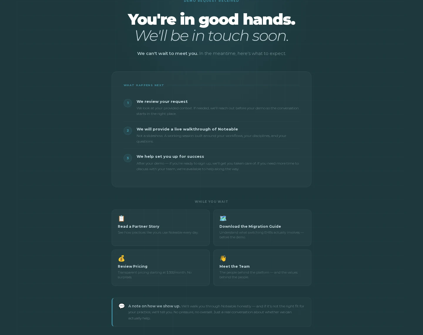
Noteable, a practice management platform, confirms the demo request with “You’re in good hands. We’ll be in touch soon,” then lays out three numbered steps for what happens next.
Below that, a “While you wait” section offers a partner story, a migration guide, pricing, and a page about the team.
What they do right
The gap between asking for a demo and the first call is where doubt grows. Noteable fills it with a customer story and honest expectations, including a note that it will say so if the product isn’t a fit.
Steal this
On your contact or demo thank you page, add one customer story that matches the visitor’s situation. Pick proof that answers the question they’re most likely to have.
The same logic drives landing page social proof.
7. Sephora: Purchase Upsell
Sephora uses its order confirmation page to suggest products based on what you just bought, plus a prompt to join its loyalty program.

What they do right
The suggestions are tied to the order, so a foundation buyer sees matching concealer, not random bestsellers. Showing the points just earned gives a clear reason to join the loyalty program.
Steal this
Add three or four products that pair with the purchase to your order confirmation page. Relevance is what makes post-purchase suggestions work.
8. Kuat: Review Request
Kuat’s thank you page has a simple ask. After product registration, it confirms the action and asks customers to share their experience.

What they do right
It asks for a review right after a positive moment, when the customer has just finished something successfully and feels good about it.
Steal this
Ask for reviews on your thank you page rather than weeks later by email, and make leaving one a single click. Our look at order review pages covers the step before purchase.
9. Harry’s: Usage Survey
Harry’s adds a short survey to its thank you page. It asks how customers use the product, not how they liked the website.

What they do right
“How often do you shave?” gives Harry’s product and marketing data it can act on. “How was your experience?” wouldn’t.
Steal this
Add one or two behavior questions to your thank you page. The answers feed product decisions, messaging, and segments.
10. [X]cube LABS: Video and Logos
[X]cube LABS combines a video, client logos, and social sharing buttons on its thank you page.

What they do right
After a form submission, a short video feels natural where a long sales pitch wouldn’t. The logos underneath add credibility without taking much space.
Steal this
Add a video under two minutes to your B2B thank you page, such as a founder welcome or a short client story.
11. Wärtsilä: Webinar Reminders
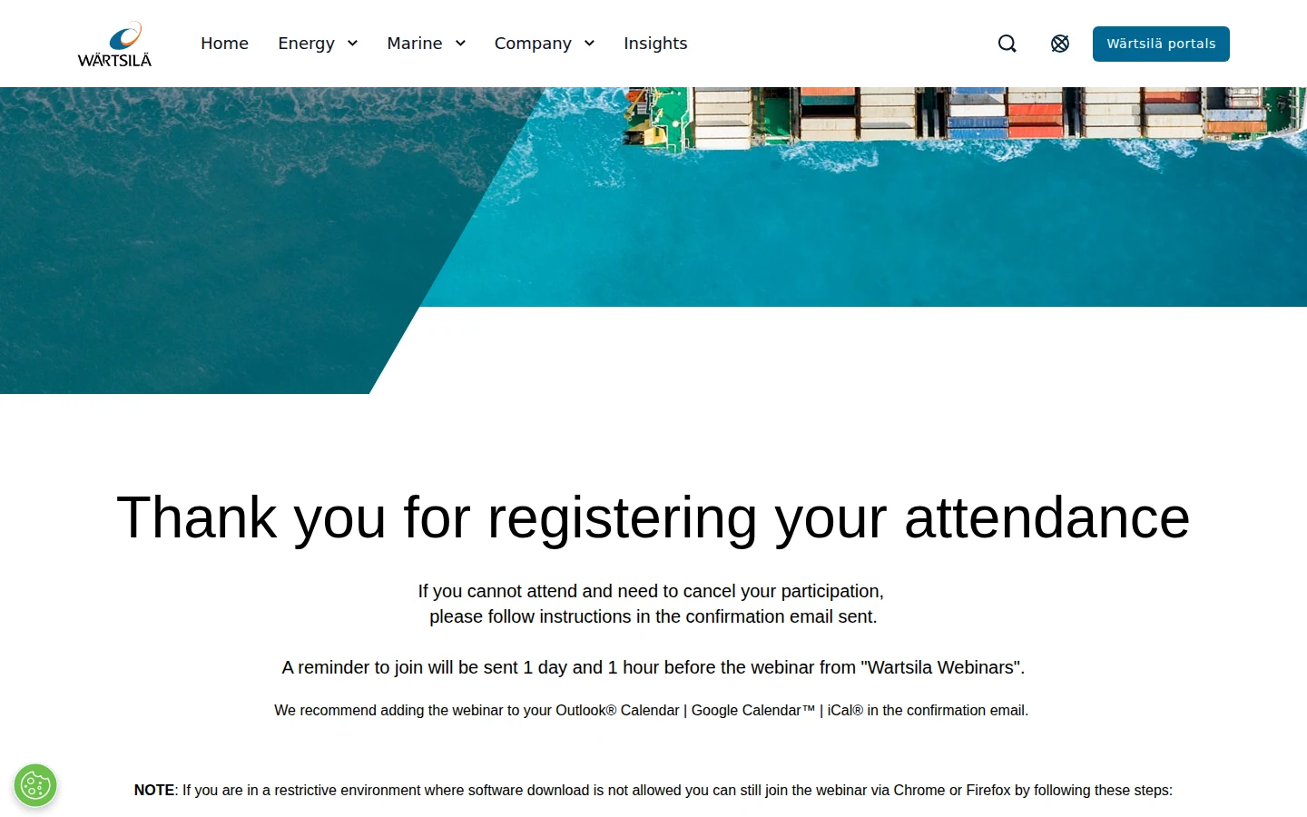
Wärtsilä, the marine and energy tech company, keeps its webinar thank you page practical. It confirms the registration, explains how to cancel, and says exactly when reminders will arrive, one day and one hour before the session.
What they do right
It plans for no-shows. The page recommends adding the session to Outlook, Google Calendar, or iCal, and even gives a browser workaround for attendees on locked-down work computers.
Steal this
List your reminder schedule and an add-to-calendar step on your webinar thank you page. Anything that stops a registrant from forgetting, or getting stuck on the day, lifts attendance.
Build urgency
Add floating offers with countdown timer & coupon code.
12. RevenueCat: Demo Next Steps
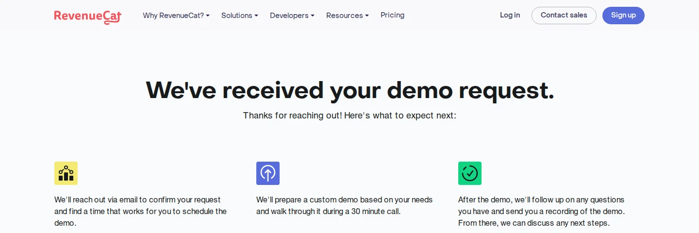
RevenueCat’s page opens with “We’ve received your demo request” and three short steps underneath.
What they do right
Each step answers a question the lead would otherwise email about. RevenueCat will confirm by email, prepare a custom demo for a 30-minute call, and send a recording afterward.
Steal this
Write out your sales process in three steps on your demo thank you page, from the first email to the follow-up. A prospect who knows what’s coming shows up prepared.
13. Oxfam America: Donation Impact
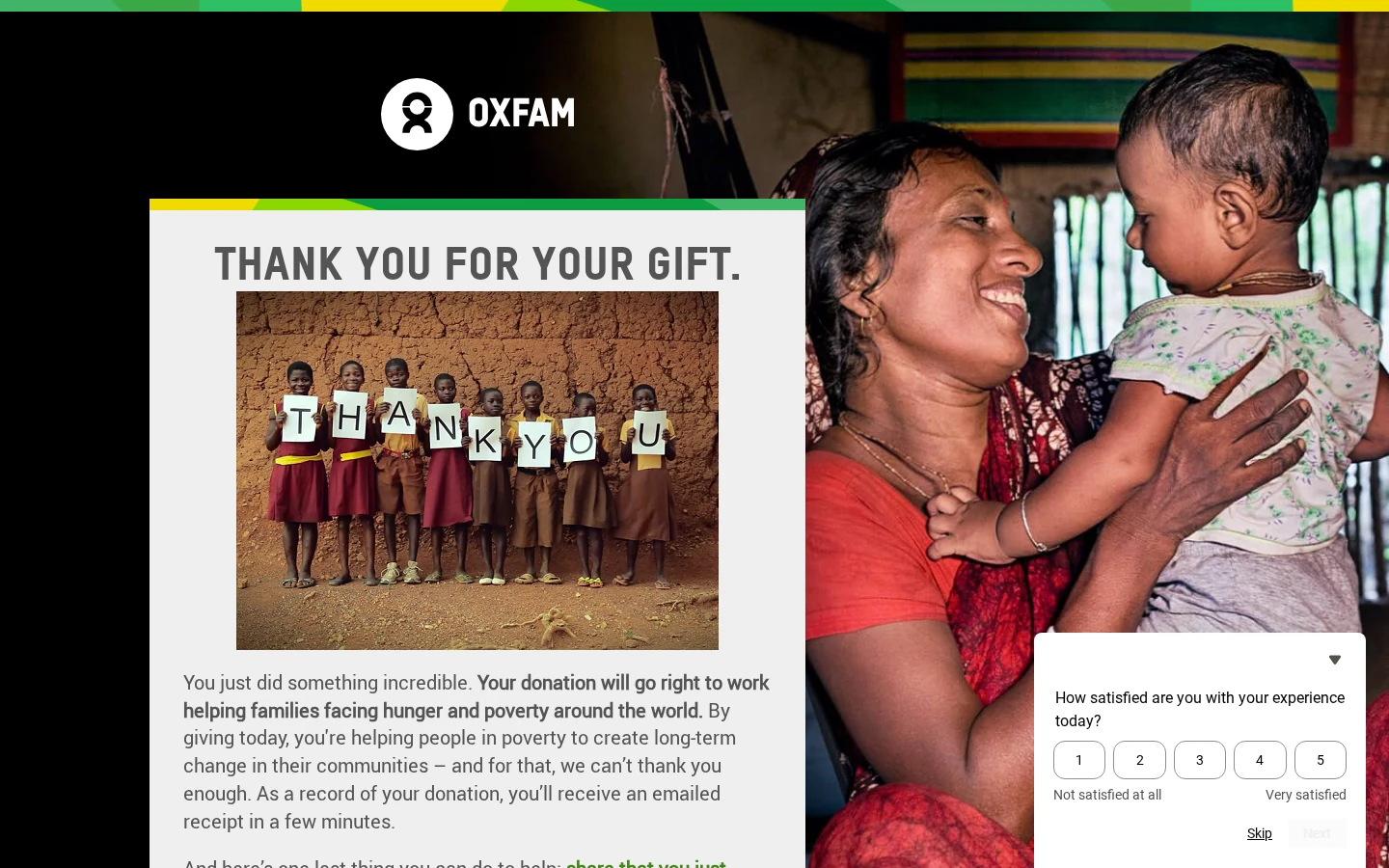
Oxfam America’s thank you page starts with “You just did something incredible” and explains where the donation goes, helping families facing hunger and poverty.
What they do right
It connects the gift to a result before asking for anything. Then it asks donors to share the donation on Facebook and explains that shares bring in new supporters, which turns one gift into reach.
Steal this
Lead your thank you page with the impact of the purchase or donation, then add one share prompt with the reason it helps.
14. Eden Project: Course Application
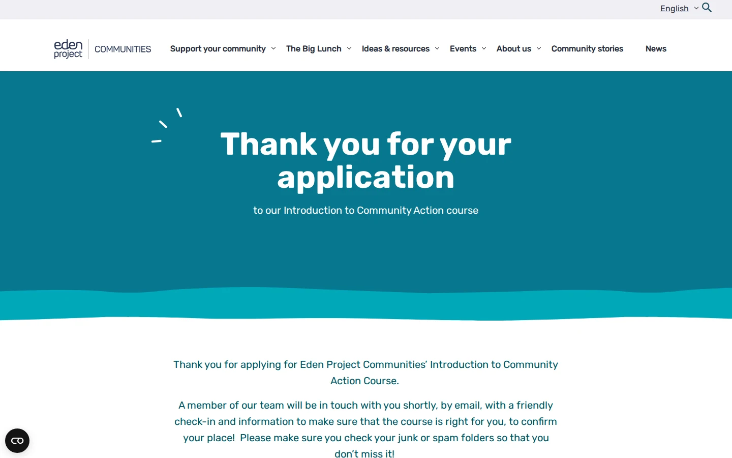
Eden Project Communities confirms applications to its Introduction to Community Action course and says a team member will check in by email to confirm the place.
What they do right
It warns applicants to check their junk and spam folders, the most common reason a confirmation goes missing. Then it offers participant information and other resources to read while they wait.
Steal this
If your next step happens by email, tell people to check spam on the thank you page itself. Then give them something useful to explore in the meantime.
15. Jericho Writers: Course Community
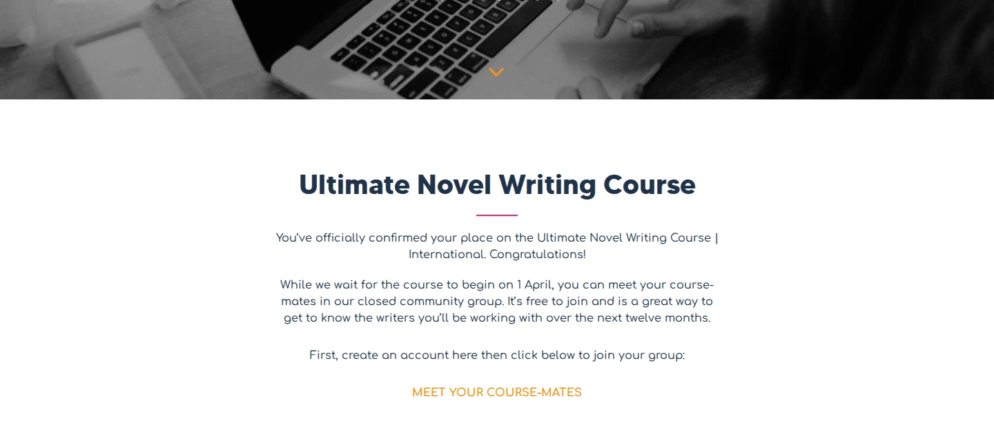
Jericho Writers confirms each student’s place on its Ultimate Novel Writing Course and points straight to a closed community group.
What they do right
The main button says “Meet your course-mates.” Students can get to know each other before the course starts, which builds commitment for a year-long program.
Steal this
If you sell courses or memberships, make the community link the main call to action on your thank you page. Connection keeps people engaged after they pay.
Thank You Page Best Practices
Match the CTA to the Funnel Stage
A new subscriber isn’t ready to buy, and a new customer doesn’t need a newsletter pitch.
- Newsletter or lead magnet. Point to content or community.
- Webinar or demo request. Share case studies, testimonials, and what to expect.
- Purchase. Suggest related products or ask for a referral.
Use One CTA, Not Five
Asking for a follow, a referral, a survey, and an upsell on one page usually gets you none of them. Pick the single highest-value action and commit to it.
Add a noindex Tag
If search engines index your thank you page, people can reach it without converting, and your conversion data gets skewed.
A noindex meta tag on every thank you page takes seconds to add and keeps tracking clean.
Set Up Conversion Tracking Properly
The thank you page URL is where conversion tags fire. Add the Google Ads conversion tag, a GA4 conversion event for the URL, the Meta Pixel lead event, and the LinkedIn conversion URL, ideally through Google Tag Manager.
Use a dedicated URL such as /thank-you/ rather than an inline message, because an inline message has no URL for tags to fire on.
Keep It Mobile-Friendly
Test every thank you page on a real phone before you ship it. Check button size, text size, and load speed.
Common Thank You Page Mistakes
- Redirecting to the homepage. The visitor just converted. Dumping them on the homepage throws away the moment.
- Saying “Thanks!” and nothing else. Two words waste the most attentive moment in your funnel.
- Asking for too much. Several calls to action compete with each other. Pick one.
- Not confirming the action. People need to know the payment went through or the form arrived, and when they’ll hear back.
- Ignoring mobile. A thank you page that breaks on a phone undoes a good first impression.
- Forgetting tracking tags. Your ad attribution depends on the conversion tags on this page.
The same principles apply to the steps before checkout, covered in our shopping cart page design examples.
Add Social Proof to Your Thank You Page
The thank you page is a good place to show that other people are making the same choice.
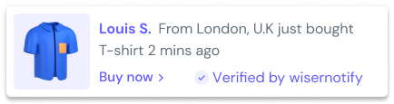
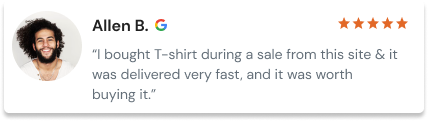
Small notifications like “Sarah from New York just purchased” or a live count of recent signups reassure a new customer at the moment buyer’s remorse can start.
WiserNotify, used by 20,000+ brands, adds recent purchases, signups, reviews, and live visitor counts to any page, including thank you pages. These upsell and cross-sell strategies pair well with it on order confirmation pages.
Wrap Up
A thank you page isn’t a formality. It’s the one page every converter sees, right when their interest is highest.
Confirm what happened, say what comes next, and give one useful next step that fits the action they just took. Then track the results and keep the version that works.
Frequently Asked Questions
What is a thank you page?
It’s the page visitors land on right after they buy, sign up, register, or request a demo. A good one confirms the action and gives one useful next step.
What should a thank you page include?
A clear confirmation, what happens next, and one call to action that fits the action the visitor just took.
What makes a good thank you page design?
Keep it on brand, put the confirmation at the top, use one prominent button, and make sure it reads well on a phone.
Should a thank you page be noindexed?
Yes. A noindex tag stops people from reaching the page through search without converting, which keeps your conversion tracking accurate.
How do you upsell on a thank you page?
Show a few products that pair with what the customer just bought, rather than random bestsellers, and keep it to one clear offer.

Krunal Vaghasiya is a marketing tech expert who boosts e-commerce conversion rates with automated social proof and FOMO strategies. He loves to keep posting insightful posts on online marketing software, marketing automations, and improving conversion rates.




 Capterra