
How To Display Offers On a Website Using the Offer Widget
 Krunal Vaghasiya|May 21, 2025
You’ve got a great product, your design looks solid, your checkout works, and yet… crickets.
You’re not alone.
Most ecommerce sites spend weeks perfecting their store and forget one powerful trigger that drives ecommerce sales: timely, relevant offers.
In this guide, I’ll show you how to effectively display offer widgets on your website, avoid common traps, and where these widgets work.
I’ve reviewed dozens of widgets, tested them on real pages, and analyzed what works and what doesn’t.
Let’s start with the foundation: understanding different types of offers and how to present them so your visitors care.
Build urgency
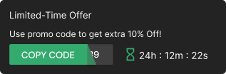
Add floating offers with countdown timer & coupon code.

Types of Offers and Their Presentation

Before you go and paste any offer widget on your homepage, pause. Offers aren’t one-size-fits-all.
Context matters. Your visitors land on your site for different reasons, and matching offers to those reasons is key.
1. Time-Sensitive Deals
Think: countdowns, flash sales, or limited-time offers.
These drive urgency.
Example: Create a pop-up widget with a “Get 20% off if you purchase in the next 15 minutes” offer and add a ticking timer.
Why it works: Urgency taps into action. People don’t want to miss out, especially new visitors to your ecommerce site.
Where to use:
- Exit intent popups
- Product pages (especially when a discount is active)
- Homepage banners
Keeping default configurations for widgets and pop-ups can optimize user engagement and maintain consistency while allowing customization to better suit specific marketing goals.
Pro Tip: Use precise language like “limited-time offer,” and show the exact countdown.
2. Personalized Offers
Personalization isn’t fluff. It’s a conversion booster that enhances online sales through tailored offers that understand customer types and purchasing behaviors.
You can personalize based on:
- Referral link
- First-time customers
- Location
- Previous visitor clicks
Example: “Welcome back! Use code WELCOME10 to save 10%.”
Another: “You left items in your cart. Here’s 5% off to complete your purchase.”
This makes your offer feel more like a service, not a trick. You’re rewarding behavior, not begging for attention.
Where to use:
- On cart abandonment popups
- Homepage for returning users
- Admin panel settings to trigger widgets based on visit history
3. Loyalty and Referral Programs
Offers don’t stop after the first sale.
Use offer widgets to promote:
- Loyalty discounts after repeat purchases
- Referral coupons (“Give $10, Get $10”)
Creating engaging elements like loyalty discounts and referral coupons is easy and effective for enhancing customer experience and boosting sales.
Why it works: it rewards users who bring you more people.
Example: An offer banner on the order confirmation page: “Invite a friend and get 15% off your next purchase.
Where to use:
- Confirmation/thank you pages
- In-account dashboard pages
- As floating widgets on product pages
Build trust & FOMO
Highlight real-time activities like reviews, sales & sign-ups.
How to Add the Offer Widget to a Website
Now let’s get into how to add an offer widget on a website,
First, sign up for Wisernotify.
Once you sign up and board, you can see the Wisernotify dashboard like this. The dashboard has widget options, and you can add notifications from there.

Now choose any widget from it to show offers, click on “add,” and start customizing based on your style and the best practices mentioned in this article.

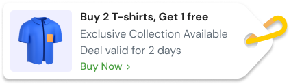
Here is how the countdown offer looks now on a real website.

Strategic Placement of Offers

Let’s talk about where to place your offer widgets. Most people get this wrong. You don’t need 12 widgets. You need the right widget in the right place.
Effectively displaying multiple offers on a landing page enhances user engagement and prevents visitors from bouncing.
1. Homepage Highlights
Your homepage is your billboard.
It’s the first thing new visitors see. So make it count.
Ideas:
Add a promo code bar at the top
Show a pop-up for first-time visitors (timed or scroll-based)
Highlight seasonal deals in your hero section
Bonus: Match your color theme and ensure the offer doesn’t blend into the design like wallpaper.
2. Product and Category Pages
These are intent-heavy pages.
Someone clicking on a product page isn’t browsing—they’re considering, so give them a little nudge.
Ideas:
Show a sticky banner: “Get 10% off with discount code SAVE10”
Float a discount box below the add-to-cart button
Include offer widgets that preview other deals in your catalog
Ensure the widget doesn’t block any CTA or essential info like price or availability.
3. Cart and Checkout Pages
This is where you close. And also where you lose people.
So, include:
Final reminders of a discount offer (“Apply your code SAVE10 before checkout!”)
Auto-apply coupons (from previous clicks)
Cross-sell upsell widgets: “Add this for 50% off”
Exit intent widgets also work great here: “Wait! Complete your order in the next 2 minutes and get an extra 5%.” These offers should be strategically displayed to incentivize customers to complete their purchases.
Just don’t overload the cart. Focus on one offer at a time.

Boost Conversion Instantly
Add Social Proof & Urgency to your website
Design Principles for Offer Displays

Now let’s get into the looks.
Designing your offer widgets incorrectly is the easiest way to tank conversions.
1. Visual Hierarchy
Your widget must stand out—but not scream.
Use contrast wisely:
Backgrounds should pop, not clash
Keep CTA buttons bold and action-based (like “Get My Discount” or “Claim Deal”)
Avoid tiny fonts. Your target audience should not squint to get a promo code.
Also, first, display the most crucial part: the value. Not the fine print.
2. Mobile Responsiveness
Over 50% of ecommerce sales happen on phones.
So yes, your offer widget must be mobile-friendly.
Check how it loads on:
- Product pages
- Cart
- Landing pages
Use preview tools to simulate mobile view and test widget placements.
Bonus: Avoid popups that take over the whole screen without exit intent.
3. Consistency and Branding
This is big.
Nothing kills trust faster than an off-brand discount widget.
Make sure:
Fonts, color themes, and button styles match your brand
Offer language matches your tone (casual, serious, playful)
Your widgets don’t feel like third-party ads
Use your existing style guide or design system. And yes, customize every widget if you can. Prebuilt templates help, but tweak them.
Common Mistakes to Avoid

There’s the right way to offer widgets. And then there’s… well, this list.
1. Overloading Pages with Offers
Don’t show five different widgets on a single page.
It’s not a festival.
Focus on one deal that matters. Too many offers confuse users, lower trust, and distract from the purchase.
Using high-quality images is also crucial, as low-resolution images can negatively impact conversions and fail to engage the audience.
If needed, rotate them using smart rules. Or limit one per session.
2. Poor Timing and Targeting
Bad timing = ignored offer.
Use triggers like:
- Exit intent
- Scroll percentage
- Time on site
- Referral source
And target properly:
- Show first-time offers only to new visitors
- Don’t show popups to users who have already claimed a deal
Additionally, using high-quality images can significantly enhance the visual appeal of your offer widget, making it more engaging and effective.
If your tool supports behavior-based targeting, use it. It turns guesswork into smart offer delivery.
3. Lack of Clarity
Your offer shouldn’t need a decoder ring.
Don’t hide:
- Coupon codes
- Discount %
- When it expires
- Which products does it apply to
Be clear, concise, and upfront.
Bad: “Save Big Today!” Good: “Get 15% off your order. Code: TODAY15. Expires at midnight.”
Conclusion
Just adding a deal to your website doesn’t mean it’ll get noticed.
The right offer, placed smartly, styled cleanly, and shown to the right visitor, does move the needle.
High-quality images can significantly enhance the visual appeal of the offer widget, making it more engaging for visitors.
Offer widgets don’t need to be flashy. They need to be relevant.
So take this post, adjust your widgets and test placements, match them with your website visitors’ intent, and watch your ecommerce sales grow.
Start with one clear offer on your homepage. Keep refining.
It’s not about how many offers you can display, but how many convert.
Krunal Vaghasiya is a marketing tech expert who boosts e-commerce conversion rates with automated social proof and FOMO strategies. He loves to keep posting insightful posts on online marketing software, marketing automations, and improving conversion rates.




 Capterra