

I’ve analyzed over 200 ecommerce landing pages while building conversion tools at WiserNotify.
Most of them are terrible. Same stock photos. Same “Shop Now” buttons. Same forgettable layouts.
But a handful of pages consistently pull 2x to 5x the average conversion rate. And they all share a few specific patterns that you can steal for your own store.
In this post, I’m breaking down 13 ecommerce landing page examples that actually convert.
Not just “pretty pages” (you can find those on Dribbble). These are real pages from real brands that drive revenue.
I’ll explain exactly what each one does right and how you can apply the same tactics.
Boost Conversion Instantly
Add Social Proof & Urgency to your landing page
What Separates a Great Ecommerce Landing Page From a Product Page
Before we jump into examples, I need to clear up a source of constant confusion.
A product page lives inside your store’s navigation. It has a menu bar, related products, category links, and breadcrumbs. Its job is to inform. Shoppers browse multiple product pages before deciding.
An ecommerce landing page is different. It’s a standalone page with one single goal: get the visitor to take a specific action. Buy this product. Claim this offer. Sign up for this subscription. Everything on the page exists to push toward that one outcome.
The key difference? Distraction. Product pages offer 15 clickable options. Landing pages offer one.
That’s why landing pages consistently convert higher than product pages. According to Unbounce’s benchmark data, landing pages have a median conversion rate of 6.6%, compared to the ecommerce average of 2-3%.
Also check: 11 Product Landing Page Examples That Drive Sales
13 Ecommerce Landing Page Examples (With Conversion Breakdowns)
1. Tattly
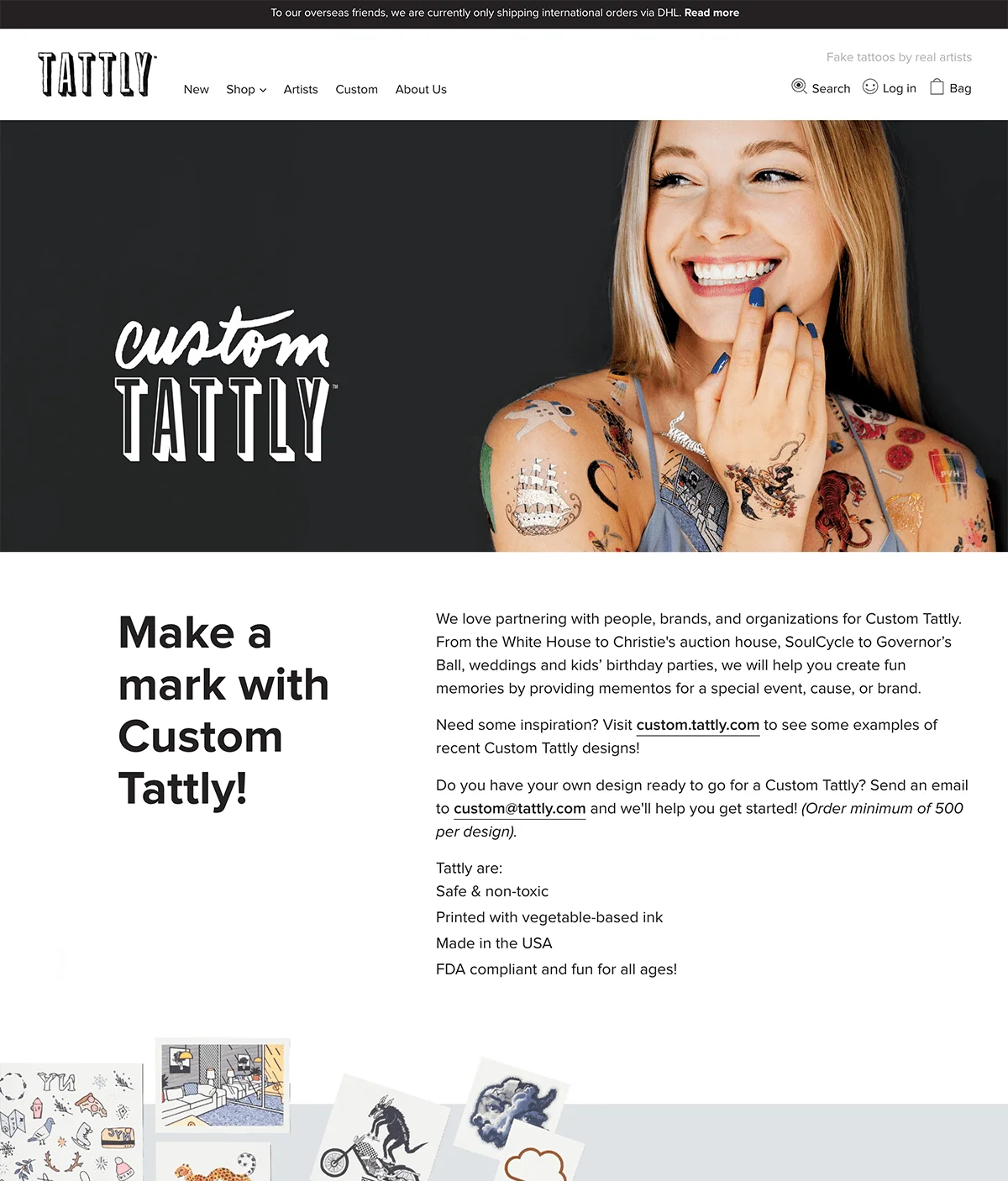
Tattly’s landing page for its custom temporary tattoo service does something most ecommerce pages fail to do: it makes the product feel personal before you even scroll.
What they nail: The hero image shows real tattoos on real hands (not product-on-white-background shots). The playful photography communicates exactly who this product is for, parents and event planners, without saying it in text.
Steal this: Use lifestyle imagery that shows your product in context. A shopper should understand the use case within 2 seconds of landing on your page. Tattly doesn’t waste words explaining what temporary tattoos are. The image does all the heavy lifting.
Build urgency
Add floating offers with countdown timer & coupon code.


2. Ipsy
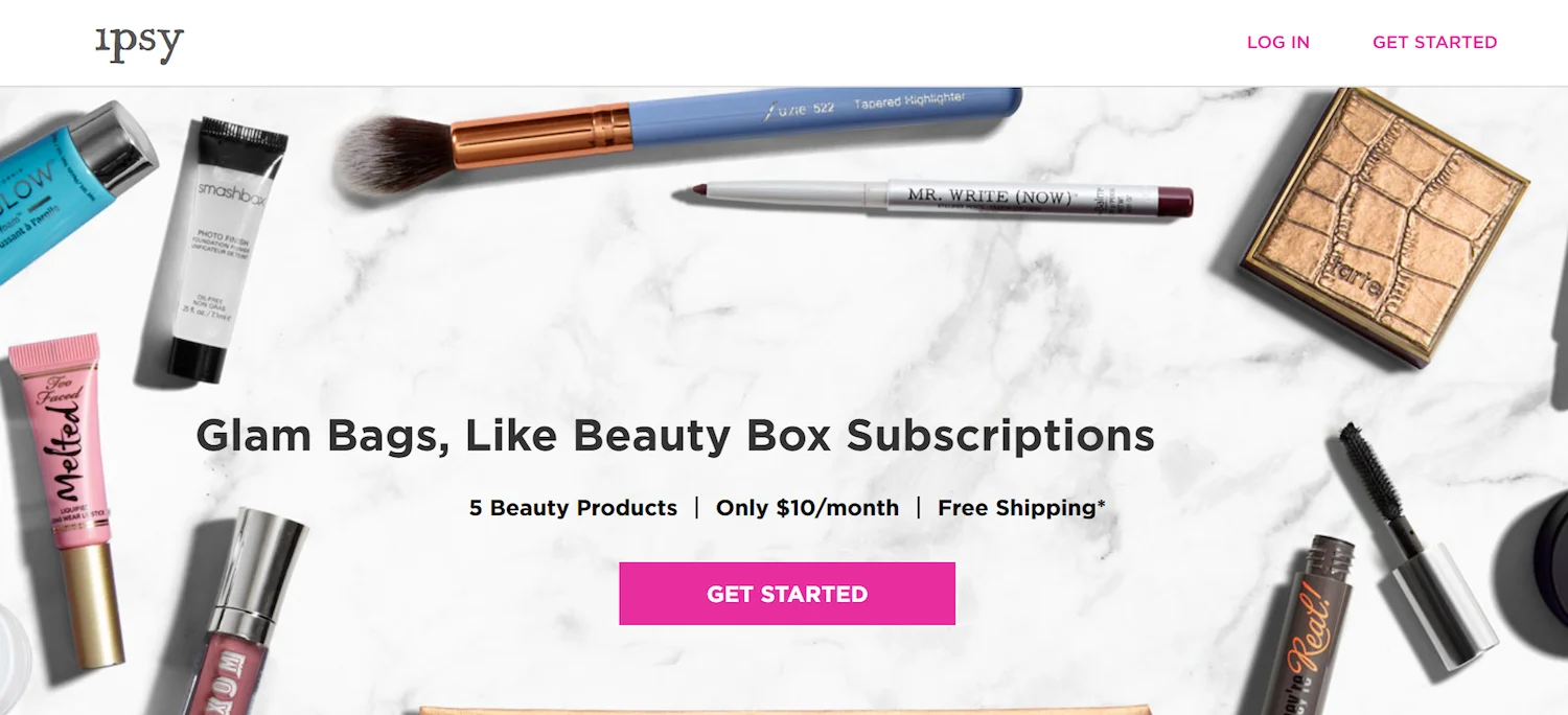
Ipsy’s subscription landing page is a masterclass in showing value. The hero section displays the actual products you’ll receive, arranged beautifully on marble.
What they nail: Instead of saying “you’ll get 5 beauty products,” they SHOW you five specific products with visible brand names. That’s a psychological trick. Named brands feel more valuable than generic promises. The clean background makes each item pop.
Steal this: If you sell bundles, boxes, or subscriptions, photograph the actual contents laid out. A flat-lay of real products converts better than a picture of a closed box every single time.
3. FabFitFun
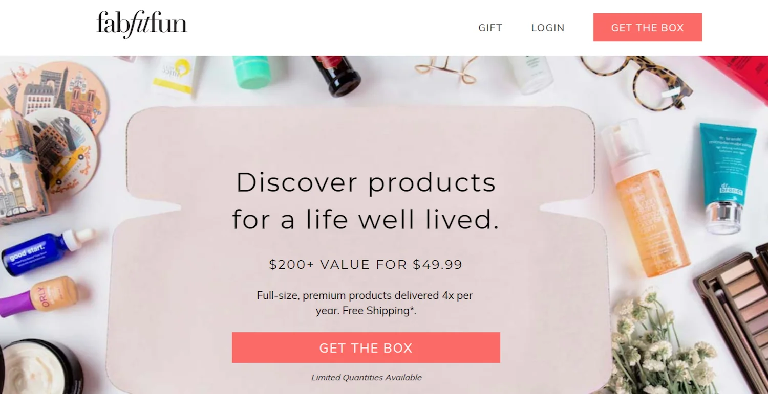
FabFitFun takes the “show the contents” approach even further. Their landing page looks like someone just unboxed the subscription and spread everything across the table.
What they nail: The variety. You can see beauty products, wellness items, fashion accessories, and home goods all in one shot. That variety communicates value better than any price comparison ever could. And the bright, colorful photography makes the whole experience feel exciting.
Steal this: For subscription boxes, the unboxing visual is your most powerful asset. Shoot it like it’s a gift someone’s about to open, not a product catalog. FabFitFun’s page makes you want to be the person who receives that box.
4. Casper

Casper sells mattresses online, which sounds impossible. You can’t feel a mattress through a screen. So their landing page focuses entirely on the outcome: peaceful sleep.
What they nail: The hero shows a family sleeping comfortably, not a mattress sitting in a room. That’s outcome selling. They’re not selling foam and springs. They’re selling restful nights. The minimalist design with lots of white space reinforces a sense of calm and simplicity.
Steal this: If your product solves a problem, show the solved state, not the product. Casper doesn’t show mattress construction diagrams above the fold. They show the result you actually care about.
Build trust & FOMO
Highlight real-time activities like reviews, sales & sign-ups.

5. Onewheel
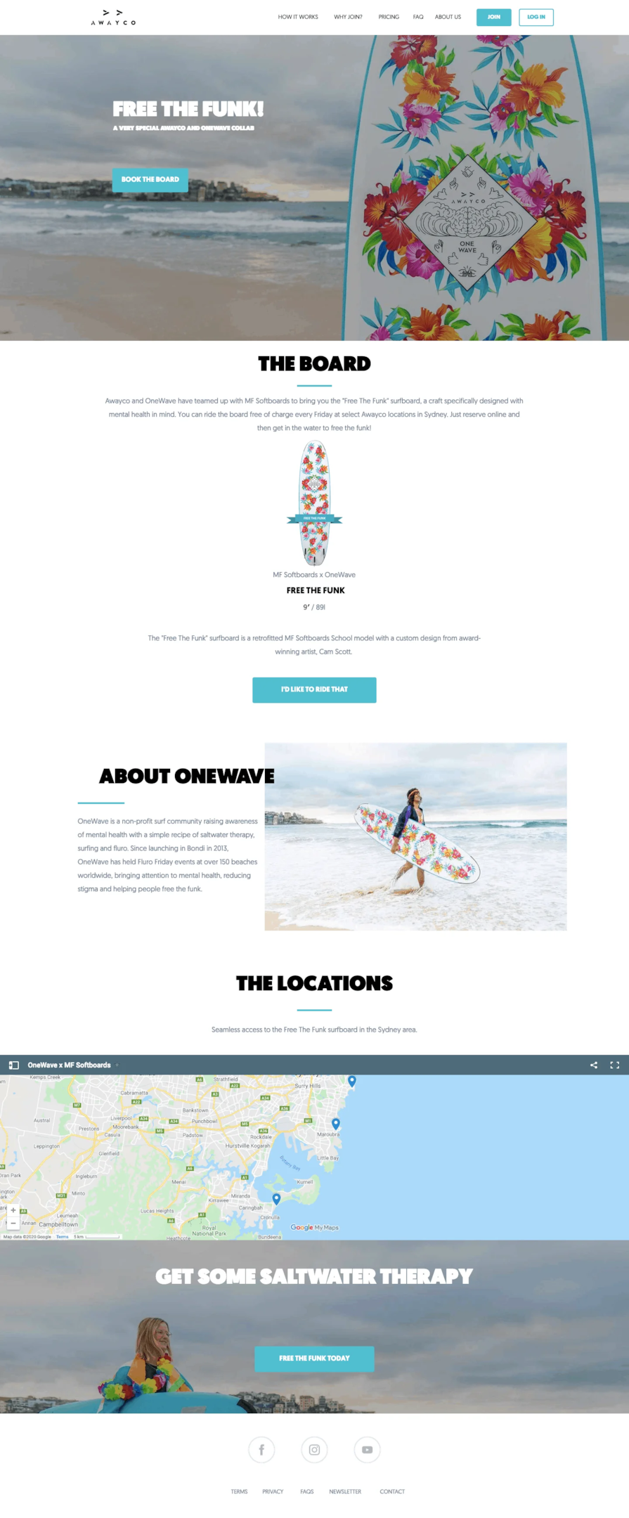
Onewheel’s landing page sells adventure, not hardware. The beach backdrop, the bold colors, the “Free the Funk” campaign name. Everything screams personality.
What they nail: Emotional connection. Nobody buys an electric skateboard because of its specs. They buy it because they want to feel like the person in that photo. Onewheel understands this. The page has minimal text, a single bold CTA, and lets the visuals carry the message.
Steal this: For lifestyle products, your landing page should make visitors feel something. Not “informed.” Not “educated.” They should feel desire. Keep the copy short and let the imagery do 80% of the work.
6. Away

Away’s landing page for their AirPods cleaning kit is fascinating because it’s a low-ticket impulse product, not their flagship luggage.
What they nail: Problem-solution simplicity. The page highlights a specific problem (dirty AirPods) and positions their kit as the obvious fix. No fluff, no brand story, no mission statement. Just “your AirPods are gross, here’s how to fix that.” The product photography is crisp and detailed.
Steal this: For low-price accessories, strip your landing page down to its essentials. State the problem, show the solution, price it, CTA. Away proves you don’t need a 2,000-word page to sell a $15 product.
Build trust & FOMO
Highlight real-time activities like reviews, sales & sign-ups.
Also check: 10 Social Proof Landing Page Examples That Build Trust
7. Woodcraft
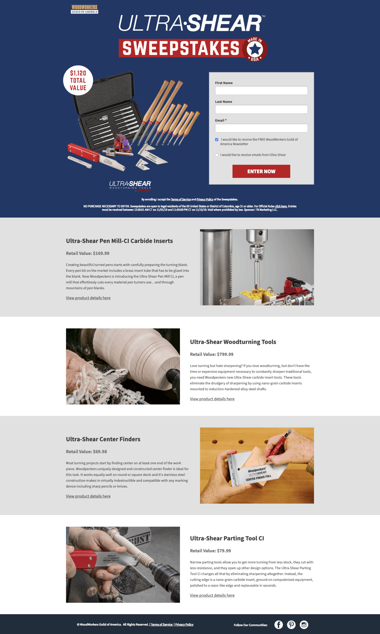
Woodcraft uses its landing page for lead generation, not direct sales. It’s a sweepstakes for a chance to win Ultra-Shear tools. And the simplicity is what makes it work.
What they nail: Low-friction entry. The form asks for minimal information. The prizes are displayed prominently with high-quality images. And the barrier to entry is almost zero, which maximizes the number of leads captured.
Steal this: If your goal is email list growth, a sweepstakes landing page with a valuable product prize will outperform a generic “sign up for our newsletter” form. Make the prize aspirational and the entry form short.
8. Xpand
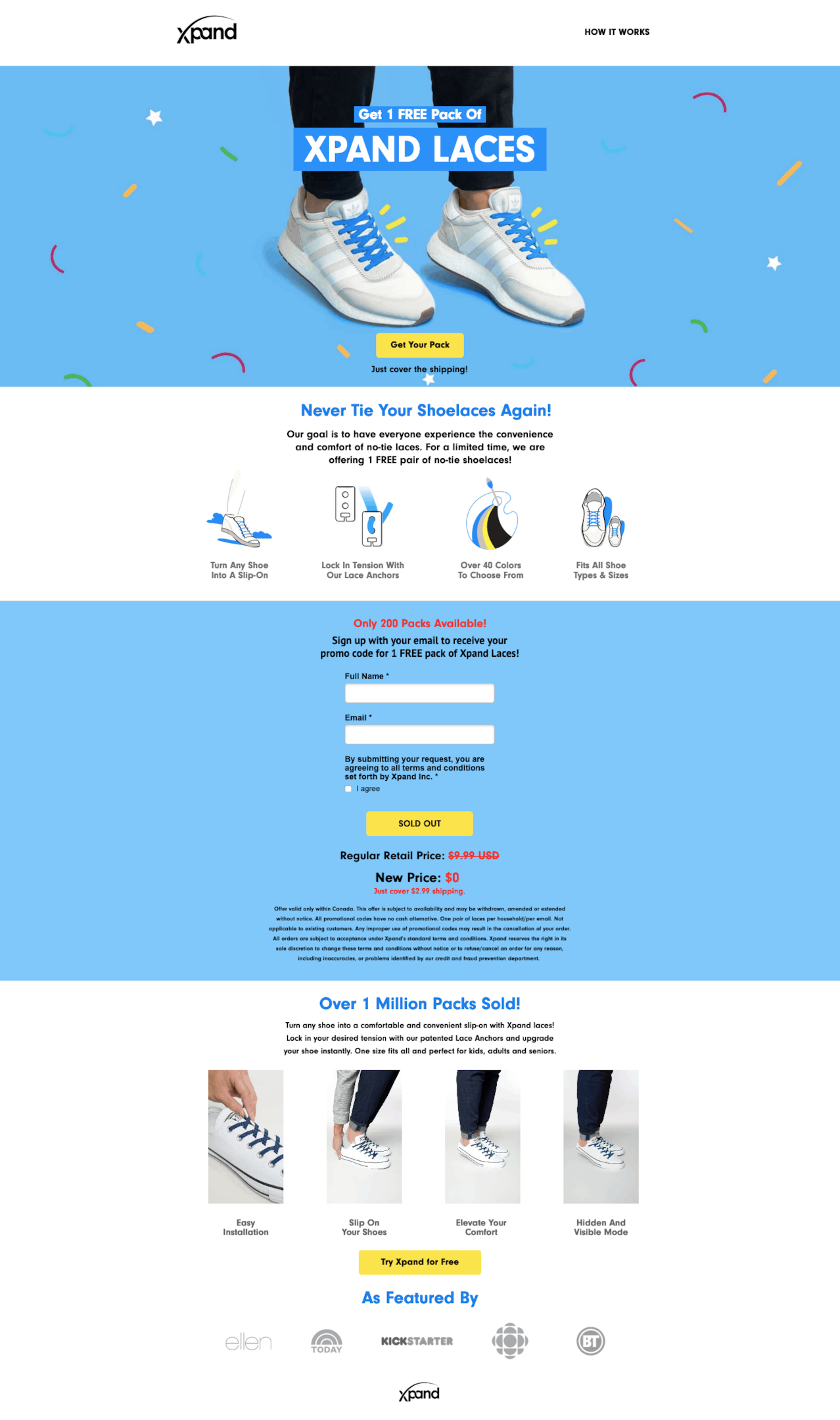
Xpand’s “free laces” landing page is a textbook example of using a free offer to acquire customers. They give away the product and charge shipping.
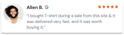
What they nail: Social proof placement. The page combines user photos, star ratings, and review counts right next to the CTA. When you see that thousands of people have already bought these laces and rated them 5 stars, the “free” offer becomes irresistible.
Steal this: The “free + shipping” model works brilliantly for low-cost products with high repeat purchase potential. Pair it with strong social proof near the CTA, and your conversion rate will surprise you.
Build trust & FOMO
Highlight real-time activities like reviews, sales & sign-ups.

9. Boiron
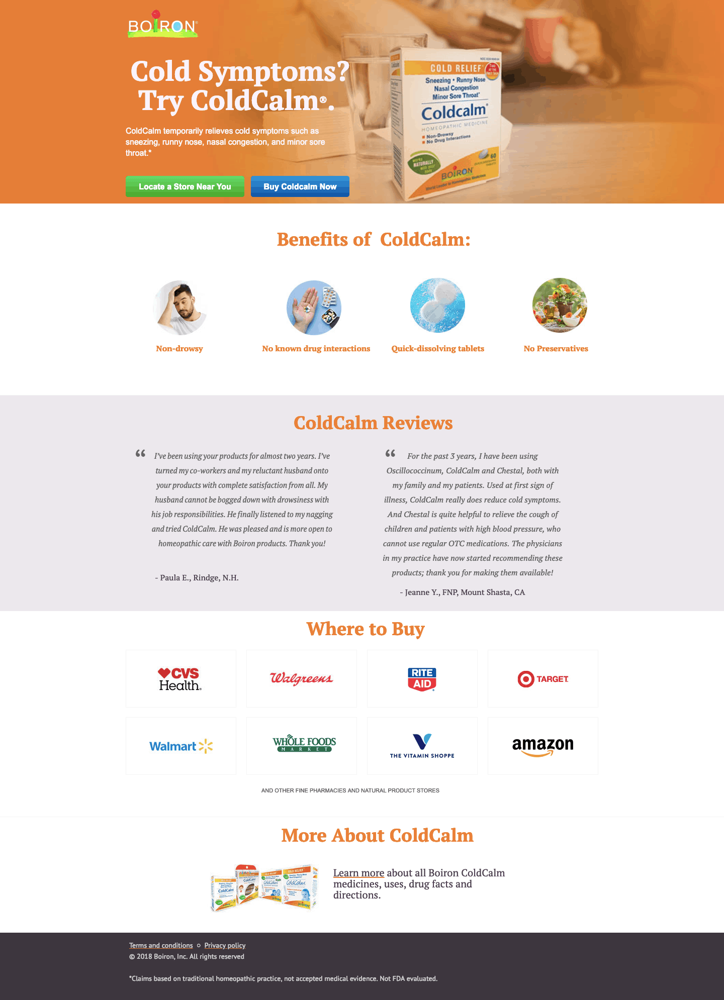
Boiron’s ColdCalm landing page sells a health product, which means trust is everything. They lean heavily into customer testimonials and clean, medical-grade design.
What they nail: Trust architecture. The page flows from product benefits to customer testimonials to ingredient transparency. For health products, this sequence matters. People need to understand what they’re putting in their bodies before they buy, and Boiron addresses this anxiety in the right order.
Steal this: For supplements, health products, or anything customers might be skeptical about, lead with benefits, follow with social proof, and close with ingredient/safety transparency. The trust sequence is: what it does, who uses it, and what’s in it.
10. Vanity Planet
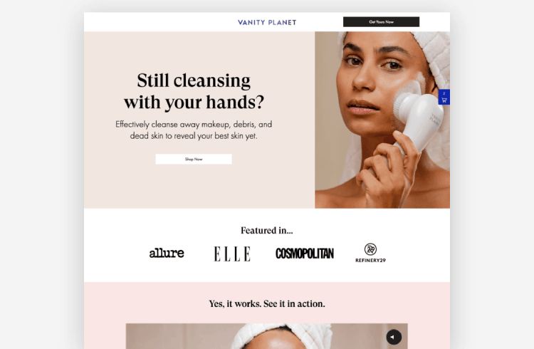
Vanity Planet’s facial cleansing brush page combines video demo, lifestyle imagery, and technology explanation into one cohesive flow.
What they nail: The video demo. Showing the product being used on someone’s face removes the biggest objection (does this actually work?). Bold text over lifestyle images keeps the page scannable while still feeling premium.
Steal this: If your product requires demonstration to understand its value, embed a short video above the fold. Vanity Planet doesn’t hide the demo in a FAQ section. They make it the centerpiece. Product videos can boost conversion rates by up to 80%.
11. Axis
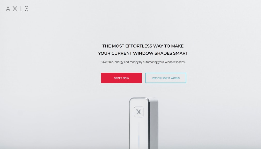
Axis sells smart window shades, a product that’s hard to visualize online. Their landing page solves this with clean product renders and a focus on simplicity.
What they nail: Objection handling. Smart home products intimidate non-technical buyers. Axis addresses this by emphasizing “no tools, no drilling” and visually showing the installation process. Short copy blocks with clear CTAs make the page feel approachable rather than overwhelming.
Steal this: For tech products or anything with an installation component, address the “is this going to be complicated?” fear directly in your landing page copy. Show the easiest path to using your product.
Build urgency
Add floating offers with countdown timer & coupon code.
12. Hims
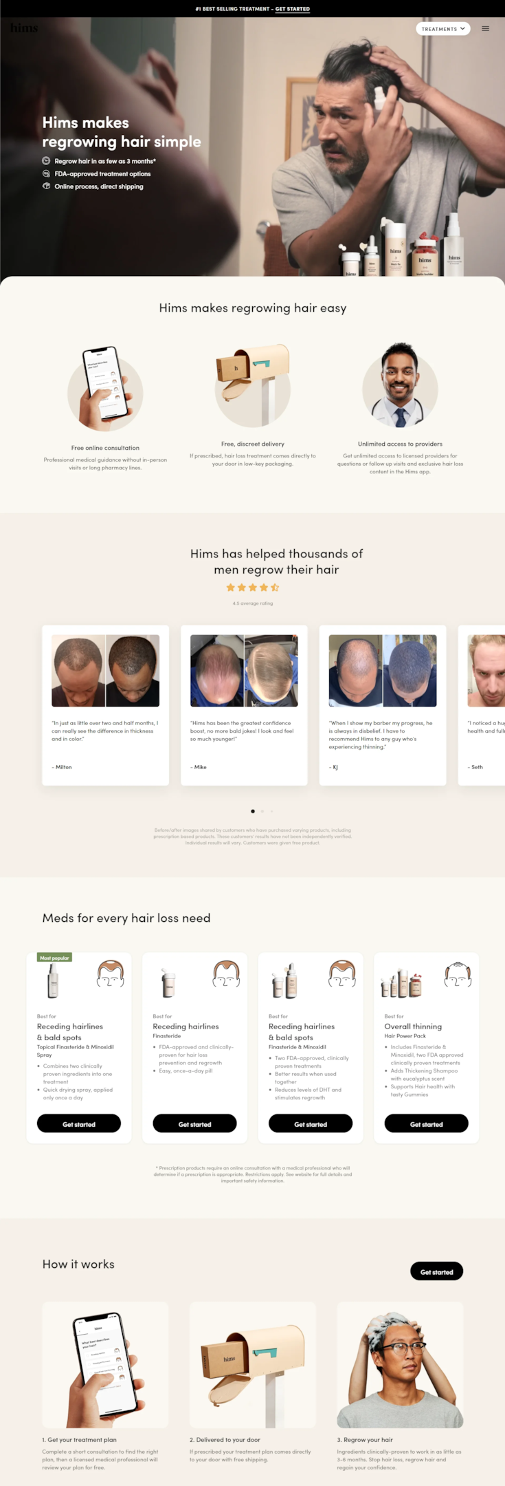
Hims tackles a sensitive topic (hair loss) with a landing page that feels clean, modern, and judgment-free.
What they nail: Tone. The page doesn’t use fear tactics or dramatic before/after photos. It presents hair growth treatments as normal, routine self-care. The design feels more like a wellness brand than a medical company. Social proof and clinical data are woven in without making the page feel clinical.
Steal this: For sensitive or stigmatized products, your landing page tone matters more than your design. Hims makes hair loss treatment feel as normal as buying moisturizer. That destigmatization through design is what drives their conversions.
13. Squatty Potty
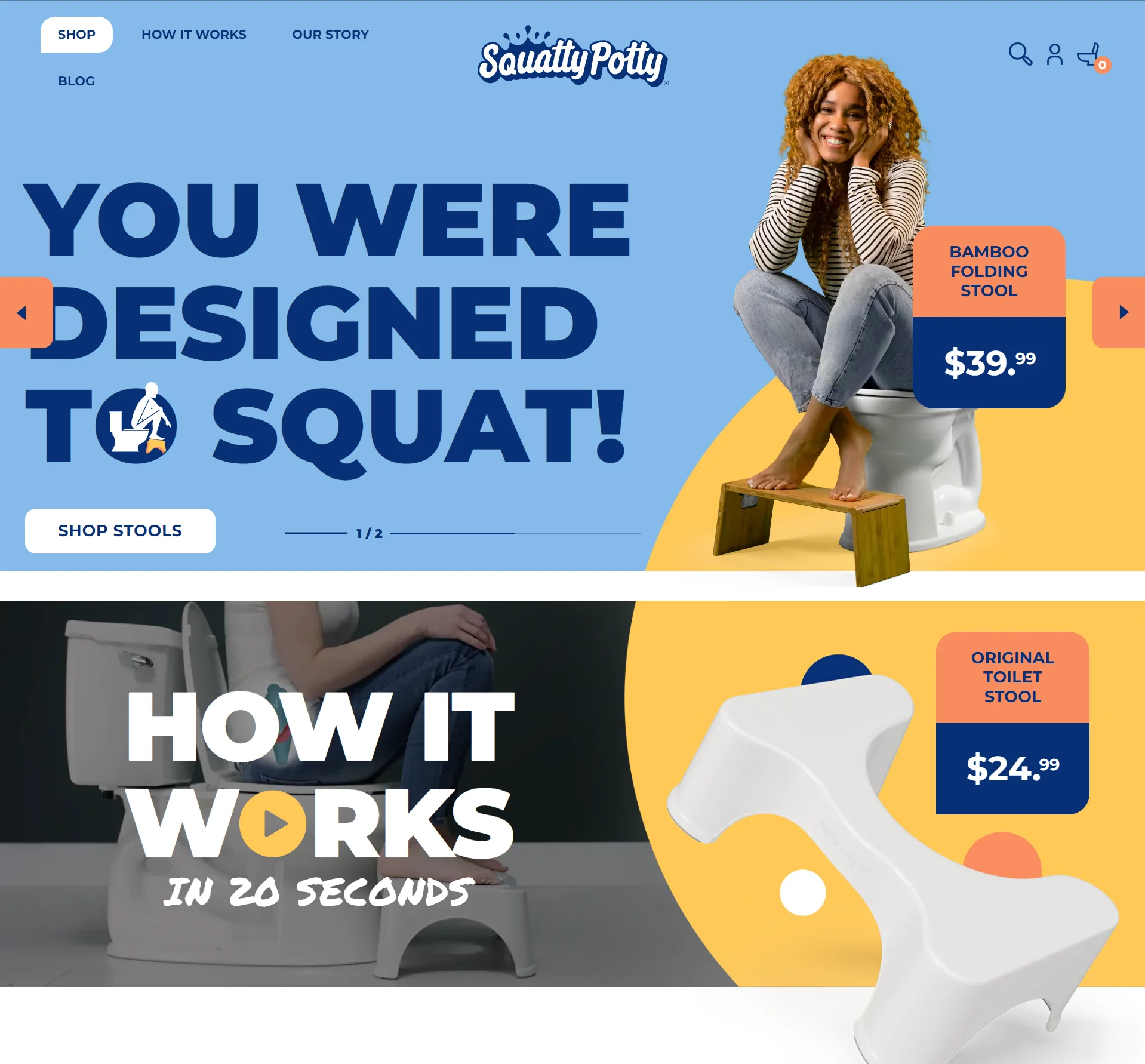
Squatty Potty has the hardest marketing challenge on this list: selling a toilet stool. Their landing page uses humor and education to make an awkward product feel approachable.
What they nail: They acknowledge the awkwardness head-on instead of pretending it doesn’t exist. The mix of humor with actual health science (posture diagrams, medical benefits) gives visitors permission to take the product seriously. The clean, informative design bridges the gap between “this is funny” and “I actually need this.”
Steal this: If your product addresses an embarrassing problem, don’t shy away from it. Address it with humor and back it up with credibility. The combination of “we know this is weird” plus “but here’s the science” is incredibly effective.
Boost Conversion Instantly
Add Social Proof & Urgency to your landing page
5 Conversion Patterns Every Ecommerce Landing Page Needs
After studying these 13 pages (and hundreds more), I’ve noticed five patterns that separate high-converting ecommerce landing pages from the rest.
1. The hero image sells the outcome, not the product. Casper shows sleep, not mattresses. Onewheel shows adventure, not hardware. The best pages make you want the lifestyle, not the item.
2. Social proof appears near the CTA, not buried at the bottom. Xpand puts star ratings right next to the “Get Free Laces” button. Boiron places testimonials just before the purchase CTA. When proof and action sit together, conversion rates climb.
3. Navigation is minimal or removed entirely. None of these landing pages has a full site menu. Some have a logo that links to the home page, but that’s it. Every click option that isn’t the CTA is a potential exit. I’ve seen removing navigation increase conversions by 20-30% on WiserNotify customer sites.
4. Price is reframed, not hidden. The best ecommerce landing pages don’t just say “$45.” They say “$2.65 a day” or “6 pairs for the price of 3.” Reframing the price relative to daily cost, competitive products, or value received consistently outperforms showing raw pricing.
5. One page, one offer, one CTA. Not a single example on this list tries to sell multiple products on the same landing page. One focused offer with one repeated CTA button throughout the page. That’s the formula.
How to Add Social Proof to Your Ecommerce Landing Pages

Every high-converting example on this list uses some form of social proof: reviews, testimonials, user counts, and purchase notifications. It’s not optional. It’s the difference between “this looks interesting” and “I’m buying this right now.”
Here’s how we approach it at WiserNotify. Full disclosure, this is our tool. But I’m including it because adding social proof to landing pages is genuinely one of the highest-impact changes you can make for conversions.
Real-time purchase notifications show visitors that other people are buying right now. When someone sees “Maria from Denver just purchased this 4 minutes ago” on your landing page, the product feels validated. We’ve seen this single change lift conversion rates by 12-15% on average.
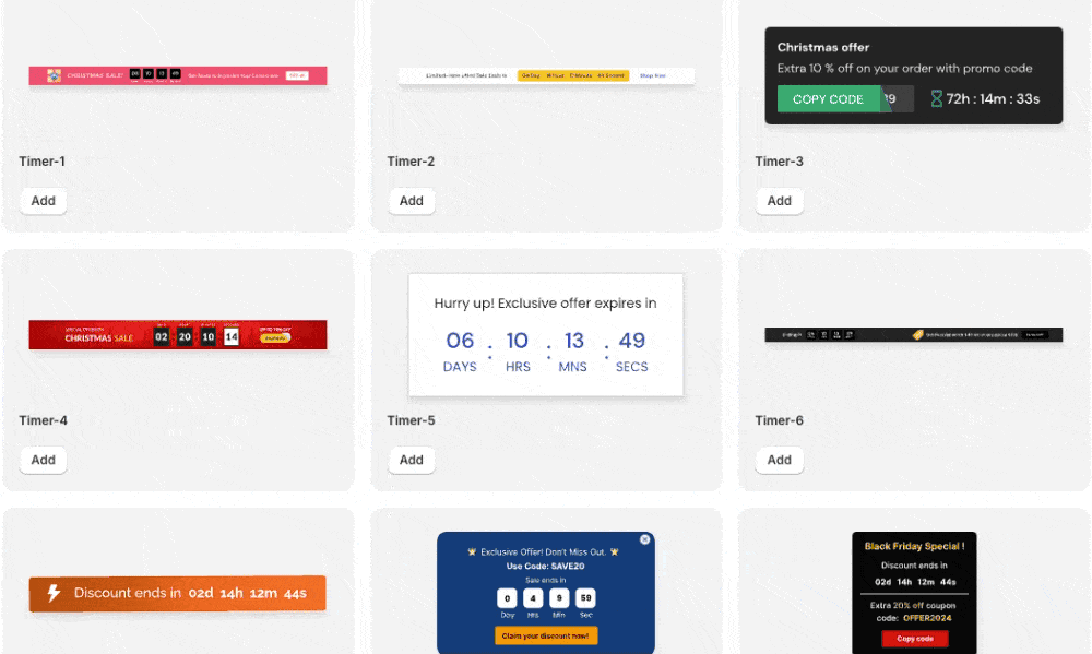
Countdown timers create genuine urgency. Pair a countdown timer with a limited-time offer on your landing page, and fence-sitters become buyers. The keyword is “genuine.” If your timer resets when the page refreshes, you’ll lose trust fast.
A/B test your notifications. Not every type of social proof works for every product. We let you test different notification styles, placements, and messages to find what moves your specific audience.
WiserNotify offers a 14-day free trial with a money-back guarantee. Takes about 5 minutes to set up on any landing page, whether you’re on Shopify, WordPress, or any other platform.
3 Ecommerce Landing Page Builders Worth Using
You don’t need to code from scratch. These three tools let you quickly build professional ecommerce landing pages.
1. Unbounce
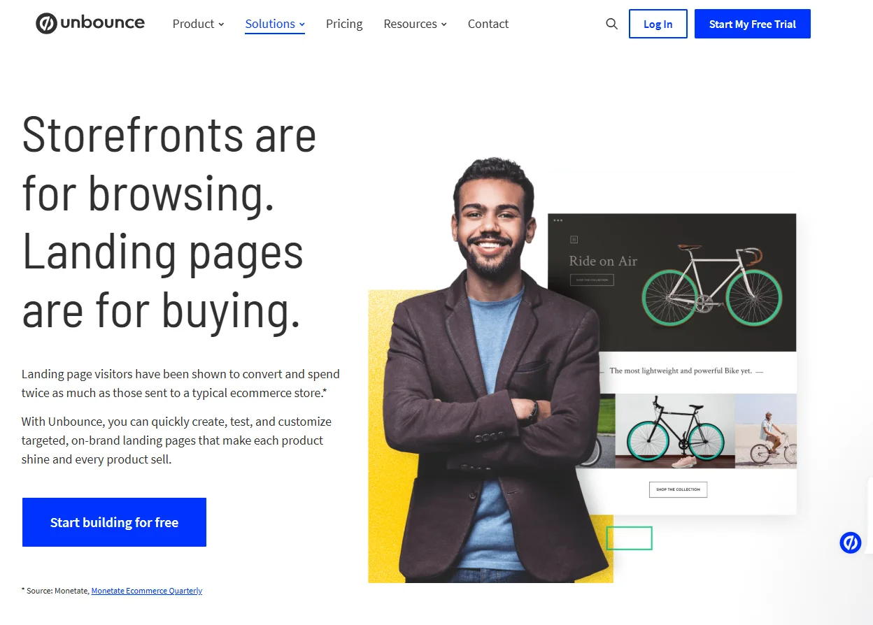
Unbounce is my top pick for most ecommerce brands. Their Smart Builder uses AI to recommend page layouts based on your industry and conversion data.
The drag-and-drop editor is genuinely intuitive (I’ve tested it extensively), and the built-in A/B testing means you’re always optimizing.
Pricing starts around $99/month, which is steep for small stores, but the ROI math works if you’re driving paid traffic.
2. ConvertFlow
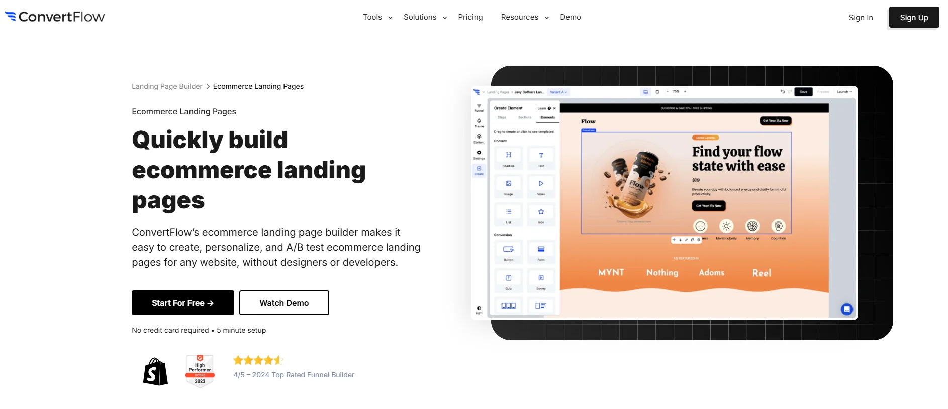
ConvertFlow shines for personalization. You can build landing pages that change based on who’s visiting (new vs. returning, traffic source, location).
If you’re running multiple ad campaigns pointing to the same landing page, ConvertFlow’s dynamic content lets you match the message to each audience without building separate pages.
Great for mid-size stores running sophisticated campaigns.
3. Shogun
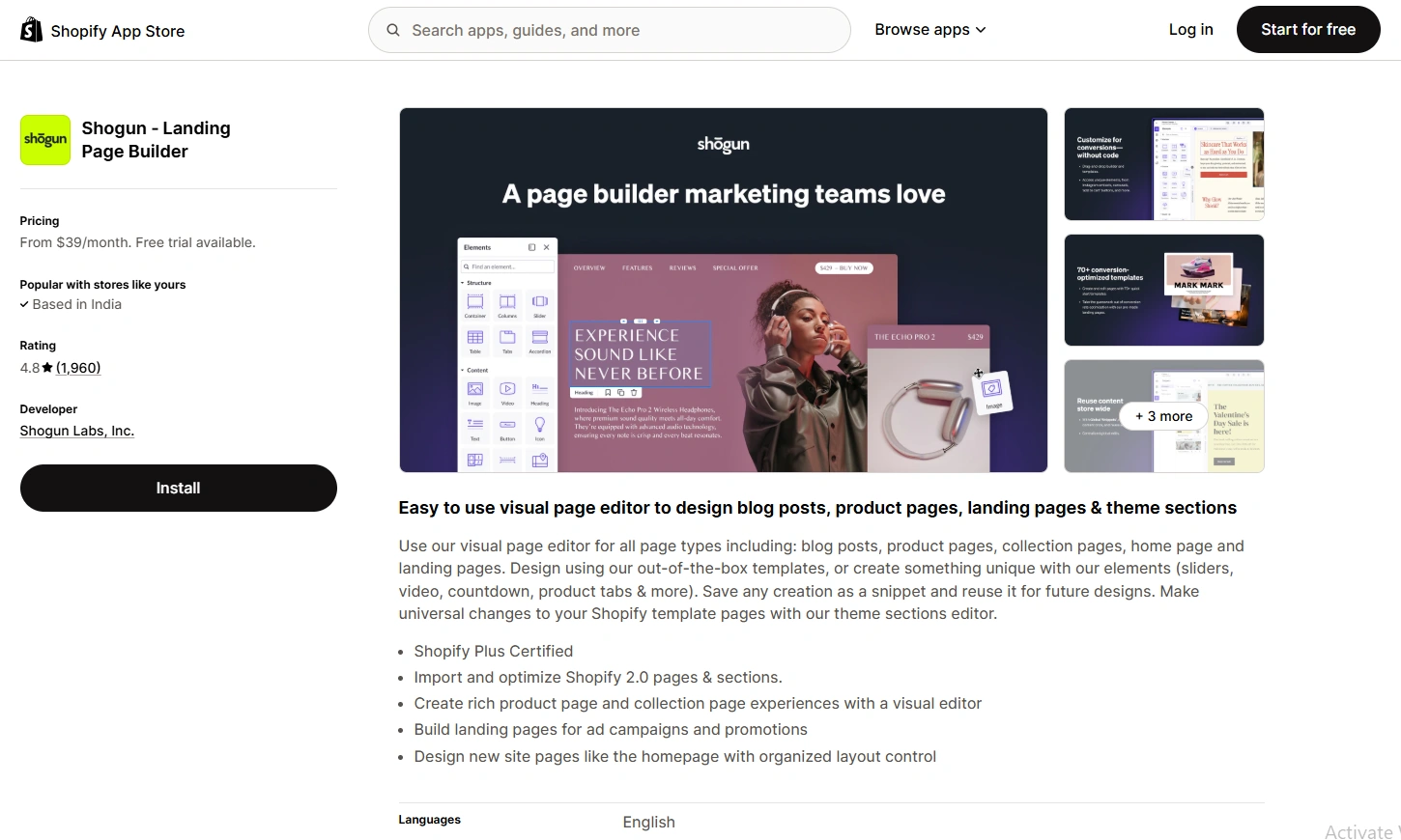
If you’re on Shopify, Shogun is the most popular page builder for a reason.
It lives inside your Shopify admin, pulls your product catalog directly, and has specific ecommerce blocks (product sliders, reviews, countdown timers) that generic builders don’t offer.
The free plan is limited, but the $39/month tier handles most needs.
Common Ecommerce Landing Page Mistakes
I’ve reviewed hundreds of landing pages for WiserNotify customers. These three mistakes show up over and over.
Mistake 1: Treating your landing page like your homepage. Your homepage introduces your brand. Your landing page sells one thing. If your landing page has a navigation menu, category links, and featured collections, you’re bleeding conversions. Strip it down. One offer. One CTA.
Mistake 2: Hiding the price. I’ve seen landing pages that make visitors click through to a product page just to see the cost. Every extra click is a drop-off point. Show the price on the landing page, ideally framed in terms of perceived value (price per day, price per use, “less than your daily coffee”).
Mistake 3: Generic CTAs. “Submit” and “Learn More” are conversion killers. Your CTA should tell visitors exactly what happens when they click. “Get 50% Off Today,” “Start Your Free Trial,” or “Claim Your Box” outperform generic buttons by 2-3x. We covered this in depth in our guide on effective calls to action.
Next Steps
The 13 examples above aren’t just eye candy. They’re templates for how to structure your own ecommerce landing pages.
Here’s my quick-start advice. Pick the example that best matches your product type. Study what they do with their hero image, their CTA placement, and their social proof. Then build your own page following the same structure.
If you want to further boost conversions, add real-time social proof notifications and offers to your landing page. It’s one of the fastest ways to increase trust and urgency without redesigning anything.
And never stop testing. The best ecommerce landing pages aren’t launched and forgotten. They’re iterated weekly based on actual visitor behavior. Run A/B tests on headlines, images, CTA copy, and social proof placement. Small changes compound into massive revenue differences over time.
