
How to Create an Exit Intent Popup for Your Website

I’ve tested 13+ exit intent popups over the past 2 years.
Some worked like magic. Others? They straight-up flopped.
In this guide, I’ll explain an exit intent popup, why it matters, what real results you can expect, and what mistakes to avoid.
I’ll also explain how to create exit popups that don’t annoy people but actually generate results.
Let’s get into it.
What Is an Exit-Intent Popup?
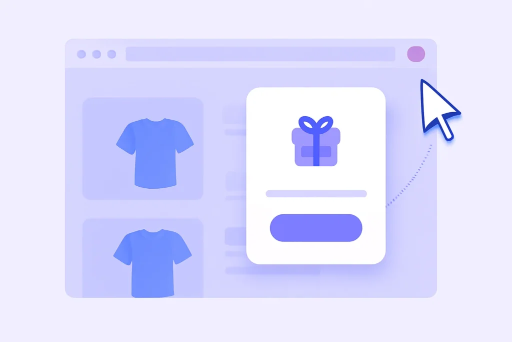
An exit intent popup is a small message that appears when someone is about to leave your site.
It usually appears when the user’s mouse moves toward the browser’s close button or tab bar, ensuring the exit intent popup appears precisely to capture attention.
It’s like your site saying, “Wait! Before you go…”
These intent popups use exit intent technology to track user behavior, like cursor movement and scroll patterns, and trigger a message right before visitors leave.
This is your last chance to grab visitors’ attention before they bounce.
You’ve probably seen these before:
A pop-up offering a discount code just before checkout.
A newsletter signup form that appears as you move to close the tab.
A free content upgrade on a blog post just before you hit the back button.
That’s what we call exit intent popups.
They’re not new, but they work. When done right, they convert abandoning visitors into email leads, buyers, and fans.
Real Stats to Prove the Point
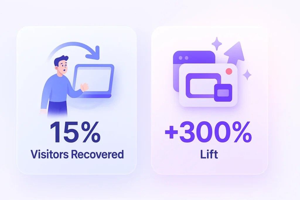
Numbers don’t lie. Let’s talk real performance.
Wisepops reported that exit popups can recover up to 15% of abandoned visitors.
OptiMonk found that on average, exit intent popups convert 2%–4% of traffic.
Sleeknote tested an exit popup with a content upgrade and saw a +300% conversion boost compared to a sidebar form.
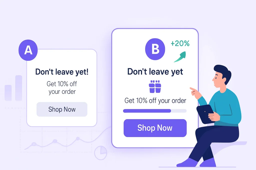
I’ve personally run A/B tests on eCommerce stores where a simple exit popup with a progress bar and CTA button outperformed sticky banners and static opt-ins by a long shot.
Again, the key is timing and messaging.
Making data-driven decisions based on A/B testing and analytics can significantly enhance the effectiveness of your exit intent popups.
If you throw up a popup without understanding your visitors, it’ll annoy more than it helps.
But if your popup feels helpful, relevant, and visually appealing, it’ll work.
Benefits of Using Exit-Intent Popups
Most site visitors won’t convert on the first visit.
Exit popups help you fix that. They also play a crucial role in boosting user engagement by presenting timely and relevant offers.
Here’s what you get when you create exit intent popups for your website:
1. Convert More Visitors
Without an exit popup, visitors leave. That’s it.
With a popup form triggered at the right moment, you give them a second chance to take action, like grabbing a deal, signing up for a newsletter, or downloading a freebie, ultimately converting them into paying customers.
2. Reduce Cart Abandonment
This one’s big. A well-timed exit intent popup offer with a discount code or urgency-based message can significantly reduce shopping cart abandonment; instead of bouncing, the shopper reconsiders. And often buys.
3. Capture Leads
You can still grab their email even if someone’s not ready to buy.
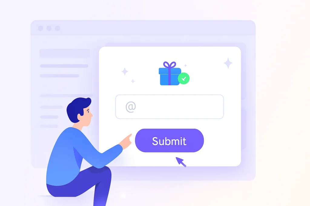
A simple popup example: “Want 10% off your first order? Just drop your email.” This acts as a lead magnet, enticing visitors to provide their contact information.
Boom. Lead captured.
Creating an Effective Exit-Intent Popup


5 Best Practices for Using Exit-Intent Popups
Let’s make one thing clear: not all popups are created equal.
Here’s how to create exit intent popups that actually boost conversions and don’t drive people away.
Exit popup hacks can optimize your strategy, ensuring maximum engagement and conversions.
1. Match the Offer With the Page
If someone’s leaving your product page, don’t offer them a free eBook.
Instead, try: “Still thinking about it? Here’s a coupon code for 10% off your order—just for today.”
Make your popup offer match the intent of the page.
2. Use Clear and Short Copy
This isn’t the time for long paragraphs. To quickly capture the visitor’s attention, stick to a simple headline, a few words of body copy, and a clear call to action button.
Something like:
“Leaving already? Here’s a discount!”
Get 10% off right now. Just enter your email below.
Simple. Direct. Effective.
3. Don’t Show It Too Soon
Timing matters.
Don’t show an exit popup the second someone lands on your site. Let them browse.
The exit intent trigger should only activate when their behavior signals they’re leaving, ensuring the popup appears just before visitors exit.
Exit intent popups work best when they feel like a helpful last-minute offer, not an ambush.
4. Design for Mobile Devices Too
Some tools fail at this. But your mobile traffic needs love, too.
Given that a significant portion of website traffic comes from mobile devices, it’s crucial to ensure that your popups are mobile-friendly.
Ensure your exit intent popups are mobile-friendly, have clear text, and an easy-to-close button. They should also not break the user experience.
5. A/B Test Like Crazy
Try different popup designs, images, CTA buttons, and even offers.
Want to know which one pulls more conversions? You’ll only know when you test.
Start small, test headlines, CTA color, or add a progress bar. Every tweak brings data.
Incorporating customer feedback into your A/B testing process can provide valuable insights for further optimization.
3 Common Mistakes to Avoid

Some exit popups work like a charm.
Others annoy visitors.
Here’s how to avoid the second one:
1. Using Generic Messaging
“Wait! Don’t leave!” is not enough.
Your popup needs a clear value proposition. Tell people what they’ll get, why it matters, and what to do next.
Bad: “Sign up for our newsletter.”
Better: “Get exclusive deals and updates—no spam, we promise.”
2. Overdoing the Offers
Don’t keep hitting users with 4 different popups on every page.
Be selective. Use exit intent pop-ups only to convert visitors who are leaving.
One well-placed pop-up works better than a flood of interruptions.
3. No Clear CTA
If you make someone think too hard, they’ll click away.
Your popup needs one thing: an explicit action.
Make it obvious to them whether they’re entering their email, claiming a discount code, or purchasing a content upgrade.
One CTA button. Big. Bold. Clear.
Platform-Specific Creation Guides
Now let’s create the popup for your platform and see where to place it for the best results.
How to Add a WooCommerce Exit Intent Popup in 5 Minutes
Add a HubSpot Exit Intent Popup to Reduce Bounce Rate
How to Add a Magento 2 Exit Intent Popup in 5 Minutes
How to Add a Webflow Exit Intent Popup in 5 Minutes
Exit Popup Shopify Without Coding (Simple Tutorial)
Conclusion
Exit intent popups aren’t magic. But when used right, they help you convert visitors who were seconds away from disappearing.
They give you one more shot to encourage visitors to stay, act, or sign up. Creating compelling and relevant popups is key to maximizing their effectiveness.
Use exit intent technology, track user behavior, and build compelling exit popups that speak directly to your target audience.
Want to collect more leads, sell more products, or grow your email list?
Add an exit intent popup for your website today.
Andf you’re looking for a great popup editor to build visually appealing popups fast, you know where to look.

Krunal Vaghasiya is a marketing tech expert who boosts e-commerce conversion rates with automated social proof and FOMO strategies. He loves to keep posting insightful posts on online marketing software, marketing automations, and improving conversion rates.




 Capterra