I Tested 14 Exit Intent Popups (Here’s What Converts in 2026)
 Krunal Vaghasiya|Dec 27, 2024
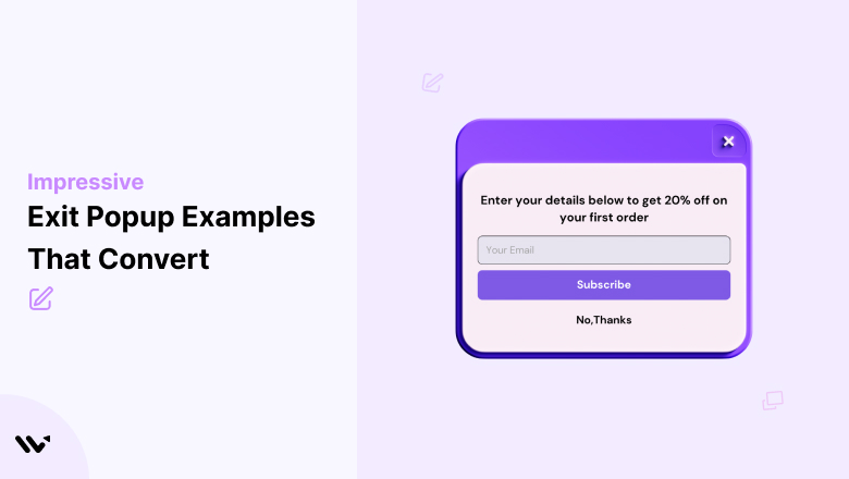
I’ve spent the last three years building exit intent popups for WiserNotify users. Some converted at 12%. Others barely hit 1%.
The difference wasn’t the tool. It was the pop-up itself.
After analyzing hundreds of exit popups across ecommerce stores, SaaS sites, and content blogs, I noticed patterns.
The popups that convert share specific traits. The ones that flop make the same mistakes.
In this post, I’m breaking down 14 exit intent pop-up examples that actually work.
For each one, I’ll show you what makes it convert and how you can steal the approach.
Also check: Latest popup statistics for 2026 benchmarks.
What Is an Exit Intent Popup?
An exit intent pop-up appears when a visitor is about to leave your website. It’s triggered by tracking mouse movement toward the browser’s close or back button.
Think of it as your last shot to make a case before someone walks out the door.
These popups can show discounts, collect emails, recommend content, or even ask for feedback.
When done right, they reduce cart abandonment and recover revenue you’d otherwise lose.
According to Wisepops, the average exit intent pop-up converts at 2.81%. The top 10% of exit popups convert at 19.63%.
That’s not a small number. On a store doing $100K/month, even a 3% recovery rate adds up to thousands in saved revenue.
How Do Exit Intent Popups Work?
On a desktop, exit intent technology tracks your mouse cursor. The moment it moves toward the top of the browser (where the close button or address bar sits), the pop-up fires.
It’s simple, fast, and surprisingly accurate.
Mobile is a different story. There’s no mouse cursor to track. So mobile exit intent relies on other signals: tapping the back button, switching tabs, quickly scrolling up, or pausing for a set amount of time.
Not every tool handles mobile well, which is why mobile conversion optimization matters so much.
The timing is everything. Fire too early and you annoy people. Fire too late and they’re already gone.
Most tools let you set a delay (1 to 3 seconds after exit intent is detected). I’ve found that a 1-second delay performs best in most tests. It feels less jarring.
14 Exit Intent Popup Examples That Actually Convert
I’ve grouped these by strategy so you can find the approach that fits your business.
1. Help Scout (Content Lead Magnet)

Help Scout doesn’t offer a discount. They don’t beg you to stay.
Instead, they pitch their email newsletter with a simple promise: get articles like the one you just read, twice a week.
Why it converts: The pop-up matches the visitor’s existing intent. Someone reading a Help Scout blog post is already interested in customer support content. Asking them to get more of what they came for is a natural next step.
No friction. No hard sell. Just value alignment.
This approach works best for content-heavy sites where the audience values education over discounts. If you’re running a blog that drives traffic, this model is worth testing.
2. Pricefalls (Cart Completion Reminder)
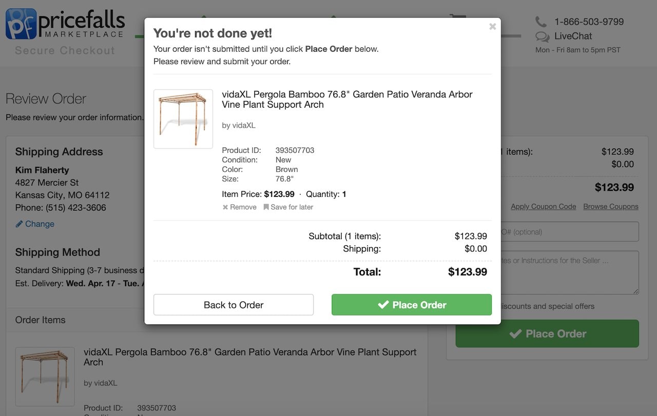
Pricefalls takes the simplest possible approach. Their exit pop-up just says: “Your order isn’t complete until you click Place Order.”
No discount. No gimmick. Just a reminder.
Why it converts: Sometimes people forget they have items in their cart. Or they get distracted by another tab. A gentle nudge is all they need.
I’ve seen this type of reminder pop-up convert at 5-8% in stores with strong product pages. The key is keeping the message short and the call to action obvious.
3. Hallow (Social Proof + Free Trial)

Hallow’s popup promotes a 90-day free trial tied to a specific campaign (their Pray40 challenge). They also feature Mark Wahlberg and Jonathan Roumie as campaign participants.
That’s a smart move.
Why it converts: Celebrity social proof removes hesitation. A 90-day trial (not the typical 7 or 14 days) makes the risk feel like zero. And tying it to a community event creates urgency without feeling pushy.
This is the kind of pop-up that makes you think, “Why not?” instead of “not interested.”
4. Blavity TV (App Download Push)

Blavity TV’s pop-up isn’t about email capture. It’s about app downloads.
The visual is bold, the headline (“Black excellence streaming 24/7”) speaks directly to their audience, and the CTA is “Get the App.” They also show the app’s availability across platforms.
Why it converts: The pop-up doesn’t fight the exit. Instead, it redirects the visitor to a different channel (the mobile app), where engagement is typically higher. It’s not “don’t leave.” It’s “take us with you.”
If you have a mobile app, this strategy is underused and worth testing.
5. JewelScent (Gamification)

JewelScent uses a scratch-and-win pop-up. Visitors scratch a virtual card to reveal their prize (usually a discount or free item).
Why it converts: Gamification triggers curiosity. People think, “I might as well try, I’ve got nothing to lose.” That small psychological shift from passive browsing to active engagement is powerful.
According to Wisepops’ research, bold interactive elements can lift engagement by 140% compared to static popups.
The catch? Gamified popups can feel gimmicky if your brand is premium or professional. They work best for casual ecommerce, beauty, and lifestyle brands. For a deeper look at urgency tactics, check out these FOMO marketing examples.
6. Worn Wear by Patagonia (Sustainability Angle)

Worn Wear’s pop-up highlights the environmental benefits of buying used Patagonia gear. It also saves the visitor’s cart so they can return later.
Why it converts: This pop-up works because it aligns with the brand’s core mission. Visitors to Worn Wear already care about sustainability. Reinforcing that value at the exit point makes them reconsider leaving.
Saving the cart is a practical touch. It tells visitors: “You don’t have to decide now. We’ll keep your picks safe.”
7. The Oodie (Humor + Discount)

“Would You Like a Hug? And $25 Off.”
That’s the headline. It works because it’s unexpected, warm, and perfectly on-brand for a wearable blanket company.
Why it converts: The Oodie doesn’t just offer a discount. They wrap it in personality. The “hug” angle connects emotionally. The $25 off provides the rational justification to stay.
I’ve seen dozens of discount pop-up strategies. Most are boring. “10% OFF!” in a white box. The Oodie proves that injecting personality into your offer dramatically improves results.
8. Ecommerce Influence (High-Value Lead Magnet)

This pop-up offers a free “Ecommerce Founders Growth Pack” and promises to help you reach $200K+/month.
Why it converts: The specificity. “$200K+/month” is a concrete, aspirational number. It’s not “grow your business” (vague). It’s a target that resonates with their audience.
The lead magnet (a pack of tools and resources) feels valuable because it’s positioned as something that has actually produced results.
Also check: Conversion copywriting tips for your popups.
9. Sprout Social (Problem-Solution)

Sprout Social’s pop-up addresses a specific pain point: managing social media across teams is chaotic. Their pop-up lists the problems they solve and offers a free trial.
Why it converts: It speaks to a frustration the visitor is probably experiencing right now. Instead of “Sign up for our tool,” it says “Here’s how we fix the exact problem that brought you here.”
Problem-solution framing beats feature lists every time.
10. Backlinko (Classic Email Capture)

Brian Dean’s exit pop-up is the gold standard for simplicity. Clean design. One line describing the offer (a free SEO guide). One button.
Why it converts: Backlinko’s audience trusts the brand. When Brian offers a guide, people know it’s going to be valuable. The pop-up doesn’t need to “sell” hard because the reputation does the heavy lifting.
This works best when you’ve already built authority in your niche. If your brand is new, you’ll need to work harder on the pop-up copy. Study these headline examples for inspiration.
11. Truly Beauty (Free Product Offer)

“Do you like FREE stuff?” Yes. Everyone does.
Truly Beauty’s pop-up offers a free whitening wand in exchange for an email address. The “just pay shipping” model keeps the perceived value high while the actual cost stays low.
Why it converts: The word “free” is still one of the most powerful triggers in marketing. Pairing it with a specific, tangible product (not a vague “discount”) makes the offer feel real.
This approach works especially well for beauty, health, and physical product brands.
12. Mobile Blog Exit Popup (Curiosity Hook)

This personal blog uses a simple “More about me…” pop-up when mobile visitors try to leave.
Why it converts: Curiosity. On a personal brand site, visitors who are leaving might still be curious about the person behind the content. A soft pop-up that invites deeper exploration (not a hard sell) fits the context perfectly.
For mobile, simpler is always better. This pop-up takes up minimal screen space and loads fast, which matters for mobile conversion rates.
13. PRESS Healthfoods (Visual Product Showcase)
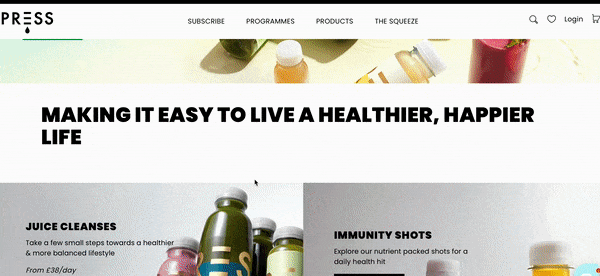
PRESS leads with lifestyle. Their pop-up features vibrant product shots of juice cleanses and immunity shots, with the headline “Making it easy to live a healthier, happier life.”
Why it converts: Visuals sell physical products better than text. The images do 80% of the work here. Visitors see the product, picture themselves using it, and click to learn more.
If you sell visually appealing products, lead with images in your exit pop-up. Don’t bury them under text.
14. MADSEN Cycles (Playful Discount)
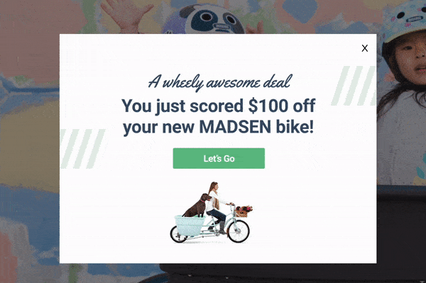
“A wheely awesome deal.” It’s a pun. It shouldn’t work. But it does.
MADSEN offers $100 off their family cargo bike, paired with a playful graphic and a bold “Let’s Go” button.
Why it converts: For a high-ticket product ($2,000+ bikes), a $100 discount feels significant. The humor lowers defenses. And the bold CTA makes the next step clear.
For expensive products, time-limited offers in exit popups can be the push shoppers need to commit.
Quick Comparison: Best Exit Intent Popup Tools (2026)
Not all pop-up tools handle exit intent equally. I’ve used most of these tools while building campaigns for WiserNotify users, and the differences matter more than you’d think.
Here’s a quick overview of the three tools I’d recommend, followed by a full comparison.
OptiMonk
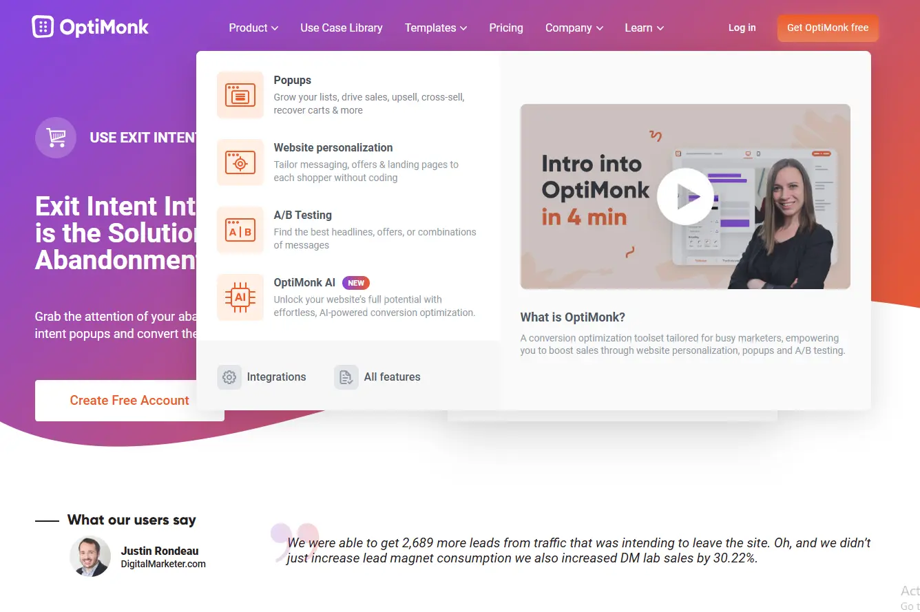
OptiMonk gives you the most flexibility for free. Their drag-and-drop builder is genuinely easy to use, and you get access to hundreds of templates. Advanced targeting lets you show different popups based on page visited, time on site, or scroll depth.
The free plan covers up to 10,000 pageviews/month, which is enough for most small stores to get started.
Justuno
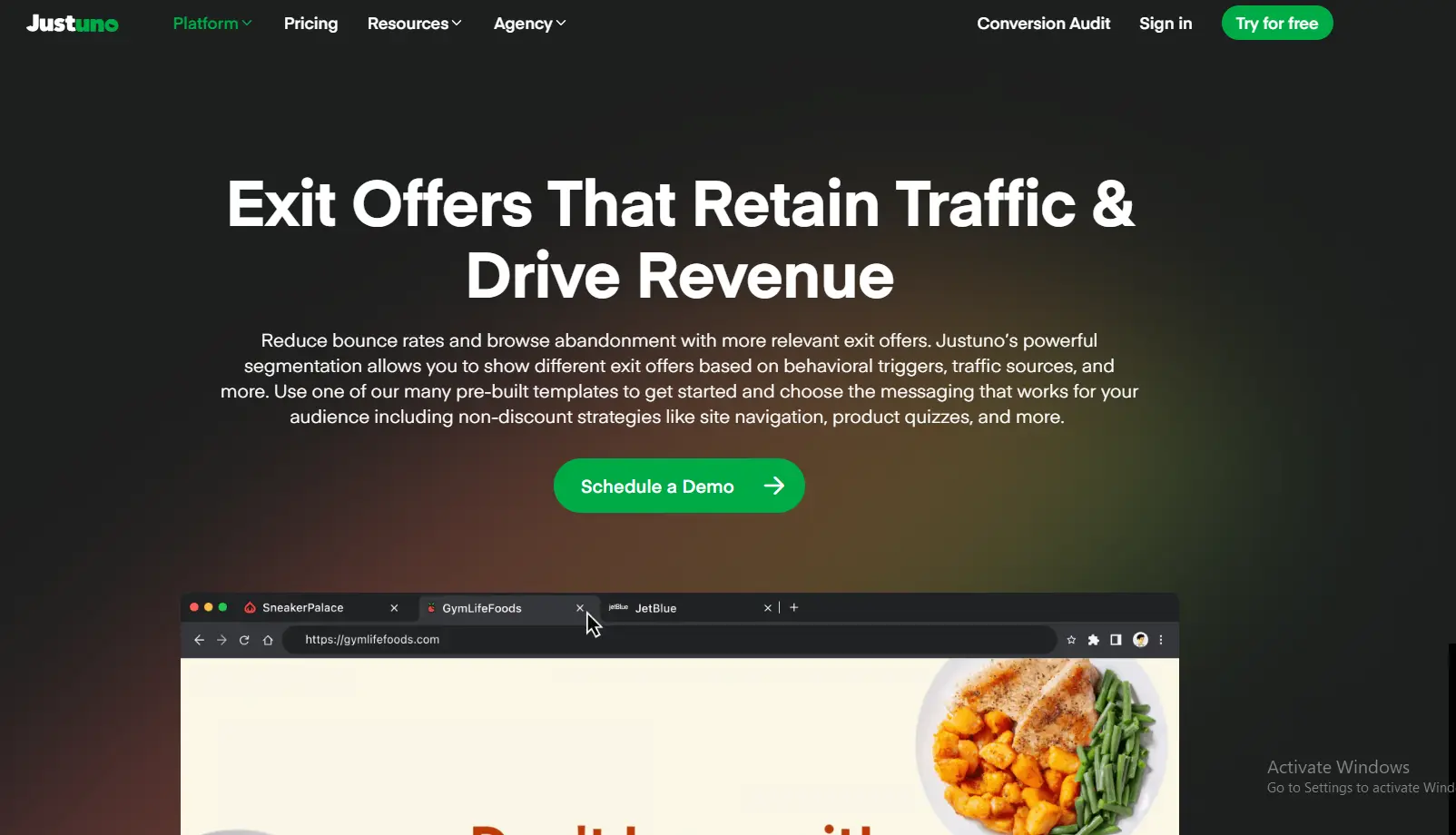
Justuno takes targeting further. You can personalize popups based on referral source, device, location, and even purchase history. Their AI optimization feature automatically adjusts campaigns based on performance data.
The free plan is available, with paid plans starting at $39/month. It’s best for stores that want deep personalization without writing complex rules.
Wisepops
Wisepops stands out for design quality and mobile optimization. Their editor produces clean, professional popups, and their mobile exit intent triggers (back button, tab switch, scroll up) are among the most accurate I’ve tested.
No free plan, but their 14-day trial gives you full access. Paid plans start at $49/month. If design matters to your brand, Wisepops alternatives are worth comparing too.
Full Tool Comparison
| Tool | Free Plan | Starting Price | Exit Intent on Mobile | A/B Testing | Best For |
|---|---|---|---|---|---|
| OptiMonk | Yes (10K views) | $29/mo | Yes | Yes | Ecommerce stores |
| Wisepops | 14-day trial | $49/mo | Yes | Yes | Advanced targeting |
| OptinMonster | No | $7/mo | Yes | Yes | WordPress sites |
| Hello Bar | Yes (limited) | $39/mo | Limited | Yes | Simple notification bars |
| Poptin | Yes (1K visitors) | $20/mo | Yes | Yes | Budget-friendly option |
| Picreel | No | $19.99/mo | Yes | Yes | Exit surveys |
If you’re on Shopify, I wrote a step-by-step guide on how to add an exit intent pop-up to your Shopify store in under 10 minutes.
Also check: OptiMonk alternatives if you want more affordable options.
7 Exit Intent Popup Mistakes That Kill Conversions
I’ve reviewed hundreds of popups. These are the mistakes I see most often.
1. Showing Multiple Popups Per Visit
One pop-up per session. That’s the rule.
I’ve watched heatmap recordings where visitors get hit with a welcome popup, a scroll popup, AND an exit popup in a single visit. Their reaction? Close, close, close, leave.
Fix: Set frequency caps. One pop-up per session. If they dismiss it, respect that decision.
2. Generic Offers That Ignore Context
Offering a newsletter sign-up to someone browsing your pricing page? That’s a mismatch.
Fix: Segment by page type. Product pages get discount offers. Blog posts get content upgrades. Pricing pages get “book a demo” prompts.
3. Ignoring Mobile Completely
Over 60% of web traffic is mobile. If your exit pop-up only works on desktop, you’re missing more than half your audience.
Fix: Test every pop-up on mobile devices. Use responsive designs. Keep text short and buttons large.
4. Making the Close Button Impossible to Find
Tiny close buttons. Hidden X icons. Confusing “No thanks, I don’t want to save money” guilt-trip buttons.
These tactics backfire. Visitors feel trapped, and they’ll remember that feeling next time they see your brand.
Fix: Make the close button visible and easy to tap. A good exit pop-up convinces people to stay. It doesn’t hold them hostage.
5. Bland Copy That Sounds Like Everyone Else
“Subscribe to our newsletter for exclusive updates.” That sentence is on a million websites. It converts on none of them.
Fix: Be specific about the value. “Get a weekly teardown of one high-converting ecommerce landing page” beats “Subscribe for updates” every time.
6. No A/B Testing
Your first pop-up will not be your best pop-up. Period.
I’ve seen A/B tests where changing the headline alone doubled conversion rates. According to A/B testing research, even small copy changes can shift results by 20 to 50%.
Fix: Test one element at a time. Headline first. Then offer. Then design. Track results for at least 1,000 impressions before deciding.
7. Setting It and Forgetting It
An exit popup from 2024 with “Black Friday Special!” still running in March 2026 sends the wrong message.
Fix: Review and refresh your popups quarterly. Update the copy. Swap the offers. Check that the design still matches your site.
How to Write Exit Intent Popup Copy That Converts
Your pop-up design gets attention. Your copy closes the deal. Here are the rules I follow after writing hundreds of pop-up variants.
Lead With the Benefit, Not the Ask
Bad: “Sign up for our email list.”
Good: “Get 15% off your first order (delivered to your inbox in 10 seconds).”
The first one asks for something. The second one offers something. Big difference.
Create Urgency Without Being Fake
Real urgency works. Fake urgency doesn’t.
“Only 3 left in stock” works if there are actually 3 left. “Limited time offer” works if there’s an actual deadline. Countdown timers increase revenue per visitor by 60%+ in tests.
But a generic “Don’t miss out!” with no context? That’s just noise. For genuine urgency strategies, explore these flash sale examples.
Match Your Brand Voice
If your brand is fun and casual, your pop-up should be too. If you’re a B2B SaaS company, skip the spin-to-win wheel.
The Oodie’s “Would You Like a Hug?” works because it matches their playful brand. That same headline on a law firm’s website would be bizarre.
Keep It Under 30 Words
Your pop-up is not a landing page. Visitors are mid-exit. You have maybe 3 seconds.
Headline: 5 to 10 words. Supporting text: 10 to 15 words. CTA button: 2 to 5 words. That’s it.
Every word beyond that reduces your conversion rate.
Mobile Exit Intent Popups: What Works in 2026
Mobile exit intent has improved significantly over the last two years. But it’s still trickier than a desktop.
Here’s the reality: mobile doesn’t have a mouse cursor. So “exit intent” on mobile means tracking behavioral signals like back-button taps, tab switching, rapid upward scrolling, or inactivity timeouts.
3 Rules for Mobile Exit Popups
Rule 1: Size matters. Google penalizes intrusive interstitials on mobile. Your pop-up should cover no more than 60% of the screen.
Rule 2: Load speed matters more than design. A beautiful pop-up that takes 2 seconds to load will never be seen. Most mobile visitors will have already bounced.
Rule 3: One-tap actions only. Don’t ask mobile visitors to type their email, phone number, AND name. One field maximum. Or better, offer a one-tap action like “Copy Code” or “Add to Cart.”
Tools like OptiMonk and Wisepops now support mobile-specific exit intent triggers. If your current tool doesn’t handle mobile well, it might be time to switch. Compare your options with these pop-up tool alternatives.
Start Building Exit Popups That Actually Convert
The 14 examples above prove one thing: the best exit intent popups aren’t about tricking visitors into staying. They’re about giving people a genuine reason to stick around.
Match your offer to your visitor’s intent. Keep the copy short and specific. Make the design clean and on-brand. Test everything.
And remember: even a pop-up that converts at 3% is leaving 97% of visitors untouched. There’s always room to improve.
If you’re running an ecommerce store and want to boost conversions beyond popups, here’s our full ecommerce sales strategy guide.
Krunal Vaghasiya is a marketing tech expert who boosts e-commerce conversion rates with automated social proof and FOMO strategies. He loves to keep posting insightful posts on online marketing software, marketing automations, and improving conversion rates.