
Conversion Copywriting: 12 Tips With Real Examples (2026)

Conversion copywriting is writing built to get one specific action from the reader, like a purchase, a trial signup, or a booked call. It starts with customer research and is judged by one number, the page’s conversion rate.
That is a different job from brand copy. Slogans build a feeling over years. Conversion copy has a few seconds to answer one doubt and point to one next step.
Below you’ll find how to write it, 12 tips with page captures, four before and after rewrites, the frameworks worth knowing, and the copy each store page needs.
What Is Conversion Copywriting?
Conversion copywriting is persuasive writing tied to one measurable action, such as a sale or signup, built from customer research and checked with testing.
The word that matters is “measurable.” A conversion copywriter doesn’t ask whether a line sounds good. They ask whether more people clicked, signed up, or bought after the line changed.
Nike’s “Just Do It” is the example most posts reach for, and it shows the gap well. It’s brilliant brand copy.
But it doesn’t tell a visitor on a product page what to do, why this shoe, or what happens after they click.

Here’s how the two kinds of copy split:
| Point | Brand copy | Conversion copy |
|---|---|---|
| Goal | Make people remember and like the brand | Get one action on one page |
| Judged by | Recall, awareness, sentiment | Conversion rate of that page or email |
| Source of the words | Creative team and brand voice | Customer reviews, surveys, sales calls |
| Where it lives | Campaigns, billboards, taglines | Landing pages, product pages, forms, CTAs, emails |
| Example | “Just Do It” | “Runs small. Size up if you’re between sizes.” |
Most stores need both. The trouble starts when brand lines get pasted onto pages that have to sell.
What a Conversion Copywriter Does
Joanna Wiebe, who founded Copyhackers, is usually credited with naming the practice. The job itself is mostly research, then writing, then testing.
- Interviews customers and reads reviews, support chats, and sales call notes.
- Finds the main objection stopping people from buying.
- Writes the headline, body, proof, and CTA around one page goal.
- Plans the test and reads the result before touching the next element.
How to Write Copy That Converts
Copy that converts comes from five steps in order: research the customer, pick one action, write the page around it, add proof, then test.
- Research: collect the exact words buyers use for their problem.
- Position: turn those words into a value proposition for the right stage.
- Write: build the page around a single action.
- Prove: put evidence and honest urgency next to the claim.
- Test: change one element at a time and keep what wins.
The 12 tips below follow that same order.
Research Before You Write a Word
The first three tips happen before any drafting. Skip them and you end up polishing guesses.
1. Start With the Customer’s Words
Weak copy is written from the founder’s head. Strong copy is lifted from what buyers already say, because those are the words the next buyer will recognize.
You probably have more of this material than you think:
- Your 3-star reviews. Happy-but-not-thrilled buyers explain the doubt they almost acted on.
- Competitor reviews. One-star reviews on a rival’s product hand you the problem your copy should promise to fix.
- Support chats and tickets. Repeated questions are objections your page failed to answer.
- A one-question survey. My favorite question for new customers is “What almost stopped you from buying?”
- Reddit and forum threads. People describe problems there with zero marketing polish.
Paste the phrases that repeat into one doc. That doc becomes your headline and bullet bank.
2. Write a Specific Value Proposition
A value proposition says why someone should pick this product, from you, over every other option. One or two sentences. No adjectives doing the heavy lifting.

This HelloFresh offer block (a 2024 capture) runs claim, proof, offer in about 50 words. The headline claims “America’s most popular meal kit.”
The body backs that up with “over 10,000 5-star meal kit reviews.” And the button says “Get Offer,” not “Submit.”
I use a quick test on any value proposition. Could a competitor paste it onto their site without changing a word? If yes, it isn’t specific yet.
Your messaging strategy should give every page the same core promise, worded for that page’s reader.
3. Match Copy to the Buyer’s Stage
The same page gets visitors at very different levels of readiness. Copy that only speaks to buyers who are ready to purchase loses everyone still deciding.

HubSpot handles this with two buttons side by side. “Get a demo” is for people ready to talk to sales. “Get started free” is for people who want to try it alone first.
A simple way to plan copy by stage:
- Problem aware: name the problem better than they can.
- Solution aware: show how your approach differs from the usual fix.
- Product aware: give proof, comparisons, and a reason to trust you.
- Ready to buy: state price, guarantee, and the CTA plainly.
Our guide to call to action designs breaks CTAs down by funnel stage, with screenshots.
Write the Page Around One Action
With research done, the writing itself gets easier. These three tips cover word choice, structure, and emotion.
4. Use Plain, Specific Words
Specific words sell because they let the reader picture the result. Vague words make them do the work, and most won’t.

Look at this older version of Spotify’s homepage. “Music for everyone.” is the brand line.
The subhead does the selling: all the music you’ll ever need, listen free or subscribe to Premium. Two buttons match those two paths, “Get Free” and “Go Premium.”

This hiring ad shows the opposite problem and its fix in one image. “Awesome benefits are waiting for you!” says nothing. The four tags underneath do all the work: RD$215 per hour, weekends off, morning shift, on-site.
Swaps worth making on your own pages:
- “High quality” becomes the material or the warranty.
- “Fast shipping” becomes the number of days.
- “Easy to use” becomes how long setup takes.
- “Don’t miss out” becomes what they get and when it ends.
Some words do pull more clicks than others. We collected 83 of them in our list of trigger words, sorted by goal.
5. Give Each Landing Page One Job
A landing page with three goals usually hits none of them. Pick the one action that matters and cut everything competing with it.

This Shopify capture from 2024 is close to the minimum. The headline names the outcome and the effort: “Build your own ecommerce website in 3 easy steps.” One proof line follows. Then one email field and one button.
Use this as a checklist:
- The headline states the outcome, not the product category.
- The subhead says who it’s for or how it works.
- One CTA, repeated if the page is long.
- Proof sits right next to the button, not in the footer.
- Paid-traffic pages drop the main navigation.
If I could fix only one thing on a weak landing page, it would be the headline. Stuck on yours? These landing page headline examples come with eight formulas you can adapt.
6. Use Emotion That Fits the Moment
People buy on feeling and justify with facts. Conversion copy needs both, in that order, and the feeling has to be one the customer already has.

Airbnb’s “Don’t just go there. Live there.” sells an identity: you’re a local, not a tourist. That’s perfect for a campaign.
On a listing page, though, the same feeling only works when facts sit right beside it, like location, price, and reviews.
Four emotions tend to move people on a sales page:
- Relief: the problem goes away.
- Belonging: people like me already use this.
- Anticipation: picture life after the purchase.
- Fear of loss: use only when the deadline or stock limit is true.
My rule here is simple. Name a feeling your research turned up in Tip 1. Never invent one.
CTAs and Form Copy
This is where a visitor either acts or leaves. Small wording changes here matter more than anywhere else on the page.
7. Write CTAs That Say What Happens
A good CTA tells the reader what they’ll get and what happens next. “Submit” and “Learn more” do neither.

Dropbox’s trial page (a 2024 capture) repeats the promise from the button that brought you there: “Try free for 30 days.”
A quieter link offers the paid route. A summary on the right lists what the plan includes, so nobody wonders what they signed up for.

Compare that with this SEO agency’s footer. “There’s no better time than the present!” is filler. The button saves it, because “Get Free Expert Advice” names the thing you receive.

And this ebook store gets it right in one line: “Get the First eBook in a Series for Free.” You know the item, the price, and the next step before you click.
A formula that works for most buttons: verb + the thing + any cost or time. “Start my 7-day trial.” “Get the sizing guide.” “Book a 15-minute call.”
Writing the button in first person (“my” instead of “your”) is worth a test too. For ready-made wording, see these call to action phrases grouped by goal.
8. Keep Form Copy Short and Clear
Forms lose people when they feel long, unclear, or risky. Copy fixes all three without removing a single field.

Zapier’s signup page puts three checkmarks beside the form: easy setup with no coding, free forever for core features, and a 14-day trial of premium apps.
Those lines answer the three questions people have right before they type an email.
Copy fixes for any form:
- Use plain field labels, never placeholder text that disappears.
- Say why you need a phone number if you ask for one.
- Put the privacy line directly under the button.
- Make the button repeat the benefit, not “Submit.”
- Write error messages that explain the fix, like “Add the @ in your email.”
Build trust & FOMO
Highlight real-time activities like reviews, sales & sign-ups.

Proof and Urgency Copy
Claims get skimmed. Evidence gets believed. These two tips cover how to show both proof and urgency without losing trust.
9. Put Proof Next to the Claim
Every big promise on a page needs evidence within one scroll of it. Proof buried on a separate testimonials page barely gets seen.

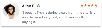
Amazon’s review block shows 4.5 out of 5 from 18,876 ratings. Then a summary notes that some customers had mixed opinions on mic quality and fit. That small admission is what makes the praise believable.

iMemories pairs a round headline, “Over 1 million happy customers,” with an oddly exact line under it: “Reviewed by over 21,386 customers.” Round numbers grab attention. Exact ones read as true.
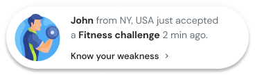
Proof can be live, too. A notification reading “Priya from Mumbai just bought this” does the same job in real time, using WiserNotify to pull recent purchases straight onto the page.
Placement matters as much as the proof itself. Our guide to landing page social proof shows where each type works best.
Build trust & FOMO
Highlight real-time activities like reviews, sales & sign-ups.
10. Use Urgency Only When It’s True
Urgency works when it’s honest and specific. Fake timers and vague “limited stock” banners get noticed, and they cost you trust on every page after.

This Booking.com room table (a 2024 capture) shows the balance. “Only 2 left on our site” adds pressure. “Free cancellation” and “No prepayment needed” sit right beside it, so acting fast feels safe.
The button reads “I’ll reserve,” and the line under it says confirmation is immediate.

Now compare a “Limited Stock” heading with no number, no date, and no reason. It reads like decoration, so shoppers ignore it.

Exact stock badges like “Only 1 Left” and “10 in Stock” fix that, as long as the count comes straight from your inventory.
Countdowns follow the same rule. Tie them to an actual end date, never a timer that resets on refresh.
I’d rather lose a sale than get caught faking scarcity. More honest ways to create urgency in sales are in our full guide.
Build trust & FOMO
Highlight real-time activities like reviews, sales & sign-ups.

Personalize, Then Test
The last two tips turn a good page into a better one over time. Personalization makes copy feel written for the reader. Testing tells you whether it worked.
11. Personalize With Data You Have
Personalized copy uses what you already know about a visitor to remove a doubt. It doesn’t have to mean their first name in a headline.

This Nordstrom product page, seen from India, does it four ways. Prices show in rupees. A fit note pulled from reviews says the trousers run slightly small.
Then “56 people are viewing” and “Free returns anytime” sit above the button, with “You Might Also Like” down the side.
Start with the easy layers and work up:
- Location: currency, shipping time, local holidays.
- Traffic source: match the headline to the ad they clicked.
- Behavior: new versus returning visitor messages.
- Purchase history: refills, upgrades, and add-ons.
If you’re comparing software for this, our roundup of website personalization tools sorts options by budget.
12. Test the Words, One at a Time
Copy is never finished on the first draft. Testing shows which words move people, and changing one element at a time shows why.
Treat the page like an assembly line. The headline’s job is to keep people reading. The CTA’s job is to earn the click. When conversions drop, find the step that broke before rewriting everything.
A basic test plan:
- Pick a page with steady traffic and one clear goal.
- Write a hypothesis from your research, like “Naming the sizing doubt will lift add-to-cart.”
- Change one element only.
- Run it until you have enough conversions to trust, not for a fixed number of days.
- Log the result, win or lose. I keep the losers too, because they show what buyers don’t care about.
Low traffic? Show both versions to five customers and ask what each page offers. If they can’t say it back, the copy isn’t clear yet.
When you do have the traffic, these A/B testing tools compare prices side by side.
Before and After Conversion Copy Examples
Here are four rewrites of copy types every site has. Each “before” is a line you’ll find on thousands of live pages. Each “after” applies the tips above.
| Copy type | Before | After | What changed |
|---|---|---|---|
| Headline | “There’s no better time than the present!” | “Find out why your site isn’t ranking. Free audit in 48 hours.” | Names the problem, the offer, and the timeline |
| CTA button | “Submit” | “Send me my quote” | Says what the click gets, in first person |
| Product description | “Stand out with our vibrant red t-shirt! Made from premium, breathable fabric, it’s perfect for any occasion.” | “Midweight 100% cotton that keeps its shape after washing. Cut a little long so it stays tucked. Runs true to size.” | Facts replace adjectives and the fit doubt is answered |
| Social proof line | “Trusted by thousands of happy customers” | “Rated 4.8 by 2,140 buyers. 63 sold this week.” | Exact, checkable numbers instead of a round boast |
One warning before you copy any of these. Every detail in an “after” line has to be true for your business.
Don’t promise a 48-hour audit you can’t deliver. The point is the type of detail, not these exact claims.
The product description rewrite is the one most stores need first. Our list of product description examples shows the same fix across 12 products.
The social proof line is also the easiest to keep current. Counts like “63 sold this week” go stale fast when typed by hand, so many stores pull them live from their order data instead.
Conversion Copywriting Frameworks
Frameworks give a draft its order so you aren’t starting from a blank page. Pick the one that fits the job, then fill it with your research.
| Framework | Order | Best for | Example opening |
|---|---|---|---|
| PAS | Problem, Agitate, Solve | Landing page intros, ads | “Shoppers fill the cart, then vanish. Each one is ad money spent twice.” |
| AIDA | Attention, Interest, Desire, Action | Long sales pages, launch emails | “The course 3,000 bakers used to open their first shop.” |
| BAB | Before, After, Bridge | Product pages, case studies | “Before: three apps to track one order. After: one screen.” |
| FAB | Feature, Advantage, Benefit | Spec-heavy product descriptions | “5,000 mAh battery. Lasts two full days. Leave the charger at home.” |
I reach for PAS most often on short pages. Whichever you pick, don’t let the framework show. If a reader can spot “agitate” happening, it’s too heavy.
Conversion Copy for Ecommerce Stores
Ecommerce copywriting is conversion copy split across many small pages. Each page has its own job, and most stores only write the homepage carefully.
| Store page | Copy job | Example line |
|---|---|---|
| Homepage hero | Say what you sell and who it’s for | “Leakproof bottles for kids who throw everything” |
| Collection page | Help the shopper choose | “Not sure which size? Most 3 to 5 year olds fit the 350 ml.” |
| Product page | Answer the last doubt before add to cart | “Dishwasher safe. Lid parts come apart for cleaning.” |
| Cart | Remove surprise costs | “Free shipping over $50. You’re $8 away.” |
| Checkout | Reassure at the moment of payment | “Free returns for 30 days. No questions.” |
The product page carries the most weight, because that’s where the buying doubt peaks. These product page examples show how 15 stores handle it, from photos to the line under the button.
Sales Page Examples
A sales page pulls everything above into one piece of copy. Here’s how three well-known brands handle theirs right now.
Apple: Specs Turned Into a Life
Apple’s MacBook Air page states “Up to 18 hours of battery life,” then follows it with “Won’t call it a day until you do.”
The spec earns trust. The second line tells you what that spec means for your day.
Basecamp: Against the Category
Basecamp’s homepage opens with “project management without all the nonsense,” then adds that it’s rock solid and famously easy to use.
It sells by naming what buyers hate about rival tools. That’s exactly the kind of line customer interviews tend to produce.
Slack: Answering This Year’s Question
Slack’s homepage now leads with “All your people and AI agents working together.” Chat is old news to its buyers. The headline answers the question teams are asking this year instead of repeating features everyone knows.
Across all three, the pattern holds. Name one outcome plainly, back it with a detail, and skip the jargon.
Wrap Up
Conversion copy isn’t clever writing. It’s your customers’ words, put in the right order, on a page with one job.
So pick the page with the most traffic and the weakest results. Read its reviews, fix the headline and the CTA, and put proof next to the claim.
Test one change, keep what wins, and move to the next page. That’s the whole job, repeated.

Boost Conversion Instantly
Add Social Proof & Urgency to your website
Frequently Asked Questions
What is conversion copywriting?
Conversion copywriting is writing built to get one specific action, such as a purchase or a signup. It starts with customer research and is judged by the conversion rate of the page.
What does a conversion copywriter do?
A conversion copywriter researches customers, writes page and email copy around one goal, and plans tests to see which version converts better.
How much does a conversion copywriter cost?
Upwork rate data puts most copywriters at $19 to $45 an hour. Conversion specialists who include research and testing usually charge more and often quote per page or per project.
What is the difference between copywriting and conversion copywriting?
Copywriting covers any persuasive marketing writing, including slogans and ads. Conversion copywriting is the part tied to one measurable action on a page and tested against that action.
Can AI write conversion copy?
AI tools can draft headlines and variations quickly, but they do not know the customer’s own words or objections. Conversion copy works best when a person feeds AI actual customer research and tests the output.
How long should conversion copy be?
Conversion copy should be as long as the reader needs to feel sure. A cheap, familiar product can sell on a short page, while an expensive or new offer needs more proof.

Krunal Vaghasiya is a marketing tech expert who boosts e-commerce conversion rates with automated social proof and FOMO strategies. He loves to keep posting insightful posts on online marketing software, marketing automations, and improving conversion rates.




 Capterra