Imagine spending hours writing eye-grabbing content and building a marketing strategy, only to see website visitors leaving without taking any action.
CTA buttons might be a small part of the overall site design, but they significantly improve site conversion rates.
But the question is: Does the design of your call to action button influence your target audience to take action?
The most important thing when designing a website is to make it easy for visitors to navigate and get the information they are looking for.
The same applies to the design of a CTA button.
A well-designed CTA encourages users to take the desired action, such as making a purchase, downloading resources, or signing up for a newsletter.
In this article, we’ll explore some best practices for designing a compelling call to action button that draws the attention of potential customers, along with some of the best CTA examples to get some creative ideas.
Before we dive deeper, here’s how Wisernotify can help you: It enables you to display compelling CTAs on your website to create urgency, use social proof to build trust and increase overall consumer confidence in your brand.
Visitors leave your website without taking action?
They don’t trust your site or feel urgency to act. WiserNotify builds both, turning doubt into action & visitors into customers.
Importance of Effective CTA Design in Conversion Rate
An effective call to action button is a critical element of your website.
It tells visitors what to do next and gives them direction through the buyer’s journey.
Designing a unique Call to action can significantly impact the success of your marketing campaign and drive more engagement from your audience.
Here are some reasons to have an effective CTA design:
Conversion Optimization: By designing a visually appealing call to action button, it can capture the attention of the audience and guide users to a specific action.
It can help to improve click rates and conversion rates, grab users’ attention, and ultimately enhance your marketing effectiveness.
Increase Engagement: CTA can increase engagement on a web page, a landing page, and other platforms by presenting enticing offers, promotions, or incentives.
Whether it’s a limited-time offer, a free trial, or exclusive access, a well-designed CTA can encourage users to take action and engage with your brand, thereby increasing conversion rates.
Improve User Experience: CTA directs and provides clear pathways by navigating users to the next step.
A well-designed CTA makes it easier for the users to find relevant information with clear content or influences them with a sense of urgency to complete the desired actions, resulting in a more positive overall experience.
Drive More Sales: The primary goal of CTA is to drive more sales and fuel business growth.
By compelling users to take action and move further down the sales funnel, CTA can help generate sales, leads, and other valuable conversions, which in turn can drive business success.
An effective CTA design is essential for maximizing conversion rates and achieving marketing goals.
Make sure to craft a CTA design that grabs visitors’ attention and improves their overall experience.
Build trust & FOMO
Highlight real-time activities like reviews, sales & sign-ups.
Principles of Compelling CTA Design
When designing a CTA button, there are certain principles and guidelines to maximize its effectiveness and drive more conversions.
Here are the key principles to consider when designing a compelling call to action button:
Clear and Concise Language
A strong CTA clearly communicates the intended action.
Use concise language and action words that leave no room for confusion.
Avoid using complex sentences or words that might make visitors leave before taking any action.
For example, “Buy Now” or “Download the ebook now” can be powerful lead generation strategies, as they offer an interactive and engaging way to influence and encourage visitors.
Placement
Positioning the CTA strategically where users are mostly likely to see it and engage with it.
Place it above the fold or experiment with different areas on your web pages, landing pages, or ad campaigns to ensure maximum visibility without the need for excess scrolling or searching.
Recommended For You: How to Attract Customers to Buy Your Product Online
Emphasise Contrast
Use different colors, shapes, sizes, and fonts to make your call-to-action buttons stand out from other elements on your page.
Consider using white space to enhance visibility, reduce clutter, and improve readability for your CTA button.
In addition, make sure to use different visuals for secondary CTA and increase the conversions.
Mobile Friendly Design
With the increasing use of mobile users, optimize CTAs for different devices to ensure you don’t miss out on the opportunity to convert them.
Ensure the CTA is large enough to be easily tapped with a finger and increase readability on smaller screens.
Consistency
Make sure to be consistent with design, messaging, and branding across all CTAs to create a coherent and recognizable identity among your target audiences.
Use consistent colors, fonts, and styles that align with your brand identity and create a cohesive user experience across different touchpoints.
A/B Testing
Make sure to consistently test and experiment to optimize CTAs and improve their effectiveness over time.
Conduct A/B testing to compare different CTA variations and measure the impact on conversion rates.
Use data and analytic tools to drive better results and refine your CTA design.
Related: 9 Best Call To Action (CTA) Tools to Help Raise Conversions
These principles can help you maximize the effectiveness of your CTA that help to ultimately improve conversion rates, enhance user experience, and drive more sales for your business growth.
Build trust & FOMO
Highlight real-time activities like reviews, sales & sign-ups.
20+ Call to Action Design Ideas with Examples
Here are a few examples of the best call-to-action design buttons to get inspiration and craft your next one.
1. Use Action-Oriented Text

Here’s an example from Listings Lab that reminds us how important it is to use action-oriented text along with the CTA to make it more effective.
The strong headline, supporting copy, and visual cues help the CTA button stand out.
The Action-Oriented Text, “The Listings Lab Guide, will show you how you can double your revenue,” influences visitors to take the required action to download.
The CTA is effective because it promises visitors to double their revenue without sacrificing their lifestyle; the Listings Lab clearly encourages agents to take action.
2. Emphasize Urgency
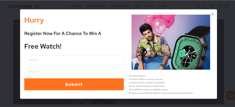
Here’s an example from Fastrack that creates a sense of urgency by influencing visitors to register and not miss the chance of winning a free watch.
The CTA looks simple, which attracts the leads interested in winning a free watch.
The CTA serves two valuable purposes: to create urgency to win a watch and to build a targeted list of potential leads by collecting their contact information.
Although the CTA has the simple text “Submit,” the heading encourages users to submit their details, making it more effective.
3. Leverage Color Psychology
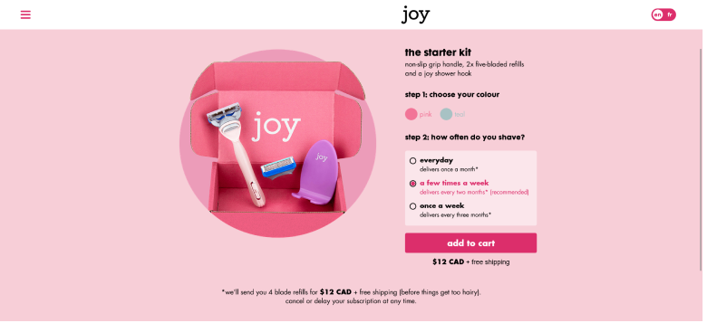
Color plays a significant role in CTA design, as it evokes emotions and perceptions that influence user behavior.
Here’s an example from Joy, a Canadian company that offers a razor subscription service for Women.
The contrasting color of the button easily stands out, which is relevant to their target audience and evokes emotions.
Further, the CTA text “Add-to-cart” is simple and easy for the audience to understand what the next step is.
The color provides a unique look and influences the target audience to take the desired action.
Also See: Top 10 Call to Action Color Button To Users Love to Click
4. Increase Button Size for Visibility

The button size can make a significant impact on the effectiveness of driving user engagement and conversions.
By enlarging the size of the call to action button, you make it prominent and easier for users to notice.
In addition, it makes it easier for users to interact and create a bold visual impact.
Here’s an example from HubSpot: It offers free resources to its audiences.
They use an Enlarged button size to grab the audience’s attention and make it easily clickable.
The use of an enlarged size ensures that it remains responsive and accessible for different screens and devices.
5. Add Hover Effects

Adding hover effects can further enhance interaction and draw the attention of your audience.
To ensure an engaging and interactive user experience, add shadows, change the button’s background color, increase the size of the buttons, add text animation, and add icons or images.
Here’s an example from Slider Revolution that uses the Hover effect on its CTA button.
The use of color and effect influences and improves user engagement.
The CTA button keeps mimicking a heartbeat, adding an attention-grabbing interaction that encourages user engagement.
6. Use Contrasting Colors
Using contrasting colors is another powerful way to make your call-to-action design stand out and attract users’ attention.
Opt for bold, bright, and vibrant colors to grab the attention, and make sure it uses a color that contrasts sharply with the background color of your web pages or landing pages.
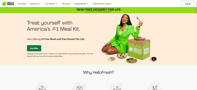
For example, Hello Fresh is a popular ready-to-cook meal kit delivery service that offers consumers subscription services that suit their needs.
The use of a bright green CTA button attracts audiences to click and receive an offer of 10 Free meals and desserts.
The headline and content make the CTA more engaging and persuasive, causing users to click and receive the offer.
7. Incorporate Icons or Symbols
The use of Icons and Symbols adds visual interest to the CTA button, making it more eye-catching and attention-grabbing.
It conveys meaning at a glance, helping users understand the purpose of the button and making it more compelling for them to take action.
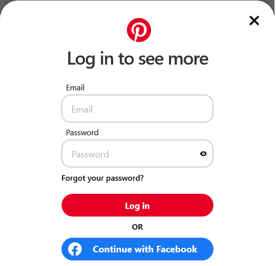
Here’s an example from Pinterest.
Want to sign up?
You have a couple of options: sign up via Facebook or via email.
The Facebook icon added makes the icon used with the “Continue with Facebook” CTA button more prominent and recognizable.
Moreover, the use of the Pinterest logo and color makes it more relevant.
Build trust & FOMO
Highlight real-time activities like reviews, sales & sign-ups.
8. Create a Sense of Scarcity

Creating a sense of scarcity is an effective way to make users take action by conveying that an offer or an opportunity is limited and exclusive.
Using words like “Limited Time Offer” or “Offer Ends Soon” in your call-to-action design can convey a more time-sensitive offer.
Here’s an example from Flipkart: the notification offers a Limited-Time offer from the 1st to the 7th of April and influences users to avail of the offer before missing out.
In addition, the color and font make it more eye-grabbing and attractive, making users take action.
Related: 10 Impactful Push Notification CTA Examples to Use in 2025
9. Personalize the CTA

Personalized CTA is tailored to individual users based on their behavior, preferences, demographics, or other relevant data.
By analyzing insights, you can adjust the content of your CTAs based on users’ behavior and attributes.
Craft a personalized message that speaks directly to your target audience and creates a sense of connection and relevance with them.
Here’s an example from Handy: the content on the CTA directly talks with the target audience who are interested in registering themselves with Handy.
The content is simple and engaging, which influences the right audience to take action.
Moreover, the color used is calming and builds more engagement with the audience.
10. Place CTAs at Strategic Locations
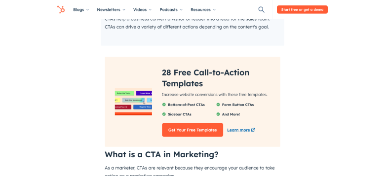
Placing the CTA at strategic locations throughout the website or marketing materials is crucial for maximizing user engagement and driving conversions.
Position the CTA prominently so that it is immediately visible without scrolling, increasing the likelihood of engagement.
You can place it at the sidebar, end of the compelling content, In-line with content, and near social proof to gab users’ eye.
For example, Hubspot positions the CTA between the content and at the end and also in popups to grab users’ attention.
It influences the audience to take action and guides them to the next step without scrolling much.
11. Use First-Person Language
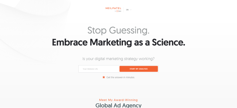
Using first-person language directly addresses the user and creates a more personalized experience for users, leading to higher click-through rates and conversions.
First-person language makes them feel like they are in control and encourages a sense of ownership over the decision to engage with the CTA.
For example, NeilPatel.com uses first-person language on its website CTA button, which connects with the audience and influences them to analyze the website.
In addition, the content and color personalize it, making it more relevant to the right target audience.
12. Simplify the Design
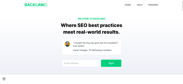
The simple call-to-action design improves the effectiveness of the CTA button by focusing on clarity, usability, and visual appeal.
Using a clean and uncluttered layout ensures readability, is user-friendly and improves visibility to enhance overall user experience.
For example, Backlinko’s CTA uses a simple design and minimal content, which provides more clarity and enhances the target audience’s experience.
They add social proof to influence the visitors to sign up for the newsletter, and signing up for it can add more value.
13. Highlight with Shadows or Borders
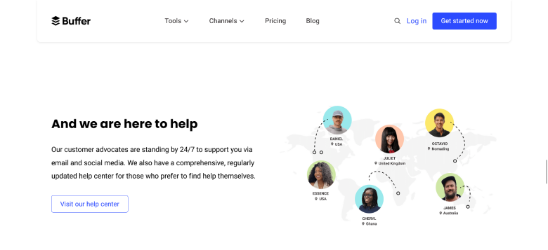
Highlighting your CTA button with borders or shadows can add depth and visual emphasis, making it stand out prominently on the page.
In addition, using the contrast color of the border to your CTA button makes it stand out against the background.
Moreover, adding shadows and border highlights for maximum visual impact.
Here’s an example from Buffer: the CTA button is bordered, making it easier to grab visitors’ attention and visually appealing.
The CTA is highlighted, which makes a visual impact and influences users to take action.
14. Experiment with Shapes
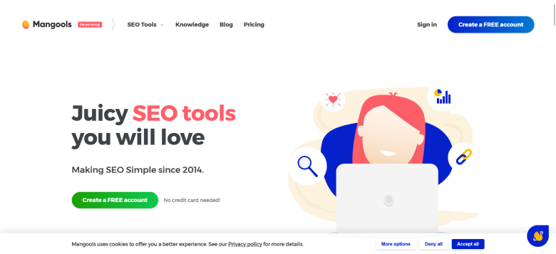
Experimenting with different shapes for your call-to-action design button can add visual interest and help it stand out on the page.
Different shapes, such as rectangular, rounded, circular, square, or other shapes, can drive the highest engagement and conversions.
Make sure to experiment with the different shapes and consider the overall design aesthetic of your website or landing page.
For example, Mangools uses rounded shapes to highlight their CTA button.
The rounded rectangle shape draws attention to the CTA and remains easy to click on.
Build trust & FOMO
Highlight real-time activities like reviews, sales & sign-ups.
15. Optimize for Mobile
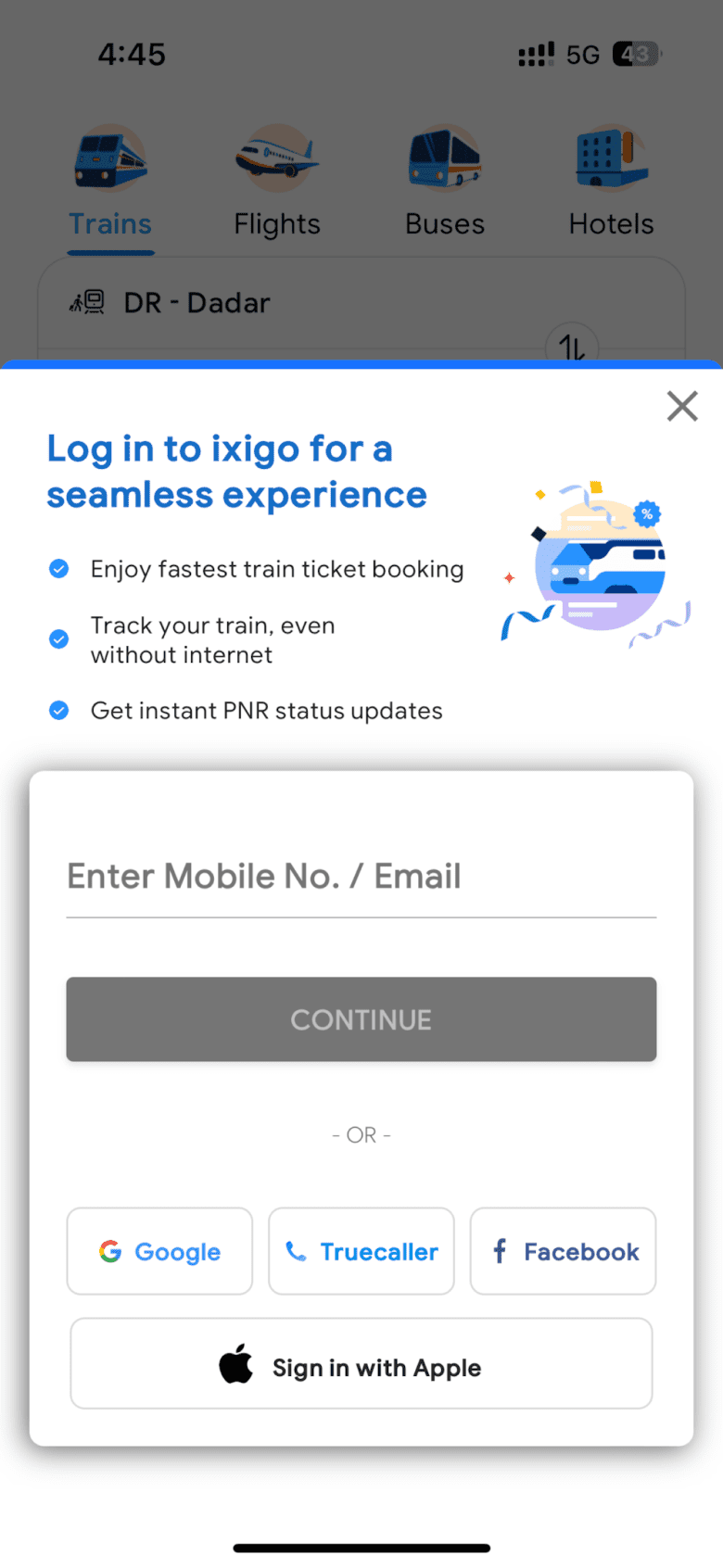
As the number of mobile users increases, optimizing the call-to-action design for mobile devices becomes crucial to attract more audiences.
Make sure the CTA buttons are large enough to click on, provide enough white space around the CTA button, use responsive design, and avoid using long or complex phrases to ensure a seamless mobile experience.
For example, the Ixigo mobile app has a responsive CTA design that is enough to grab customers’ attention, making it visually aesthetic.
The responsive design, with clear text and white spaces, provides a seamless experience to the users.
Related: Top 6 Mobile CTA Buttons That Drive More Clicks & Conversions in 2025
16. Align CTA with the Value Proposition

Aligning your CTA with the value proposition ensures that the call to action design resonates with your audience’s needs and motivates, increasing the likelihood of engagement and conversion.
Make sure the content is clear and relevant, and highlight the benefits to align it with your offerings.
For example, CleverTap uses a relevant CTA that aligns with its offer on how its customers can achieve an ROI of 561%.
Its content clearly explains what benefits visitors will get after clicking on the button, influencing visitors to download the full study.
17. Incorporate Animation Carefully
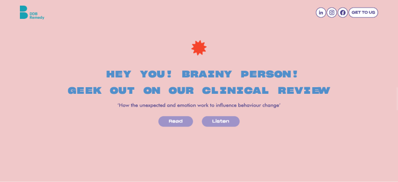
Incorporating animations into your CTA button helps you enhance user engagement without overwhelming or distracting them.
Use subtle animation relevant to the action or message of the CTA button to ensure a smooth transaction that doesn’t feel jarring.
For example, DDB Remedy provided a brand-new brand experience with an animated CTA that brings different animations when clicking on different CTA.
Like when you take a mouse on Read, a book appears to visualize that reads a book, while when you take a mouse on Listen, ears appear to determine the action.
18. Use Negative Space Wisely
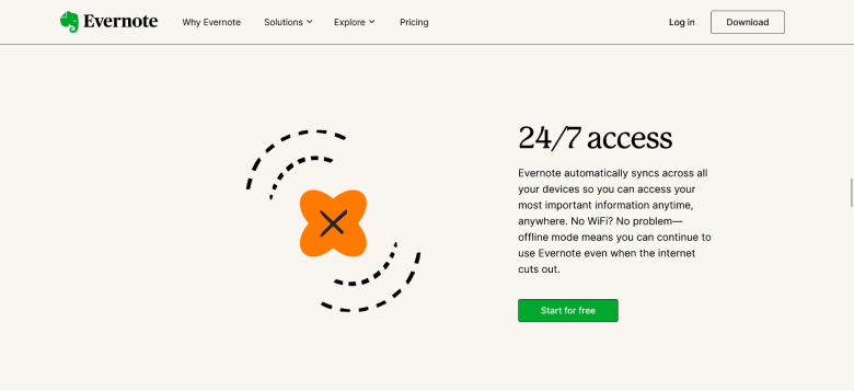
Using negative space, also known as white space, wisely around your call to action button can enhance clarity, visibility, and overall experience.
Make the use of white space correctly to separate the CTA from other elements and prevent clutter.
For example, Evernote wisely uses white space to ensure clarity of the content and separate the CTA from other text on the web page.
The content clearly shows the benefits of using Evernote and freely influencing audiences.
19. Test Different Wording
Experiment with different words and content for your CTA button to optimize it effectively and improve conversion rates with tools.
Try different words that highlight the benefits or value proposition of your offer and influence customers to take action.
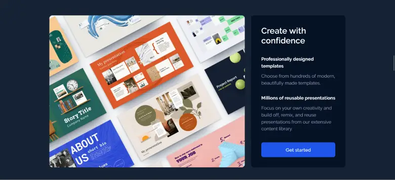
For example, Prezi offers hundreds of templates for presentations for businesses, students, and educators.
The CTA design, with its soothing color and clear content, grabs visitors’ eyes and influences them to take action.
They might experiment with different CTA words like ‘Access Now,’ or ‘Grab Now’ instead of “Get Started.”
Build trust & FOMO
Highlight real-time activities like reviews, sales & sign-ups.
20. Include Secondary CTAs for Alternate Actions
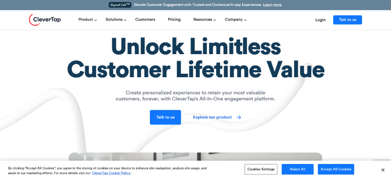
Secondary CTAs, alongside primary CTA, can provide additional options for users who might not be ready yet to take primary action.
Instead of using one cta, providing a secondary cta can be more effective and influence the customers to take action.
For example, CleverTap provides two call-to-action designs, “Talk to us” or “Explore our product,” to create more personalized experiences for visitors.
They can talk with a person to learn more details or explore the product themselves and choose the right one.
21. Directly Communicate Benefits
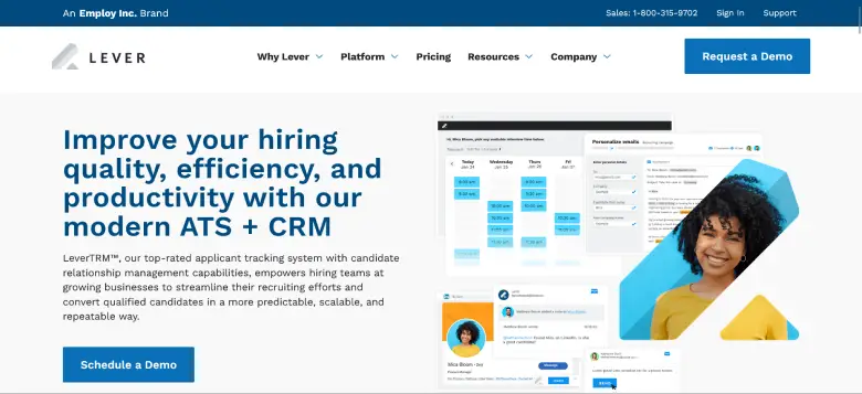
Make sure your CTA communicates the benefit or outcomes the customer or user gets after taking the action, which helps to increase effectiveness by clearly conveying the value proposition.
Highlight the key features of your product or service that differentiate it from competitors.
For example, Lever influences visitors to schedule a demo and get more insights about their product.
They highlight the benefits of scheduling a demo so that visitors can understand more about the product and how it can help them improve the hiring quality of the candidates using their modern ATA + CRM technology.
Common CTA Design Mistakes to Avoid
Overloading Pages with Too Many CTAs
Don’t overwhelm your visitors with too many calls to action on a single page.
Focus on one primary call to action button and use secondary CTAs sparingly to provide additional options.
Poor Placement
Ensure the CTA is positioned strategically to make it easily visible within the layout.
Avoid burying them with the same color and background, as this makes it difficult for visitors to find them and take action.
Neglecting the CTA Copy
Neglecting the CTA copy is a common mistake that can significantly impact the effectiveness of your call to action.
Avoid using generic CTA phrases, missing the benefits, weak call-to-action content, and ignoring the customer’s sales stage.
These are common pitfalls; make sure to craft compelling CTA copy to improve its effectiveness and overall engagement.
Full Read: 12 CTA Mistakes to Avoid That 90% of Marketers Make
Conclusion
Crafting an effective and simple call-to-action design is essential to drive user engagement and conversion rates.
Implementing these best practices, such as clear messaging, strategic placement, and compelling visuals, can effectively guide users toward desired actions.
Further, it’s crucial to continually experiment and test your CTA designs to optimize performance and ensure they resonate with your target audience.
These examples and strategies can help you avoid common pitfalls and prioritize creating effective and clear CTA designs aligned with users’ needs and preferences.

