Most people leave an empty eCommerce store or site without buying, but people who get to your checkout page are ready to buy. So, your checkout is your last and perhaps most important chance to convert visitors into customers.
Even small changes can make a big difference in your conversion rates. For example, a site getting 84.7% on its payment page could add extra monthly sales with just a few clicks and tiny bump to 90%. That’s the power of an optimized checkout flow.
Here are practical tips to improve your checkout page design with proven examples, keep customers, and increase conversions. Let’s get started!
Why Does Great Checkout Flow Design Matter?
A good checkout flow isn’t just about looks; it’s about removing friction and making buying easy.
Better Customer Experience
- A simplified checkout reduces the mental effort required for the customer to purchase. With less frustration, the customer is more likely to convert.
- A clear checkout flow gives the customer control over the process. Builds trust.
- A good checkout experience = good brand = more loyalty and repeat business.
More Sales
- An optimized checkout process minimizes cart abandonment while boosting sales and revenue.
- A good checkout flow can present upsell and cross-sell opportunities non-intrusively and increase average order value.
Better Data Collection
- A better checkout flow can collect customer data, such as email and shipping. This data can be used to personalize marketing and customer relationships.
A good checkout flow is a must for any online business that wants to sell more, improve customer experience, and build trust.
Follow the tips above to create a good and effective ecommerce website checkout process and flow.
8 Ecommerce Checkout UX Design Elements
1. Product Summary
A product summary is critical to a smooth checkout. It should include a product image, name, quantity, price, shipping address, shipping information, and total. Customers should be able to adjust quantities or remove items from their shopping carts for a better shopping experience.
2. Guest Checkout
Offer a guest checkout option for customers buying something who don’t want to create an account. While this speeds up the e-commerce checkout process, consider encouraging account creation after purchase by highlighting order history, personal recommendations, and faster future checkouts.
3. Progress Indicators
Visual cues like progress bars or numbered steps help customers know where they are in the checkout process. This reduces anxiety and builds trust by giving them control and transparency.
4. Secure Payment Options
Display trust badges and security certifications like SSL and PCI DSS to reassure customers their payment info is safe.
Offer multiple payment options to customers, including more secure credit card payments, cards, digital wallets secure credit card payment, and alternative options to cater to customer preferences.
5. Autofill
Autofill improves the ecommerce checkout page and experience by pre-populating addresses, coupon codes, and payment info. It saves customers time, reduces typing errors, and smoother the overall process.
6. Order Summary with Totals
A clear and detailed order summary shows itemized costs, shipping fees, taxes, and the total cost. This transparency reduces surprises and builds trust with customers.
7. Clear Call-to-Action Buttons
Strong action-oriented language on checkout buttons like “Complete Purchase” or “Checkout Now” encourages customers to complete their orders. The checkout button itself should be prominent and easy to find.
8. Error Handling and Validation
Real-time feedback on input errors helps customers correct mistakes immediately. Clear and helpful error messages guide users to resolve issues without frustration.
ECommerce Checkout Optimization Tips for Better Conversions
➥ Fewer Form Fields
A lengthy checkout process results in a significant number of abandoned carts. Collect only the essentials: name, billing address, shipping and billing address, email, and payment details. Make optional fields truly optional and explain why specific information is required.
Optimizing the checkout process in an e-commerce store is essential for improving user experience and minimizing cart abandonment. Provide a guest checkout option for customers who prefer not to create an account.
➥ Multiple Payment Options
Multiple payment options are crucial to cater to different customer preferences on an ecommerce site. Include popular ones like credit cards, debit cards, and digital wallets (Apple Pay, Google Pay).
Alternative payment options, such as buy now and pay later services, can also increase conversions. To build trust, ensure that all payment options are displayed clearly and securely.
➥ Free Shipping or Shipping Incentives
Free shipping is a strong driver of conversions. If offering it isn’t feasible, try alternatives such as free shipping on orders above a certain amount or reduced shipping rates.
Be transparent about shipping costs and options early to prevent surprises and even abandonment of the shopping cart page.
➥ Test Checkout Variations
Even the best-designed checkout can fail if it doesn’t work reliably in real-world conditions.
That’s where a solid approach to testing e-commerce experiences comes in.
E-commerce testing focuses on validating every step of the customer journey from adding items to the cart through payment, order confirmation, and emails across different browsers, devices, and network conditions.
By investing in ongoing e-commerce testing, you ensure that optimization changes actually help, don’t introduce new friction, and consistently deliver a stable, trustworthy checkout experience.
The Role of Visual Design in Checkout Flow
Visual design plays a massive part in creating a smooth and engaging checkout experience. It’s not just about looks; it affects user behavior and conversion rates.
Clarity and Simplicity
A cluttered or complicated checkout page can overwhelm customers and cause abandonment. A clean and minimal layout makes it easy for users to focus on the important stuff and complete the purchase.
- Using white space well makes it more readable and calm.
- Minimalism focuses on the essentials, removing distractions and reducing decision fatigue.
- Typography makes it more readable by using readable fonts and font sizes.
Hierarchy
Visual hierarchy guides the user’s focus toward the most crucial information. By carefully arranging elements, you can steer the user’s decision-making process.
- Prominent CTA buttons make the “checkout” button evident and easy to find.
- Clear product information ensures key details like the image, name, price, and quantity are prominently displayed.
- Visual cues, such as size, color, and placement, help prioritize important information for the user.
Consistency
Consistency throughout the entire checkout process creates a familiar and trustworthy experience.
- Consistent fonts and styles make it more readable and brand-recognizable.
- Keep the layout structure the same across checkout pages.
Trust and Security
Visual cues can make a big impact on how customers perceive security.
- Display trust seals and security certifications prominently.
- Use recognizable payment method logos to reassure customers.
- Show customers how far they are in the checkout process to build trust.
Persuasion
Visual design can influence buying decisions by creating a positive and compelling experience.
- Display attractive product images to entice customers.
- Use colors that evoke the desired emotions (e.g., green for trust, orange for urgency).
By carefully considering these visual design elements, you can create an account with a good checkout flow, drive conversions, and enhance customer satisfaction.
5 Successful Ecommerce Checkout Flow Examples
How top brands use the best-optimized checkout process to enhance customer satisfaction and boost revenue growth. Here’s a quick example to inspire your own checkout design strategies.
1. Allbirds
Why it’s best
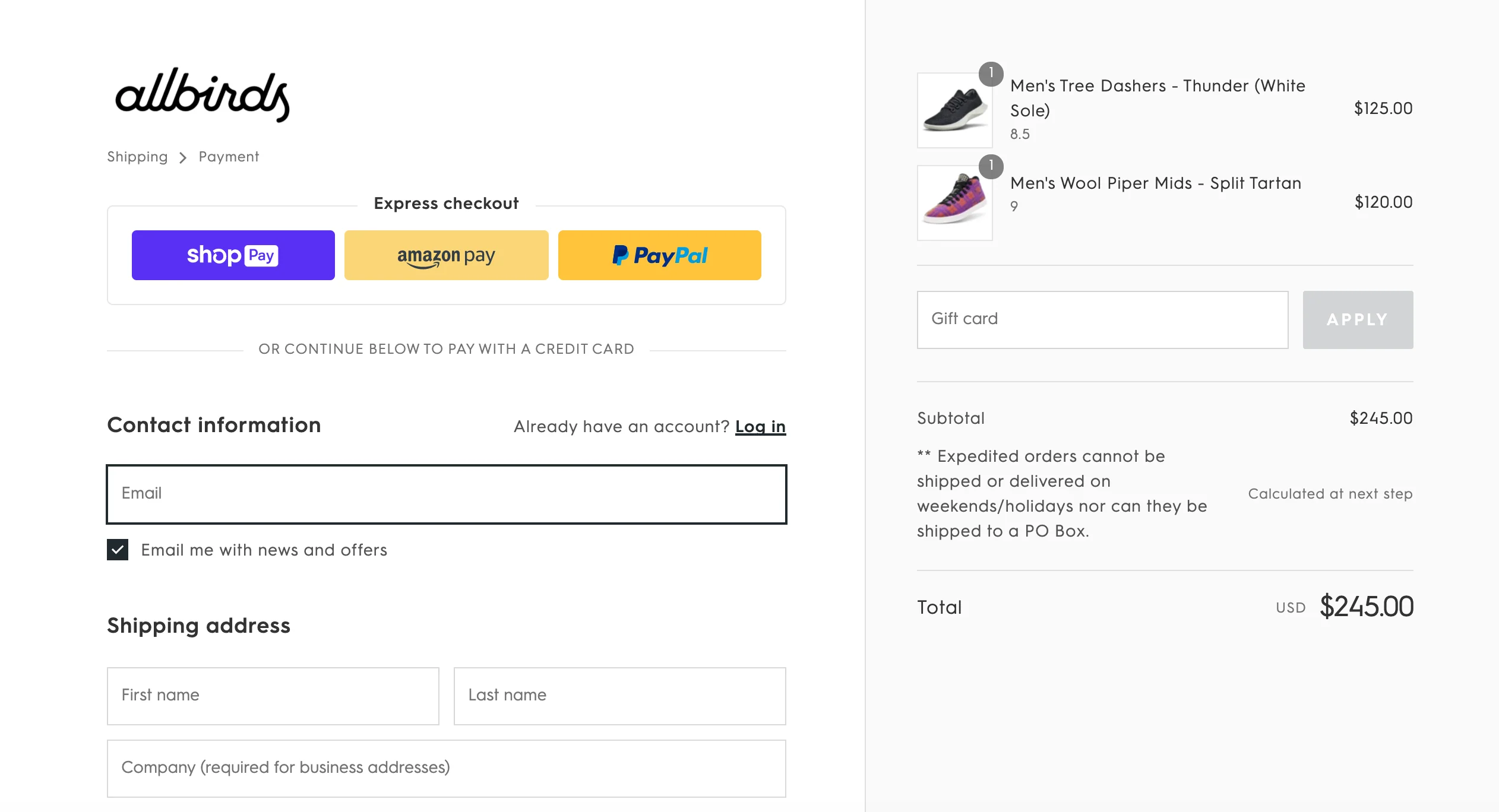
Allbirds is all about sustainable and comfortable footwear. The checkout flow reflects that with transparency and eco-friendliness.
Key Features
- Environmental impact calculator: This nifty feature lets you see your purchase’s carbon footprint and offset it.
- Clear returns policy: Allbirds is a prominent trust builder and offers free returns.
- Minimal design: Simple and uncluttered. Easy to navigate.
2. Glossier
Why it’s best
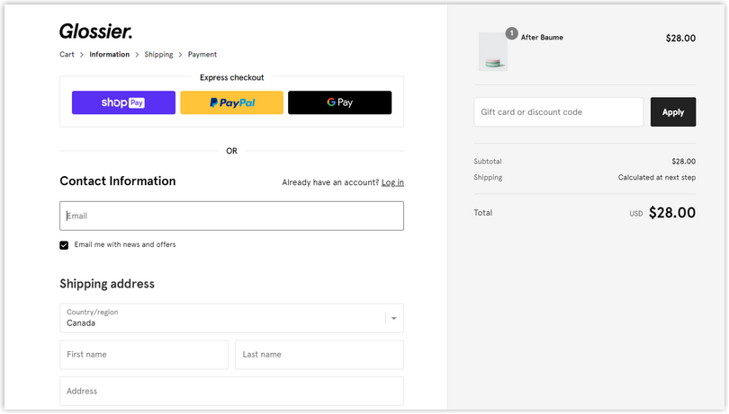
Glossier has a cult following because of its simple, youthful vibe and focus on natural beauty. The checkout flow matches that.
Key Features
- Social proof: Glossier often puts customer reviews and photos on the checkout page—a prominent trust builder.
- Subscription options: They offer a subscription service for their best-selling products, a considerable loyalty and revenue booster.
- Mobile-first design: Glossier’s checkout is mobile-optimized. A lot of their customers shop on their phones.
3. Harry’s
Why it’s best
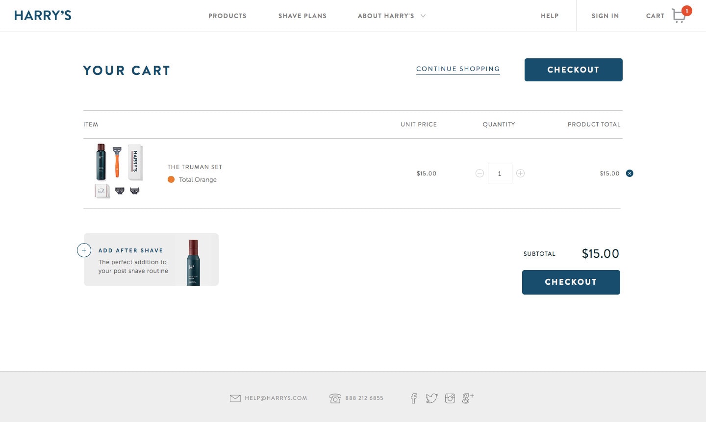
Harry’s has disrupted the razor market with affordable, high-quality products. The checkout is simple and fast.
Key Features
- Subscription options: Harry’s offers flexible subscription plans for razors and other grooming products. Repeat customers and business.
- Transparent pricing: The total cost of the order is displayed, including shipping and tax.
- Guest checkout: Harry’s allows you to checkout as a guest. As fast as possible.
4. Casper
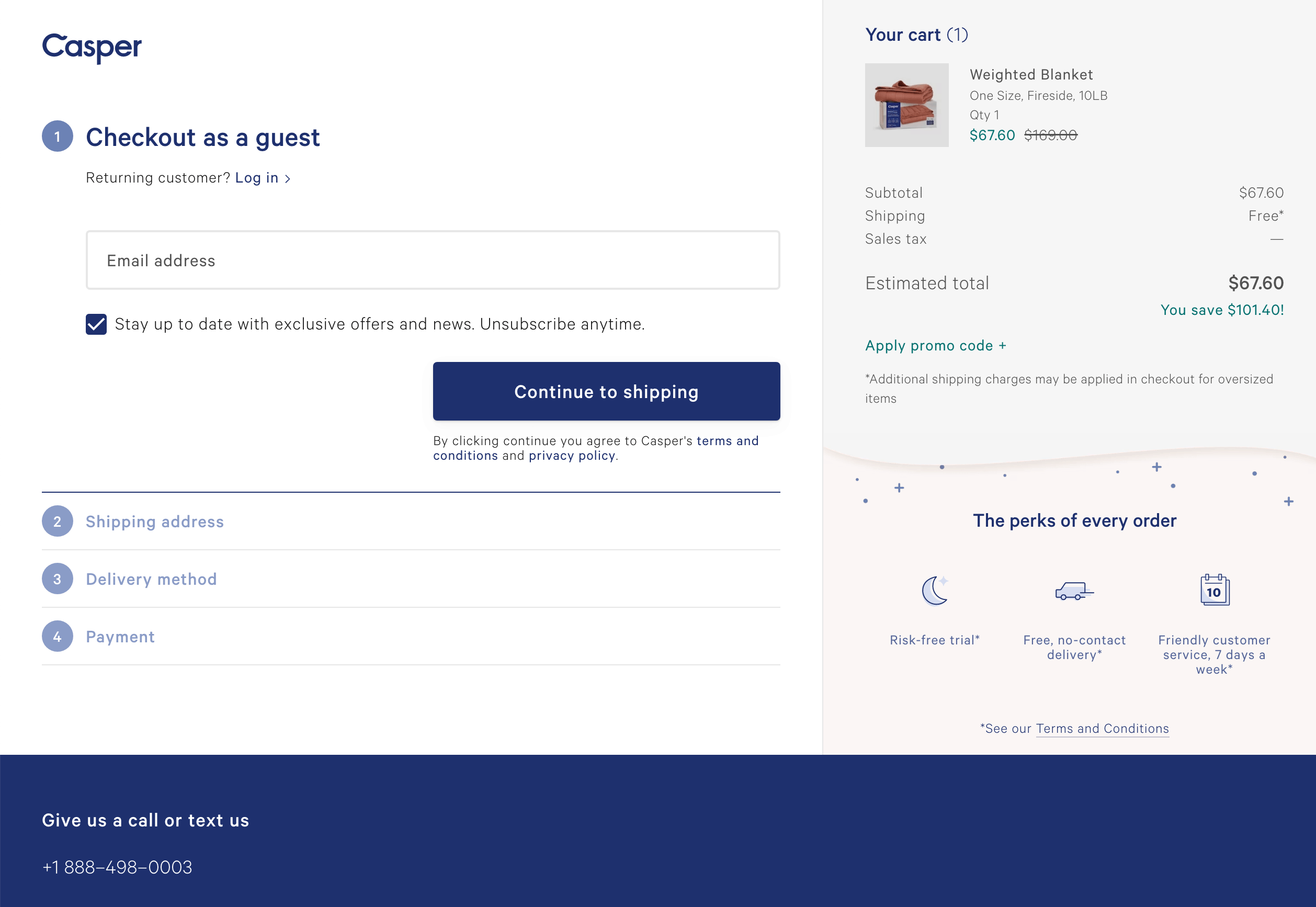
Why it’s best
Casper is a well-known online mattress company for its comfortable, high-quality products. The checkout process is informative and reassuring.
Key Features:
- Educational content: Casper includes sleep hygiene and mattress care information on the checkout page, which helps customers decide.
- Financing options: Financing options to make it easier for customers to buy.
- Risk-free trial: The mattress is available with a 100-night risk-free trial, during which customers can test it out and ensure they love it.
Related post: 13 Stunning Ecommerce Landing Pages Examples
5. Away
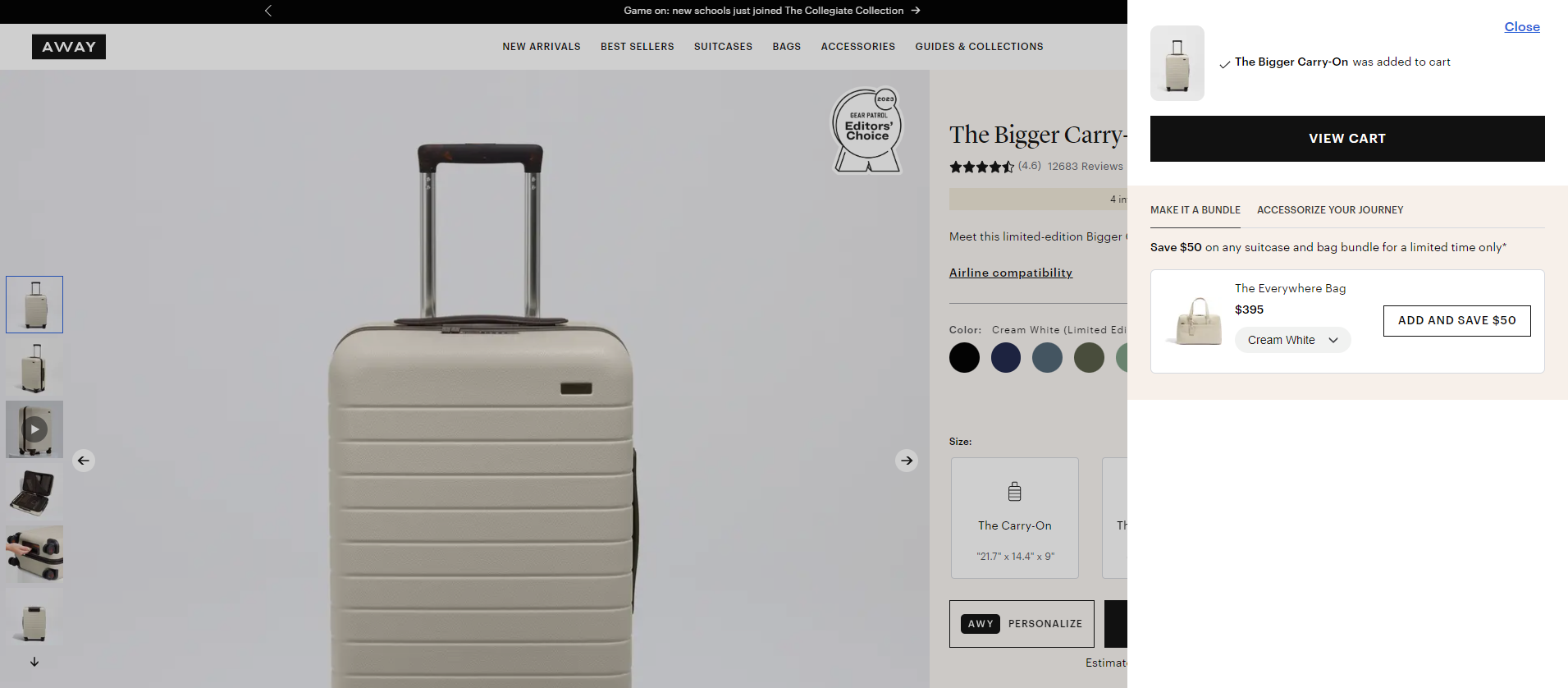
Why it’s best
Away is a travel luggage brand that values quality, durability, and style. The checkout reflects that.
Key Features:
- High-resolution product images: Away shows products in detail on the checkout page. Features and benefits.
- Limited-time offers: Away often has exclusive discounts or promos.
- Customer service info: Away puts customer service contact info on the checkout page, reassuring customers that help is available.
So there you have it—examples of how D2C brands are doing checkout right, including design, functionality, and customer psychology. Now, optimize your checkout to convert and build loyalty.
Emerging Trends in Checkout Flow Design
⤊ One Page Checkout
This trend simplifies the various ecommerce sites’ checkout pages and processes by putting all the information and steps on one page. The benefits are faster checkout times, less friction, and a more streamlined user experience. However, make sure the page isn’t too cluttered or overwhelming.
⤊ Personalized Checkout
Using customer data to personalize the checkout can increase conversions. By offering personalized product recommendations, pre-filled info, and relevant shipping options based on purchase history and preferences, businesses can create a more engaging and efficient checkout experience many customers.
⤊ Augmented Reality (AR)
AR can be integrated into the checkout to give customers a more immersive online shopping experience. This can include features like virtual try-ons for clothing or visualizing products in a real-world setting so customers can make a more informed purchase.
⤊ Voice Commerce
Voice assistants like Amazon Alexa and Google Assistant are becoming more popular. Checking out through voice commands is a hands-free and convenient experience, especially for returning customers.
⤊ Biometric Authentication
Fingerprint or facial recognition for checkout can increase security and speed up the payment process, too. There is no longer a need to remember passwords or input payment information; it’s a more seamless and secure experience.
⤊ Subscription Checkout
Offering subscription options can increase customer loyalty and revenue. By simplifying the complicated checkout process for recurring purchases with pre-filled information and flexible payment options, customers will be more likely to make future purchases or subscribe to products or services.
By incorporating these emerging trends, businesses can create checkout flows that are not only efficient but also engaging and customer-centric.
Conclusion
The checkout is the final step between the customer and the sale. Get it right, and you’ll boost conversions and customer loyalty. You can turn your checkout from a transactional step into a customer experience by prioritizing speed, simplicity, security, and personalization.
Remember, a seamless checkout is more than just technology. It’s about understanding your customers and tailoring the process to them. Continuous testing, analysis, and refinement of complicated checkout processes are essential to beating the competition and achieving customer satisfaction.
A well-optimized checkout can increase sales, reduce cart abandonment, encourage repeat customers to buy more business, and drive growth.

