
20 Ecommerce Conversion Rate Optimization Tips (2026)
Most conversion guides open the same way. Small changes, big revenue: here are twenty tips.
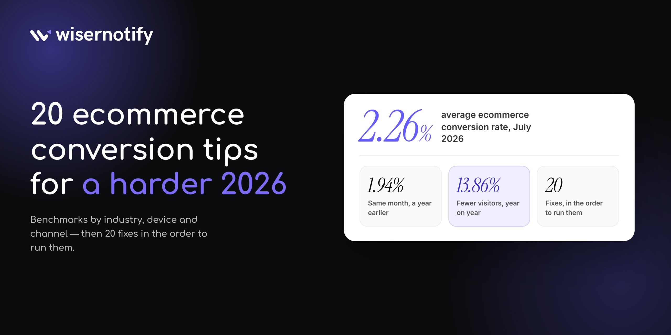
Here is the number they skip. IRP Commerce logged a 2.26% average ecommerce conversion rate in July 2026, up from 1.94% in July 2025. Over the same twelve months, visitor numbers fell 13.86%.
Read those two together, and you get the real story of 2026. Traffic got smaller and more expensive. The people still arriving are further along in their decision, so rates went up without anyone getting better at this.
Which means a flat conversion rate this year is a rate that lost ground.
So this guide does two things differently. It gives you benchmarks split by industry, device, and channel, because a blended global average tells you nothing about your store. Then it walks through 20 fixes in the order I would run them.
What Is a Good Ecommerce Conversion Rate in 2026
A conversion is any action you decide counts. Usually a purchase, sometimes an email signup, an add to cart, or an account creation.
Ecommerce makes this harder than lead gen does. You’re selling a physical thing someone can’t touch, through a checkout that might run five or six steps, with shipping costs and a returns policy attached.
Every one of those is a place to lose the sale. Which is also why there’s so much room to fix, mostly through social proof and a shorter path to payment.
Here is what the major sources report right now.
| Source | Rate | What it measures |
|---|---|---|
| IRP Commerce (July 2026) | 2.26% | Live market panel, updated monthly, SME heavy |
| Statista (Q2 2026) | 1.3% | Global, all business sizes, share of visits |
| Littledata (Shopify, 2023 study) | 1.4% | 2,800 Shopify stores, session-based |
All three are correct for the stores they sampled. Comparing a Shopify number to an enterprise panel number tells you nothing.
One note on that last row. The Littledata figures get quoted everywhere as current Shopify benchmarks, and they are from a 2023 study. Treat them as history, not as this year’s bar.
Conversion rates vary a lot by industry
This split matters most. IRP Commerce publishes it monthly, and the gap between the top and bottom sector runs close to ten times.
| Sector | July 2026 | Year on year |
|---|---|---|
| Arts and crafts | 5.23% | Up 25.9% |
| Health and wellbeing | 3.57% | Up 21.9% |
| Kitchen and home appliances | 3.34% | Down 4.3% |
| Pet care | 2.12% | Down 1.5% |
| Sports and recreation | 2.12% | Up 17.8% |
| Cars and motorcycling | 1.82% | Up 31.2% |
| Fashion, clothing and accessories | 1.81% | Up 33.3% |
| Toys, games and collectibles | 1.72% | Down 30.0% |
| Food and drink | 1.47% | Up 1.6% |
| Baby and child | 0.55% | Down 34.3% |
A baby brand at 1% is doing well. An arts and crafts store at 3% is underperforming. Same number, opposite verdict.
Device and traffic source change it too
Contentsquare’s 2026 benchmark puts desktop around 3.4% and mobile web around 2.0%. Desktop converts about 74% higher.
Mobile still carries 69.9% of the traffic. That gap is where most stores are quietly losing money.
Channel matters just as much. Paid search converts at 2.8%. Organic social sits at 0.7%. If your mix shifted toward cold social this year, your blended rate fell for reasons that have nothing to do with your site.
Returning visitors convert at 2.9% against 1.7% for new ones, and they make up a little over half of all traffic. Both numbers fell year on year, new visitors faster than returning ones.
How to Calculate Your Conversion Rate
The formula is simple.
Conversion rate = (conversions / visitors) x 100
10,000 visitors and 200 orders gives you (200 / 10,000) x 100 = 2%
The trap is the denominator. Three different ones are commonly used, and they produce very different numbers from identical sales.
- Session-based. Orders divided by sessions. What Littledata, Statista, and most benchmarks use.
- Visitor-based. Orders divided by unique visitors. Always higher, because one person can have several sessions.
- Pageview-based. Orders divided by pageviews. Always the lowest, and it punishes browse-heavy stores unfairly.
Pick one, write it down, and never compare it to a number calculated the other way. Half the “our conversion rate is terrible” panic I hear comes from this.

Boost Conversion Instantly
Add Social Proof & Urgency to your website
Why Your Conversion Rate Might Be Dropping
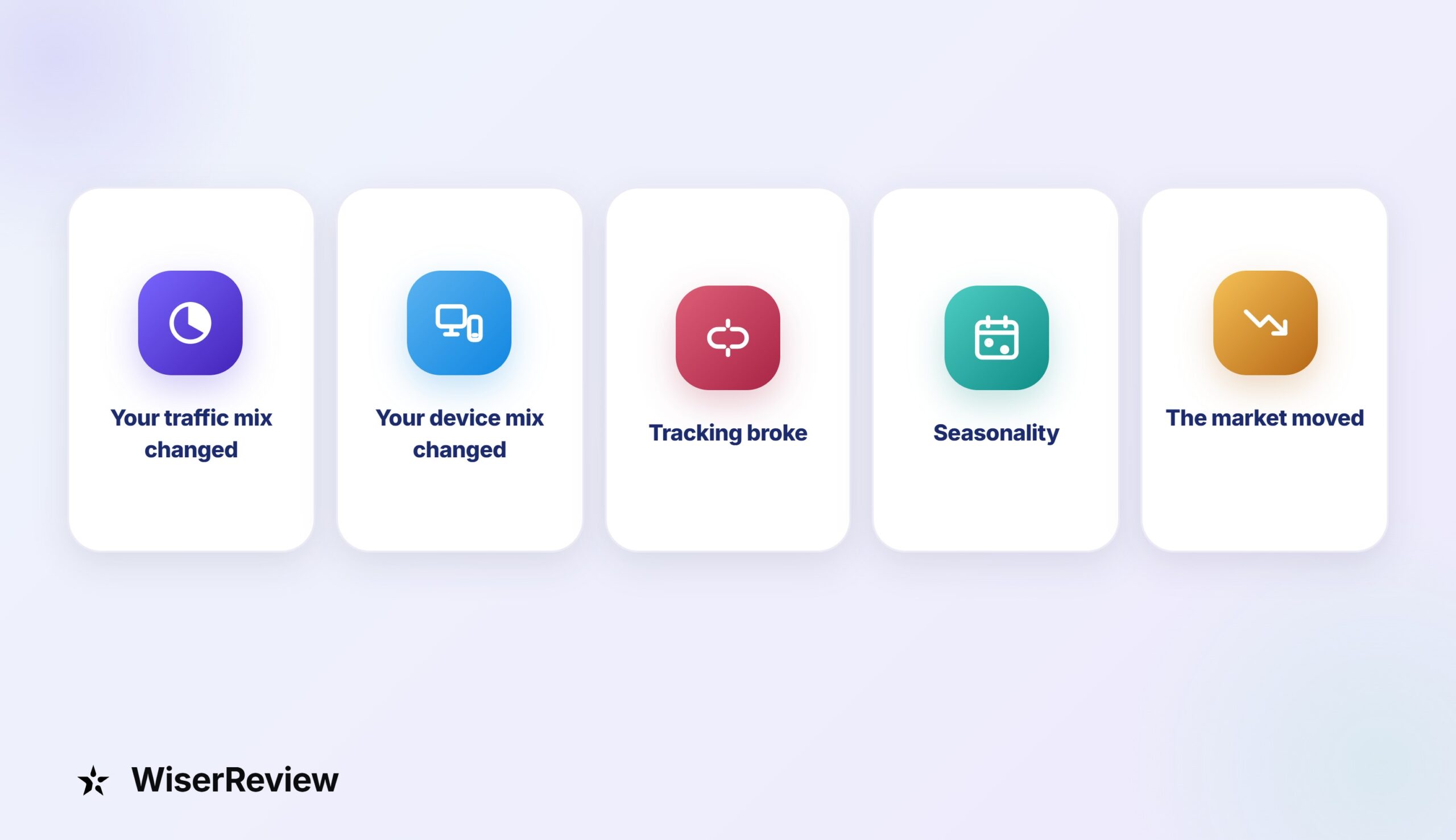
A falling rate doesn’t always mean your site got worse. Check these five before you change anything.
- Your traffic mix changed: More paid social means more cold visitors. Paid social converts at 0.7% to 1.2%, so your average drops even if every page performs the same.
- Your device mix changed: A shift toward mobile pulls the number down on its own, because mobile converts at roughly half of desktop.
- Tracking broke: A consent banner change, a new analytics setup, or a duplicated purchase event will move the number without moving a single sale.
- Seasonality: Compare against the same period last year, not last month. January is not November.
- The market moved: IRP Commerce’s cross-industry average fell from 2.18% to 1.99% to 1.70% over two years. Some of your drop is everyone’s drop.
Rule out all five before you rebuild a product page. Most of the panic I see traces back to reason one or reason three.
How AI Shopping Changed Ecommerce Conversions
Shoppers now ask an assistant before they open a store. They describe a problem, get three or four options back, and land on a product page having already made most of the decision.
Adobe tracked what happens when those visitors arrive at retail sites in July 2026. Traffic from AI sources was up 62% year on year. Those visitors converted 60% higher than everyone else, bounced 34% less, and viewed 22% more pages.
Revenue per visit from AI referrals hit a record, up 53%.
The share is still small. AI sits at a fraction of a percent of total sessions for most stores. The growth rate is the point, and so is the intent quality.
Three things follow from that, and none of them need a new tool.
- Put the facts in text, not in images: Price, sizing, materials, shipping times, and return windows have to be readable HTML. A spec sheet baked into a JPEG is invisible to the model summarizing your product.
- Make reviews crawlable: If your review widget loads only after a click, none of that proof exists to an assistant. Render at least the rating, count, and a few review bodies in the initial page.
- Answer the comparison question yourself: Assistants get asked, “Which one is better for X?” Pages that say who a product suits and who it does not get pulled into that answer. Feature lists do not.
An AI visitor arrives warmer than a paid social visitor and colder than a returning customer. Treat them like someone who read a friend’s recommendation, then landed on a page that has to back it up.
Where to Start If You Only Have a Week
Twenty tactics is a lot. If you can only do one thing this week, do this diagnostic first.
- Split your rate by device: If mobile is under half your desktop number, that’s your whole project. Stop reading and go there.
- Split it by traffic source: A rate that fell alongside a paid social push isn’t a site problem.
- Find your drop-off step: Product page to cart, cart to checkout, checkout to paid. One of those three is leaking hardest.
- Check your top five landing pages: Most stores get half their entrances through a handful of URLs. Fix those before anything else.
- Watch ten session recordings: You’ll learn more in twenty minutes than from a month of dashboards.
Only then pick from the list below. Working in this order means you fix the expensive thing first, not the easy thing.
Also check: 34 Reasons Why You’re Getting Traffic but No Sales + Tips
How to Increase Your Ecommerce Conversion Rate
The 20 fixes below are grouped by where they sit in the buying journey. Store and product pages first, then checkout, then the trust and urgency layer on top.
Work through them in that order. A persuasion tactic on a slow page is wasted effort.
Store and Product Page Fixes
Everything here happens before the cart. If these are wrong, the checkout fixes further down never get a chance to help.
1. Fix site search and filters before anything else
Shoppers who use site search convert at a much higher rate than browsers because they arrive knowing what they want.
Four things to get right:
- Handle typos and synonyms. A search box that returns nothing for a misspelled product name is costing you sales.
- Suggest as they type. It catches vague queries before they turn into a dead end.
- Filter the way people shop. Size, price, color, rating. Not your internal SKU taxonomy.
- Group by intent, not just type. “Gifts under $50” pulls more clicks than another dropdown labeled “Accessories”.
Also check: I Analyzed 50 Product Listing Pages (11 Best in 2026)
2. Use better product photos and video

Nobody can pick up your product through a screen. Your photos have to do the job a shelf and a fitting room do in a store.
So shoot for the questions people can’t ask you:
- A scale shot. Next to a hand, a table, or something familiar, so nobody guesses at size.
- Detail shots. Texture, stitching, finish. The things a buyer would check in person.
- One photo in use. On a person, in a room, doing its job.
- A short video. A clip answers the question a still photo never can. Does it work the way you say it does?
Skip the stock photography. Buyers recognize it instantly, and it reads as a store that never owned the product.
Also check: 20 Product Video Examples That Will Make You Say Wow
3. Write clear call-to-action buttons
“Submit” and “Learn More” tell a visitor nothing about what happens when they click.
Your call-to-action should say the outcome. “Add to Cart” beats “Continue”. “Get 20% Off Today” beats “Shop Now” when there’s a real offer behind it.
One primary button per screen. If you’ve got three buttons competing at the same visual weight, you’ve got no primary button.
And check contrast on a phone in daylight. A CTA that disappears in sun glare converts at zero.
Also check: Best CTA Button Colors That Actually Convert (2026)
4. Speed up your most important pages

Shopify ran a 28-day study across its stores in early 2026 and put real numbers on this. Every 100 milliseconds of slower Largest Contentful Paint lined up with about 3.5% lower conversion.
Interaction to Next Paint mattered too, at roughly 1.5% per 32 milliseconds. Layout shift showed no meaningful link to conversion.
So chase load and responsiveness, and stop worrying about a small CLS score.
Most speed work starts with the homepage. That is usually the wrong place to start. Begin with your top landing pages and product templates, because that is where paid traffic lands and where the money decision happens.
The culprits are the same every time:
- Uncompressed hero images: Convert to WebP and size them for the slot they sit in.
- A video autoplaying above the fold: Use a poster image and let people press play.
- Tracking scripts loading first: Defer anything not needed to render the page.
- Apps you stopped using: Most Shopify stores I look at carry two or three nobody has opened in a year.
5. Build for mobile first
Mobile carries about 70% of your traffic and converts at roughly 60% of desktop. That gap is the single biggest number on this page.
Responsive design isn’t the fix on its own. A layout that technically fits a phone can still bury the price below the fold and put the buy button out of thumb reach.
Pick up your phone and check three things:
- Is the price visible without scrolling?
- Can you reach the buy button one-handed?
- Does it load on mobile data with wifi switched off?
Thirty seconds of that will find more problems than an afternoon in a browser emulator.
6. Make your support easy to find
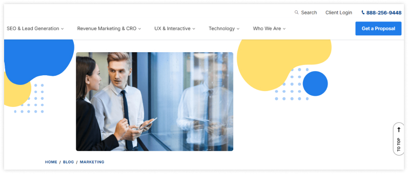
A visible phone number converts people who never call it.
It’s a signal. A store willing to publish a number is a store that expects to answer for the order, and shoppers read that instantly.
Put it in the header or near the buy button, not buried in the footer. Same for a returns link and a shipping policy.
This matters most for higher ticket items and for first-time visitors who’ve never heard of you.
Also check: 22+ Ecommerce Website Features for 10x Profitability
7. Show reviews and customer photos
Reviews at the bottom of the page are reviews nobody reads.
Put star ratings next to the price. Put customer photos next to the product gallery, because other buyers answer the “will it look like the photos” question, not you.
Written reviews carry weight when they’re specific. A review mentioning fit, delivery time, or how it held up after a month does more than fifty five-star ratings with no text.
Ask for photos in your post-purchase email. That’s where most UGC platforms get their content, and it’s better than waiting for it to appear.
Check one more thing while you are in there. Load your product page with JavaScript off and see whether the rating survives. If it doesn’t, your proof is invisible to search and AI assistants.
Also check: 15 Essential Product Page Optimization Strategies
Build trust & FOMO
Highlight real-time activities like reviews, sales & sign-ups.


Checkout and Payment Fixes
Someone in your checkout has already decided to buy. Every sale you lose here is one you gave away.
8. Cut the checkout down to what you need
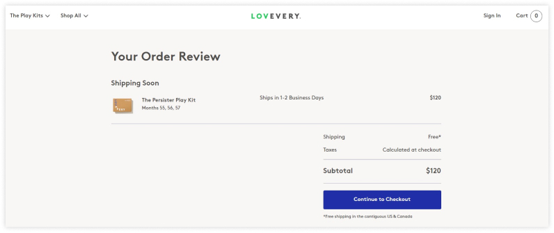
Baymard found the average US checkout page shows 23.48 form elements by default.
Most stores need about half. Start with the fields that are optional, pretending to be required:
- Company name. Unless you sell B2B.
- Second address line. Most people leave it blank anyway.
- Phone number. Keep it only if your courier needs it.
- Account creation. More on that in the next fix.
Then add a progress indicator and turn on autofill. Every field you remove is friction removed, and on mobile the effect roughly doubles.
Deleting four fields beats installing another app.
Also check: 10 Mobile Checkout Best Practices to Reduce Abandonment (2026)
9. Let people buy without making an account
Making people create an account before they can pay costs you sales, and plenty of stores still do it.
Someone buying a $30 item once does not want a password to manage. Give them guest checkout and offer the account afterward, on the confirmation page, when the pressure is off.
You’ll still collect the email. You just won’t lose the sale to get it.
Also check: How to Create Great Online Shopping Experience (2026)
10. Offer the payment methods your buyers already use
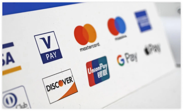
One-tap wallets are the biggest single win on this list for mobile.
Shop Pay, Apple Pay, and Google Pay skip the form entirely. For a phone buyer, that’s the difference between twelve fields and one thumbprint.
Beyond that, match payment options to where your customers live:
- Cards and wallets: The baseline everywhere.
- Cash on delivery: Expected in some markets, irrelevant in others.
- Buy now pay later: Works for higher-ticket items; adds nothing on a $20 order.
- Local methods: UPI, iDEAL, Pix. Whatever your country data says you need.
Check your analytics by country first. Six logos nobody uses just clutter the page.
Also check: One-Click Checkout: A Complete Guide for Online Stores
11. Put trust signals at the payment step
Nineteen percent of abandoners said they did not trust the site with their card details. They are being asked for a card number by a brand they met four minutes ago.
Trust badges work, but only where people hesitate. A security seal on your homepage does nothing. The same seal next to the card field helps.
Four things belong right at the payment step:
- Your SSL or secure checkout indicator.
- Accepted card and wallet logos.
- A returns line in plain words, not a link to a policy page.
- A support contact, so there’s a human behind the transaction.
Keep it honest. Badges you aren’t entitled to are worse than no badges, because a shopper who checks will never come back.
Also check: 12 Trust Badges I Use to Boost Sales (2026 Guide)
12. Show shipping cost early, not at the last step
Unexpected shipping cost is consistently the top reason people abandon a cart. Not the cost itself. The surprise.
If you offer free shipping over a threshold, say so on the product page and in the cart, with the amount still needed to qualify.
If you can’t offer it free, show the number early anyway. People will accept a $6 delivery fee they saw coming and abandon a $6 fee that appeared at step four.
Free shipping funded by a slightly higher product price usually beats a lower price with a shipping line. Same margin, better conversion.
13. Add live chat for quick questions
Live chat converts because it catches the one question standing between someone and a purchase.
Sizing, delivery date, compatibility, returns. Those get asked at the decision point, and an answer twenty-four hours later by email is an answer that arrives after the sale is gone.
A chatbot handles the repeat questions fine. Just make the handoff to a person obvious, because nothing kills trust faster than a bot looping a shopper who needs a real answer.
Keep a log of what people ask. That list tells you exactly what your product pages are missing.
Trust and Urgency Fixes
The first thirteen fixes remove friction. These seven add reasons to act now.
14. Show live activity on the page
A product page with no activity on it feels risky to someone who has never bought from you.
Live notifications fix that by showing what’s happening right now. Someone bought this an hour ago, twelve people are viewing it, this went out to a customer in Melbourne this morning.
It answers the question most buyers never ask out loud. Is anyone else buying from these people?
Keep it truthful. Real orders, real numbers, real timestamps. Invented activity is the fastest way to lose a customer who checks.
Full disclosure, this is what we build at WiserNotify, so weigh that accordingly.
Also check: 27 Winning Social Proof Examples That Seal the Deal
15. Use urgency that’s real
Urgency works when the deadline is real and backfires when it isn’t.
A limited-time offer with a genuine end date moves people who were going to think about it. A countdown timer that resets when you refresh the page teaches shoppers you can’t be trusted.
Same with stock counters. “Only 3 left” works if it’s pulling from real inventory and does damage if it’s a static number.
Pick one urgency element per page. Two competing timers cancel each other out.
16. Personalize with data you already have
Personalization doesn’t need an AI budget to start.
Three rules cover most of it:
- Returning visitors see recently viewed items first.
- Paid ad traffic lands on the product the ad promised, not your homepage carousel.
- Past buyers see complements, not repeats. Someone who bought running shoes wants socks.
Most stores haven’t set up any of the three.
Recommendations do lift average order value, but only when the logic is sensible. “Customers also bought” beats “you might like”, because one is evidence and the other is a guess.
Also check: 50+ E-commerce Personalization Statistics & Trends (2026)
17. Use exit-intent popups
An exit-intent popup fires when someone moves to close the tab. Last chance to say something useful.
Make the offer match where they are. Someone leaving a product page might respond to a discount. Someone leaving your blog will not.
One popup, one message, one button, and an obvious close X. Popups that trap people generate rage clicks, not conversions.
On mobile, exit intent barely works because there’s no cursor to track. Use a scroll depth or time-based trigger there instead.
18. Track the funnel, not just the rate
Your sitewide conversion rate is a summary, not a diagnosis. It tells you something is wrong, but not where.
Track four steps, because each drop points to a different cause:
- Product view to add to cart: Usually the photos, the copy, or the price.
- Add to cart to checkout start: Usually shipping cost or a late-appearing fee.
- Checkout start to payment: Usually form length or an account wall.
- Payment to confirmation: Usually missing payment methods or card declines.
GA4 handles the funnel, and Microsoft Clarity does session recordings and heatmaps for free. Analytics tells you what happened. Recordings tell you why.
Watch for rage clicks on things that aren’t buttons. That’s usually a design problem you’d never find in a report.
19. Run A/B tests the right way
Most ecommerce A/B tests don’t have enough traffic behind them to mean anything.
The rules are boring, and they matter. One change at a time, at least two weeks so you capture a full weekly cycle, and enough traffic to reach significance.
Test in this order, because the big levers move first:
- The offer: Free shipping against a percentage off will swing more than anything below it.
- The headline: Match it more tightly to the ad that sent them.
- The hero image: Outcome shot against product shot.
- Proof placement: Ratings beside the button, not below the fold.
- Button copy: A real change, not “Buy Now” against “Buy now.”
- Colors and spacing: Last, and only with enough volume to detect a difference.
If a test claims a 300% lift on 400 visitors, it’s noise. Run it again.
Also check: Powerful 30 A/B Testing Statistics Every Beginner Should Know
20. Convert the visitors who already know you
Returning visitors convert at 4.5% to 6.0%. First-timers convert at 1.0% to 2.0%.
Most CRO advice ignores this completely and spends all its effort on the harder audience.
So capture the email before they leave, then give the second visit a reason to close. Abandoned cart flows, back-in-stock alerts, and a post-purchase sequence that asks for a review and offers a reorder.
A store with a 2% rate on cold traffic and a 6% rate on returning traffic doesn’t need a redesign. It needs more returning traffic.
Also check: How to Increase eCommerce Sales: eComm Sales Strategy
Boost Conversion Instantly
Add Social Proof & Urgency to your website
Two Ecommerce CRO Examples
Two stores, two small changes worth copying.
Chewy: making the tracking link impossible to miss
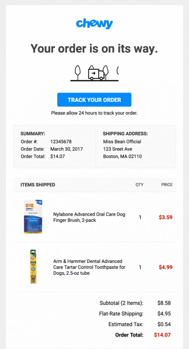
Chewy sells pet supplies, which people buy on a schedule. A late delivery isn’t an inconvenience; it’s a dog with no food on Thursday.
So their confirmation page leads with one thing. A large “Track Your Order” button, above the order summary and above any upsell.
Loqate found that when an address is wrong or incomplete, 41% of those deliveries run late. A tracking link people find on day one catches the problem before it becomes a support ticket.
What to take from it: your confirmation page has one job the customer cares about. Make that the biggest thing on the page.
Allbirds: removing a step from the path to cart
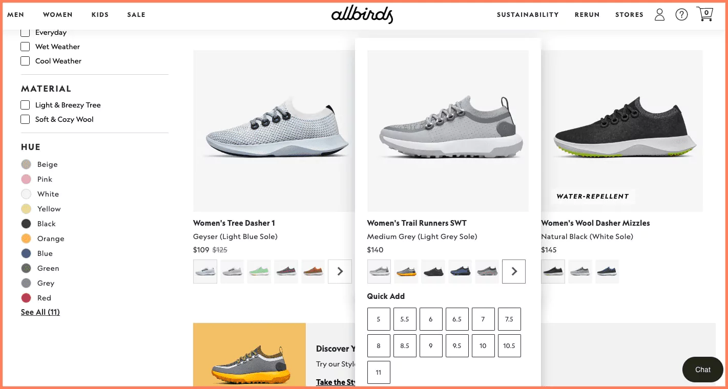
Allbirds sorts its listing pages by use case instead of price bands. Everyday, Wet Weather, Cool Weather, then material and color.
Then comes the part most stores skip. Hover a product and a Quick Add panel opens with every size in stock, right there on the listing page.
For a shopper who already knows their size, that deletes a whole page load from the path to cart.
What to take from it: count the steps between a decided buyer and the cart, then remove one.
Also check: 13 Ecommerce Landing Page Examples (+ Why They Work)
Wrapping Up
The market average went up this year while visitor counts went down. If your rate held steady, you are getting fewer, warmer visitors and converting them no better than before.
Run the diagnostic before you touch the tactics. Most stores find their problem is mobile, and that reframes the next month of work.
Then fix in order. Removing an obstacle beats adding a persuasion tactic on top of one.
And write your product facts in plain text while you are at it. The shoppers arriving from an assistant are the warmest traffic most stores will see next year.
Also check: How to Convert Traffic Into Sales: 14 Fixes That Work
Related CRO Guides
- 15 Latest eCommerce Growth Strategies Must Use In 2026
- 20 Top Conversion Optimization Agencies In The World
- 25 Elite Conversion Rate Optimization Experts & Consultants
- How to Improve Sales Conversion Rate: 11 Ways That Work
Frequently Asked Questions
What is the most important factor for a successful eCommerce website?
A successful eCommerce website combines technical optimization, user experience, and effective marketing strategies. Factors like loading speeds, mobile friendliness, clear navigation, an optimized checkout process, and compelling product pages are crucial.
Why is the Conversion rate so important?
Conversion rates are an effective, proven method for measuring the performance of your marketing strategies, whether it’s your online store or website. Understanding customers can help to make it more optimized and help you drive more sales.
What is the role of customer experience in eCommerce?
A positive customer experience drives more sales and builds brand loyalty. Focus on factors like easy navigation, fast loading speeds, personalized recommendations, and excellent customer support that help to provide a unique customer experience.
What are some common eCommerce mistakes to avoid?
Avoid slow loading speeds, confusing navigation, poor product image, lengthy checkout forms, a lack of responsiveness, and poor shopping experience.

Krunal Vaghasiya is a marketing tech expert who boosts e-commerce conversion rates with automated social proof and FOMO strategies. He loves to keep posting insightful posts on online marketing software, marketing automations, and improving conversion rates.




 Capterra