Sounds familiar? You’re getting a decent amount of traffic to your e-commerce site but only a handful of your visitors become customers. If so, you’re not alone.
It’s a common problem for online businesses. You spend time and effort driving traffic to your site and then…poof! They disappear before they buy.
But here’s the good news: you can recapture those almost-lost customers with exit intent popups.
These little buggers can be the difference between a lost sale and a loyal customer, especially when used in well-planned exit campaigns.
In this post we’ll go deep into exit intent popups, what they are, why they work and how to use them.
Plus we’ll show you 15 examples of exit intent, to inspire your own exit intent popup campaigns.
Ready to turn those abandoning visitors into paying customers? Let’s get started!
Visitors leave your website without taking action?
They don’t trust your site or feel urgency to act. WiserNotify builds both, turning doubt into action & visitors into customers.

What’s an exit intent popup?
A visitor is about to leave your site. As they move their mouse towards the close button, an exit intent popup appears and offers them a reason to stay. That’s an exit intent popup in action!
In short, it’s a targeted message that’s triggered when a visitor is about to leave your site. It’s a last chance to grab their attention and persuade them to stay.
Why use exit intent popups?
Exit intent popups are a powerful weapon in your e-commerce arsenal. Here’s why:
1. Reduce Cart Abandonment
An exit popup at the right time can remind visitors of the items in their cart and offer them a little incentive to complete the purchase.
Maybe it’s free shipping, a discount code or a reminder of your easy return policy.
2. Grow Your Email List
Grab those email addresses by offering lead magnets like a discount or exclusive content in exchange for signing up.
This way you can nurture those leads and bring them back to your site later.
3. Promote Special Offers
Got a flash sale or new product launch? Exit intent popups are perfect for promoting those time sensitive offers.
4. Get Feedback
Why are visitors leaving? Use an exit intent popup to ask a quick survey and get valuable feedback on their experience.
Understanding how exit popups work exactly can help you design more effective feedback mechanisms.
How do exit intent popups work?
(Source)
Exit popups work by using exit intent technology to detect when a visitor is about to leave.
This technology tracks mouse movements, scrolling behavior and other cues to figure out when someone is about to say “goodbye”.
On desktop, exit popups track mouse movements to determine exit intent, while on mobile, they can be triggered by actions such as switching tabs or pressing the back button since there’s no mouse movement to follow.
Once the exit intent detection technology kicks in, the popup appears and offers them a reason to stay.
Now let’s get to the examples!
15 Exit intent popup examples
1. Helpscout

Here’s an exit popup example from Help Scout that shows how to entice with content.
As the visitor moves their mouse towards the close button this popup appears, with a great reason to stay.
Instead of a sales pitch or discount offer, Help Scout is building their email list by offering content.
The popup says joining their community of subscribers gets you articles like the one they just read, twice a week.
It’s a great way to establish authority, nurture leads and keep your audience engaged.
2. Pricefalls
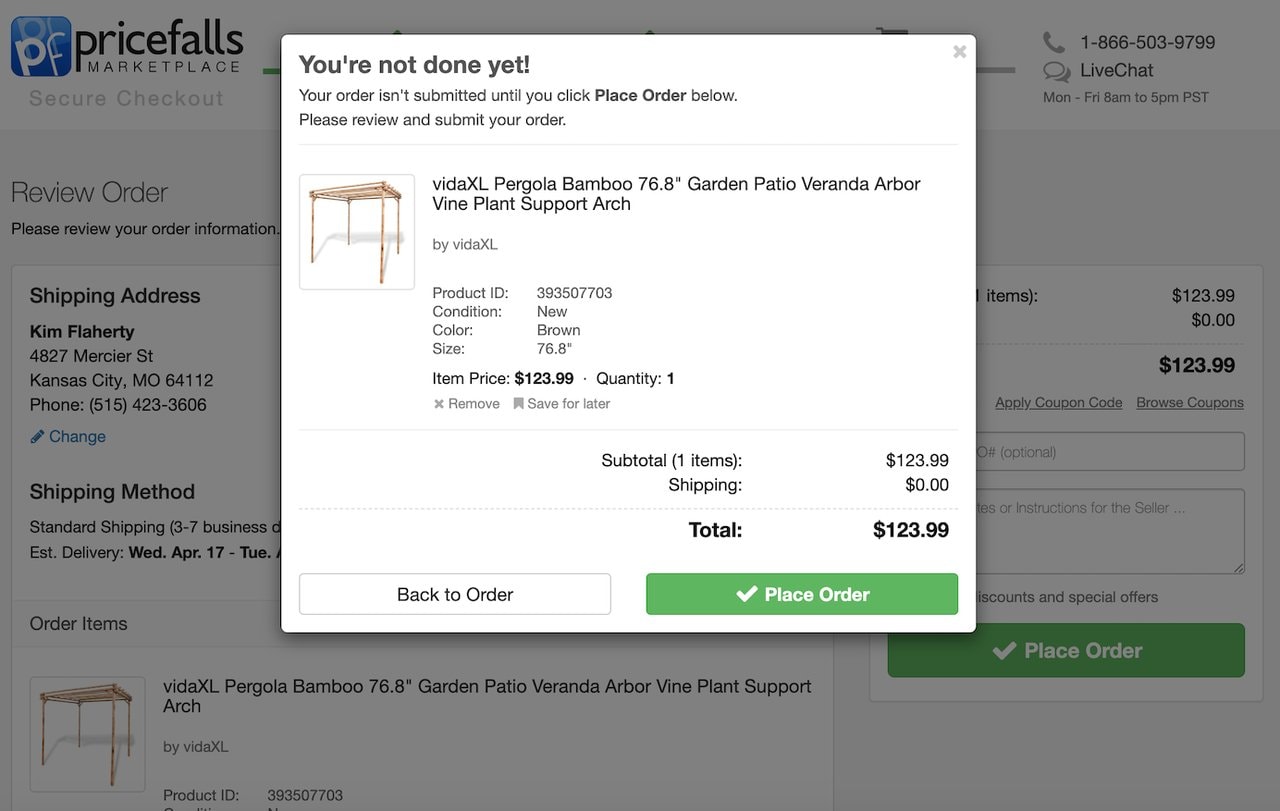
Pricefalls goes all in with their exit intent popup, turning the typical “abandonment alert” into a big checkout reminder.
Instead of offering discounts or incentives they simply remind the visitor their order isn’t complete until they click “Place Order”.
This simple approach is a gentle nudge to complete the purchase without relying on discounts.
3. Hallow

Hallow’s exit-intent popup uses a limited time campaign and a sense of community to encourage engagement.
By promoting their Pray40 prayer challenge and offering 90 days free they tap into the visitor’s desire for spiritual growth and connection.
Featuring big names like Mark Wahlberg and Jonathan Roumie adds social proof to encourage visitors to join in.
4. Blavity TV

Blavity TV’s exit intent popup grabs attention with a big visual and clear value proposition.
The image and headline hits you with what they offer: “Black excellence streaming 24/7”.
By putting the “Get the App” CTA front and centre and showing availability on multiple platforms they make it easy for visitors to get their content.
This popup promotes their streaming service and encourages app downloads.
5. JewelScent

JewelScent’s exit intent popup gamifies the shopping experience with a scratch and win offer.
This fun approach grabs attention and incentivises visitors to give their email address to win a prize.
By leveraging the surprise and thrill of potentially winning JewelScent creates a memorable and engaging exit intent experience that can drive email signups and conversions.
6. Worn Wear

Worn Wear’s exit intent popup promotes sustainability and re-engages lost customers.
By highlighting the environmental benefits of buying used they appeal to eco-conscious shoppers and give an alternative to leaving empty handed.
The cart is saved so they encourage visitors to explore the Worn Wear platform.
7. Oodie

Oodie’s exit intent popup uses a fun approach and a great offer to capture leads.
The headline “Would You Like a Hug? And $25 Off” grabs attention and creates a sense of warmth and comfort, perfect for their brand.
By offering a big discount and cozy email content they incentivise visitors to give their info and join their community.
The fun tone and offer makes this popup a lead gen tool.
8. Ecommerce Influence

Ecommerce Influence’s exit intent popup offers a lead magnet to aspiring entrepreneurs.
By offering a free “Ecommerce Founders Growth Pack” they provide practical tools and resources to help visitors achieve their business goals.
The promise of “$200k+/month” adds a bit of aspiration and encourages visitors to give their contact info for the growth pack.
This popup grabs leads and positions Ecommerce Influence as a resource for e-commerce businesses.
9. Sproutsocial

SproutSocial’s exit intent popup is direct and problem solving. Instead of a generic offer they address a pain point for social media managers: streamlining workflows and optimizing team efforts.
By highlighting the benefits of their platform – categorising messages, scheduling posts and improving team efficiency – they offer a solution to their target audience.
The “Start Your Free Trial” CTA is a clear path to trying it out.
This popup communicates value and engagement with a solution to a problem.
10. Backlinko

Backlinko’s exit intent popup is a classic example of offering a lead magnet for contact info. The clean design and headline immediately tells you what’s being offered: a free 2021 SEO guide.
By highlighting the benefits of the guide – proven strategies for higher rankings – they appeal to visitors who want to get their website seen.
The CTA and design is clear and makes this popup a lead gen tool.
11. Playful exit

This playful exit intent popup from Truly Beauty uses a big ask to get email addresses.
The “Do you like FREE stuff?” headline grabs attention, the free whitening wand (with a clear value prop) incentivises visitors to subscribe.
By focusing on a free product and minimising the perceived commitment (just pay shipping!) this popup encourages email signups and feels generous.
12. Personal Blog

Mobile exit intent popup example on a personal blog.
As visitors try to leave, a simple popup appears with “More about me…” to encourage visitors to dig deeper into the site owner’s background and work.
This is a nice way to capture interest without overwhelming the visitor, perfect for personal blogs and portfolio sites.
13. Press
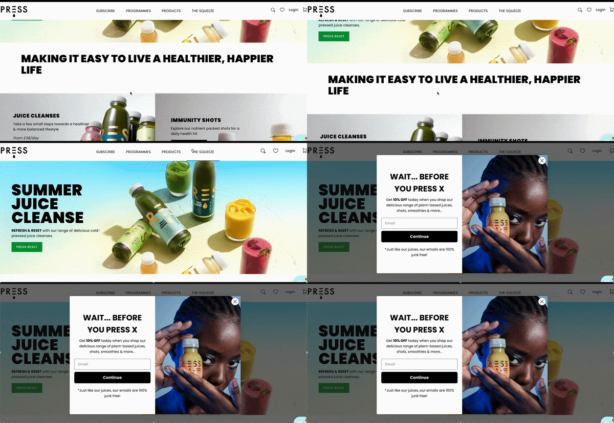
This press website grabs attention with the headline “MAKING IT EASY TO LIVE A HEALTHIER, HAPPIER LIFE” and then visuals of their products.
The “JUICE CLEANSES” and “IMMUNITY SHOTS” sections use big imagery and short descriptions to guide visitors to learn more and buy, encouraging exploration and more visitor engagement on shopify.
14. Discount Popup
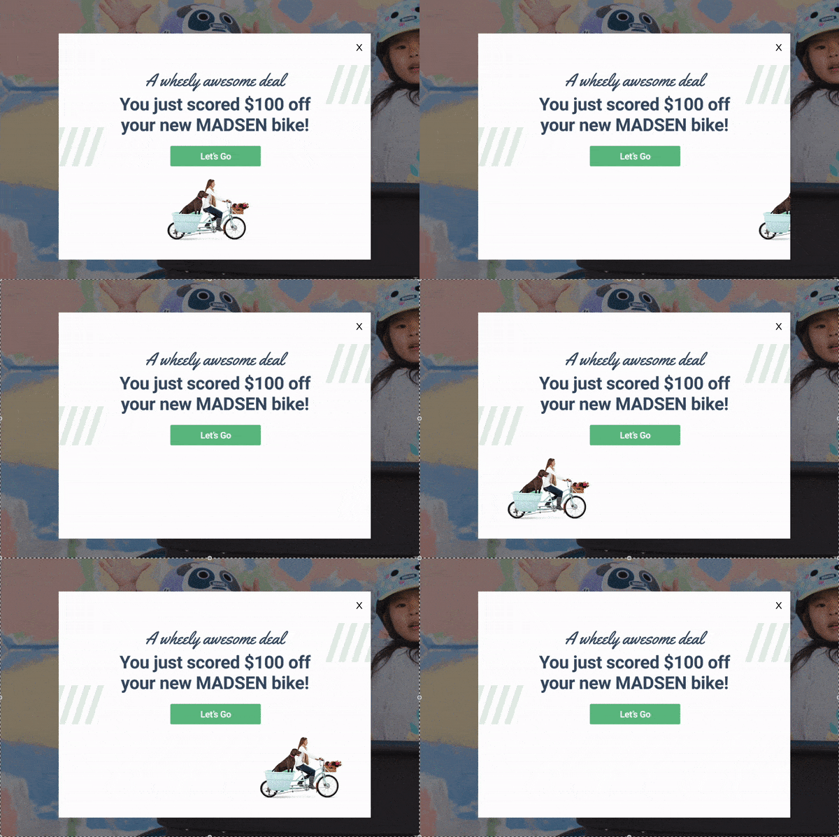
This exit intent popup uses a playful pun “A wheely awesome deal” to engage visitors with a big discount offer.
It’s a $100 off a new MADSEN bike, with a nice graphic of a family bike.
The “Let’s Go” button is front and centre, so visitors are encouraged to take action, which will likely grab the attention of visitors who are about to buy.
This popup makes a last minute pitch to convert visitors into buyers with a big discount.
15. True Trendy
This exit intent popup catches visitors just as they’re about to leave the site, with a 20% off first purchase offer.
It shows the coupon code straight away, so new visitors can make the decision to stay and buy.
By addressing the common hesitation of first time visitors with a tangible offer this popup reduces bounce rates and converts exits into engaged customers.
Tools to create exit intent popups
Now that you’ve seen the examples, you might be wondering how to create your own exit intent popups.
Luckily there are many tools available to help you out. Here are a few:
1. OptiMonk
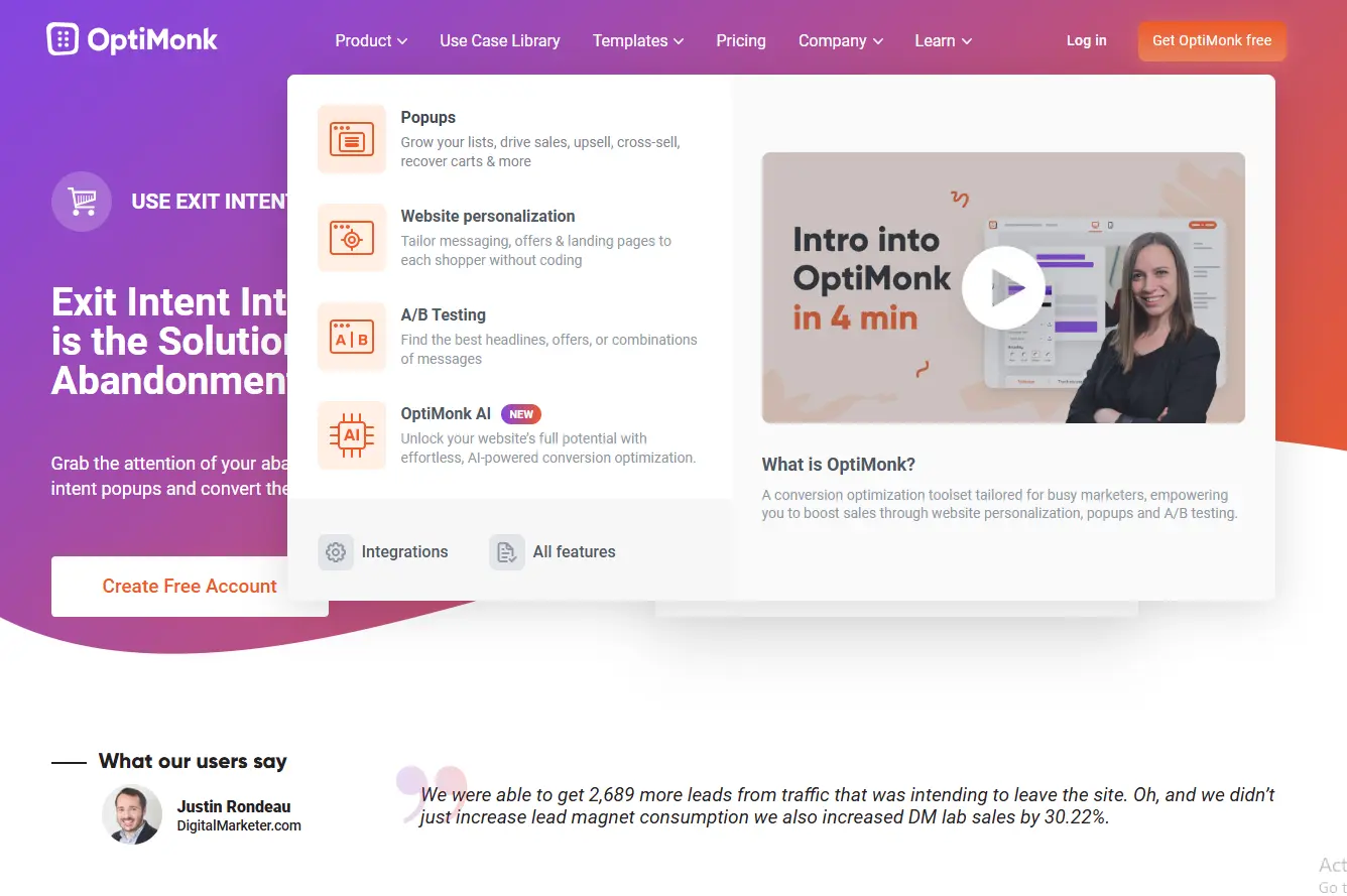
If you want a full-fledged solution with many features, OptiMonk is the way to go.
It’s like the Swiss Army knife of exit intent popup tools. OptiMonk’s popup overlay design ensures that your offers are visually appealing and effective.
➨ Drag-and-Drop Builder: Even if you’re not a designer, you can create beautiful popups with OptiMonk’s drag-and-drop builder. No coding needed!
➨ Tons of Templates: Get inspired with a huge library of pre-made templates. Choose a template that matches your brand and customize it to your taste.
➨ Advanced Targeting: Target your popups based on visitor behavior such as pages visited, time spent on site or scrolling depth. So your offers are relevant and timely.
➨ A/B Testing: Test different designs, copy and offers to see what works best with your audience. OptiMonk’s A/B testing makes it easy to optimize your campaigns for maximum conversions.
➨ Detailed Analytics: See how many visitors see your popups, how many are converting and which campaigns perform best.
Pricing:
- They offer a free plan, with paid plans starting at $29/month.
2. JustUno
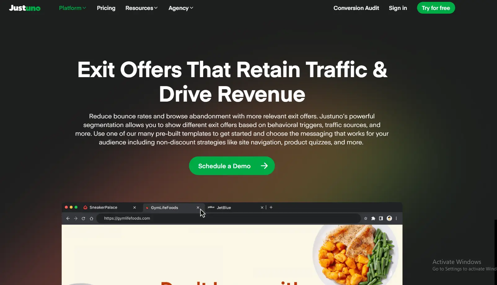
If you want to take your exit intent campaigns to the next level, JustUno has advanced targeting and personalization features.
It’s like having a personal shopper for each of your website visitors.
➨ Hyper-Targeting: Target your popups based on many criteria such as referral source, device type, location and even purchase history.
➨ Personalized Messaging: Create dynamic popups that address visitors by name or show offers based on their browsing behavior.
➨ AI-Powered Optimization: JustUno uses artificial intelligence to analyze visitor data and optimize your campaigns for maximum conversions.
➨ Integrations: Connect Sleeknote with your email marketing platform, CRM and other marketing tools to automate your workflows.
Pricing:
- They offer a free plan, with paid plans starting at $39/month.
3. Sleeknote
If design and user experience is your top priority, Sleeknote is the way to go. It’s like the fashion designer of exit intent popup tools.
➨ Beautiful Templates: Sleeknote has a curated selection of gorgeous templates that will grab attention.
➨ Mobile-First Approach: Sleeknote’s popups are designed with mobile users in mind so it’s smooth on all devices.
➨ Gamification Options: Add interactive elements like spin-to-win wheels or quizzes to your popups.
➨ User-Friendly Editor: Customize your popups with Sleeknote’s simple editor.
Pricing:
- They offer a 14-day free trial, with paid plans starting at $64/month.
You have the exit intent technology to create popups that grab attention and convert. Now you need to package it all together.
How to design exit intent popups
You have the tools and the offer, but how do you put it all together to grab attention and convert?
That’s where the art and science of exit intent popup design comes in.
Think of your exit intent popup as a tiny store. You have just a few seconds to grab a passerby’s attention and make them enter.
Every design element from colors to fonts to layout plays a role in achieving that.
Here’s a breakdown of the key design principles to keep in mind
1. Clarity Above All
Avoid visual clutter at all costs. Your message should be clear and instantly understandable. Following these guidelines will help you create the exit intent popup best suited for capturing attention and driving conversions.
Visitors shouldn’t have to decipher what you’re offering or hunt for the call to action button.
Concise Headline: Use a strong headline that clearly communicates the value of your offer. Think “Don’t Miss Out! 20% Off Your First Order” or “Wait! Get Your Free Shipping Code.”
Minimal Text: Keep the body text short and sweet. Use bullet points or short paragraphs to highlight the key benefits.
Strategic Whitespace: Don’t cram every inch of your popup with text and images. Use whitespace to make it clean and uncluttered.
2. Visuals That Match Your Brand
Your exit intent popup should look visually appealing and match your brand.
High-Quality Images: Use eye-catching images or graphics that are relevant to your offer. If you’re offering a discount on shoes, show a pair of shoes. If you’re promoting a free guide, show an image that represents the content of the guide.
Color Palette: Use your brand colors to keep it consistent and reinforce brand recognition.
Fonts: Choose fonts that are readable and match your brand’s tone.
3. A Strong Call to Action (CTA)
Your CTA is the core of your exit intent popup. It’s the action you want visitors to take. Make it clear, concise and impossible to ignore.
Action-Oriented Language: Use verbs that encourage action, like “Get My Discount”, “Claim Your Free Gift” or “Join Now”.
Button Design: Make your CTA button prominent. Use contrasting colors to make it pop from the background.
Button Size: Make sure the button is big enough to be tapped on mobile devices.
4. Placement and Timing
While exit intent technology triggers the popup as the visitor is about to leave, you still have some control over where it appears on the screen.
Center Stage: Centering the popup makes it grab attention without blocking the whole page.
Consider a Slight Delay: Instead of triggering the popup the instant the mouse moves towards the close button, consider a 1-2 second delay. This can feel less intrusive and give the visitor a chance to rethink their exit.
5. Testing and Iteration
Even the best designed exit intent popup can be improved with testing and iteration.
A/B Testing: Test different design elements, copy and offers to see what works best.
User Feedback: Get feedback from your audience to understand how they perceive your popups.
Analytics: Track your popup performance and use the data to make data driven design decisions.
Follow these design principles and test and iterate and you’ll have exit intent popups that are both beautiful and convert abandoning visitors into loyal customers.
Mobile exit intent popups
More and more people are browsing on their mobile devices. Optimizing your exit intent popups for mobile is key.
Understanding how exit popups work exactly on mobile versus desktop can help you optimize for both platforms.
Here are a few things to consider:
Size Matters: Make sure your popup fits on smaller screens.
Simplify the Design: Avoid complex layouts that are hard to navigate on mobile.
Optimize for Touch: Make sure buttons and interactive elements are tapable.
Customize your popups for mobile and you’ll have a great user experience and more conversions across all devices.
This is especially important considering the latest mobile vs desktop popup stats.
6 Exit intent popup copywriting tips
You have a beautiful exit intent popup, now comes the hard part: writing copy that converts.
Think of your popup copy as a mini sales page.
You have seconds to grab attention, communicate value and drive action. Every word matters.
Here’s a breakdown of the copywriting tips to make your exit intent popups convert:
1. Urgency is Your Friend
People are more likely to act when they feel a sense of urgency.
Create that “gotta-have-it-now” feeling with:
- “Don’t Miss Out!”
- “Limited Time Offer”
- “Last Chance”
- “Ending Soon”
- “Only a Few Left”
Using the right exit intent popup at the right time can significantly boost your conversion rates.
Combine urgency with scarcity for extra power. For example “Only 3 Hours Left to Claim Your 20% Off!”
2. Benefits, Benefits, Benefits
Clearly communicate the value proposition of your offer. What’s in it for the visitor? Why should they stay?
Instead of “Sign up for our newsletter” try “Get exclusive access to new arrivals, style tips and special offers.”
Focus on what’s in it for the visitor, not the features of your offer.
3. A Conversational Voice
Write as if you’re talking to the visitor. Use a friendly and casual tone.
Instead of “Subscribe to our email list” try “Want to be in the know? Join our crew?”
Avoid jargon or formal language. Keep it simple.
4. Keep it Short
No one wants to read a book in an exit intent popup. Keep your copy brief.
Use short sentences and paragraphs. Break up long text with bullet points or headings.
Get to the point and make your offer clear.
5. A Little Personalization
If you have visitor data, use it to personalize your popup copy.
Address the visitor by name or reference their browsing history. For example “Hey [Name], we saw you looking at [Product]. Here’s a special offer just for you!”
Personalization makes your popups feel more relevant.
6. Proofread with Care
Typos and grammatical errors can hurt your credibility. Proofread your copy before you launch.
Consider having someone else review your copy to catch any mistakes you missed.
By following these copywriting tips and testing and iterating you can create exit intent popups that are beautiful and convert abandoning visitors into customers.
Exit intent popup mistakes
Exit intent popups can be a great way to convert abandoning visitors, but only when done right.
Unfortunately many businesses fall into common mistakes that make them ineffective and even drive visitors away.
Here’s a breakdown of the most common mistakes people make when designing and implementing exit intent popups:
1. Popup Overload
Imagine this: you’re browsing a website and just as you’re about to leave, BAM! A popup appears. You close it, try to leave again and BAM!
Another one pops up, this time with a different offer. Annoying right?
That’s exactly what happens when you popup too much.
It creates a bad user experience and makes your brand seem pushy and desperate.
The Fix: Show restraint. Limit yourself to one popup per visitor session. Focus on a high value offer that’s relevant to their browsing behaviour.
2. The Irrelevant Offer
You wouldn’t offer a discount on winter boots to someone browsing swimwear would you?
The same applies to exit intent popups.
Offering irrelevant deals or incentives makes your popups seem generic and impersonal.
It shows you haven’t taken the time to understand your visitor’s needs and interests.
The Fix: Segment your audience and tailor your offers. Use website behaviour, referral source and other data to personalize your popups.
For example if someone is browsing your blog offer them a free guide or ebook related to the content they’re reading.
For instance, offering basic outfitters brand news to visitors interested in fashion can make your popups more relevant and engaging.
3. Mobile Mayhem
More and more people are browsing the web on their mobiles. Ignoring mobile users is a huge mistake.
Displaying a desktop sized popup on a mobile screen is a recipe for disaster.
It creates a bad user experience and makes it hard for visitors to engage with your offer.
The Fix: Optimize your popups for mobile devices. Make sure they’re responsive and fit on smaller screens. Use larger font sizes and buttons for easy tapping.
4. The Gotcha!
Some websites make it impossible to close exit intent popups.
They use tiny close buttons, confusing navigation or even force visitors to click through multiple pages to escape.
This “gotcha!” approach is deceitful and annoying. It creates a bad impression of your brand and can hurt trust.
The Fix: Make it easy for visitors to close your popup if they’re not interested. Use a clear and prominent close button. Don’t use manipulative tactics to trick visitors into staying.
5. Bland and Generic
“Sign up for our newsletter!” “Don’t miss out on special offers!” These generic phrases are boring and don’t grab attention.
Using bland and generic copy makes your popups forgettable and ineffective. It shows a lack of effort and creativity.
Looking at intent popup examples wrapping engaging copy can provide inspiration for your own designs.
The Fix: Add personality and creativity to your copy. Use a conversational tone, strong verbs and compelling language that speaks to your target audience.
6. The Timing Misfire
Trigger your popup too early or too late and it will be ineffective.
If it appears the instant the mouse moves it can feel intrusive and interrupt the browsing experience.
On the other hand waiting too long might mean missing the opportunity to engage the visitor before they leave.
The Fix: Experiment with different timing delays to find the sweet spot. Consider a slight delay of a second or two to give the visitor a moment to reconsider their exit.
7. Set it and Forget it
Creating an exit intent popup isn’t a one time task. It’s an ongoing process of monitoring, testing and optimisation.
Not analyzing your popup performance and making adjustments will lead to stagnant results.
The Fix: Track key metrics like impressions, conversions and close rates.
Use A/B testing to test different design elements, copy and offers. Refine your popups based on data and user feedback.
You can turn these powerful tools into conversion machines by avoiding these mistakes and taking a strategic approach to exit intent popup design and implementation.
Conclusion
Exit intent popups are a must-have for any e-commerce business looking to get more leads, reduce cart abandonment, and increase website traffic.
Now go ahead and create some exit intent popups!
Remember to test different offers, designs, and copy for your audience.
And always put the user first so your popups are welcomed, not feared.
