10 Mobile Checkout Best Practices to Reduce Abandonment (2026)
 Krunal Vaghasiya|Sep 4, 2024
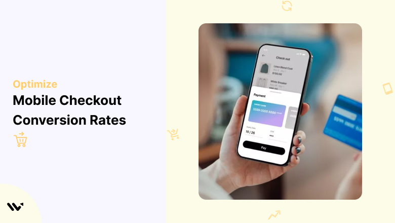
Mobile devices now account for more than half of all ecommerce transactions globally.
Yet mobile checkout conversion rates consistently lag behind desktop by a significant margin. The gap isn’t because mobile shoppers are less willing to buy; it’s because most mobile checkout experiences are poorly built.
Too many steps, too many required fields, forms that don’t work on small screens, payment methods that create friction instead of removing it.
Cart abandonment sits at around 70% across ecommerce generally. On mobile, the primary drivers are consistent: a checkout process that feels too long or complicated, unexpected costs appearing late in the flow, and a lack of payment options the shopper actually uses. Every one of those is fixable.
These 10 mobile checkout best practices address the specific friction points that cost ecommerce stores the most revenue on mobile devices.
Why Mobile Checkout Optimization Matters
The stakes are higher than most stores realize. A shopper who reaches the checkout page has already made the hardest decision: they want your product. Losing them at checkout isn’t a traffic problem or a marketing problem. It’s a UX problem with a direct revenue impact.
Every percentage point of improvement in mobile checkout conversion rate translates directly to revenue without spending more on acquisition.
The mobile checkout experience also shapes long-term brand perception. A smooth checkout creates a positive last impression that increases the likelihood of repeat purchase.
A frustrating one creates a lasting impression that sticks: shoppers remember when checkout was painful, and they’re less likely to return.
•More than 50% of ecommerce transactions now happen on mobile devices
•70% of shopping carts are abandoned, with mobile abandonment rates consistently higher than desktop
•Slow loading, too many form fields, and unexpected fees are the three most cited reasons for mobile checkout abandonment
•One-tap payment options like Apple Pay and Google Pay increase mobile conversion rates by reducing form completion to a single authentication step
Also check: Mobile commerce statistics every ecommerce store should know
Build trust & FOMO
Highlight real-time activities like reviews, sales & sign-ups.


10 Mobile Checkout Best Practices
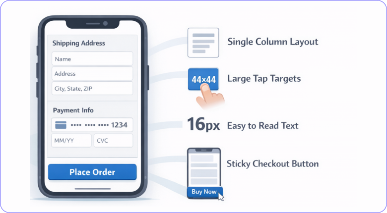
1. Design mobile-first, not mobile-adapted
The most common mobile checkout mistake is building a desktop checkout and then trying to make it work on a smaller screen.
The result is always a compromised experience: elements that are too small to tap, forms that require excessive scrolling, and layouts that feel like a shrunken version of something designed for a different context.
Mobile-first design starts from the constraints of a phone screen and builds up.
Single-column layouts, large touch targets (minimum 44×44 pixels for tappable elements), generous spacing between interactive elements, and content prioritized for a small viewport. The checkout should feel like it was built for a phone because it was.
•Single-column layout throughout: no side-by-side elements that compress on small screens
•Minimum 44x44px touch targets for all buttons and interactive elements
•Font size minimum 16px to prevent browser zoom on form fields
•Sticky checkout button visible without scrolling, so the primary action is always accessible
•No pop-ups, sidebars, or interstitials during the checkout flow
2. Reduce form fields to the minimum possible
Every field in your checkout form is a potential exit point. On mobile, typing is slower and more error-prone than on a desktop.
Each additional field increases the cognitive load and physical effort required to complete the purchase.
The standard practice of asking for first name, last name, address line 1, address line 2, city, state, zip, country, phone, and email separately represents eight to ten distinct typing tasks on a touchscreen: most of which can be eliminated or automated.
Address autocomplete fills most address fields from a single lookup. Autofill handles payment details for returning customers.
Guest checkout removes the account creation barrier entirely. The goal is to reach a point where a first-time buyer can complete checkout in under two minutes without any friction from form design.
•Enable address autocomplete to reduce address entry to a single search field
•Use browser autofill for payment fields rather than blocking it with custom inputs
•Combine first and last name into one field: no conversion benefit to separating them
•Make phone number optional unless required for delivery: it’s a common abandonment trigger
•Show inline validation in real time so errors surface immediately, not at submission
3. Offer guest checkout by default
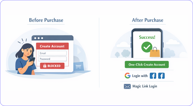
Forcing account creation before purchase is one of the highest-impact abandonment triggers in mobile checkout.
A customer who wants to buy a specific product right now is not in the mindset to create an account: they’re in the mindset to complete a transaction. Interrupting that with a registration requirement creates friction at the worst possible moment.
Guest checkout removes that barrier entirely. Post-purchase account creation (offering to save their details after the transaction completes) captures most of the account creation value without any of the pre-purchase friction.
Returning customers who want the speed benefit of saved details will create accounts voluntarily once they’ve had a positive purchase experience.
•Make guest checkout the default option, not buried below account creation
•Offer one-click account creation after purchase completes using details already entered
•Allow social login (Google, Facebook) as a middle ground for users who want speed without full registration
•For returning customers, offer magic link login by email to skip password entry entirely
Also check: Checkout page design examples that convert
Build trust & FOMO
Highlight real-time activities like reviews, sales & sign-ups.

4. Add express payment options at the top
Express payment options like Apple Pay, Google Pay, and Shop Pay don’t just save time: they fundamentally change the checkout experience.
Instead of filling out a form, the customer authenticates with Face ID or Touch ID, and the purchase is done. No typing, no card number entry, no address form.
The entire form-filling stage of checkout is eliminated.
The critical detail most stores get wrong is placement. Express payment buttons placed at the top of the checkout flow (before the form) perform significantly better than those placed at the bottom or on a separate payment method selection screen.
A customer who sees Apple Pay immediately when they reach checkout has a one-tap path to a completed purchase.
•Place Apple Pay, Google Pay, and Shop Pay buttons above the checkout form, not below it
•Include express payment on the product page and cart page, not only at checkout
•Support PayPal for customers who don’t use device-native wallets
•Enable buy-now-pay-later options (Klarna, Afterpay) for higher-ticket products where payment flexibility reduces hesitation
•Save payment details for returning customers to enable one-tap repeat purchases
5. Show a progress indicator
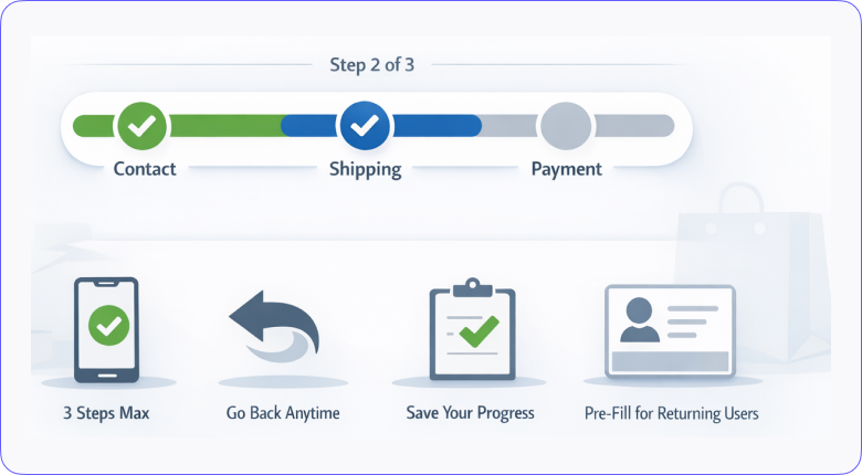
Checkout abandonment spikes when customers don’t know how much is left. A shopper who’s filled in their address and doesn’t know whether there are two more screens or five is more likely to abandon than one who can see they’re on step 2 of 3.
Progress indicators reduce abandonment by making the remaining effort visible and finite.
The design principles that matter: keep step count low (three steps maximum: contact, shipping, payment), show which step is current and which are complete, allow backward navigation to correct earlier entries without losing progress, and keep step labels descriptive enough that users know exactly what’s coming next.
•Limit checkout to three steps maximum: anything longer loses mobile users disproportionately
•Display a persistent progress bar at the top of every checkout screen
•Mark completed steps visually (checkmark or filled indicator) to give a sense of momentum
•Allow users to navigate back to previous steps without losing data already entered
•Pre-fill details for returning customers to skip steps they’ve already completed
6. Be transparent about costs early
Unexpected costs at the payment screen are the single most common reason cited for checkout abandonment across every survey of mobile shoppers.
A customer who sees a product for $35, adds it to the cart, works through the checkout form, and then discovers $12 in shipping and taxes on the final screen has been misled.
Even if those costs are legitimate, the experience of discovering them late creates a sense of bait-and-switch that damages trust and kills the conversion.
The fix is surfacing all costs as early as possible: ideally on the product page, definitely in the cart, and clearly summarized before the payment screen. Free shipping thresholds should be visible throughout the shopping experience, not revealed only at checkout.
•Show estimated shipping costs on the product page or cart, not only at payment
•Display tax estimates as soon as a shipping address is entered
•Show a free shipping progress bar in the cart that tracks how close the buyer is to qualifying
•Include a full order summary (products, shipping, tax, total) on the payment screen before the buy button
•Show estimated delivery dates at the shipping step, not after purchase confirmation
7. Optimize page speed for mobile networks
Mobile checkout pages load over cellular networks, not always broadband.
A checkout page that loads in 2 seconds on a desktop WiFi connection may take 6-8 seconds on a 4G connection and longer on 3G. Every second of additional load time increases the probability of abandonment.
Google’s research found that as page load time goes from 1 to 3 seconds, the probability of bounce increases by 32%.
Speed optimization for mobile checkout specifically: compress images aggressively, defer non-critical JavaScript, eliminate unnecessary third-party scripts from the checkout page, and use a CDN to serve assets from servers close to the user’s location.
•Target a checkout page load time under 2 seconds on a 4G mobile connection
•Remove non-essential scripts (live chat, marketing pixels) from checkout pages
•Compress and lazy-load product images in the order summary
•Use Google Lighthouse to audit checkout page performance and identify specific bottlenecks
•Enable browser caching so repeat visitors load checkout resources faster
Also check: How multiple payment options reduce checkout abandonment
Build trust & FOMO
Highlight real-time activities like reviews, sales & sign-ups.

8. Build trust at the payment step
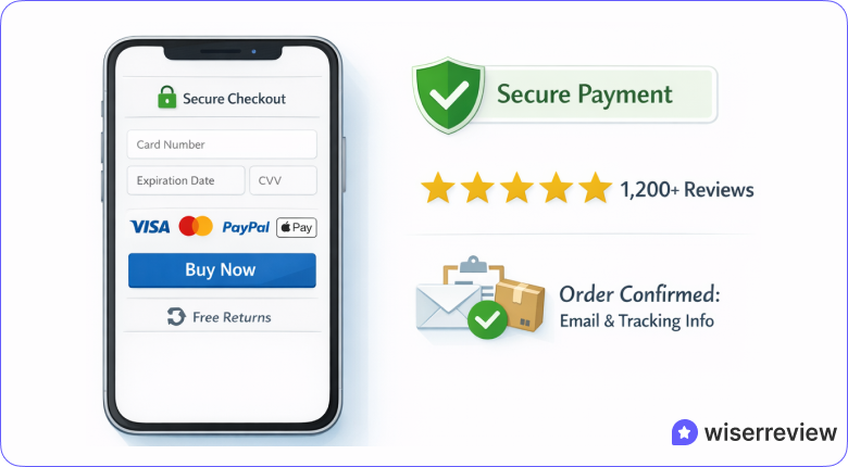
The payment screen is where trust anxiety peaks. A customer entering their card details on an unfamiliar mobile site is making a security judgment in real time.
Every visual signal on that screen either reinforces trust or undermines it. Security badges, payment provider logos, SSL indicators, and clear return policy information aren’t decorative: they’re the evidence a shopper uses to decide whether the transaction is safe.
The specific trust signals that move the needle on mobile: SSL certificate indicator, recognized payment logos (Visa, Mastercard, PayPal), a brief return policy reminder near the buy button, and a clear explanation of what happens next after purchase.
Reviews or customer counts near the payment button add social proof at the highest-anxiety moment in the flow.
•Display SSL certificate indicator and security badge near the payment form
•Show recognized payment logos (Visa, Mastercard, PayPal, Apple Pay) to establish credibility
•Include a one-line return policy reminder near the buy button to reduce perceived purchase risk
•Add a short customer review or star rating near the payment screen to reinforce purchase confidence
•Clearly state what the customer will receive after clicking buy: confirmation email, order number, tracking link
9. Use exit-intent and cart recovery tactics
Not every abandonment is permanent. A shopper who leaves the checkout page because they got distracted, had second thoughts about the price, or wanted to compare alternatives is still a potential conversion. Exit-intent triggers and cart recovery sequences capture a percentage of those shoppers before they’re gone permanently.
On mobile, exit-intent detection works differently than on desktop (there’s no cursor movement to track).
Instead, mobile exit-intent relies on scroll velocity, inactivity timers, and back-button detection. Cart recovery email sequences (sent within one hour, then at 24 hours, then at 72 hours) consistently recover 5-15% of abandoned carts when they include a clear cart summary and a direct link back to checkout.
•Use back-button and inactivity detection to trigger mobile exit-intent offers
•Offer a time-limited discount or free shipping in exit-intent popups to tip hesitant buyers
•Send cart recovery emails within 1 hour, 24 hours, and 72 hours of abandonment
•Include a full cart summary and direct checkout link in every recovery email
•Sync carts across devices so a shopper who starts on mobile can complete on desktop without starting over
Also check: Exit intent popup examples that recover abandoned carts
10. Add social proof and urgency at the checkout
The checkout page is the last conversion point before purchase, which makes it the highest-value location for social proof.
A shopper who’s already decided to buy needs confirmation that they’re making a good decision: recent purchase notifications, customer review counts, star ratings near the buy button, and inventory alerts all reinforce the decision to proceed rather than second-guess.
Urgency signals work alongside social proof: low stock alerts, limited-time offer timers, and recent purchase activity activate loss aversion at the moment when it most directly affects conversion.
WiserNotify’s live notification widgets display real-time purchase activity, review counts, and stock alerts on checkout pages without any page speed impact: turning the checkout page into an active social proof environment rather than a static form.
•Display recent purchase notifications to signal active buying activity at the checkout moment
•Show product star ratings and review counts near the order summary to reinforce product confidence
•Add low stock alerts for items with limited inventory to create genuine urgency
•Use countdown timers for time-limited offers or flash sale prices to activate loss aversion
•Display loyalty points earned on this purchase to increase the perceived value of completing the order
Also check: Social proof marketing: how to use it to increase conversions
Build trust & FOMO
Highlight real-time activities like reviews, sales & sign-ups.

Real Brand Mobile Checkout Examples
Amazon: one-click removes the checkout entirely
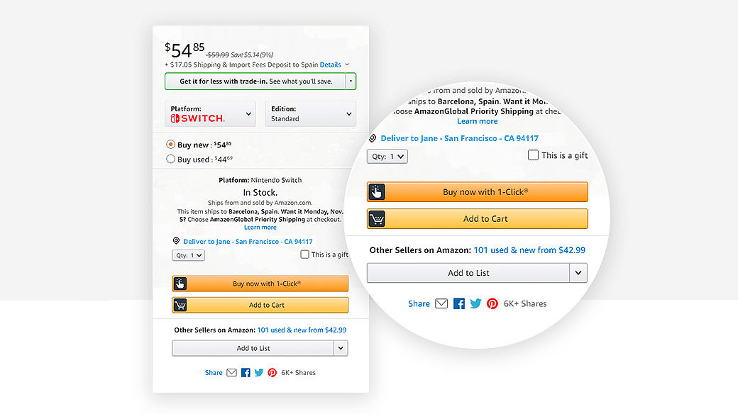
Amazon’s “Buy Now with 1-Click” is the most extreme form of mobile checkout optimization: the checkout process itself is eliminated.
Saved payment and shipping details mean the entire form-filling stage never happens. The lesson isn’t that every store needs one-click checkout, but that the direction of travel is clear: reduce friction at every step until the step itself no longer needs to exist.
Apple: security confidence drives completion
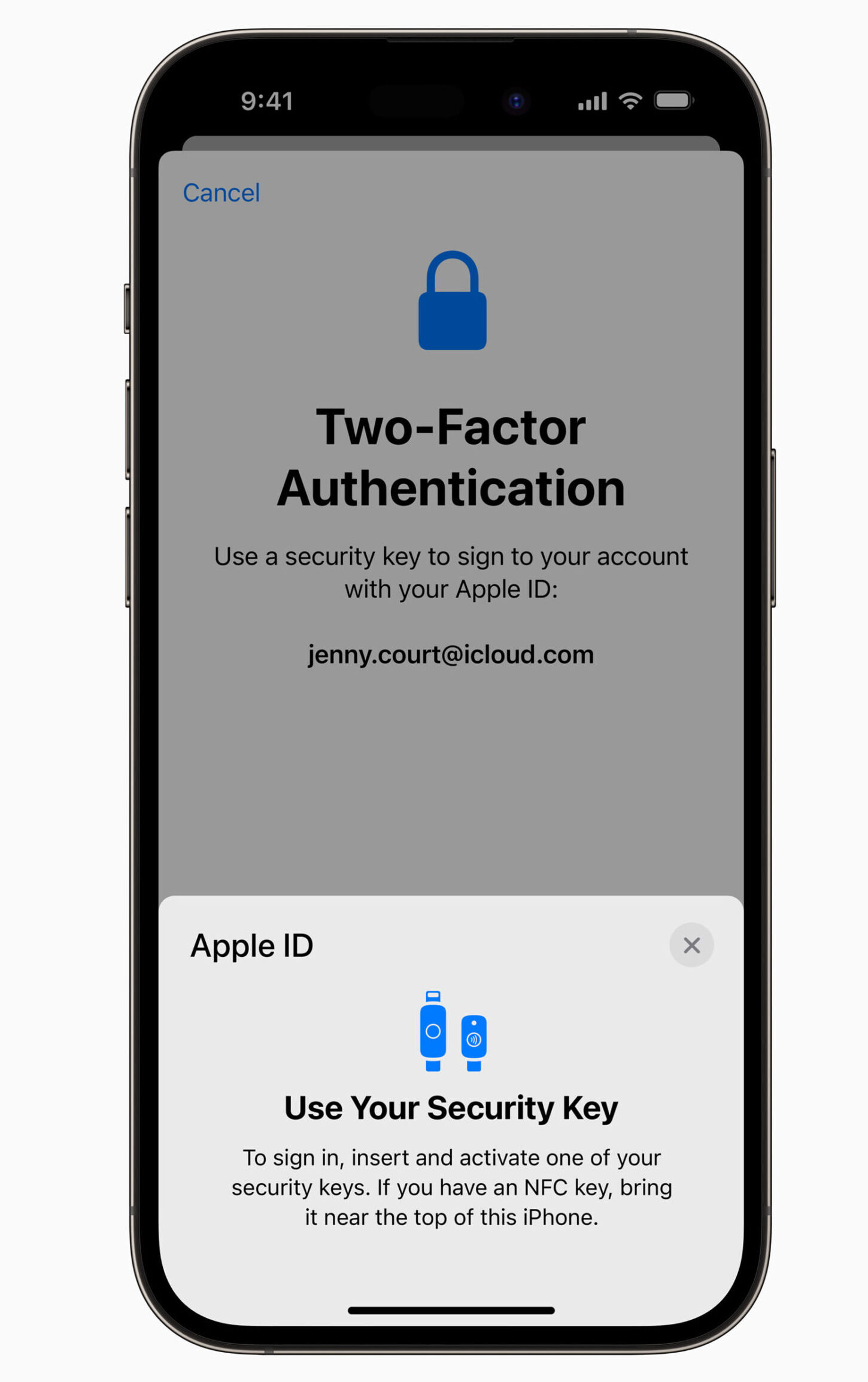
Apple’s mobile checkout leads with security signals rather than treating them as an afterthought.
SSL indicators, Face ID authentication, and prominent Apple Pay placement communicate that the transaction is safe before the customer has to make that judgment themselves.
For high-value purchases where trust anxiety is highest, leading with security is a conversion strategy, not just a compliance requirement.
Kotn: express checkout eliminates the form
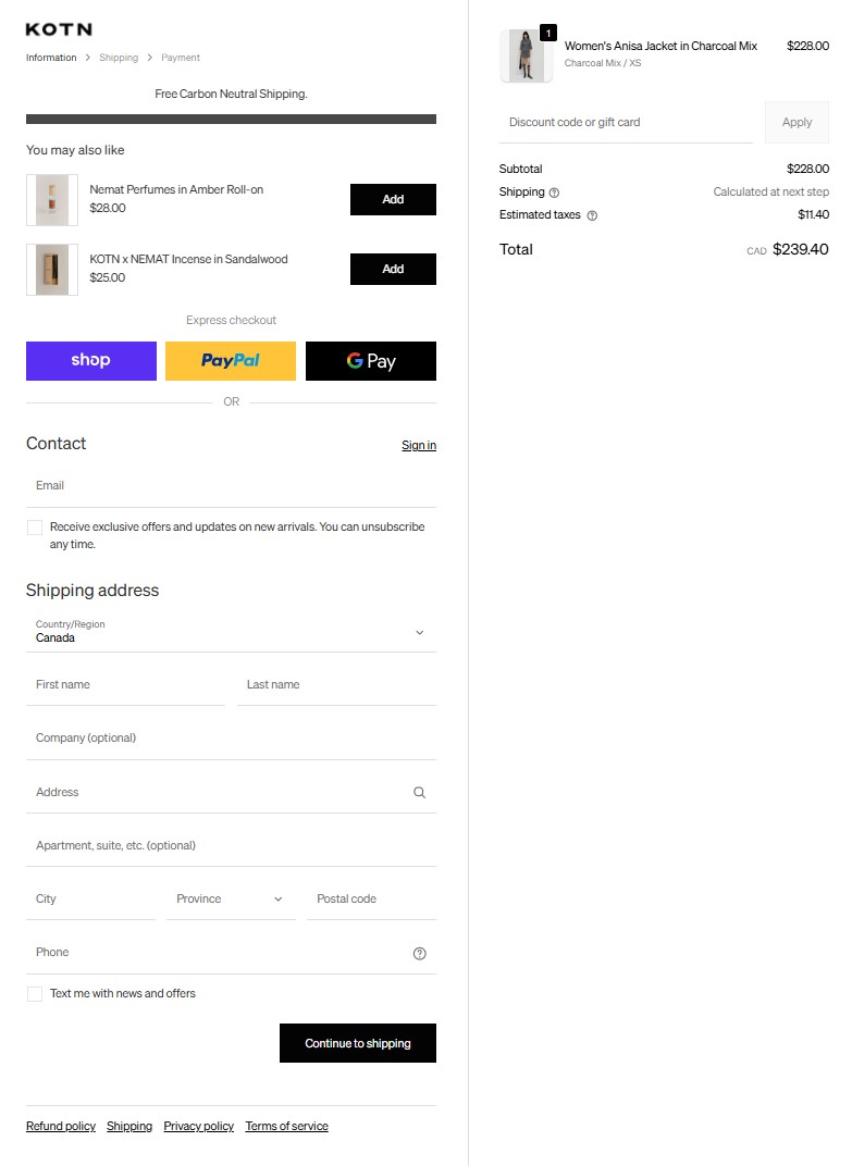
Kotn integrates Shop Pay as the primary checkout option, placing it above the standard checkout form.
For customers who’ve previously used Shop Pay on any Shopify store, their details are pre-filled, and the entire address and payment form is bypassed.
Clean design, large buttons, and easy-to-read text keep the experience frictionless for customers who use the standard form.
Bombas: progress bar drives order value and completion
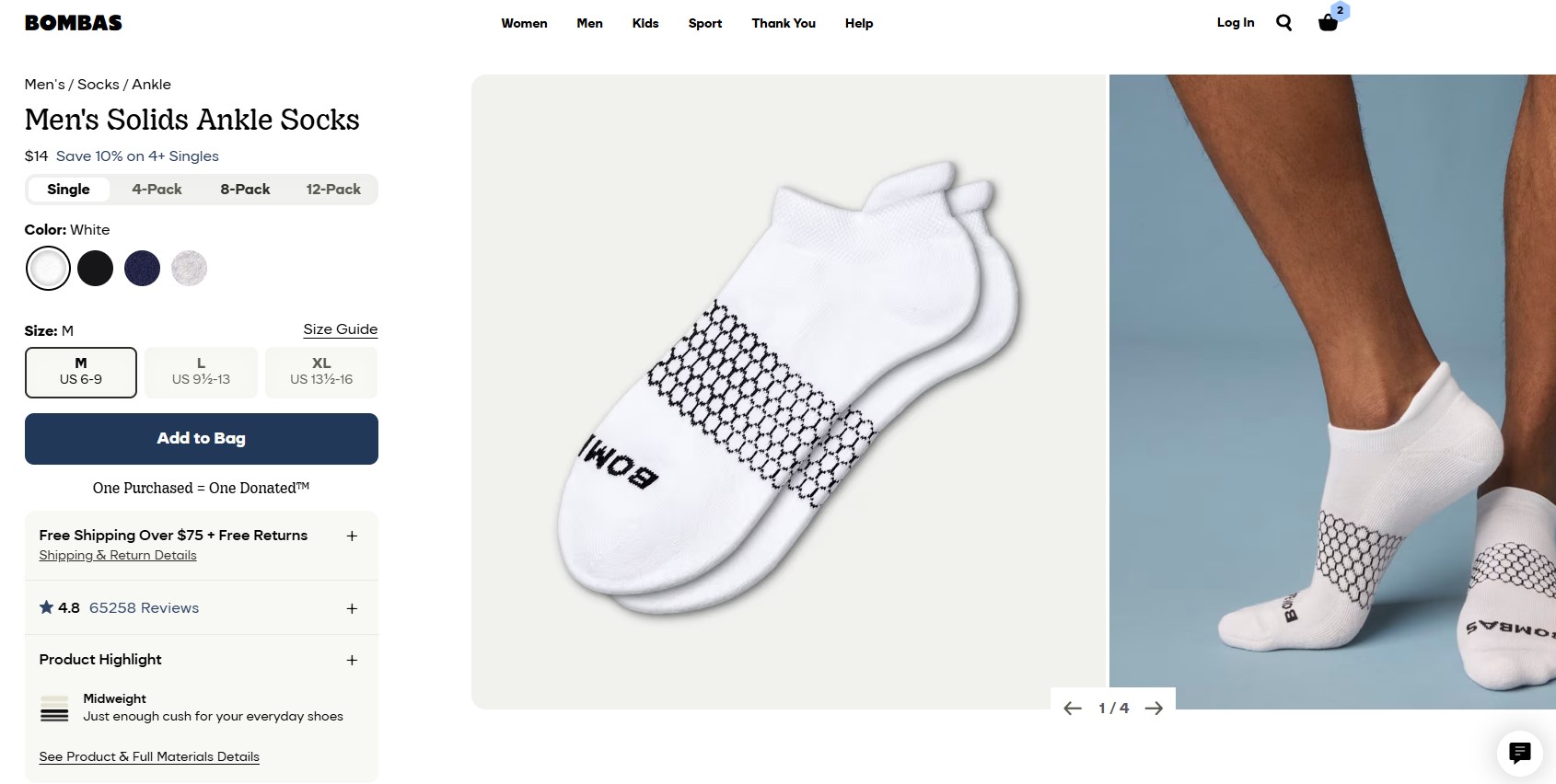
Bombas uses a free shipping progress bar that shows exactly how much more a customer needs to spend to unlock free shipping.
This serves two purposes simultaneously: it reduces the cost anxiety that causes abandonment (by showing free shipping is achievable), and it increases average order value by motivating customers to add items. Transparent shipping costs and a clear order summary eliminate the surprise-fee abandonment trigger.
Glossier: minimal design keeps focus on completion
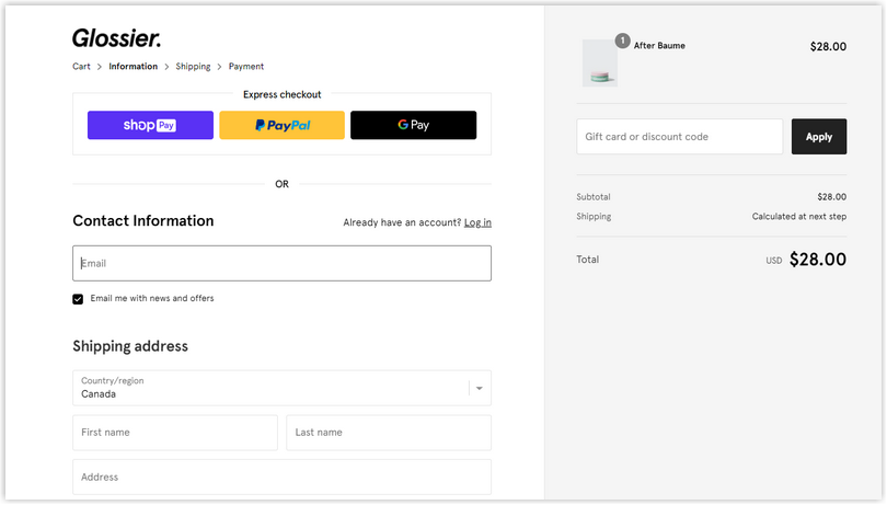
Glossier’s checkout removes every element that isn’t directly necessary for completing the purchase. No cross-sells, no promotional banners, no newsletter prompts.
Guest checkout is the default. The design is clean enough that the buy button is always the most prominent element on screen.
For mobile shoppers who buy by impulse, removing every distraction between intent and purchase is the highest-leverage optimization.
Boost Conversion Instantly
Add Social Proof & Urgency to your website
Final Word
Mobile checkout optimization isn’t a one-time project. It’s a continuous process of identifying where customers drop off, understanding why, and removing the specific friction causing the abandonment.
The 10 practices above address the most common and highest-impact causes: poor mobile design, excessive form fields, forced account creation, limited payment options, hidden costs, slow loading, insufficient trust signals, and no social proof at the conversion point.
Start with the highest-friction point in your current checkout. For most stores, that’s either the number of required form fields or the absence of express payment options.
Fix the worst friction first, then work through the rest systematically. Each improvement compounds: a checkout that’s 10% better at each of three steps delivers a materially higher overall conversion rate than one that’s 30% better at a single step.
Also check: How to improve average order value at checkout
Krunal Vaghasiya is a marketing tech expert who boosts e-commerce conversion rates with automated social proof and FOMO strategies. He loves to keep posting insightful posts on online marketing software, marketing automations, and improving conversion rates.