
On your morning commute, you’re browsing for headphones on your smartphone. After finding the perfect pair and trying to check out, you encounter a confusing, slow process. This often leads to delay or abandonment of the purchase, highlighting a common issue in mobile shopping.
Optimizing your mobile checkout is more than just increasing sales; it’s about ensuring a smooth and quick customer journey from desire to satisfaction. Improving the mobile checkout process can convert browsers into buyers and make your online store as welcoming as a physical one.
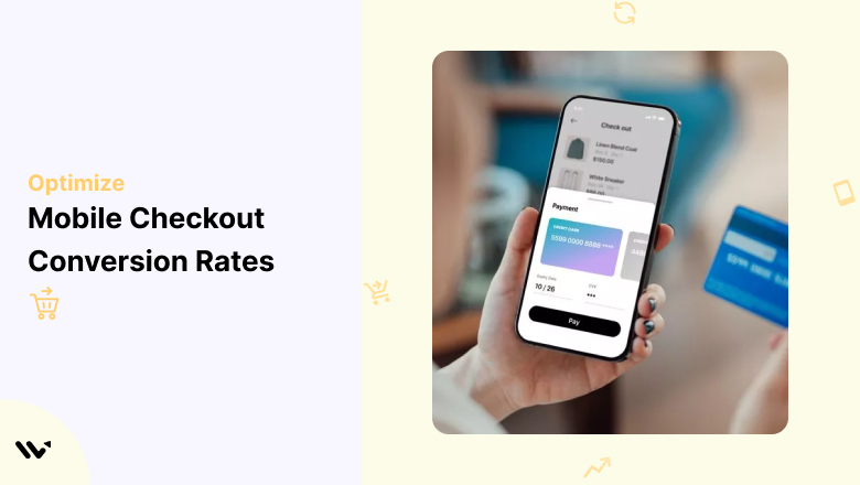
Why Mobile Checkout Optimization is Essential
As mobile shopping continues to dominate, an alarming 70% of shopping carts are abandoned, and a substantial fraction of these occur on mobile devices. The main reasons? Slow loading times, too many form fields, and unexpected fees that turn users away.
Mobile Shopping: The Present and Future
As we approach the end of 2024, mobile devices already account for over half of all eCommerce transactions. Research consistently shows that mobile users abandon their purchases primarily due to slow loading and cumbersome checkout processes.
According to detailed statistics on the WiserNotify blog, these frustrations are widespread among consumers, underlining the need for optimized mobile experiences. Mobile shoppers demand quick, straightforward, and secure checkouts.
By refining your mobile checkout process, you can convert abandoned carts into successful sales, tapping into the full potential of mobile commerce as it continues to evolve.
The Impact of Poor Checkout Experiences
A faulty checkout process leads to missed sales and lost customers. Platforms like Amazon have set the standard with one-click checkouts, making anything more complex seem outdated. It’s crucial to streamline your mobile checkout to boost sales and foster customer trust and loyalty.
Next, we’ll share best practices for refining your mobile checkout as we move into 2025.
1. Mobile-First Design: Enhance User Experience with Simplicity
Here are essential points to focus on when designing a mobile-first checkout:
- Responsive Layout: Ensure your layout adjusts to various screen sizes and orientations for a seamless experience across all devices.
- Minimalism: Eliminate unnecessary elements like ads or sidebars to keep users focused on the checkout process.
- Touch-Friendly Buttons: Make sure buttons are large for easy tapping and spread far apart to prevent accidental clicks.
- Single-Column Layout: Use a single-column format to simplify scrolling and avoid overcrowding the screen.
- Simple Form Fields: Limit form fields to the essentials, such as name, address, and payment info, and provide autofill where possible.
- Clear, Readable Fonts: Use large, high-contrast fonts that are easily read on smaller screens. Avoid decorative fonts that hinder readability.
- Error Prevention and Real-Time Validation: Display clear error messages as users fill in fields, allowing them to correct mistakes without reloading the page.
- No Pop-Ups or Distractions: Avoid using pop-ups or redirect links during checkout to prevent interruptions.
- Fast Loading Times: optimize images and scripts to ensure the page loads quickly. Shoppers will likely abandon a slow checkout.
- Sticky Navigation Bars: Keep a sticky checkout or progress bar visible as users scroll so they can easily proceed to the next step.
2. Large, Clickable Buttons and Clear Calls-to-Action (CTAs)
To make your CTAs stand out and encourage users to complete their purchase, focus on these key points:
- Prominent CTA Placement: Place the primary action button (like “Buy Now” or “Checkout”) in visible, easy-to-reach areas, usually at the bottom of the screen.
- Button Size: Ensure buttons are large enough to be easily tapped on touchscreens. A common guideline is at least 44×44 pixels.
- Action-Oriented Text: Use clear, concise text like “Complete Purchase” instead of generic terms like “Submit” to create a sense of urgency.
- High Contrast Colors: Use contrasting colors for buttons to stand out against the background.
- Avoid Multiple CTAs: Stick to one primary action per screen. Too many options can confuse users and cause decision paralysis.
- Space Between Buttons: Ensure enough space between buttons or clickable elements to avoid accidental taps.
- Feedback on Interaction: Provide instant feedback (like changing the button color) when a user taps on the CTA to reassure them the action is processing.
- Fixed CTA Bar: Use a sticky or floating CTA bar that remains visible as users scroll so they can proceed at any time.
- Clear Next Steps: Explain what happens after users click a button, such as showing “Processing” or “Order Confirmed.”
- Avoid Text Links for CTAs: Never use text links for essential actions, as they are harder to tap on mobile devices.
3. Progress Indicators: Keep Users Informed
To help users feel confident about the checkout process, implement clear progress indicators to maintain simplicity and transparency in the mobile checkout flow:
- Visible Progress Bar: Display a progress bar at the top, showing which steps are completed and what’s next.
- Step-by-Step Layout: Break the checkout process into steps like “Shipping,” “Payment,” and “Review” so users know exactly where they are.
- Highlight Completed Steps: Visually change the state of completed steps (like a checkmark) to reassure users.
- Shorten the Checkout Process: The fewer steps, the better. Streamline the process by removing unnecessary steps.
- Allow Navigation Between Steps: This feature allows users to easily navigate between steps without losing progress, such as changing shipping information mid-checkout.
- Avoid Surprises: Clearly show how many steps remain so users know how long the checkout will take.
- Touch-Friendly Step Icons: Use simple, touch-friendly icons or labels for each checkout stage.
- Faster Checkout for Returning Customers: Pre-fill details for returning customers to skip unnecessary steps.
- Real-Time Error Handling: Flag errors immediately within the relevant step rather than waiting until the end of the process.
4. Accessibility: Make Checkout Inclusive for All Mobile Users
To ensure every mobile user can use your mobile checkout, regardless of physical or technical limitations, focus on these accessibility improvements:
- High Contrast Text and Buttons: Ensure good contrast between text and background colors for readability.
- Readable Fonts: Use simple, large fonts (16px or higher) for easy reading, avoiding decorative fonts.
- Touch Target Size: Make sure all interactive elements (like buttons) meet the recommended minimum size to accommodate users with motor disabilities.
- Screen Reader Compatibility: Use proper HTML elements and labels to ensure your checkout is accessible to screen readers.
- Keyboard Navigation: Ensure users can navigate the checkout process using only a keyboard, which is essential for users with motor impairments.
- Accessible Error Messages: Provide clear error messages highlighting problematic fields and explaining how to fix the issue.
- Alt Text for Images: Use descriptive alt text for product images so visually impaired users can understand what’s in their cart.
- Voice Command Compatibility: Ensure compatibility with voice navigation as voice assistants are popular.
- Avoid Timeouts: Don’t rush users by automatically timing out sessions. Give them ample time to complete their purchase.
- Test on Multiple Devices: Regularly test accessibility features across various devices and tools to ensure functionality.
5. Simplify the Checkout Process: Minimize Effort, Maximize Conversions
Here are practical ways to simplify the mobile checkout process:
- Guest Checkout Option: Offer guest checkout so users aren’t forced to create an account before purchasing.
- Autofill and Auto-Suggest: To save time when filling out forms, enable autofill for address and credit card fields and use auto-suggest.
- Minimal Form Fields: Only ask for essential information, such as the shipping address, to speed up form completion and avoid overwhelming users.
- One-Click Payments: For returning customers, offer one-click payments using saved details.
- Inline Validation: Show real-time validation to correct mistakes immediately, such as entering email addresses or credit card numbers.
- Progressive Disclosure: Only show fields relevant to previous answers, like showing the state field after selecting a country.
- Save Cart for Later: Let customers save their cart for later, even across devices.
- Auto-Save Form Data: If a user leaves mid-process, auto-save their data so they can pick up where they left off later.
- Remove Distractions: Avoid newsletter sign-up prompts or promo code fields that might distract users from completing their purchases.
- Optimize for Slow Connections: Compress images and minimize large files to ensure the checkout works efficiently on slower mobile networks.
6. Multiple Payment Options: Reduce Checkout Abandonment
Offering a variety of payment methods helps ensure smooth transactions, especially for mobile customers who benefit from features like easy autofill options and the ability to save shopping carts for later.
Here’s how:
- Mobile Wallets: Support mobile wallets like Apple Pay and Google Pay so users can check out with one tap.
- PayPal and Other Digital Wallets: Offer trusted digital payment options like PayPal, which can reduce friction.
- One-Click Payments: Enable one-click payments using saved payment details for returning customers.
- Autofill for Credit Cards: Use forms that automatically detect and validate credit card types, speeding up entry.
- Multiple Currencies: Allow users to pay in their local currency for a more seamless experience.
- Alternative Payment Methods: For flexibility, offer additional options like buy-now-pay-later services or bank transfers.
- Secure Payment Gateways: Display security badges and use secure gateways to reassure customers about their data safety.
- Local Payment Methods: Depending on your target market, offer regional payment methods to build trust.
- Save Payment Info for Future Purchases: Customers can securely save their payment details for quicker checkout next time.
- Recurring Billing: Support recurring payments for subscription-based services or products.
7. Reduce Cognitive Load with Clear Product Information
Make it easy for users, especially mobile shoppers, to review their orders without overwhelming them. Here’s how:
- Show Key Product Details: For easy confirmation, display product names, prices, and quantities.
- Product Images: Include clear product images so users can see exactly what they’re buying.
- Editable Cart: Users can modify their carts directly from the checkout page, such as changing quantities or removing items.
- Order Summary: Show a detailed breakdown of the total cost, including product prices, shipping, and taxes.
- Estimated Delivery Date: Provide estimated delivery dates or windows so customers know when to expect their items.
- Free Shipping Progress Bar: If you offer free shipping, show a progress bar that tracks how close the user is to qualifying.
- Return and Refund Info: Display a quick link or reminder of your return policy for added confidence.
- Payment Options Display: Clearly show all available payment options to set expectations.
- Promo Code Application: This allows users to easily apply promo codes without interrupting the checkout process.
8. Save Cart for Later and Cross-Device Cart Syncing
Customers often shop on multiple devices or may want to come back later. Enable cart-saving options to boost conversion rates:
- Save Cart for Later: Allow users to save their cart so they can revisit it at any time without losing items.
- Cross-Device Cart Syncing: Ensure carts are synced across devices when users are logged in, allowing them to switch from mobile to desktop seamlessly.
- Cart Recovery Emails: Send reminders to users who have abandoned their cart, offering a simple way to resume the checkout process.
- Wishlist Integration: Users can move items from their cart to a wishlist, giving them the flexibility to save products for future purchases.
- Low Stock Alerts: Display alerts if items in the cart are running low in stock, encouraging users to complete their purchase sooner.
- Persistent Cart for Guest Users: Even without an account, guest users can recover their cart when they return to the site later.
- Easy Account Creation at Checkout: Offer a one-click option to create an account after completing checkout, allowing for future cart syncing and faster purchases.
9. Use Exit-Intent Popups to Recover abandoned
Sometimes, customers leave their carts at the last moment. To combat this, use exit-intent popups to retain those potential sales:
- Offer a Discount or Incentive: Trigger a popup offering a discount, free shipping, or another incentive when users attempt to leave the checkout page.
- Remind of Benefits: Use the popup to remind users of benefits like secure checkout, easy returns, or loyalty rewards.
- Capture Emails for Cart Recovery: Use the popup to capture the user’s email if they haven’t provided it yet, so you can send follow-up cart recovery emails.
- Highlight Shipping Info: If users are hesitant due to shipping fees, offer discounted or free shipping in the exit-intent popup to encourage them to stay.
- Show Cart Summary: Include a summary of the cart contents in the popup to remind users of what they’re leaving behind, along with a clear call-to-action to complete the purchase.
10. Utilize Persuasive Techniques
Incorporating persuasive elements into your mobile checkout can encourage customers to follow through with their purchases. Here are some effective techniques to drive conversions:
- Urgency and Scarcity: Highlight limited-time offers, such as “Only 2 left in stock” or “Offer ends in 1 hour.” This creates urgency and pushes users to act quickly to avoid missing out.
- Social Proof: Display customer reviews, ratings, or recent purchases (“John from NY just bought this!”) to build trust and show that others have successfully completed their purchases.
- Trust Signals: Use security badges, trust seals, and well-known payment logos (like Visa, Mastercard, and PayPal) to reassure users that their transactions are safe.
- Free Shipping and Returns: Offer clear information about free shipping or easy return policies. This reduces risk in the customer’s mind and can tip the scale in favor of completing the purchase.
- Loss Aversion: Remind users of what they’re leaving behind with cart abandonment notifications or popups (e.g., “Don’t miss out on this offer!” or “Your cart will expire soon”).
- Anchor Pricing: Show the original price with a discount to make the savings more noticeable. Displaying the old price next to the new one makes the offer more appealing.
- Personalization: Use personalized messages like “Complete your purchase, [Customer’s Name]!” This makes the experience feel tailored to the user, which can increase loyalty.
- Bundling Discounts: Offer additional items at a discount during checkout, showing customers that they’ll save more by purchasing now instead of returning later.
- Money-Back Guarantee: Clearly state any guarantees like “30-day money-back guarantee” to reduce hesitancy around making a purchase.
- Loyalty Points: If applicable, remind customers how many points or rewards they’ll earn by completing their purchase, increasing the perceived value of checking out.
Proven Mobile Checkout Examples
Here are some real-world examples of businesses that have mastered mobile checkout design, creating smooth, conversion-boosting experiences
1. Glossier- Beauty Brand
Glossier’s mobile checkout is the epitome of simplicity. With minimal fields and clean design, users can checkout quickly without distractions. The brand also offers express payment options like Apple Pay and Google Pay, which enable customers to complete purchases in one tap, dramatically reducing friction. The inclusion of a clear progress bar and guest checkout further streamlines the process.
What We Can Learn: Keep the checkout page minimalistic, with fewer distractions and guest checkout options.
2. Kotn- Clothing Brand
Kotn optimizes the mobile checkout experience by making it fast and intuitive. They use a one-click payment option with Shop Pay, which helps users skip the tedious task of filling out forms. Their design is clean and focused, with large buttons and easy-to-read text, making the checkout experience smooth and hassle-free.
What We Can Learn: Offering express checkout methods (like Shop Pay or Google Pay) increases conversions and simplifies the process.
3. Bombas- Socks and Apparel
Bombas utilizes a clever progress bar that encourages customers to add more to their cart to unlock free shipping. This gamification strategy not only improves the checkout experience but also increases average order value. Additionally, Bombas provides a clear, concise order summary and transparent shipping costs upfront, avoiding surprise fees that often lead to cart abandonment.
What We Can Learn: Using progress bars and clear incentives for additional purchases can drive sales and reduce friction.
4. Build.com –Home Improvement
Build.com offers product recommendations during checkout without overwhelming the user or creating friction. Their mobile checkout includes a clean interface and quick payment options like Amazon Pay. Even with additional upsell prompts, the checkout process remains quick and easy, helping customers make last-minute decisions without slowing them down.
What We Can Learn: Product recommendations can be included as long as they don’t disrupt the checkout process flow.
5. Apple- Tech Giant
Apple’s mobile checkout is built on trust. With a strong emphasis on security (using visible SSL certificates and secure payment options like Apple Pay), customers feel reassured when making purchases. The checkout is simple, with as few steps as possible, and offers the option to save payment information for future purchases.
What We Can Learn: Emphasizing security and offering options like Apple Pay make users feel safe, encouraging them to complete their purchases.
6. Amazon- E-Commerce Giant
Amazon’s mobile checkout is famously frictionless. The “Buy Now with 1-Click” feature allows customers to purchase instantly without even entering the full checkout process. This ultra-simplified experience is powered by saved payment and shipping information, making it one of the fastest checkouts in the industry.
What We Can Learn: Streamlining checkout to a single click for repeat customers reduces friction and drives repeat purchases.
Conclusion
The checkout experience often decides whether a customer completes their purchase or abandons it. Optimizing your mobile checkout requires more than a sleek design—it’s about minimizing friction, ensuring user security, and making the process seamless.
Implementing a mobile-first design, clear and actionable CTAs, progress indicators, multiple payment options, and persuasive elements like urgency and social proof can significantly reduce cart abandonment and increase conversions.
A well-optimized checkout improves user satisfaction and boosts your bottom line, turning more visitors into loyal customers. The right adjustments can make a dramatic difference—transforming an average checkout into a high-converting, user-friendly experience.
