
A floating button stays visible on screen while visitors scroll through your content.
It’s always there, always clickable, and it gives people a clear next step without making them hunt for it.
I’ve tested floating button plugins on dozens of WordPress sites over the past five years.
The right plugin makes a measurable difference in the number of visitors who click your key CTAs.
The wrong one adds page bloat, slows your site, and annoys visitors with buttons they can’t dismiss.
Most WordPress sites don’t use floating buttons at all. That’s a missed opportunity.
When someone reads your blog post and decides they’re interested, the CTA they need should be right there, not buried three scrolls above.
This guide covers the 9 best WordPress floating button plugins I’ve tested, how to add a floating button without a plugin (a popular approach for developers who don’t want extra bloat), and the mistakes that kill conversions rather than boost them.
Boost Conversion Instantly
Add Social Proof & Urgency to your website
Why Floating Buttons Work
Floating buttons solve a specific problem: visitors forget to take action. They read your content, get interested, then scroll past your CTA. By the time they’re ready to act, the button is gone.
That’s not a design flaw in your content. It’s a design flaw in your navigation.
A sticky floating button fixes that. It’s always visible, always accessible.
Whether a visitor is at the top of the page, halfway through a blog post, or at the bottom of a product page, the CTA is right there waiting for them.
Call-to-action buttons that stay visible during the entire browsing session convert better because they catch visitors at the moment of peak interest, not before or after.
Floating buttons also work especially well on mobile, where screen space is limited, and visitors scroll more.
A compact floating button in the corner provides mobile users with a consistent touchpoint without blocking content.
I’ve tested this across ecommerce stores, SaaS landing pages, and service business sites. The conversion lift is consistent across industries.
According to the Baymard Institute, nearly 70% of online shopping carts are abandoned before checkout, and a significant portion of those abandonments happen because shoppers don’t feel the next step is clear or accessible. A persistent floating CTA addresses that friction directly.
Also check: 17 CTA Design Examples That Drive Clicks
9 Best WordPress Floating Button Plugins (2026)
I’ve ranked these based on features, ease of use, depth of customization, and impact on page speed. Each plugin serves a different use case.
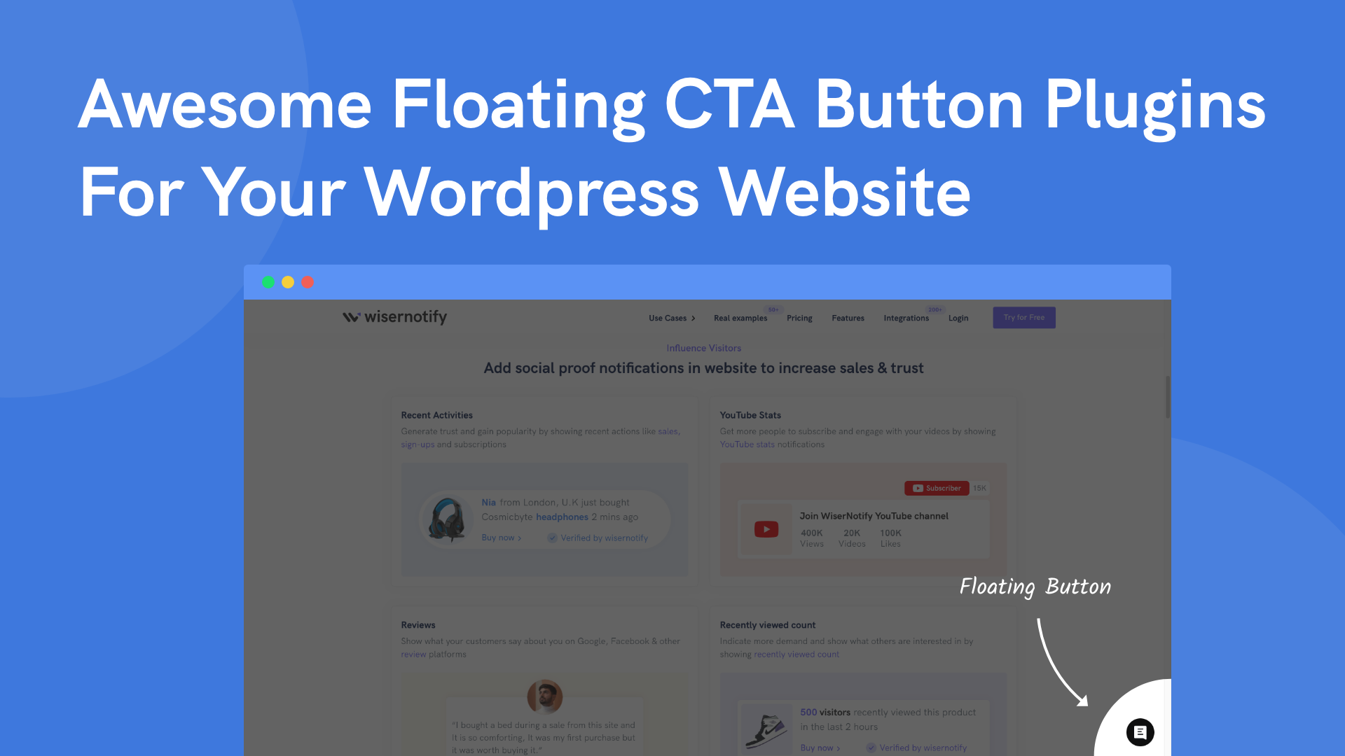
1. WiserNotify

Best for: Combining floating CTAs with social proof notifications and urgency widgets.
WiserNotify isn’t just a floating button plugin. It’s a full conversion toolkit that includes floating social proof notifications, announcement bars, countdown timers, and CTA popups.
The floating elements stay visible as visitors scroll, and you can control exactly which pages, devices, and visitor segments see them.
What makes it different from standalone button plugins: WiserNotify’s floating elements show dynamic data.
Instead of a static “Sign Up” button, you can show “23 people signed up today” or “Sale ends in 2 hours.” That combination of social proof and urgency alongside a floating CTA creates significantly more conversions than a button alone.
60+ notification designs, 250+ integrations, targeting by device, location, UTM source, and visitor behavior. No coding needed. Setup takes under 15 minutes.
Pricing: Starts at $16/month
Rating: 4.7/5
Build urgency
Add floating offers with countdown timer & coupon code.


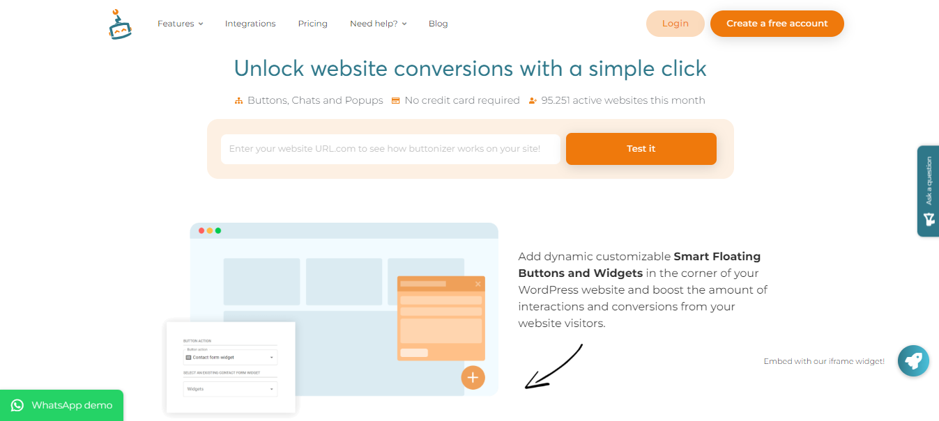
2. Buttonizer
Best for: Multi-button floating menus with WhatsApp, Messenger, and contact options.
Buttonizer is the most popular dedicated floating button plugin for WordPress, with 80,000+ active installations.
It lets you create single buttons or expandable floating menus where multiple buttons fan out from a main icon.
The WhatsApp integration is where Buttonizer really shines. You can set up click-to-chat buttons with pre-filled messages, multiple agent numbers, and business hour scheduling.
Visitors click the floating WhatsApp icon and start a conversation instantly.
50+ click actions available: phone calls, email, SMS, Telegram, Facebook Messenger, scroll-to-section, URL redirect, and more.
Smart display rules let you show different buttons on different pages, devices, or times of day. Built-in analytics track clicks and conversions.
Where it falls short: The free version is limited. You can’t change button colors or positions without upgrading. The pro version starts at $9/month, which adds up. Page speed impact is noticeable on lower-tier hosting.
Pricing: Free (limited). Pro from $9/month.
Rating: 4.5/5
Build trust & FOMO
Highlight real-time activities like reviews, sales & sign-ups.

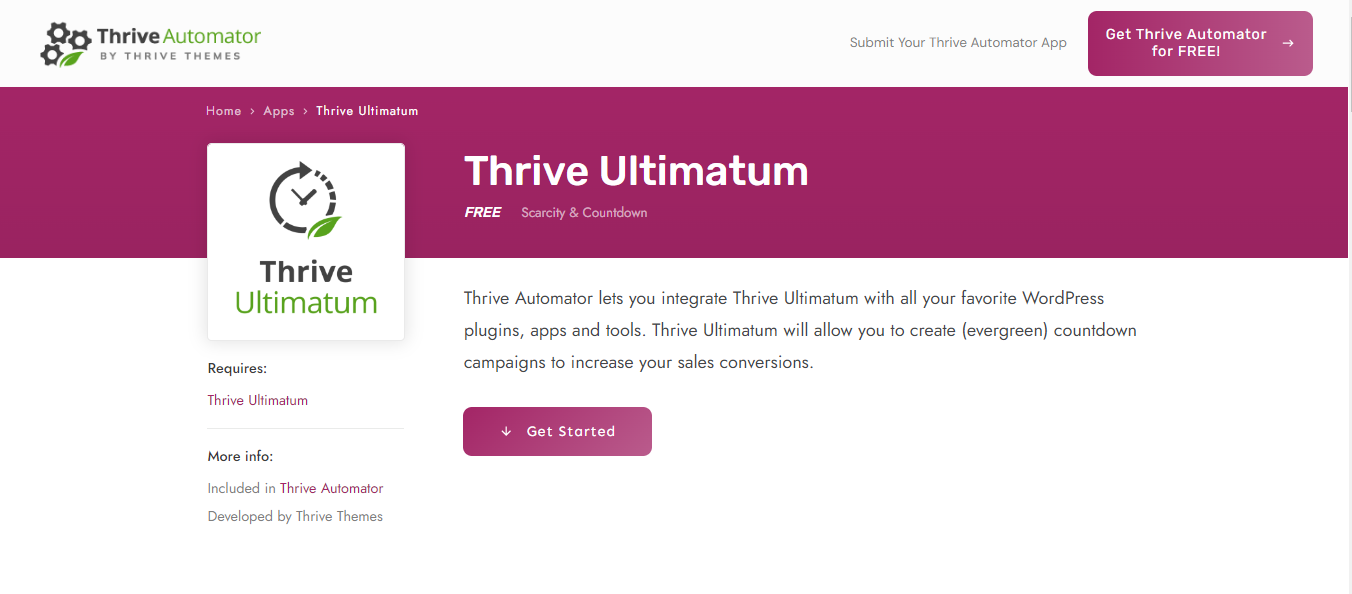
3. Thrive Ultimatum
Best for: Scarcity-based floating campaigns with countdown timers.
Thrive Ultimatum focuses on urgency marketing through floating elements. You can create countdown timers, limited-time offer bars, and evergreen scarcity campaigns that float on your pages.
The standout feature is the evergreen countdown. Each visitor gets their own unique timer that starts when they first visit, creating genuine individual urgency without fake “sale ending” claims that reset for everyone.
You can run fixed campaigns (same deadline for everyone), recurring campaigns (weekly or monthly promotions), or visitor-triggered campaigns (the timer starts on the first visit).
The drag-and-drop builder makes design customization straightforward.
Where it falls short: It’s part of the Thrive Suite ($299/year for all tools), which is expensive if you only need floating buttons. It’s focused on urgency/scarcity, not general-purpose floating buttons. No WhatsApp or chat integrations.
Pricing: Part of Thrive Suite ($299/year)
Rating: 4.5/5
4. WPB Floating Menu Pro
Best for: Simple, lightweight floating buttons without bloat.
WPB Floating Menu Pro does one thing well: it creates floating action buttons with clean icons and links.
No pop-up builders, no analytics dashboards, no complex targeting rules. Just buttons.
Beautifully designed layouts with multiple position options.
You can set buttons to appear only on specific pages, preventing clutter across your entire site. The plugin is lightweight and doesn’t noticeably affect page speed.
Where it falls short: The free version is extremely limited. No click tracking or analytics. No display scheduling or device targeting. Fewer features than Buttonizer or WiserNotify.
Pricing: Free (very limited). Pro from $29/year.
Rating: 4.2/5
5. Wow Side Menu
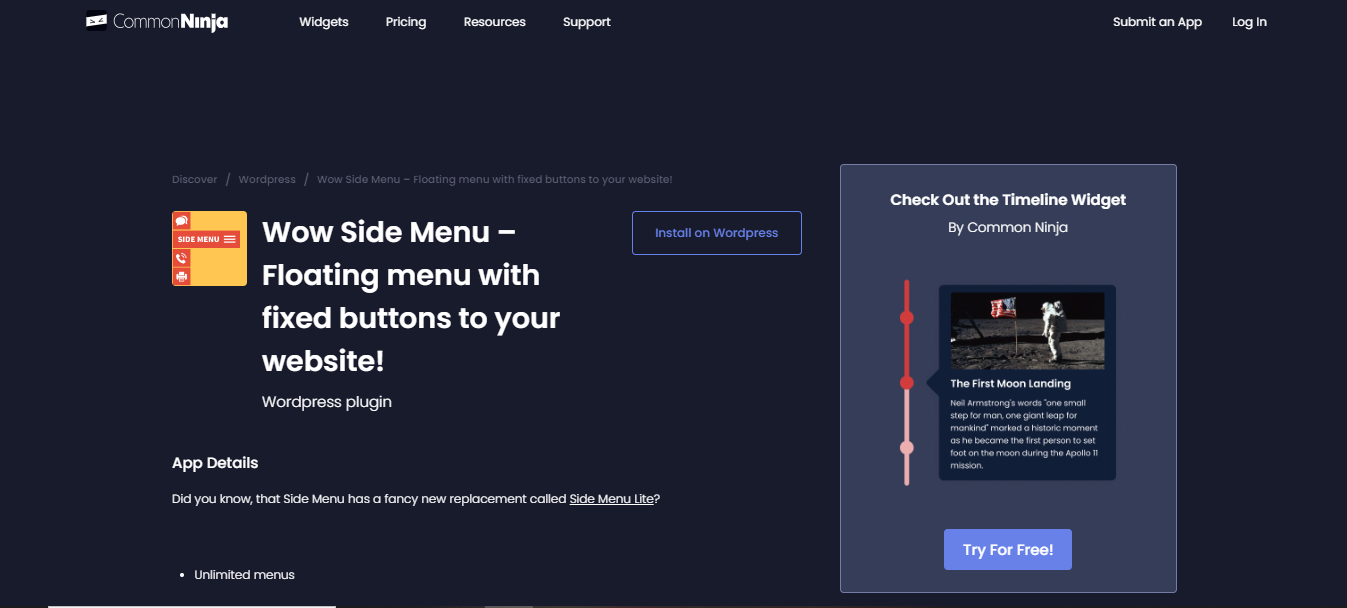
Best for: Multi-purpose sticky side menus and button bars.
Wow Side Menu creates floating button sets that can serve as navigation menus, contact panels, or social media link bars.
You can position buttons on any side of the screen and configure them as individual floating buttons or grouped menu bars.
The mobile navigation use case is strong. You can create a bottom navigation bar for mobile users that mimics the app-like experience visitors expect.
Integrated with the FontAwesome icon pack, giving you 600+ icon choices. Supports open-in-new-window links for better navigation flow.
Where it falls short: The interface feels dated compared to Buttonizer. Advanced features require the pro version. Limited analytics.
Pricing: Free. Pro from $39/year.
Rating: 3.7/5
Boost Conversion Instantly
Add Social Proof & Urgency to your website
6. Bloom Plugin
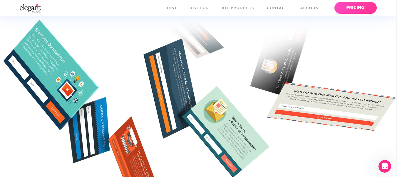
Best for: Email list building with floating opt-in forms.
Bloom is Elegant Themes’ email opt-in plugin. It creates floating fly-in forms, popups, inline forms, and widget-based opt-ins.
The floating fly-in option slides in from the corner of the screen, catching attention without being as intrusive as a full-screen pop-up.
100+ pre-built templates with full customization of colors, fonts, images, and layout. Integrates with 19 email marketing platforms, including Mailchimp, ConvertKit, HubSpot, and ActiveCampaign.
Display targeting lets you choose which pages, posts, and categories show the form.
Where it falls short: Requires an Elegant Themes membership ($89/year). It’s specifically for email opt-ins, not general floating buttons. The fly-in forms can feel aggressive if not configured with delay triggers. No WhatsApp or contact button functionality.
Pricing: Part of the Elegant Themes membership ($89/year)
Rating: 4.4/5
7. Hello Bar
Best for: Floating announcement bars and notification strips.
Hello Bar creates sticky bars that float at the top or bottom of your website. These aren’t buttons in the traditional sense. They’re full-width notification strips that announce promotions, collect emails, or drive traffic to specific pages.
The A/B testing feature is built in and easy to use. Create two versions of your bar, split traffic, and Hello Bar tells you which one converts better. This makes it one of the few floating element plugins with proper testing capabilities.
Targeting options include time on site, page URL, device type, and referral source. You can create different bars for different visitor segments.
Where it falls short: The free plan is very limited (5,000 views/month). The floating bar format doesn’t work for all use cases. It’s not a button plugin, it’s a bar plugin. No sidebar or corner button options.
Pricing: Free (5K views). Growth from $29/month.
Rating: 4.3/5
Build trust & FOMO
Highlight real-time activities like reviews, sales & sign-ups.

8. Simple Side Tab
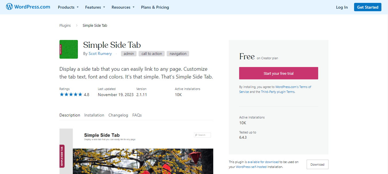
Best for: Minimalist floating tab on the side of your page.
Simple Side Tab adds a small, customizable tab to the left or right side of your website. Click it, and it opens a link or a page. That’s it. No menus, no animations, no complexity.
This simplicity is actually its strength. The plugin is under 10KB, has zero performance impact, and does exactly what the name says.
If you just need a “Contact Us” or “Get a Quote” tab floating on the side of your pages, this is the cleanest solution.
Full color customization, font size control, and position adjustment. Works with any WordPress theme.
Where it falls short: Extremely basic. One tab, one link. No icons, no multi-button menus, no targeting rules, no analytics. If you need anything beyond a single floating tab, you’ll need a different plugin.
Pricing: Free
Rating: 4.3/5
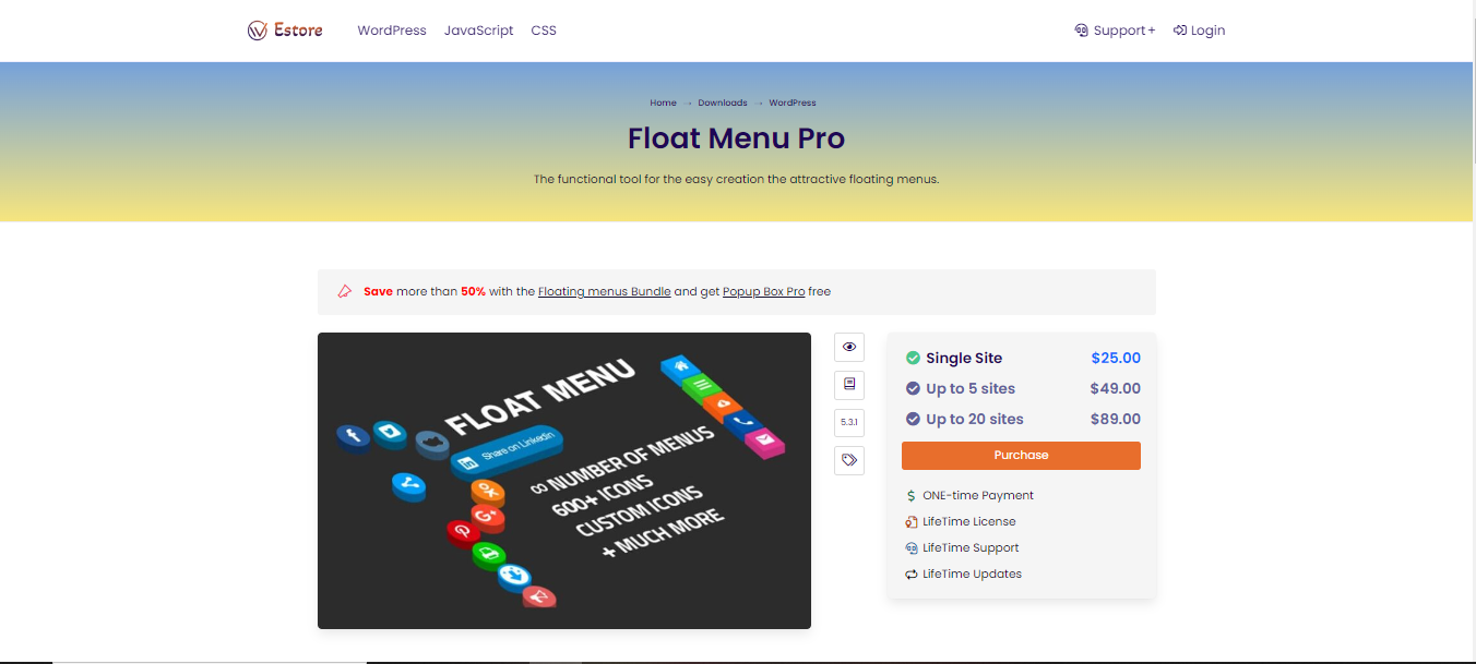
9. Float Menu Pro
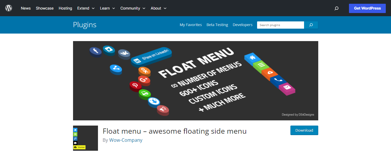
Best for: Feature-rich floating navigation menus.
Float Menu Pro creates elaborate floating menus with icons, labels, sub-menus, and social sharing buttons.
It’s the most feature-dense floating menu plugin on this list, giving you control over every design detail.
600+ Font Awesome icons, custom icon uploads, adjustable button sizes, multiple animation effects, and full color control.
You can create one-page navigator menus that scroll to specific sections, which is perfect for long landing pages.
Where it falls short: The learning curve is steeper than that of simpler plugins. Feature density can lead to over-designed floating menus that distract from content. The free version is basic. Pro version required for most useful features.
Pricing: Free (basic). Pro from $29/year.
Rating: 4.4/5
How to Add a Floating Button in WordPress Without a Plugin
If you don’t want to install a plugin, you can add a floating button with pure HTML and CSS. This approach is faster, lighter, and gives you full control.
Step 1: Go to Appearance > Customize > Additional CSS in your WordPress dashboard and add this CSS:
.floating-cta {

position: fixed;

bottom: 30px;

right: 30px;

background: #645CFC;

color: #fff;

padding: 14px 28px;

border-radius: 50px;

text-decoration: none;

font-weight: 700;

font-size: 15px;

box-shadow: 0 4px 16px rgba(100,92,252,0.4);

z-index: 9999;

}

.floating-cta:hover {

transform: translateY(-2px);

box-shadow: 0 6px 20px rgba(100,92,252,0.5);

}
Step 2: Add this HTML to a Custom HTML widget in your footer, or directly in your theme’s footer.php:
<a href="/contact" class="floating-cta">Get a Quote</a>This creates a purple floating button in the bottom-right corner that links to your contact page. Change the color, text, URL, and position to match your needs.
For a floating WhatsApp button, replace the href with your WhatsApp link:
<a href="https://wa.me/YOUR_NUMBER" class="floating-cta" target="_blank">Chat on WhatsApp</a>When to use this approach: If you need one simple floating button and you’re comfortable with basic CSS. No tracking, no targeting rules, no A/B testing. Just a button.
When to use a plugin instead: If you need multiple buttons, display rules, WhatsApp scheduling, analytics, or A/B testing. Plugins save time when your requirements go beyond a single static button.
Boost Conversion Instantly
Add Social Proof & Urgency to your website
How to Choose the Right Floating Button Plugin
Pick the plugin that matches what you actually need, not the one with the longest feature list.
If you want floating CTAs combined with social proof, WiserNotify gives you floating notifications, purchase alerts, urgency timers, and CTAs in one tool. It’s the only option that combines social proof with floating elements.
If WhatsApp chat is your priority, Buttonizer’s WhatsApp integration is the most complete. Multi-agent support, business hours, pre-filled messages. It’s purpose-built for click-to-chat conversions.
If you need urgency and scarcity, Thrive Ultimatum’s evergreen countdown timers create genuine individual urgency. Worth the investment in Thrive Suite if scarcity marketing is core to your strategy.
If you want to grow your email list, Bloom’s floating fly-in opt-in forms convert well and integrate with all major email platforms. The $89/year Elegant Themes membership includes Divi, so it’s a good value if you’re already in that ecosystem.
If you just need a simple button: Simple Side Tab (free) or the no-plugin CSS approach above. Don’t install a heavy plugin for something you can build in 5 minutes with CSS.
Common Mistakes With WordPress Floating Buttons
I’ve audited dozens of WordPress sites to assess the effectiveness of floating buttons. These mistakes come up constantly.
Too many floating elements. A floating CTA, a floating chat button, a floating social bar, and a cookie consent banner all fighting for corner space. On mobile, this becomes a disaster. I’ve seen sites where three different floating elements overlapped, making the bottom quarter of the screen completely unusable. Stick to one or two floating elements maximum.
No mobile testing. A floating button that looks fine on desktop can cover the “Add to Cart” button or block content on phones. According to Statista, over 60% of global web traffic comes from mobile devices. Test on real devices before going live. Don’t rely on browser dev tools alone. They don’t catch every rendering issue.
Showing buttons on every page. A “Book a Demo” floating button makes sense on your product pages and pricing page, but not on your blog archive or privacy policy. Use page-level targeting to show relevant CTAs on relevant pages. Most plugins support this, and it makes a noticeable difference in conversion rates.
Ignoring page speed. Some floating button plugins add 200-500ms to load time. That’s significant when Google uses page speed as a ranking factor. Test your page speed before and after installing. If the plugin adds more than 100ms, consider a lighter alternative or the CSS-only approach I showed above.
No clear action. A floating button labeled “Click Here” or featuring a generic icon without text doesn’t tell visitors what happens when they click. Make the action obvious: “Get a Quote,” “Chat on WhatsApp,” “Start Free Trial.” I’ve seen floating buttons with just a phone icon and no text. Half the visitors didn’t realize it was clickable.
Forgetting to track results. If you can’t measure clicks and conversions from your floating button, you can’t know if it’s working. Use a plugin with built-in analytics, or add UTM parameters to your button links and track them in Google Analytics. Without data, you’re guessing whether the button is helping or just taking up screen space.
Using aggressive animations. Bouncing, pulsing, glowing, and floating buttons grab attention, but they also irritate visitors. If your floating button pulses every 5 seconds, visitors will mentally block it out or leave your site entirely. A subtle hover effect is enough. Let the persistent visibility do the work, not flashy animations.
