You’ve done the hard work of getting people to your website and interested in your products.
They even put things in their shopping cart! But then, right before they buy, they leave. This happens to a lot of businesses.
It’s like inviting people to dinner and cooking a big meal, but they leave before eating anything!
You lose money and miss out on sales. Why does this happen?
The problem is often your checkout page. If it’s confusing or seems unsafe, people won’t buy anything.
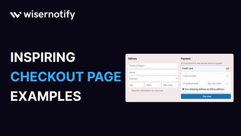
But don’t worry! We can help you fix it. This blog will show you 15 examples of checkout pages that work really well.
These examples will help you make more sales.
15 Best ecommerce checkout page design examples
The effectiveness of a checkout page design can make or break a sale. 28% of consumers abandon their purchases due to a complicated or lengthy checkout process.
Let’s explore the best practices and innovations in ecommerce checkout design for 2025. Here are 15 best examples of simple checkout:
1. Amazon
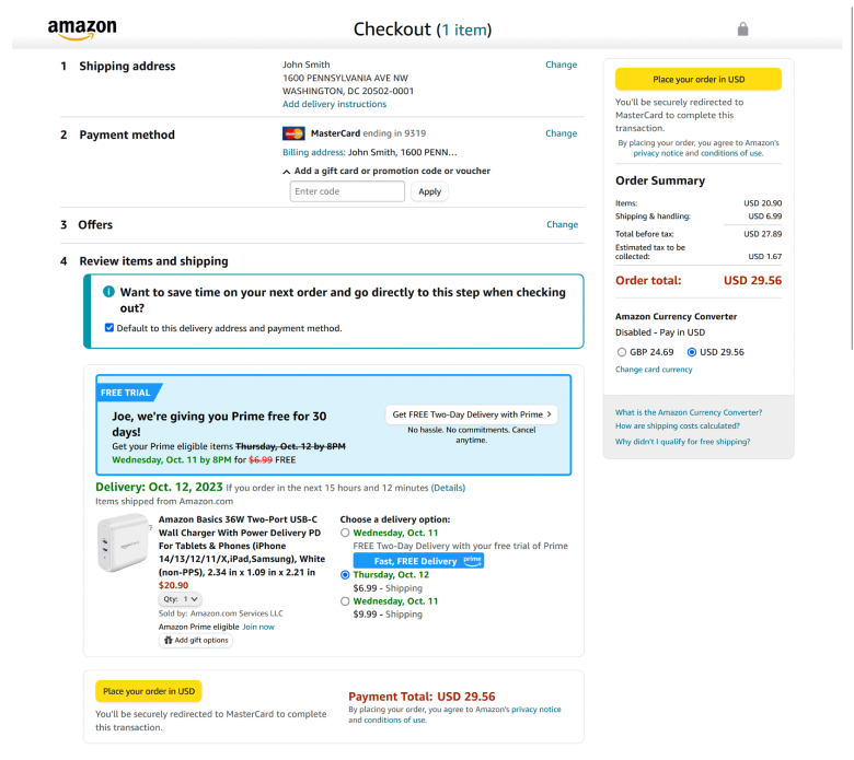
Amazon uses a one-page layout for a quick checkout, which is popular in eCommerce.
Amazon increases conversions by reducing the form field and keeping the process to four steps.
Shoppers can skip steps on their next order, boosting conversions for return visitors.
The checkout page on Amazon is a bit cluttered with multiple shipping addresses and payment methods.
There are additional features like Prime upsell and choosing delivery dates. Amazon tests its page for maximum conversions and avoids anything that could harm profits.
Don’t miss: 20 Fresh Ecommerce Conversion Rate Optimization Strategies
The page has two order buttons: one at the top for quick buying and another at the end for exploring options.
2. Away
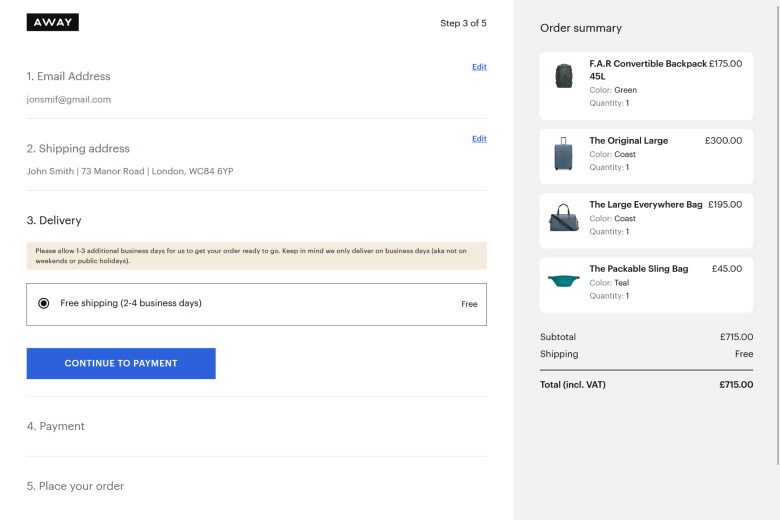
Away has made it easy to navigate the checkout process by using a small logo as the only way to exit.
However, there is no direct link to go back or edit the cart contents. If a shopper wants to make changes, they must return to the store homepage and then find the cart again.
This could lead to distractions and incomplete orders. The checkout page has more steps than other stores, but it is effectively a one-page experience with an accordion-style checkout.
Showing images of the products in the cart is a good way to remind shoppers of their purchases, especially for expensive items.
This can help shoppers remember why they added the item in the first place. The simple design ensures quick loading times, reducing the risk of cart abandonment.
3. Samsung
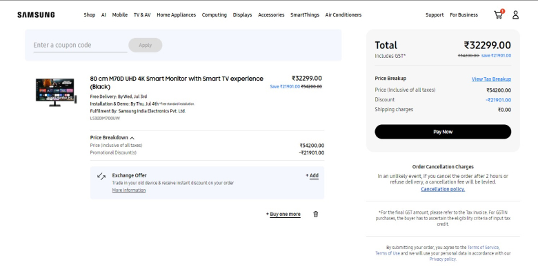
Samsung, a leading technology brand, offers various high-tech electronics like phones and appliances.
With multiple payment options and prominently displayed trusted seals, customers can shop confidently.
The modifiable cart section, non-intrusive promo code application, and wishlisting capabilities enhance convenience.
Uppercase CTA text ensures immediate attention, making Samsung’s checkout user-friendly and efficient.
4. MVMT
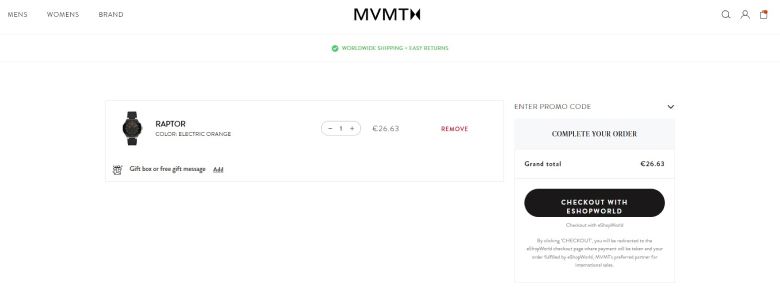
MVMT, a brand popular with millennials, sells stylish watches, blue light glasses, and other cool stuff at reasonable prices.
They use a four-step to attract buyers, and their progress bar at the top makes it easy to follow.
The way they set up their checkout page is brilliant. It’s designed to be clear and not overwhelm you, even if there are several steps to go through.
5. Brandless
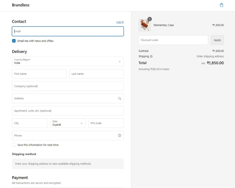
Brandless is a commerce platform that makes shopping easy, whether online or in-store, and they care about your well-being.
They’ve updated the checkout page with brand colors.
They’ve also added a little reminder to sign up for emails at the top of the page.
Adding an email sign-up prompt at the top of your checkout page can help increase value by encouraging more people to sign up.
Also see: 11 Amazing Order Review Page Examples (With Tips!)
6. Zara
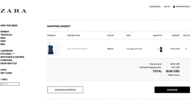
Zara, a renowned fashion label, is known for its trendy prices and collections that cater to millennials.
They streamline their online shopping experience with a minimal number of form fields.
One innovative feature they’ve added is a drop-down Google Maps location chart on their product checkout page.
This intention significantly reduces customer friction by minimizing the need for manual typing, ensuring a smoother and more efficient shopping process.
7. MOUS
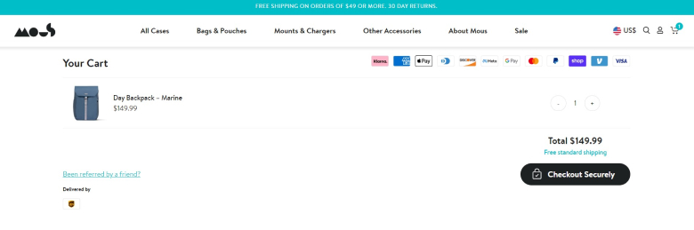
Mous is a leading digital e-commerce store specializing in protective phone cases and device accessories.
Their Shopify checkout page is tailored for seamless transactions, boasting a PayPal express checkout option, a transparent price breakdown, and a thoughtful referral incentive.
Including “Been Referred by a Friend?” during checkout enhances the customer experience by fostering a deeper connection and promoting word-of-mouth marketing.
This thoughtful approach enhances user engagement and underscores MOUS’s commitment to customer satisfaction.
8. TYLER’S
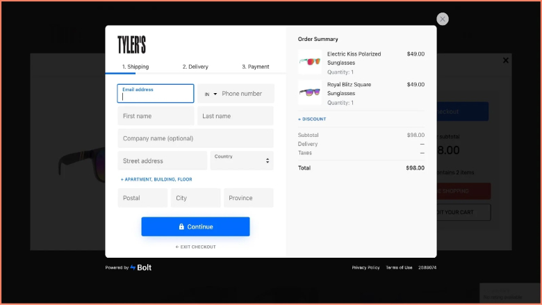
TYLER’s is a store in Texas that sells fashionable clothes, shoes, and accessories for everyone.
When you shop there online, they make it easy with three simple steps: they show you what you’re buying, let you apply discounts if you have any, and break down the cost.
This helps you feel confident about your purchase quickly.
They also use a lock icon to show that their payment checkout page is safe and reliable.
9. Under Armour
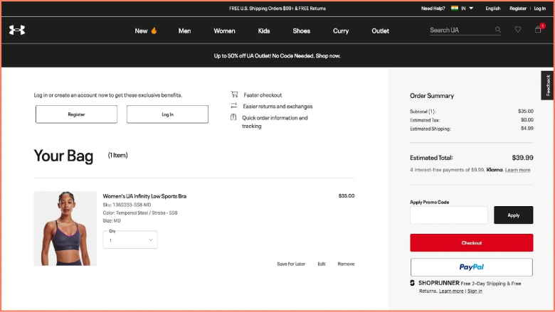
Under Armour is an eCommerce store known worldwide for fitness and sports clothes. They offer many ways to pay and even financing options.
Their website lets you easily edit your shopping cart, check out as a guest, and remind you about items on your wishlist. They also encourage you with messages about free shipping and returns.
When you reach the checkout page, they remind you that orders over $99 ship free in the U.S., and returns are free, too, which might encourage you to buy more.
10. Lord & Taylor
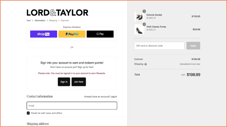
Lord & Taylor, America’s oldest department store, is coming back with a new digital Collective Store that focuses on effective online shopping and personalized approaches.
They’ve introduced features like express checkout, guest checkout, clear order summaries, and transparent pricing to make shopping easier for customers.
They also encourage customers to sign in for a smoother experience, highlighting benefits like customer loyalty rewards through clear prompts in red text during checkout.
11. Tommy Hilfiger
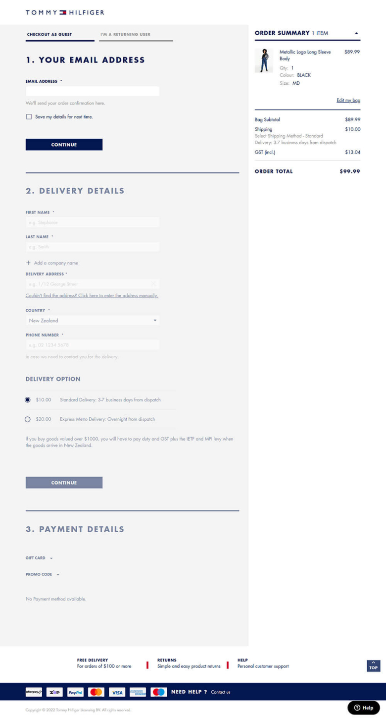
Tommy Hilfiger is not just a brand but a symbol of American heritage and preppy fashion. With its signature red and blue color palette, the brand has become synonymous with classic yet modern style.
Tommy Hilfiger’s checkout page looks fabulous and is easy to read. When you buy something, the order summary section gives you all the details, like how much tax and shipping costs.
Two things stand out about this checkout page. First, a button takes you back to the top of the page, making it easier to use.
Second, there’s a section where you can donate to help out the community, which is pretty neat!
12. Omega
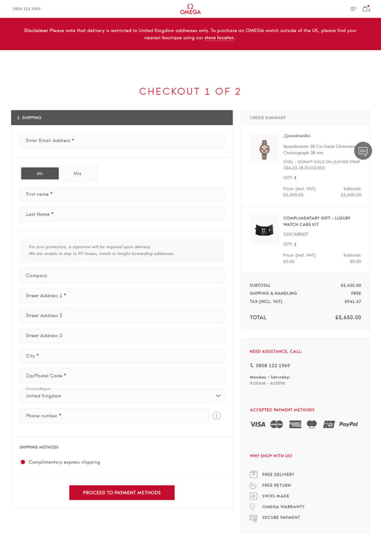
The Omega checkout page looks elegant and luxurious—the steps to the checkout area are simple to follow. Customers can see all information on one page, making double-checking easy. Customers can easily log in or sign up.
Omega aims to personalize the experience for new and loyal customers.
The checkout process is guided in an accordion style to avoid being overwhelmed by a long list of steps. The page is clean and clutter-free to prevent distractions and improve the shopping experience.
13. Crate & Barrel
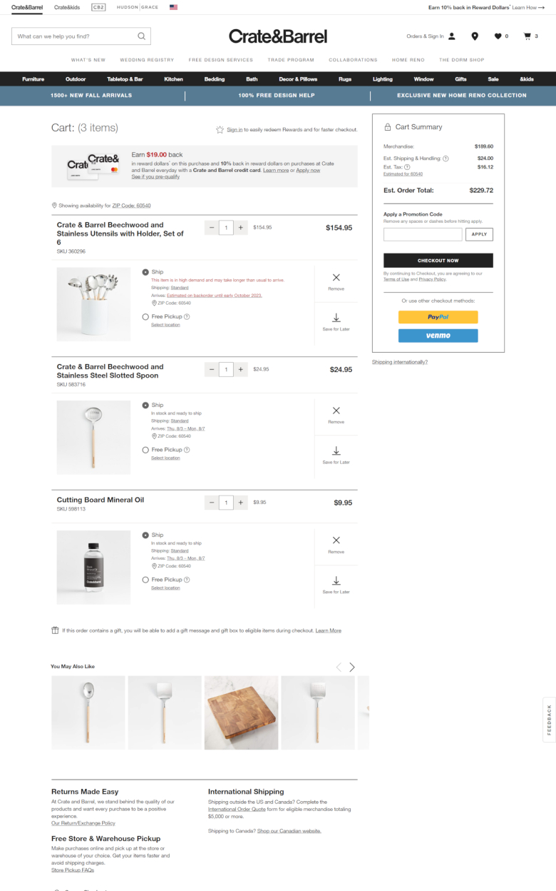
Crate & Barrel has an excellent checkout page on security, transparent pricing, and user-friendly features.
Whether buying kitchen appliances, home decor, or dinnerware, the checkout page ensures the process is smooth and secure.
The page has a few form fields, which help customers focus on completing their purchases.
A progress indicator shows where customers are in the checkout process. The pricing is transparent, showing all costs like product prices, shipping fees, taxes, and extra charges.
This way, customers know what exactly they’re paying for.
14. Glossier
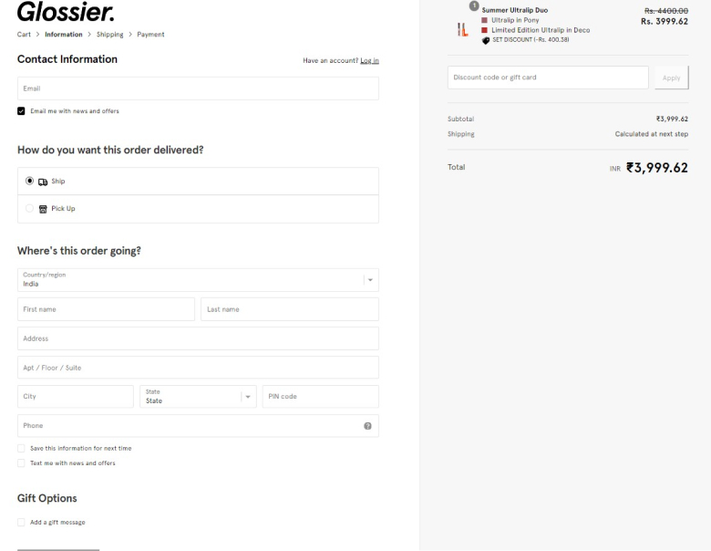
Glossier is a skincare brand that focuses on simple and easy-to-use products.
They use a question-based format to engage customers. They offer a guest checkout option and provide a clear order summary. The brand’s copywriting helps connect the brand and the customer.
15. Brooks
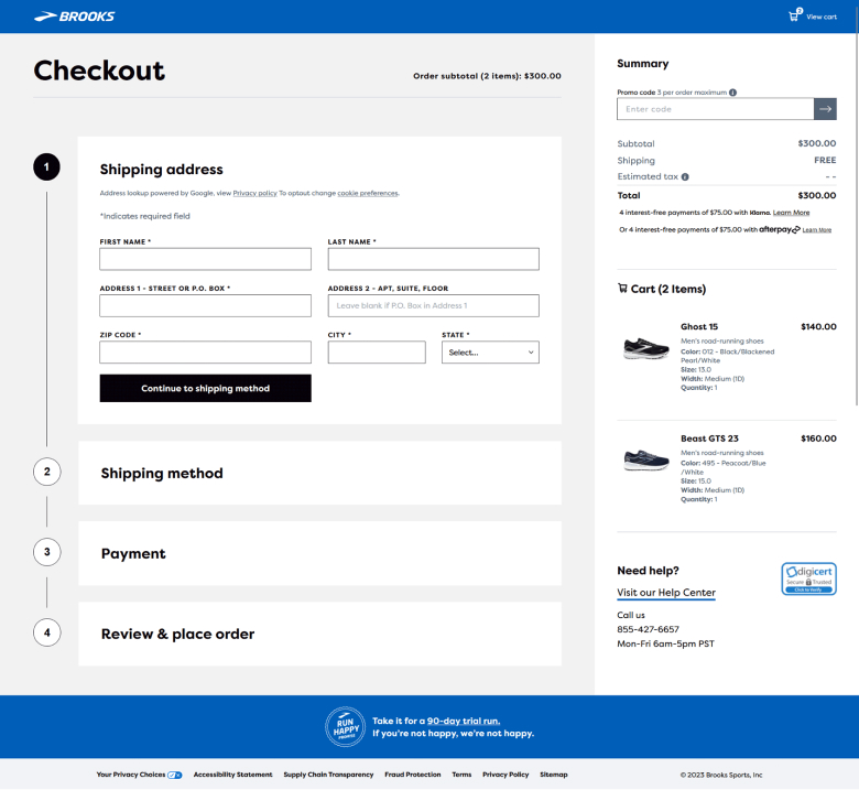
Brooks store has a simple one-page checkout process with four steps on the same page. Only the form fields for the current step are shown to avoid overwhelming shoppers.
Headers for each section are always visible to show progress.
Shoppers can see how far they are in the checkout process without feeling overwhelmed.
Shoppers in a hurry can checkout as a guest but still have the option to create an account. This encourages shoppers to sign up and join, even if they start as guests.
This will allow Brooks to contact them in the future for marketing and will enable faster and more secure checkout as customer details are saved.’
Things that make a checkout page work well
A good checkout page helps people buy things easily. Here are some essential things to include:
Design
Simple and clear: The page should be easy to understand and use. Avoid clutter and confusing layouts.
Minimal distractions: Keep the focus on the checkout process. Remove unnecessary elements like banners, pop-ups, or irrelevant links.
Customer Experience
Guest checkout: Let people buy things without making an account. This reduces friction and encourages impulse purchases.
Multiple payment options: Offer a variety of payment methods, including credit cards, debit cards, PayPal, and digital wallets, to cater to different preferences.
Security badges: Display security badges and trust signals to build confidence and assure customers that their information is safe. This can include logos from trusted security providers or certifications.
Progress indicators: Show people how far along they are in the checkout process. This gives them a sense of control and reduces anxiety.
Clear order summary: Provide a detailed breakdown of the order, including itemized costs, shipping fees, and taxes. This helps prevent misunderstandings and builds trust.
Easy editing: Allow customers to easily edit their cart, change quantities, or remove items. This flexibility reduces cart abandonment.
Mobile optimization: Ensure the checkout page is fully responsive and optimized for mobile devices. This is crucial as more and more people shop on their smartphones.
Customer support: Offer clear and accessible customer support options, such as live chat or a phone number, in case customers have any questions or issues. This provides reassurance and helps build trust.
Trust and Security
Clear and concise privacy policy: Explain how you collect and use customer data. This builds trust and helps meet legal requirements.
Secure checkout process: Use industry-standard encryption to protect customer information. Display security badges from trusted providers to further reassure customers.
Following these guidelines, you can create a checkout page that is functional and enjoyable to use. This will lead to higher conversion rates and increased customer satisfaction.
Conclusion
Your checkout page is the last step for your customers before they buy something. Don’t let a bad checkout experience stop people from buying! Make it easy for them to finish their purchase.
Remember, a good checkout page is more than just a form. It needs to be easy to use and make people feel safe. So, spend some time making your checkout process better, and you’ll see more sales!
