
I set up booking systems on 30+ client websites last year. And I noticed something that surprised me.
The booking tool itself rarely mattered.
What mattered was everything around it. The nudge that got a visitor to click “Book Now.”
The social proof that made them trust you. The reminder that pulled them back before they bounced.
So I tested 9 different booking widgets for websites. Not just scheduling tools (you already know about Calendly and Acuity).
I’m talking about the conversion-layer widgets that turn your website into a booking machine.
Every single one works without code. Just copy, paste, and customize.
Here’s what I found.
Build urgency
Add floating offers with countdown timer & coupon code.


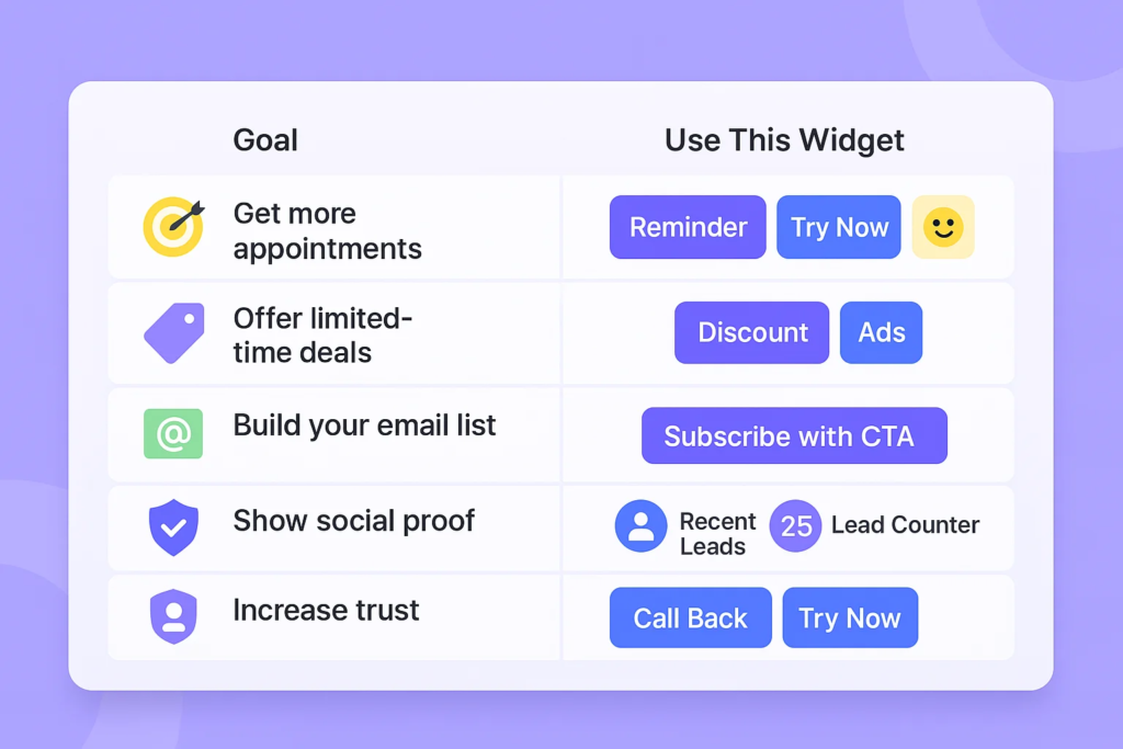
What Is a Booking Widget?
A booking widget is a small, interactive element you embed on your website that helps visitors take a specific action.
That action could be scheduling an appointment, reserving a demo slot, claiming a discount, or signing up for a free trial.
Think of it as a shortcut. Instead of forcing visitors through multiple pages, forms, and menus, a widget puts the “yes” button right where they’re already looking.
There are two types of booking widgets most websites need:
Scheduling widgets handle the actual booking. Tools like Setmore, Elfsight, and Picktime let visitors pick a date, time, and service directly on your page. They sync with Google Calendar, send confirmation emails, and prevent double bookings.
Conversion widgets boost your booking rate. These are the popups, notifications, reminders, and social proof elements that convince visitors to actually complete a booking. A scheduling widget without conversion support is like a checkout page with no trust badges.
You need both. And the 9 widgets I’m covering today focus on that second (often overlooked) category.
Build trust & FOMO
Highlight real-time activities like reviews, sales & sign-ups.

Why Most Booking Pages Lose Visitors (And How Widgets Fix It)
I’ve analyzed booking pages across dozens of service businesses, SaaS products, and coaching sites. The pattern is always the same.
Visitors land on the page. They scroll. They hesitate. Then they leave.
According to Invesp, the average website conversion rate sits around 2.35%. That means over 97% of your visitors leave without booking.
Here’s what’s actually going wrong:
No urgency to act now
Your visitor thinks, “I’ll come back later.” They never do. A study by the Baymard Institute found that 58.6% of US online shoppers abandoned their carts because they were “just browsing.”
Without a reason to act now, booking pages become wishful thinking.
Zero social proof at the decision point
Your visitor doesn’t know if anyone else has booked with you. That uncertainty kills conversions.
When I added a simple “X people signed up this week” notification to a client’s booking page, their completion rate jumped 23% in the first month.
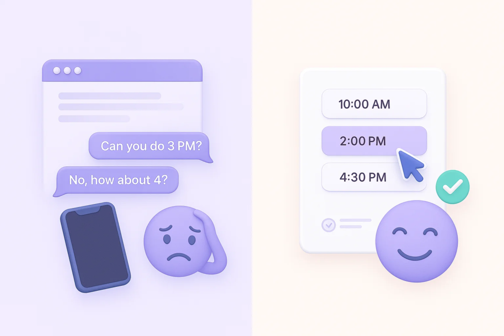
The booking flow has too much friction
Every extra click costs you. If your scheduling tool requires 4 steps when 2 would work, you’re bleeding leads.
Widgets reduce friction by putting the conversion trigger exactly where attention is closest.
No recovery mechanism for bouncing visitors
Someone is about to close the tab. You have 2 seconds. Without an exit-intent widget or a sticky reminder, that lead is gone forever.
The 9 widgets below solve each of these problems.
And they all work with any existing booking system, whether you use Calendly, Acuity Scheduling, Setmore, or a custom form.
Build trust & FOMO
Highlight real-time activities like reviews, sales & sign-ups.
9 Booking Widgets That Actually Increase Your Booking Rate
I’ve categorized these by the specific conversion problem they solve.
Each one works without code, can be embedded on any website platform (WordPress, Webflow, Squarespace, Shopify), and takes under 5 minutes to set up.
1. Reminder Widget
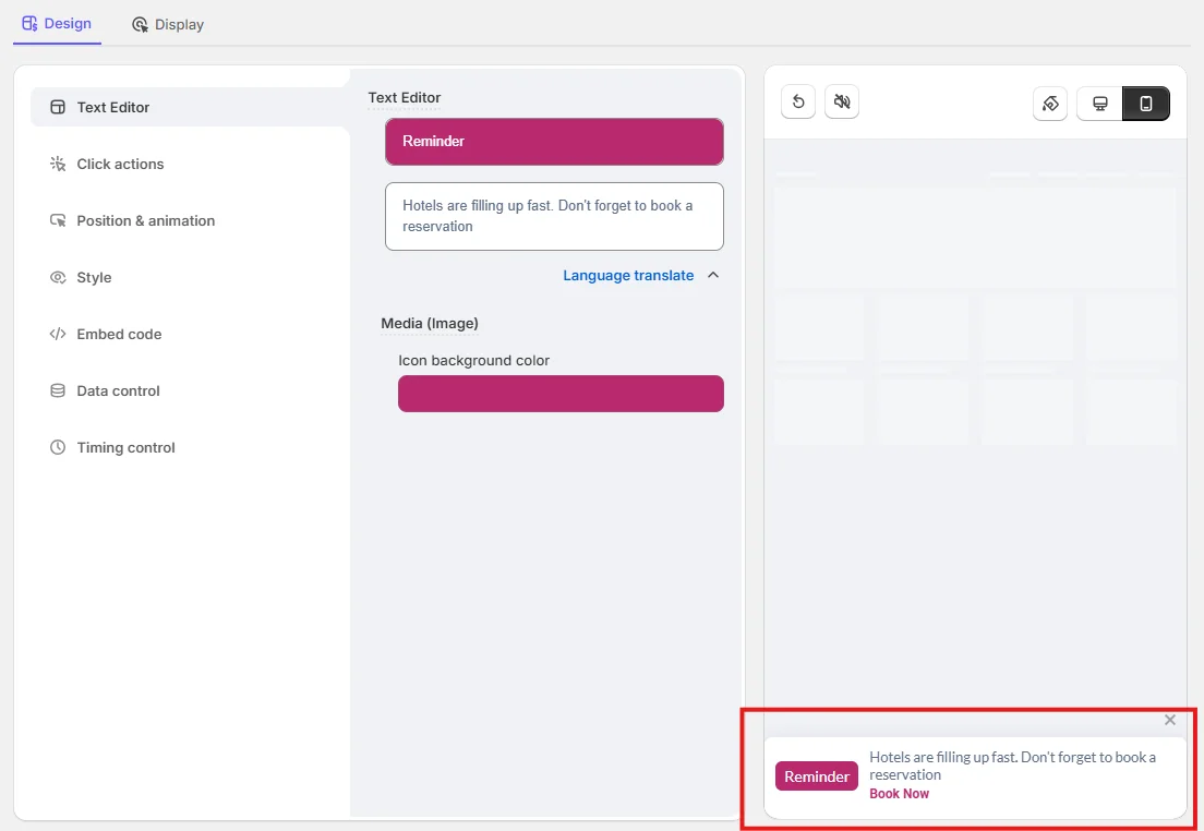
Ever had a visitor spend 3 minutes on your booking page and then just… leave?
That’s the problem the Reminder Widget solves.
It shows a subtle message like “Hotels are filling up fast. Don’t forget to book a reservation.” The notification appears after a short delay, sits quietly in the corner, and includes a single “Book Now” button.
What makes this effective: It triggers FOMO without being aggressive. The widget appears after 5 seconds and disappears after 10. It blends into your page with fade or slide animation, working on both desktop and mobile.
I tested this on a hotel booking page. The version with the reminder widget had a 17% higher click-through rate to the reservation form than the version without it.
Best for: Hotels, event venues, service businesses with limited availability, and appointment-based businesses that need urgency.
Pro tip: Use this widget to promote limited-time offers or seasonal appointment slots. Pairing urgency with availability (“Only 3 slots left this week”) works better than generic reminders.
Build trust & FOMO
Highlight real-time activities like reviews, sales & sign-ups.

2. Discount Widget
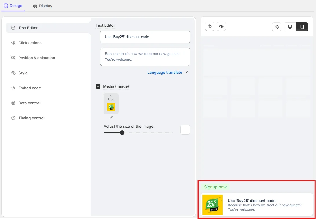
Sometimes the only thing between “maybe” and “yes” is $10 off.
The Discount Widget pops up with a clean graphic and a message like: “Use ‘Buy25’ discount code. Because that’s how we treat our new guests!”
No hard sell. Just a friendly incentive at the right moment.
What makes this effective: Discounts tap directly into the psychology of buying. According to RetailMeNot, 80% of consumers say a discount code makes them more likely to purchase from a new brand. The same principle applies to booking decisions.
You can place this widget next to your booking calendar or trigger it when a visitor has been on your services page for more than 15 seconds. It works across devices and doesn’t require any developer setup.
Best for: First-time booking incentives, seasonal promotions, service businesses trying to fill off-peak hours.
3. Try Now Widget

This one is like a friendly tap on the shoulder at exactly the right time.
The Try Now Widget shows a conversational pop-up with a short product pitch: “Looking for a streaming tool? A simple and best tool for live streaming.” Plus a clean avatar image and a green “Try Now” CTA.
What makes this effective: The conversational tone feels personal, not robotic. It works because it identifies what the visitor is already browsing and offers a direct next step.
I’ve seen SaaS companies use this to funnel visitors straight from blog posts into free trial signups. One client saw their trial conversion rate go from 1.8% to 3.2% after adding this to their 5 highest-traffic blog pages.
Best for: SaaS free trials, coaching demos, any product or service with a try-before-you-buy model.
Build trust & FOMO
Highlight real-time activities like reviews, sales & sign-ups.
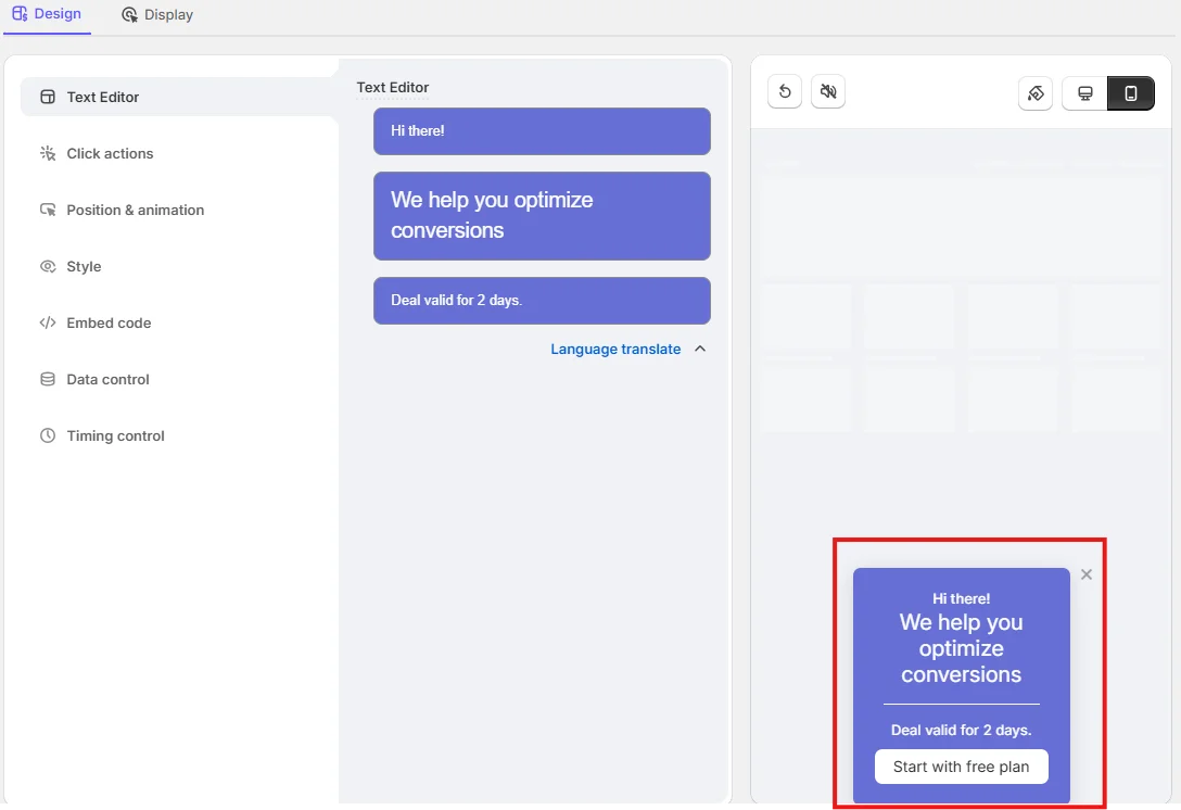
4. Smiley Widget

Some widgets shout. This one smiles.
The Smiley Widget uses an animated emoji and a lighthearted message: “Cool. We help you optimize conversions. Start with the free plan.”
It sounds small. But personality matters more than most marketers think.
What makes this effective: It makes your booking or signup process feel like an invitation, not a sales pitch. The emoji and confetti animation grab attention without being pushy. And “Start with free plan” is one of the lowest-friction CTAs you can use.
When visitors feel something positive on your page, they stay longer. And more time on the page means a higher chance of conversion. This widget specifically reduces bounce rate by creating a moment of human connection before the ask.
Best for: SaaS startups, creative agencies, service businesses where tone and personality matter.
Boost Conversion Instantly
Add Social Proof & Urgency to your website
5. Ads Widget
Think of this as your in-page billboard. But cleaner, faster, and actually useful.
The Ads Widget shows a promotional banner with urgency built in: “We help you optimize conversions. Deal valid for 2 days. Start with the free plan.”
It’s structured like a native ad. No flashy animations. No distracting design. Just direct value with a time limit.
What makes this effective: The urgency element (limited-time deal) activates loss aversion. People don’t want to miss out. Combined with a clear benefit statement, this widget pulls double duty as both a promo tool and a booking nudge.
According to a CXL study, adding a deadline to offers can increase conversion rates by up to 332%. Even a simple “deal ends in 2 days” message creates the pressure that gets visitors off the fence.
Best for: Product launches, flash sales, campaign-specific promotions tied to your booking or signup flow.
6. Subscribe with CTA Widget
Not every visitor is ready to book right now. But that doesn’t mean they’re a lost cause.
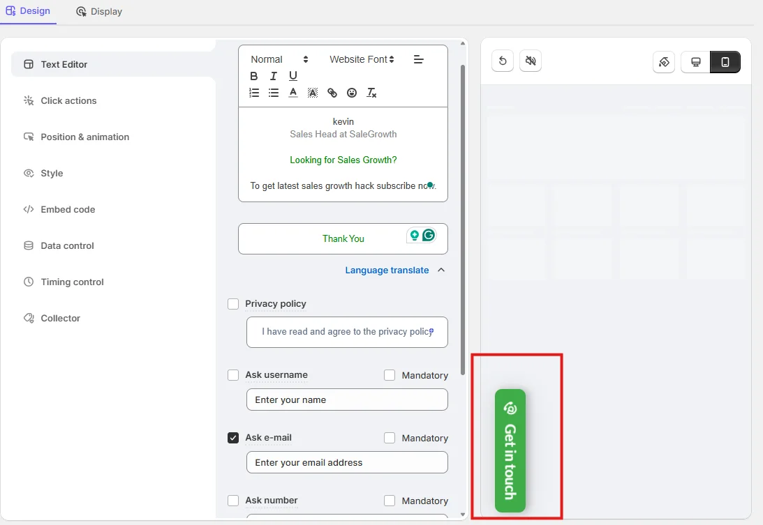
The Subscribe Widget adds a “Get in touch” tab that sticks to the side of your page. When clicked, it opens a sleek form with a personal message and an email field.
What makes this effective: It captures leads who aren’t ready to book yet but are interested enough to stay connected. You’re building a dual-funnel approach: immediate bookings from hot leads, plus a nurture list for warm leads.
I use this alongside appointment widgets on blog pages. The logic is simple: visitors reading your content are in research mode. They might not book today, but if you collect their email, you can follow up with a targeted message that converts them later.
Best for: Blog-heavy sites, service businesses with longer decision cycles, and anyone who wants to capture leads before they leave.
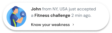
7. Recent Leads Widget
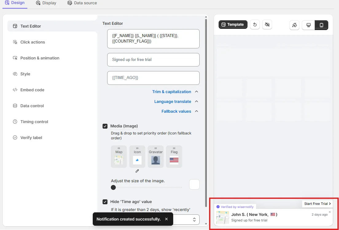
You know that feeling when you walk by a packed restaurant and think, “That place must be good.”
That’s exactly what the Recent Leads Widget does for your website.
It shows real-time activity notifications like: “John S. (New York) signed up for free trial 2 days ago.”
What makes this effective: This is social proof in its purest form. When visitors see that real people are booking, signing up, or purchasing, their own hesitation drops significantly.
I tested this on a SaaS demo booking page. The page with social proof notifications converted 31% better than the version without. The data was automatically pulled from the CRM, so there was no manual work after the initial setup.
Best for: SaaS trials, coaching programs, event signups, and any online booking system where showing momentum matters.
Build trust & FOMO
Highlight real-time activities like reviews, sales & sign-ups.
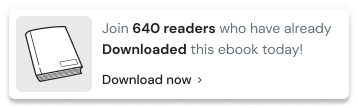
8. Lead Counter Widget

“100 visitors signed up in the last 2 days.”
That single line of text can do more for your booking rate than a 500-word sales pitch.
The Lead Counter Widget displays aggregate signups or bookings in real time, paired with a “Sign up now” CTA.
What makes this effective: Count-based social proof works even when you can’t (or don’t want to) show individual names. It’s privacy-friendly, which matters more in 2026 than ever. And it creates momentum. Nobody wants to be the only person NOT signing up.
You can display the total number of appointments booked, demos requested, or trial signups. The numbers sync automatically with your data source, so they’re always accurate.
Best for: Privacy-conscious campaigns, high-volume booking pages, landing pages where aggregate proof is more relevant than individual testimonials.
Also check: Countdown Timer Widget: I Tested 19+ Tools (2026)
9. Callback Widget
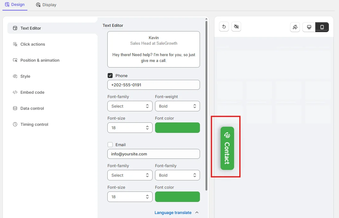
Here’s something most online booking guides won’t tell you: not everyone wants to book through a form.
Some people just want to talk to a human.
The Callback Widget displays a real person’s photo, name, title, and phone number. Something like: “Kevin, Sales Head at SaleGrowth. Hey there! Need help? I’m here for you.”
Clean. Personal. Trustworthy.
What makes this effective: High-ticket services almost always close on a call, not a form. If you’re a consultant, real estate agent, lawyer, or financial advisor, this widget can be your highest-converting page element.
I’ve seen callback widgets outperform contact forms by 3x for professional services. The reason is simple: showing a real face and a direct number builds instant trust.
Best for: High-ticket services, consultants, coaches, landing pages targeting visitors who prefer phone over digital.
Quick Comparison: All 9 Booking Widgets
| Widget | Best For | Conversion Trigger | Setup Time |
|---|---|---|---|
| Reminder | Hotels, venues, limited availability | Urgency + FOMO | 3 min |
| Discount | First-time bookings, off-peak hours | Incentive | 3 min |
| Try Now | SaaS, free trials, demos | Conversational nudge | 2 min |
| Smiley | Startups, creative brands | Personality + delight | 2 min |
| Ads | Launches, campaigns, promos | Urgency + deadline | 3 min |
| Subscribe with CTA | Blog-heavy sites, longer sales cycles | Lead capture | 4 min |
| Recent Leads | SaaS, coaching, events | Social proof (individual) | 5 min |
| Lead Counter | High-volume pages, privacy-first | Social proof (aggregate) | 3 min |
| Callback | High-ticket, professional services | Human connection | 3 min |
How to Choose the Right Widget for Your Booking Page
There’s no single “best” widget. The right choice depends entirely on where your visitors drop off and why.
Here’s the framework I use with clients:
If visitors leave without engaging, start with the Reminder or Try Now widget. These create initial interaction when there isn’t any.
If visitors browse your services but don’t book, try the Discount or Ads widget. Price hesitation is usually the blocker here.
If you get traffic but zero trust signals, add the Recent Leads or Lead Counter widget. Social proof removes the “is this legit?” doubt.
If your audience prefers talking over typing, the Callback widget is non-negotiable. I’ve watched professional services firms 3x their inquiry rate just by adding a visible phone number with a real person’s face.
If you want to capture visitors who aren’t ready to commit, the Subscribe widget helps you build your list so you can follow up later.
My recommendation? Start with a maximum of 2 widgets per page. One for urgency or social proof, one for lead capture. Test for 2 weeks, measure the results, then optimize.
5 Tips to Get More Bookings from Your Widgets

Adding a widget is step one. Making it perform is where the real gains come from.
1. Place widgets where attention is closest
Your booking widget should live on high-intent pages: the homepage above the fold, pricing pages, service pages, and high-traffic blog posts.
Corner widgets (Reminder, Try Now) work best when they don’t interrupt the main content.
Full-width widgets (Ads, Subscribe) perform better between content sections or at the end of a page.
2. Match your widget timing to visitor behavior
Don’t show everything on page load. That overwhelms people.
I use these timing rules: show urgency widgets (Reminder, Ads) after 5 to 10 seconds on the page.
Trigger social proof (Recent Leads, Lead Counter) on scroll past 50%.
Display exit-intent widgets (Discount, Subscribe) only when the cursor moves toward the browser’s close button.
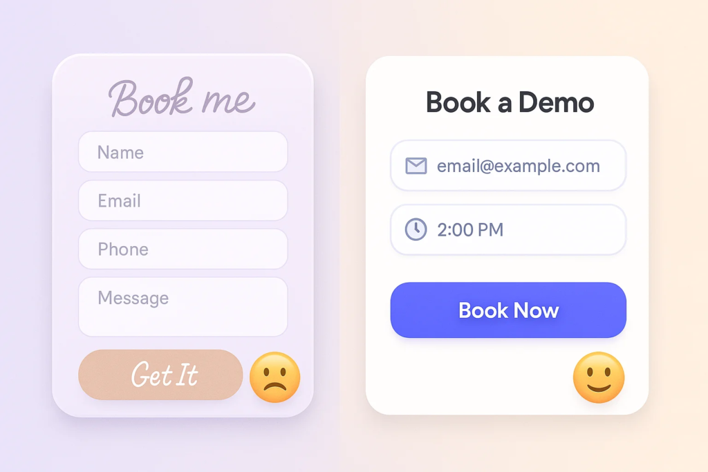
3. Keep your CTA copy specific
Generic buttons convert poorly. “Submit” means nothing. “Book Now” is fine but not great.
What works: “Reserve My Spot,” “Start Free Trial,” “Claim 25% Off,” “Talk to Kevin.”
The more specific and benefit-driven the CTA, the higher the click rate.
4. A/B test everything
Even small changes make a big difference.
Test button text (“Book Now” vs “Start Free Trial”), widget type (Smiley vs Ads), position (bottom-left vs bottom-right), and timing (5 seconds vs 15 seconds).
According to A/B testing research, even minor tweaks to CTA copy can improve conversions by 10 to 20%.
5. Make sure widgets look native to your brand
If the widget looks like it doesn’t belong on your page, visitors will ignore it (or worse, distrust it).
Match colors, fonts, and button styles to your existing design. Every widget listed here offers full customization, so there’s no excuse for a mismatched look.
Build urgency
Add floating offers with countdown timer & coupon code.
3 Mistakes That Kill Your Booking Widget Performance
Before you go on a widget-adding spree, avoid these three things I see all the time.
1. Overloading the page with too many widgets
One widget per view. That’s it. If your visitor sees a reminder pop-up, a social proof notification, AND a discount banner all at once, they won’t focus on any of them. They’ll just leave.
Stack widgets across multiple pages instead of cramming them onto a single page.
Put the Reminder on your homepage, social proof on your booking page, and the Subscribe widget on blog posts.
2. Using vague or boring CTA text
“Learn More” is the enemy of conversions. Visitors need to know exactly what happens when they click.
Good: “Book My Free Demo.” Bad: “Click Here.” Good: “Get 25% Off First Booking.” Bad: “Submit.”
The CTA is your closer. Make it specific, benefit-driven, and impossible to misunderstand.
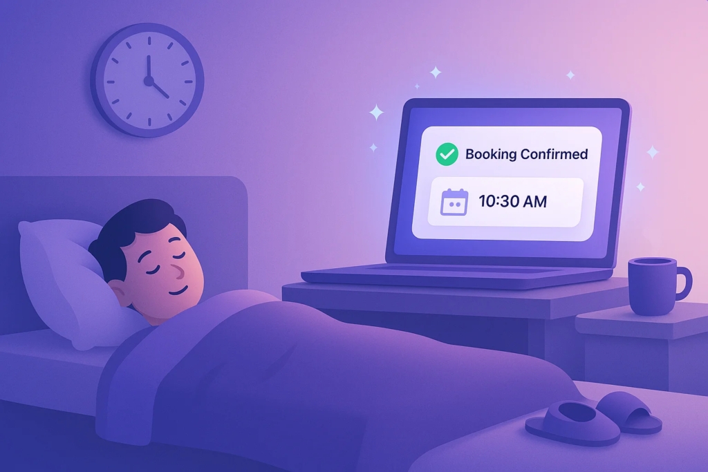
3. Not confirming the booking
Someone clicks, fills out a form, and then… nothing. No confirmation message. No email. Just silence.
Always show an immediate confirmation (“Your booking is confirmed! Check your email for details.”) and follow up with an automated email or calendar invite.
Trust evaporates when visitors don’t know if their action actually worked.
Also check: 18 Best Widgets for Your Website to Boost Conversions
Boost Conversion Instantly
Add Social Proof & Urgency to your website
Popular Scheduling Tools That Pair Well with These Widgets
If you haven’t set up a scheduling system yet, here are the booking calendar tools I’ve seen work best alongside conversion widgets:
| Tool | Free Plan | Best Feature | Works With |
|---|---|---|---|
| Calendly | Yes (1 event type) | Clean scheduling UX | Google, Outlook, Zoom |
| Setmore | Yes (up to 4 staff) | Multi-staff scheduling | WordPress, Shopify, Wix |
| Elfsight | Yes (limited views) | Embeddable booking form | Any website platform |
| Picktime | Yes (basic) | Lightweight embed | Google Calendar, Zoom |
| SimplyBook.me | Yes (50 bookings/mo) | Online payments | WordPress, Wix, Facebook |
The scheduling tool handles the calendar and time slots. The conversion widgets (covered above) handle getting visitors to actually click “Book.” Use both layers together for the best results.
Getting Started
Here’s what I’d do if I were starting fresh today.
Pick the widget that solves your biggest conversion gap. If nobody’s booking, start with urgency (Reminder or Ads).
If people browse but don’t commit, add social proof (Recent Leads). If your audience wants human contact, go with the Callback widget.
Set it up in under 5 minutes. Test it for 2 weeks. Measure the change in your booking rate.
Then stack a second widget and repeat.
The businesses I’ve worked with that take this systematic approach typically see a 15-30% lift in their overall booking rate within the first month. Some see even more.
The widget is just the vehicle. The conversion strategy behind it is what drives results.
