Black Friday is a make-or-break time for many eCommerce businesses, and having a high-converting landing page is crucial to bringing more visitors and sales.
Many businesses are already gearing up by optimizing SEO, updating their websites, running ads on social media channels, and running A/B testing to maximize the impact & convert visitors into customers.
Since Black Friday is just a breath away from the holiday season, it’s high time to start crafting your landing pages for sales and attracting new customers.
Don’t know where to start?
In this blog, we’ll be sharing some examples, tips, and tools that can help you get inspired and make your landing page catchy and super-attractive.
Let’s dive in.
Grabe the Deal: Top 30 Black Friday Software Deals in 2025
Plan Your Black Friday Strategically
Get Our Proven Black Friday Marketing Calendar
9 Black Friday Landing Page Examples That Work
Let’s start by exploring some of the best landing pages for the Black Friday sales –
1. Joomla Shine
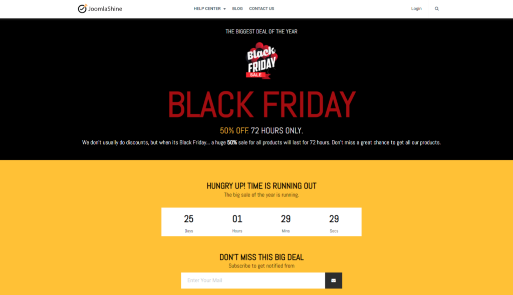
Joomla Shine’s Black Friday page stands out with its bold, high-contrast design. Combining a black background with large, red text captures attention and communicates urgency.
The headline reads “Black Friday 50% Off 72 Hours Only!” highlighting the offer’s limited-time offer triggering urgency. The page design is simple, with minimal distraction and a clear call-to-action to subscribe for updates.
Related: 15 Magnetic Landing Page Headlines That Hook Attention
The page focuses on one offer and ensures clarity to build trust, making this a great example of a high-converting landing page focused on simplicity, urgency, and lead capture.
2. Matalan

The sleek background and bold white and red typography from Matalan’s Black Friday landing page emphasize urgency and excitement. With the clear headline “Black Friday Sale Event up to 50% off” captures customer’s attention.
The clear navigation and structure help audiences to find relevant deals for different categories (Men, Women, Kids, and Homeware sales). The page balances simplicity with functionality, offering both online and in-store deals.
The clean design and easy-to-navigate layout create a seamless user experience to encourage visitors.
Also see: 29 Proven Black Friday Marketing Ideas to Boost Sales
3. Hostinger

The futuristic design features a striking offer of up to 81% off for hosting and website builder services. The headline emphasizes this as “Biggest Ever Black Friday Sale,” creating excitement and exclusivity.
Key benefits like a free domain, website migration, and 24/7 support are listed clearly, making the value proposition compelling. A countdown timer adds urgency and motivates customers to take immediate action.
The CTA button stands out from different elements and is strategically placed for visibility, complemented by a 30-day money-back guarantee.
4. Sundays
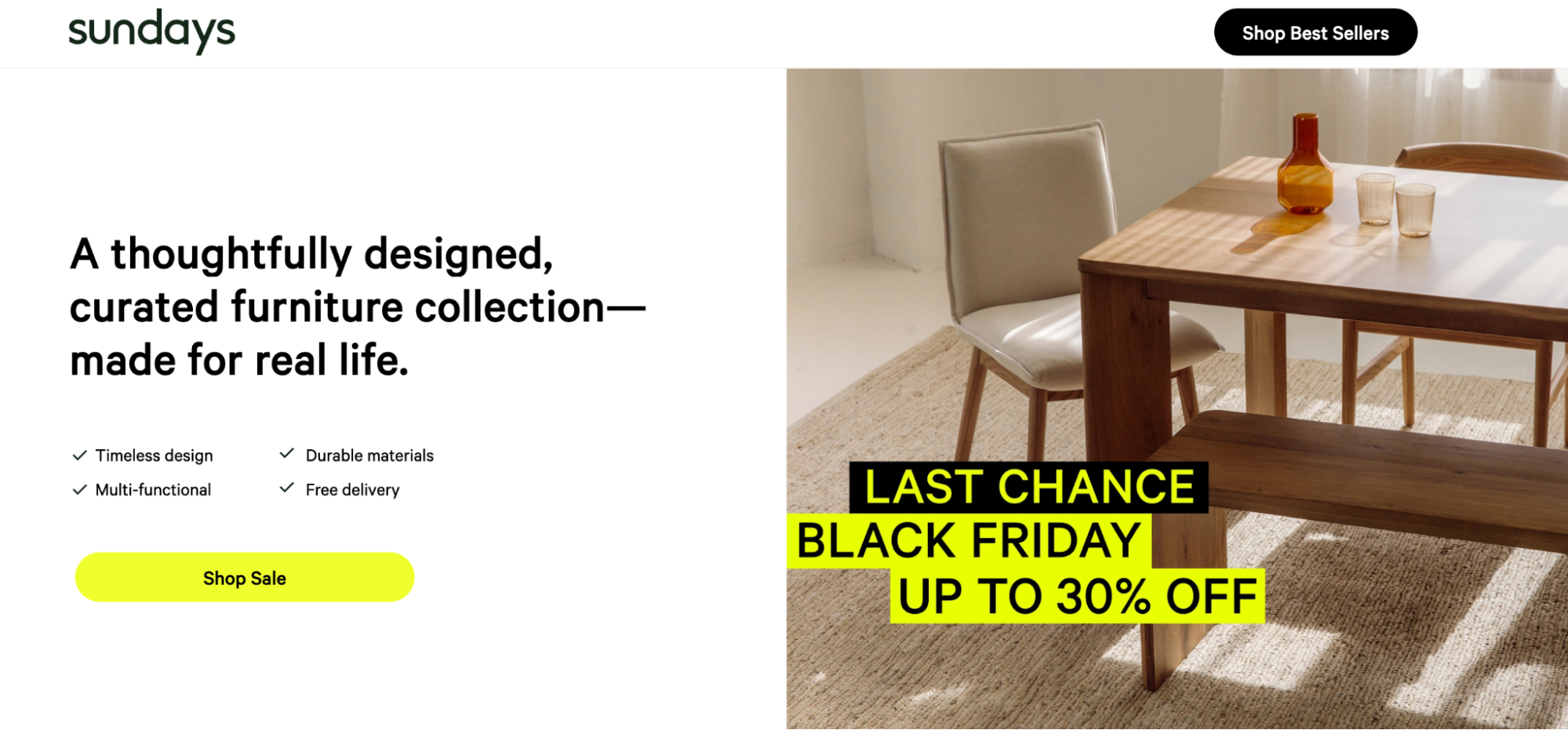
Sunday’s Black Friday landing pages capture attention with a minimalist, aesthetically pleasing design. It highlights the brand’s core values – timeless design, multifunctionality, and durability, reinforcing the quality of its curated furniture collection.
The yellow CTA button labeled “Shop Sale” contrasts effectively with the clean white space, guiding users to take action. A well-placed “Last Chance Black Friday” banner featuring a 30% discount adds urgency.
5. Get Response
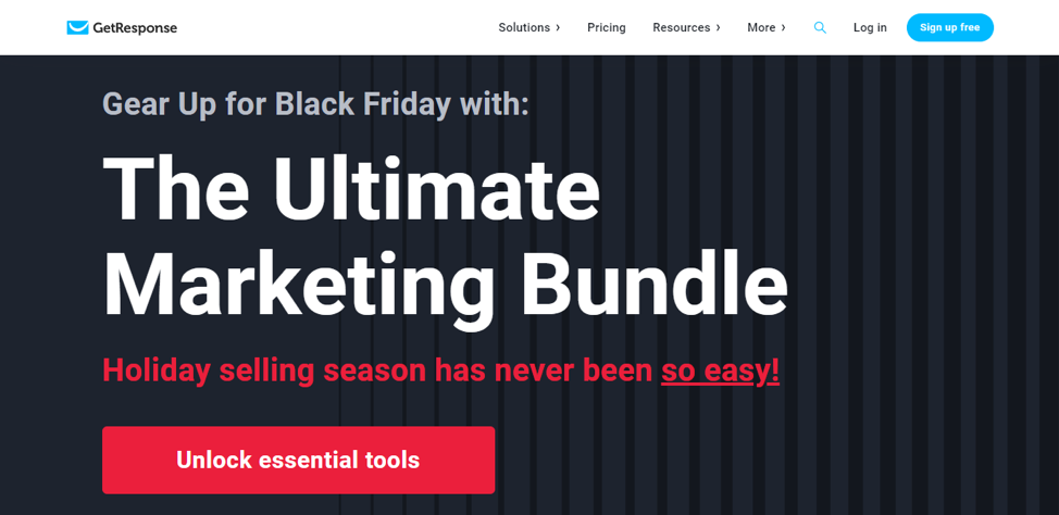
With a clean, bold design highlighting its offer, “The Ultimate Marketing Bundle” focuses on a pain point, suggesting that the holiday selling season has “never been so easy.”
The prominent red CTA button “Unlock Essential Tools” stands against the dark background, guiding visitors toward immediate action.
The landing page effectively appeals to marketers by showcasing tools designed for the season, creating a sense of relevance and practicality for the audience.
6. Engage Bay

The EngageBay landing page effectively combines multiple seasonal promotions – Black Friday, Cyber Monday, and Christmas under one unified campaign titled “Holiday SaaS Deals 2025.”
The strategy streamlines the message and builds momentum throughout the holiday season. The stand-out offer of “40% off lifetime” draws the audience’s attention.
Visitors are encouraged to enter their email addresses to be notified when the deal goes live, creating a sense of exclusivity and anticipation.
With concise messaging like “Market better. Sell faster. Support smarter,” the page speaks directly to its audience, focusing on benefits without unnecessary clutter—making it an innovative and engaging way to drive conversions.
7. XPro Elementor Addons

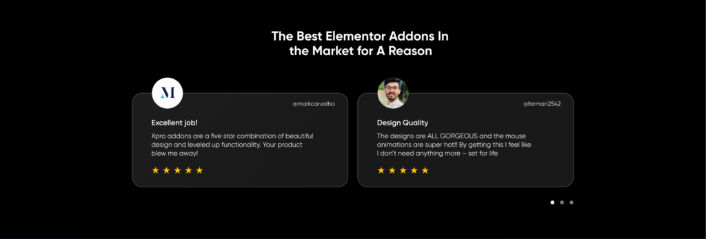


The XPro Elementor Addon Campaign uses a modern, sleek design to promote its offer effectively.
With a 50% discount countdown, it drives urgency while maintaining a clean, visually appealing layout. Moreover, the page highlights the testimonials to build audience trust and credibility.
Key features and premium widgets are presented concisely, showcasing value without overwhelming visitors.
With the clear pricing, tiers provide flexibility to customers’ needs, while the “Buy Now” CTA button stands out, encouraging them to take immediate action.
8. WPZOOM
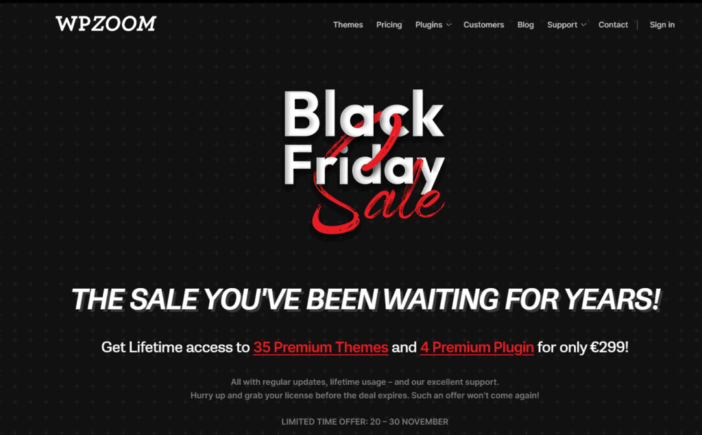
With a striking black background, bold typography, and contrasting red & white elements, WPZOOM’s Black Friday landing page captures visitors’ attention.
The headline “The Sale You’ve Been Waiting for Years!” adds excitement and positions the offer as rare and irresistible.
The core offer of Lifetime Access to 35 Premium Themes and 4 Premium Plugin for €299 prominently displays the long-term benefits.
A limited-time offer date and urgency-driven language, “Hurry Up,” further pushes users towards immediate action.
9. Karen Millen
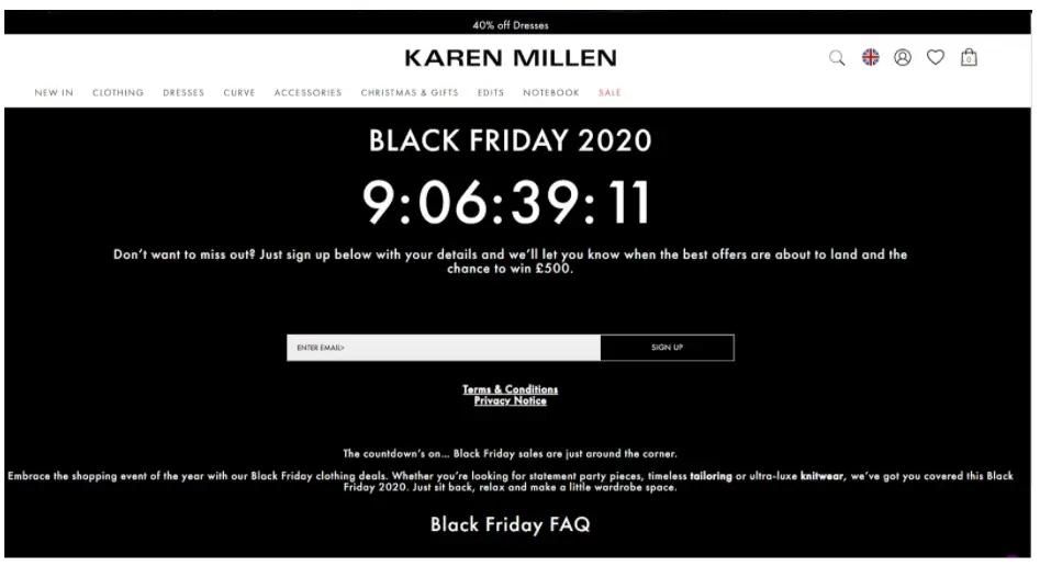
The Karen Millen Black Friday landing page builds excitement with a minimalist yet bold design.
The countdown timer takes center stage, emphasizing urgency and encouraging visitors to act fast. The page invites users to sign up with their email to be notified about upcoming deals, creating anticipation and capturing leads.
Additionally, the chance to win £500 adds an extra incentive for users to subscribe. The concise message focuses on timeless tailoring and luxury knitwear, appealing to fashion-conscious shoppers.
With a clean layout, clear value proposition, and urgency-driven elements, this landing page effectively draws attention and drives conversions.
9 Tips for Creating Black Friday Landing Pages
1. Craft a Killer Headline That Screams Value
Your headline is the first thing visitors notice; make sure to keep it short, powerful, and value-focused, highlighting the most exciting part of your offer.
Use stronger language that creates excitement and urgency. For example, “50% off – Black Friday Savings Start Now!” immediately hooks customers’ attention to the deal and compels visitors to read further.
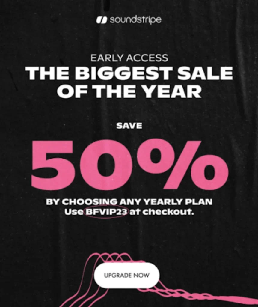
Make sure to use a contrasting color and bold fonts that grab customer attention. Here’s an example of a killer headline from SoundStripe: “The Biggest Sale of the Year – Save 50%.”
2. Embrace the Power of One
Make your Black Friday landing page focus on one primary offer to prevent confusion or overwhelming visitors. Too many discounts, offers, or product categories can dilute your message and leave users unsure about where to click.
If offering multiple discounts, consider crafting a dedicated landing page for each offering and ensure that the message stays clear, concise, and effective. Moreover, keep the layout clear and avoid clutter, leading to more conversions.
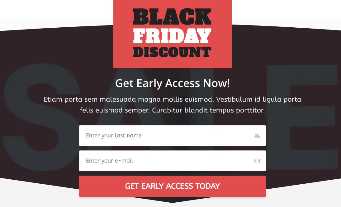
Here’s an example that asks customers to sign up for early access to the Black Friday offers.
3. Use a Hero Shot That Sells
You can’t have a Black Friday landing page without offering customers with a great deal. That’s the hero of your page – the reason shoppers are here, so make sure it influences them.
The first thing people notice on the landing page is the headline. It must be clear, short, and visually attractive, keeping customers reading. In addition, the banner on your landing page sets the tone.
It needs to evoke emotions and align with your brand message. Use high-quality images and relevant visuals of your products, showing how t product can solve problems for your customers.
4. Write Persuasive Copy That Converts
The words you use on your landing page should directly speak to the audience. Use benefit-driven language that makes people feel they need to buy your products. Keep it simple, clear, and emotional.
Focus on the tone and words that evoke urgency and exclusivity, such as “Limited Time” or “Only a Few Left,” to excite people more.
Moreover, don’t just tell them to purchase; talk about how the features will benefit them.

5. Design a CTA That’s Impossible to Ignore
Your call to action (CTA) button tells shoppers what to do next. Make your CTA buttons bold, brightly colored, and visible.
Use action-oriented language like “Grab the Deal Now!” or “Claim Your 50% Discount” to encourage customers to take immediate action.
The CTA should be easy to find – whether in the header, at the bottom, or within product text.
If the CTA is harder to find or unclear, potential customers might miss out on the deal or leave without taking any action.

6. Leverage the Power of Social Proof
Online reviews are your trusty guide, illuminating the path to the perfect purchase. They’re like having a personal shopper whisper in your ear, “Trust me, this is amazing!” It’s no surprise that a staggering 88% of shoppers rely on them as much as recommendations from friends.
So, why not sprinkle your landing page with glowing testimonials, positive reviews, and trust badges?
These elements act as social proof, reassuring potential customers that they’re making a safe choice.
Seeing that others have had a great experience builds trust and makes them feel confident about hitting that “Buy Now” button. It’s like saying, “You’re in good company—go ahead and shop confidently!”
7. Craft Mobile Responsive landing pages
Just like everything else these days, shopping happens on mobile phones. That’s why your Black Friday landing page must have mobile responsiveness built-in.
This ensures that your page adjusts seamlessly to fit any screen size, providing a smooth shopping experience.
But it doesn’t stop there! Beyond automatic reformatting, you can further optimize your page for mobile by trimming unnecessary sections, placing your CTA at the top for quick access, and cutting out excessive media elements that slow down loading times.
The goal? Keep it clean, fast, and easy to navigate—so visitors can shop effortlessly, even on the go.

8. Eliminate Distractions
Keep your Black Friday landing page sleek and simple so visitors can glide through without a second thought.
The easier it is to navigate, the more likely they will stick around and buy.
But if your page is cluttered with too many visuals and distractions, visitors will get frustrated—and you know what happens next: they’ll bounce to a competitor’s site faster than you can say “Black Friday deal.”
So, how do you create a page that’s engaging and easy to navigate?
- Use white space like a pro – let key info and CTAs stand out without fighting for attention.
- Cut the clutter mercilessly – if it doesn’t add value, it’s just noise.
- Limit links – keep shoppers focused on your offers, not wandering through unnecessary pages.
A clean, focused design shines your message, creating a seamless shopping experience that helps visitors find what they want and confidently complete their purchases.
9. Don’t Forget the Thank You Page
The customer journey doesn’t stop at checkout—it’s just getting started! Your Thank You page is prime real estate for turning a one-time buyer into a loyal, repeat customer.
Use this moment to upsell or cross-sell products that complement their purchase—like the perfect accessory or an upgrade, they can’t resist.
You can also promote loyalty programs or offer exclusive discounts for their next visit, giving them a reason to return.
Moreover, make sure to personalize your message with some special offer that makes customers feel valued and special.
How Wisernotify Helps Convert Landing Page Visitors
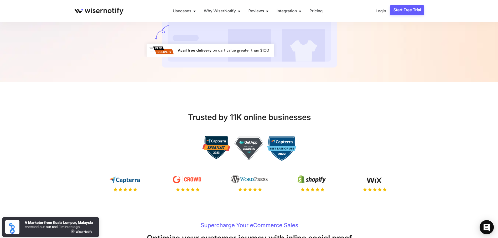
WiserNotify is a powerful social proof and FOMO marketing tool that can help you boost conversion rates on your Black Friday landing pages.
The tool shows real-time notifications like recent purchases, signups, and stock updates to build customer trust and credibility.
These real-time notifications influence customers to take action, and seeing others actively engaging with your brand reassures them that they’re making the right decision.
Key Benefits:
Build Trust: Display real-time purchases or signups to make visitors confident about buying. If others trust you, they will, too.
Create Urgency: Use countdowns or stock alerts to show that time is running out, motivating shoppers to act fast.
Boost Engagement: Keep visitors hooked and encourage them to take the next step, like purchasing or signing up.
Tools That Help You Build Black Friday Landing Pages
1. Convertflow
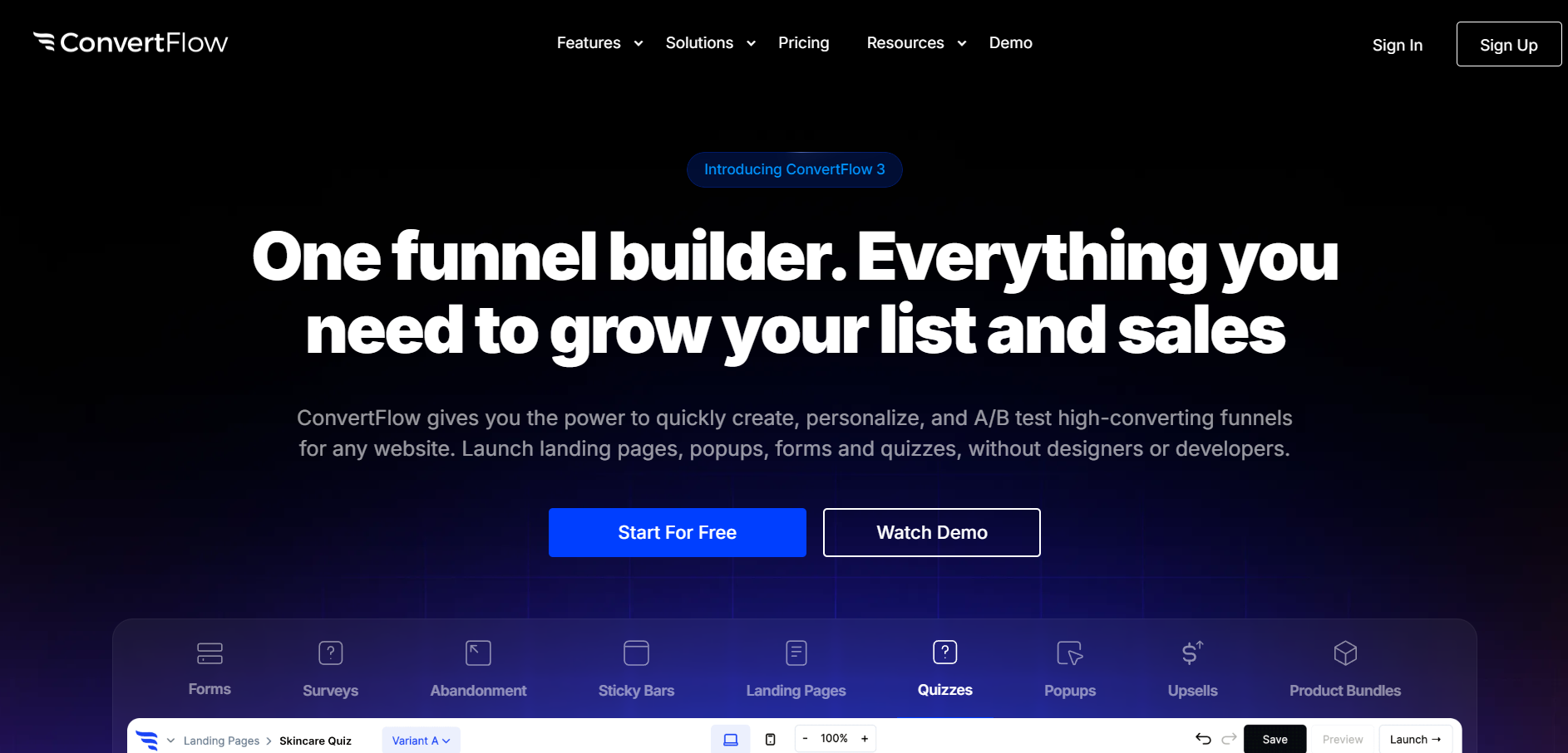
Convertflow is an easy-to-use tool that provides pre-made Black Friday landing page templates, helping you get started quickly.
Moreover, the easy drag-and-drop option allows one to customize without any coding knowledge. The pre-built landing pages are mobile responsive, so you can make sure the landing page looks great on all devices.
Further, it integrates with various tools that make it easier to collect and optimize data to make it more engaging and effective.
2. Leadpages
Leadpages offers a wide range of templates specifically designed for high-converting landing pages.
Its intuitive builder ensures that you can design a page without needing a developer, and it’s a great tool for testing various page designs.
Further, you can add a sense of urgency using countdown timers, rearrange elements with a drag-and-drop editor, and mobile responsive design to ensure a smooth experience on any device.

3. SeedPro
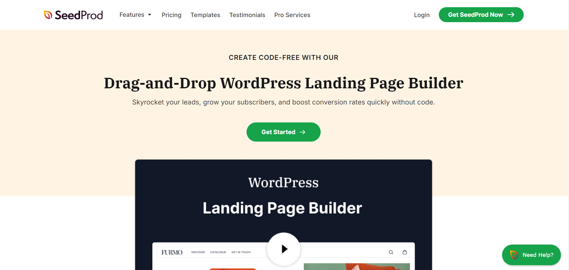
SeedPro is a WordPress Landing Page builder that makes it easy to create stunning Black Friday landing pages with zero coding skills.
Its drag-and-drop editor and conversion-focused templates allow you to build a high-performing page in minutes.
It helps craft mobile-friendly landing pages and functionality for any screen size. Moreover, you can integrate with popular email marketing services, form builders, marketing tools, Zapier, Google Analytics, and SEO plugins.
3 Landing Page Design Flaws That Kill Conversions
Effective Black Friday Landing pages are crucial to drive conversions, but even minor flaws can significantly impact their effectiveness.
Here are 3 common mistakes that can hinder your landing page performance:
1. Cluttered Design: The “Too Much of a Good Thing” Trap
A cluttered design can overwhelm visitors and make it difficult to focus on the most important information.
Too many elements can create a visual noise and distract visitors from the primary message.
You can simplify your design by removing unnecessary elements and prioritizing important information by making it visually prominent.
2. Buried Call to Action: The “Hide-and-Seek” CTA
Visitors who can’t find your CTA easily might not take further action, reducing the chances of conversions.
Prominently place the CTA above the fold, easily visible without scrolling, and use different colors to make it stand out from the other elements.
3. Distracting Navigation: The “Escape Route”
A distracting navigation menu can lead visitors to leave the page before taking the desired action.
A complex navigation structure can make it difficult for visitors to find what they want. Simplify your navigation menu by removing unnecessary links and elements to make navigating easier for the audience.
Here is more: 9 Critical Black Friday Mistakes to Avoid at All Cost
Wrap up
The holiday shopping season is nearby, and people are excited about Black Friday deals.
Creating a high-converting Black Friday landing page requires a mix of eye-catching design, persuasive copy, and a focus on user experience.
By optimizing your web page with compelling offers, social proof, urgency triggers, and seamless navigation, you’ll not only capture attention but also convert visitors into customers.
In today’s competitive online landscape, search engines favor fast, mobile-friendly pages that provide a smooth user experience.
Building a dedicated landing page for online stores is essential to stand out during the high traffic period and boost sales. A great black Friday landing page can make all the difference in your Black Friday marketing strategy.
