If you’re looking to boost the sales of your online store, one metric that should be top of mind is checkout conversion rates.
After all, visitors may browse through your products, add items to their shopping carts, and even get excited about purchasing.
But if they abandon the checkout process, it’s all for nothing.
This blog is all about checkout conversion optimization.
I’ll walk you through 12 proven tactics to increase your checkout conversion rate, ensuring that those potential customers who are ready to buy actually follow through.
Implement these strategies to improve the checkout experience, reduce checkout abandonment, and skyrocket your ecommerce conversions.
Ready to dive in? Let’s get started.

What is Checkout Conversion
Before we jump into the tactics, let’s first define checkout conversion.
In simple terms, it’s the percentage of visitors to your ecommerce store who successfully complete a purchase after reaching the checkout page.
Your checkout conversion rate is the most direct measure of how effective your checkout process optimization is at turning site visitors into paying customers. But why does it matter?
Because the checkout page is the final step in the customer journey.
If this step is too complicated, overwhelming, or doesn’t meet customer expectations, it can lead to checkout abandonment, and research says that 70.19% of shoppers will abandon their carts.
Even if you’re driving traffic and getting people to your store, it means nothing if they don’t complete their purchases.
Improving your checkout conversion means increasing the likelihood of turning a potential customer into a repeat customer—and that is crucial for your customer lifetime value (CLV).
So, let’s look at how you can optimize checkout pages to maximize your chances of completing purchases.
Checkout Conversion Rate Formula
Understanding the formula behind checkout conversion rates is key to tracking success. The basic formula is:
Checkout Conversion Rate = (Completed Checkouts / Shopping Cart Views) x 100
This means that if 100 people visit your checkout flow and 2 of them successfully complete their purchase, your checkout conversion rate is 2%.
Now that we know how to measure success, let’s explore the 12 strategies to improve this number.
1. Use Wisernotify
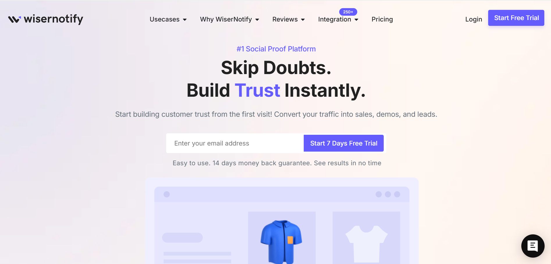
One of the most effective tools for boosting checkout conversion rates is social proof.
Wisernotify is an easy-to-integrate tool that shows real-time activity like recent purchases, sign-ups, and actions by other customers on your site.
This builds trust and encourages site visitors to feel more confident in completing their purchases.
It’s like saying, “Hey, others are buying this too!”—which, for online shoppers, can be the nudge they need to hit “Buy now.”
2. Offer Guest Checkout Option
Not everyone wants to create an account just to make a quick purchase.
A guest checkout option allows customers to quickly enter their payment details without the hassle of creating a password or account.
This is crucial for improving checkout conversion rates, as it removes friction from the checkout process and caters to the convenience-driven preferences of online shoppers.
Plus, it can reduce checkout abandonment from those who simply don’t want to commit to creating an account.
Here is how Allbirds offers guest checkout.

3. Multiple Payment Options
Offering multiple payment options is a game changer for checkout optimization.
Customers have their preferred methods for paying—whether it’s credit cards, PayPal, Google Pay, or even newer options like Buy Now, Pay Later.
If you restrict them to just one or two choices, you’re more likely to see abandoned carts.
The key here is to align your payment options with your audience’s preferences. Ecommerce stores that offer popular options have been shown to experience higher checkout conversion rates.
Allowing your customers to pay with their preferred payment method will boost satisfaction and reduce checkout abandonment.
Here is how public-supply offers express checkout with multiple payment options.

Here is how Nice Laundry offers customers a buy now, pay later option to increase their chances of buying.

4. Display Trust Signals
Your checkout page is the final moment to assure online shoppers that their payment information is secure.
Displaying security badges and trust signals like SSL certificates, secure payment gateways, and customer satisfaction guarantees can dramatically improve confidence.
If customers feel safe entering their payment details, they’re more likely to complete their purchase online.
Make it clear that you prioritize security, and customer experience will improve.
Here is how UGG shows on their checkout pages:

And even wallpaper showing on their checkout assures the customers of buying confidently.

5. Transparent Cost
One of the biggest reasons for checkout abandonment is hidden or unexpected fees—especially unexpected shipping costs.
Be transparent about the total cost early in the checkout process.
Online retailers who show shipping fees upfront often see higher conversion rates, because customers appreciate knowing the total price before they’re too deep in the process.
Offering free shipping can also be an attractive option to encourage customers to proceed through the checkout procedure.
You can see in Dr. Squatch’s example below that they clearly show the total price and free shipping offer for a $55$ order value, and below the price, they charge the shipping costs. That’s how transparent pricing works.

6. Offer Countdown Timers
Creating a sense of urgency can push your potential customers to complete their purchases.
Use countdown timers to show limited-time offers or to display a special discount that expires soon.
This creates a fear of missing out (FOMO), encouraging customers to act fast.
For your understanding, the checkout customizer example below offers a limited-time deal with a coupon code and countdown timer that urges you to buy, not to leave.

You can use Wisernotify to create countdown timers with even more customizations, designs, and advanced analytics.
Here is what we offer: 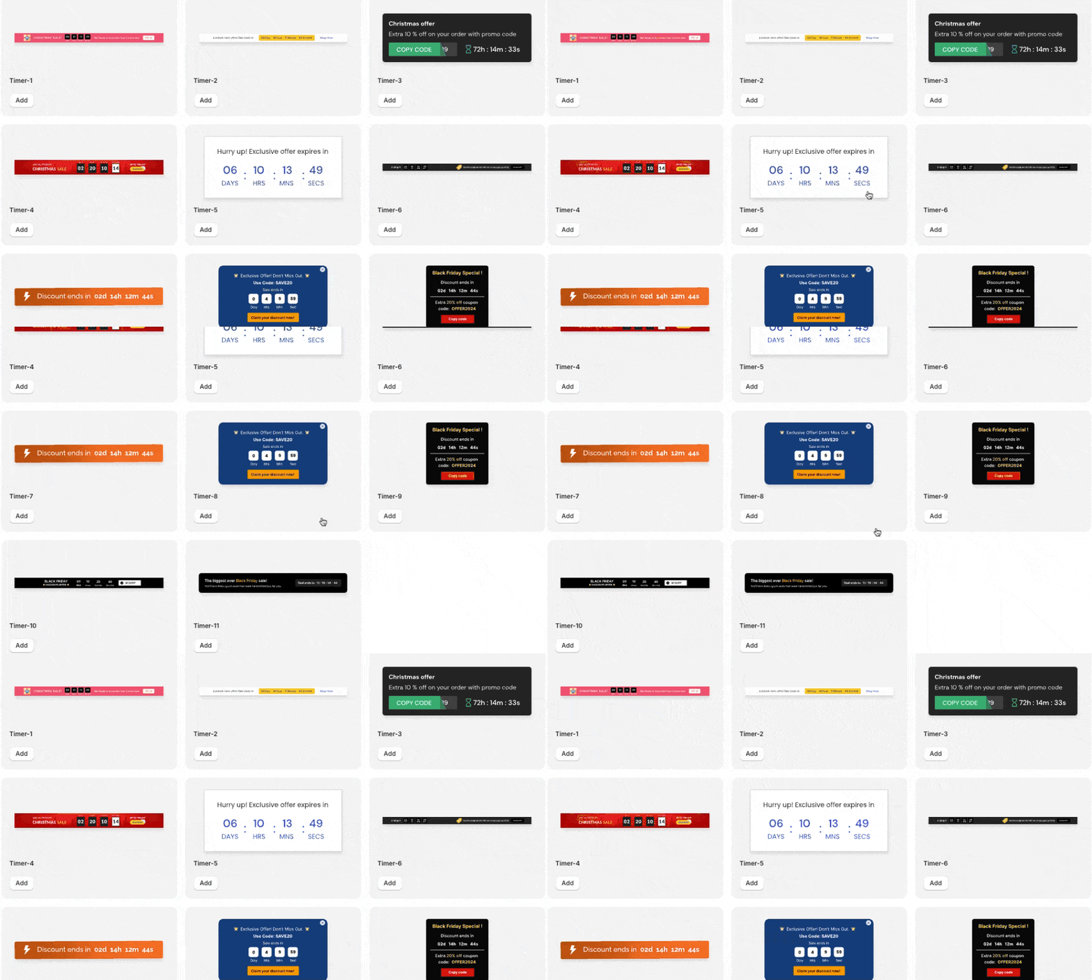
7. Retarget Abandoned Carts
Even with the best checkout optimization strategies, some customers will still abandon their carts. This is where retargeting comes in.
Use email marketing or retargeting ads to remind customers of their abandoned carts and offer incentives, such as a discount or free shipping, to complete their purchase.
A well-timed reminder can bring back site visitors who were on the fence, helping reduce checkout abandonment.
Here is an excellent example of an abandoned cart email from Beauty Bay.

Here is a slightly different example of a retargeting ad from Colehaan.

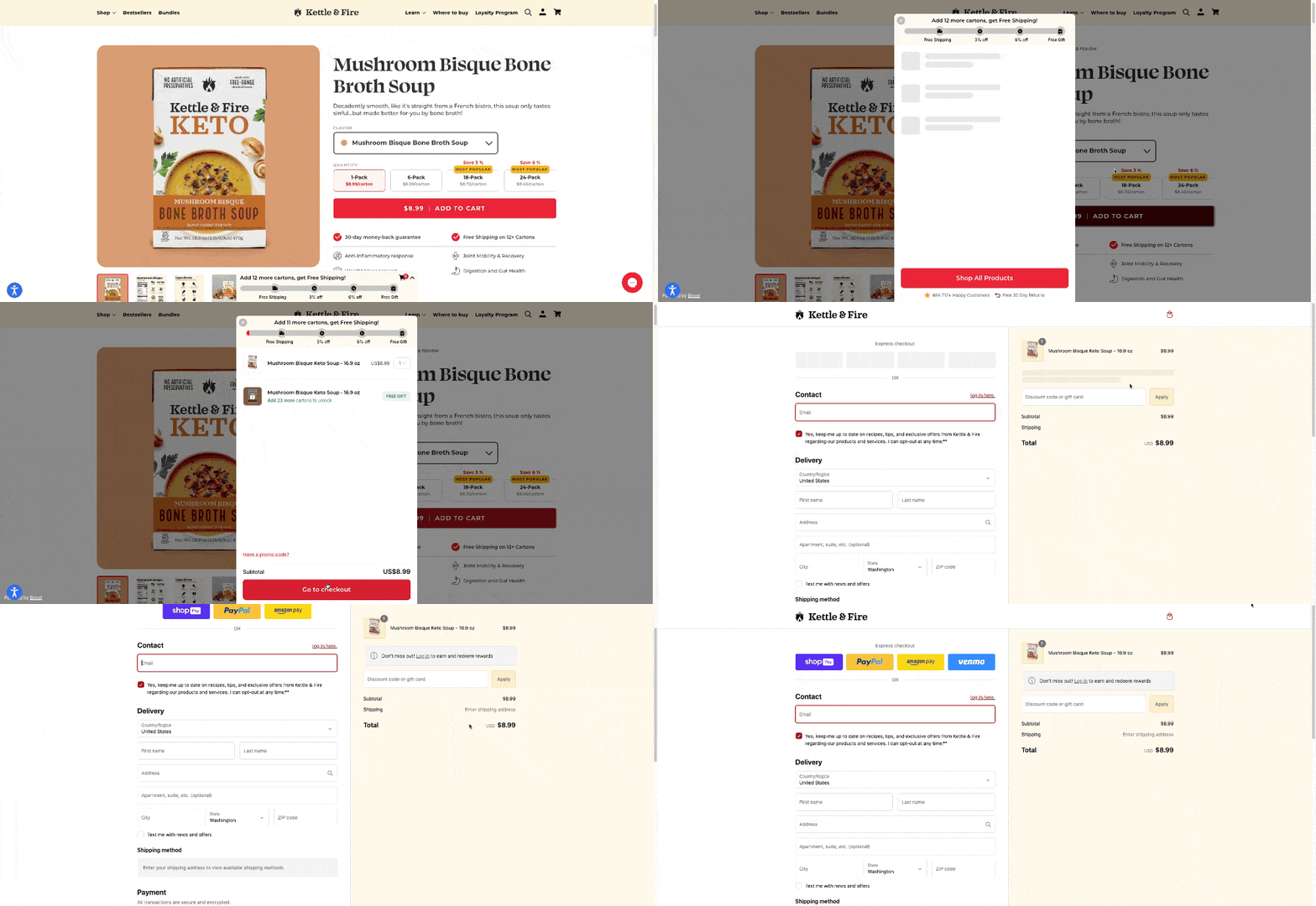
8. Reduce Checkout Friction
The key to a good checkout page is simplicity. Reduce any unnecessary steps, fields, or requests.
For instance, if you have a multi-page checkout, consider switching to a single page checkout.
The fewer clicks required, the better. Every extra step in the checkout process adds to the chance of losing a paying customer.
Test your checkout flow to ensure it’s as smooth and intuitive as possible.
Here is how buying a product from Kettle & Fire is simple and frictionless.
9. Use Google auto-address
Google auto-address is a feature that automatically populates the billing address for customers based on their location.
This can save time during checkout and help avoid errors that could lead to checkout abandonment.
By speeding up the checkout procedure and reducing friction, you’ll see an increase in checkout completion rates.
Here is how kitchen korner uses it.

10. Mobile-Friendly Design
More and more online shoppers are purchasing via mobile devices.
If your checkout pages aren’t mobile-friendly, you’re likely losing out on sales.
A mobile-optimized checkout ensures a smooth and easy checkout process on any device.
Ensure that your buttons are large enough to tap, forms are easy to fill out, and the entire checkout experience is seamless across mobile platforms.
Here is what the Sephora checkout page looks like on mobile devices.

11. Cross-Sell and Upsell
Cross-selling and upselling can increase your average order value, which directly impacts your conversion rate.
Offer complementary products or upgrade options during the checkout process.
For instance, if a customer is buying a camera, suggest a camera bag or additional lenses.
When done right, these strategies improve checkout conversion rates while also boosting your revenue per customer.
Here is how Jeffreestar cosmetics uses upselling and cross selling on their ecommerce site.

12. Offer Samples
Offering samples can entice customers who are hesitant to buy.
Whether it’s a sample size of a product or a small add-on item, including samples in the checkout process can increase the likelihood of a complete purchase.
This works particularly well for businesses that sell consumables or items that customers want to try before committing to a larger purchase.
Here is an excellent example of how you should offer samples:

Over to You
Improving your checkout conversion isn’t a one-time task—it’s an ongoing process.
Applying these strategies and continually optimizing your checkout experience will increase your chances of turning online shoppers into paying customers.
So, what will you do next?
Start implementing these tactics, measure their impact, and watch your conversion rates soar.
