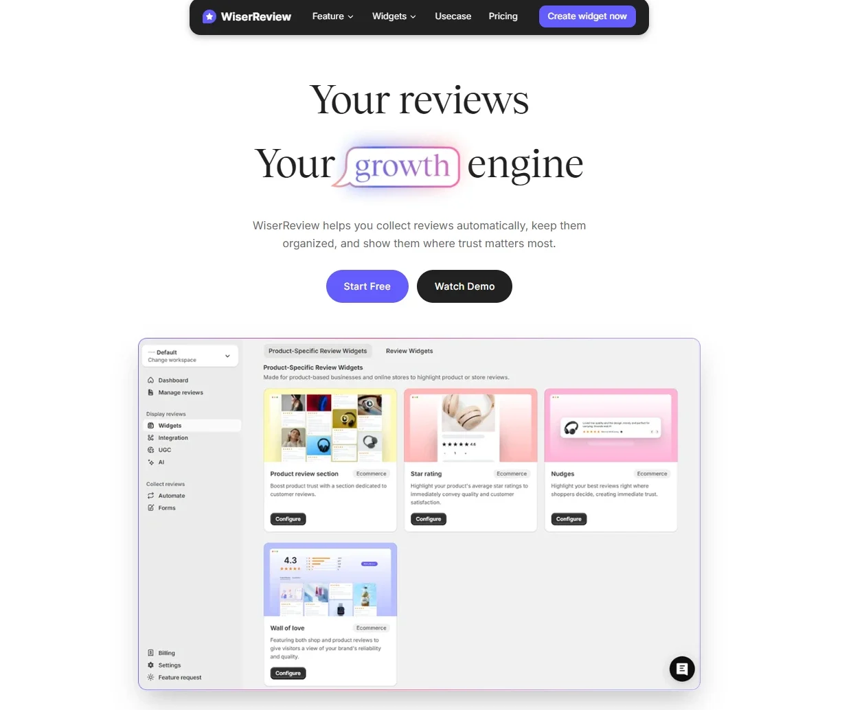
How to Add a Review Carousel to Your Website (2026)
 Krunal Vaghasiya|Sep 23, 2024
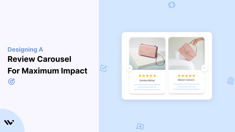
I’ve helped over 400 store owners set up review displays on their websites. And the one format that consistently outperforms everything else? The review carousel.
Not a static wall of text. Not a screenshot of a Google listing. A clean, rotating display of real customer feedback, placed exactly where buyers hesitate most.
According to recent online review statistics, 93% of shoppers read reviews before making a purchase.
But here’s what most businesses get wrong: they bury those reviews at the bottom of the page where nobody scrolls.
A review carousel fixes that. It puts your best social proof front and center, in a compact format that works on any device.
In this guide, I’ll walk you through what a review carousel actually is, where to place it for maximum conversions, how to set one up in minutes, and which tools are worth your time in 2026.
What Is a Review Carousel?
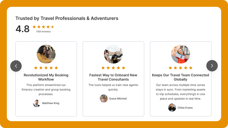
A review carousel is a rotating widget on your website that displays customer reviews one at a time (or a few at a time) inside a fixed space. Think of it like a slideshow, but for customer feedback.
Visitors either click arrows to browse, or the carousel auto-scrolls through reviews. Either way, you’re showing multiple testimonials without eating up your entire page layout.
A typical review carousel includes the customer’s name, their star rating, a short snippet of review text, and sometimes a profile photo. Some advanced setups also pull in photo or video reviews.
The beauty of this format lies in its simplicity. You can drop one on a homepage, a product page, or a landing page, and it blends right in. It doesn’t stretch your layout. It doesn’t look cluttered.
And if you pick the right tool, setup takes about five minutes. No coding required.
Not sure whether you need testimonials, reviews, or both? Here’s a breakdown of testimonials vs reviews and when to use each.
Why Review Carousels Actually Work (With Data)
I’ve seen store owners add a review carousel near their pricing section and watch conversion rates jump within a week. It’s not magic. It’s just psychology.
Here’s why they work so well:
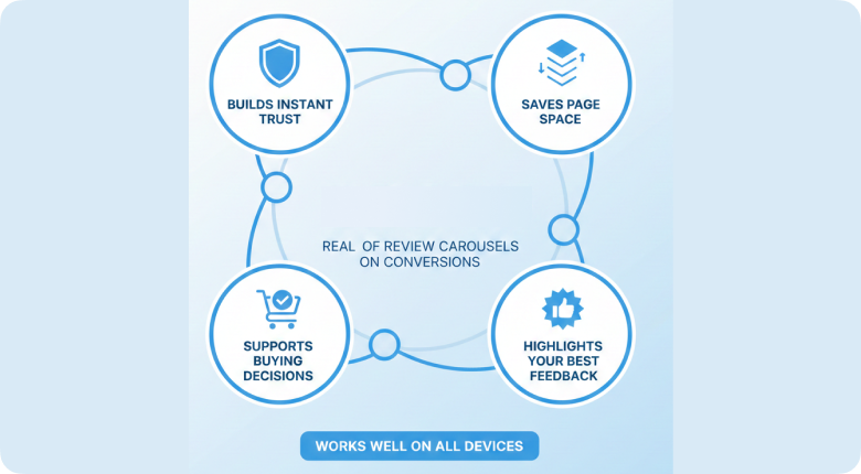
They Build Trust in Seconds
When someone lands on your site for the first time, they’re skeptical. That’s normal. A carousel of real reviews from real customers answers the question “Can I trust this company?” before they even think to ask it.
According to a 2025 BrightLocal survey, 88% of consumers trust online reviews as much as personal recommendations. That’s a powerful stat. And a review carousel puts that trust directly in front of your visitors, right when they need it.
They Save Valuable Page Space
A long list of 20 reviews makes your page look heavy. Nobody wants to scroll through a wall of text.
A carousel condenses all of that into one clean section. It shows 1 to 3 reviews at a time, rotates through the rest, and keeps your layout focused.
I’ve tested both formats on client stores. The carousel consistently wins at engagement because it doesn’t overwhelm visitors.
They Reduce Buyer Hesitation
The moment right before someone clicks “Buy Now” is the most fragile moment in the entire sales process. Any doubt, and they bounce.
When a review carousel sits right next to that button (and shows 5-star feedback from happy customers), it acts like a final nudge.
I’ve seen testimonial placement near CTAs reduce cart abandonment by double digits in some stores.
They Highlight Your Strongest Feedback
Most carousel tools let you hand-pick which reviews to display. That means you’re not showing random 3-star feedback. You’re curating a highlight reel of your best customer experiences.
You control the narrative. Show product-specific feedback on product pages. Show service-quality reviews on your homepage. Show results-driven testimonials on your pricing page.
7 Best Places to Display a Review Carousel
Placement matters more than design. I’ve seen beautifully designed carousels perform terribly because they were buried in the wrong spot.
Here are the seven locations that consistently drive the most conversions, based on my testing across hundreds of stores.
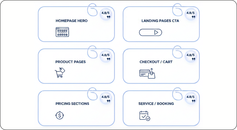
1. Below the Hero Section on Your Homepage
Your homepage hero creates the first impression. The review carousel right below it delivers the first proof.
When a visitor lands on your site, the first question in their head is: “Is this legit?” Three to six short, high-rated reviews answer that within seconds.
Keep the reviews short here. Focus on star ratings and brief quotes. Don’t put long paragraphs in your homepage carousel.
2. Near Product Details on Product Pages
Product pages are where the real buying decisions happen. Your visitor is reading features, comparing specs, and checking prices.
A review carousel placed near the product description (or just below the feature list) connects your claims with real customer experiences. If your product promises fast shipping, show a review that says “Got it in 2 days.”
This is one of the highest-converting placements I’ve tested. If you’re running an ecommerce store, optimizing your product and landing pages with review carousels should be priority number one.
3. Right Next to Pricing
Pricing sections create doubt. That’s where objections live.
“Is this worth it?” “Can I get this cheaper somewhere else?” “What if it doesn’t work?”
A carousel of happy customers, right above or below the pricing tables, quiets all those voices. I’ve seen SaaS companies and high-ticket ecommerce brands both benefit from this placement.
4. Before the CTA on Landing Pages
Landing pages have one job: get the visitor to take action. Every section builds toward that moment.
Placing a review carousel just before the main call-to-action button creates a smooth flow: value explanation, then proof, then action. It’s a pattern that works for both lead-gen and direct-sales pages.
If you’re working on your landing page conversion rates, this single change can move the needle.
5. On Checkout and Cart Pages
Checkout pages are sensitive. Even a tiny doubt leads to cart abandonment.
A small, compact review carousel near the order summary can reassure buyers at the last moment.
Keep it minimal, though. Short reviews, clear star ratings, and a clean layout. You don’t want to distract from the checkout flow.
6. On Service or Booking Pages
If you sell services (consulting, agencies, SaaS demos, local services), your booking page is your money page. Prospects want proof of results before they commit.
Place the carousel near the booking form or consultation request. Show reviews that mention outcomes: “Increased our reviews by 3x in the first month” or “Setup took 10 minutes.”
7. In Your Blog Sidebar or Footer
This one’s underrated. Blog visitors are top-of-funnel, meaning they don’t yet know your product.
A subtle review carousel in the sidebar or footer introduces social proof without being pushy.
It plants a seed. They read your content, notice real customer feedback in the sidebar, and that builds familiarity.
Review Carousel Tools Compared (2026)
Not all review carousel tools are the same. Some are built for enterprise ecommerce. Others work better for small businesses and local shops. I’ve tested the most popular options, and here’s how they stack up.
| Tool | Best For | Starting Price | Key Feature | Free Plan? |
|---|---|---|---|---|
| WiserReview | Ecommerce stores (any platform) | Free forever plan | Photo/video reviews + full design control | Yes |
| Elfsight | Websites needing multi-platform widgets | Free (limited) | 7 layout options (carousel, grid, masonry) | Yes (branded) |
| EmbedSocial | Google review displays | $29/mo | Auto-sync with Google, Facebook | No |
| Yotpo | Enterprise ecommerce | Free (basic) | AI sorting + UGC galleries | Yes (basic) |
| Reviews Carousel (WP Plugin) | WordPress blogs and small sites | Free | Simple carousel with admin submissions | Yes |
If you’re running an ecommerce store on Shopify, WooCommerce, or BigCommerce, WiserReview gives you the most control over design and lets you collect photo and video reviews without paying extra. The free plan is genuinely usable (not a stripped-down teaser).
For WordPress blogs that just want to embed Google reviews, Elfsight or the Reviews Carousel plugin works fine. But you’ll hit limitations quickly if you need customization or review-collection features.
How to Add a Review Carousel with WiserReview (Step by Step)
I’ll walk you through this with WiserReview since it’s the tool I know best (full disclosure: it’s our product). The whole process takes about 5 minutes.
Step 1: Create your account
Sign up for WiserReview (the free plan works for this). Once you’re in, head to your dashboard.
Step 2: Open the Widgets section
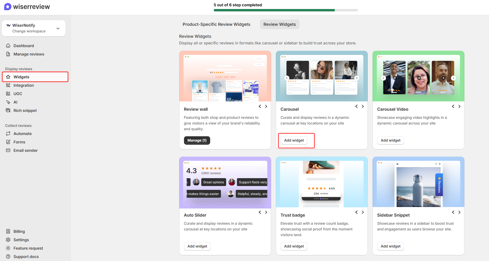
Go to Widgets in the left menu. Select the Review Carousel widget type. You’ll see a preview right away.
Step 3: Customize the design
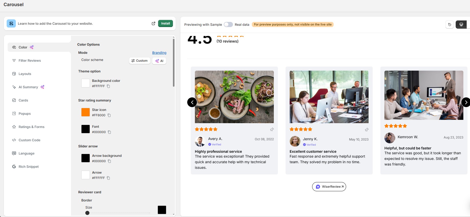
Pick the reviews you want to feature. Adjust the star style, card layout, colors, and spacing to match your brand.
My advice? Keep it simple. Clean backgrounds, readable fonts, and enough spacing so it doesn’t feel cramped. The reviews should be the star here, not the design.
Step 4: Grab the embed code
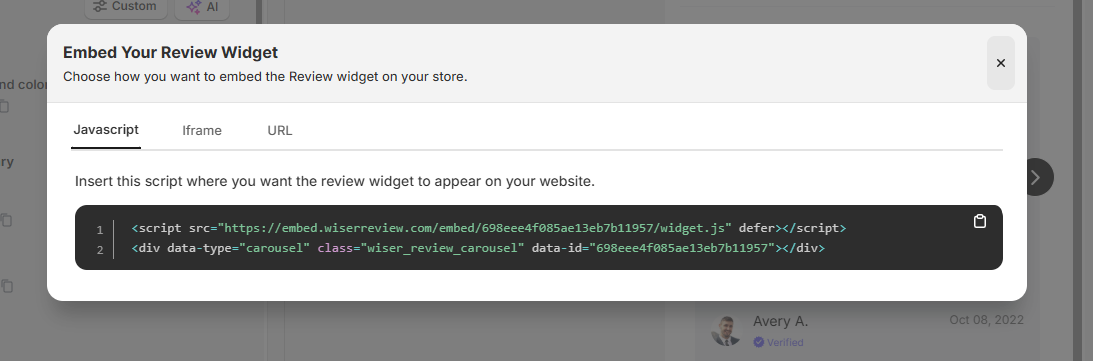
Once you’re happy with the look, WiserReview generates a small JavaScript snippet. Copy it.
Step 5: Paste it on your website
Add the code wherever you want the carousel to appear. Best spots include below your hero section, near product details, above pricing tables, or close to your main call-to-action button.
Save and publish the page.
Step 6: Test on mobile and desktop
Open your page on both a phone and a computer. Make sure the carousel loads quickly, scrolls smoothly, and doesn’t break your layout. WiserReview carousels are responsive by default, but it’s always worth a quick check.
Here’s a quick video walkthrough of the entire process:
Design Tips That Actually Increase Clicks
Setting up a carousel is the easy part. Making it convert? That takes a bit more thought.
After testing dozens of carousel configurations, here’s what I’ve learned actually moves the needle:
Show star ratings prominently. Stars are visual shorthand for quality. A 2024 Spiegel Research Center study found that displaying ratings can increase conversion rates by up to 270%. Make those stars big and visible.
Include customer photos when possible. Reviews with photos feel more real. User-generated content (photos, videos, screenshots) builds authenticity that plain text can’t match. If your review tool supports photo reviews, use them.
Keep review text short. Nobody reads a 200-word review in a carousel. Trim or select reviews that get to the point in 1 to 2 sentences. “Best purchase I’ve made this year. Shipping was fast, and quality exceeded expectations.” That’s all you need.
Don’t auto-rotate too fast. I’ve seen carousels that switch every 2 seconds. That’s too fast to read anything. Set your rotation to 5-7 seconds, or, better yet, let users control the scrolling manually.
Match your brand colors. A carousel that clashes with your site design looks like a third-party ad. Customize backgrounds, text colors, and borders so the widget feels native to your page.
Test the mobile separately. Over 60% of ecommerce traffic comes from mobile devices. If your carousel looks great on desktop but is cramped or broken on mobile, you’re losing the majority of your audience.
Mistakes I See Businesses Make with Review Carousels
I’ve audited hundreds of websites that use review displays. Here are the most common mistakes I see (and they’re all easy to fix).
Using obviously fake reviews. “This is the best product in the world! 5 stars! I love everything about it!” Nobody talks like that. Visitors can spot fake reviews instantly, and it destroys trust instead of building it. Always use verified, authentic feedback.
Putting the carousel in the wrong spot. A review carousel at the very bottom of the page, below the footer? That’s where content goes to die. Place it near a decision point: pricing, CTA button, or product details.
Showing too many reviews at once. Three cards visible at a time is the sweet spot for the desktop. On mobile, one card at a time works best. More than that, and it feels cluttered.
Never updating the reviews. If your carousel still shows feedback from 2022, visitors will wonder if anyone has bought from you recently. Rotate in fresh reviews every few months.
Ignoring Google reviews. If your business has strong Google reviews, pull them into your carousel. Google reviews carry extra credibility because customers know those are harder to fake.
Looking at how other businesses build trust effectively? Our roundup of FOMO marketing examples shows some creative approaches worth studying.
Google Review Carousels in Search Results
You might have noticed that Google sometimes shows a “review carousel” directly in search results, with snippets of reviews from Google Business Profiles, Yelp, and other platforms.
This is different from the carousel you put on your website. Google’s version automatically pulls from public review platforms. You can’t control exactly which reviews appear there.
But here’s the connection: having a strong Google Business Profile with lots of positive reviews increases your chances of appearing in that search carousel.
And when prospects click through to your site, your own review carousel reinforces the trust they’ve already built in the search results.
It creates a consistent experience. Positive reviews in Google search, followed by positive reviews on your website. That double exposure can be the difference between a bounce and a conversion.
Start Getting More Conversions Today
A review carousel is one of the simplest changes you can make to your website, and one of the most impactful.
Put it near pricing, product details, or your main CTA. Curate your best reviews. Keep the design clean. And test it on mobile.
That’s it. No complicated funnel redesign. No expensive agency. Just your real customers doing the selling for you.
If you want the fastest path from “zero carousel” to “live on your site,” WiserReview’s free plan gets you there in about five minutes. Worth a try.
Krunal Vaghasiya is a marketing tech expert who boosts e-commerce conversion rates with automated social proof and FOMO strategies. He loves to keep posting insightful posts on online marketing software, marketing automations, and improving conversion rates.