An excellent product page is essential because it’s where potential customers decide whether to purchase or walk away. The key to success lies in optimizing every aspect of your product page to create an inviting, trustworthy, and persuasive experience.
A shopper stumbles upon your product page, curious but undecided. They glance at the title, skim through the description, scroll down, and…click away. You’ve just lost a potential customer. Why? Because your product page didn’t cut.
In this guide, find the 15 best product page optimization strategies for success.
Let’s dive in and create product pages that attract delight and convert customers!
15 Core Elements of Product Page Optimization
Here are the proven tactics to implement in your next campaign.
1. Interesting Product Descriptions and Title
Your product titles and descriptions are the first things customers notice on your product page. They serve two purposes: capturing attention and conveying value.
A compelling title grabs the shopper’s interest, while an engaging description communicates why the product is perfect for them. These elements also play a critical role in SEO, helping your product pages rank higher on search engines.
An excellent product title and description are your digital sales pitch. They grab attention, provide essential details, and inspire customers to take action.
Also check: 12 Best Product Description Examples I’d Steal (2026)
Best Practices for Titles and Descriptions
- Titles should be concise and descriptive and include primary keywords naturally. For example, “Eco-Friendly Stainless Steel Water Bottle – BPA-Free and Durable.”
- Beyond technical specs; highlight how the product solves problems or enhances the buyer’s life.
- Using power words like “exclusive,” “premium,” or “limited edition” can create excitement.
- Include your primary keyword in the title and sprinkle secondary keywords in the description.
Example
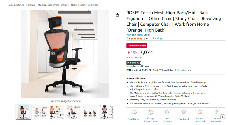
Title: “Ergonomic Office Chair – Adjustable, Breathable, and Designed for All-Day Comfort”
Description: “Transform your workspace with our ergonomic office chair. Designed for all-day comfort, it features adjustable height, breathable mesh, and lumbar support to reduce back strain. Perfect for professionals, students, and anyone working long hours. Available in sleek black and gray finishes to match any decor.”Here is more: I Reviewed 15 Product Page Examples (Top Choices for 2025)
2. Clear and Strategic Placement of CTA Buttons
Call-to-action (CTA) buttons act as guideposts for customers, leading them through their shopping journey. Clear and strategic placement of CTA buttons on product pages enhances the customer journey by making it intuitive and hassle-free.
By ensuring visibility, accessibility, and trust, you can guide customers effortlessly through the buying process, improving satisfaction and encouraging purchases.
Best Practices for CTA Buttons
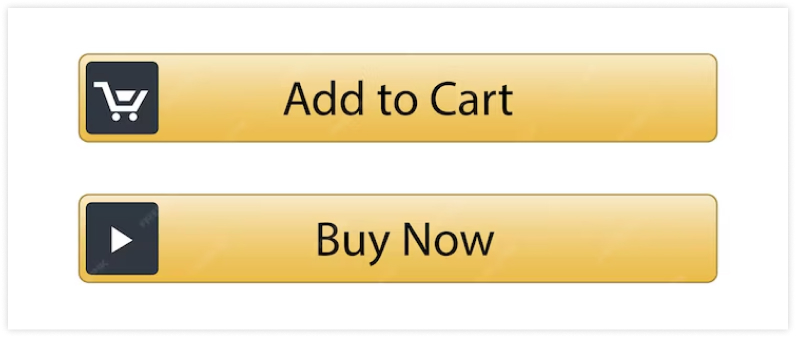
- Use clear, actionable text CTAs like “Buy Now,” “Add to Cart,” or “Get Yours Today” are straightforward and persuasive.
- Strategic Placement positions CTAs above the fold, near key information like product descriptions or pricing.
- Design for visibility uses contrasting colors and ensures buttons are large enough to click, especially on mobile devices.
3. Add Trust Signals on Product Page
Online shoppers often hesitate to make purchases due to the lack of physical interaction with products or sellers. Trust signals are vital for overcoming this uncertainty. They reassure customers about the product’s quality, your brand’s credibility, and the security of their purchase.
Adding trust signals enhances conversions and improves your product page’s SEO performance by reducing bounce rates and building user trust.
Trust signals on your product pages will boost conversions and foster long-term customer loyalty. Trust is the foundation of any successful e-commerce strategy—make it a priority on your product pages!
Key Trust Signals to Add On Product Page
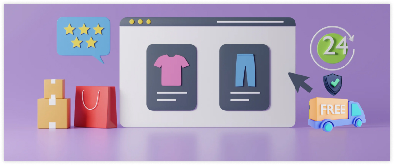
- Customer Reviews and Ratings: Display prominently near the product description; star ratings and UGC build confidence.
- Security Badges: Highlight SSL certification, payment security logos (e.g., PayPal Verified), and trust seals near CTAs.
- Money-Back Guarantees: Offer clear, risk-free guarantees like “30-Day Money-Back – No Questions Asked.”
- Shipping Transparency: Provide delivery timelines, free shipping offers, and tracking options.
- Verified Buyer Labels: Mark reviews as “Verified Purchase” to enhance authenticity.
- Media Mentions and Logos: Showcase endorsements, partner logos, or recognitions like “As Seen In [Media Name].”
Placement Tips
- Position trust signals near CTAs, product descriptions, and checkout areas.
- Use A/B testing to determine the most effective trust signals for your audience.
4. Use High-Quality Visuals and Videos
In online shopping, customers can’t touch or try your products. That’s why visuals and videos are critical—they’re the closest your customers will get to experiencing your product before buying.
Top-quality images and engaging videos help build trust, showcase details, and provide an immersive shopping experience, leading to higher conversions and reduced returns.
Shoppers rely heavily on visuals to assess product quality. Optimized images and videos enhance user experience and reduce return rates.
Best Practices for Product Photography
- Show all sides of the product to provide a comprehensive view.
- Enable users to zoom in for close-up details.
- Show the product in use to help customers visualize its functionality.
For Product Videos
- Demonstrating use videos are excellent for showcasing how a product works.
- A 360-degree view or demo video builds trust and reduces uncertainty.
- Videos increase dwell time on product pages, which can improve SEO rankings.
Also see: 33 Brilliant Shopping Cart Page Design Examples
4. A/B Testing
Why It’s Important?
Nowadays, assumptions about what works on your product page can lead to missed opportunities. A/B testing eliminates guesswork by comparing two versions of a page element (e.g., button color, image placement, or headline) to determine which performs better.
Systematically testing and optimizing your product pages can improve conversions, enhance user experience, and boost sales.
A/B testing is an invaluable tool for optimizing product pages. By systematically testing and analyzing changes, you can make data-driven decisions that enhance user experience, boost SEO performance, and increase conversions. Start small, focus on one element at a time, and let the data guide you to a more effective product page.
What to Test on Product Pages
- CTA Buttons: Text (e.g., “Buy Now” vs. “Add to Cart”), colors, size, and placement.
- Product Titles: Short vs. detailed, keywords vs. emotional triggers, unique selling points.
- Product Images: Lifestyle vs. plain, multiple angles, 360-degree views.
- Descriptions: Bullet points vs. paragraphs, short vs. detailed, informative vs. conversational tone.
- Pricing: Discounts (e.g., “Save 20%”) vs. just the price, styling, free shipping messaging.
- Trust Signals: Placement of badges, reviews, and guarantees.
- Page Layout: Tabbed details vs. continuous scrolling, review placement.
- Videos: Demos vs. lifestyle, auto-play vs. click-to-play, short vs. detailed.
- Shipping Info: Free shipping vs. fast delivery, placement (near price vs. dedicated section).
- UGC: Customer photos/videos vs. professional shots, positioning.
- Social Proof: “X people viewing” vs. “Y recently purchased,” placement.
- Urgency Triggers: Countdown timers, low-stock alerts.
- Color Options: Dropdowns vs. swatches with images.
- Checkout: Guest checkout vs. account required, number of steps.
Example of an A/B Test for Product Pages
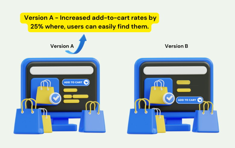
Scenario: Testing CTA Button Placement
- Version A: “Add to Cart” button placed above the fold near the product title.
- Version B: “Add to Cart” button placed below the product description.
- Result: Version A increased add-to-cart rates by 25%, proving the importance of placing CTAs where users can easily find them
5. Do the Best SEO for Product Pages
Your product pages are your digital salespeople—working 24/7 to showcase what you offer. However, to attract potential customers, these pages must first be visible on search engine results pages where people search for products. That’s where SEO (Search Engine Optimization) plays a crucial role.
SEO ensures your product pages are easily discoverable by search engines and rank higher in search results. Effective optimization drives organic traffic to your product pages, enhances user engagement, and boosts sales.
So, doing the best SEO is crucial!
Use SEO Strategies for Product Pages
- Keyword research involves identifying primary and long-tail keywords (e.g., “sleek black ankle boots”) that effectively target search intent.
- Image SEO includes using descriptive file names, keyword-rich alt text, and compressing images for faster loading.
- Writing unique descriptions avoids duplicate content by focusing on original, benefit-driven text with naturally integrated keywords.
- Using structure data markup helps enhance search results by enabling rich snippets like price, ratings, and availability.
- Mobile optimization ensures pages are responsive, fast-loading, and easy to navigate.
- Improving page speed involves compressing images, using lazy loading, and optimizing code for quicker load times.
- Adding internal links connects related products or content, such as blogs, to guide users and improve navigation.
- Highlighting customer reviews builds trust and boosts visibility by showcasing reviews and ratings with schema markup.
- Creating clean URLs ensures URLs are simple, readable, and keyword-rich (e.g., “example.com/black-leather-handbag”).
Build trust & FOMO
Highlight real-time activities like reviews, sales & sign-ups.
6. FAQs & Shipping Details

A successful product page does more than showcase a product—it answers questions, sets clear expectations, and builds customer confidence. Including a best-created FAQ section and detailed shipping information directly on your product page addresses buyer concerns, improves the user experience, and ultimately drives sales.
These elements also optimize your product page by keeping visitors engaged and reducing cart abandonment.
A robust FAQ section and transparent shipping details on your product page will improve customer satisfaction and optimize the product page. These elements create a seamless shopping experience that converts hesitant visitors into confident buyers.
- Answer essential questions, including details about sizing, materials, care instructions, and product-specific concerns.
- Show costs highlight fees or free shipping offers upfront.
- Provide delivery times and specify estimated delivery dates and processing times.
- Include tracking options to let customers know how they can track their orders.
7. Cross-Sell and Upsell Related Products
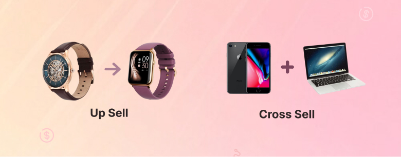
Cross-selling and upselling are proven techniques for boosting sales and increasing average order value (AOV). More than just driving revenue, these strategies create a more engaging and helpful shopping experience by showcasing relevant or upgraded products that complement a customer’s purchase.
Think of it as offering helpful suggestions, like a friend recommending something that pairs well with what you’re already buying.
When done thoughtfully, cross-selling and upselling enhance the shopping experience by helping customers find the right solutions for their needs. Focus on relevance, simplicity, and value to ensure these strategies are helpful guides rather than sales pushes.
How to Incorporate Cross-Sell and Upsell Techniques on Product Pages
- Add “Frequently Bought Together” sections, a curated selection of items customers commonly purchase together.
- Showcase “You May Also Like” or “Similar Items”: Offer products related to the main item the customer is viewing.
- Highlight Upgrade Options: Present upsell suggestions that highlight the added value of the premium product.
- Leverage Personalized Recommendations: Use AI or browsing history to recommend items tailored to the customer’s interests or previous purchases.
- Include Cross-Sell Items in the Cart. During checko-ut, suggest additional items the customer may find useful.
Read More About This Topic : Top 14 Upselling Statistics & Cross-Selling Statistics
8. Improving User Experience / Page Layout and Design
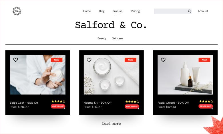
A product page’s layout and design are critical to its success. A well-designed product page makes it easy for customers to find the information they need, explore the product, and confidently purchase. A cluttered, confusing, or poorly structured layout can drive customers away, resulting in lost sales.
A clean, intuitive layout, responsive design, and strategic element placement can transform a basic product page into a high-converting one.
- Keep the Layout Simple Organize content into clear sections (images, descriptions, reviews) with proper spacing.
- Highlight Key Information Place the product name, price, and “Add to Cart” button above the fold.
- Use High-Quality Visuals Include multiple angles, zoom options, and demo videos to showcase the product.
- Ensure Easy Navigation Add breadcrumbs and clear menus to help users move around easily.
9. Fast Product Page Speed
Why Fast Page Speed is Crucial for Product Pages?
Speed is everything when it comes to e-commerce. A slow-loading product page frustrates customers, increases bounce rates, and reduces conversions. Studies show that 40% of users abandon a website if it takes more than 3 seconds to load. Moreover, fast page speed improves the shopping experience and boosts SEO, as search engines prioritize faster sites in rankings.
Fast product page speed is essential for a smooth shopping experience. By optimizing images, minimizing scripts, minimizing server requests by combining CSS and JavaScript files and using tools like CDNs and caching, you can ensure your product pages load quickly, keeping customers engaged and improving your sales.
10. One-Click Purchases and Guest Checkout
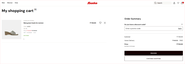
Why One-Click Purchases and Guest Checkout Matter
Shoppers want convenience. Lengthy checkout processes or mandatory account creation often lead to cart abandonment. By offering one-click purchases and a guest checkout option, you streamline the buying process, making it easier for customers to complete their purchases quickly and without frustration.
You can enhance customer satisfaction and reduce cart abandonment by simplifying the buying process and eliminating unnecessary barriers. These features turn a good product page into an excellent one.
Best Practices:
- Allow checkout without account creation
- Use autofill features
- Enable one-click purchases for returning users.
- Offer guest checkout to remove barriers for first-time buyers.
- Support multiple payment options, including digital wallets like PayPal and Apple Pay.
- Display a progress bar for multi-step checkout processes to keep customers informed.
Build trust & FOMO
Highlight real-time activities like reviews, sales & sign-ups.
11. Use Social Proof
Why Social Proof is Essential for Product Pages?
Social proof leverages the power of community influence to build trust and confidence in your products. When potential customers see that others have purchased, used, and loved your product, they are more likely to follow suit. Social proof on your product page enhances credibility, reassures hesitant buyers, and encourages conversions.
Best Practices:
- Customer reviews and ratings display average ratings and customer feedback near the product title or price. Users can sort reviews by relevance.
- User-Generated Content (UGC) Feature customer photos or videos showcasing your product in real-life use. Encourage sharing via social media.
- Expert or Influencer endorsements highlight recommendations from trusted experts or media outlets to boost credibility.
- Use sales notifications, such as live updates, like “5 people purchased this item in the last hour,” to build trust with buyers.
- Use trust badges and certifications Add “Verified Buyer” tags or secure payment icons to reinforce trust.
12. Using Urgency and Scarcity On the Product Page
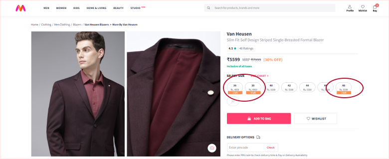
Urgency and scarcity tap into the psychological principle of FOMO (Fear of Missing Out). When customers feel a product is limited or only available for a short time, they’re more likely to act quickly to secure their purchase. These tactics create a sense of immediacy and encourage customers to complete their transactions without delay.
When applied honestly and thoughtfully, these tactics create an engaging and compelling shopping experience that drives results.
Best Practices:
- Highlight limited quantities, e.g., “Only 3 left in stock!”
- Use countdown timers for flash sales or special promotions.
- Emphasize urgency with phrases like “Offer ends tonight.”
13. Include Detailed Shipping and Return Information

Clear shipping and return policies are key to building customer trust and confidence. Shoppers want to know exactly when they’ll receive their product, how much shipping will cost, and what to do if they need to return or exchange the item. Transparent, detailed information reduces uncertainty, prevents cart abandonment, and enhances the shopping experience.
Make your policies customer-centric. Instead of focusing solely on your terms, frame the information in a way that highlights the convenience for customers. For example, instead of saying, “Returns must be made within 30 days,” say, “Enjoy a hassle-free return policy within 30 days of your purchase.”
When customers know exactly what to expect, they’ll feel more confident about buying from your store! Customers appreciate clarity and convenience, making this a critical step in optimizing your product pages for success.
14. Provide Live Chat on the Product Page
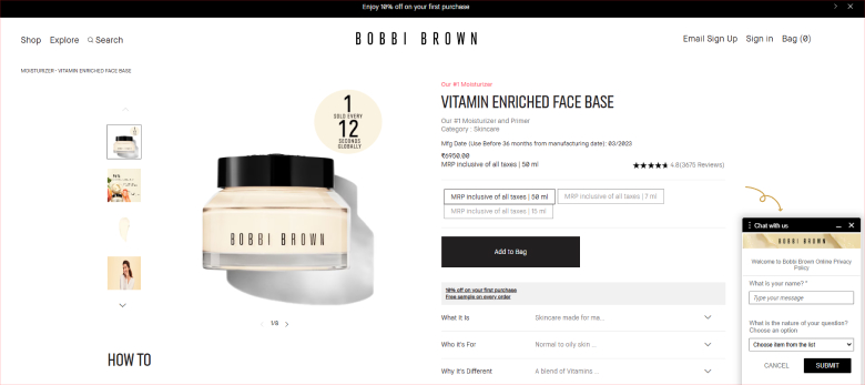
Why Live Chat is Vital on Product Pages
Live chat on product pages offers real-time support, enabling customers to ask questions and resolve concerns without leaving the page. This immediate assistance helps clarify doubts, reduce hesitation, and encourage customers to complete their purchases. Live chat enhances the shopping experience and increases trust and customer satisfaction.
When implemented thoughtfully, live chat can be a powerful tool for enhancing customer satisfaction, reducing cart abandonment, and boosting sales.
Conclusion
Implementing these product page optimization strategies can create a seamless shopping experience that drives higher engagement, boosts SEO rankings, and improves conversions.
Whether you’re focusing on visuals, CTAs, or social proof, every detail matters in creating a page that makes a great product page. Start optimizing today and watch your sales grow!
