We all do it. We scroll through an online store looking for that perfect product. But sometimes the product page just doesn’t deliver.
Maybe the product copy is weak, the product images are fuzzy or the whole thing just feels…off.
A bad product page can be the difference between a sale and a bounce.
And in the world of online shopping, you can’t afford to lose customers because of a subpar experience.
That’s why I spent over 20 hours researching the best product page examples out there.
I wanted to find the ones that actually convert site visitors into happy customers and show you how they do it.
This post will reveal my top 15 examples, along with actionable tips you can use to create product pages that sell and increase your average order value.
Ready? Let’s go!
What is a Product Page?
In simple terms, a product page is a dedicated page on an ecommerce site that contains all the info about a specific product.
Think of it as your online store’s salesperson. It’s where customers go to learn about your product’s features, benefits and why they should buy it.
Why Product Pages Matter
Product pages are the lifeblood of any ecommerce business. They’re often the first (and sometimes only) impression a customer has of your product.
Here’s why they’re so important:
They convert: Compelling product pages can be the difference between a browser and a buyer. They provide all the info a customer needs to make a purchasing decision.
They’re SEO gold: Product pages are a treasure trove for search engines. By optimizing your product page copy with keywords you can increase your visibility in search and attract more customers.
They build trust: High quality images, detailed descriptions, and real customer reviews all contribute to building trust with potential buyers.
They showcase your brand: Your product pages are an extension of your brand. They should reflect your brand values and brand voice.
15 Ecommerce Product Page Examples (After 20+ Hours of Research)
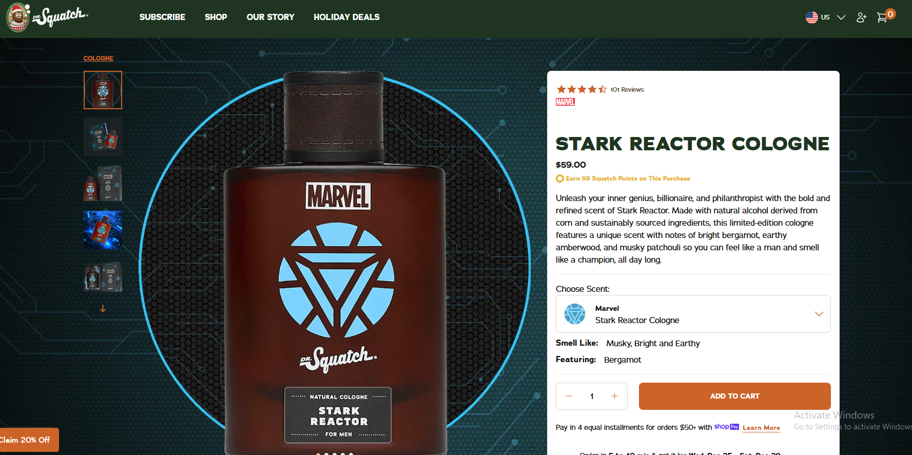
1. Dr Squatch
Unleash your inner Tony Stark with this limited-edition cologne.
Natural ingredients. Bold and refreshing. Spice and citrus. A unique, masculine scent. Feel like a champion all day long.
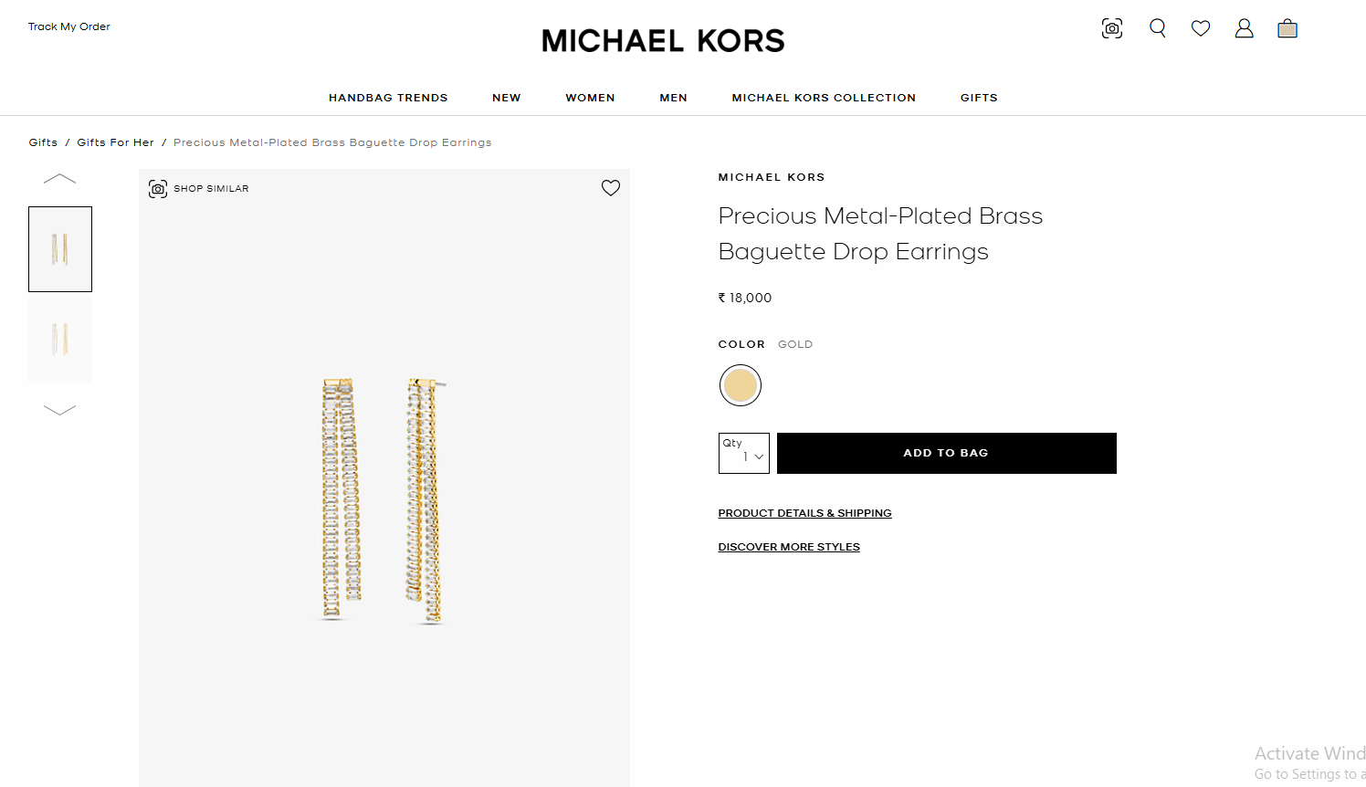
2. Michael Kors
This Michael Kors product page is elegant and simple. High-res images and a clean design let the earrings pop.
Mobile responsive and user friendly.
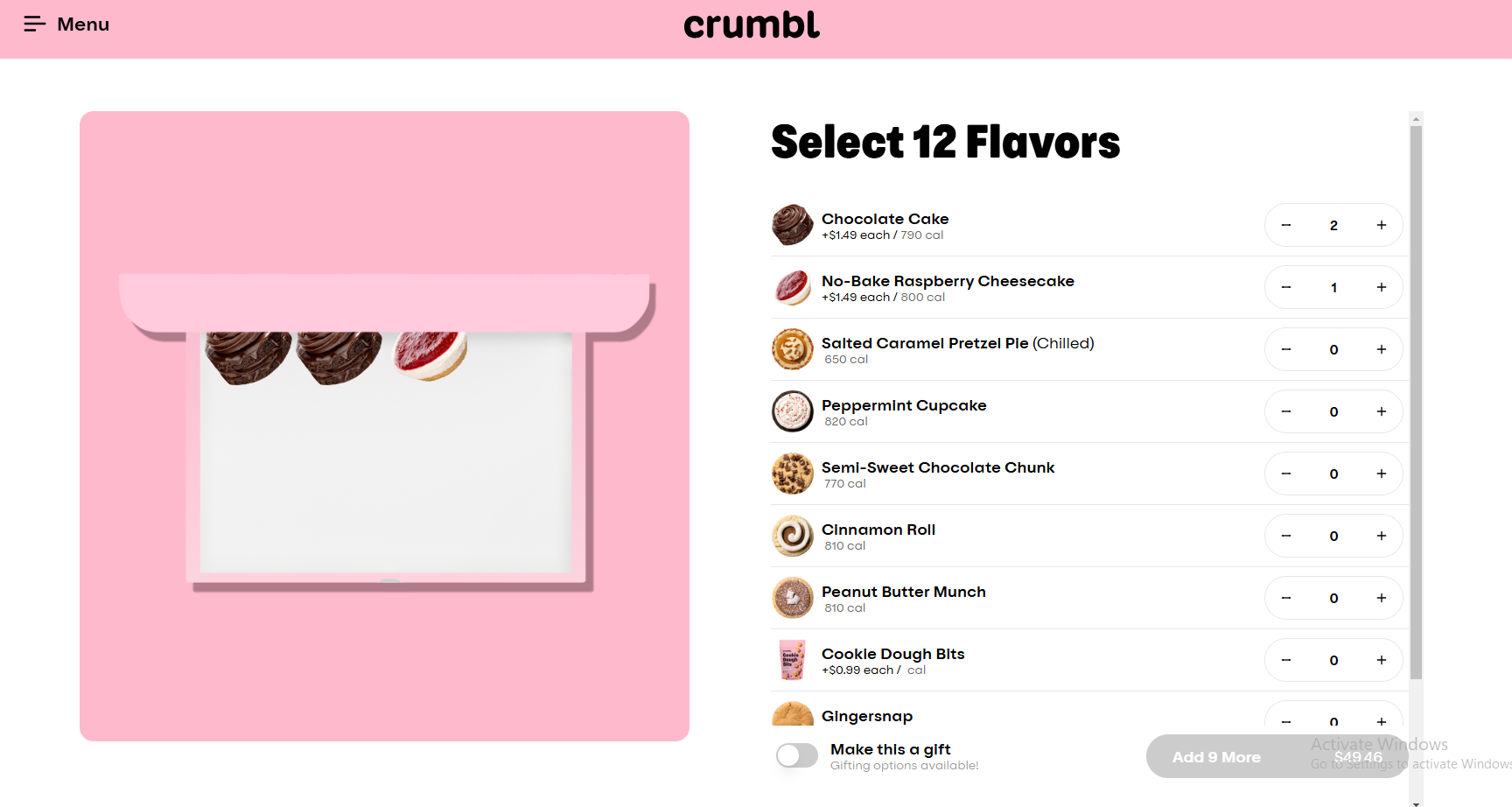
3. Crumbl
Instead of showing a single cookie, they let customers create their own box and turn the experience into an interactive and personalized journey.
Playful visuals and simple design.
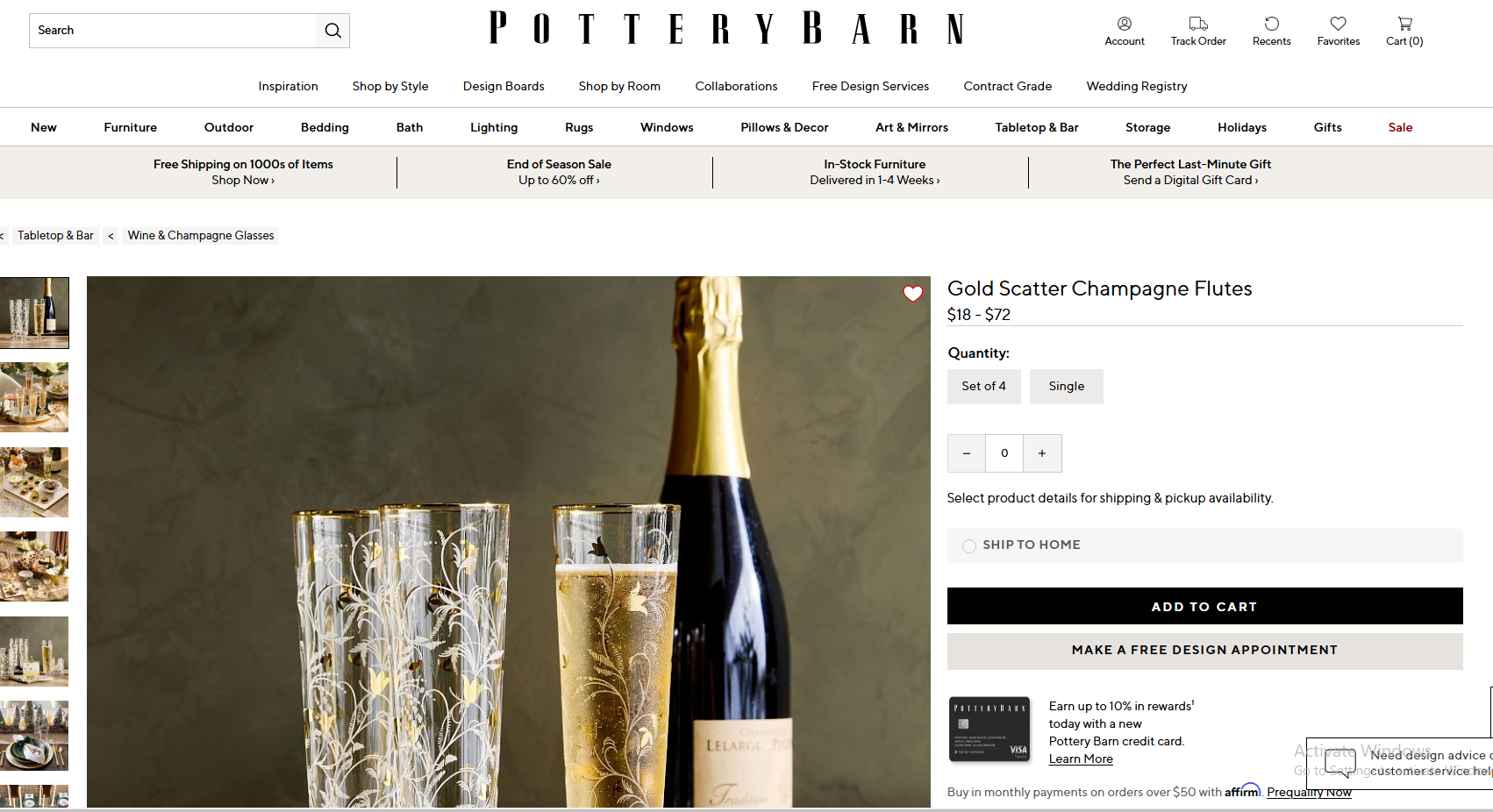
4. Potterybarn
Pottery Barn shows off these champagne flutes with a clean design. High-res images including lifestyle shots make it aspirational.
Easy to navigate with clear product info and a big “Add to Cart” button.
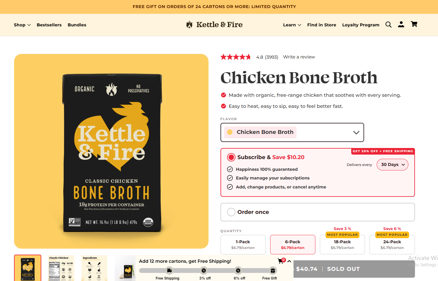
5. Kettle and Fire
Kettle & Fire shows off their bone broth with a clean product page.
Design highlights key features like organic ingredients and high protein content. Multiple purchasing options including a subscription service cater to different customer needs.
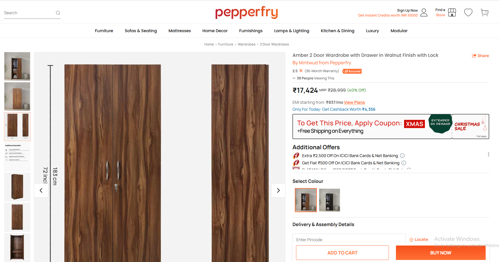
6. Pepperfry
Pepperfry’s product page for this wardrobe is clean, informative and action oriented. Multiple images show the product from different angles and dimensions are displayed.
Big CTAs and special offers to buy now.
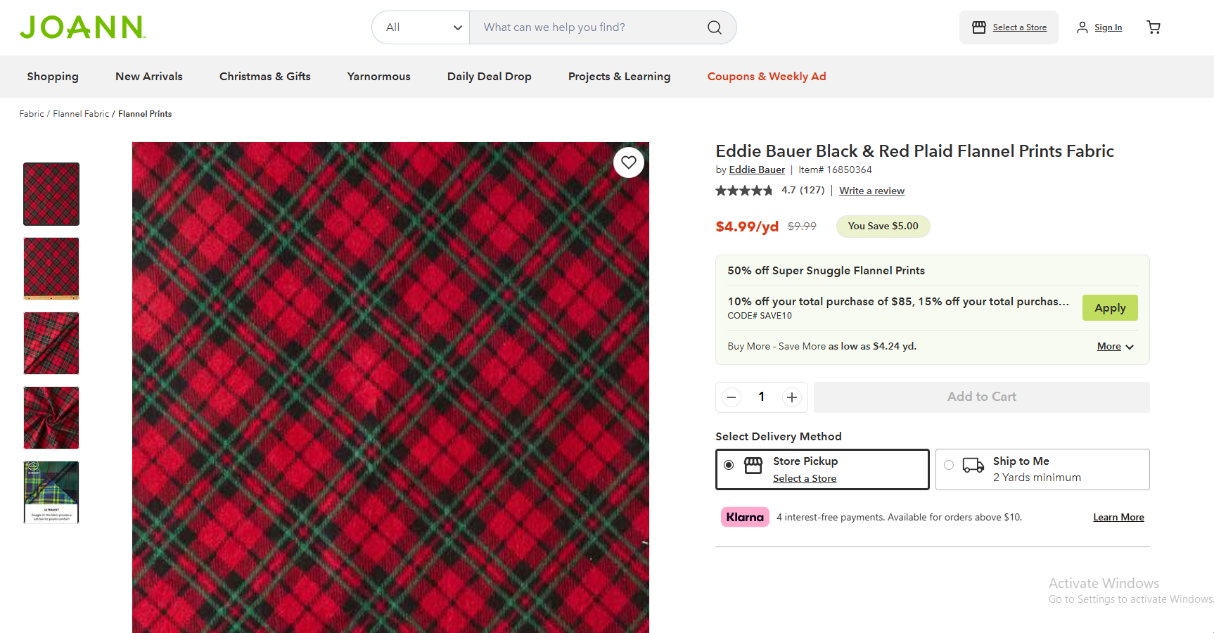
7. Joann
JOANN’s product page for this flannel fabric is clean, informative and pretty.
Multiple images show the fabric’s pattern and texture. Clear product info and pricing so customers can buy now.
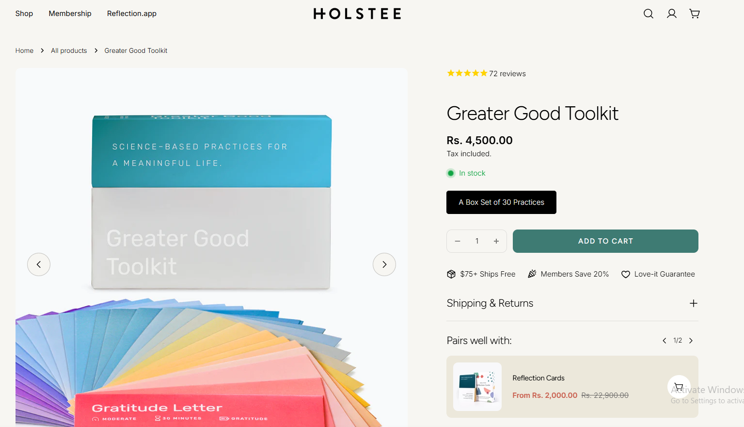
8. Holstee
HOLSTEE’s product page for the Greater Good Toolkit is clean, informative and pretty.
Design highlights the product’s features and benefits. Clear CTAs and trust signals to buy.
9. Stanley
Stanley’s product page for this tumbler is clean and modern. High-res images show off the product’s features and color.
Simple and uncluttered design to guide the customer’s attention to the key info and CTA.
10. Total Wine
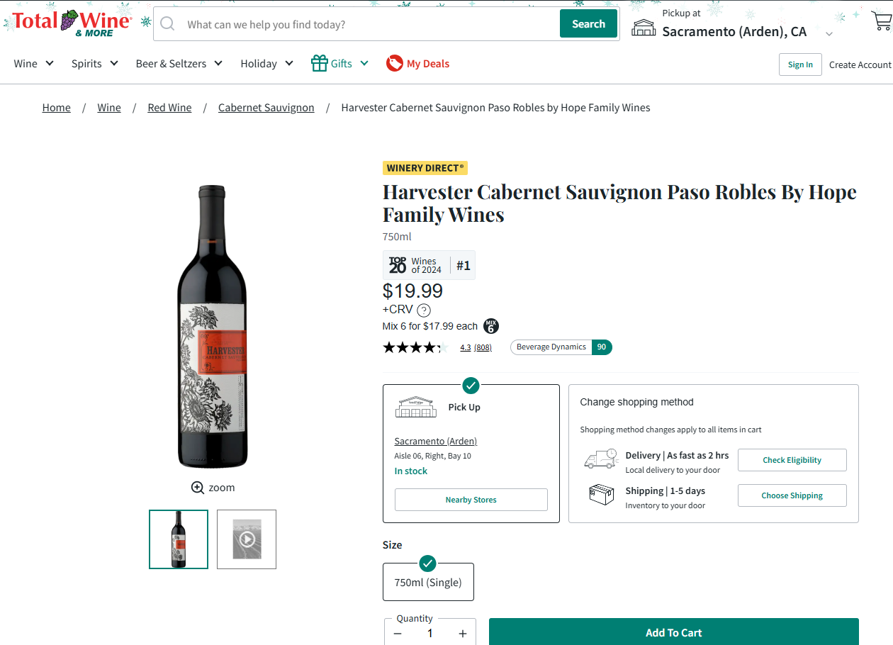
Total Wine & More shows off this Cabernet Sauvignon with a clean product page.
High-res images of the bottle and label. Essential info like price, ratings and in-store availability front and center.
Multiple purchasing options: in-store pickup, local delivery and shipping to cater to different customer needs.
11. Aura Bora
Aura Bora’s product page for their Green Bean Casserole sparkling water is weird and wonderful.
Clean and informative design with whimsical illustrations and emphasis on the unique flavor.
12. Casper
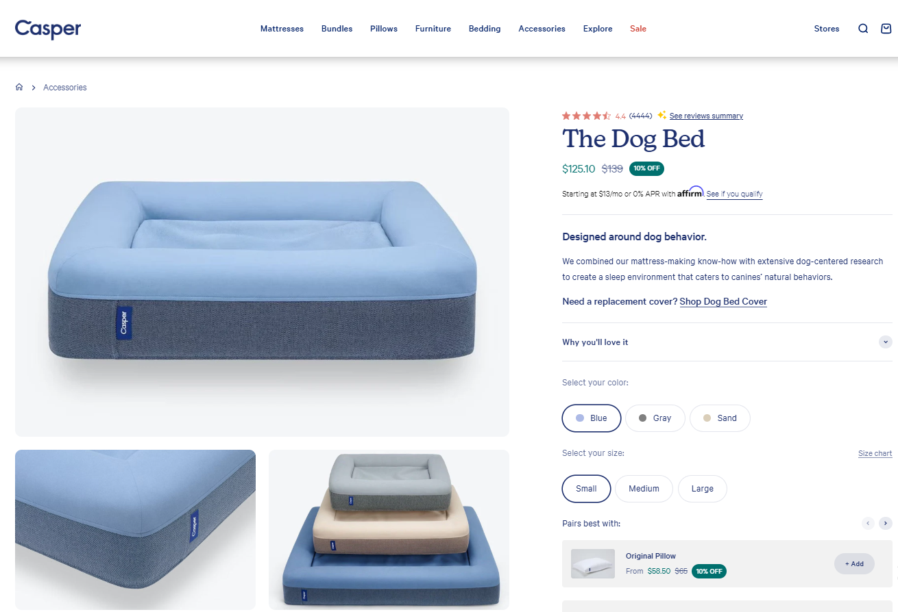
Casper brings their sleep expertise to our furry friends with “The Dog Bed.”
This product page combines function and comfort. Highlights the bed’s unique design and durable materials.
13. Crocs
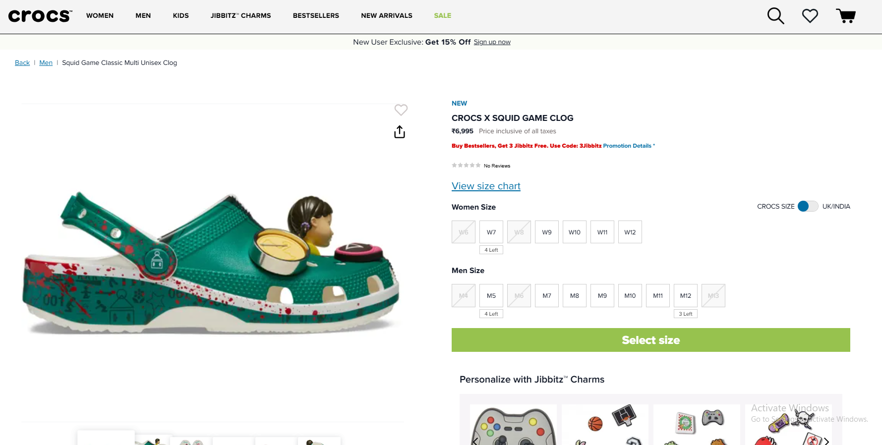
Crocs is milking the Squid Game trend with this limited edition clog. The product page is bold and playful and captures the essence of the collab.
Option to personalize with Jibbitz charms is fun and interactive.
14. Fable and Mane
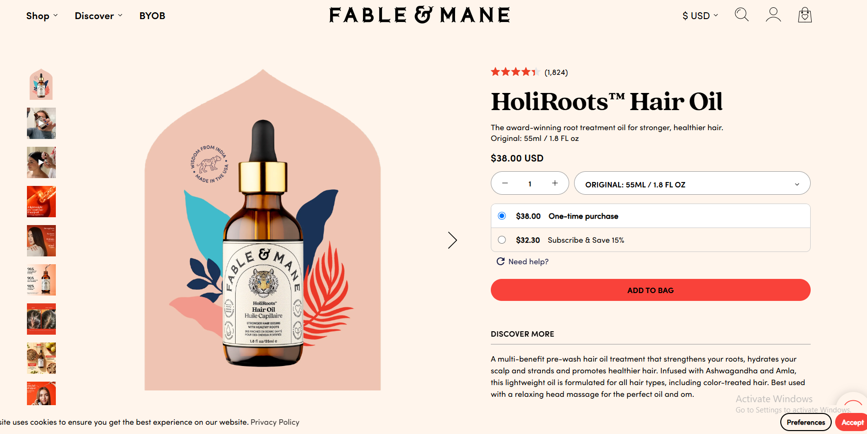
Fable & Mane’s product page for HoliRoots™ Hair Oil is pretty and informative.
Vibrant images and elegant design feels luxurious. Detailed description of the product and ingredients.
15. Hiya
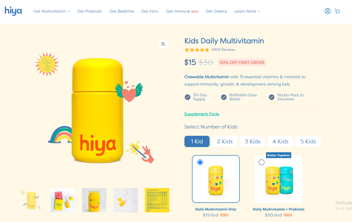
Hiya’s product page for children’s multivitamin is bright, playful and fun. For parents and kids.
Clean design and clear visuals. Concise product info.
7 Product Page UI/UX Tips
Even the most beautiful product photography and great copy can fail if your product page is not visually appealing and a mess.
You could have the best book in the world but if the pages are stuck together and the font is tiny no one will read it.
Same with your product pages. They need to be seamless, intuitive and enjoyable to use. Here’s how to do that:
1. Mobile First
We live in a mobile first world. More people are browsing and buying on their phones than on desktops.
If your product pages aren’t mobile optimized you’re turning away a big chunk of potential customers.
Think about it: have you ever landed on a website on your phone and the text is tiny, the images are cut off and you have to zoom and scroll just to find the “Add to Cart” button? Ugh.
That’s exactly what you want to avoid. Make sure your product pages are fully responsive meaning they adapt to any screen size.
The layout, text and images should all adjust automatically so online shoppers can browse and buy on their phones, tablets or any other device.
Actionable Takeaway:
Use Google’s Mobile-Friendly Test tool to check your product pages. If they’re not mobile friendly, work with your developer to fix it.
2. Page Loading Speed
We’re all impatient online. If a product page takes forever to load, chances are site visitors will bounce before they even see your product.
Think of it like waiting in line at the grocery store. If the line is moving at a snail’s pace you might get frustrated and leave without buying anything.
Your product pages should load fast to keep visitors engaged and prevent them from abandoning their carts.
Actionable Takeaways:
Compress your images: Large image files can slow down your page loading speed. Use TinyPNG to compress your images without losing quality.
Minimize HTTP requests: Every element on your page (images, scripts, stylesheets) requires a separate HTTP request. Reduce the number of elements to speed up loading times.
Use a Content Delivery Network (CDN): A CDN stores your website’s content on servers around the world so users can access it from the server closest to them and load faster.
3. High-Quality Product Images
Those blurry, pixelated product photos I mentioned earlier? Yeah, those are a big no-no.
Your product images are the first thing potential customers see and play a big role in how they perceive your product.
High res, professional looking photos make your products look more appealing and desirable.
Think about the difference between seeing a product in a dimly lit store with a grainy photo versus seeing it in a well lit studio with high res images. Which one are you more likely to buy?
Actionable Takeaways:
AI Tools: With so many AI tools available for product photography such as pebblely.com you can create authentic and professional looking images.
Invest in professional photography: If possible hire a professional photographer to take high quality product photos.
Use multiple images: Show your product from different angles and in different contexts. Lifestyle shots can help customers visualize how they would use the product in their own lives.
Consider product videos: Videos can provide an even more immersive experience and show the product in action.
4. Simple Navigation
Imagine walking into a store where the aisles are disorganized, the signs are confusing and you can’t find what you’re looking for. You’d probably leave pretty quickly right?
The same goes for your product pages. Make it easy for site visitors to find what they need with clear and simple navigation.
Actionable Takeaways:
Clear menu: Organize your products into categories and subcategories that make sense.
Search bar: Allow users to search for specific products by name or keyword.
Breadcrumbs: Breadcrumbs show users where they are on your website and help them navigate back to previous pages.
5. Clear Calls to Action
Don’t leave your customers wondering what to do next. Use clear and compelling calls to action (CTAs) to guide them through the process.
Think of your CTAs as signposts to the checkout. Make them stand out with contrasting colors and action oriented language.
Actionable Takeaways:
Use strong verbs: Instead of “Submit” use “Add to Cart” or “Buy Now”.
Create a sense of urgency: Use phrases like “Limited Time Offer” or “Shop Now Before It’s Gone” to encourage action.
Test different CTAs: Try different colors, sizes and placements to see what works best for your audience.
6. Show Shipping Costs Upfront
Hidden shipping costs are a sure way to annoy customers and increase cart abandonment. Be transparent about your shipping costs by showing them on your product pages.
Think about it: have you ever added an item to your cart and then been hit with a big shipping fee at checkout? Not a pleasant surprise and can make you change your mind.
Actionable Takeaways:
Show shipping costs on the product page: Don’t make customers wait until checkout to see the shipping costs.
Free shipping: If possible offer free shipping on orders above a certain amount.
Estimated delivery dates: Give customers an idea of when they will receive their order.
7. Product Comparison Tools
Help your customers make informed decisions by offering product comparison tools. This is especially useful if you sell multiple products with similar features.
If you’re buying a new TV you’ll probably want to compare different models side by side to see which one meets your needs.
Actionable Takeaways:
Allow customers to compare products: Create a feature that allows customers to select multiple products and compare their features, prices and specifications in a clean and concise way.
Show the differences: Make it easy for customers to see the differences between products.
Use visuals: Use charts, graphs or images to help customers visualize the comparisons.
By following these UI/UX tips you can create product pages that are beautiful and user friendly and conversion focused.
Remember the goal is to make your potential customers’ online shopping experience as smooth and enjoyable as possible.
WiserNotify Helps You Convert More Customers from Product Pages
Okay you’ve built a product page that would make even the most picky online shopper drool. Stunning visuals, compelling copy, user friendly design – you’ve checked all the boxes.
But what if you could multiply your efforts and turn those browsers into buyers?
Enter WiserNotify, your secret sauce to supercharge your product pages and boost those conversion rates.
You’ve baked a cake but WiserNotify is the cherry on top, the extra magic that makes it irresistible.
But what is WiserNotify and how does it work?
In short, WiserNotify is a tool that uses the psychology of social proof to nudge your visitors to buy.
It does this by showing real-time notifications on your product pages, that other people are buying, engaging with and loving your products.
You’re on a product page, deciding whether to buy that new fancy jacket. Then a notification pops up “Someone in London just bought this jacket!”
Suddenly you feel a sense of urgency, a fear of missing out. If others are buying it, it must be good right?
That’s social proof in action, helping to convert a potential customer into a buyer.
Related post: 13 Stunning Ecommerce Landing Pages Examples
Here’s how WiserNotify can help your product pages:
➨ Build Trust and Credibility: Seeing real-time purchase notifications builds trust and reassures visitors that your products are popular and good. It’s like having a crowd of happy customers vouching for your brand.
➨ Create Urgency and Scarcity: Notifications like “Low stock!” or “Selling fast!” trigger a fear of missing out and encourage visitors to act before it’s too late.
➨ Showcase Social Proof: Displaying customer reviews, testimonials and star ratings on your product pages adds another layer of social proof and shows potential buyers that others have had good experiences with your products.
➨ Abandoned Carts: WiserNotify can even help you recover abandoned carts by sending notifications to visitors who left items in their cart.
A gentle reminder or a limited-time offer can be all it takes to bring them back and complete the purchase.
Think of WiserNotify as your friendly salesperson, always nudging your visitors in the right direction.
It’s like having a virtual assistant whispering in their ear “Go ahead, buy it! You won’t regret it.”
But that’s not all! WiserNotify also has:
➨ Countdown Timers: Create urgency with limited time offers or flash sales.
➨ Announcement Bars: Show off free shipping or new product launches.
With WiserNotify you can turn your product pages from static displays into dynamic experiences that drive conversions and sales.
It’s like adding a sprinkle of magic to your online store and making your products irresistible to buyers.
Let’s get creative!
Here’s a product page copywriting framework to get you started.
Product Page Copywriting and Frameworks
Okay, you’ve got your beautiful product images, your page loads in 1 second and your navigation is smoother than a jazz solo. But what about the words?
The copy on your product pages is just as important as the images. It’s your chance to tell a story, highlight the benefits and replicate the in store experience to convince customers to click “Add to Cart”.
But here’s the thing: you can’t just throw any old text on there and call it a day. You need a plan. You need a framework.
Think of it like building a house. You wouldn’t just start stacking bricks without a blueprint, right? The same goes for your product page descriptions.
A copywriting framework gives you the structure to write compelling, persuasive copy that converts.
Here are a few of my favorites:
1. AIDA (Attention, Interest, Desire, Action)
This is a copywriting classic. It’s like a map to take your reader through the stages of awareness, interest, desire and finally action.
➨ Attention:Start with a bang! Grab their attention with a headline, an image or a question.
➨ Interest:Once you have their attention, pique their interest by highlighting the benefits of your product.
- What problems does it solve?
- How will it make their life better?
➨ Desire: Now turn that interest into desire. Use sensory language, storytelling and social proof to make your product irresistible. Make them want it.
➨ Action: Finally, close the deal with a clear call to action. Tell them what to do (e.g. “Add to Cart”, “Shop Now”)
Example:
You’re selling a super soft, organic cotton blanket. Here’s how you could use AIDA:
➨ Attention: Headline: “Wrap Yourself in Comfort with the Softest Blanket You’ll Ever Own” (with an image of someone snuggled up in the blanket)
➨ Interest: “Made with 100% GOTS-certified organic cotton, this blanket is gentle on your skin and the planet.
For snuggling on the couch, adding luxury to your bedroom or keeping you warm on cold nights.”
➨ Desire: “Imagine sinking into the cloud-like softness of this blanket after a long day.
The breathable fabric will keep you warm without overheating and the luxurious texture will make you feel like you’re sleeping on a cloud.”
(Include a customer testimonial about how much they love the blanket)
➨ Action: “Shop Now and Get Comfort”
2. PAS (Problem, Agitation, Solution)
This framework is all about tapping into your customer’s pain points.
It’s like a gentle nudge (or sometimes a not so gentle shove) that reminds them of a problem they have and then presents your product as the solution.
➨ Problem: Start by identifying a problem your target audience has. This could be anything from dry skin to a messy closet.
➨ Agitation: Once you’ve identified the problem, “agitate” it a bit. Remind them how frustrating or inconvenient this problem is. Make them feel the pain.
➨ Solution: Finally, swoop in with your product as the hero. Explain how your product solves their problem and makes their life easier, better or more enjoyable.
Example:
You’re selling a productivity app. Here’s how you could use PAS:
➨ Problem: “Feeling overwhelmed by your to-do list? Struggling to stay organized and focused?”
➨ Agitation: “It’s frustrating when you have so much to do but you can’t seem to get anything done. You’re constantly switching between tasks, getting distracted and feeling like you’re falling behind.”
➨ Solution: “Introducing [App Name], the productivity app that helps you get more done in less time. With our task management system, customizable reminders and focus mode you can finally take control of your day and achieve your goals.”
3. Feature to Benefit
This framework is all about translating features into benefits. It’s like saying, “Here’s what this product does, and here’s how it will make you feel.”
➨ Feature: Start by highlighting a specific feature of your product. This could be anything from the material it’s made from to the technology it uses.
➨ Benefit: Then explain how that feature benefits the customer.
- What problem does it solve?
- How does it make their life better?
Example:
You’re selling a pair of noise-canceling headphones. Here’s how you could use Feature to Benefit:
➨ Feature: “Our headphones have noise-canceling technology.”
➨ Benefit: “Block out distractions and get lost in your music, podcasts or audiobooks. Whether you’re commuting, working from home or just relaxing our headphones will create a sound sanctuary.”
➨ Bonus Tip: Don’t be afraid to combine these frameworks! You can use AIDA to structure your whole product page and then use PAS or Feature to Benefit within your descriptions.
➨ Remember: The best copywriting is clear, concise and persuasive. It speaks directly to your target audience and addresses their needs and desires.
So, put yourself in your customer’s shoes and write copy that will make them believe your product is what they’ve been looking for.
3 Common Mistakes That Kill Your Product Pages
Okay, we’ve covered the good stuff – the elements that make a product page great. Now it’s time to get real and talk about the bad stuff.
The mistakes. The pitfalls. The things that make customers click away from online stores faster than you can say “conversion rate.”
You’re baking a cake. You’ve got the best ingredients, the recipe is perfect and you feel like a master chef.
But then you add salt instead of sugar, forget to preheat the oven and overbake the whole thing. Disaster, right?
The same happens to your product pages. Even with the best of intentions a few common mistakes can kill your efforts and send your sales plummeting.
So let’s shine a light on these sneaky saboteurs and learn how to avoid them:
1. Ignoring the Above the Fold
Imagine walking into a store and being greeted by a mess. Clothes all over the floor, shelves cluttered and no clear direction on where to find what you’re looking for.
You’d turn around and walk out, wouldn’t you?
The same applies to your product pages, especially that above the fold area – the section visitors see before they start scrolling.
This is your first impression, your chance to grab their attention and make them want to keep going.
If your above the fold content is weak, confusing or lacks a clear value proposition you’re essentially slamming the door in your customer’s face.
They won’t bother scrolling down to find the amazing features and benefits you’ve hidden below.
Actionable Tips:
Showcase your best product image first: Make sure your main product image is high res, attention grabbing and clearly shows the product’s key features.
Highlight your unique selling proposition (USP): What makes your product different and better than the competition? Make it clear in a headline or tagline.
Include a clear call to action: Don’t make visitors have to hunt for the “Add to Cart” button. Make it above the fold.
Use visual cues to encourage scrolling: Arrows, contrasting colours or a peek of content below the fold will encourage visitors to keep going.
2. Hiding Critical Information
Think about the last time you tried to find a specific piece of information on a website.
You clicked through menus, scoured pages of text and still couldn’t find what you were looking for. Frustrating, right?
The same applies to your product pages. If pricing, shipping costs, product specs or customer reviews are hidden deep within the page you’re creating friction in the buying process.
Customers want quick and easy access to the information they need to make a decision.
If they have to work too hard to find it they’ll likely abandon your page and go to a competitor who makes it easier.
Actionable Tips:
Display pricing prominently: Don’t make customers have to hunt for the price. Display it clearly and above the product image and call to action.
Be upfront about shipping costs: Transparency is key. Display shipping costs on the product page or offer free shipping to encourage purchases.
Use tabs or accordions to organize information: If you have a lot of product details use tabs or accordions to keep the page clean and organized. This way customers can access the information they need without being overwhelmed.
Show customer reviews and testimonials: Social proof is a conversion booster. Make sure reviews and testimonials are visible and easily accessible.
3. No Social Proof
In the world of online shopping trust is everything. If customers don’t trust your brand or your product they won’t buy from you.
You’re walking down a dark alley at night. You see two restaurants – one is full of happy customers and the other is empty and dimly lit. Which one are you going to choose?
Social proof is like the bustling restaurant. It shows potential customers that other people have used and enjoyed your product which builds trust and credibility.
Actionable Tips:
Include customer testimonials: Feature testimonials from real customers who have used and loved your product. Include photos or videos to make the testimonials more powerful.
Showcase user-generated content: Encourage customers to share photos or videos of themselves using your product.
This is a great way to show how your product is used in real life and build a community around your brand.
Show reviews and ratings: Make it easy for customers to see what others are saying about your product. Display star ratings, reviews and even Q&A sections to provide as much information as possible.
Highlight awards or certifications: If your product has won awards or has been certified by a reputable body display those badges prominently.
Avoiding these mistakes and implementing the tips above you can create product pages that are not only beautiful and informative but also trustworthy and persuasive.
Remember the goal is to create an online shopping experience that gets customers to click that “Add to Cart” button and become fans of your brand.
5 Product Page Templates
Okay, you’ve optimised your product page. You have the beautiful images, the copy and the user friendly design.
But now you’re wondering: “How do I put it all together?”
You’re a musician with all the skills and talent in the world. You can play every instrument, you can write beautiful music and you have a voice that can melt glaciers.
But without a song structure, a framework to guide your creativity, your music might be directionless and powerless.
The same goes for your product pages.
You need a template, a blueprint to organise your elements and create a cohesive high-converting experience.
But here’s the thing: there’s no one size fits all.
The best template for you will depend on your products, your brand and your target audience.
So let’s take a look at some product page templates, analyse real life examples and find which one might be the perfect fit for your ecommerce masterpiece:
1. The Simple
This is your go-to template for individual products with a clear value proposition.
Think clean, concise and conversion focused.
Hero Section
- High quality product image or video
- Headline that highlights the benefit
- Tagline that summarises the USP
- Call to action (“Add to Cart”, “Buy Now”)
Below the Fold
- Product description (break up text with bullet points or images)
- Product specs (size, material etc.)
- Customer testimonials or reviews
- Shipping and return policy
- Related product recommendations (“You might also like…”)
Best for: Most ecommerce products, especially those with a strong visual appeal and clear benefits.
2. The Feature-Forward
For products with lots of technical specs or complex features.
Think clear organisation, detailed explanations and educating the customer.
Hero Section
- High quality product image showing key features
- Headline that highlights the main feature
- Tagline that explains the benefit of that feature
- Call to action
Below the Fold
- In-depth feature explanations (use visuals, diagrams or videos)
- Product specs and technical details
- Comparison chart (if comparing to other models or competitors)
- Customer testimonials or reviews (focus on feedback about specific features)
- FAQs that answer common questions
Best for: Electronics, software or any product with lots of technical details or complex functionality.
3. The Benefit-Focused
For products that solve a specific problem or address a particular need. Think customer focused language, problem solution presentation and emotional connection.
Hero Section
- Image or video of the product in use and highlighting the benefit
- Headline that speaks to the customer’s pain or desire
- Tagline that explains how the product delivers
- Call to action
Below the Fold
- Problem explanation and how the product solves it
- Benefit driven bullet points or short paragraphs
- Customer testimonials or case studies that show the results
- Lifestyle images of the product in use and building emotional connection
Best for: Health and wellness products, beauty products, productivity tools or any product that offers a clear solution to a common problem.
4. The Social Proof
Use user generated content and social proof to build trust and credibility.
Think real voices, real life examples and community.
Hero Section
- Image or video of the product in use by a real customer
- Headline that quotes a positive customer review
- Tagline that references the community or social proof
- Call to action
Below the Fold
- Gallery of customer photos or videos
- Customer testimonials and reviews (include photos or videos of the reviewer)
- Social media integration (e.g. Instagram feed, hashtag campaign)
- Interactive elements (e.g. polls, quizzes)
Best for: Products that encourage creativity, community or social sharing (e.g. fashion, beauty, travel, hobbies).
5. The “FOMO-Inducer”
Create a sense of urgency and scarcity to prompt action. Think limited time offers, low stock warnings and exclusive deals.
Hero Section
- High quality product image with a “limited time offer” banner or badge
- Headline that highlights the scarcity or urgency (e.g. “Only a few left!”)
- Tagline that explains the exclusive deal or discount
- Call to action with urgency (e.g. “Shop Now Before It’s Gone!”)
Below the Fold
- Countdown timer or low stock indicator
- Benefit driven bullet points or short descriptions
- Customer testimonials or reviews (focus on the positive)
- Guarantee or risk reversal (e.g. free shipping, easy returns)
Best for: Limited edition products, seasonal items, flash sales or any product with limited stock.
Remember, these are just templates. Mix and match elements, try different layouts and adapt to your brand and your needs.
It’s all about creating a product page that’s beautiful, informative and persuasive and gets your customer to that “Add to Cart” button.
Conclusion
Ecommerce product pages are an art and a science. It’s about combining great visuals, great copy and user friendly design to create an online shopping experience that converts.
Study the best product pages and use the tips and tricks in this guide to turn your product pages into sales machines.
So, what are you waiting for? Start optimizing your product pages today and watch your conversions soar!