
I’ve audited over 200 ecommerce stores in the last 4 years. And the one page that gets ignored the most? The product listing page.
Most brands obsess over their homepage and product detail pages. But the PLP (product listing page) is where the real decisions happen. It’s where shoppers decide if they’ll keep browsing or bounce.
A Baymard Institute study found that 70% of users rely on category navigation as their primary way to find products. Not search. Not homepage banners. The product listing page.
I’ve pulled together 11 product listing page examples that nail it.
But more than that, I’m breaking down exactly what makes each one work, so you can steal the ideas for your own store.
Boost Conversion Instantly
Add Social Proof & Urgency to your website
What Is a Product Listing Page (PLP)?
A product listing page is any page on an ecommerce site that shows multiple products. Category pages, collection pages, search results, and sale pages. They’re all PLPs.
When someone lands on “Women’s Running Shoes” on Nike.com, that’s a PLP. When you search for “wireless headphones” on Amazon and see 48 results, that’s a PLP too.
The job of a PLP is simple: help shoppers find the right product fast and get them to click through to the product detail page.
Every element on the page (filters, images, pricing, badges) either helps or hurts that goal.
Here’s why this matters for your store: according to ecommerce research, the average ecommerce conversion rate sits around 2.86%. But stores with well-optimized PLPs consistently outperform that benchmark. The PLP is where you set the stage for the sale.
11 Product Listing Page Examples That Actually Convert
I spent over 5 hours analyzing 50 ecommerce product listing pages. These 11 made the cut because each does something specific and different that you can learn from.
1. Perfect Keto

What they nail: Clean grid layout with zero visual clutter.
Perfect Keto uses a white background with high-quality product images that pop. Every product card has the same structure: an image, a title, a star rating with review count, a price, and a “Quick Buy” button.
Why it works: The consistency reduces cognitive load. Shoppers don’t have to figure out where to look on each card because every card follows the same pattern.
The star ratings with review counts add social proof right in the listing, so shoppers can gauge quality before clicking.
Steal this: Include review counts (not just stars) on your PLP cards. “4.8 stars” is good. “4.8 stars (2,341 reviews)” is way more convincing.
Also see: I Tested 21 Review Management Software (Here Are the Top 5 for 2026)
2. Fable and Mane

What they nail: Minimalist design with bold discount callouts.
Fable and Mane keep things simple. Grid layout, product name, price, star rating, “Add to Bag” button. But the 60% OFF badge on the discounted product immediately pulls your eye.
Why it works: When everything else is minimal, the discount badge creates a natural focal point. Your eye goes straight to the deal.
This is the contrast principle in action. If every product had a badge, none of them would stand out.
Steal this: Use product labels sparingly. If everything is “on sale,” nothing feels special. Limit badges to 2-3 products per page for maximum impact.
Build urgency
Add floating offers with countdown timer & coupon code.


3. Nutribullet

What they nail: Two-column layout for a small product catalog.
Nutribullet only shows two featured blenders on this page. Each item gets a large image, a detailed product name, a star rating, pricing (with the sale price highlighted), and an “Add to Cart” button.
Why it works: When you have a small catalog, a two-column layout gives each product more breathing room. The larger images let shoppers see details they’d miss in a 4-column grid.
This works because Nutribullet isn’t trying to show 50 products. They’re showing 2, and they’re showing them well.
Steal this: Match your grid columns to your catalog size. 4 columns for 20+ products. 2-3 columns for under 10. Don’t force a small catalog into a dense grid.
4. Figs

What they nail: Lifestyle photography that sells the experience.
Figs uses professional model shots for their medical scrubs. Every image shows the product on a real person, in a professional setting.
The “NEW” label on select products creates discovery moments.
Why it works: For apparel and fashion, seeing the product on a person is critical. A flat-lay photo of scrubs looks boring. But scrubs on a confident healthcare professional?
That sells the feeling of wearing them. The color swatch count (“12 colors”) also hints at variety without overwhelming the listing.
Steal this: If you sell clothing, home decor, or anything people use visually, invest in lifestyle photography. It converts significantly better than product-only shots on PLPs.
5. ASOS

What they nail: Persuasion triggers and wishlist functionality.
ASOS uses labels like “SELLING FAST” and “PETITE” on product cards. Each card has a heart icon for saving to a wishlist. The four-column grid maximizes product density while keeping each card readable.
Why it works: The “SELLING FAST” label creates urgency through social proof. It tells the shopper that others are buying this item right now, triggering fear of missing out.
The wishlist heart gives shoppers who aren’t ready to buy a reason to stay engaged with the product. That’s a smart middle ground between “buy now” and “leave forever.”
Steal this: Add a wishlist option to your PLP cards. It captures intent from shoppers who aren’t ready to purchase but might come back. You can also trigger email reminders for wishlisted items.
6. Allbirds

What they nail: Smart filtering with inline “Quick Add” size selection.
Allbirds has a left sidebar with contextual filters (Everyday, Wet Weather, Cool Weather, Material, Hue). When you hover on a product, you get a “Quick Add” option with size selection right on the PLP.
Why it works: The filters aren’t generic “price” and “color” dropdowns. They’re use-case filters. “Wet Weather” and “Cool Weather” match how people actually think about shoes. You don’t think “I need shoes in the $100-$150 range.” You think, “I need shoes for rainy commutes.”
The Quick Add feature is even smarter. It eliminates one entire page load (the product detail page) for shoppers who already know what they want.
Steal this: Design your filters around how customers think about your products, not how your database organizes them. Use-case filters convert better than attribute filters.
Build trust & FOMO
Highlight real-time activities like reviews, sales & sign-ups.

7. Master and Dynamic

What they nail: Premium product presentation with concise descriptions.
Master and Dynamic uses large product images with a three-column grid. Each card includes the product name, a short benefit-focused description, price, color options, and a “New In” label on the latest model.
Why it works: For premium products, you need breathing room. The three-column layout with generous spacing communicates quality before the shopper reads a single word. The short descriptions on the PLP card are a smart touch.
Most PLPs only show the product name. M&D adds a one-liner like “Active Noise-Cancelling Wireless Headphones” that helps shoppers differentiate between similar-looking products.
Steal this: For products above $200, use fewer columns and more white space. Dense grids communicate “bargain bin.” Spacious layouts communicate premium quality.
8. Aura Bora

What they nail: Brand personality that jumps off the page.
Aura Bora’s PLP is colorful, playful, and completely on-brand. Each product card shows the can image alongside flavor profile descriptors such as “crunchy, succulent, fresh” for its Green Bean Casserole flavor. The “Add to Cart” button sits right on the card.
Why it works: In a crowded beverage market, Aura Bora uses their PLP to differentiate through personality. The flavor descriptors aren’t typical marketing copy.
They’re unexpected and fun, which makes shoppers curious enough to click through.
Steal this: If your brand has a strong personality, let it show on your PLP. Most PLPs feel interchangeable. Yours shouldn’t.
9. Wild One

What they nail: Color-matched product sets and smart category navigation.
Wild One uses a four-column grid with high-quality product photography. Products are grouped by use case (Walk, Carry, Play, Live) in the top navigation. Price, color count, and sale prices are clearly displayed.
Why it works: The top navigation categories (Walk, Carry, Play, Live) match how pet owners think about shopping. You don’t search for “dog leash.
” You think, ‘I need stuff for walks.” Color-matched sets (harness + leash + poop bag carrier in the same color) encourage bundle purchasing without an explicit “buy the bundle” push.
Steal this: Group products by use case in your navigation, not just by product type. This reduces the steps between landing and finding the right product.
10. Fabletics

What they nail: Comprehensive filtering with membership pricing.
Fabletics shows a “NEW VIP OFFER: 2 FOR $24 BOTTOMS” banner alongside their three-column grid. The left sidebar has detailed filters: size, color, activity, review rating, rise, fabric, features, compression level, and collection.
Why it works: The filter depth is what sets Fabletics apart. “Compression level” and “rise” are filters that only apply to activewear, and Fabletics includes them because its customers actually care about these attributes.
The VIP pricing creates a membership incentive right on the PLP, turning browsers into subscribers.
Steal this: Survey your customers about what attributes matter most when they shop. Then build those into your PLP filters. Generic filters (price, color, size) aren’t enough for specialty products.
11. Spacegoods

What they nail: Bundle savings displayed prominently with texture photography.
Spacegoods uses close-up product shots of hands scooping powder, giving shoppers a tactile sense of the product. Bundle offers display exact savings (e.g., “SAVE £86.00”), making the value proposition immediately clear.
Why it works: For consumable products, texture matters. Seeing someone scoop the powder makes the product feel real.
And showing exact pound/dollar savings instead of percentage discounts is more effective. “Save £86” feels like real money. “Save 30%” feels abstract.
Steal this: Show absolute savings instead of percentage discounts on your PLPs. And for consumable products, show the product in use, not just the packaging.
Boost Conversion Instantly
Add Social Proof & Urgency to your website
Anatomy of a High-Converting Product Listing Page
Now that you’ve seen what great PLPs look like, let’s break down the specific elements that make them work.
I’ve organized these by impact, starting with what matters most.
Product Images That Sell

Your product images do 80% of the selling on a PLP. Shoppers scan images first, then price, then everything else.
Grid view works best for visually-driven products (fashion, home decor, food, beauty). Most ecommerce sites should default to a grid.
List view works better for technical products where specs matter more than looks (electronics, industrial equipment, B2B products).
The best PLPs (like ASOS and Allbirds) change the image on hover. When you hover over a clothing item, it switches from a flat-lay to a model shot or shows the product from a different angle. This gives shoppers more information without requiring a click.
Pricing and Discount Display

Price is the second thing shoppers look at after the image. How you display it matters.
Show original and sale prices together with the original crossed out. Use a contrasting color (red is standard) for the sale price. Display the exact savings amount, not just the percentage.
For products with variants, show a price range (“$49-$99”) so shoppers know the starting point. And if you offer installment payments (e.g., Afterpay, Klarna), mention them on the PLP card. “From $12/month” can make a $149 product feel accessible.
Also see: I Studied 11 Product Recommendation Examples (My Takeaways)
Filters That Match How People Think

Bad filters kill PLPs. I’ve seen stores with 200+ products and only “price” and “color” as filter options. That’s not enough.
Your filters should match the attributes your customers actually care about. For clothing: size, color, style, occasion, and material.
For electronics: brand, price range, features, compatibility. For food: dietary restrictions, flavor, and pack size.
Sort options matter too. Offer: relevance (default for search results), price (low to high, high to low), newest arrivals, best selling, customer rating.
The key is to put the most-used filter at the top. If you sell shoes and 90% of shoppers filter by size first, make size the top filter.
Breadcrumbs for Navigation

Breadcrumbs look small, but they do heavy lifting. “Home > Women > Shoes > Running Shoes” tells shoppers exactly where they are and lets them jump back to broader categories with one click.
They also help with SEO. Breadcrumbs create a clean internal linking structure that search engines love.
Google even shows breadcrumbs in search results, which can improve your click-through rate.
If your store has more than 3 levels of categories, breadcrumbs aren’t optional. They’re essential.
Product Titles and Descriptions

On the PLP, less is more. Your product title should be descriptive enough that shoppers can differentiate products without clicking through.
Good title: “Men’s Ultralight Running Shoe, Breathable Mesh.”
Bad title: “Product #4821 Running Shoe.”
Skip long descriptions on the PLP. Save those for the product detail page. On the PLP, a one-line benefit statement is enough. Or let the specs (size, color count, rating) do the talking.
Search Within the PLP

For PLPs with 50+ products, add a search bar within the category. Let shoppers search within filtered results without having to start over.
Auto-suggest is powerful here. As someone types “blue,” show all blue products in the current category. And always add a “Did you mean?” fallback for misspellings.
Product Labels and Badges

Badges work because they create visual hierarchy. “New,” “Sale,” “Best Seller,” “Low Stock,” and “Free Shipping” badges all trigger different psychological responses.
“Low Stock” creates scarcity (urgency to buy now). “Best Seller” creates social proof (other people chose this). “New” creates curiosity (what’s this?). “Free Shipping” removes a purchase barrier.
Use 1-2 badges per product max. More than that, and they lose their effect.
Clear Call-to-Action Buttons

Every product card needs a CTA. “Add to Cart” is standard. “Quick Buy” or “Quick Add” (like Allbirds) can be even better because they skip the product page entirely.
Make the button visually distinct. A button that blends into the card background is invisible.
Use a contrasting color, enough padding, and clear text. On mobile, make sure it’s large enough to tap comfortably (at least 44×44 pixels, per Apple’s guidelines).
How Social Proof Transforms Your Product Listing Pages
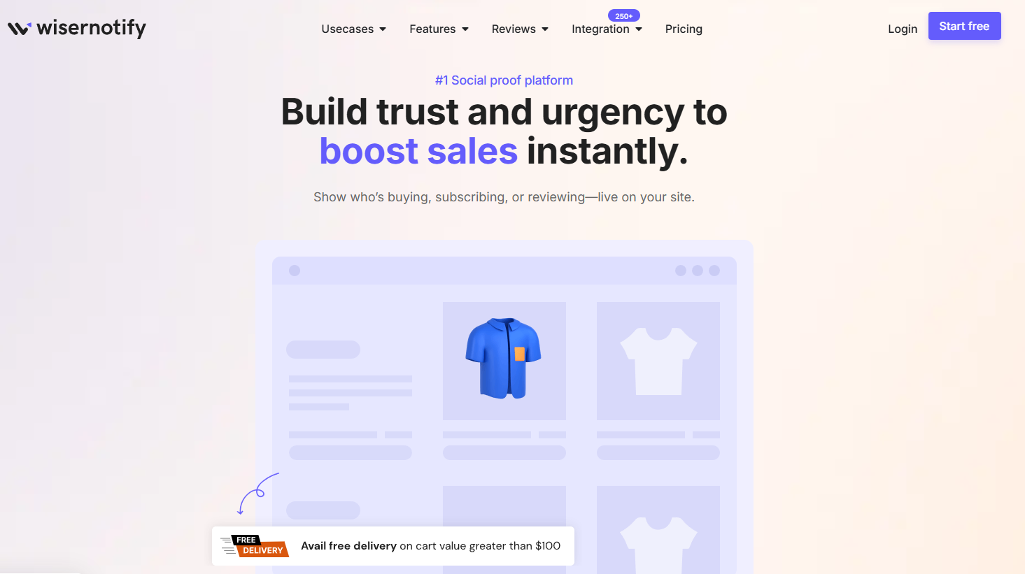
Every example in this guide uses some form of social proof. Star ratings, review counts, “Selling Fast” badges, and live visitor counts.
These aren’t decorations. They’re conversion tools.
Here’s what I’ve seen work across the stores we’ve helped at WiserNotify:

Recent purchase notifications: Small popups showing “Sarah from Austin just bought this” while someone browses your PLP. This creates both urgency and validation.

Live visitor counts: “47 people are viewing this right now” on popular products. This works especially well during sales events and product launches.

Star ratings on PLP cards: Products with visible ratings receive more clicks than those without.
You don’t need to build these from scratch. WiserNotify adds real-time social proof notifications to your product listing pages with a simple setup.
Recent purchases, live visitors, review popups, urgency widgets. All customizable to match your brand.
Product Listing Page Best Practices (The Quick Version)
After analyzing hundreds of PLPs, here’s what separates the top performers:
Mobile first, always. Over 60% of ecommerce traffic comes from mobile. Design your PLP for a phone screen first, then scale up. Test on real devices, not just browser previews. Make sure filters work with thumb-friendly taps, not tiny checkboxes.
Load speed matters more than you think. Every extra second of load time costs you conversions. Compress images, lazy-load products below the fold, and minimize JavaScript on your PLP. Google’s Core Web Vitals directly impact your rankings for PLP keywords.
Show product count and let shoppers control density. “Showing 1-24 of 312 products” tells shoppers how much is available. Let them change how many products show per page (24, 48, 96). Some shoppers want to browse. Others want to scan everything fast.
Use structured data for product reviews and pricing. Schema markup on your PLP helps Google show rich snippets (star ratings, price ranges) in search results. This improves your Google CTR before shoppers even reach your site.
Don’t forget the empty state. When filters return zero results, don’t just show a blank page. Suggest broadening filters, showing popular products, or offering a way to contact support. The “no results” page is where many stores silently lose customers.
A/B test your PLP layout. What works for Allbirds won’t necessarily work for your store. Test grid columns (3 vs 4), image sizes, filter placement (sidebar vs top bar), and CTA button text. Small changes on a PLP can have a big impact on revenue because every shopper passes through it.
Also check: 10 Social Proof Landing Page Examples That Convert
Boost Conversion Instantly
Add Social Proof & Urgency to your website
Common PLP Mistakes (And How to Fix Them)
Too many products per row. Five or more products per row creates cognitive overload. Stick to 3-4 columns on desktop and 2 on mobile. The Baymard Institute recommends no more than 4 items per row for optimal customer experience.
No filtering on mobile. I’ve seen stores that hide their filters behind a tiny icon on mobile. Filters should be prominent and easy to use on small screens. A sticky “Filter” button that opens a full-screen filter panel works best.
Generic product images. Using manufacturer stock photos when every competitor uses the same images. Invest in custom photography or at least add lifestyle shots alongside product-only images.
Ignoring page speed. Large, uncompressed images are the number one PLP speed killer. Use WebP format, lazy loading, and properly sized images. A PLP with 48 products means 48+ images loading. Optimize everyone.
No social proof on the PLP. If you only show star ratings on product detail pages, you’re leaving conversions on the table. Add ratings, review counts, and “X people bought this” signals directly to your PLP cards. Social proof works best when it’s visible during the browsing stage, not just the buying stage.
Getting Started
Your product listing page is the most underrated page on your ecommerce site.
It’s where browsing becomes buying, and getting it right can have a bigger impact on revenue than almost any other page change.
Start with the examples that match your product type. If you sell fashion, study Figs and ASOS.
If you sell premium products, look at Master and Dynamic. If you sell food or beverages, Aura Bora and Perfect Keto are your models.
Then layer in social proof. Star ratings on your PLP cards. Recent purchase notifications. Live visitor counts. These are the conversion multipliers that turn a good PLP into a great one.
And the fastest way to add those social proof tools to your product listing pages? WiserNotify sets them up in minutes, no coding required.
