I’ve seen a lot of product landing pages in my time. Some are good, some are…not so good.
What’s the difference? And how do you create a product landing page that converts?
In this post I’ll be sharing 11 of the best product landing pages I’ve found, each serving as a landing page example of what makes them work.
By the end you’ll know what it takes to create a remarkable product landing page that helps you achieve your marketing goals.

What is a Product Landing Page?
A product landing page is a web page that sells one product. It’s different from a product page in that it’s more focused and has one call to action.
A dedicated product landing page ensures maximum visibility and encourages conversions by aligning all elements to provide a consistent user experience across various traffic sources, highlighting the importance of the landing page’s design and elements.
Think of it this way: a product page is like a brochure, a product landing page is like a sales pitch.
Boost Trust and Conversions on PLP
Even the most beautifully designed product landing page can fail if it doesn’t build trust fast enough.
Visitors hesitate to convert when they don’t see honest feedback from real customers.
Without visible proof, like authentic reviews, testimonials, or user photos, your product can feel untested, especially to new visitors.
And relying solely on design or copy isn’t enough to counteract skepticism.
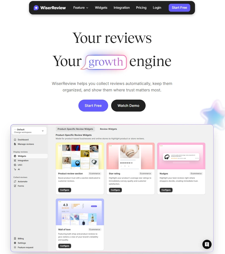
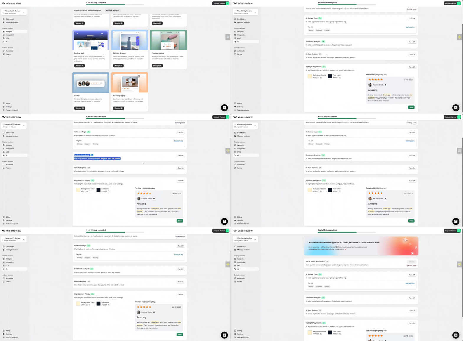
WiserReview solves this by automating a complete review collection and display workflow designed to power your product landing pages with trust-building content:
Collect
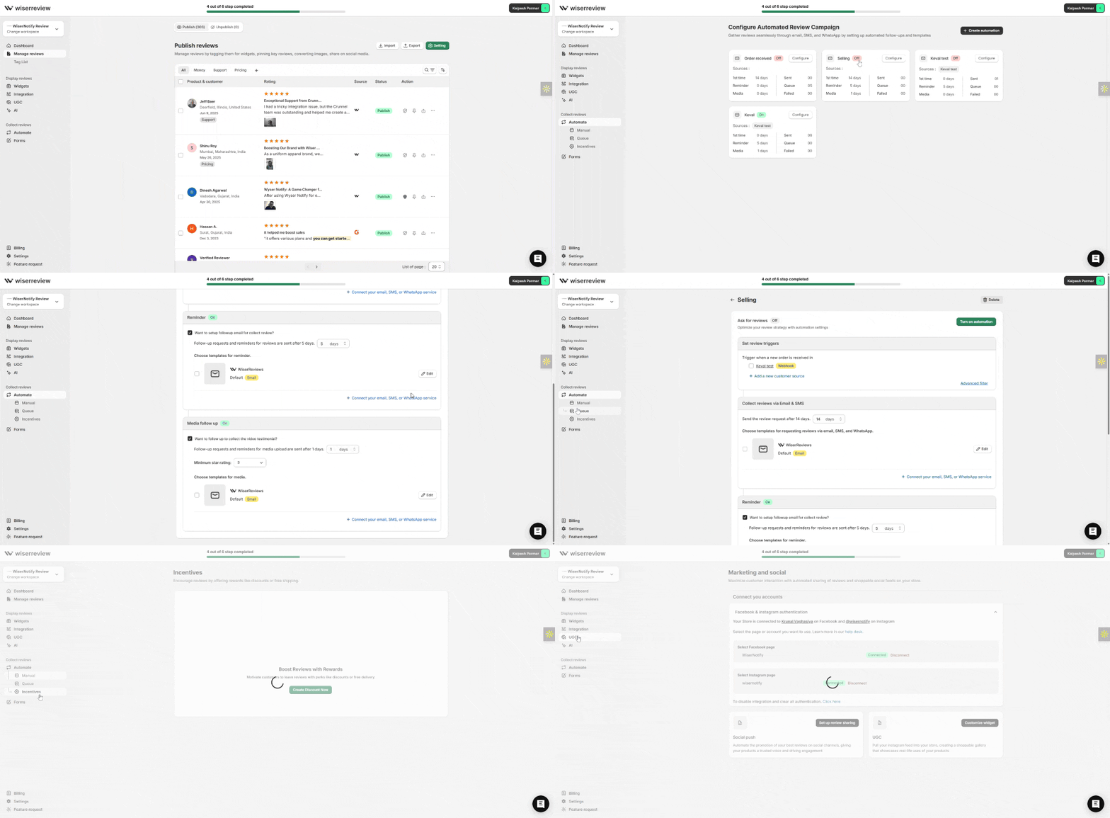
Utilize pre-built forms and SMS/email automations to collect post-purchase or service reviews, including photos, videos, and text feedback.
Moderate
Filter out low-quality or off-brand reviews with built-in moderation tools and tag filters.
Customize & Embed
Match your branding with complete design control, then embed review widgets (carousel, badges, floating popups) directly on your landing pages.

Analyze & Improve
Monitor which reviews drive clicks and optimize future placements using performance insights.


Add a Trust Badge widget or Review Carousel just below your CTA on the landing page to reinforce credibility at the decision point.
Boost Conversions with Trusted Reviews
Show real photos, videos, and text reviews on your product landing page, beautifully and instantly.
Product Landing Page vs Product Page
I know, I know, I just said that. But it’s worth repeating.
A product page is a page on your site that lists all your products. It’s like a catalog.
A product landing page is a standalone page that sells one product. More focused and one call to action.
The product landing page’s design and content are tailored to drive conversions by addressing the target audience’s specific needs and preferences.
What are the Key Elements of a Product Landing Page
All successful product landing pages have these in common:
- Problem-focused headline that states what the product does and how it helps the customer.
- High-quality images that show the product in action.
- Customer testimonials that prove social proof.
- Product benefits that highlight the distinct advantages and features of the product, such as technology integration or innovative design, and include testimonials and FAQs to reinforce the value proposition.
- Clear and concise call to action.
Looking at various product landing page examples can help you understand how these elements come together to create an effective page.
11 Examples of Effective Product Landing Pages
Now that you know what a product landing page is and what makes it effective, let’s take a look at some landing page examples.
1. Hims
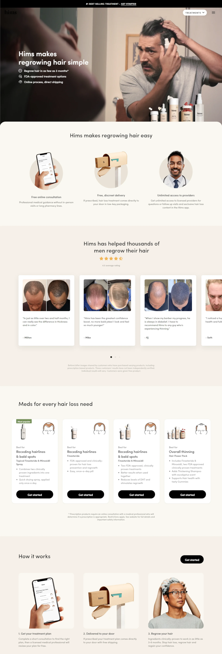
Take Hims for example. They help men address hair loss with personalized treatments.
Their product landing page is a great example of how to show a sensitive solution with empathy and clarity.
The page uses a soothing color palette, relatable images and concise copy to address a problem many men have.
Hims walks visitors through their offerings with clear visuals and a simple path to buy, aligning the product with what the target audience’s seeks.
2. Copper Cow
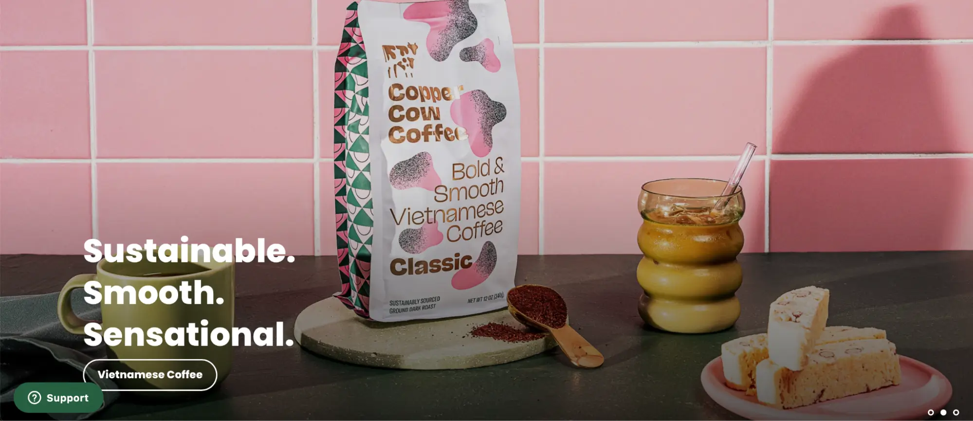
Now let’s get into Copper Cow Coffee. This brand offers a different spin on traditional Vietnamese coffee and their product landing page is as cool as their coffee.
Instead of overwhelming visitors with info, they’ve gone for a minimalist approach that gets to the point of their product. This approach is similar to how a minimalist wallet brand emphasizes simplicity, functionality, and durability.
The page uses a hero image with bold colors and a simple but powerful headline: ‘Sustainable. Smooth. Sensational.’ This tells the brand’s values and the coffee’s benefits.
Copper Cow Coffee uses a limited color palette and whitespace to create a beautiful experience that’s calming and welcoming.
3. Alpine
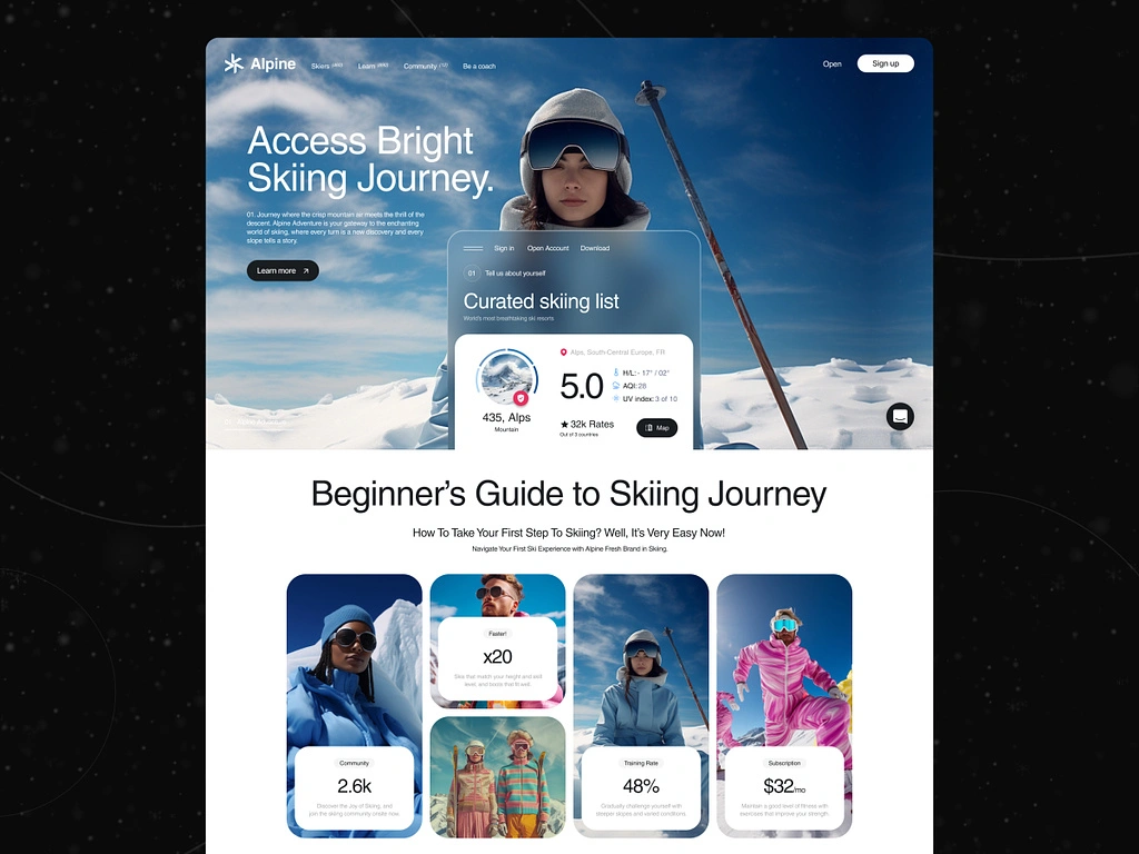
Now let’s hit the slopes with Alpiney, a platform that curates ski trips. Their product landing page is as fresh as the mountain air.
Instead of showing generic travel photos, they’ve gone for a clean and modern design that conveys the feeling of freedom and adventure.
The hero image is a single skier in a beautiful mountain landscape, and instantly transports visitors to the experience.
Alpiney uses a contrasting color palette of cool blues and white to feel wintery and calm.
The copy is short and benefit-focused, on the unique value of curated ski trips.
4. Fresh Hritage
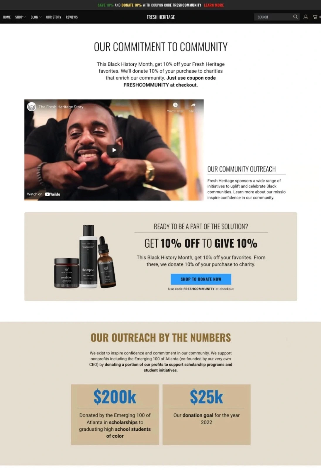
Now let’s talk about Fresh Heritage, a brand that’s not just selling products but also a message of community empowerment.
Their product landing page combines a great offer with a social cause, so visitors feel purpose and engagement.
Instead of just product features, they focus on their commitment to donate a portion of their profits to scholarships and student initiatives.
This will resonate with socially conscious consumers who want to make an impact with their purchase. Fresh Heritage uses a bold color palette and real images to show their products and celebrate Black history.
They’ve added video content to further engage visitors and tell their brand story.
5. Finn
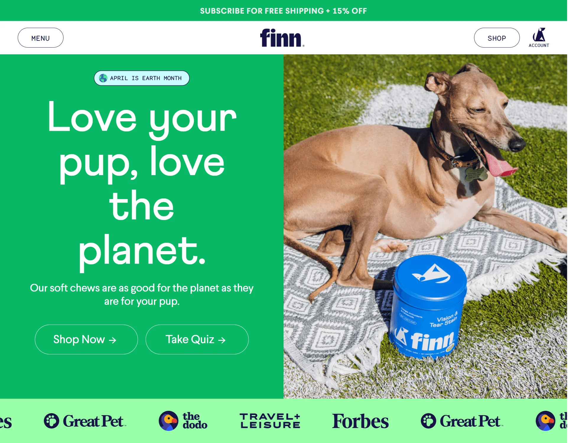
Who can resist a landing page with a cute pup? Not me! Finn, a company that makes sustainable dog chews, knows how to grab attention from the get go.
Their product landing page is a paws-itive example of how to show a strong visual and a message.
The hero image is a happy dog with a Finn chew, and instantly makes visitors feel happy and connected to pet owners.
The headline, ‘Love your pup, love the planet,’ ties the product to the growing trend of environmental sustainability.
Finn also shows social proof by featuring logos of major publications that have featured their products, to build trust and credibility.
Build trust & FOMO
Highlight real-time activities like reviews, sales & sign-ups.
6. Flewd

Now get ready to be charmed by this colorful landing page from Flover. This flower delivery service is breaking the mold with their unconventional design and fun approach.
Instead of the usual romantic tropes, Flover brings energy and personality to their product page.
The hero section has an animated blooming flower, to grab attention and feel happy and alive.
The color palette is a fun mix of bold and pastel colors, to create a visually interesting experience that’s playful and elegant.
7. Oura Ring
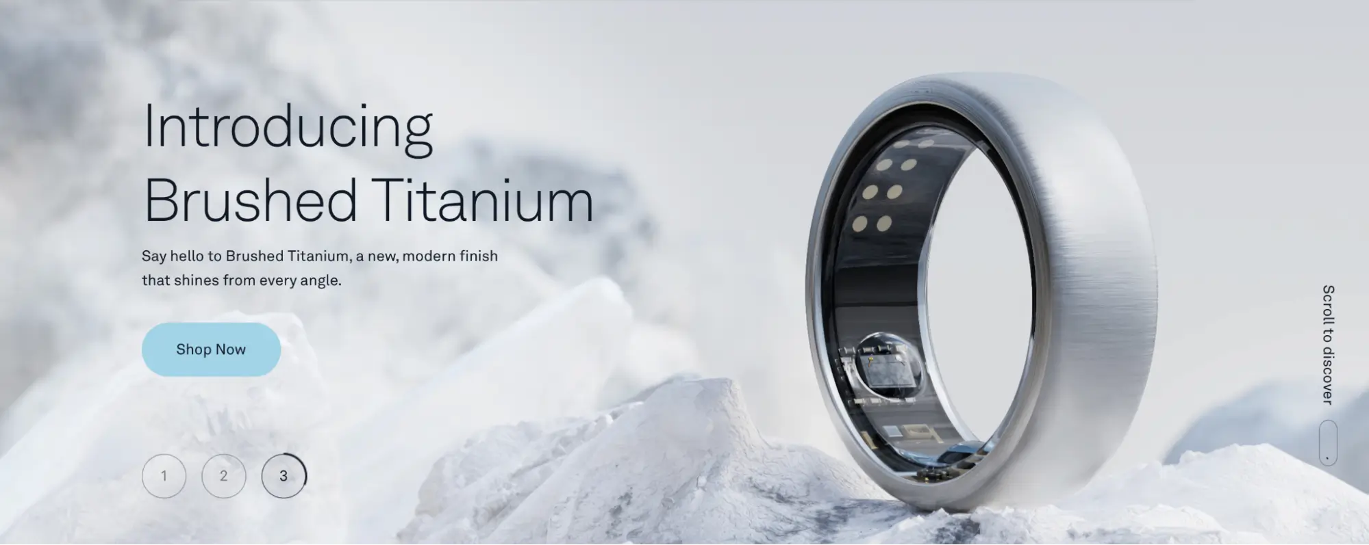
Now let’s get into wearable tech with Oura Ring. This health tech company knows how to show a premium product with a clean design.
Their Brushed Titanium ring product page is a masterclass in simplicity and beauty.
The hero image is the ring against a frozen lake, and instantly feels luxurious and exclusive.
The copy is short and benefit-focused, on the modern finish and clean design.
Oura Ring uses a monochromatic color palette and lots of whitespace to feel sophisticated and premium, which is perfect for their high-end target market.
8. Muid
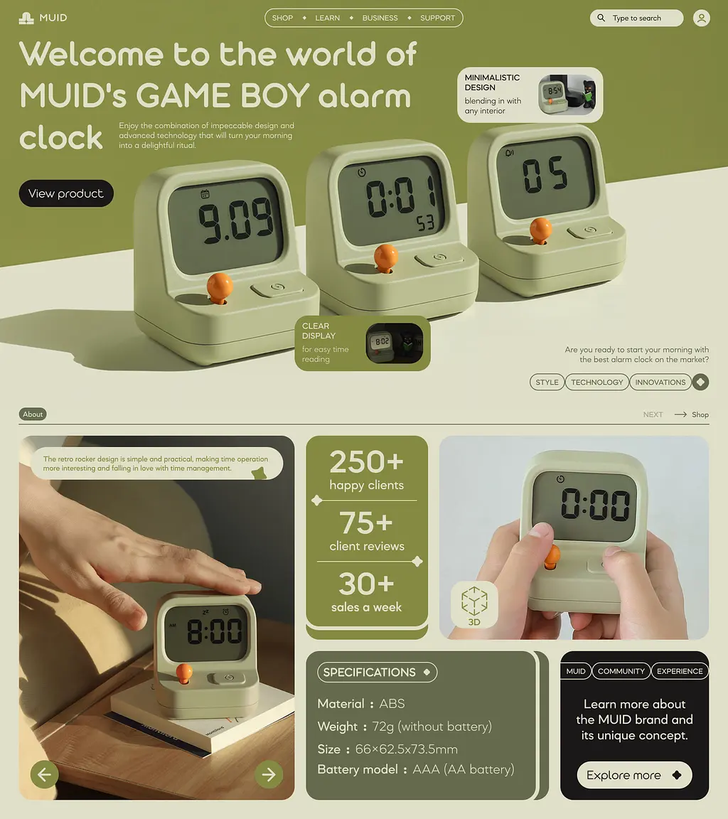 Now let’s go back in time to the pixelated days of Game Boy with this fun landing page from MUID.
They’ve tapped into the retro gaming trend with their alarm clock and their product page is a nostalgic trip back to our childhood gaming days.
Instead of a boring product focused approach, they’ve created an experience that puts visitors back in their childhood gaming shoes.
The hero image shows the alarm clock in all its pixelated glory, and feels fun and familiar.
MUID uses a bright color scheme and playful font to add to the retro vibe. The page also has interactive elements to view the product from different angles and explore the features in a more dynamic way.
9. Cowboy
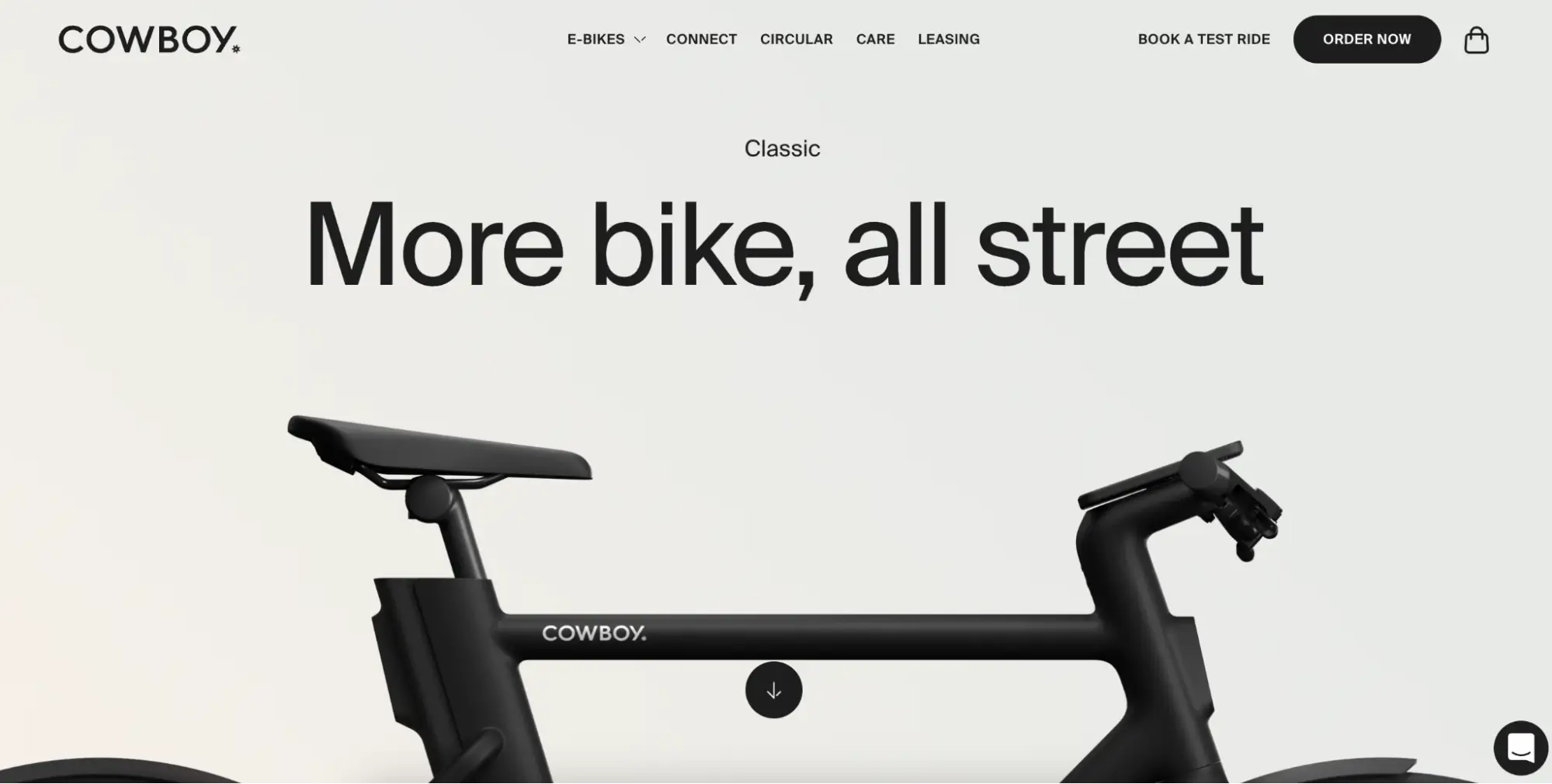
Now let’s switch gears and get into e-bikes with Cowboy. They’ve taken a clean approach to their product page, with a minimalist design and strong imagery to show off their cool e-bikes.
The hero image is a close up of the Cowboy Classic e-bike, showing off its clean lines and minimal design. The headline, ‘More bike, all street,’ is short, sweet and to the point.
Cowboy uses a black and white color scheme and lots of whitespace to feel modern and sophisticated, for their urban dwellers and tech savvy riders.
10. Scoota
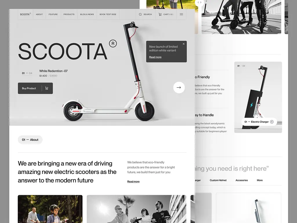
Now let’s get into the future of urban transport with Scoota. This electric scooter company has a product page as sleek and efficient as their vehicles.
The hero image is the White Redemtion-07 against a white background, to show off its modern design and minimalism.
Scoota uses a monochromatic color scheme and bold font to create a visual impact.
The page is also very functional, with clear CTAs to buy the scooter or learn more about the features.
By being clear and concise, Scoota communicates the key benefits of the product and guides the visitor to a smooth purchase experience.
11. Giling

And finally, let’s grind into the world of coffee with Amuz Inc. This coffee grinder company has a product page as nice as a perfect cup of coffee.
Instead of just showing the product, they’ve created an experience that celebrates the art of coffee making.
The hero section has a bold contrasting color scheme and a headline that speaks directly to the user’s desire for a classic coffee experience.
Amuz Inc uses a dark background to feel intimate and premium, and high quality images and video to show off the grinder’s craftsmanship and features.
The page also has a bit of storytelling, about the company’s philosophy and quality.
Boost Conversions with WiserNotify on Product Pages
You have a killer product page. You have a strong headline, good copy and great images.
But something’s missing. You’re not seeing the conversion rates you were hoping for.
Sound familiar?
You’re not alone. Even the best product pages can use a little extra boost. And that’s where WiserNotify comes in.
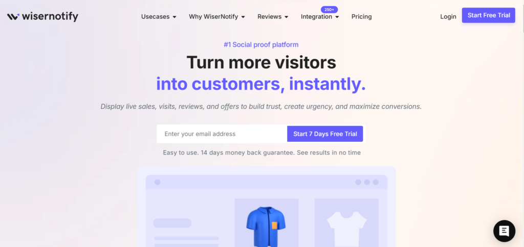
WiserNotify is a social proof platform that can boost those conversions. It’s like having a secret weapon in your marketing arsenal. But how does it work?
Well, WiserNotify uses the power of “social proof”. It’s a fancy term, but the concept is simple. See, people are more likely to take action when they see others doing the same.
Think of it like this: you’re more likely to try a new restaurant if you see it’s full of happy customers, right?
WiserNotify exploits that psychology by showing real-time notifications on your page.
These notifications show visitors that others are interacting with your site, whether it’s buying, subscribing to your email list or downloading resources.
Imagine a visitor landing on your page and seeing a notification pop up saying “John from New York just bought this!” Suddenly there’s a sense of urgency and credibility.
“If John bought it, it must be good!” they think. And just like that, they’re more likely to convert themselves.
And that’s not all. WiserNotify has a whole bunch of features to supercharge your landing page:
Show live visitor activity: Display real-time notifications of purchases, sign-ups and other actions to build trust and FOMO (fear of missing out).
Showcase positive reviews: Feature testimonials and reviews on your page to build credibility and show customer happiness.
Promote limited time offers: Create urgency with notifications of flash sales, limited time discounts and low stock alerts.
Customise the experience: Tailor notifications based on visitor behaviour and preferences to make it more engaging and relevant.
Think of WiserNotify as your landing page’s personal hype man, constantly reminding visitors of the value you offer and encouraging them to take action.
And the best part? It’s super easy to set up. Just a few clicks and you can integrate WiserNotify with your page and start seeing results.
So, if you want to supercharge your product pages, try WiserNotify. It might just be the missing piece you’ve been looking for.
Top Tools for Product Pages?
Okay, so you’re ready to dive into the world of product pages. You have your goals, your audience and maybe even some copy brewing.
But how do you actually build the thing?
Fear not, my friend, for there’s a whole world of landing page tools out there to help you, even if you have zero coding skills.
Think of them as your product page fairy godmothers, with magic wands (or rather, drag-and-drop builders) to turn your vision into reality.
Here are some of the top landing page tools:
1. Unbounce
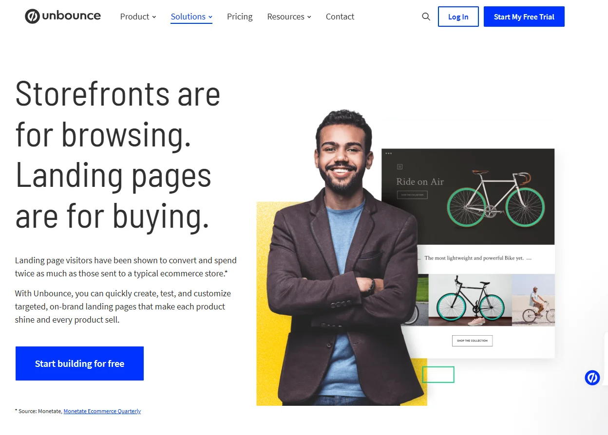
If you want a platform that can handle everything you throw at it, Unbounce is a great option. It’s like the Swiss Army knife of landing page tools.
Why I Like This Tool:
Drag-and-drop builder: Even if you can’t operate a microwave, you can create beautiful landing pages with Unbounce’s drag-and-drop builder. No coding required!
Templates: Don’t know where to start? Unbounce has a huge library of professionally designed templates for various industries and goals. Just pick one and customise to your heart’s content.
A/B testing: Not sure which headline or CTA will perform better? Unbounce makes it easy to run A/B tests and optimise your pages for maximum conversions.
Popups and sticky bars: Want to capture leads or promote offers? Unbounce lets you create beautiful popups and sticky bars to increase engagement.
Who should use it? Leadpages is for businesses of all sizes that want a powerful landing page tool.
2. Leadpages
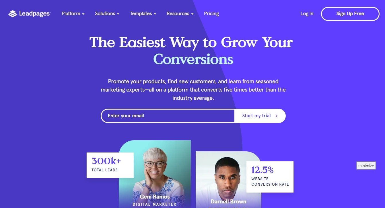
Leadpages is another popular one, known for being affordable and easy to use. It’s like the friendly neighbourhood landing page tool, always there to help out.
Why I Like This Tool:
Budget friendly: Leadpages has a range of plans to fit your budget, perfect for startups and small businesses.
Simple: The platform is super simple, even for newbies. You’ll be creating pages in no time.
Lead capture forms: Leadpages is great at lead capture with various forms and popups to grow your email list.
Website builder: Leadpages also has a website builder so you can have a full online presence in one place.
Who should use it? Leadpages is for businesses on a budget that prioritise lead gen and ease of use.
3. Instapage
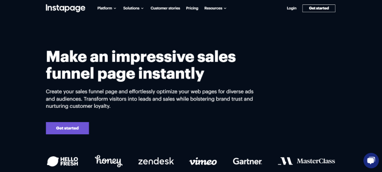
Instapage is all about conversions. It’s like the high-performance sports car of landing page tools, built for speed and efficiency.
Why I Like This Tool:
Fast loading times: Instapage is built for speed so your pages load fast and provide a smooth user experience.
Collaboration tools: Instapage makes it easy for teams to collaborate on pages, with real-time editing and commenting.
Personalisation: Want to create a more personalised experience for your visitors? Instapage lets you customise your pages based on location, demographics and more.
Advanced analytics: Instapage has in-depth analytics to track your page performance and see where to improve.
Who should use it? Instapage is for businesses that are serious about conversions and want a platform with advanced features and analytics.
These are just a few of the many landing page tools out there. The one for you will depend on your needs and budget.
So go do your research, try out a few and choose the one that feels right for you.
Writing Copy for a Product Landing Page?
You’ve got your new landing page tool and a template that makes you happy. But now comes the hard part: writing copy that will actually make people buy your product.
Think of your copy as your landing page’s sales pitch. It’s the voice that guides visitors, answers their questions and persuades them to take action.
But writing copy is more than just stringing words together. It’s about understanding your audience, highlighting your product’s benefits and telling a story that resonates.
So how do you write copy that converts like crazy? Let’s get into some juicy tips and frameworks:
1. Know Your Audience (Like, Really Know Them)
Before you write a single word you need to have a crystal clear understanding of your target audience. Who are they? What are their pain points? What are their aspirations?
The more you know about your audience the better you can tailor your copy to their needs and desires.
Imagine trying to sell a skateboard to a grandma (unless she’s a super cool grandma, of course!). Your message wouldn’t resonate would it?
So do your research. Create buyer personas, analyse your website analytics and conduct surveys to gather insights into your audience’s demographics, interests and behaviours.
The more you know the better your copy will be.
2. Focus on Benefits Not Features
This is a copywriting principle that’s been around for ages but worth repeating. People don’t buy features; they buy benefits.
They don’t care about the technical specs of your product; they care about how it will make their lives better.
So instead of just listing your product’s features, translate them into tangible benefits.
For example instead of saying “Our software has a drag-and-drop interface” say “Create stunning websites in minutes, no coding required.”
See the difference? The first statement is a feature, the second is a benefit. Always focus on the “what’s in it for me?” factor.
3. Headline That Grabs Attention
Your headline is the first thing visitors will see so it needs to be a showstopper.
It should be clear, concise and attention grabbing. Think of it as the bait that hooks them in.
Here are a few tips for writing headlines:
- Use numbers: “10 Ways to Boost Your Productivity”
- Ask a question: “Feeling Overwhelmed?”
- Create a sense of urgency: “Limited-Time Offer: 50% Off Today!”
- Highlight a benefit: “Write emails in seconds”
4. Tell a Story (But Keep it Brief)
People are wired for stories. They help us connect, understand and remember information. So try to tell a story in your landing page copy.
This could be a customer success story, a founder’s journey or even a simple anecdote that illustrates your product’s value.
But remember, attention spans are short these days. So keep your story brief and to the point. No one wants to read a novel on your landing page.
5. Use Persuasive Language (Without Being Pushy)
Your copy should be persuasive but not pushy. No one likes to feel like they’re being sold to. Instead build trust and rapport with your visitors.
Use language that’s confident, enthusiastic and benefit oriented. And don’t be afraid to inject some personality into your writing. After all people buy from people.
6. And Don’t Forget the Call to Action!
Your call to action (CTA) is the final piece of the puzzle. It’s the button or link that tells visitors what to do. Make sure your CTA is clear, concise and visible.
Use strong action verbs like “Get Started”, “Download Now” or “Shop Now”. And consider creating a sense of urgency with phrases like “Limited-Time Offer” or “Don’t Miss Out!”
7. Frameworks for Writing Copy
Here are a few frameworks to help you structure your landing page copy:
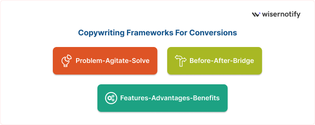
- Problem-Agitate-Solve (PAS): Identify the problem your audience faces, agitate their pain points and then present your product as the solution.
- Features-Advantages-Benefits (FAB): List your product’s features, explain the advantages and then the benefits for the customer.
- Before-After-Bridge (BAB): Describe the customer’s situation before using your product, paint a picture of their life after using your product and then explain how your product bridges the gap.
Follow these tips and frameworks and you’ll be writing landing page copy like a pro. So put on your writing hat, grab a cup of coffee and get writing!
Also see: 12 Best Product Description Examples I’d Steal (2026)
Product Landing Page SEO?
You’ve written the perfect product landing page. It’s a work of art.
Persuasive copy, beautiful visuals and an irresistible offer. But what’s the point of a work of art if no one sees it?
That’s where SEO comes in. It’s like the spotlight that shines on your landing page so it’s visible to the people searching for what you offer.
But optimising a product landing page for SEO isn’t the same as optimising a blog post or product page. It requires a different approach, one that’s tailored to the specific goals and nature of a dedicated product landing.
So let’s get past the generic SEO advice and get into the strategies that will get your product landing page to the top of the search results:
1. Keyword Mastery
Keywords are the foundation of SEO but for product landing pages it’s about more than just keyword stuffing.
It’s about understanding search intent and aligning your keywords with the specific needs and desires of your target audience.
Think like a customer.
- What would someone type into Google when searching for a product like yours?
- What questions would they ask?
- What problems are they trying to solve?
Use tools like Ahrefs, SEMrush or even Google’s Keyword Planner to find keywords with high search volume and low competition.
But don’t stop there. Analyse the search results to understand the intent behind those keywords. Are people looking for information, reviews or are they ready to buy?
Once you have a clear understanding of search intent, strategically weave your keywords into your landing page copy, headlines and meta descriptions.
But remember, write for humans first, search engines second. Your copy should be natural, engaging and persuasive.
2. A Custom URL That Sings
Your landing page URL is more than just a web address. It’s a piece of SEO real estate.
So ditch the generic URLs and create a custom URL that includes your primary keyword and matches the content of your page.
For example instead of using a generic URL like “[invalid URL removed]” use a keyword rich URL like “[invalid URL removed]”
This helps search engines understand what your page is about and improves click through rates from search results.
People are more likely to click on a URL that’s relevant and informative.
3. On-Page Optimisation

On-page optimisation is the art of fine tuning your landing page to make it more search engine friendly. It’s about sending clear signals to Google that your page is relevant, authoritative and user friendly.
Here are some key on-page optimisation tactics for product landing pages:
➨ Header tags: Use header tags (H1, H2, H3 etc) to structure your content and highlight key information. Your main headline should be an H1, subheadings should be H2s, H3s and so on.
➨ Image optimisation: Optimize your images by using descriptive file names and alt text. This helps search engines understand what your images are about and can even improve your rankings in image search results.
➨ Page speed: No one likes a slow website, including Google. Optimise your landing page’s loading speed by compressing images, minimising code and using a fast web host.
➨ Mobile friendliness: More and more people are accessing the internet on their mobile devices. Make sure your landing page is mobile friendly by using a responsive design that adapts to different screen sizes.
4. Backlinks

Backlinks are like votes of confidence from other websites. They tell Google your landing page is valuable and trustworthy.
The more high quality backlinks you have the higher your page will rank in search results.
But building backlinks for product landing pages can be tough. After all you’re not exactly writing a blog post that’s begging to be shared. So you need to get creative.
Here are a few ways to get those backlinks rolling:
➨ Influencers: Reach out to influencers in your industry and ask them to review your product or link to your page.
➨ Guest blogging: Write guest posts for other websites in your niche and link back to your page.
➨ Submit to directories: There are a number of directories that list landing pages. Submit your page to relevant directories to get more visibility and backlinks.
➨ Contests and giveaways: Run a contest or giveaway that requires people to link to your page.
5. Schema Markup
Schema markup is a type of code that helps search engines understand the content of your landing page. It’s like giving Google a cheat sheet to your page.
For product landing pages you can use schema markup to provide information about your product such as its name, price and availability.
This can help your page appear in rich snippets in search results which can increase click through rates.
There are a number of schema markup tools available such as Google’s Structured Data Markup Helper.
So there you have it, implement these SEO strategies and turn your product landing page from a hidden gem to a search engine superstar.
Now get to it, put on your SEO hat and get ready to dominate the search results!
Gemini can make mistakes, so double check it
3 Product Landing Page Templates
Let’s be honest, staring at a blank canvas can be daunting even for the most creative minds. That’s where landing page templates come in.
They’re like pre-built blueprints for your product landing page, a solid foundation to build on.
But with so many templates out there how do you choose the right one? Fear not my friend, I’ve curated a selection of three product landing page templates, each with its own strengths and use cases:
1. The “Classic” Template: Unbounce’s “Product Launch” Template
Ideal for: Launching a new product with a bang
This template from Unbounce is a classic for a reason. It’s clean, concise and laser focused on conversions. It’s like the well tailored suit of landing page templates – timeless and effective.
Features:
👉 Hero section with headline and visuals: Grab attention with a hero image and headline that tells your product’s value proposition.
👉 Benefit driven sections: Highlight your product’s benefits in separate sections using clear and concise language that speaks to your target audience.
👉 Social proof: Build trust and credibility by showing customer testimonials or social media mentions.
👉 Clear CTA: Guide visitors to the desired action with a big and persuasive CTA button.
👉 Why I like it: This template is super versatile and can be used for any product and industry. It’s a great starting point for any product landing page and provides a solid structure to build upon.

To make this template really pop, personalize it with your brand colors, fonts and imagery. And don’t forget to A/B test different elements to optimize for conversions.
2. The “Storyteller” Template: Leadpages’ “Authoritative Ebook” Template
Ideal for: Selling ebooks, online courses or other digital products that require a story
This Leadpages template is for products that need a bit more storytelling. It’s like the novel of landing page templates – draws visitors in with a story and persuasive language.
Features:
👉 Engaging headline and intro: Hook visitors with a headline that grabs their attention and an intro that sets up your product’s story.
👉 Problem-agitation-solution structure: Address your target audience’s pain points, agitate their emotions and then present your product as the solution.
👉 Authoritative tone and expert insights: Show your expertise and provide valuable insights related to your product.
👉 Scarcity and urgency: Create a sense of urgency by showing limited time offers, exclusive bonuses or limited availability.
👉 Why I like it: This template is great for building hype around your product. You can create a deeper connection with your audience by telling a story and positioning your product as the hero.

Use high-quality visuals and multimedia elements to add to your storytelling and make it more engaging for your visitors.
3. The “Minimalist” Template: Instapage’s “Simple SaaS” Template
Ideal for: Software products, SaaS solutions or any product that needs a clean and modern design
This Instapage template is minimalist. It’s like the smartphone of landing page templates – cuts through the noise with a clean design and a focused message.
Features:
👉 Clean and simple layout: Prioritize clarity and focus with a minimal design that removes distractions and guides visitors to the CTA.
👉 Strong headline and short copy: Communicate your product’s value proposition in a clear and short language that speaks to your target audience.
👉 Visual hierarchy: Use headings, subheadings and bullet points to guide the visitor’s eye and break up the text and highlight the key info.
👉 Whitespace and negative space: Use whitespace to create a sense of calm and focus and let your product and CTA shine.
👉 Why I like it: Good for products that need a premium and modern look. Also good for complex information to be presented in a bite-sized and visually appealing way.

Use high-quality product screenshots or mockups to show your product’s features and benefits. And don’t forget to add some personality with your brand colors and fonts.
These are just a few of the many product landing page templates out there. The best one for you will depend on your product, target audience, and marketing goals.
So, try out different options, experiment with different layouts, and find the one that matches your vision.
What to Measure on a Product Landing Page?
You should measure your product landing page. This will help you see what’s working and what’s not.
Some of the key metrics to measure:
- Conversion rate: The percentage of visitors who take action on your page.
- Bounce rate: The percentage of visitors who leave your page without taking action.
- Time on page: The average time visitors spend on your page.
Product Landing Page Mistakes?
Creating a high-converting product landing page is like baking a cake. You need the right ingredients, the right tools and the right technique to create a masterpiece.
But even with the best of intentions it’s easy to make mistakes that can make your landing page flat and unappetizing.
So, let’s skip the generic advice and get into the common mistakes that can kill your product landing page and the solutions to avoid them:
1. The “Lost in the Woods” Syndrome
Imagine landing on a page that throws everything at you, multiple offers and confusing CTAs. It’s like being in a dense forest with no clear path.
This is a common mistake that can leave visitors feeling lost and disoriented.
The solution:
One page, one goal: Your product landing page should have one single goal. Whether it’s to generate leads, drive sales or promote a specific offer, make sure everything on the page is aligned to that goal.
Clear value proposition: Communicate your product’s unique value proposition in seconds. Visitors should know what your product is, how it benefits them and why they should care.
Simplified design: No clutter and distractions. Use a clean and organized layout to guide visitors to the CTA.
2. The “Wall of Text” Disaster
No one likes to be greeted by a wall of text, especially on a landing page. It’s like attending a lecture where the speaker goes on and on and on and your eyes start to feel heavy.
Overloading your page with information can overwhelm visitors and make them bounce faster than a rubber ball.
The solution:
- Short and scannable copy: Use short paragraphs, bullet points and headings to break up the text and make it easy to read.
Visual storytelling: Use images, videos and infographics to communicate information in a more engaging and digestible way.
Prioritize key info: Put the most important info above the fold (the visible area of the page before you scroll). So visitors see the key details without having to dig.
3. The “Hidden Treasure” Dilemma
Your CTA is the treasure at the end of your landing page. But if it’s buried under a pile of text or hidden in a corner, visitors might never find it.
The solution:
Prominent placement: Make your CTA stand out. Put it above the fold, use contrasting colors and make it visually different from the rest of the page.
Compelling copy: Use action-oriented language that encourages visitors to click. For example instead of a generic “Submit” button use “Get My Free Trial” or “Download Now.”
Multiple CTAs: Consider having multiple CTAs on the page especially for longer landing pages. This gives visitors multiple chances to convert.
4. The “Generic Stock Photo” Epidemic
Stock photos can be a lifesaver but generic images that lack personality can make your landing page feel boring and uninspired.
It’s like using clip art in a presentation – it screams “unoriginal” and fails to grab attention.
The solution:
High-quality visuals: Use high-resolution images that are relevant to your product and target audience.
Authenticity: Use images that feel real and relatable. Consider using photos of people using your product or showcasing your brand’s personality.
Visual hierarchy: Use images to guide the visitor’s eye and highlight key info.
5. The “Ignoring Mobile” Oversight
In today’s mobile first world, ignoring mobile users is a no-no. If your landing page isn’t optimized for mobile devices you’re alienating a big chunk of your potential customers.
The solution:
Responsive design: Make sure your landing page adapts to different screen sizes and provides a consistent experience across all devices.
Mobile friendly elements: Use big font sizes, clear buttons and concise copy that’s easy to read on smaller screens.
Page speed optimization: Optimize your landing page’s load speed for mobile devices. No one wants to wait for a slow page to load especially on their phone.
By avoiding these mistakes and implementing the solutions you can have a product landing page that’s not only beautiful but also converts like crazy. So, get rid of the pitfalls, follow the best practices and watch your conversions go up!
Conclusion
Now you have a product landing page that will help you achieve your marketing goals.
Remember to focus on the audience’s needs, use high quality visuals and write good copy. And track your results so you can see what’s working and what’s not.
Got questions about product landing pages? drop in below live chat.
