I’ve tested product badges across dozens of ecommerce stores. The right badge boosts click-through rates by 55%.
The wrong approach, badging everything, trains shoppers to ignore them.
This guide covers 12 badges that convert, where to place each one, and the mistakes that kill results.
Boost Conversion Instantly
Add Social Proof & Urgency to your website
What Are Product Badges?
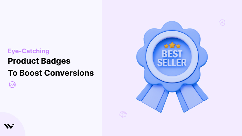
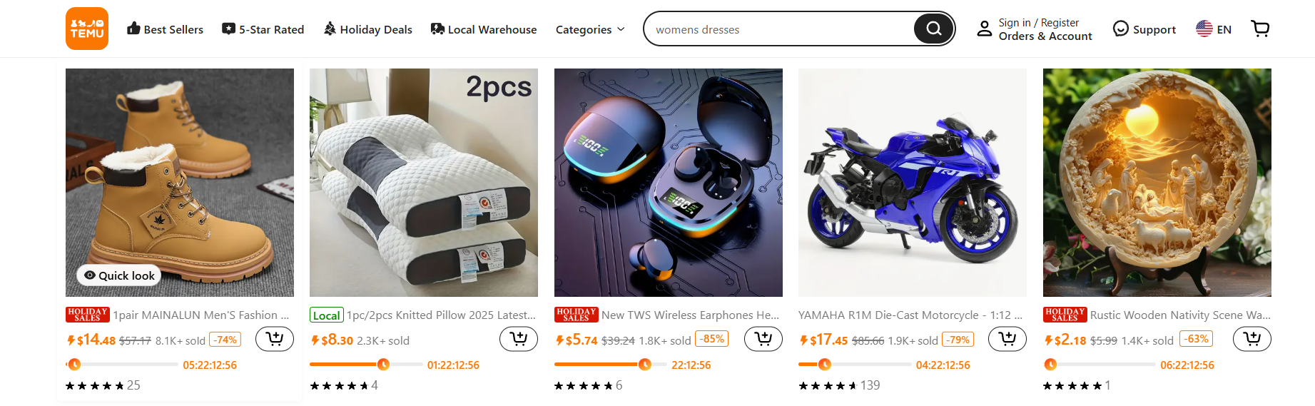
Best Seller
New Arrival
Limited Stock
30% Off
Product badges are small visual labels or icons displayed on product images in an online store.
They highlight specific attributes like “Best Seller,” “New Arrival,” “Limited Stock,” or “30% Off” to help shoppers quickly understand what makes a product worth their attention.
Think of badges as digital shelf tags. In a physical store, you’d see a red “Sale” sticker or a “Staff Pick” card.
Online, product badges serve the same purpose: they guide shoppers through your catalog and help them make faster decisions.
Effective badges do three things simultaneously. They create visual contrast in the product grid, forcing a micro-pause as shoppers scan.
They communicate value instantly (“Why should I care about this product right now?”). And they nudge shoppers forward in the buying journey by reducing hesitation.
The best ecommerce stores use badges strategically on 15-25% of their catalog, not on everything.
When every product has a badge, none of them stand out. It’s a common mistake I’ll cover later.
Also check: 12 Trust Badges I Use to Boost Sales (2026 Guide)
Why Product Badges Drive Sales
Product badges work because they tap into well-documented psychological triggers that influence purchase behavior.
Create urgency and scarcity. “Only 3 Left” and “Sale Ends Tonight” badges activate loss aversion, which is the fear of missing out on something desirable. According to the Baymard Institute, nearly 70% of online carts are abandoned. Urgency badges reduce that hesitation by giving shoppers a reason to act now instead of “later” (which usually means never).
Provide social proof. “Best Seller,” “Top Rated,” and “Customer Favorite” badges tell shoppers that other people have already validated this product. Social proof is especially powerful for first-time visitors who don’t yet know your brand. A Spiegel Research Center study found that displaying reviews and popularity signals can increase conversion rates by up to 270% for higher-priced products. That’s not a typo. Social proof badges are effective when they’re backed by real data.
Simplify decision-making. When shoppers face too many choices, they freeze. They can’t decide, so they don’t decide. Badges act as filters, helping people quickly identify which products deserve a closer look. “Best Seller” says, “This is a safe choice.” “New Arrival” says, “This is worth exploring.” “Free Shipping” says, “this won’t cost you extra.”
Highlight value without discounting. Not all badges are about sales and promotions. “Eco-Friendly,” “Handmade,” or “Award Winner” badges communicate value without reducing your margins. They give shoppers reasons to choose your product over competitors that don’t highlight these attributes. You don’t always need a price cut to make a product more appealing.
12 Product Badges That Increase Conversions (With Examples)
I’ve organized these by the psychological trigger they activate: social proof, urgency, value, and trust. Every store should use at least one badge from each category.
Social Proof Badges
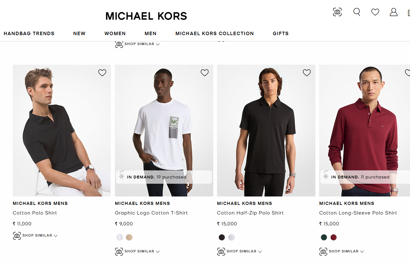
1. Best Seller Badge
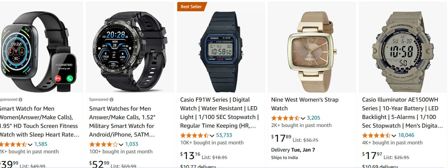
The “Best Seller” badge is the most powerful social proof signal in ecommerce. It tells shoppers: “Hundreds of people chose this product, and you should too.”
Amazon’s orange “Best Seller” badge is the most recognized example. It appears on category pages and product detail pages, instantly communicating that this product outperforms alternatives.
The badge works because it reduces perceived risk for undecided shoppers.
Best placement: Category pages, product listing pages, and product detail pages. Most effective on products with genuine high sales volume.
Build urgency
Add floating offers with countdown timer & coupon code.


2. New Arrival Badge
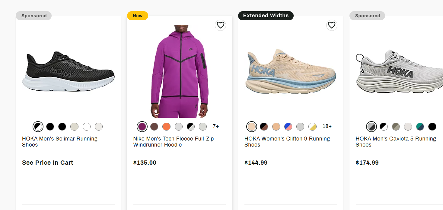
“New Arrival” badges attract two customer segments: early adopters who want the latest products, and returning customers who check back regularly for fresh inventory.
Dick’s Sporting Goods uses a clean “New” badge on recently added merchandise.
The simplicity works because it doesn’t compete with other product information.
Best placement: Homepage featured sections, category pages, and email campaigns. Time-limit these badges to 30-60 days after product launch to maintain credibility.
3. Social Proof Badge
“Top Rated,” “Customer Favorite,” and star rating badges leverage existing customer feedback as a conversion tool.
These badges work best when backed by real review data, not just arbitrary labels.
Pairing social proof badges with live social proof notifications (like “Sarah just purchased this” or “42 people viewing this right now”) creates a powerful trust layer.
Static badges plus dynamic notifications build more trust than either approach alone.
Best placement: Product detail pages near the price, category pages, and landing pages for high-consideration products.
Build trust & FOMO
Highlight real-time activities like reviews, sales & sign-ups.

Urgency and Scarcity Badges
4. Limited Stock Badge
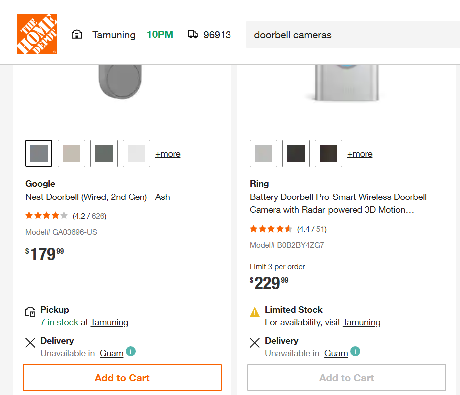
“Only 3 Left in Stock” is one of the most effective urgency triggers in ecommerce. Specific numbers work better than vague statements.
“Limited Stock” is ignorable. “Only 2 Left” creates real tension.
Home Depot uses limited stock badges to push shoppers toward quick decisions on popular items. The key is connecting these badges to real inventory data.
Fake scarcity (showing “Only 3 Left” on everything) destroys trust fast.
Best placement: Product detail pages near the “Add to Cart” button, and category pages for fast-moving items.
5. Urgency Badge
“Sale Ends Tonight,” “Last Chance,” and countdown timer badges create time pressure. They work by making shoppers feel that delaying means losing the deal.
The most effective urgency badges include a specific deadline. “Flash Sale: 6 Hours Left” converts better than “Limited Time Offer” because the specificity feels real.
Combine urgency badges with announcement bars at the top of the page for maximum visibility.
Best placement: Product detail pages, cart pages, and site-wide announcement bars during promotional periods.
6. Seasonal and Holiday Badge
Holiday badges (“Valentine’s Gift,” “Black Friday Deal,” “Back to School”) tap into event-driven purchasing intent.
Shoppers actively looking for holiday gifts are more likely to click on products flagged for that occasion.
These badges work best when they’re issued promptly and removed after the event. A “Christmas Special” badge showing in February hurts credibility.
Best placement: Homepage featured sections, dedicated landing pages, and category pages during the relevant season.
Build trust & FOMO
Highlight real-time activities like reviews, sales & sign-ups.

Value and Promotion Badges
7. Discount and Sale Badge
Discount badges are the most common product badge in ecommerce. “30% Off,” “Save $50,” or “BOGO” badges work because they quantify the savings immediately.
Specific percentages outperform generic “Sale” labels. Walmart’s clearance badges show exact discount amounts, which performs better than vague “On Sale” messaging because shoppers can instantly calculate value.
Best placement: Category pages, product detail pages near the price, and cart pages (to reinforce the deal). Don’t use it on more than 30% of products, or the impact fades.
8. Free Shipping Badge
According to the Baymard Institute, 48% of shoppers abandon carts because extra costs like shipping were too high. A “Free Shipping” badge directly addresses this friction point before the shopper even reaches checkout.
Wayfair prominently displays “Free Delivery” badges on qualifying products, making the shipping benefit visible from the category page.
Best placement: Category pages (near price), product detail pages, and checkout pages. If you offer conditional free shipping (over $50), show the threshold on the badge.
9. Clearance Badge
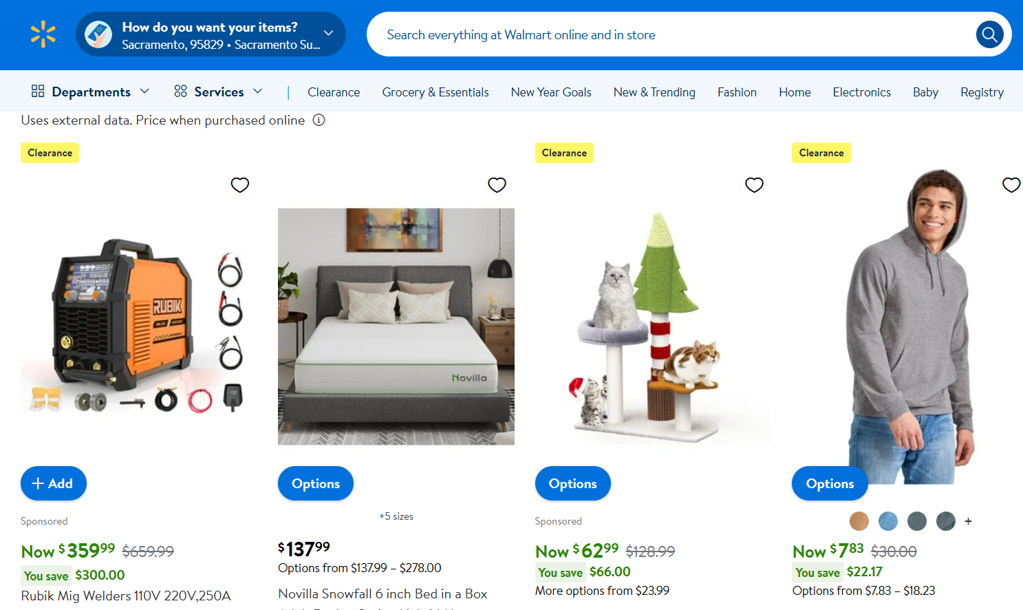
Clearance badges signal the deepest discounts, attracting deal-hunters and helping you clear slow-moving inventory. They combine value (big discount) with urgency (once it’s gone, it’s gone).
The most effective clearance badges show the original price crossed out alongside the clearance price. That visual contrast makes the savings feel more tangible than a percentage alone.
Best placement: Dedicated clearance pages, category pages, and sidebar filters. Keep clearance products in a separate section so they don’t dilute your full-price catalog.
Boost Conversion Instantly
Add Social Proof & Urgency to your website
Trust Badges
10. Secure Payment Badge
Secure payment badges (“SSL Encrypted,” “Secure Checkout,” payment method logos) reassure shoppers that their financial information is protected.
These aren’t product-level badges, but they appear on product pages near the checkout button and are critical for conversion.
GymShark prominently displays accepted payment logos (Visa, Mastercard, Apple Pay) to build trust at the moment of highest purchase anxiety.
Best placement: Near the “Add to Cart” button, checkout page, and footer. These work best alongside other trust signals on your site.
11. Money-Back Guarantee Badge
A money-back guarantee badge removes the biggest objection in online shopping: “What if I don’t like it?” When shoppers know they can return a product hassle-free, the perceived risk of buying drops significantly.
Specific guarantees convert better than vague ones. “60-Day No-Questions-Asked Return” outperforms “Money-Back Guarantee” because the specificity communicates confidence in the product.
Best placement: Product detail pages (below “Add to Cart”), checkout page, and “About Us” page.
12. Award and Certification Badge
“Award Winner,” “Editor’s Choice,” “Organic Certified,” and “Cruelty-Free” badges communicate third-party validation.
They’re especially powerful for products where quality, ethics, or sustainability influence the purchase decision.
These badges work because they shift the source of trust from your brand’s claims to an independent authority.
A “USDA Organic” badge carries more weight than your own “Made with Natural Ingredients” statement.
Best placement: Product detail pages near the product description, category pages, and landing pages for premium or specialty products.
Build urgency
Add floating offers with countdown timer & coupon code.
How to Use Product Badges Effectively
The difference between badges that convert and badges that get ignored comes down to strategy, not design.
Badge 15-25% of your catalog, not everything. When every product has a badge, shoppers develop “badge blindness” and stop noticing them. Reserve badges for products where they add genuine information: actual best sellers, real limited stock, current promotions, and legitimate new arrivals. If you’re badging more than a quarter of your catalog, you’re diluting the impact.
Use real data, not fake labels. If your “Best Seller” badge appears on products that don’t actually sell well, customers will notice the disconnect. It’s not something you can fake long-term. Connect badges to real inventory data, real sales rankings, and real review scores. Tools like WiserNotify can automate this by showing live social proof data alongside your static badges.
Match badge types to product categories. New arrivals badges work best for fashion and seasonal products. “Only X Left” badges work best for popular items with limited inventory. Free shipping badges work best on higher-priced items, where shipping costs are a bigger concern. Don’t use the same badge type across unrelated categories. It won’t resonate.
Test one badge type at a time. Don’t launch five new badge types simultaneously. Add one type, measure its impact on CTR and conversion rate for 2-3 weeks, then add the next. This way, you’ll know which badges actually drive results and which ones aren’t worth keeping.
Design for mobile first. According to Statista, over 60% of ecommerce traffic is mobile. Your badges need to be readable on small screens. If the text is too small or the badge obscures the product image on a phone, it’s hurting more than it’s helping.
Combine static badges with dynamic social proof. Static badges (“Best Seller”) tell shoppers what happened in the past. Dynamic notifications from tools like WiserNotify’s purchase alerts (“Sarah from London just bought this”) show what’s happening in real time. The combination is more persuasive than either approach alone. I’ve seen this layered strategy consistently outperform static badges by 2-3x in conversion tests.
Common Mistakes With Product Badges
I’ve audited product badge strategies for dozens of ecommerce stores. These mistakes come up almost every time.
Badging everything. If every product in your store has a badge, you’ve effectively badged nothing. The whole point of a badge is to make specific products stand out. When everything stands out, nothing does. I’ve seen stores put “Best Seller” on 60% of their catalog. It doesn’t work. Keep badges on 15-25% of products, at most.
Using fake scarcity. “Only 2 Left!” on 80% of your products teaches shoppers to distrust your badges. Connect stock badges to real inventory data. If customers catch you faking scarcity, the damage to trust extends beyond badges to your entire brand. This is especially true for returning customers who notice the same “Almost Gone” badge on the same product week after week.
Stacking too many badges on one product. A product with “New,” “Best Seller,” “Free Shipping,” AND “30% Off” badges looks cluttered and confusing. Stick to one badge per product. Choose the one that matters most for that specific product’s conversion goal. If it’s a new product, use “New Arrival.” If it’s a top seller, use “Best Seller.” Don’t try to say everything at once.
Never refreshing badges. A “New Arrival” badge that’s been on the same product for six months isn’t credible. Set expiration rules for time-sensitive badges. New arrivals should rotate every 30-60 days. Seasonal badges should be removed within a week after the event. If you can’t maintain badge freshness, you shouldn’t be using time-based badges.
Ignoring mobile rendering. Badges that look great on desktop can be illegible or overlap product images on mobile. Over 60% of ecommerce traffic is mobile. Test on real phones, not just browser dev tools. If the badge text isn’t readable at a glance on a 5-inch screen, simplify it or use an icon-only approach.
No A/B testing. Don’t assume badges work. Prove it. Run A/B tests comparing products with and without badges. Measure click-through rate from category page to product page, and conversion rate from product page to cart. I’ve seen stores where removing a poorly designed badge actually improved conversions. Let data drive your badge strategy, not assumptions.
Poor color choices. A red “Sale” badge on a product with a red background disappears completely. Your badge colors need to contrast with both the product image and your site’s color scheme. Test different badge colors and pick the ones that create the strongest visual pop without clashing with your brand identity.
