
12 Pricing Page Best Practices (With SaaS Examples, 2026)
A pricing page converts when a visitor can pick the right plan fast and feels safe paying for it.
In practice that means three or four clear plans, one highlighted pick, proof from other buyers, and a button that names the next step.
Below are 12 practices grouped by the job they do, each shown on a SaaS pricing page you can open today, plus how to write the copy and measure the result.
Key takeaways
- Keep self-serve plans to three or four, and label who each one is for.
- Use anchoring and a highlighted plan to steer visitors toward the tier most people should buy.
- Put the price, what it scales with, and what’s not included in plain text on the page.
- Place proof next to the plan cards, and give every button a clear next step.
How Should You Structure Your Plans?
A pricing page that converts offers three or four tiers built around who buys, anchors high, and makes the target plan the obvious pick.
1. Keep Pricing Simple
Every extra plan is one more thing to compare. Past four self-serve tiers, many visitors stall instead of choosing.
Keep the lineup short and move any custom enterprise deal into its own card with a “Contact sales” button.
- Show three or four plans side by side, not a dropdown of ten.
- Give each plan one line on who it’s for.
- Highlight one plan with a badge or a different color.
- List features in the same order under every plan so the rows line up.
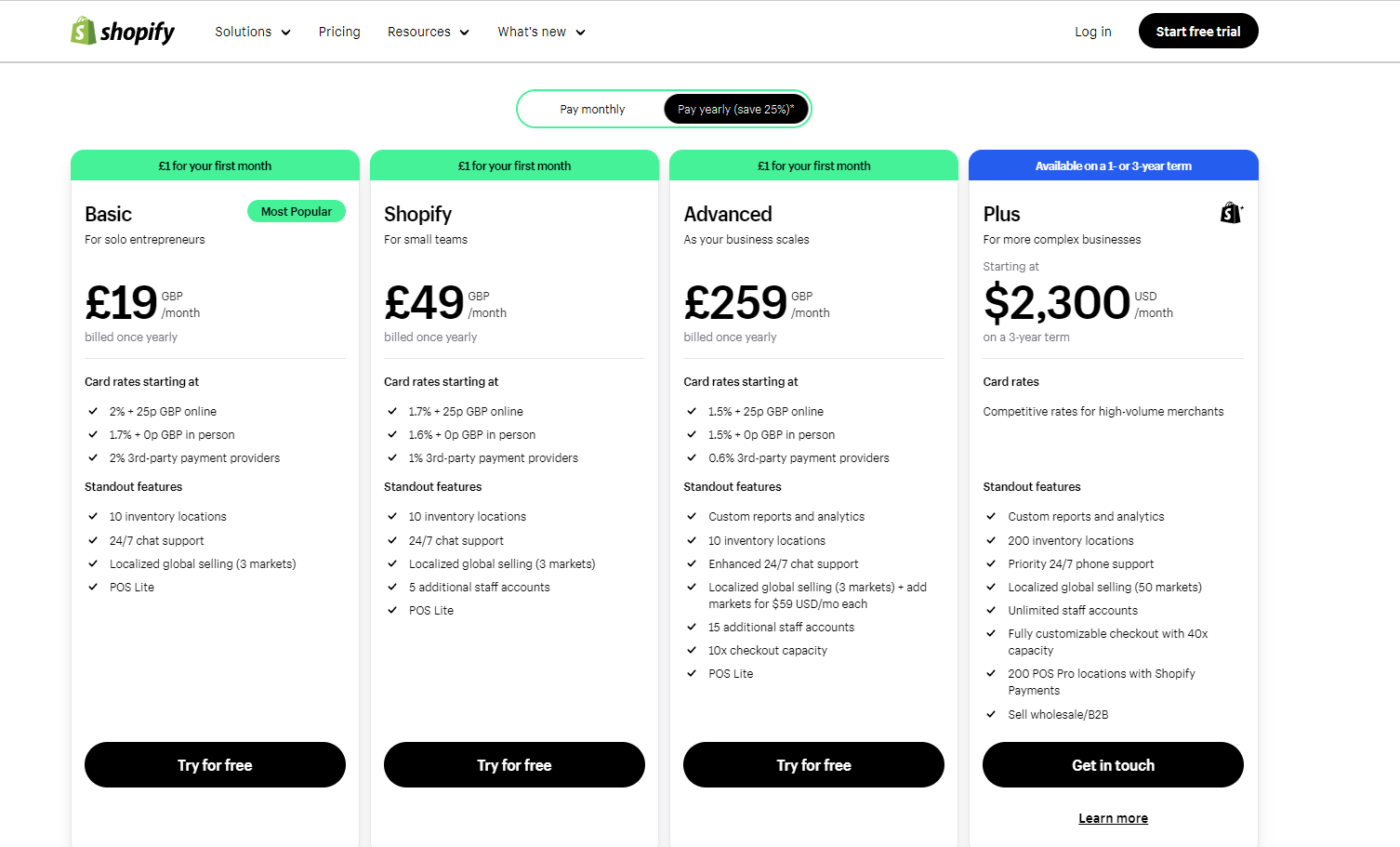
Example: Shopify
Shopify shows three self-serve plans, each with a one-line audience label for solo entrepreneurs, small teams, or bigger operations. Plus sits in a fourth card for complex businesses.
That keeps the main decision a three-way pick. A merchant can place themselves without opening the full feature table.
2. Use Price Anchoring
The first price a visitor sees becomes the yardstick for every price after it. Show the top plan first and the middle plan feels like a fair deal.
It works best when the anchor is a plan some buyers do pick. A fake top tier that nobody buys reads as a trick.
Anchoring is one of the most common psychological marketing examples you’ll see, and pricing pages are where it earns the most.
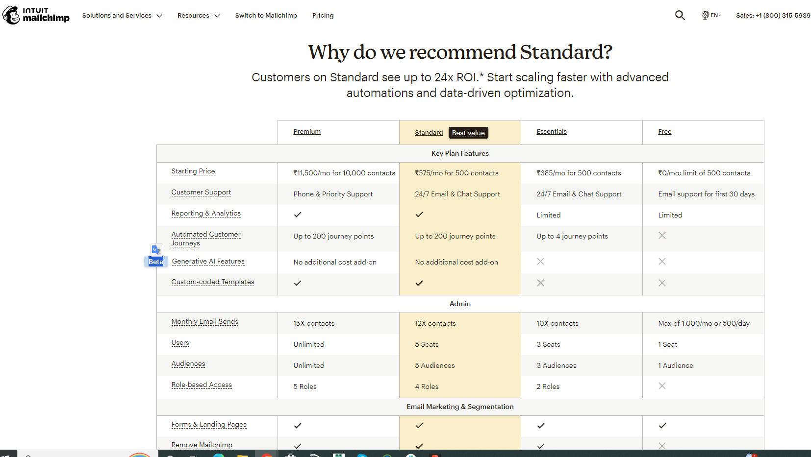
Example: Mailchimp
Mailchimp’s plan comparison runs Premium, Standard, Essentials, then Free, left to right.
By the time readers reach Standard, its price looks modest next to Premium, and a “Best value” tag tells them this is the one to take.
3. Show Your Best Plan (Decoy Effect)
A decoy is a plan priced close to your target plan but noticeably weaker. Its only job is to make the target plan look like the smart choice. Both decoys and anchors show up in our nudge marketing guide, on stores and travel sites as well as SaaS pages.
To build one, keep the decoy’s price near the target’s and leave out a feature your buyers care about.
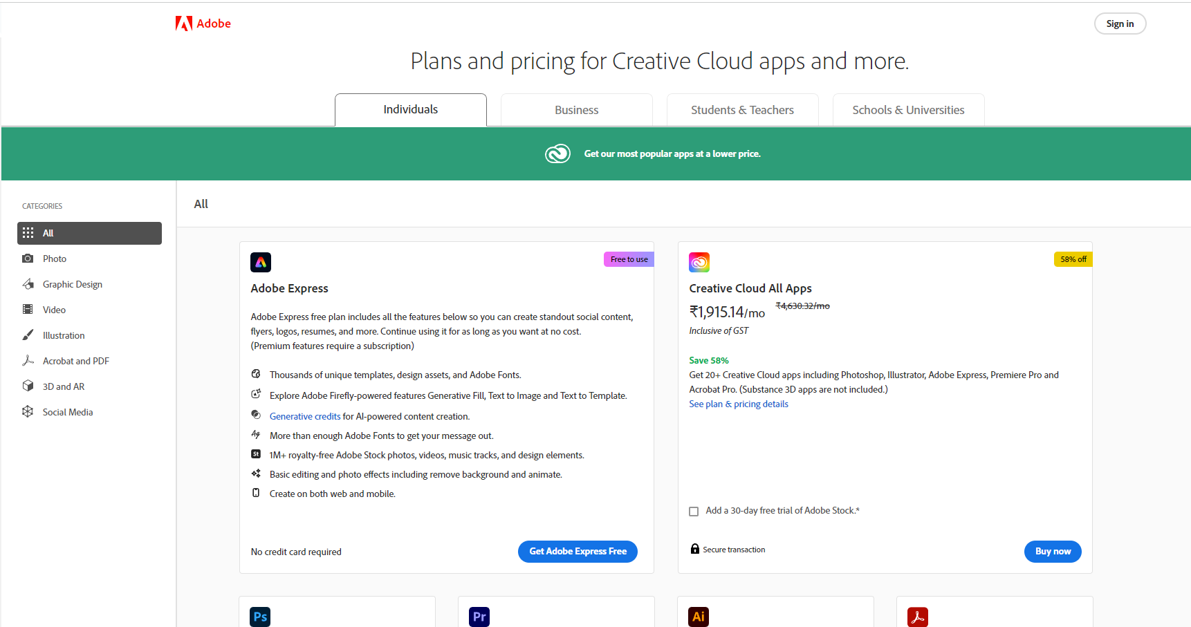
Example: Adobe Creative Cloud
Adobe splits its all-apps offer into Creative Cloud Standard and Creative Cloud Pro. Both come with the same desktop apps.
Pro costs a little more per month but adds a far larger generative AI allowance plus full web and mobile access. Standard ends up making Pro look like the easy step up.
4. Match Plans to Buyer Personas
Freelancers, growing teams, and companies with a security review all land on the same page. Each of them needs a card that speaks to them.
Write the audience into the plan description first, then let the feature list back it up.
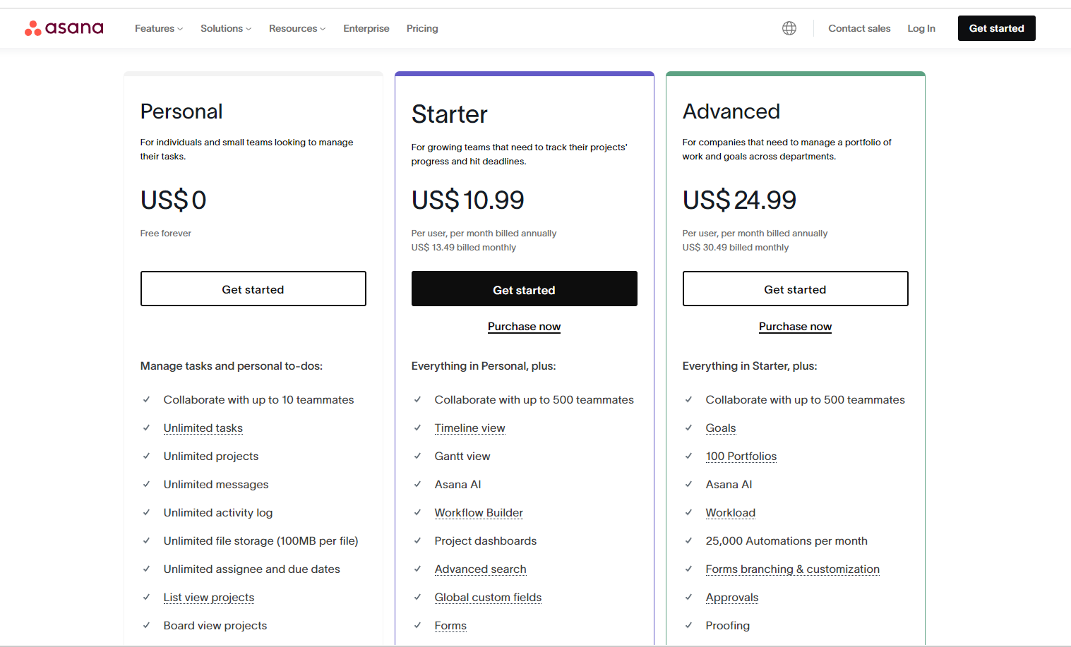
Example: Asana
Asana starts every card with a plain audience line. Personal is for one or two people, Starter for small teams chasing deadlines, and Advanced for growing teams planning work across projects.
Enterprise sits apart for buyers who need single sign-on and admin controls, so the self-serve choice stays clean.
How Do You Make Buyers Trust the Price?
Buyers trust a price when they can try the product first, see that people like them already pay for it, and find no hidden costs.
5. Offer a Free Plan or Free Trial
A free plan or a trial lets buyers check the product before they pay. Which one fits depends on how fast your product shows its value.
- Free trial: better when the value shows up within days and you want a clear decision point.
- Free plan: better when the product spreads through a team or needs weeks of use before it clicks.
Trials also lean on loss aversion marketing. Once someone has set up their account, losing it feels worse than paying for it.
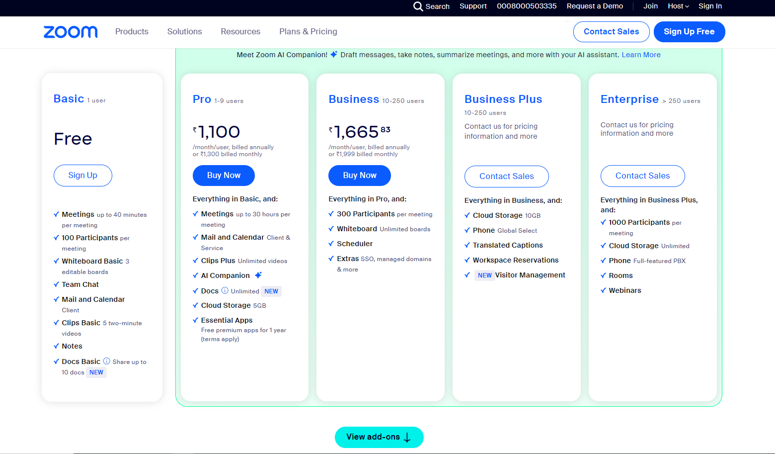
Example: Zoom
Zoom’s Basic plan is free, but meetings stop at 40 minutes. That cap is the whole upgrade pitch.
Pro, tagged “Most popular,” lifts the limit to 30 hours. The reason to pay shows up the first time a call gets cut off.
Build trust & FOMO
Highlight real-time activities like reviews, sales & sign-ups.


6. Add Social Proof
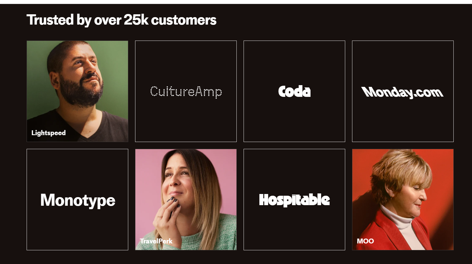
Buyers look for people like them before they commit. Testimonials, customer logos, and review counts placed near the plan cards answer that without a click.
This is social proof marketing at its simplest. Specific beats general, so a named customer with a job title and one hard result does more than a wall of logos.
Example: Intercom
Intercom’s pricing page carries a block of named customer quotes under the headline “Thousands of businesses have already seen transformational results.”
Each quote carries a name, a job title, and a result in numbers. A count of the company’s five-star reviews sits on the same page.
Add Live Proof Next to the Plans
Static quotes prove people bought at some point. A live notification shows people signing up now.
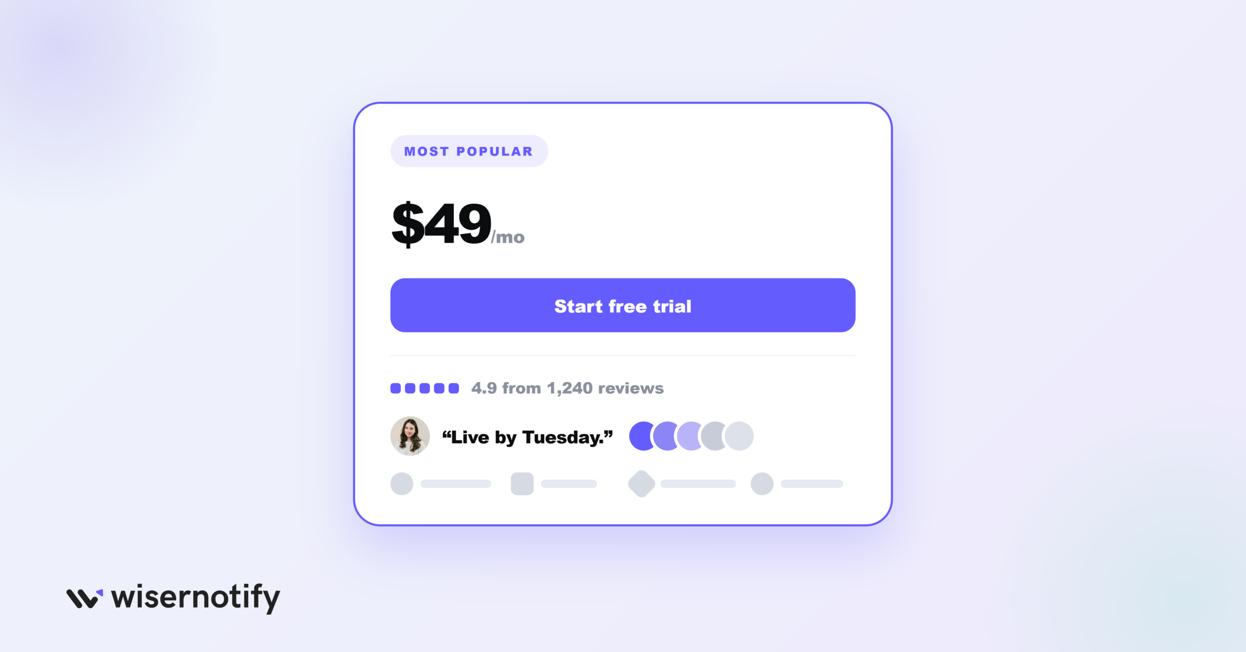
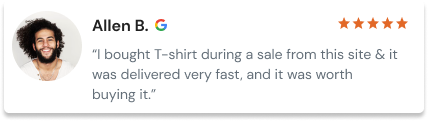
WiserNotify places a small notification beside your plan cards that shows recent sign-ups, how many people are viewing the page, or a fresh customer review.
Match it to your traffic. A pricing page with a handful of visits a day will show stale sign-ups, so a review notification is the safer pick there.
Stick to one notification type on the page and keep it clear of the plan buttons. The same placement rules work on landing pages too.
Build trust & FOMO
Highlight real-time activities like reviews, sales & sign-ups.
7. Transparent Pricing
Surprise costs at checkout kill trust faster than a high price. Show the starting price, what the price scales with, and anything that costs extra.
Plain-text prices matter for a newer reason too. Buyers now ask AI assistants what a tool costs, and a hidden or script-loaded price often gets swapped for a review site’s older number.
Example: Basecamp
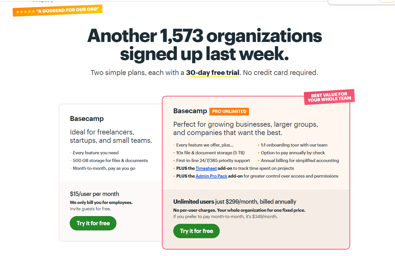
Basecamp leads its pricing page with “No per-user fees, everyone’s included.” Every tier is a flat monthly price tied to a project count and storage.
Each plan panel also lists what’s missing with a red cross, so buyers see the gaps before they sign up, not after.
What Layout Makes Plans Easy to Compare?
Plans are easy to compare when every card follows the same pattern, a full feature table sits below, and nothing important hides behind tooltips.
8. Feature Comparison Table
Cards sell the choice. The table settles it for buyers who need to check one specific feature before they commit.
Keep rows in the same order as the cards, use checkmarks over sentences, and let the header row stick as people scroll.
Example: Buffer
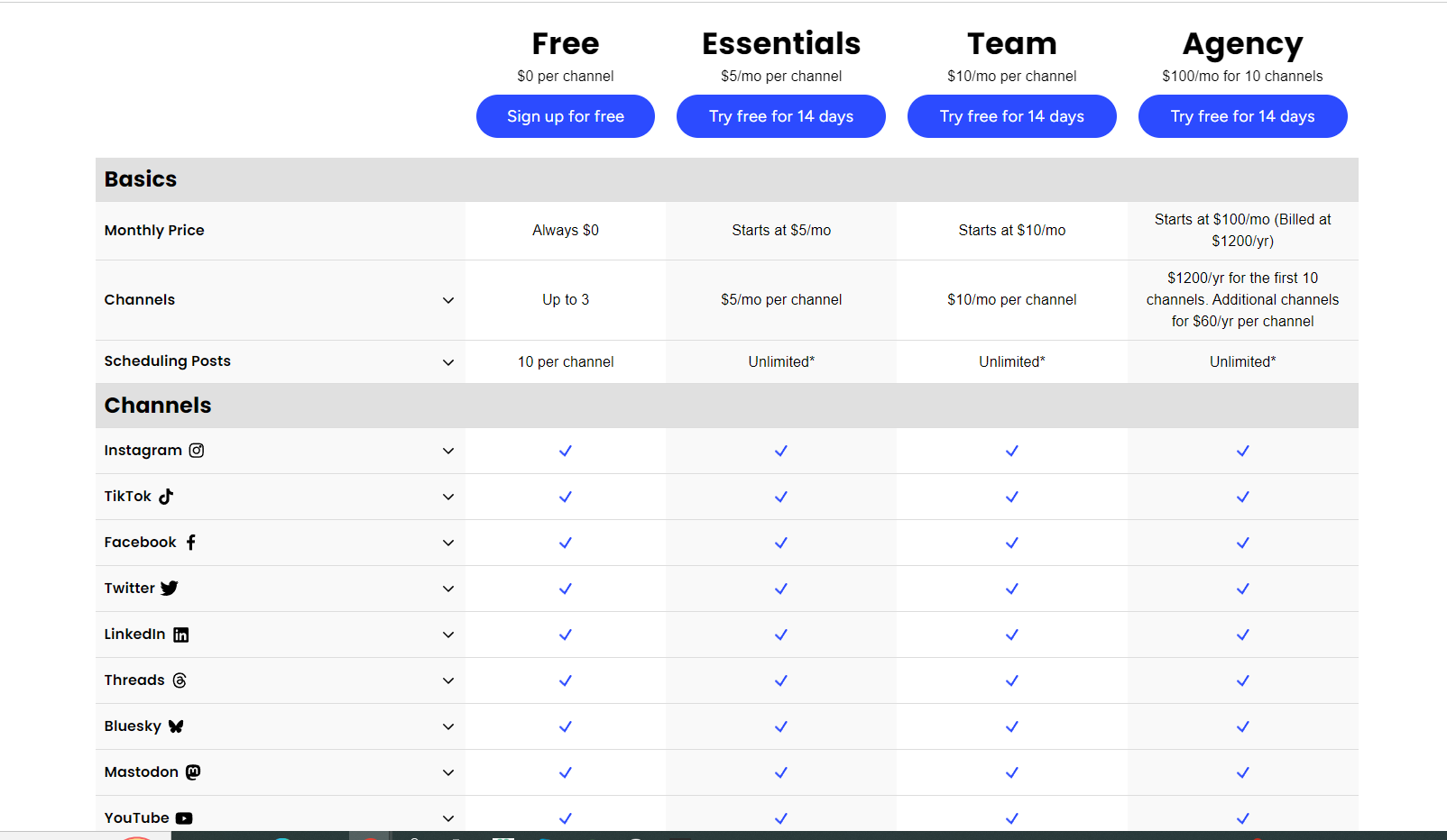
Buffer prices by social channel, with a channel picker above three plans and a full “Compare plans” table underneath.
It also publishes a machine-readable version of its pricing for AI agents. That plain-text file lists every plan, price, and limit in one place.
9. Pricing Cards
Each card needs the same five parts in the same order. That means plan name, price, a one-line purpose, a short feature list, and a button.
Matching parts let the eye jump across cards and compare like with like.
Example: Webflow
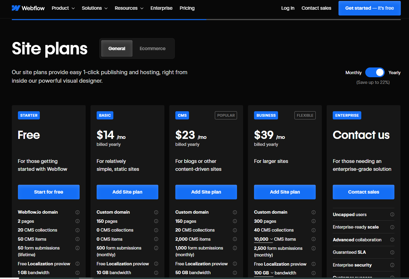
Webflow’s cards each name the kind of site the plan suits, then list hard limits such as static pages, CMS items, and bandwidth.
Someone building a simple static site can rule out the higher tiers in a few seconds.
10. Good UX
Friction costs sales on a page built for deciding. Buttons should be easy to find, text easy to scan, and the page quick to load.
Check it on a phone before anything else. Side-by-side cards often stack into a long scroll, and the highlighted plan can end up far below the fold. Our guide to mobile conversion rate optimization covers the layout fixes.
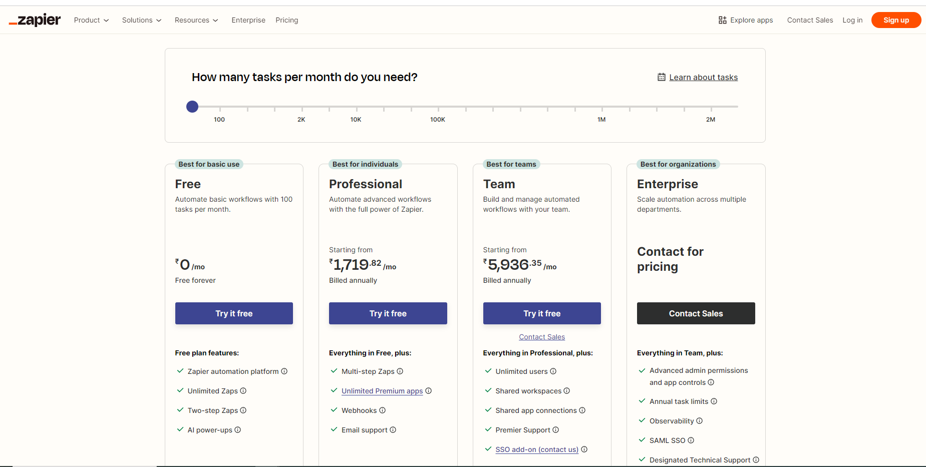
Example: Zapier
Zapier opens its pricing page with one question, how many tasks you need each month, and a slider to answer it.
The plan cards follow with a one-line purpose each. A “Compare all features” table comes after that for anyone who wants every detail.
What Turns a Pricing Page Visit Into a Signup?
A pricing page visit turns into a signup when the button names the next step, the risk is removed, and each plan’s value fits in one line.
11. Effective Call-to-Action
The button is the last thing a buyer reads before deciding. Vague labels like “Submit” or “Learn more” make people stop and think.
- Name the action and the offer. “Start 14-day trial” beats “Get started.”
- Use one contrasting button color across all plans, with a bolder style on the highlighted one.
- Add urgency only when it’s true, like limited-time offers on annual billing with a fixed end date.
- Put a short risk line under the button, such as “Cancel anytime.”
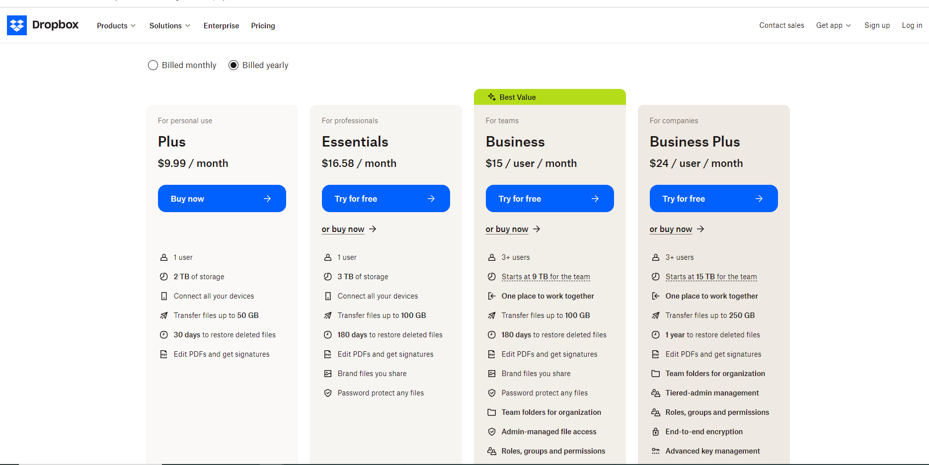
Example: Dropbox
Dropbox changes the button to fit the buyer. The single-user Plus plan gets “Buy now,” while the team plans offer “Try for free or buy now” for teams that want to test before rolling out.
The Standard plan also wears a “Best Value” tag, which tells undecided visitors where to click.
Build trust & FOMO
Highlight real-time activities like reviews, sales & sign-ups.
12. Value Proposition
Price only makes sense next to what it buys. Each plan needs a one-line promise of the outcome, not just a stack of features.
Write that line from the buyer’s side. “Sell online and get paid” says more than “Commerce features included.”
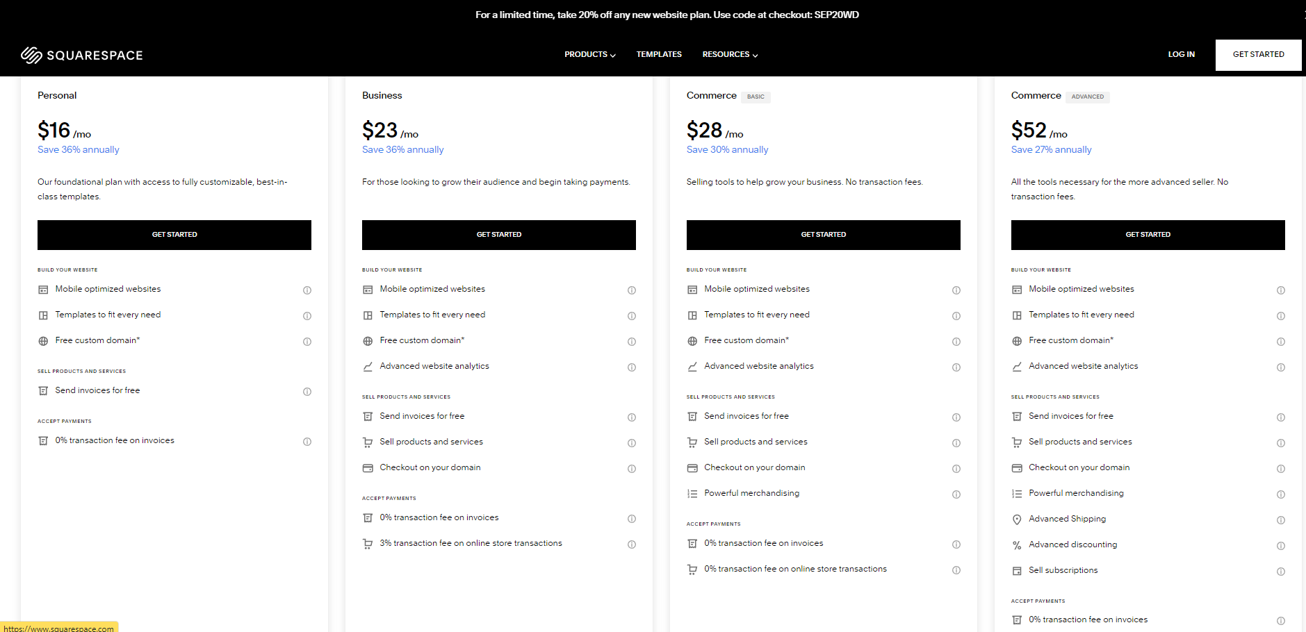
Example: Squarespace
Squarespace tops each plan card with one line on what the plan helps you do, from getting a site discovered online to cutting payment fees as sales grow.
The feature list comes second, as proof of that promise.
How Do You Write Pricing Page Copy That Converts?
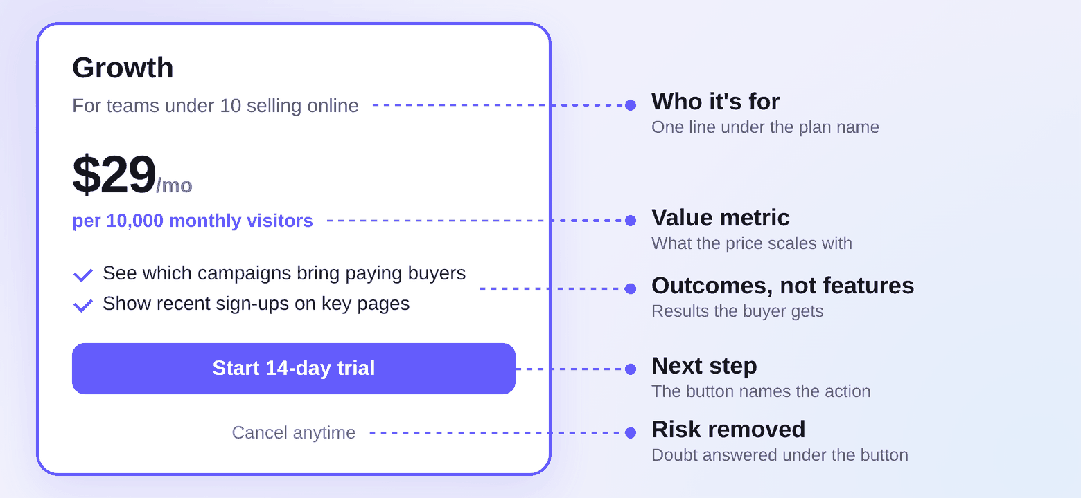
Pricing page copy converts when it names who each plan serves, states the value metric plainly, and turns each feature into an outcome.
Most pricing pages get the layout right and the words wrong. These are the lines worth rewriting first.
- Headline: Lead with what makes your pricing easy to say yes to, such as a flat fee or a trial, instead of a bare “Pricing” title.
- Plan one-liners: Write one sentence under each plan name on who it’s for. “For teams under 10” works. “Our most flexible plan” doesn’t.
- Value metric: Put what the price scales with right beside the number, per user, per contact, or per 1,000 visitors, so nobody has to guess the bill.
- Feature lines: Rewrite labels as results. “Advanced reporting” becomes “See which campaigns bring paying customers.”
- Billing FAQ: Answer the questions that stall signups right under the plans, like what happens when the trial ends, how to switch plans, and what counts as a user.
Read the finished page out loud. Any line you’d have to explain to a friend needs another pass.
Common Pricing Page Mistakes to Avoid
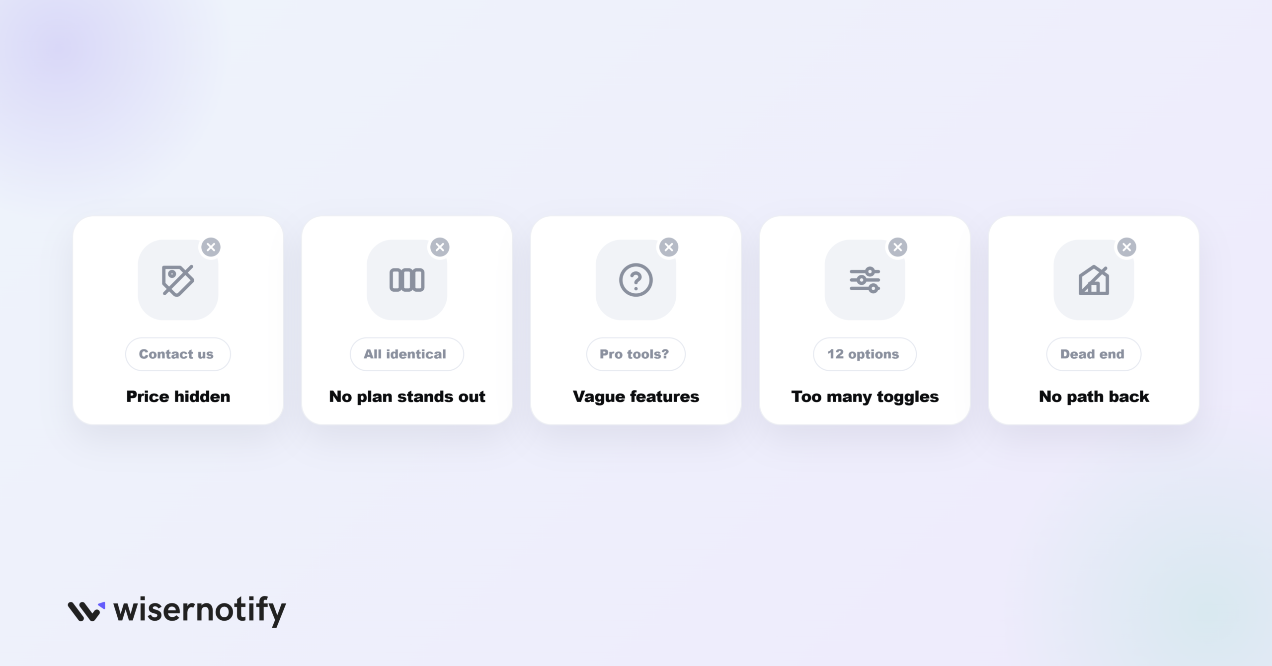
Most of these show up as one symptom, plenty of visits and few signups. We break that pattern down in our post on getting traffic but no sales.
- Hiding the price behind “Contact us”: Fine for custom enterprise deals. For a standard plan, it sends price-checkers to a competitor who shows the number.
- Making every plan look the same: If nothing stands out, visitors have to work out the best fit alone, and many leave instead.
- Vague feature names: “Pro tools” or “Advanced support” forces a guess. Say what the feature does.
- Too many toggles and add-ons: A few options help. A page full of sliders and checkboxes turns a buying decision into homework.
- No path for the unsure: Give hesitant visitors somewhere to go, like a demo booking, a comparison page, or an email signup.
How Do You Measure Pricing Page Results?
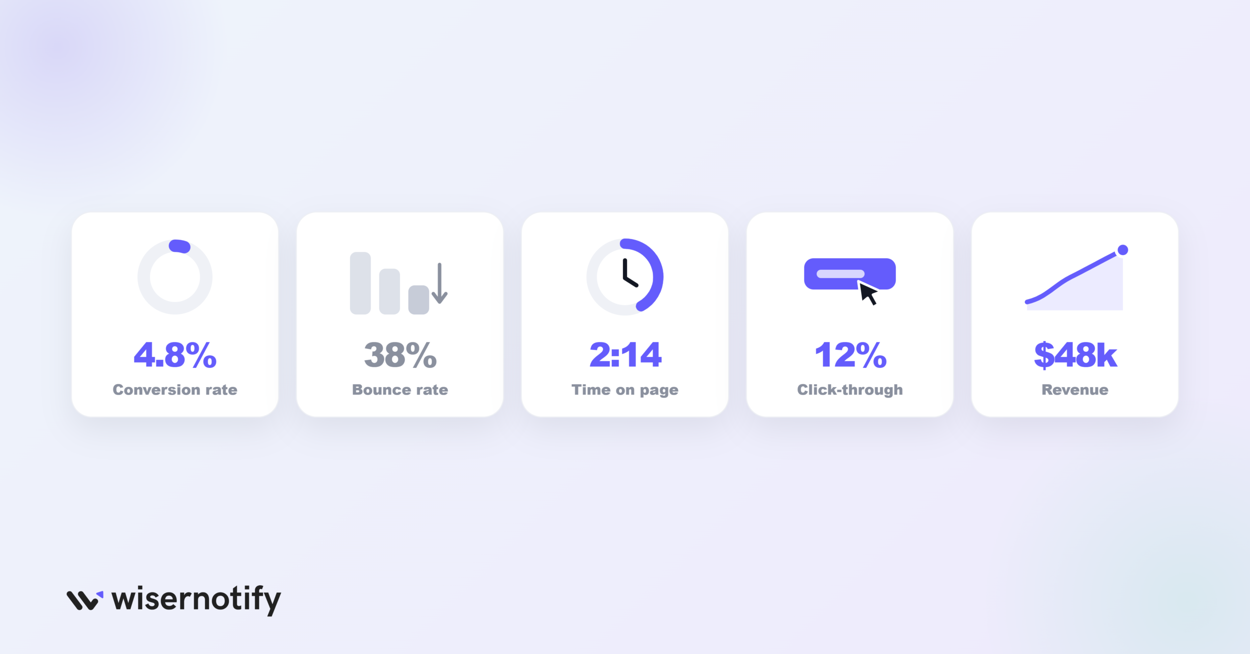
Measure a pricing page by the share of visitors who start a trial or buy, then use four supporting metrics to find where it leaks.
- Conversion rate: The share of pricing page visitors who start a trial or pay. Every other metric here helps explain this one.
- Bounce rate: A high bounce rate on this page often means the plans confused people or the price surprised them.
- Time on page: Long visits with no signup point to hesitation. Check which plans people keep comparing.
- Click-through rate: The share of visitors who click a plan button. A low rate next to a long time on page points to a copy problem.
- Revenue: Shows whether a change pulls people toward higher plans, not just toward more signups.
Read every metric by plan. A jump in cheap-plan signups can hide a drop in revenue.
A/B Testing Your Pricing Page
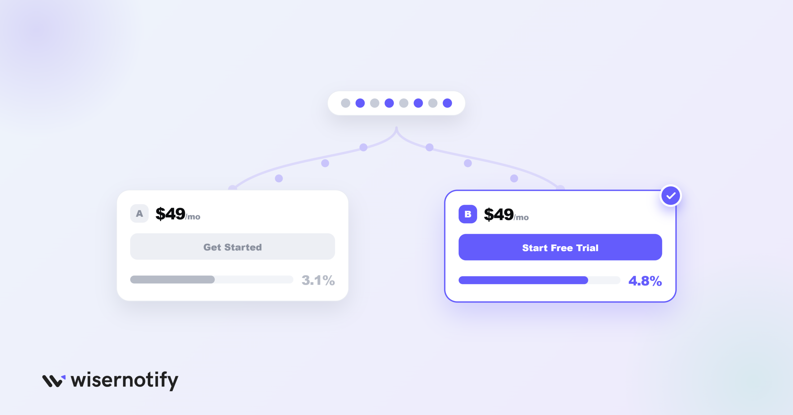
Metrics show where the page leaks. A/B testing shows which fix works.
Change one thing per test so the result points to a single cause. These four are the cheapest places to start.
- Button wording: “Get started” against “Start free trial” is quick to set up and tends to show a result fast.
- Highlighted plan: Move the badge to a different tier and watch where signups land.
- Default billing view: Showing monthly or annual first changes how the price looks without changing the price.
- Trial or free plan: If you’re unsure which model fits, test it instead of guessing.
Give each test enough traffic for a clear result. An early lead after two days can flip by day ten.
Wrapping Up
Pricing pages rarely fail because of one big mistake. They lose sales through small ones that stack up, like an extra plan, a vague button, or a missing customer quote.
Pick the group above that matches your weakest spot, fix it, and measure before you move to the next one.

Boost Conversion Instantly
Add Social Proof & Urgency to your website
Frequently Asked Questions
How many plans should a pricing page have?
Most pricing pages work best with three or four self-serve plans. Put custom or enterprise deals in a separate card with a Contact sales button.
Should my pricing page and free trial page be the same?
No. The pricing page helps visitors choose a plan, while the trial sign-up page should ask for as little as possible so starting is fast.
Should I show prices publicly or ask people to book a demo?
Show prices for every self-serve plan, since hidden prices send buyers to competitors and review sites. Keep Contact sales for custom enterprise deals.
Is a free plan or a free trial better for conversions?
A trial works better when your product shows its value within days. A free plan suits products that spread through a team or need longer use before they click.
Where should social proof go on a pricing page?
Place it close to the plan cards and buttons, where the decision happens. A named customer quote or a live sign-up notification does more there than a logo strip in the footer.
How often should I update my pricing page?
Review it whenever your plans or prices change. Between changes, keep one A/B test running so there is always a next fix in the queue.

Krunal Vaghasiya is a marketing tech expert who boosts e-commerce conversion rates with automated social proof and FOMO strategies. He loves to keep posting insightful posts on online marketing software, marketing automations, and improving conversion rates.




 Capterra