
15 Mobile Landing Page Examples That Convert (2026)
A mobile landing page is a page built for a phone screen first, with one goal, a button you can reach with your thumb, and nothing that makes visitors pinch or zoom.
That matters because about 59% of web traffic now comes from mobile devices. The 15 examples below show what that looks like in practice, from pinned CTAs and email popups to one-tap sign-ups.
Every example was checked on an iPhone-size screen (390 pixels wide), so each one includes a measured detail you can compare against your own page.
Build trust & FOMO
Highlight real-time activities like reviews, sales & sign-ups.

Mobile Landing Page Examples at a Glance
| Brand | Mobile tactic | Why it works |
|---|---|---|
| HubSpot | Pinned header with a demo button | The CTA never scrolls out of reach |
| Todoist | Sticky “Start for free” plus a 64px hero button | Two easy taps to the same action |
| Canva | One button on a clean first screen | No competing choices |
| Evernote | App banner and a full-width CTA | Routes visitors to the app or the web |
| Allbirds | 10% off email popup | Turns browsers into subscribers |
| Bose | Popup with three numbered steps | Explains the offer before asking |
| Liquid Death | Free gift popup in brand voice | Feels like part of the brand, not an ad |
| Death Wish Coffee | Offer bar at the top of the screen | Shows the deal without blocking the page |
| Sift | Review stars above the headline | Trust before the pitch |
| Mixpanel | Review score and logos on the first screen | Proof sits next to the CTA |
| Uber | Pickup form as the hero | Visitors start using the product right away |
| Promo | One input field and a 48px button | The first step takes seconds |
| Duolingo | Two stacked full-width buttons | New and returning users each get a path |
| Calendly | One-tap Google and Microsoft sign-up | No typing on a small keyboard |
| Spark Membership | Demo and trial buttons, both 50px tall | A clear choice for every buyer |
What Makes a Mobile Landing Page Work
A mobile landing page isn’t a shrunken desktop page. It’s designed around a thumb, a small screen, and visitors who are often on slower connections.
- Tap-friendly buttons. Google’s Lighthouse flags tap targets smaller than 48 by 48 pixels when they crowd other targets.
- A CTA in reach. The main button sits on the first screen, or stays pinned as visitors scroll.
- Less typing. Fewer fields, autofill, and one-tap sign-in beat long forms.
- Fast loading. Light images and few scripts, since many visitors browse on mobile data.
For the bigger picture beyond mobile, see these ways to improve landing page conversion rate.
Pages That Keep the CTA in Reach
On a phone, a button that scrolls away is a button nobody taps. These four keep the main action close at all times.
1. HubSpot
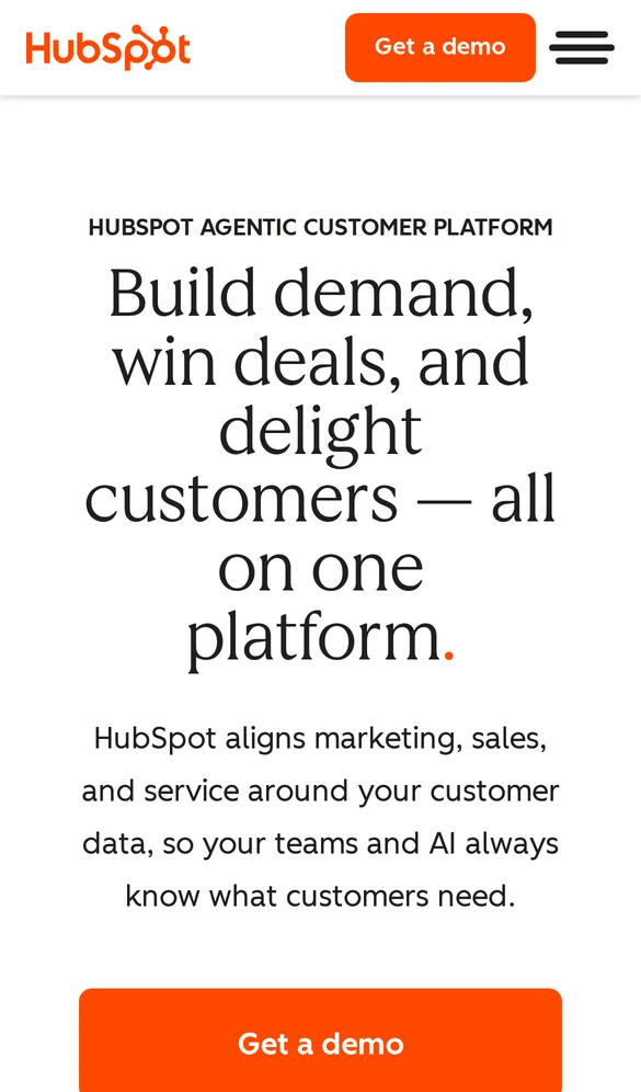
HubSpot pins its header to the top of the screen, so the orange “Get a demo” button inside it stays visible as visitors scroll. The hero repeats the same button, full width, at the bottom of the first screen.
- Pinned header: 56px tall, with the demo button inside it at all times.
- What to copy: put your main CTA in a slim sticky header, and repeat it in the hero.
2. Todoist
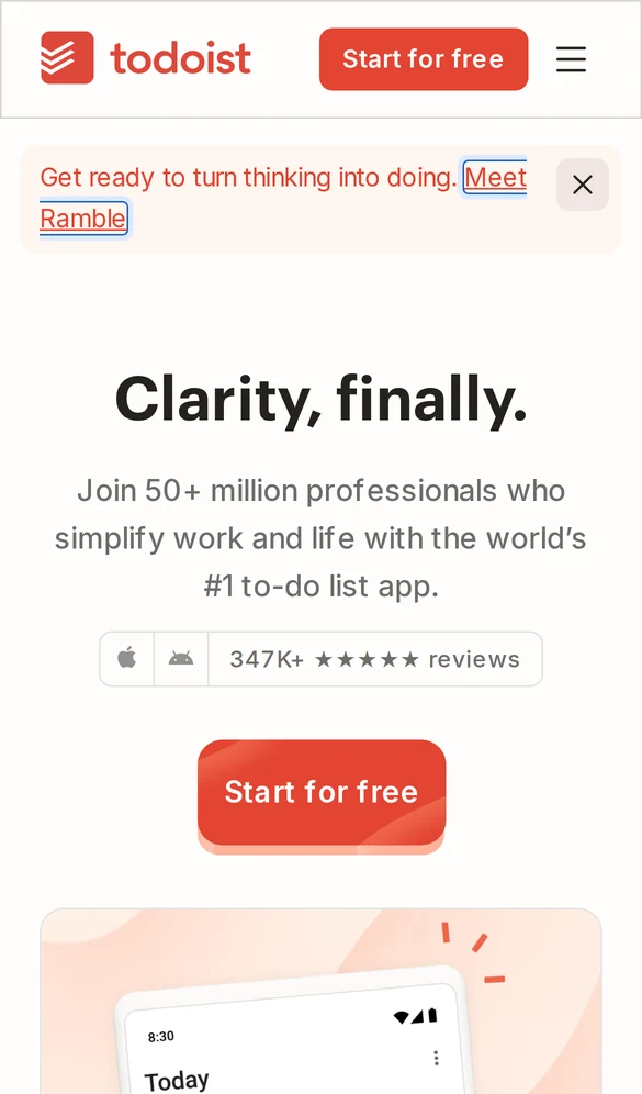
Todoist gives mobile visitors two ways to start: a “Start for free” button in its sticky header and a larger one under the headline.
Social proof sits right above the hero button, with 50+ million users and 347K+ app reviews.
The hero button is 64px tall, well above the 48px minimum, and its red color is the only strong color on the screen. Your eye goes straight to it.
See more mobile call to action examples for button ideas.
3. Canva
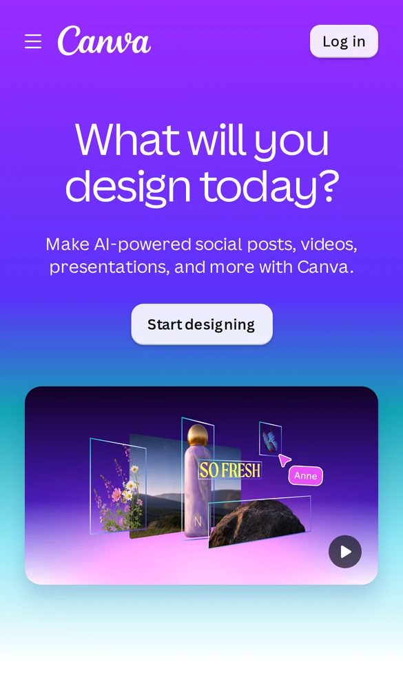
Canva’s first mobile screen asks one question, “What will you design today?”, and offers one button. There’s no second CTA competing for the tap, and the gradient background makes the white button stand out.
One thing to improve: the “Start designing” button measures 40px tall, a little under the 48px target. A slightly taller button would be easier to hit with a thumb.
4. Evernote
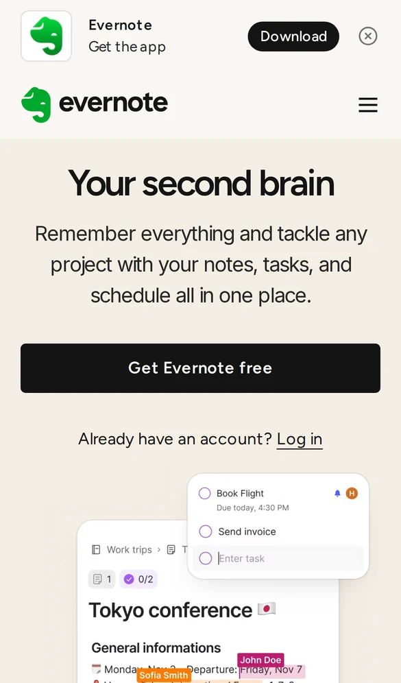
Evernote opens with a slim banner offering the app, then a full-width “Get Evernote free” button. Visitors who’d rather use the app tap the banner; everyone else signs up on the web.
- Full-width button: it spans 350px of the 390px screen and is 48px tall.
- Returning users: a small “Already have an account? Log in” line keeps them from hunting for the menu.
Pages That Capture Emails With Offers
Mobile visitors often aren’t ready to buy on the first visit. These pages trade a small reward for an email address, so the visit isn’t wasted.
5. Allbirds
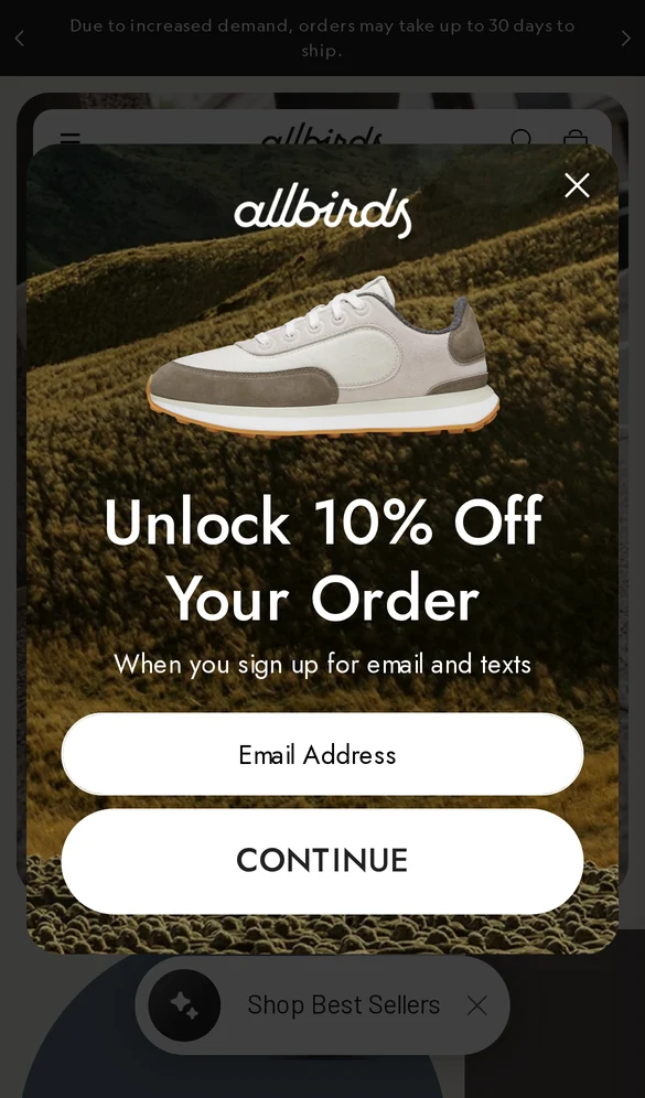
Allbirds shows a popup that offers “10% Off Your Order” for signing up with an email or phone number. The email field and “Continue” button both run nearly the full width of the popup, so they’re easy to tap.
Behind the popup, the shop buttons tell a different story. They’re 278px wide but only 33px tall, under the 48px target. Wide buttons help, but height matters for thumbs too.
6. Bose
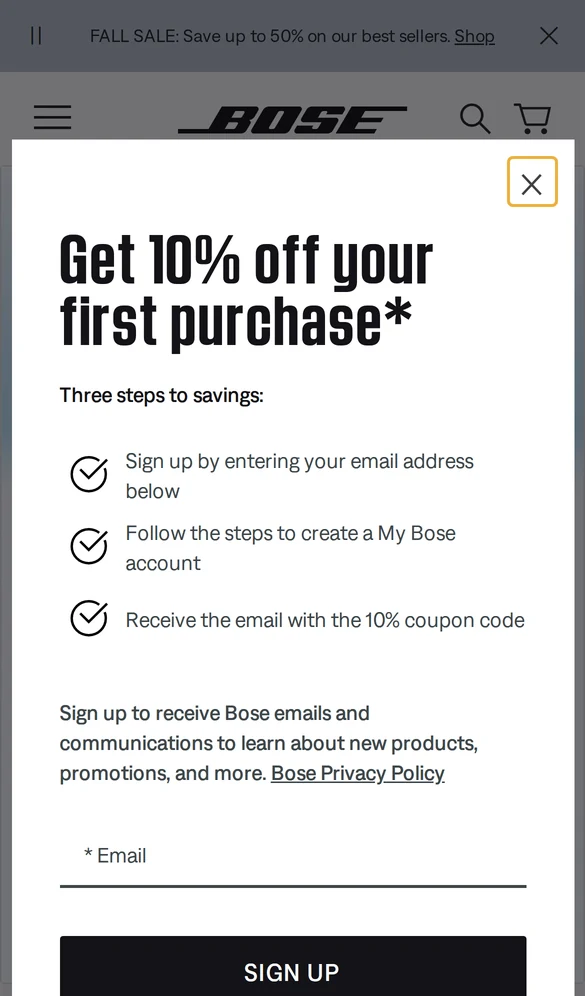
Bose’s popup explains its 10% offer in three short, checkmarked steps before it asks for anything. Visitors know exactly what happens after they share their email.
- Sign up with your email address.
- Create a My Bose account.
- Get the email with your 10% coupon code.
Spelling out the steps works well for offers with more than one action involved. These exit intent popup examples show more ways to time an offer.
7. Liquid Death
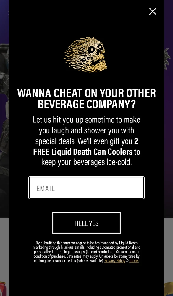
Liquid Death’s popup asks, “Wanna cheat on your other beverage company?” and offers two free can coolers for an email address. The button says “Hell yes” instead of “Subscribe.”
The offer is a physical gift, not a discount, which protects margins and still feels generous. The copy sounds like the rest of the brand, so the popup reads as part of the experience rather than an interruption.
8. Death Wish Coffee
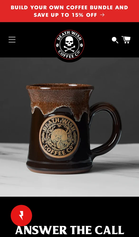
Death Wish Coffee puts its offer in a red bar at the very top of the screen: build your own coffee bundle and save up to 15%.
It’s the first thing visitors read, but it doesn’t block the page the way a popup does.
An offer bar suits brands that want to promote a deal on every visit without stopping people. See these announcement bar examples for more layouts.
Build trust & FOMO
Highlight real-time activities like reviews, sales & sign-ups.
Pages That Lead With Social Proof
When the screen is small, proof has to sit close to the headline. These two put it on the first screen, where visitors decide whether to keep reading.
9. Sift

Sift places a row of G2 review stars and a “#1 in Risk-Based Authentication” label above its headline. Visitors see that others trust the product before they read a word of the pitch.
- Demo button: the pink “Demo Sift” button is 47px tall, just under the 48px target.
- Second path: an outlined “See customer stories” button gives skeptical visitors more proof instead of a dead end.
10. Mixpanel

Mixpanel fits a lot of trust into one screen: a 4.5 out of 5 score from more than 1,300 reviews, plus customer logos like monday.com and Coinbase, all directly under its two buttons.
The buttons sit side by side and are 40px tall. Side-by-side buttons save space, but they work best when each one is clearly different, as Mixpanel does with a dark “Book a Demo” and a light “Get Started Free.”
For more ideas, see how to use landing page social proof.
Pages Built Around One Action
The fastest mobile pages ask for one small step and make it as easy as possible. These five cut the first action down to a tap or two.
11. Uber
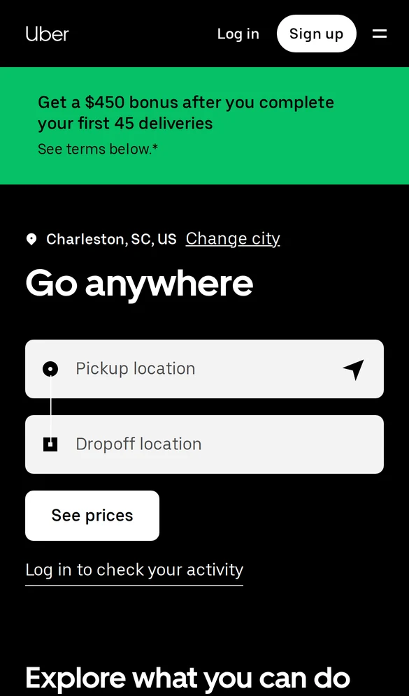
Uber’s mobile hero is the product itself: a pickup field, a dropoff field, and a “See prices” button. Visitors start planning a ride before they’re asked to sign up.
- Price button: “See prices” is 48px tall, right on the target.
- What to copy: if your product has a quick first step, such as a price check or a search, make it the hero.
12. Promo
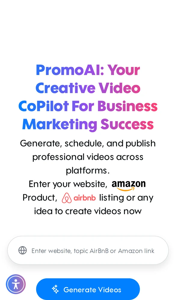
Promo asks for one thing: a website, topic, or Amazon or Airbnb link. Enter it, tap “Generate Videos,” and the tool does the rest.
The button is 48px tall, and the single field means there’s almost nothing to type on a phone keyboard. One field almost always beats a full sign-up form on mobile.
13. Duolingo
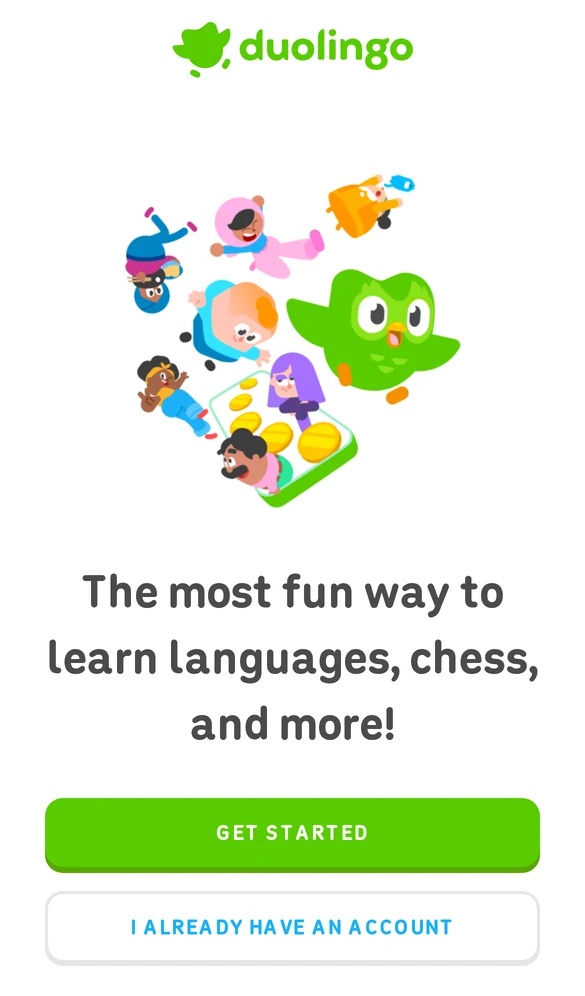
Duolingo ends its first screen with two stacked buttons: a green “Get started” and an outlined “I already have an account.” New visitors know where to go, and returning ones don’t have to look for a login link.
Both buttons are 330px wide and 50px tall, so either one is easy to hit with a thumb. The green button is the only bright color near the bottom of the screen.
14. Calendly
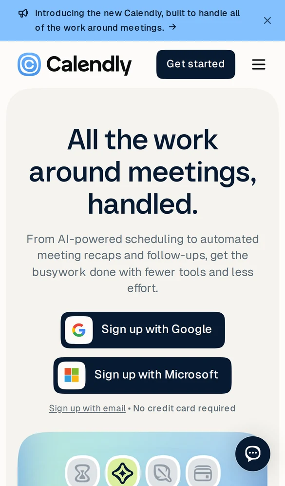
Calendly skips the form entirely. Visitors tap “Sign up with Google” or “Sign up with Microsoft,” and a small “No credit card required” line answers the most common worry.
- Sign-up buttons: both are 50px tall.
- Why it matters: typing an email and password on a phone keyboard is where many mobile sign-ups fail.
15. Spark Membership

Spark Membership, software for martial arts schools, leads with “More Students. Less Admin.” and gives two clear options: “Book a demo” or “Start free trial.”
Both buttons are 50px tall, and the trial button is the only orange element on the screen, which steers most visitors toward it. A product dashboard peeks in below, hinting at what they’ll get.
Add Live Social Proof on Mobile
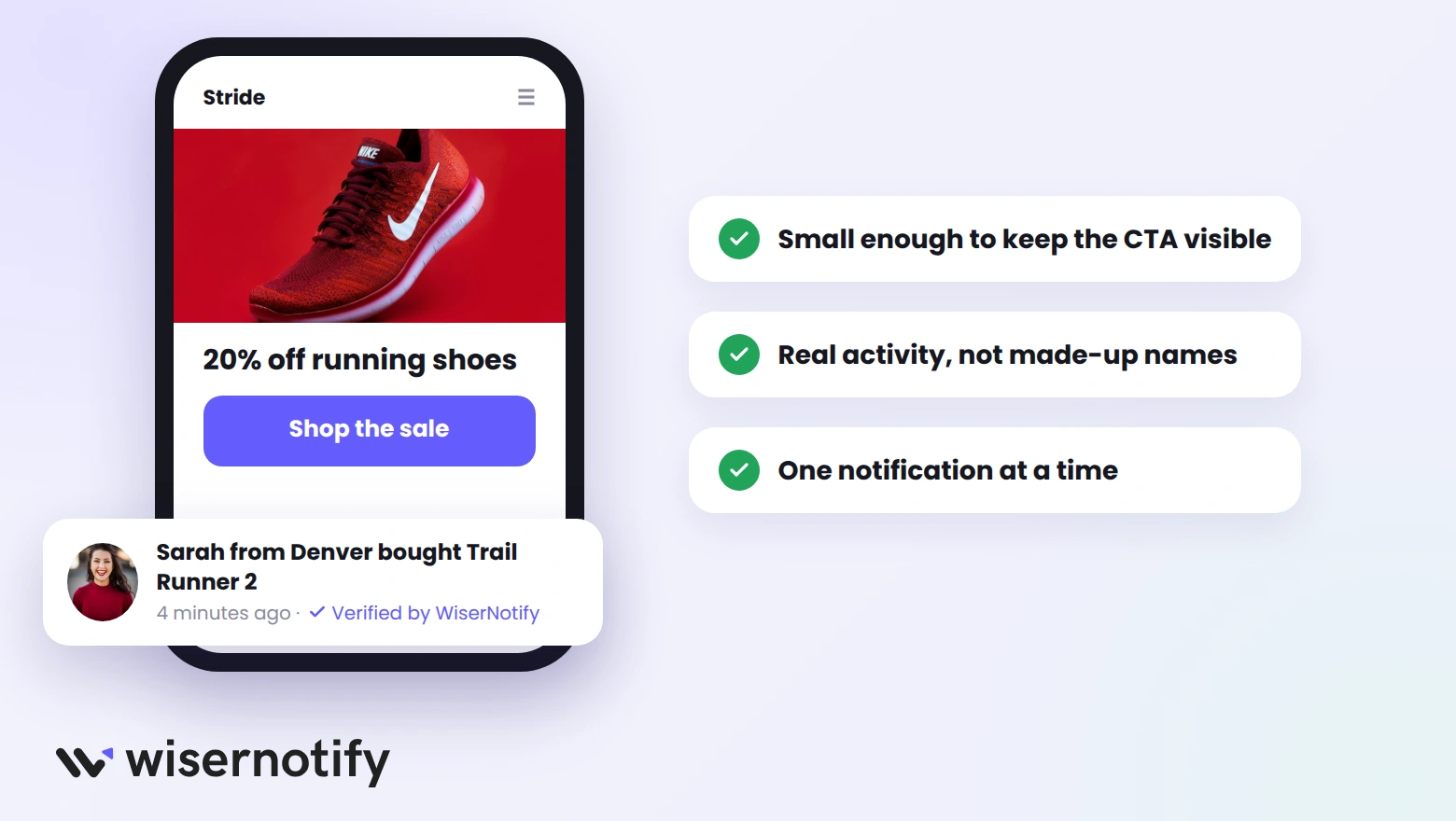
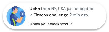
Small notifications that show real activity, such as “Sarah from Denver bought Trail Runner 2,” add proof without taking space from the CTA. On mobile, they work best when they’re compact and appear one at a time.
The Online Dog Trainer, for example, runs WiserNotify on its site, including review notifications on its training program pages.
- Keep them small so they never cover the main button.
- Use real data only, from actual orders, sign-ups, or reviews.
- Space them out, so visitors can read the page between them.
Build trust & FOMO
Highlight real-time activities like reviews, sales & sign-ups.

Mobile Landing Page Best Practices
The examples above share a short list of habits. Use it as a checklist for your own page:
- Put the CTA on the first screen, and keep it pinned if the page is long.
- Make buttons at least 48px tall, with space between them.
- Cut the form to one or two fields, or offer one-tap sign-in.
- Write a short headline that fits in two or three lines on a phone. These landing page headline examples can help.
- Show proof near the CTA, like a review score or a few customer logos.
- Use popups carefully: one offer, easy to close, and not the moment the page loads.
- Compress images and test the page on a real phone before you launch.
Where to Find Mobile Landing Page Templates
Most landing page builders include templates that are already responsive, so you start with a page that works on phones. Pick one close to your goal, then apply the checks above.
If your site runs on WordPress, these WordPress landing page plugins come with mobile-ready templates you can edit without code.
Build trust & FOMO
Highlight real-time activities like reviews, sales & sign-ups.
Wrap Up
The best mobile landing pages do less, not more. They keep one action in reach, make buttons easy to tap, and ask for as little typing as possible.
Pick the example closest to your business, copy its main tactic, and check the result on your own phone.
Frequently Asked Questions
What is a mobile landing page?
A mobile landing page is a page designed for phone screens first, with one goal, a thumb-friendly button, and content that reads without zooming.
What makes a good mobile landing page?
A good mobile landing page keeps the main button on the first screen, asks for little typing, loads fast, and shows proof near the CTA.
How big should buttons be on a mobile landing page?
Aim for buttons at least 48 pixels tall, since Google’s Lighthouse flags smaller tap targets that crowd other links.
Where can I find a mobile landing page template?
Most landing page builders and WordPress landing page plugins include responsive templates you can edit for phones without code.
Should mobile landing pages use popups?
Yes, if they offer one clear reward, are easy to close, and do not cover the page the moment it loads.
How much web traffic comes from mobile?
About 59% of worldwide web traffic comes from mobile devices, so most landing page visitors arrive on a phone.

Krunal Vaghasiya is a marketing tech expert who boosts e-commerce conversion rates with automated social proof and FOMO strategies. He loves to keep posting insightful posts on online marketing software, marketing automations, and improving conversion rates.




 Capterra