Want more website visitors to take action? Of course you do!
And you know that conversions are KEY.
But here’s the thing: Most people focus on MACRO conversions. You know, the big ones: sales, leads, and signups.
But what about the little things, the macro and micro conversions?
The small steps that nudge people towards those big goals?
I’m talking about micro conversions. In this post, I’m going to show you exactly how to get more of them.
You’ll also see real-life examples… and learn how to avoid common micro conversion mistakes.
Sound good? Let’s dive right in.

What is a Micro Conversion?
A micro conversion is a small, incremental step a user takes on your website that indicates interest, engagement, or progress towards a larger goal (a macro conversion).
Think of it like this:
Macro conversions are the main goals of your website.
For an ecommerce website, that’s usually a sale. For a SAAS company, it might be a free trial signup.
Micro conversions are the smaller actions that lead up to those goals. These actions are crucial touchpoints in the customer journey, helping to guide users towards the final goal.
Things like:
- Adding a product to a shopping cart
- Downloading a PDF
- Watching a video
- Clicking on a link in your email
- Sharing your content on social media
Basically, micro conversions are any actions that show a user is moving in the right direction.
Examples of Micro Conversions
So, what exactly counts as a micro conversion? Here are some common examples:
Signing up for a newsletter: This shows that a visitor is interested in staying updated with your content.
Downloading an ebook: Indicates that they find your resources valuable.
Watching a video: Engaged enough to spend time consuming your content.
Filling out a form on a landing page: Taking a step towards deeper engagement.
Sharing content on social media: They find your content valuable enough to share with others.
Creating an account: A significant step towards becoming a loyal customer.
Adding a product to a wish list: Shows interest in purchasing in the future.
Adding a product to the cart: A clear sign of purchase intent.
Entering payment information: They’re almost ready to buy.
Each of these actions indicates that a visitor is moving closer to making a purchase, providing valuable insights into their level of interest and engagement.
Why Tracking Micro Conversions Matters
Why bother with tracking micro conversions?
Here’s the deal:
Micro conversions give you HUGE insights into user behavior.
They help you understand what’s working on your site… and what’s not.
For example, let’s say you have a high bounce rate on your landing page.
(In other words, people are leaving your site without taking any action.)
By tracking micro conversions, you can see where people are dropping off. Monitoring micro conversion rates can help you identify specific areas where users are disengaging.
Maybe they’re not clicking on your call-to-action.
Or maybe they’re getting confused by your sign up form.
Either way, micro conversions help you identify areas for improvement.
Which can lead to more macro conversions down the road.
11 Ways to Increase Micro Conversion Rates with Examples
Now it’s time for the good stuff:
How to actually get more micro conversions.
Here are 11 proven strategies that you can use right now:
These strategies are essential for effective conversion rate optimization, ensuring that each step in the user journey is optimized for success.
1. Use Strong Calls to Action (CTAs)
Alright, let’s talk CTAs. You know, those buttons or links that tell people what to do next?
They’re like the flashing neon signs of your website, guiding visitors toward your micro conversions!
But here’s the deal: a weak CTA is like a dim bulb – no one’s going to notice it.
Think of your CTA as the climax of your content.
You’ve just wowed your reader with amazing info, now it’s time to seal the deal.
A strong CTA makes it crystal clear what you want them to do, and makes them eager to do it. Effective CTAs can drive secondary actions, such as signing up for a newsletter or downloading a resource, which are crucial for moving users down the funnel.
Here’s the thing: most people use boring, generic CTAs. “Learn More”, “Submit”, “Click Here”… Yawn! These are so overused, they practically blend into the background.
Want to stand out? You need CTAs that pack a punch.
CTAs that practically scream “Click Me!”
Here’s the secret formula:
⮕ Ditch the passive voice and use verbs that inspire action. “Download Your Free Guide”, “Grab Your Discount Now”, “Join Our Community” – these get people excited!
⮕ No one wants to miss out on a good thing. Create a sense of urgency with phrases like “Limited Time Offer”, “Don’t Miss Out”, or “While Supplies Last”. This makes people feel like they need to act NOW.
⮕ Your CTA should be impossible to ignore. Use contrasting colors, big fonts, and eye-catching design. Think of it as the VIP section of your page – it needs to stand out from the crowd.
Here is the “Increase your sales” CTA we’re showing on the right side of this blog. Does that interest you? 👉

Don’t be afraid to A/B test different CTAs to see what works best for your audience. Try different colors, different wording, different placements – you might be surprised at the results!
2. Optimize Your Forms
Okay, let’s be honest: nobody loves filling out forms. They can be long, confusing, and downright frustrating.
But sometimes, they’re necessary to capture those valuable leads and nudge people towards your macro conversion.
The key is to make your forms as painless as possible.
Think of it like a first date – you want to make a good impression and not scare them away with too many questions!
Here’s how to create forms that people actually want to fill out:
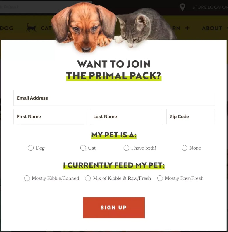
⮕ Only ask for the essential information. Do you really need their home address and birthday right now? Probably not. The fewer fields, the better.
⮕ Don’t make people guess what you’re asking for. Use clear and simple labels like “First Name”, “Email Address”, and “Company Name”.
⮕ A progress bar is like a roadmap for your form. It shows people how far they’ve come and how much is left. This can encourage them to keep going and complete the form.
Here is the simple and easy primal pack sign-up forum.
Also see: 20 Stunning Signup Form Examples
3. Use Social Proof
Let’s talk about one of the most powerful psychological forces on the planet: social proof.
You know how it is – we’re naturally drawn to things that other people like.
It’s like that trendy new restaurant everyone’s raving about.
You gotta try it, right?
The same principle applies to your website.
If people see that others are engaging with your content, downloading your lead magnets, and buying your products, they’re more likely to do the same.
It’s like a virtual stamp of approval.
Here’s the deal: social proof reduces uncertainty. It tells people, “Hey, this is a safe bet. Other people have tried this and they loved it!”
So, how do you actually use social proof on your website?
Here are a few tried-and-true tactics:
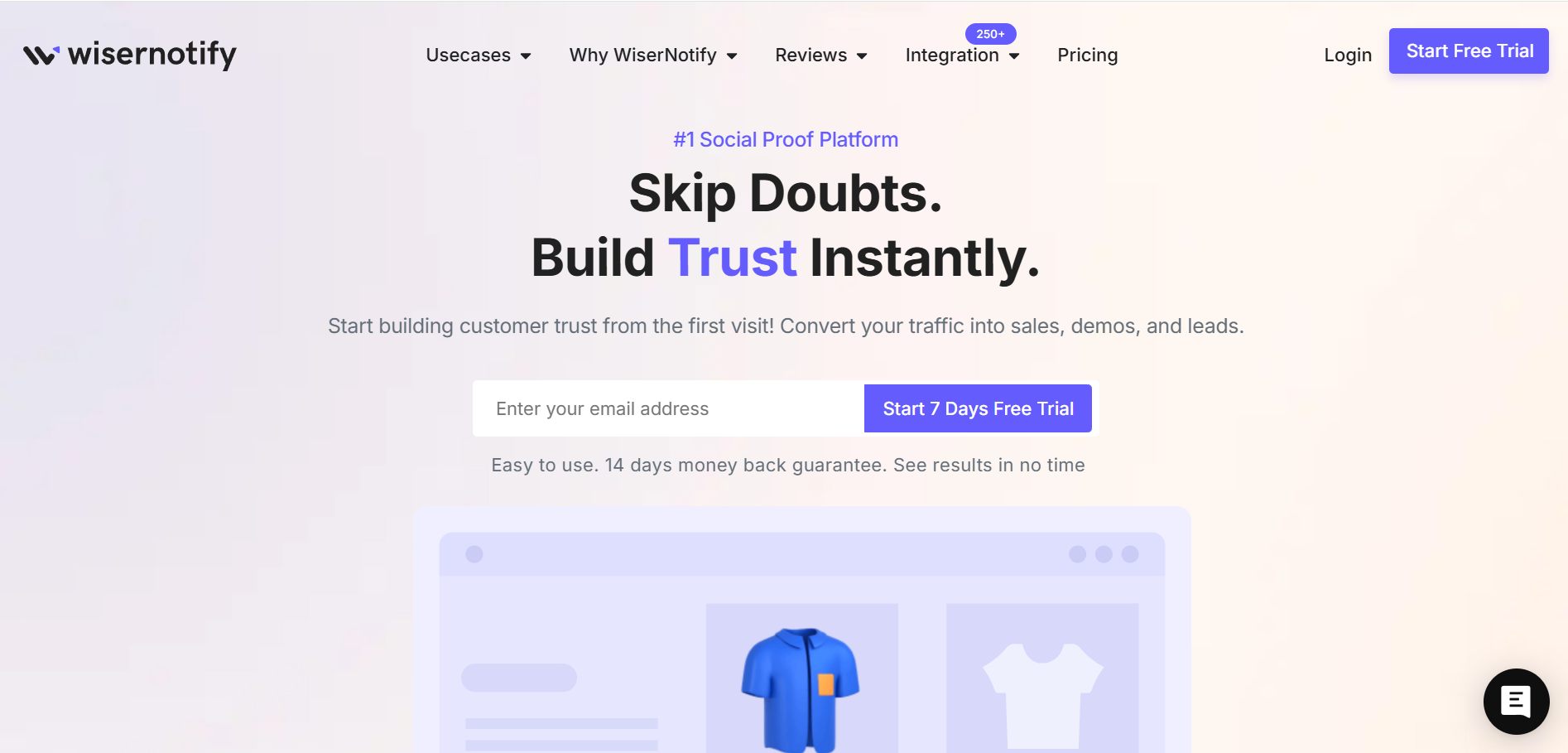
⮕ WiseNotify: It’s a top social proof tool with advanced targeting, A/B testing, and various design templates to boost your micro conversions.
⮕ Testimonials: These are like gold dust. Feature glowing reviews from your happy customers. And don’t just use generic quotes – include photos and names to make them more believable.
⮕ Case Studies: Show, don’t tell. Case studies are a powerful way to demonstrate how your product or service has helped real people achieve real results.
⮕ Social Media Shares: Got a popular blog post? Show off those social media share counts! This tells people that your content is worth sharing (and therefore, worth reading).
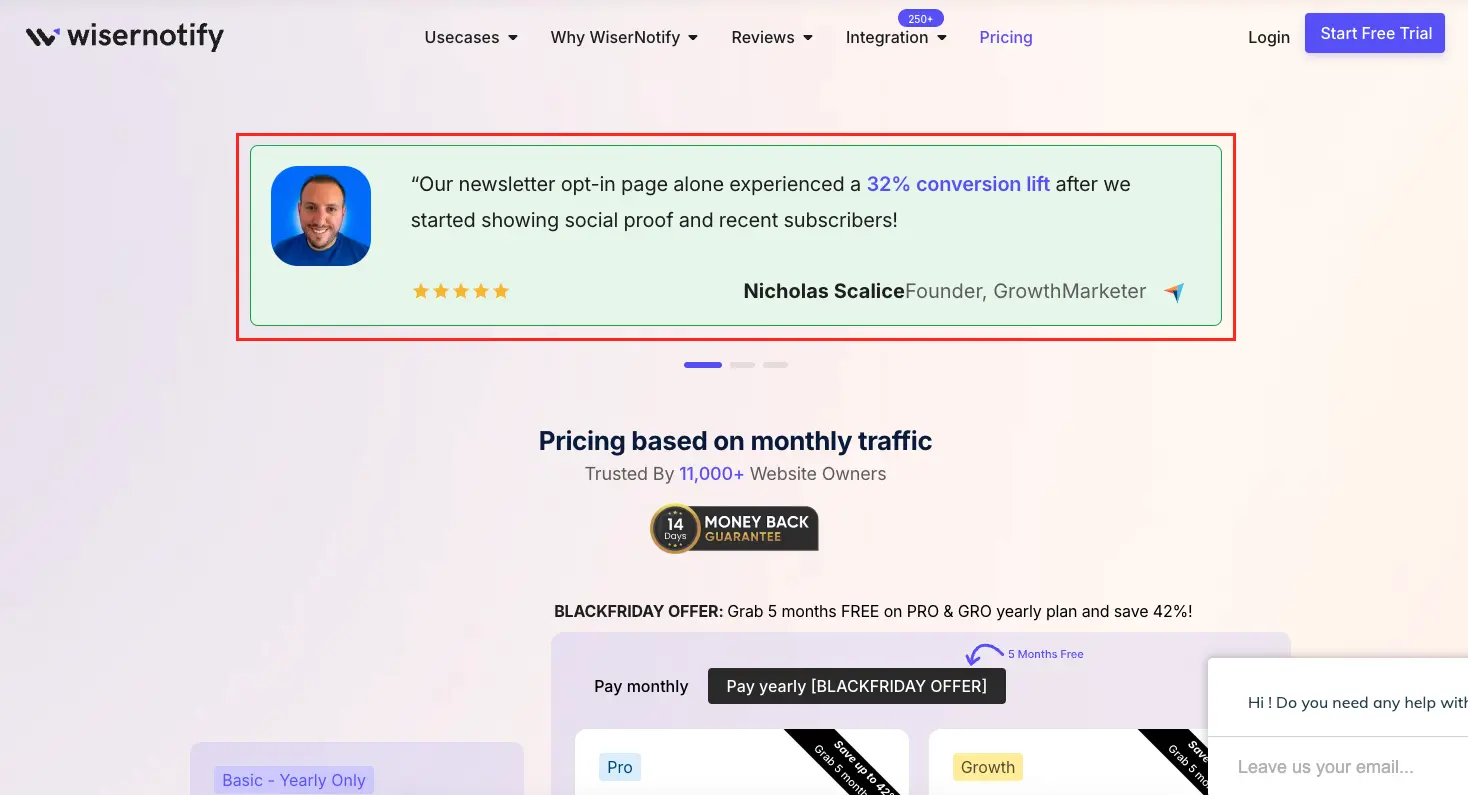
Here is a great example of social proof on the pricing page that will help boost micro conversions.

Don’t be afraid to get creative with your social proof. You can use video testimonials, influencer endorsements, or even feature customer logos on your website.
Build trust & FOMO
Highlight real-time activities like reviews, sales & sign-ups.
4. Offer a Guarantee
People are hesitant to take risks, especially when it comes to their hard-earned money. That’s where guarantees come in.
A strong guarantee is like a safety net. It tells people, “Hey, you can try this without any worries. If you’re not happy, you’ll get your money back.”
This can be a game-changer for your micro conversions. A strong guarantee can significantly increase the likelihood of achieving your primary macro conversion, such as a purchase or subscription.
It removes the fear of making a mistake and encourages people to take that first step.
Here are a few types of guarantees you can use:
⮕ Money-Back Guarantee: This is the classic. It’s simple, straightforward, and super effective.
⮕ Satisfaction Guarantee: This is a bit broader. It promises that people will be happy with their purchase, even if they don’t want a refund.
⮕ Free Trial: This is perfect for software or subscription services. It lets people try before they buy.
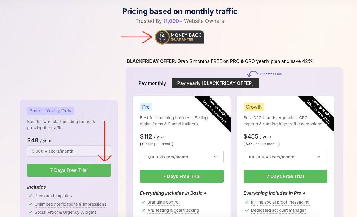
As you can see, we offer a 14-day money-back guarantee and a 7-day free trial before you commit to a purchase. Trust me, we’ve seen a significant rise in our signup conversion rate.
Pro Tip: Make your guarantee prominent on your website. Don’t bury it in the fine print. Feature it on your landing pages, product pages, and even in your CTAs.
5. Use Scarcity
Remember that time you had to have that limited-edition sneaker? Or that concert ticket that was almost sold out? That’s scarcity in action.
People want what they can’t have. It’s human nature. And you can use this principle to boost your micro conversions.
Here’s how to create a sense of scarcity:
⮕ Limited-Time Offers: “This sale ends tomorrow!” “Only 24 hours left!” These phrases create a sense of urgency and encourage people to act fast.
⮕ Limited Quantities: “Only 10 spots left!” “Limited edition!” This makes people feel like they’re getting something exclusive.
⮕ Exclusive Deals: “Only for our email subscribers!” “VIP access!” This makes people feel special and valued.
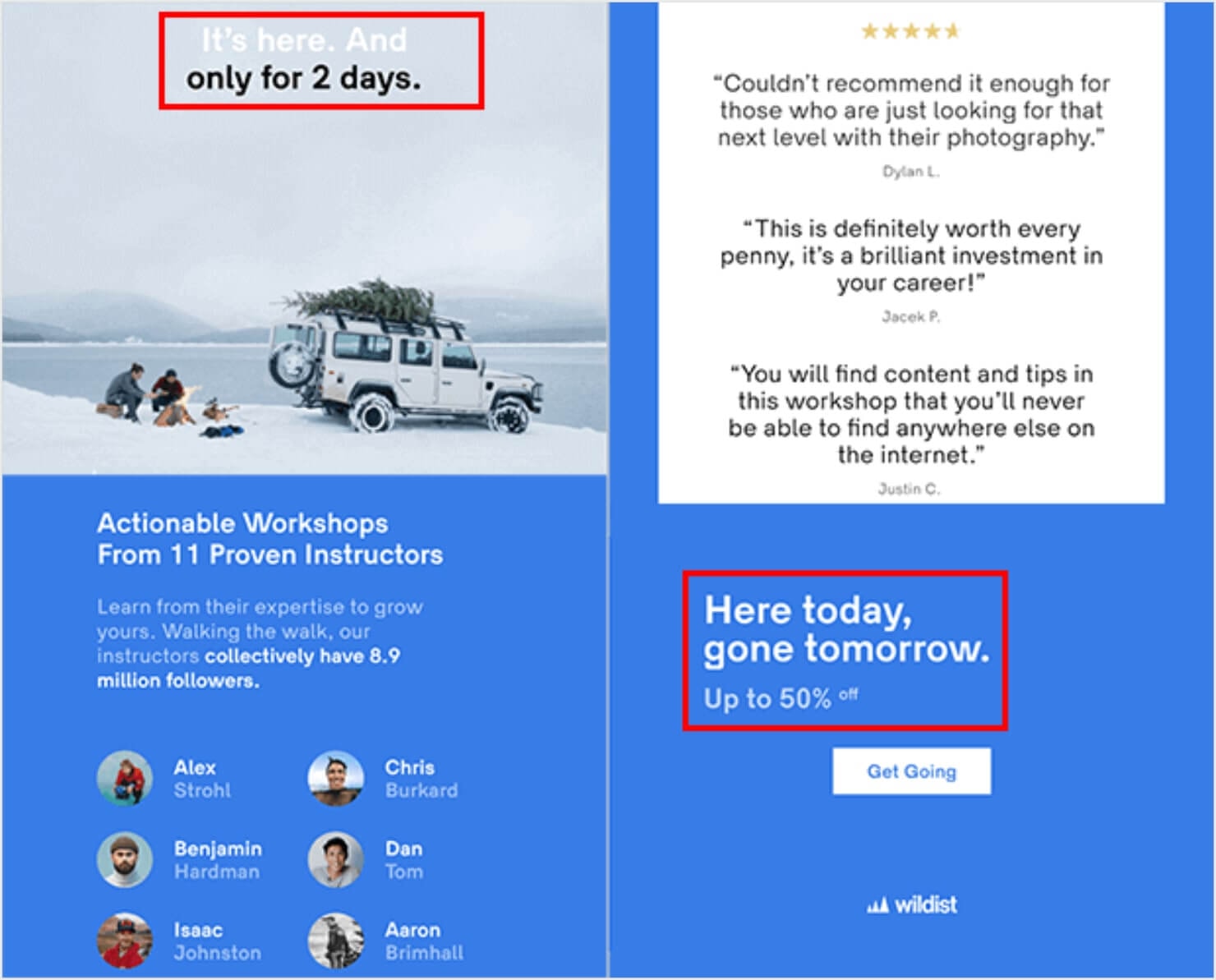
The image below showcases a powerful example of scarcity marketing in action by Wildist.

Use scarcity ethically. Don’t create fake scarcity just to manipulate people. Make sure your offers are genuinely limited.
6. Make Your Website Mobile-Friendly
Alright, let’s talk mobile. These days, everyone’s glued to their smartphones, right?
In fact, I bet you’re reading this on your phone right now! (Or maybe you’re on your desktop, who am I to judge?)
The point is: if your website isn’t mobile-friendly, you’re missing out on a HUGE chunk of potential traffic and micro conversions.
It’s like having a storefront with a revolving door that only spins one way – you’re turning away customers before they even get a chance to step inside!
Think about it: people are using their phones for everything these days – shopping, browsing, socializing, even reading in-depth blog posts like this one (you’re still with me, right?).
So, if your website is clunky and hard to navigate on a mobile device, people are going to bounce faster than a rubber ball.
Here’s how to make sure your website is mobile-friendly:
⮕ Responsive Design: This is non-negotiable. Responsive design means your website automatically adjusts to different screen sizes. No more zooming and pinching! It’s like magic, but for websites.
⮕ Optimize Images: Giant images can slow down your website on mobile devices. No one wants to wait around for a page to load. Optimize your images by compressing them and using the right file formats.
⮕ Large Font Sizes: Squinting at tiny text on a small screen is a recipe for a headache. Make sure your font sizes are large enough to be easily readable on mobile devices.
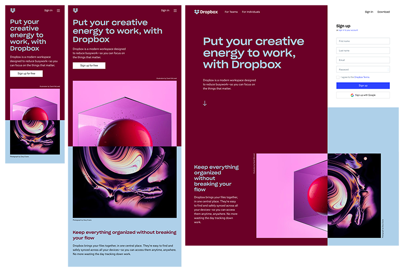
Here is an example of a responsive website from Dropbox.

Use Google’s Mobile-Friendly Test tool to see how your website stacks up. Just enter your URL and Google will give you a report card on your mobile performance.
Build trust & FOMO
Highlight real-time activities like reviews, sales & sign-ups.
7. Use Live Chat
Want to provide instant customer support and boost those micro conversions?
Then you need live chat. It’s like having a friendly concierge on your website, ready to answer questions and guide visitors towards their goals.
When you have a question or need help, what do you do? You probably look for a way to contact customer support, right?
But who wants to fill out a contact form and wait hours (or even days) for a response? That’s where live chat comes in.
Live chat lets you provide instant support, answer questions in real-time, and even overcome objections. It’s like having a personal shopper for your website.
Here’s why live chat is so powerful:
⮕ Instant Gratification: People get their questions answered immediately. No more waiting around!
⮕ Personalized Experience: Live chat allows you to provide tailored support based on the visitor’s needs.
⮕ Increased Engagement: Live chat can help you build relationships with potential customers and increase engagement with your website. These interactions can lead to potential future macro conversions, as satisfied users are more likely to return and complete a purchase.
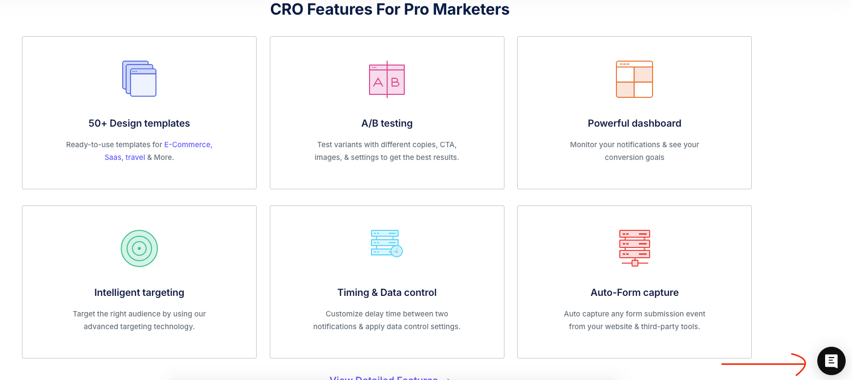
We also use a live chat option across our site to address queries from potential customers about our tool. Through this feature alone, we’re receiving over 30 messages a month from people interested in purchasing.

Make sure your live chat agents are knowledgeable and friendly. They’re the face of your company, so make sure they make a good impression.
8. Use Pop-Ups
Okay, let’s talk about the elephant in the room: pop-ups. We all have a love-hate relationship with them, right?
On one hand, they can be annoying and intrusive. But on the other hand, they can be incredibly effective at capturing leads and driving micro conversions.
The key is to use pop-ups strategically. Think of them like a spice – a little bit can add flavor, but too much can ruin the dish.
Here are a few tips for using pop-ups effectively:
⮕ Valuable Offers: Don’t just ask for email addresses. Offer something in return, like a free ebook, a discount code, or access to exclusive content.
⮕ Easy to Close: Don’t make people hunt for the “X” button. Make it clear and easy to close the pop-up if they’re not interested.
⮕ Don’t Overdo It: One or two pop-ups per visit is enough. Bombarding people with pop-ups is a surefire way to annoy them.
You can see a great example of a popup from clickup.
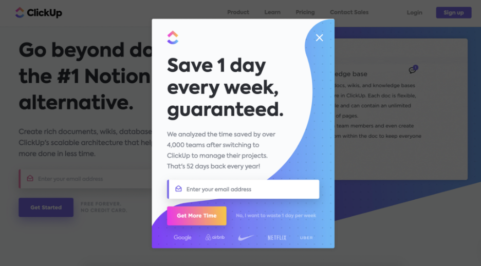

Use exit-intent pop-ups. These pop-ups appear when someone is about to leave your website. It’s a last-ditch effort to capture their attention and get them to convert.
Learn More : 12 Exit Popup Examples to Increase Conversion
9. A/B Test Everything
Let’s talk about one of the most powerful tools in your conversion arsenal: A/B testing.
It’s like having a secret laboratory for your website, where you can experiment with different elements to see what works best.
Here’s the deal: you might think you know what your audience wants.
You might think that red button is more enticing than the blue one. But the truth is, you never really know until you test it.
A/B testing takes the guesswork out of optimization. It lets you compare two different versions of something (like a headline, a CTA, or an image) to see which one performs better.
It’s like a head-to-head competition, where the winner takes all.
Here’s why A/B testing is so crucial:
⮕ Data-Driven Decisions: No more relying on gut feelings or hunches. A/B testing gives you hard data to back up your decisions.
⮕Continuous Improvement: There’s always room for improvement. A/B testing helps you constantly refine your website and increase your micro conversions.
⮕ Increased ROI: By optimizing your website for conversions, you can get more bang for your buck.
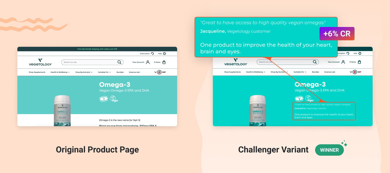
A great example of A/B testing in action is from Vegetology, demonstrating how it works. Image from optimonk blog.

Don’t test too many things at once. Focus on one element at a time to get clear results.
10. Use Retargeting
Ever noticed how those shoes you were browsing online seem to follow you around the internet?
That’s retargeting in action. And it’s a powerful way to bring back visitors who have left your website without converting.
Think of it like this: you’re at a party, and you strike up a conversation with someone interesting.
But then you get distracted and lose track of them.
Retargeting is like tapping them on the shoulder and saying, “Hey, remember me? We were having a great conversation!”
Here’s why retargeting is so effective:
⮕ Increased Brand Recall: Retargeting keeps your brand top-of-mind.
⮕ Improved Conversion Rates: People who have already shown interest in your website are more likely to convert.
⮕ Personalized Messaging: You can tailor your retargeting ads based on the visitor’s previous behavior.

Use different retargeting campaigns for different audience segments. For example, you could have one campaign for people who abandoned their shopping cart and another campaign for people who visited your blog.
Build trust & FOMO
Highlight real-time activities like reviews, sales & sign-ups.
11. Track Your Results
Alright, let’s talk about the most important step of all: tracking your results. You can have the best website in the world, but if you’re not tracking your micro conversions, you’re flying blind.
Think of it like this: you’re on a road trip, but you don’t have a map or a GPS. You might eventually reach your destination, but you’re going to waste a lot of time and gas along the way.
Tracking your results gives you a roadmap to success. It tells you what’s working, what’s not, and where you need to make adjustments.
Here’s why tracking is so crucial:
⮕ Identify Areas for Improvement: See which pages are performing well and which ones need some love.
⮕ Measure the Impact of Your Changes: Track the results of your A/B tests and other optimization efforts.
⮕ Prove the Value of Your Work: Show your boss or clients that your efforts are paying off.
See how it gives you a wealth of information about your website traffic and conversions? It’s like a treasure map for your business.

Set up custom goals in Google Analytics to track specific micro conversions, like button clicks, form submissions, and file downloads.
How to Track Micro Conversions?
Alright, let’s get down to brass tacks. You know micro conversions are important. You know they can make a HUGE difference in your overall conversion rate.
But how do you actually track them?
It’s like trying to find a needle in a haystack, right? You know it’s in there somewhere, but how do you find it?
Well, fear not, my friend! I’m here to show you the way.
First things first: you need the right tools for the job. It’s like trying to build a house without a hammer – you’re not going to get very far.
Here are a few of my favorite tools for tracking micro conversions: These tools allow you to add micro conversions as events or goals, providing detailed insights into user behavior and engagement.
1. Google Analytics: This is the granddaddy of web analytics tools. And the best part? It’s free!
Google Analytics gives you a wealth of data about your website traffic, including where your visitors are coming from, what pages they’re viewing, and how long they’re staying on your site.
It’s like having a private investigator for your website.
2. Crazy Egg: Want to know where people are clicking on your website?
Crazy Egg gives you a heatmap of your pages, showing you exactly where people are clicking, scrolling, and hovering.
It’s like having X-ray vision for your website.
3. Hotjar: This tool takes things a step further by recording user sessions. You can actually watch how people are interacting with your website, like a fly on the wall. It’s like having a hidden camera in your website’s living room.
Once you’ve got your tools in place, it’s time to set up conversion tracking. This tells your tools which actions you want to track as micro conversions.
Think of it like setting up a security system for your website. You’re telling the system which doors and windows to monitor for any suspicious activity.
Here are a few examples of micro conversions you can track:
Button Clicks: Track clicks on your CTAs, social media sharing buttons, and any other important buttons on your site.
Form Submissions: Track how many people are filling out your contact forms, lead generation forms, and other forms on your site.
File Downloads: Track downloads of your ebooks, white papers, and other lead magnets.
Video Views: Track how many people are watching your videos and how long they’re watching them for.
Example:
Let’s say you want to track how many people are clicking on the “Add to Cart” button on your product pages.
You can set up an event in Google Analytics to track this specific action.
This will tell you how many people are adding products to their cart, even if they don’t complete the purchase.
Why is this important?
Because it gives you insights into user behavior. Maybe people are adding products to their cart but then abandoning the checkout process.
This could indicate a problem with your checkout process, like hidden fees or a complicated form.
By tracking this micro conversion, you can identify the problem and fix it, leading to more completed purchases (macro conversions).
See? It’s all connected!
Tracking your micro conversions is like having a secret weapon in your conversion arsenal. It gives you the data you need to make informed decisions and optimize your website for success.
5 Mistakes to Avoid When Optimizing Micro Conversions
Want to get the most out of your micro conversions?
Then avoid these common mistakes:
1. Not Tracking Anything
If you’re not tracking micro conversions, you’re flying blind.
In addition to tracking micro conversions, it’s crucial to track macro conversions to get a complete picture of your website’s performance.
You have no idea what’s working… and what’s not.
2. Focusing on the Wrong Metrics
Not all micro conversions are created equal.
Some are more important than others.
For example, adding a product to a shopping cart is a more valuable micro conversion than viewing a product page.
3. Ignoring User Experience
If your website is difficult to use, people won’t convert.
Make sure your website is:
- Easy to navigate
- Mobile-friendly
- Fast loading
4. Not Testing Enough
A/B testing is essential for optimizing micro conversions.
Test different versions of your:
- Headlines
- CTAs
- Forms
- Images
5. Giving Up Too Soon
It takes time to optimize micro conversions.
Don’t give up if you don’t see results immediately.
Wrap up
There you have it: 11 actionable ways to boost micro conversions on your website.
Now it’s your turn.
Which of these strategies will you try first?
Are you going to A/B test your headlines?
Or maybe you’re going to add a live chat widget to your website?
Either way, let me know in the comments below.
