More and more people use mobile devices to engage with brands, collect information, and shop. Brands must craft a good mobile landing page to influence customers and provide them with a seamless mobile experience to turn traffic into sales.
But is creating a high-converting mobile landing page easy?
A well-designed mobile landing page can engage visitors and enhance their experience. Crafting a high-converting mobile landing page requires a unique strategic approach, specialized skills, and distinct design tactics compared to its desktop version.
This guide shares 15 top-quality mobile landing page examples and best practices for designing your own.
Let’s dive in…
Build trust & FOMO
Highlight real-time activities like reviews, sales & sign-ups.
What Is Exactly Mobile Landing Page?
A mobile landing page is just like a web page. It is designed to enhance the experience for mobile users and is often focused on influencing them to take action using a single-focused call to action button.
It’s like a basic web landing page crafted for mobile users.
Mobile-friendly landing pages have 11.70% more conversions than unoptimized landing pages, according to 99Firms.
That’s why we’ve gathered top-quality examples and best practices for creating mobile-friendly landing pages for your online store and site.
See how real brands are using mobile landing pages to crush their goals.
15 Best Mobile Landing Page Examples Inspirations
Here, explore the 15 best mobile landing page design inspirations. Let’s go.
1. Ballsy
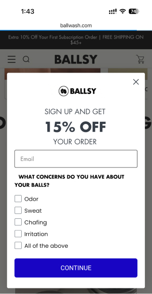
Ballsy is one of the eCommerce brands specializing in men’s grooming products. The eCommerce store helps you find body wash, trimmers, and other products for men’s hygiene.
Ballsy uses popups that allow them to collect the email addresses of first-time visitors. The visitors sign up by providing their email addresses and can avail themselves of the 15% discount. The mobile-friendly design helps them improve conversions by offering discounts on the product.
2. HubSpot
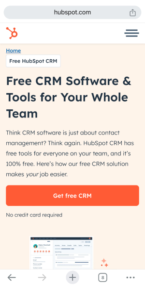
With the small mobile screen size, using clear, short, and concise copy is essential. Hubspot uses clear, explanatory paragraph text; the heading is clear so that users can see the CTA button without scrolling.
Using clear fonts, bullet points, and font size makes the content easier for mobile users to read. The text here is short yet effective and easy to read, making the HubSpot landing page attractive and clean.
3. Death Wish Coffee
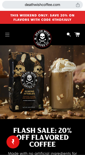
Death Wish Coffee targets people who are looking for a serious caffeine kick. The compelling headline aligns with the brand’s image, and the CTA “Flash Sale: 20% Off” grabs customers’ eyes, influencing them to take the desired action.
The high-quality product images infuse the brand’s personality, while the contrasting colors grab the user’s eyes. The content is also clear and concise and aligns with the brand voice.
4. Sift

Sift is an AI-powered fraud decision-making company that assists growth-focused businesses worldwide. The sticky navigation header with the menu and the large font size make it easier for visitors to read and understand the brand.
The structure of the mobile web page and each section outline the user’s pain points, along with user-generated content that helps build trust and credibility among visitors. The color also grabs customers’ eyes, and the use of high-quality images makes it look astonishing.
5. Canva
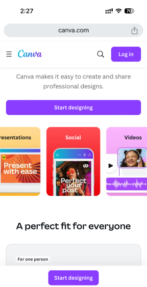
Canva is an online tool that helps users create professional designs without having any previous graphic experience. To help mobile users, Canva streamlines the page, removing complex elements and keeping it simple.
Compared to the desktop version, the mobile version looks simple, avoiding clutters and distracting the users from their main goal of influencing them to sign up. The “Start Designing” is what Canva wants users to focus on by highlighting the button in different colors.
Canva has utilized the white space significantly, directing users’ attention toward the CTA.
6. MixPanel
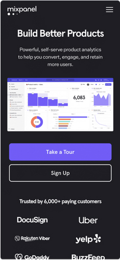
Mixpanel is a product analytics tool that helps brands track and understand user behavior that interacts on web and mobile devices. It strategically places the logo of the companies working with them to build trust, showcasing social proof.
Mobile users seeing the logo are influenced and instantly boost their confidence, keeping them exploring more about Mixpanel. The landing page looks great, thanks to high-quality images and content.
7. Promo
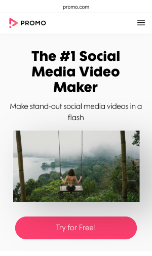
Promo uses videos to drive more conversions on its page. Videos make the page more engaging and improve customer experiences, influencing them to take action. On the mobile version, the user has to click on play to watch the video, which ensures the video doesn’t slow down the loading speed.
The Promo’s USP is highlighted as “Make stand-out social media videos in a flash,” the CTA “Try for Free!” encourages users to explore the platform. It also shows partner badges like Facebook and Instagram that incorporate trust among visitors.
8. Uber
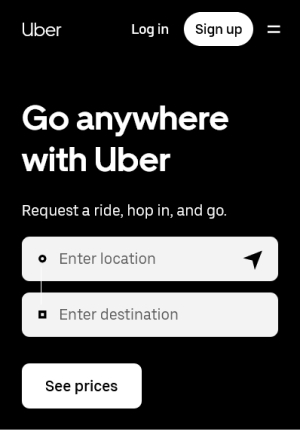
Uber’s landing page is simple and clear. It allows users to book rides. The vibrant images and clear message instantly tell visitors what to do next.
The landing page allows visitors to search for the ride prices once they sign up on the platform. The layout is clean, and every element guides users seamlessly through conversion. The minimalistic design ensures a clutter-free experience, allowing users to focus on the core message.
9. All Birds
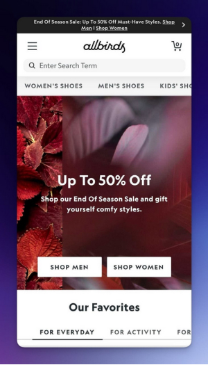
A Shopify store known for its compact and sustainable shoes has a mobile-friendly landing page. The popup banner coupon code at the top is clear and to the point, highlighting it’s hard to miss the offer.
The text is easy to read without zooming in, with a clear message, and can be readable on a small screen. Our favorite section showcases the popular products other customers have purchased and loved.
10. EverNote
Using images and videos might lower the website’s speed, and not every visitor uses wifi. Many use cellular data, so limit the use of images and videos and compress them to the smallest size possible.
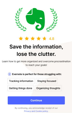
Evernote’s landing page has a simple design without images or video. It highlights the platform’s benefits and asks users to take the desired action, “Continue,” with questions.
11. Bose
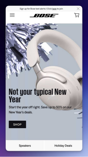
Bose is a well-known company that designs and manufactures high-quality audio products, such as headphones, speakers, and sound systems.
The text directly appeals to visitors, showing a clear value proposition to start their new year with a great deal. The highlight “Save up to 50%” below the product image creates a sense of urgency and influences them to act quickly.
The signup text at the top asks mobile users to join the list and receive SMS texts about deals, offers, and the latest information.
12. Manychat
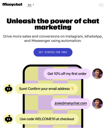
Manychats have an optimized landing page that helps customers have a seamless experience on their mobile landing page. The clear headline and CTA influence customers to take the next step and convey a clear message.
Related: 15 Magnetic Landing Page Headlines That Hook Attention
They use a simple and engaging design and show social proof above the fold to build trust among the visitors. The platform shows how the chatbot can help the brand by illustrating examples through images.
13. Spark Membership
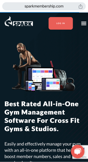
Spark membership is one of the best-rated Gym management software programs. It helps gyms and studios manage their gyms effectively and efficiently.
The landing page effectively showcases social proof in a number format that builds customer trust. Although the landing page is simple, the content is effective and influences customers to take action.
The color combination and the CTA “Get 2 Months for $1” create a sense of urgency, and visitors are encouraged to act quickly to seize the opportunity.
14. Todoist
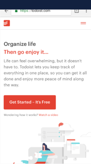
Todoists help visitors organize their work and life by organizing a To-Do list, improving productivity with the tools, or collaborating with others.
The color is highly contrasted with the CTA at the top of the page, directly grabbing the customer’s attention. Using white spaces makes the landing page look great, and the content is clear and concise.
The use of minimal graphic elements keeps the landing page sharing on-point information.
15. Fronks
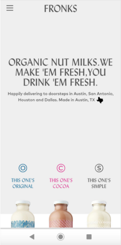
Fronks sells fresh, organic nut milk delivered weekly to customers’ doorsteps. It’s a simplistic mobile landing page design example that gives visitors a minimalistic feel.
The bold and clear written header showcases what Fronks is offering, and the clear copy grabs their attention. The high-quality images grab visitor’s attention and the information is extremely simple & straightforward.
It’s an amazing mobile landing page example to grab inspiration for your next design.
These great mobile landing page examples can help you get inspired and design your next one.
Why Do You Need a High-Performing Mobile Landing Page?
Here are some of the benefits of a High-Performing Mobile Landing Page.
Increase Mobile Traffic: With more than 59% of all website traffic coming from mobile phones, high-converting landing pages ensure you don’t miss out on converting that audience.
High Conversion Rate: Optimized mobile landing pages help the target audience focus on one CTA and take desired actions, leading to more conversions.
Better Search Engine Rankings: Search engines favor mobile-friendly sites, which improves their ranking in search results and visibility.
Reduce Bounce Rate: A mobile-friendly design keeps users engaged and reduces the likelihood of them leaving before taking action.
Improved User Experience: A seamless user experience keeps visitors engaged and encourages them to stay on your site longer.
Build trust & FOMO
Highlight real-time activities like reviews, sales & sign-ups.
Things to Consider When Designing Mobile Landing Pages
Designing an optimized mobile landing page is essential to ensure target audiences have a positive experience and get converted into loyal ones. These are a few tips to ensure the landing page is user-friendly and increases conversions.
➥ Keep it Simple and Focused
The landing page should be simple and focused, clear, uncluttered, and easy to navigate, making it easier for customers to find the information. Make sure to use high-quality images and a simple font that makes it easier for customers to read and highlights the value.
Remove unnecessary elements and provide a seamless user interface to improve page speed and reduce loading time.
➥ Responsive landing page
Ensure the landing page adapts seamlessly to various sizes and screen orientations, providing a consistent user experience across different devices. A responsive design improves the likelihood of conversion as users are more likely to engage.
➥ Minimalistic Design
Focus on various elements to avoid clutter and distractions, enhancing focus and readability for customers. Further, use ample white space to separate different sections and elements, making the page easier to navigate and visually appealing.
➥ Optimize Images & Videos
Images and videos take data and might increase the website’s loading speed. To ensure the landing page loads faster and more smoothly, keep the use of images and videos to a minimum.
In addition, use high-quality and relevant images & videos that enhance the message and engage users, but make sure to compress & optimize them. Utilize icons and graphics to highlight key points and guide users without overwhelming them.
➥ Clear CTAs
Position your call-to-action buttons in a visible, easy-to-reach screen area, typically above the fold. Use a clear and conscious CTA that communicates the desired action, such as “Sign Up Now” or “Get Started.”
Ensure the CTA button stands out from other elements on the webpage with contrasting colors and is large enough that help mobile users tap on the small screens.
➥ Use Mobile-Optimized Popups
Popups are a great way to get more leads on your mobile landing pages. However, you don’t want to distract visitors from your landing page’s primary goal. Using exit-intent popups that are only displayed when your visitor leaves your website.
You can use These best practices to create a mobile landing page that attracts, increases engagement, and converts users effectively. These elements provide a seamless experience that meets the needs of a mobile-first audience.
Build trust & FOMO
Highlight real-time activities like reviews, sales & sign-ups.
Conclusion
As technology evolves, customers use mobile devices to browse information and purchase something. With mobile eCommerce on the rise, creating a high-converting mobile landing page is essential to convert mobile traffic and grab the attention of landing page visitors.
Mobile landing pages are increasingly becoming a new way to attract customers, reduce bounce rates, and improve conversion rates. You can also use the landing page template to start building your own mobile landing page.
By creating a dedicated landing page for mobile users, you can ensure that your product or service gets the focus and attention it deserves. This article discusses different ways and examples to design landing pages that improve mobile conversions.
