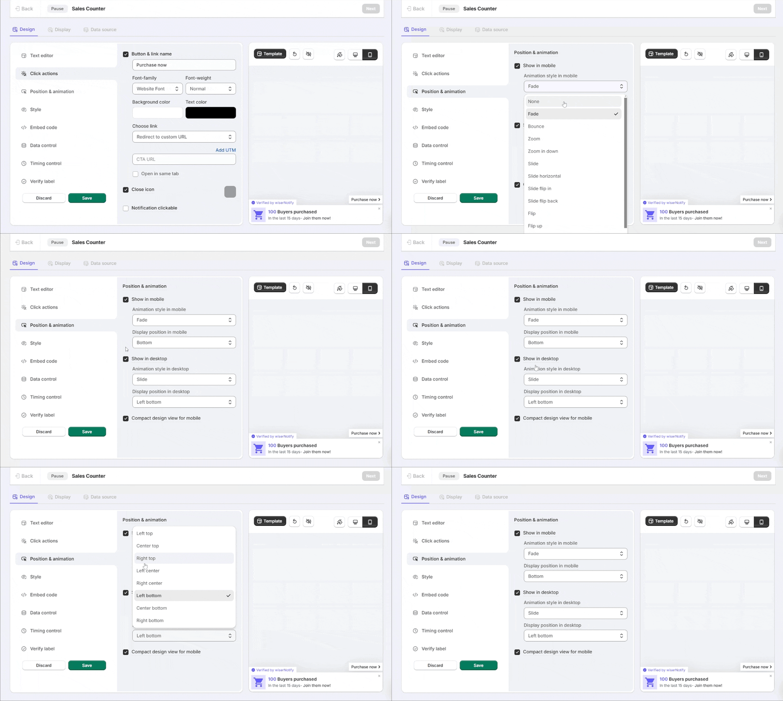
The Position & Animation section in the WiserNotify Design section allows you to define interactive behavior for notifications, especially for Call-to-Action (CTA) buttons. Here is a detailed explanation of each option available under this section:

1. Show in Mobile
- What it does: Enables the notification to display on mobile devices.
- Why it matters: Ensures your notifications reach mobile visitors, who make up a significant share of traffic.
Animation Style in Mobile
- Options:
- Fade: The notification gradually appears/disappears with a soft fading effect.
- Slide: The notification slides into view from a specified direction.
- Zoom: The notification appears with a zoom-in effect.
- Best Practice: Use animations that match your website design and don’t distract users.
Display Position in Mobile
- What it does: Lets you decide where the notification appears on mobile screens.
- Options:
- Top
- Bottom
- Example: Place critical notifications at the bottom to avoid covering important content.
2. Show in Desktop
- What it does: Enables the notification for desktop visitors.
- Why it matters: Desktop users interact differently than mobile users, so you can customize positioning and animations for larger screens.
Animation Style in Desktop
- Options:
- Fade: Creates a smooth, fading effect when the notification appears/disappears.
- Slide: The notification slides in from a side or corner.
- Zoom: Makes the notification zoom into focus.
- Best Practice: Use subtle animations (e.g., Fade) for a professional look or dynamic animations (e.g., Slide) for attention-grabbing notifications.
Display Position in Desktop
- What it does: Allows you to set the notification’s location on desktop screens.
- Options:
- Top Left
- Top Right
- Left Bottom
- Right Bottom
- Example: Place notifications in the bottom-left corner for better visibility without obstructing key elements like menus or buttons.
3. Compact Design View for Mobile
- What it does: Enables a smaller, more compact version of the notification for mobile devices.
- Why it matters:
- Enhances the user experience on small screens.
- Prevents notifications from covering too much space, ensuring content remains visible.
- When to use: Always enable this option for a clean mobile design.