
Contact Form Optimization: 12 Fixes for More Leads (2026)
Fewer than half of the people who start a contact form finish it. On a phone it drops to under four in ten. These are visitors who already wanted to talk to you and gave up halfway.
Contact form optimization is the work of removing every reason to stop. Most of it is plain. Fewer fields, a button that says what happens next, proof beside the form, and a reply that lands the same day.
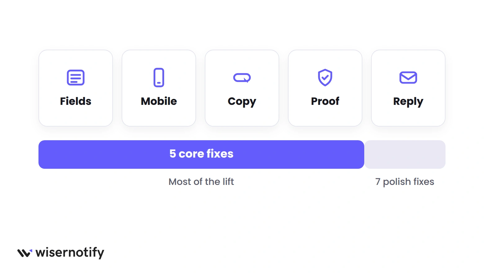
This guide covers 12 fixes. The first five do most of the work, so start there. The other seven polish a form that already converts.
What Is a Good Contact Form Conversion Rate?
About 47% of people who start a contact form submit it, and about 43% submit an enquiry form, based on 93 million tracked form sessions across industries.
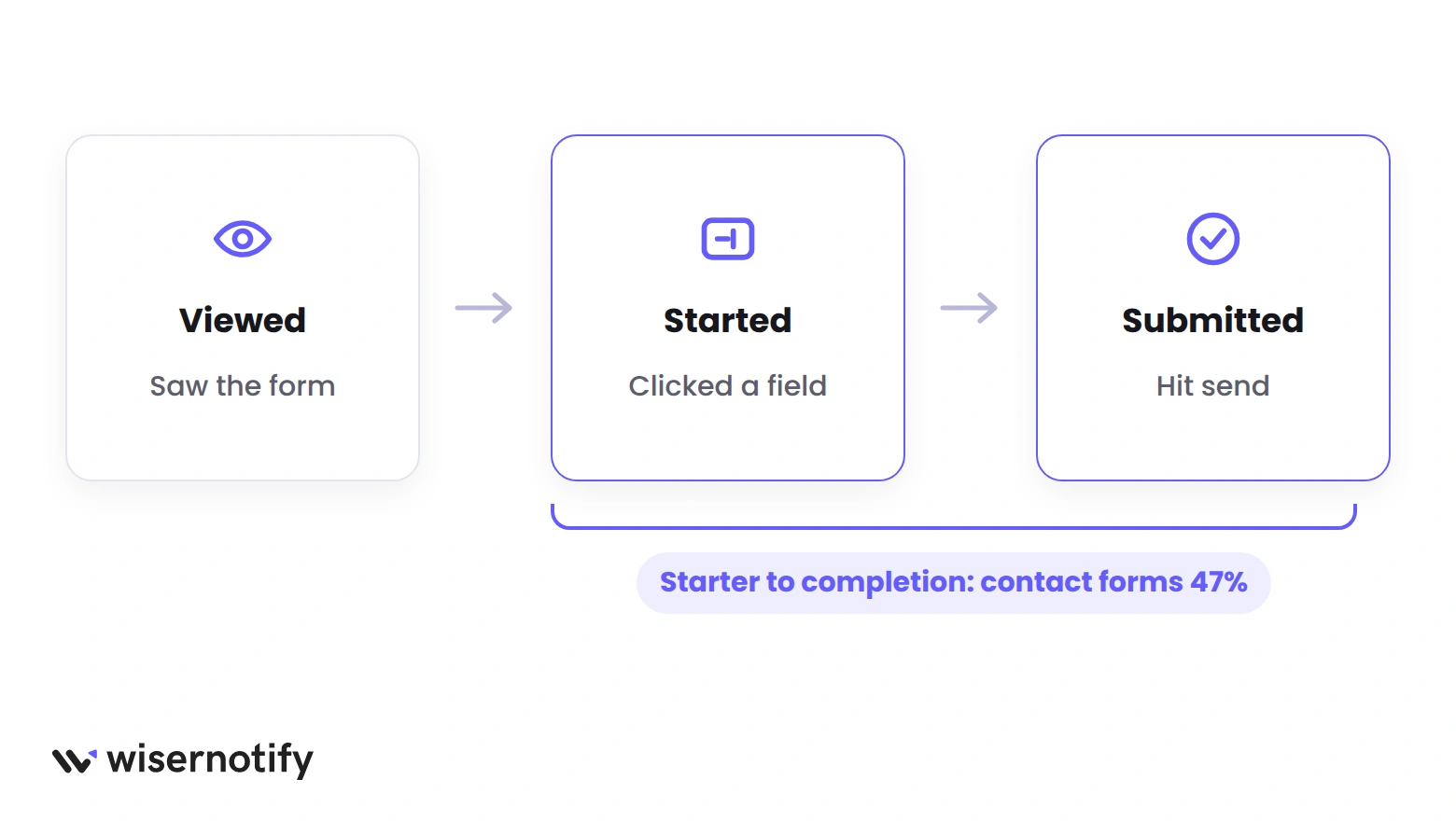
Those are “starter to completion” figures. They count people who clicked into a field. Count everyone who only saw the form and the rate drops to roughly a third.
| Form type | Desktop | Mobile | Overall |
|---|---|---|---|
| Contact form | 51.2% | 39.4% | 47.4% |
| Enquiry (lead) form | 47.7% | 37.7% | 42.7% |
| Purchase (checkout) | 56.9% | 51.4% | 54.4% |
| Registration (sign-up) | 63.0% | 57.2% | 60.7% |
| All forms | 54.5% | 47.5% | 51.7% |
Two things stand out in the form benchmarks. Contact and enquiry forms sit at the bottom of every form type. And they lose 12 points on mobile, a bigger gap than any other type.
So the bar is low, and the phone is where most of the loss happens. Keep both in mind as you read the fixes. If you want page-level numbers too, see what is a good landing page conversion rate.
The 12 Fixes at a Glance
Fixes 1 to 5 change the form itself and what happens after submit. Fixes 6 to 12 are the polish. Effort is for a typical form builder with no developer.
| # | Fix | Group | Effort |
|---|---|---|---|
| 1 | Cut every field you can’t defend | Core | Low |
| 2 | Build the form for thumbs first | Core | Medium |
| 3 | Say what happens when they hit send | Core | Low |
| 4 | Put proof and privacy beside the form | Core | Low |
| 5 | Reply fast and prove the lead landed | Core | Medium |
| 6 | Offer something worth the trade | Polish | Medium |
| 7 | Show fields only when they matter | Polish | Low |
| 8 | One name field, then autofill | Polish | Low |
| 9 | Flag mistakes while people type | Polish | Low |
| 10 | Test where the form sits | Polish | Medium |
| 11 | Break long forms into steps | Polish | Medium |
| 12 | Stop spam without a puzzle | Polish | Low |
The Five Fixes That Do Most of the Work
If you only have an afternoon, do these five. They cover the fields, the phone, the copy, the trust around the form, and what happens after the click.
1. Cut Every Field You Can’t Defend
Every field is a small question the visitor has to answer for you. The person who wants a quote doesn’t know why you need their company size, and they won’t ask. They leave.
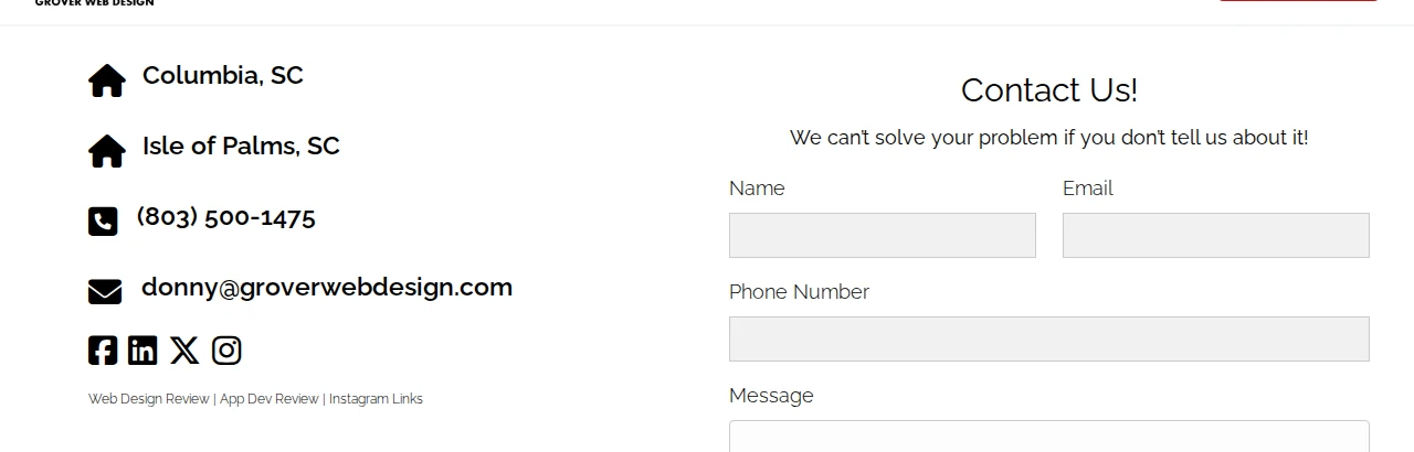
Grover Web Design, a small agency, keeps its contact form to name, email, phone number and message. That’s the whole form, and it still gets the agency what it needs to call back.
The test for each field is simple. Can you name the person on your team who will use that answer in the first reply? If nobody will, the field goes.
Even in checkouts, where people are ready to pay, the average store asks 11 fields when 8 will do. Contact forms are worse because nobody has committed yet.
- Keep. Name, email, and one open box for the message.
- Keep if someone will call. Phone number, marked optional.
- Move to the reply. Budget, company size, timeline, how they heard about you.
- Delete. Fax, title, second phone, “subject” dropdowns with one option.
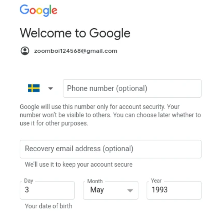
Google’s own account form is a good model for the fields you keep but can’t drop. Phone and recovery email are marked optional, and each carries one line saying what it’s used for.
Copy that pattern for your phone field.
2. Build the Form for Thumbs First
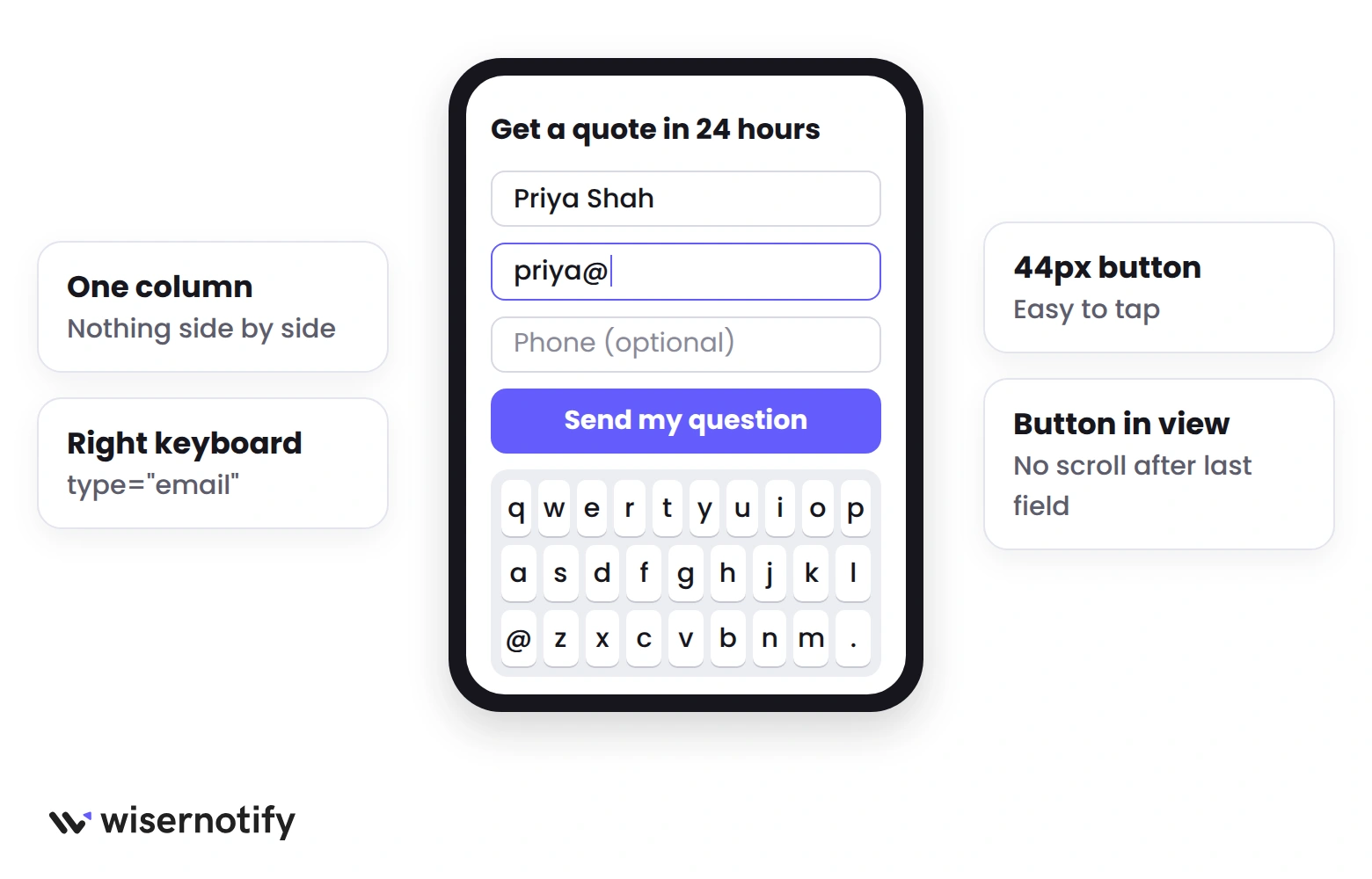
Contact forms finish at 51% on desktop and 39% on mobile. Most of that 12-point gap is mechanical, not psychological.
Small tap targets, the wrong keyboard, and an error message that appears at the top of the form where the person can’t see it.
Open your contact page on your own phone and fill it in with one thumb. Count every time you have to pinch, zoom, or scroll back up. Each one is a drop-off point.
- Use one column. Side-by-side fields collapse badly and hide the second half of a row.
- Set the input type.
type="email"brings up the @ keyboard,type="tel"brings up the number pad. - Make tap targets at least 44 pixels tall, including the submit button.
- Put error text directly under the field that failed, not at the top of the form.
- Keep the submit button in view after the last field without a scroll.
Test the form on a mid-range Android phone, not only the newest iPhone. Samsung’s browser has the lowest completion rate of any browser in the same benchmark data, and that’s where the rough edges show.
The same mechanics apply to every page, so if your whole site leans mobile, go through our guide to mobile conversion rate optimization after this one.
3. Say What Happens When They Hit Send
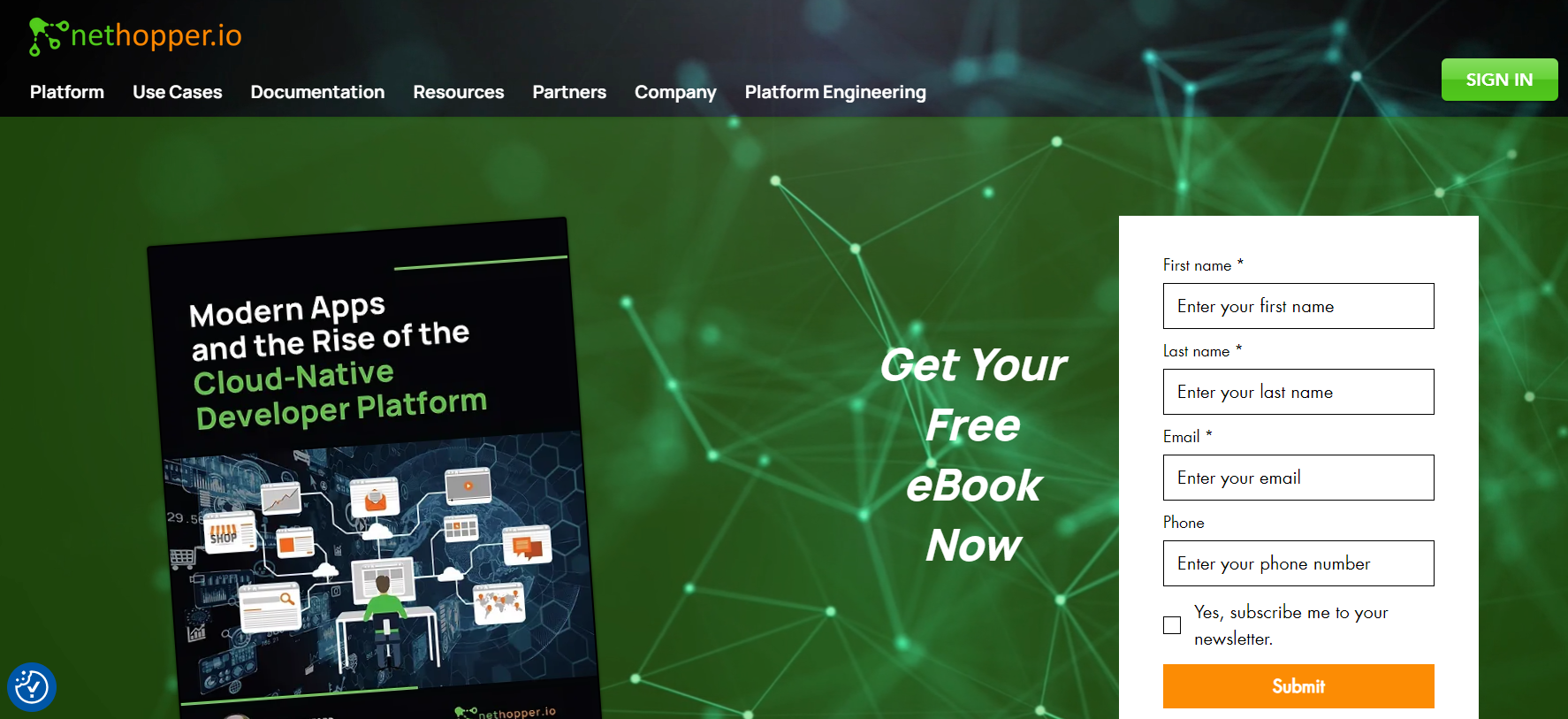
“Contact Us” above a form and “Submit” below it tell the visitor nothing. They don’t know whether they’ll get an email, a call, or silence.
So the headline and the button have one job. Say what the person gets and when.
The ebook form above isn’t subtle, but it works because the headline names the thing you receive. The form on a coaching newsletter page below does the same with a rhythm anyone can picture, insights every Friday.

Write the button as the end of the sentence “I want to…”. Then shorten it.
- “Submit” becomes “Send my question”.
- “Contact us” becomes “Get a quote in 24 hours”.
- “Sign up” becomes “Book my free call”.
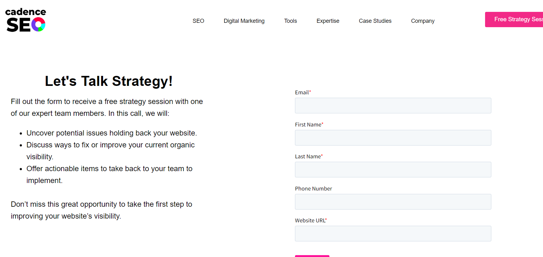
One more move that costs nothing. List what the call or reply will cover, as the agency form above does with three bullets. People fill in a form when they can picture the conversation on the other side.
Our guide to writing a call to action goes deeper on button wording.
4. Put Proof and Privacy Beside the Form
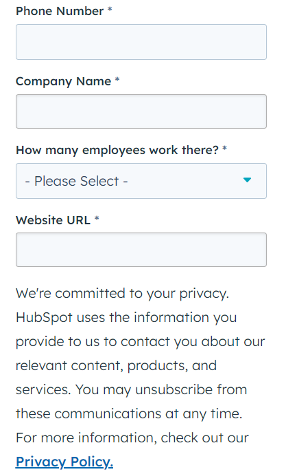
A form asks a stranger for their email. The visitor’s unspoken question is “what will you do with it”.
Answer it in one sentence under the fields, as HubSpot does, and link the privacy policy. Don’t bury it in a 200-word legal block.
Then show that other people already did this and were fine. A short testimonial, a client logo row, or a live notification beside the form does more than a security badge.
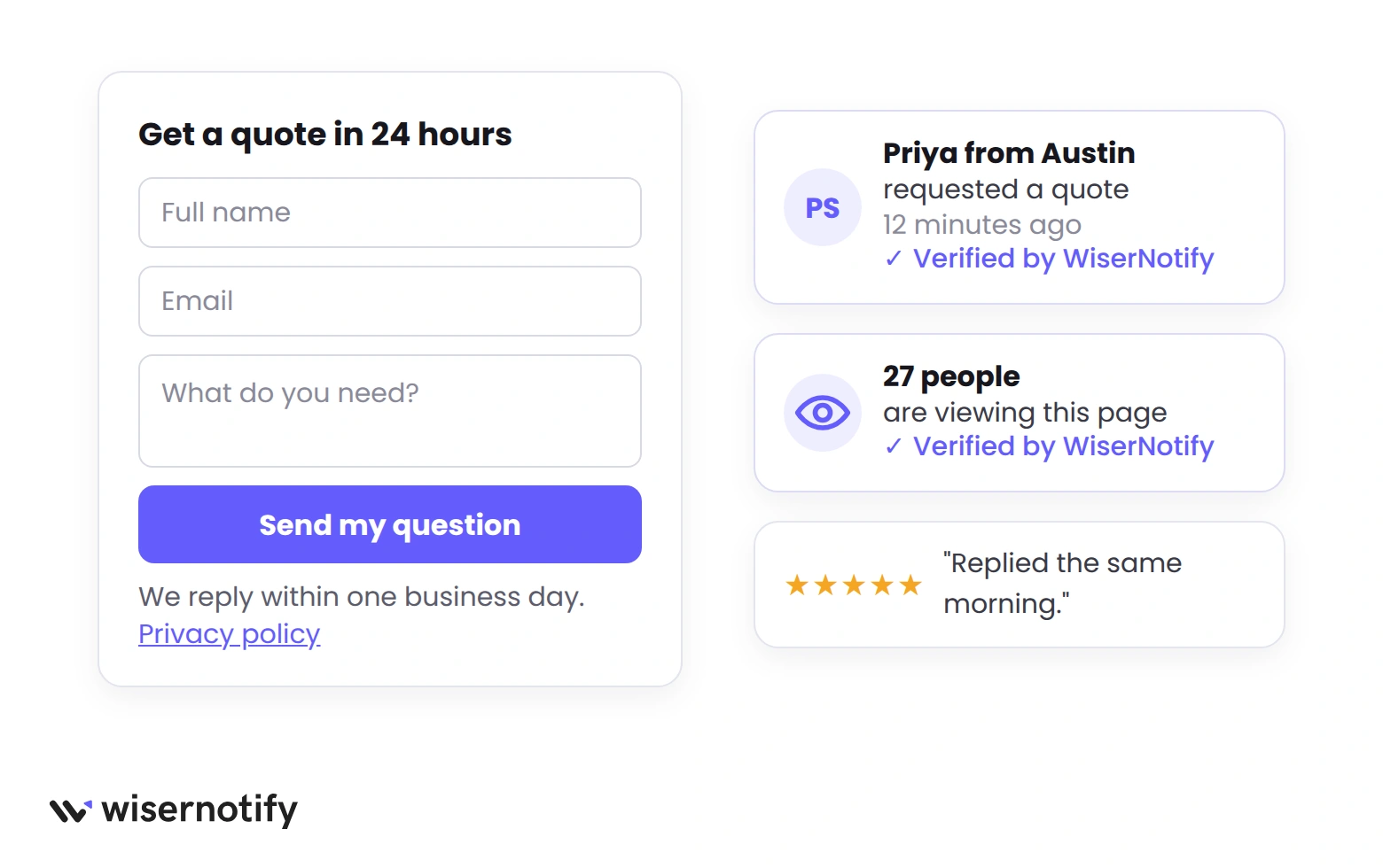
This is where WiserNotify fits. Connect your form builder and each submission becomes a small notification next to the form. “Priya from Austin requested a quote 12 minutes ago.”
Gravity Forms, Typeform and Zoho Forms connect directly, and any builder with a webhook works. Add a live visitor count and the page stops feeling empty.
For more ways to show that people are already in the room, see these social proof examples.
Build trust & FOMO
Highlight real-time activities like reviews, sales & sign-ups.


5. Reply Fast and Prove the Lead Landed
Half of contact form optimization happens after the click. A form that converts and then goes quiet for three days has not converted. The lead has already emailed two competitors.
Three things to fix in order.
Confirm the send. Replace the inline “Thanks” with a page or message that says what happens next and when. “We reply within one business day. If it’s urgent, call this number.”
Our thank you pages examples show the versions that book a call right there.
Make sure the email arrives. Send a test submission every week and check where the notification lands. Form plugins often send mail from your domain through a server that isn’t authorized for it, so the lead quietly goes to spam.
Route form mail through an authenticated sending service and set SPF and DKIM on the domain.
Answer the same day. Set a rule that someone replies within a business hour during working time, even if the reply is “got it, I’ll have a quote by tomorrow”.
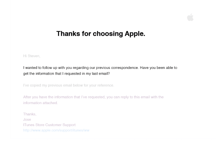
The follow-up email above is from Apple support and does one thing well. It restates what was asked and makes the next step obvious.
Seven Fixes That Polish a Working Form
Do these once the five above are in place. Each one adds a few points, and together they are the difference between an average form and one that beats the benchmark.
6. Offer Something Worth the Trade
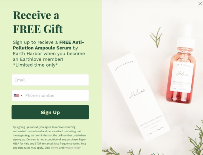
An email address has a price. People pay it with no fuss when the thing on the other side is clear and worth it, and they stall when it’s vague.
Earth Harbor, a skincare brand, offers a free serum for an email and phone number. That’s a product people already want, not a PDF nobody will open.
Match the offer to the business.
- Store. A first-order discount or a sample, delivered on the thank-you page.
- Agency or consultant. A short audit or a 20-minute call with a named person.
- Software. A trial, with the setup steps listed beside the form so the trial feels short.
- Course or coach. One lesson, not a 40-page workbook.
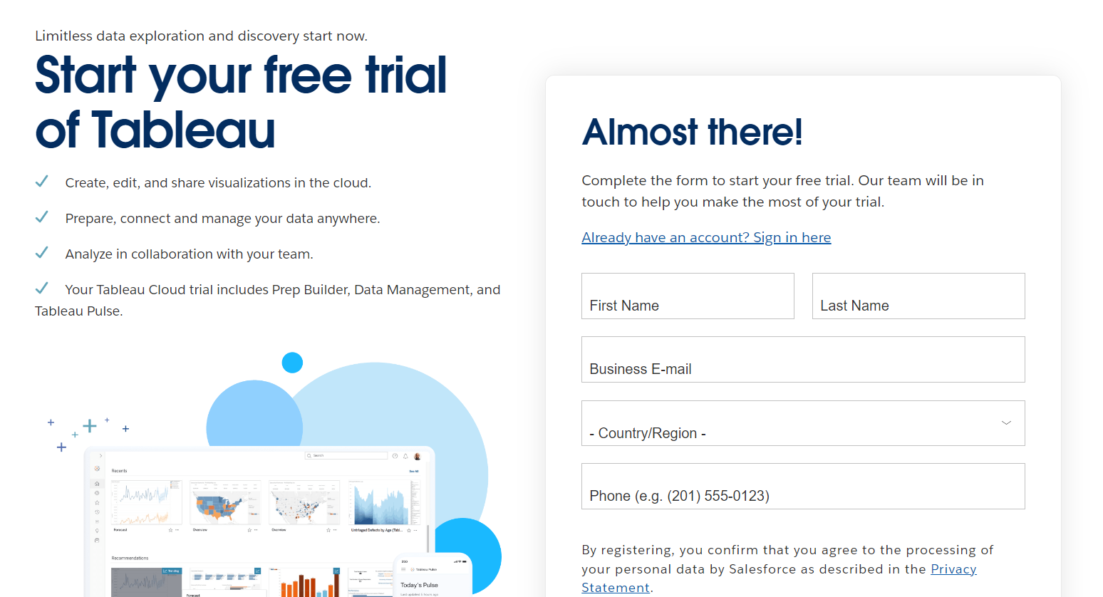
Tableau’s trial form shows the software version of this. The page lists what the trial includes on the left, and the form on the right says “Almost there”, so the offer and the ask sit together.
More examples of the trade done well are in our best signup form examples.
Build trust & FOMO
Highlight real-time activities like reviews, sales & sign-ups.

7. Show Fields Only When They Matter
Sometimes you do need the extra detail. A sales team can’t quote a project without knowing roughly what it is. The answer is conditional logic, not a longer form.
The form starts with three fields. The fourth question (“What do you need help with?”) decides what appears next.
Pick “Website redesign” and you get a field for the current URL. Pick “Something else” and you get a text box. Nobody sees fields that don’t apply to them.
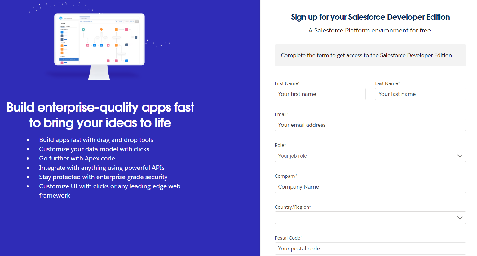
The Salesforce sign-up above is the kind of form this shortens. Role, company, country and postal code are all useful to Salesforce, but the visitor sees seven required fields at once.
Showing postal code only after a country is chosen, and company only for business roles, cuts the first impression in half.
Most form builder tools support this with a show-if rule per field. Set it up once and the form feels short to everyone while still collecting what the team needs from the people who have it.
8. One Name Field, Then Autofill
Split “First name” and “Last name” boxes look tidy and cause a surprising amount of rework.
In usability tests, 42% of people typed their full name into the first box at least once, then had to go back and fix it.
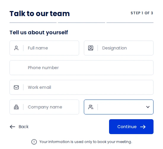
One “Full name” field, as Acefone uses on its demo form above, removes that step. It also handles names that don’t split into two parts.
The second half of this fix is the browser doing the typing. Autofill only works when each field is labeled so the browser recognizes it. In the benchmark data, sessions that used autofill finished more often than sessions that didn’t.
- Add
autocomplete="name",autocomplete="email"andautocomplete="tel"to the matching fields. - Keep a visible label above each field. Placeholder-only fields break autofill and disappear once someone starts typing.
- Don’t turn autocomplete off to fight spam. Fix spam in step 12 instead.
9. Flag Mistakes While People Type
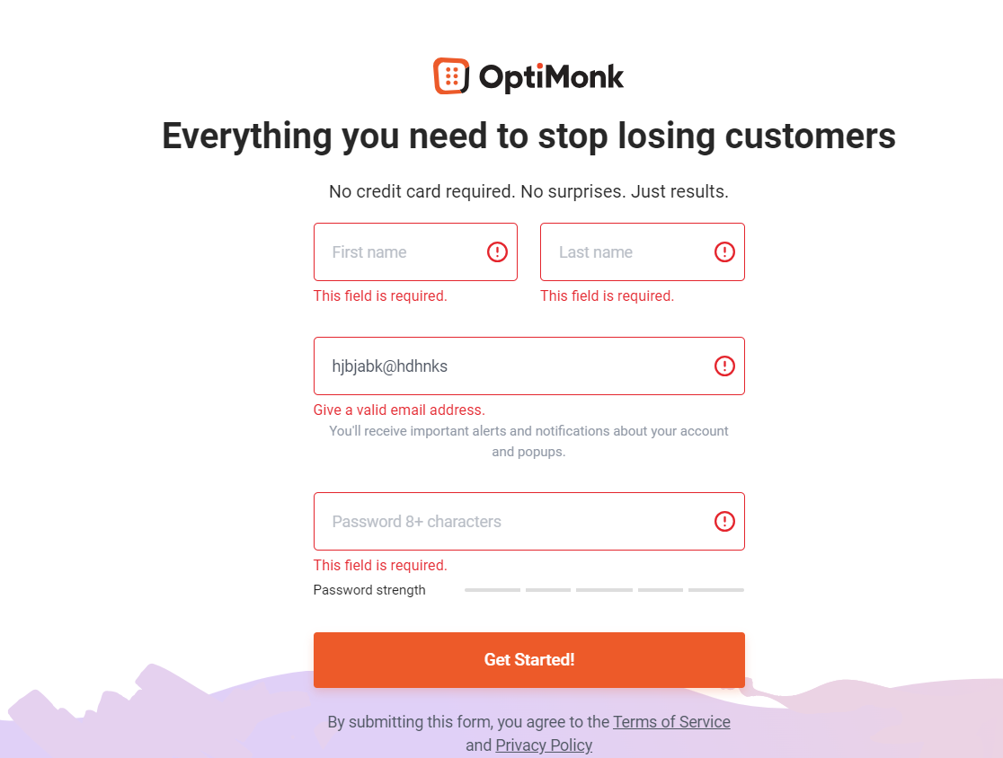
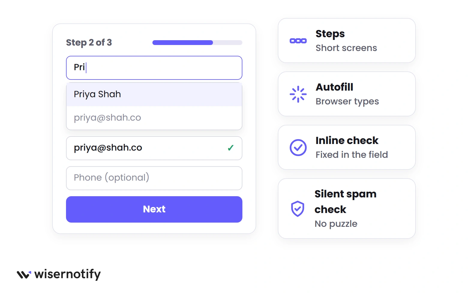
Nothing kills a form like hitting Send and watching three fields turn red at once. Inline validation checks each field as the person leaves it, so a mistyped email gets caught in the moment.
In a usability study that compared six versions of the same form, the inline version produced 22% more completed forms and took 42% less time to finish than the version that only checked on submit.
The OptiMonk form above shows the pattern. Each error sits under its own field, in red, in plain words.
- Validate when the person leaves the field, not on every keystroke.
- Say how to fix it. “Enter an email with an @” beats “Invalid input”.
- Keep every value the person typed. Never clear the form on an error.
- Show a green check only on fields people get wrong, like email and phone.
Error handling is one of the clearest wins in our list of ways to optimize CRO with UX design, because it fixes a loss the visitor blames on themselves.
10. Test Where the Form Sits
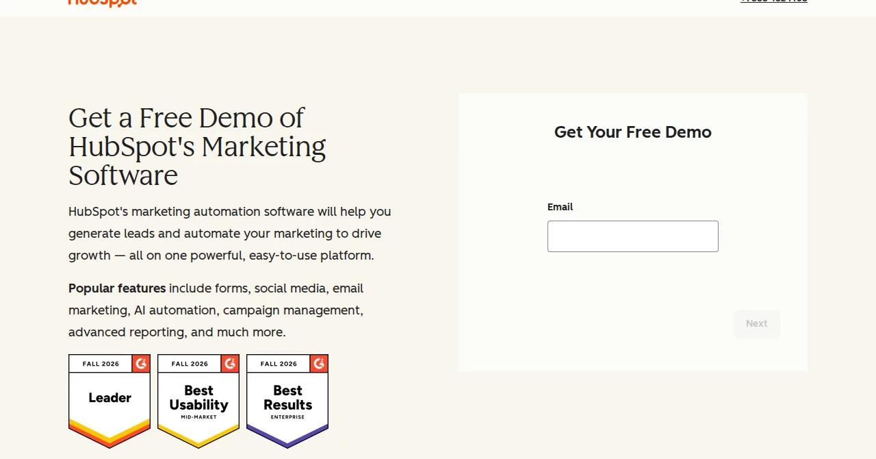
The contact page is only one place a form can live, and often the worst one. The person who wants to talk is usually on a service page or a pricing page, three clicks away from “Contact”.
HubSpot’s demo page puts the form beside the headline, above the fold, so the ask and the pitch share a screen. The first step asks for an email and nothing else.
That’s the placement to copy on any page that sells.
Run these placements against each other, one at a time, for at least two weeks each.
- Above the fold on the service or pricing page, beside the headline.
- At the end of a long guide, after the reader has gotten value.
- A sticky “Ask a question” button that opens a three-field form.
- The contact page itself, as the control.
If you don’t have an experiment tool yet, our comparison of A/B testing tools covers the ones that can split a form by page without code.
Build trust & FOMO
Highlight real-time activities like reviews, sales & sign-ups.

11. Break Long Forms Into Steps
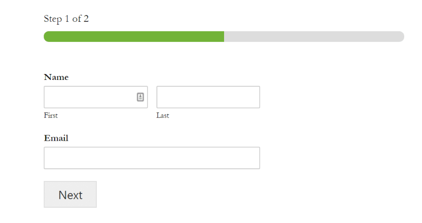
When a form has to be long, split it. A quote form with eight questions feels heavy on one page and light across three screens of two or three questions each.
Acefone’s “Talk to our team” form, shown under fix 8, is a current example. It opens with “Step 1 of 3” and a three-segment bar.
Step one covers who you are and where you work. The solutions you want and the meeting slot come on the next screens, with a line saying the details are only used to book the meeting.
The order matters more than the step count.
- Ask the easy, low-commitment questions first. What do you need, roughly when.
- Put name and email on the second step, once the person is invested.
- Ask for phone last, and only if you’ll call.
- Show “Step 2 of 3”, not a bare bar. People want the number.
- Save the answers as they go, so a refresh doesn’t wipe the form.
Don’t split a three-field form. Steps add a click, and a short form on one screen is faster. The same rule applies to the lead forms on landing pages, which we cover in increase landing page conversion rates.
12. Stop Spam Without a Puzzle
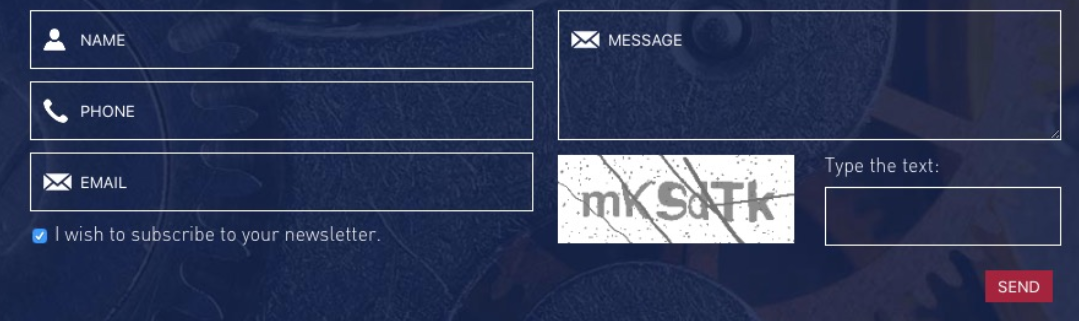
The form above has two things wrong with it, and both are common. A distorted-text CAPTCHA that makes the visitor prove they’re human, and a newsletter box that’s already ticked.
Spam is your problem, not the visitor’s. Move the check to places the visitor never sees.
- Honeypot field. A hidden field that humans can’t see. Bots fill it in, and any submission with that field filled is dropped.
- Invisible challenge. Cloudflare Turnstile or reCAPTCHA v3 score the visit in the background with no puzzle.
- Timing check. A form submitted two seconds after the page loaded wasn’t typed by a person.
- Server-side filter. Reject submissions with links in the name field or a message that’s only a URL.
On the pre-ticked box, the law has caught up. Under GDPR, a pre-ticked box doesn’t count as consent, so a marketing checkbox has to start empty.
It also builds ecommerce trust when the visitor sees you didn’t try to sneak a subscription in.
How to Find Where Your Form Loses People
You don’t have to guess which fix to make first. Two numbers tell you where the leak is, and both are free.
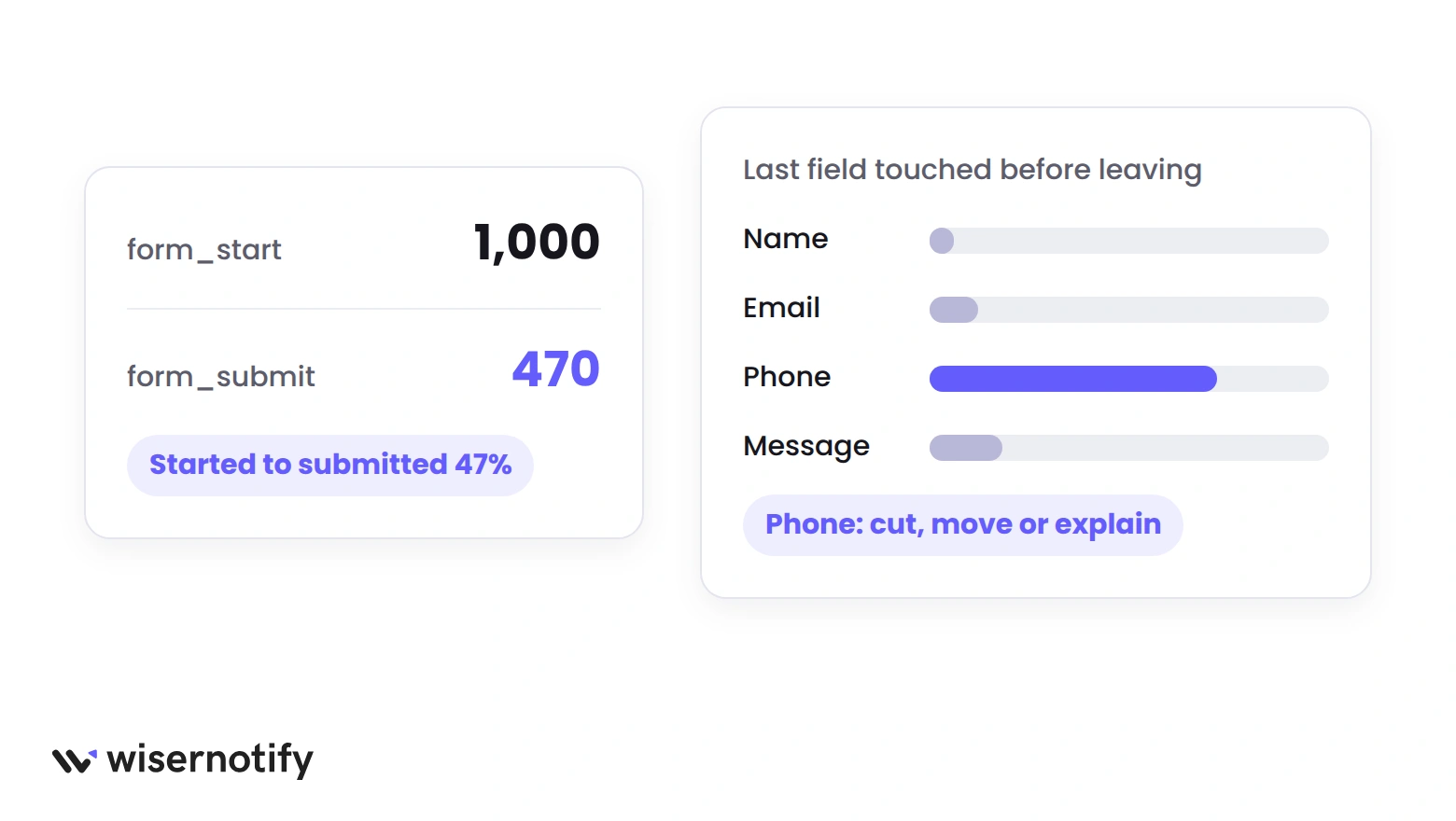
Started versus submitted. Google Analytics 4 records a form_start event the first time a person interacts with a form and a form_submit event when they send it. Divide submits by starts.
If the ratio is below the benchmark for your form type, the problem is inside the form. If starts are low compared to page views, the problem is the page around it.
Field drop-off. A form analytics tool shows the last field people touched before leaving. The field that shows up most is the one to cut, move, or explain.
- Turn on enhanced measurement in GA4 and confirm form events appear in the Events report.
- Note page views, form starts and form submits for the contact page over 30 days.
- Compare start-to-submit against the table at the top of this post.
- Watch five session recordings of people who started and didn’t finish.
- Change one thing, wait two weeks, and read the numbers again.
Once submissions flow, route them somewhere a person will see them within the hour. Most lead generation tools can push a form entry to Slack, a CRM, or a phone alert, which is what makes fix number five possible.
Wrap Up
Contact form optimization is mostly subtraction. Fewer fields, fewer taps on a phone, fewer reasons to doubt what happens after the click.
Start with the five core fixes, then measure. Started versus submitted will tell you whether the next change belongs inside the form or on the page around it.
And once the form converts, let it work for the next visitor. A notification beside the form showing that someone just reached out is the proof a new visitor needs to do the same.
Frequently Asked Questions
What is a good contact form conversion rate?
About 47% of people who start a contact form go on to submit it, so a form that converts more than half of its starters is doing well.
How many fields should a contact form have?
Three or four. Name, email, a message box and one qualifying question are enough for a first contact. Ask the rest in your reply.
Should a contact form ask for a phone number?
Only if someone on your team will call. Mark the field optional and add one line saying why you want the number.
Do multi-step forms convert better than single-page forms?
For long forms, yes, because each screen feels short. For a form with three or four fields, one page is faster and converts better.
How do I stop contact form spam without a CAPTCHA?
Use a hidden honeypot field, an invisible check such as Cloudflare Turnstile, and a server-side filter for link-filled messages. Visitors never see a puzzle.
Why does my contact form convert worse on mobile?
Small tap targets, the wrong keyboard for each field, and error messages that appear off screen. Fix those three first and retest with one thumb.

Krunal Vaghasiya is a marketing tech expert who boosts e-commerce conversion rates with automated social proof and FOMO strategies. He loves to keep posting insightful posts on online marketing software, marketing automations, and improving conversion rates.




 Capterra