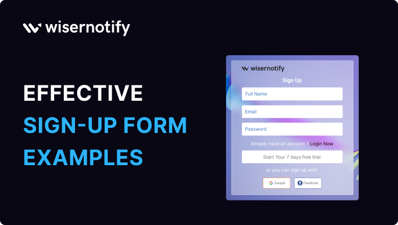

A great sign-up form can make all the difference.
But how do you design one that grabs attention and boosts conversions?
In this article, we’ll showcase 20 stunning signup form examples that are guaranteed to inspire your next website redesign.
Let’s dive in!
What is a Signup Form?
A signup form is a tool used on websites or applications to collect user information for creating accounts, subscribing to services, joining mailing lists, or accessing specific features.
It’s often the first interaction users have when engaging with a brand or platform, making it a critical element in user acquisition and conversion strategies.
Why Better Sign-Up Page Design Increases Conversions
The design of a sign-up page is crucial because it’s the first impression users get of your website or app.
It should be clear and easy to understand, guiding users through the sign-up process smoothly.
A well-designed page can encourage more people to sign up, reducing frustration and dropout rates.
It helps establish trust and credibility with users, showing that your platform is professional and user-friendly.
A good design considers user experience, making it intuitive with clear instructions and minimal distractions.
Overall, a well-thought-out sign-up page can positively impact user engagement and retention.
Did you know asking for 3 steps of information can lead to a higher conversion rate of 10%?
Whether you’re running a website or an app, having an attractive and easy-to-use signup form is crucial.
Key Elements of Good Signup Forms
A great signup form balances simplicity with value, encouraging users to take action effortlessly. Here are the essential elements:
- Keep it short—only ask for necessary information like an email address or name.
- Use actionable phrases like “Join Now” or “Get Started.”
- Showcase value with messages like “Sign up for 10% off your first order.”
- Include assurances like “Your data is secure” to build confidence.
- For convenience, users can sign up with platforms like Google or Facebook.
- Use modern, visually appealing layouts with plenty of white space.
- For multi-step forms, show users how far they’ve progressed to reduce drop-offs.
Here are 20 of the best signup form examples that look great and make the user experience smooth and hassle-free.
These designs will inspire you to create forms that people will actually want to fill out!
1. Airbnb
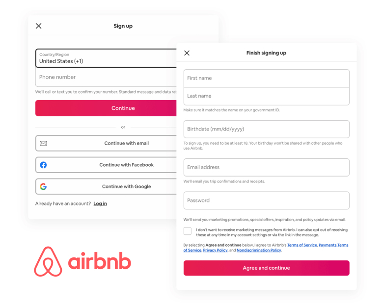
Airbnb is a well-known company in the tourism industry, with a popular online presence. The website has a simple and spacious sign up page design.
The signup page asks for more information than others, but it breaks questions into smaller parts to make it easier to complete.
For example, the birthdate is split into three dropdown menus, making it simple for users. The overall sign up page design of the is attractive and gives the impression that it won’t take much time to complete.
A nice touch is the eye icon in the password field, which adds to Airbnb’s unique personality.
2. PayPal
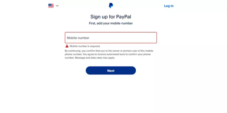
PayPal’s signup form has multiple steps. Each screen focuses on one action to avoid overwhelming users. The form asks for security details like email and mobile verification.
Since PayPal deals with finances, it needs more information compared to other apps. The dark blue CTA button on a white background stands out.
3. Dropbox
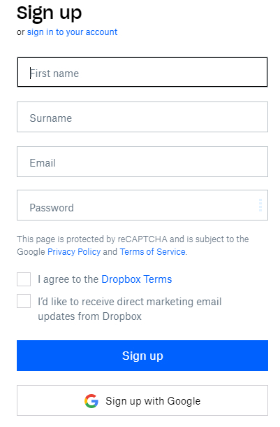
Dropbox’s signup form is designed for simplicity, asking only for name, email, and password.
It includes a checkbox for terms of service and privacy policy consent, making it easy for users to understand and agree.
By focusing on ease of use, clarity, and convenience, this example of Dropbox’s signup form ensures that users can get started quickly, trust and encourage engagement with the platform.
4. Trello
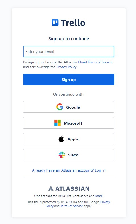
Compared to other SaaS companies, Trello’s signup form is simple. It offers different signup options with icons, making it easy for users to choose their accounts.
At the bottom of the form, there is a message saying one account can be used for all Atlassian products. This setup makes it easier to use different Atlassian products, similar to how Google Workspace works.
5. Medium
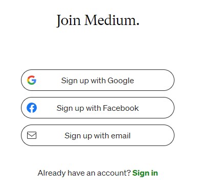
People don’t like filling out forms. Designers need to make forms easy to fill out. Let’s look at Medium’s signup page.
When you click Get Started on the homepage, a pop-up appears. There is a cool picture, but no input form fields. You can sign up with Google or Facebook in one click.
But if you don’t have those accounts, you have to fill out their forms.
Related post: 20 Form Builder Tools for Creating Effortless Online Forms
6. Evernote
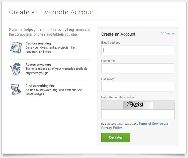
Evernote’s signup form is user-friendly, requesting email, username, and password form fields.
It highlights benefits like syncing across devices and offers a prominent CTA button to start using the service immediately.
7. Linkedin
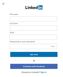
LinkedIn breaks down its registration process into clear steps, starting with basic information like name and email. They use a long signup form but keep it manageable by showing progress indicators.
The password field is secure, and the call-to-action button is prominently placed.
8. Google
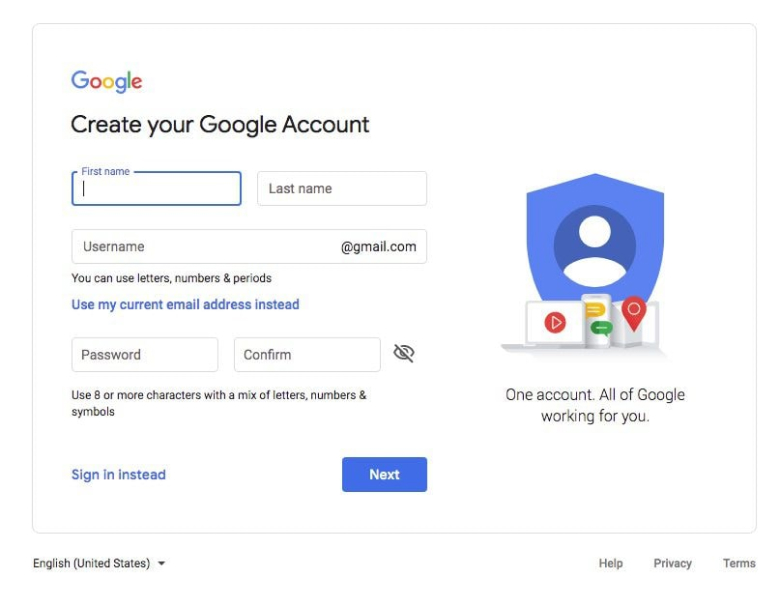
Google’s signup form for creating a Gmail account is well-designed. The form is simple and clear, with instructions under each input field.
Users enter their first and last name, username, and password. You can also view your password to avoid mistakes.
The form includes an illustration and text that emphasizes this account is for all of Google, not just Gmail.
9. Shopify
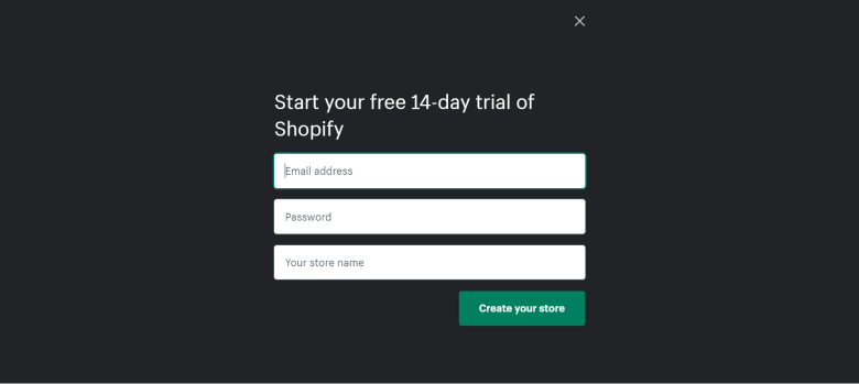
Shopify is a popular online selling platform used by people worldwide. The signup process is easy, with a short form asking for email, password, and store name.
The page is simple and straightforward, without unnecessary distractions.
The platform attracts users by providing a user-friendly registration process.
10. Facebook
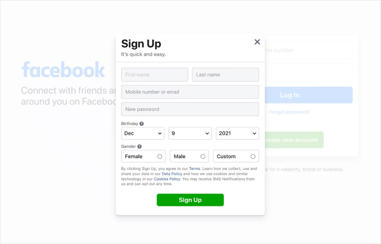
Facebook has billions of users. To attract more users, Facebook has made the signup process simple. The signup form is short and only asks for essential information.
Users can sign up using an email or a mobile phone number. The form is user-friendly and doesn’t overwhelm users with too many questions.
The form also highlights the benefits of signing up, such as seeing photos, staying updated on what’s new, and finding out what’s happening.
11. Netflix
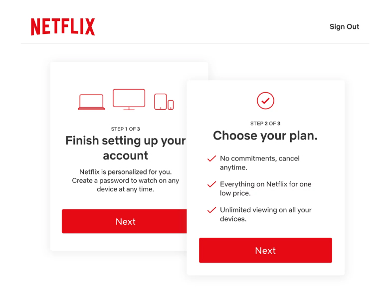
Netflix is well known for its easy-to-use platform and innovative features. The signup form is simple and divided into three steps, making it quick for users to complete.
Allowing users only need to choose a plan by clicking on a table and entering their email and password. The final step is setting up a payment method.
This Netflix signup form example shows how clarity, simplicity, and value-driven messaging can turn visitors into subscribers with minimal effort.
Overall, Netflix’s sign up form is user-friendly and efficient.
12. MailChimp
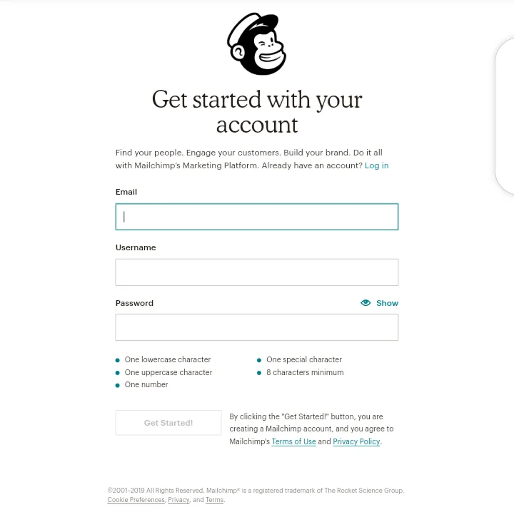
MailChimp has a great sign-up form. It is simple, clear, and easy to use. The chimp mascot adds a fun touch and catches the user’s eye. The form has only three fields, keeping it short and focused.
Clear instructions help users fill out the form quickly. For the password field, there is a helpful guide that fades as the user meets each criteria.
This saves time and improves the experience. The CTA button stays white until the form is filled, then becomes active.
13. Canva
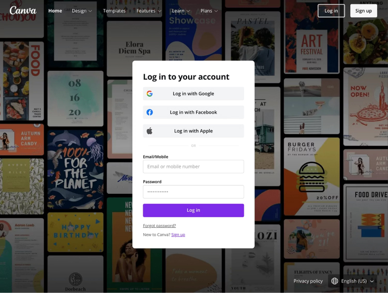
Canva’s sign-up page design is light and simple. The form is on the homepage with minimal color, mainly using Canvas blue for the CTA.
The form blends well with the home page, and the image on the right doesn’t distract from it. Canva’s sign-up form also provides useful instructions, like telling users the password needs to be at least 8 characters.
14. Quicksprout
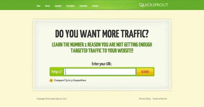
The Quicksprout sign-up form is unique. Instead of a typical form field, it uses a URL entry. It starts by providing value to users before asking for information.
The form addresses a user’s problem and offers a solution.
Understanding your user is critical to providing solutions. Quick Sprout’s form asks users if they want more traffic and offers a solution to help them understand why they lack traffic.
Asking a question and providing a solution can boost form conversions.
15. Leadinfo
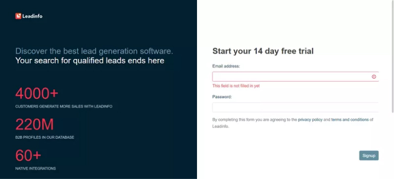
Leadinfo welcomes new users with simple sign-up forms that display clear error messages if a field is missed or filled out incorrectly. The heading mentions a 14-day free trial to reassure visitors.
The sign-up page uses simple language to make it easy to understand. To avoid confusion, social proof is on the left side of the page, while the sign-up form is on the right side.
Build trust & FOMO
Highlight real-time activities like reviews, sales & sign-ups.


16. Nerd Fitness
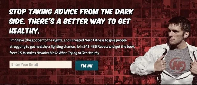
The Nerd Fitness sign-up form by Steve Kamb is an excellent example of a form that gets a lot of people to sign up. The form has many colors, but they match the brand’s style.
It is simple and only asks for your email address, which people are usually willing to give.
The less information you ask for, the more likely people will sign up. They also give away a free book to encourage people to sign up. The casual language in the form makes signing up more enjoyable.
The form also shows that over 200,000 people have signed up before you, which can make you more likely to do the same.
17. TransferWise
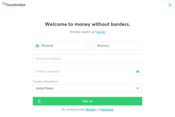
Transferwise is an app that makes it easy to send money to banks worldwide. The sign-up process is simple and clear.
The form starts with a clear message: Welcome to money with borders. It answers the question of how to transfer money between countries.
You can choose between a personal or business account. You need to provide your email, password and location. Despite having five field, the sign up page design is clean and minimal.
18. Twitter
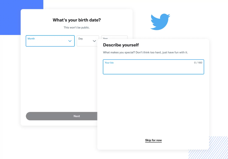
Twitter is a platform where things are happening. The sign-up form is simple and has only three steps. First, you give your name and phone number or email.
Then, you can customize your experience by connecting with people you know, getting more out of Twitter, and seeing better ads.
Finally, you confirm the information you provided in step one. The form is straightforward and efficient.
19. Reddit
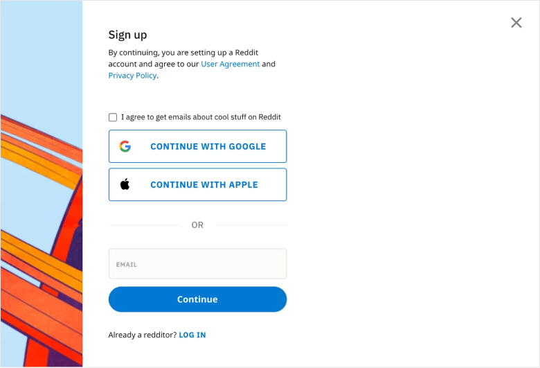
Signing up for Reddit is very easy. Click the signup button on the homepage, enter your email, and you’re done. Reddit has communities for every interest, so you’ll likely find one that suits you.
They even tell you it takes seconds to sign up, setting clear expectations.
20. Primal Pet Foods
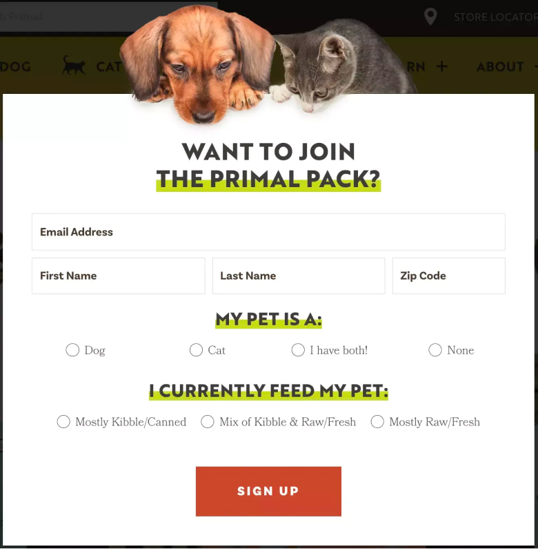
Most sign-up forms are generic, but Primal Pet Foods has a unique sign-up page design. Its form includes two furry characters watching the registration process.
It asks for more information than just email, like the subscriber’s name, zip code, and pet details.
Even though it may seem like a lot to fill out, the form is designed well with different user interface components. For instance, you can quickly answer questions by selecting options instead of typing text.
Conclusion
These 20 sign-up form examples show just how important good design is for getting users to sign up. From clean layouts to creative touches, each example offers something unique to inspire you.
Clear, concise instructions, thoughtful use of colors and fonts, and strategic placement of field were common elements that stood out.
These examples demonstrate how crucial it is for sign-up forms to be intuitive and visually appealing, ensuring users feel encouraged rather than frustrated.
Implementing these ideas can make your signup forms more user-friendly and appealing. Remember, a great signup form can make a big difference in growing your user base!
