The Click Actions section is designed to define and customize the behavior of buttons, links, and interactions within your widget or countdown timer. Here’s a detailed breakdown of its features and functionality:
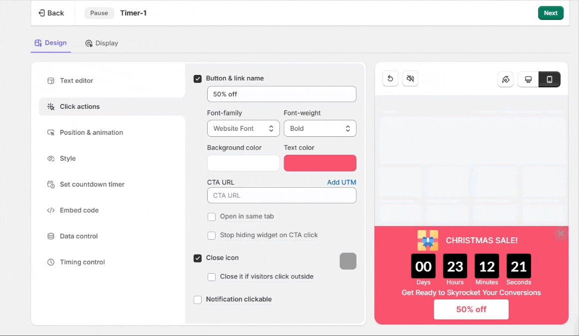
1. Button & Link Name
- Text Field (e.g., “50% Off”):
- This field allows you to specify the text displayed on the call-to-action (CTA) button. It should be concise, action-oriented, and relevant to your campaign.
- Example: “Shop Now,” “Claim Offer,” or “Learn More.”
2. Font Customization
- Font Family:
- Allows you to choose the font for the button text. Options include:
- Default website font (inherits your site’s font style).
- Custom fonts for consistency with your branding.
- Allows you to choose the font for the button text. Options include:
- Font Weight:
- Lets you adjust the boldness of the button text.
- Example: Options like Bold, Regular, or Light to match the overall widget style.
3. Background & Text Color
- Background Color:
- Customize the button’s background color to match your theme or make it stand out.
- Example: Use bright colors like red or yellow for urgency or darker tones for a professional look.
- Text Color:
- Choose a color for the button text that ensures readability and visual appeal against the background color.
4. CTA URL
- URL Field:
- Input the link you want the button to redirect to. This could be a landing page, product page, or a checkout page.
- Example: Redirect to “https://yourwebsite.com/checkout” for time-sensitive offers.
- Add UTM:
- Click this option to append UTM parameters to your URL for tracking campaign performance in analytics tools like Google Analytics.
5. Interaction Options
- Open in Same Tab:
- Determines whether the link opens in the current tab or a new one.
- Example: For eCommerce, opening in the same tab is useful to keep users focused on the purchase flow.
- Stop Hiding Widget on CTA Click:
- If enabled, the widget will remain visible even after the button is clicked. This is useful for multi-step actions or information widgets.
6. Close Icon Settings
- Enable/Disable Close Icon:
- Toggle this option to show or hide the close button on the widget.
- Useful for ensuring users have control over dismissing the notification.
- Close if Visitors Click Outside:
- If enabled, clicking outside the widget area will close the notification. This ensures a non-intrusive user experience.
7. Notification Clickable
- Entire Notification Clickable:
- When enabled, the entire notification (not just the button) becomes a clickable area, redirecting to the specified URL.
- Example: This is ideal for full-width notifications where the button and text are part of a single clickable unit.