

You’ve designed a high-converting landing page in Unbounce with clear CTAs, benefit-driven copy, and optimized layouts.
But if your visitors still aren’t converting, it might not be the design—it might be the lack of trust. A real-time notification like “Daniel from Miami just signed up for the Free SEO Toolkit” can change that instantly.
That’s where Wisernotify comes in.
By adding real-time sales popups to your Unbounce pages, you show that others are engaging with your offer.
These popups display actions like signups, purchases, and downloads, adding urgency and trust to your conversion path without distracting from your page’s message.
Here’s a quick guide video for adding sales pop-ups on Unbounce. The process is simple and takes just a minute.
Why Add a Sales Notification Pop-up on Unbounce?
Unbounce empowers marketers to build laser-focused landing pages that serve a single goal—whether it’s capturing leads, booking calls, or generating sales.
But even with optimized UX, compelling CTAs, and split-tested copy, conversion can still hinge on trust.
Wisernotify introduces social proof in real time, reinforcing confidence and accelerating decision-making.
Build trust quickly: People trust people. Displaying actions from real users reduces hesitation and builds legitimacy for your brand or product.
Boost urgency: Seeing someone else take action taps into FOMO, compelling users to act quickly so they don’t miss out.
Improve form submissions: By showcasing others signing up, downloading, or enrolling, you encourage similar behavior and reinforce the value of your offer.
Minimal code setup: Wisernotify is lightweight and integrates easily into Unbounce using a script or Google Tag Manager—no heavy coding or plugins required.
Design control: Every element of the popup can be styled to match your branding, from colors and fonts to animations and positioning.
Use Case Example: A SaaS company offering a freemium product used Wisernotify to show recent signups on their Unbounce lead-gen landing pages. Within two weeks of implementation, they saw a 31% uplift in form completions, particularly from mobile users. The presence of subtle but specific notifications helped convert skeptical visitors who were previously bouncing at the form stage.
How to Add Sales Pop-up on Unbounce

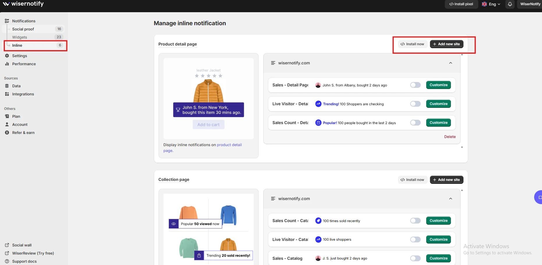
3 Best sales pop-up examples

Sales Pop-up Tips for Unbounce
Here are the main sales pop-up tips for Unbounce:
1. Use soft colors
Choose a color palette that complements your page’s design.
Harsh or high-contrast popup colors can draw too much attention and take away from your CTA.
Using soft, brand-aligned tones ensures that the popup supports your message without becoming a distraction.
2. Trigger after scroll or delay:
Showing a popup immediately can feel pushy.
Wait until users scroll 40–60% down the page or spend at least 10 seconds actively engaging.
This strategy ensures they are invested before prompting them with social proof, improving its impact.
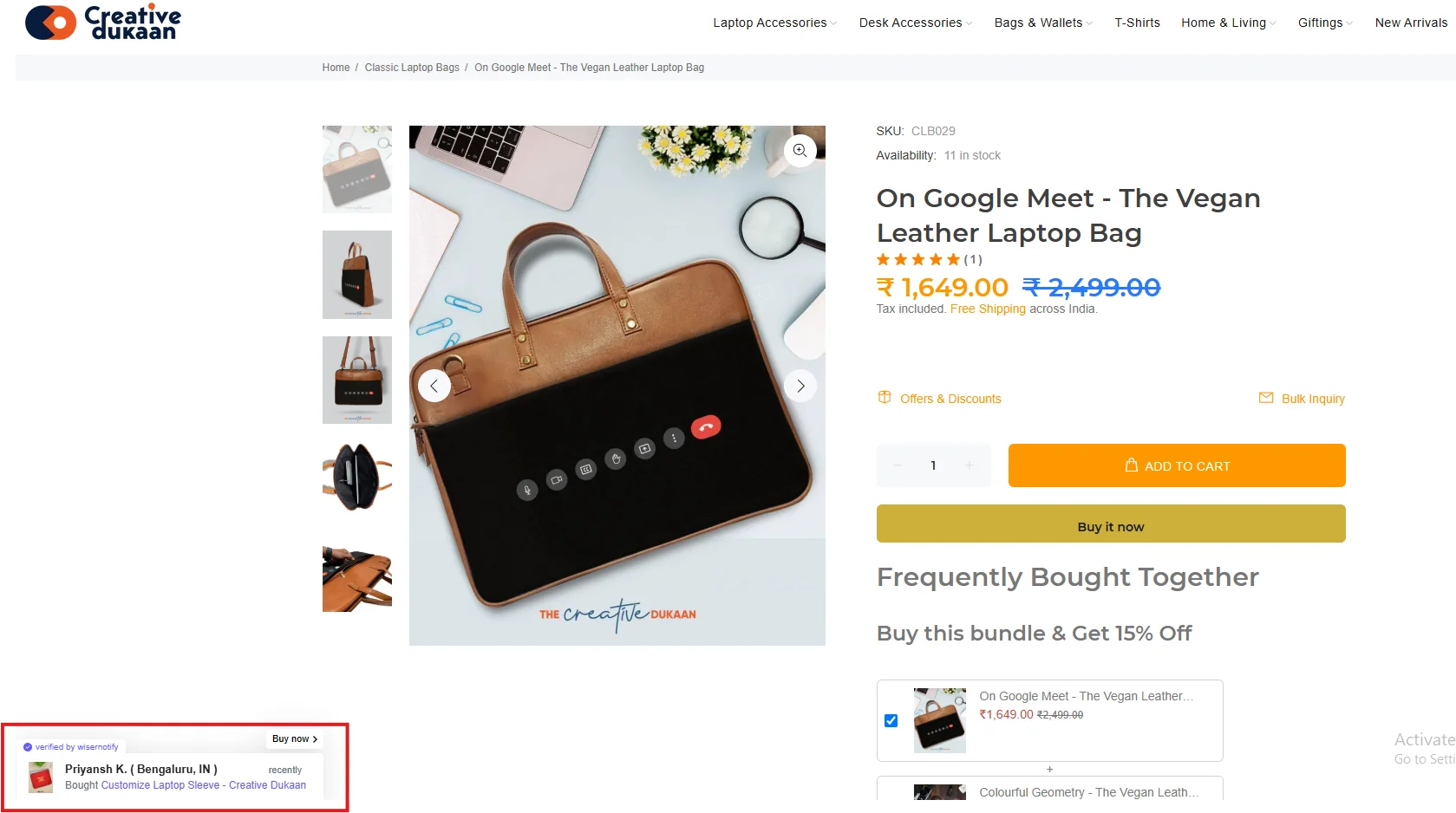
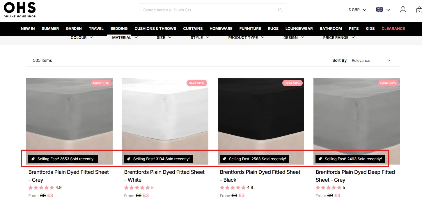
3. Show name, city, and action
Real data adds credibility. Instead of using vague messages, say “Julia from Chicago just downloaded the SEO Toolkit.”
These small touches increase believability and create a more human connection, helping users trust your offer.
4. Position wisely
Avoid placing popups in areas that cover key content or navigation.
The bottom left or top right corner often works best for visibility without disruption.
Make sure it never overlaps with forms or CTA buttons.
5. Test popup location
A/B test popup positions to see where they perform best.
While bottom left is a common choice, your audience may respond better to a different placement.
Testing allows for optimization based on real data.
6. Mobile-ready layouts
With mobile traffic dominating most campaigns, your popups must be responsive.
Ensure that the design adapts well to different screen sizes, and avoid elements that could interfere with mobile usability.
7. Highlight urgency with copy
Use phrases like “Only a few spots left” or “Download before midnight” to build urgency.
Pairing urgency with social proof motivates users to act before the opportunity passes.
8. A/B test timing and design
Regularly experiment with popup designs, message timing, and animations.
Use Wisernotify’s analytics to compare performance and refine your approach for maximum conversions.
9. Match tone with landing copy
Your popup should feel like a continuation of your landing page content.
If your tone is friendly and informal, keep the popup language consistent.
This strengthens your brand voice and enhances user experience.
Sales Popup Mistakes to Avoid on Unbounce
Here are some common mistakes to avoid:
1. Too many pop-ups
Displaying multiple popups too close together overwhelms users.
Instead, space them out—no more than one popup every 30–45 seconds and only two or three per session to keep the user experience smooth and focused.
2. Generic messages
Avoid nondescript phrases like “Someone just signed up.”
These feel impersonal and reduce credibility.
Use specific names, actions, and locations to make your popups feel authentic and trustworthy.
3. Blocking forms
Never position popups where they obscure lead forms, buttons, or any key content.
Interrupting a visitor’s flow can lead to frustration and form abandonment.
Always test placement across devices to avoid this.
4. Inconsistent design
Using colors or fonts that clash with your page reduces professional appeal.
Ensure your popup design complements your landing page’s overall aesthetic by aligning visuals with your existing branding.
5. Skipping performance review
Wisernotify provides valuable analytics—use them.
Monitor which popups are getting clicks, where users are bouncing, and what messages lead to conversions.
Without performance tracking, you miss crucial insights for improvement.
Wrap-Up
Unbounce is a powerful tool for creating focused, conversion-ready landing pages. But even the best design needs trust to seal the deal.
Wisernotify fills that gap by adding real-time validation in the form of sales popups, showing that others are actively engaging with your offer.
By installing Wisernotify, you make your Unbounce page feel dynamic, credible, and visitor-friendly.
With just a simple integration, you can start reinforcing user decisions, improving form completions, and lifting overall conversions.
Make the smart move—add Wisernotify to your Unbounce page today and turn your high-performing layout into a trust-building powerhouse.
