You’ve built high-converting landing pages with clean headlines, strong CTAs, and optimized forms—but users still bounce.
Why? Because even a great landing page won’t always feel trustworthy to new visitors.
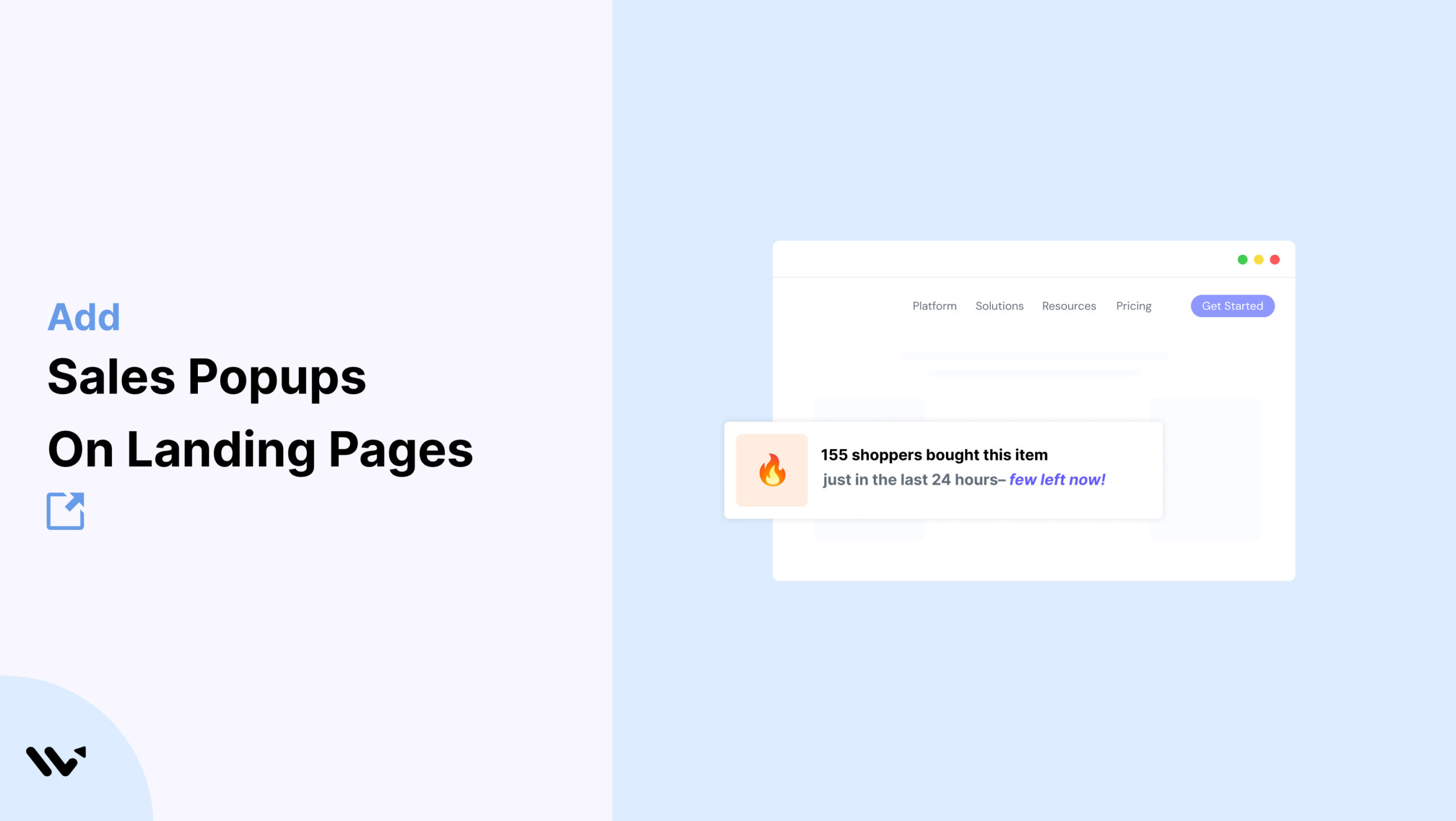
Adding a real-time popup like “James from Austin just signed up for the free SEO audit” instantly reassures and nudges action.
Wisernotify allows you to display live user activity—such as signups, purchases, or downloads—directly on your landing pages.
These popups act as social proof, strengthening trust and increasing conversion rates.
Why Add a Sales Notification Pop-up on Landing Pages?
Landing pages are built for action—sales popups add psychological reinforcement that encourages commitment. While your headlines and CTAs provide logical value, popups bring emotional validation by showing users they’re not alone.
Boost credibility: Visitors feel more confident when they see real-time actions from other users, increasing perceived legitimacy.
Trigger urgency: When people notice others signing up or making purchases, they fear missing out—prompting faster decisions.
Works across niches: Whether your page promotes a webinar, ebook, free trial, or product, real-time proof supports every goal.
Embed easily: Adding Wisernotify is straightforward via HTML embed code or Google Tag Manager, making integration smooth.
Styled to match: Customizable design settings ensure your popup looks native to your brand, blending in with fonts, colors, and layout.
Use Case Example: A SaaS company promoting a webinar embedded Wisernotify on their landing page with alerts like “Maria from NYC just registered.” The result? A 26% lift in form completions, lower bounce rates, and a higher perceived value of the event—all by adding a single layer of trust.
How to Add Sales Pop-up on Landing Pages

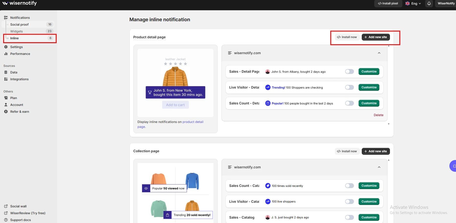
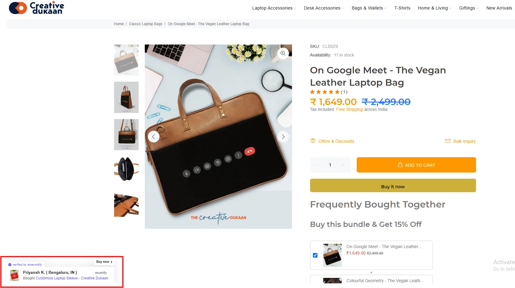
3 Best Sales Pop-up Examples

Sales Pop-Up Tips for Landing Pages
Here are the main tips for sales pop up on Landing Pages:
1. Match the look of your brand identity
Consistency builds trust. Ensure that your popup uses the same font families, color schemes, and layout style as your landing page.
A popup that feels native to your brand looks intentional and reinforces the professionalism of your entire offer.
Visual dissonance can lead users to question authenticity, reducing their likelihood of acting on the CTA.
2. Time popups based on user engagement
Avoid showing popups immediately after page load.
Instead, trigger them after a user scrolls down a portion of the page or stays on it for a certain period (e.g., 10–15 seconds).
These behavioral triggers allow you to capture attention only when users are already interested, making the popup feel more relevant and less intrusive.
3. Use contextually aligned messaging
Generic notifications dilute credibility. Instead, personalize the popup based on the specific page and offer.
If you’re promoting a free SEO audit, your popup should say something like, “Alicia from Denver just requested her audit report.”
The closer the message aligns with the CTA, the stronger the reinforcement.
4. Incorporate human elements like names and locations
Personalization makes your message more believable.
Including the name and city of recent users helps convey real activity, adding emotional connection and increasing the likelihood that new visitors will engage.
5. Ensure cross-device compatibility
A popup that works well on desktop might interfere with key functionality on mobile.
Wisernotify allows you to tailor your popups for different screen sizes.
Make sure your message is readable and that the design doesn’t block buttons, forms, or navigation on smaller devices.
6. Highlight time sensitivity when applicable
Scarcity and urgency are powerful motivators.
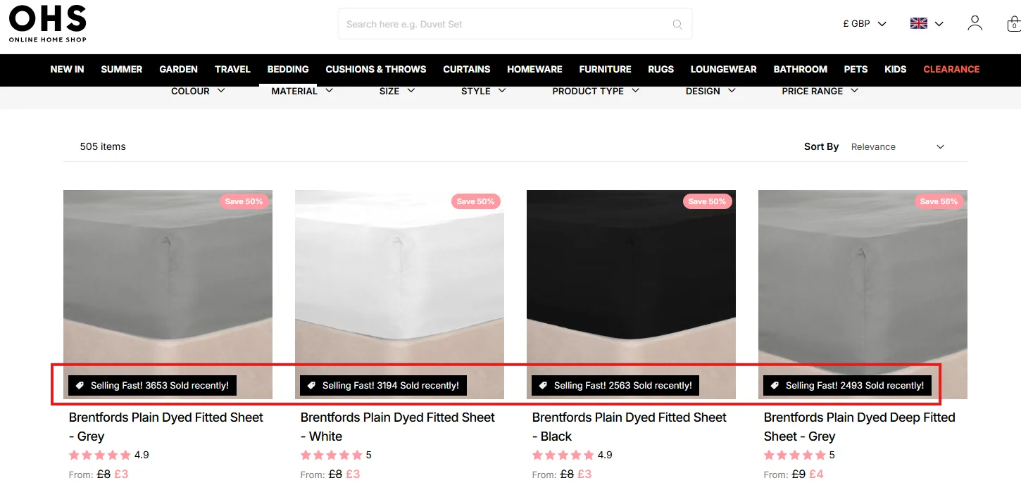
Incorporate timestamps or limited-availability cues like “Just now” or “Only 3 seats left.”
When visitors sense that action is happening in real time or that opportunities may disappear, they’re more likely to act quickly.
7. Use on all conversion-critical sections
Don’t limit your popup to just the hero section.
Add them near testimonials, pricing tables, and form boxes.
These are decision points where seeing others take action can guide hesitant users toward your CTA.
8. Limit the pop-up frequency to avoid fatigue
Too many pop-ups can overwhelm users. Set a maximum of two to three per session with ample spacing between each.
Wisernotify offers timing controls that help you create the right rhythm without overexposing your message.
9. Leverage analytics to optimize performance
Wisernotify provides detailed performance metrics including impressions, engagement rates, and conversion influence.
Use this data to A/B test timing, content, and placement to continuously improve popup effectiveness.
Sales Popup Mistakes to Avoid on Landing Pages
Here are some common mistakes to avoid:
1. Overuse of pop-ups within a single session
Displaying popups too frequently disrupts the user experience and can feel like spam.
Instead of reinforcing trust, it creates annoyance.
Stick to a maximum of three popups per session, timed based on meaningful user behavior rather than page load.
2. Unclear or vague messaging
Vague messages like “Someone signed up” fail to build credibility.
They seem artificial and make users question whether the notification is genuine.
Be specific. Use real names, relevant locations, and tie the action directly to the CTA to make your popup resonate.
3. Popup placement that disrupts engagement
Placing popups in the center of the screen or over form fields can hurt usability.
Test popup positioning on desktop and mobile to ensure they appear in unobtrusive yet visible areas—like the bottom-left or bottom-right corner.
4. Clashing visuals with the landing page design
If your popup doesn’t match the design system of your landing page—such as colors, buttons, or fonts—it can seem out of place and reduce trust.
Always design popups to visually align with your landing page to keep a professional and consistent experience.
5. Neglecting ongoing optimization
A set-and-forget strategy doesn’t work.
Without reviewing performance data, you won’t know if your messages are effective.
Monitor analytics, test variations in messaging, and refine based on results to keep performance improving.
Wrap-Up
Landing pages are your most focused asset—sales popups amplify their impact by adding a human touch that builds instant credibility.
Social proof isn’t just a nice-to-have; it’s a conversion booster that makes your CTAs feel safe, urgent, and validated by peer action.
Add Wisernotify to your landing pages today and transform passive visitors into confident leads or buyers.
Show your users that others are already engaging—and help them feel ready to do the same.
