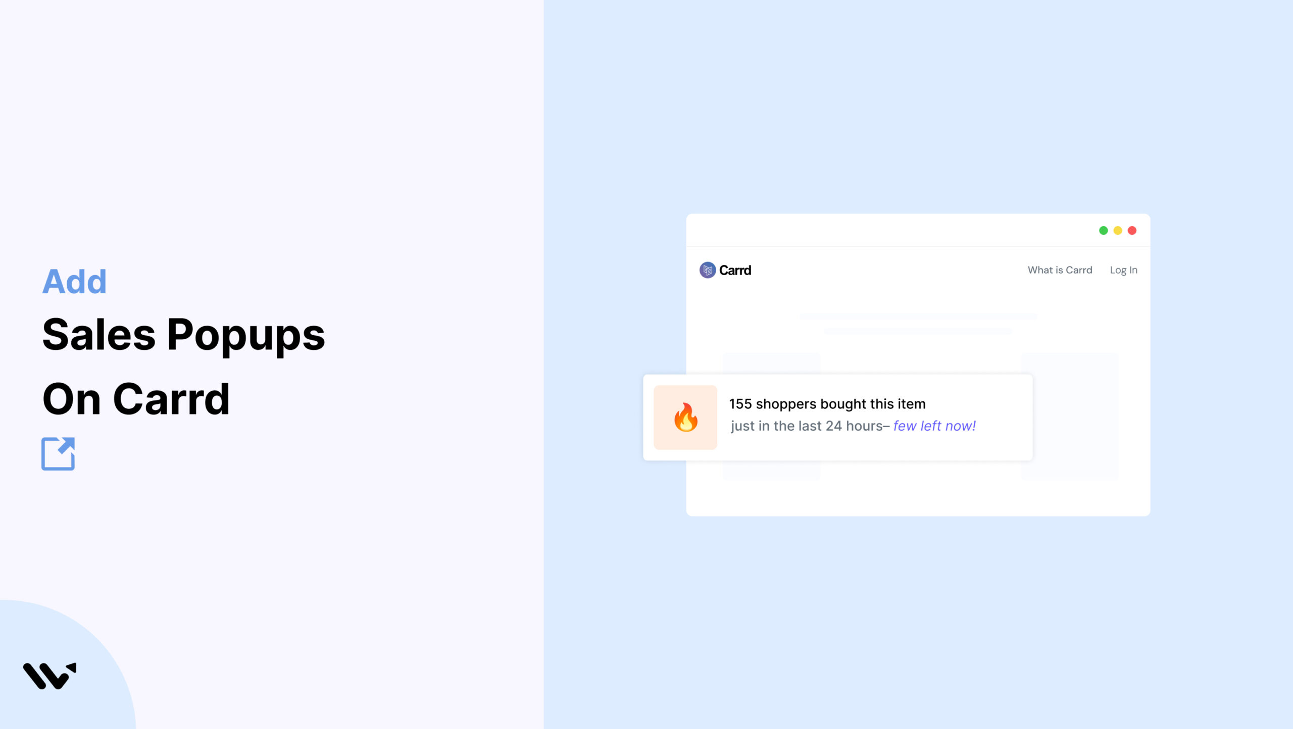
You’ve built a clean, single-page site on Carrd that showcases your product or service. It’s minimal, fast, and visually appealing. But even with the right copy and design, conversions aren’t flowing in as expected.
What’s missing? Trust. Imagine a visitor landing on your page and seeing a subtle notification like “Jake just signed up for the productivity course.” Suddenly, your page feels more alive, trusted, and active.
That’s where Wisernotify sales popups can help. These lightweight, real-time notifications show visitor activity—like purchases, signups, or form completions—without interfering with Carrd’s simple design.
By adding Wisernotify, you bring credibility and urgency to your landing page while maintaining a seamless user experience.
Why Add a Sales Notification Pop-up on Carrd?
Carrd sites thrive on simplicity and clarity. Adding Wisernotify boosts conversions without cluttering your design. Since Carrd is often used for lead generation, product launches, waitlists, and digital services, incorporating real-time social proof directly speaks to those key use cases.
Build social proof fast: Popups instantly display that others are taking action, which validates the user’s decision-making process.
Create urgency subtly: Timed notifications suggest popularity without being intrusive, which helps nudge hesitant users toward engagement.
Maintain Carrd’s minimalist aesthetic: Wisernotify’s lightweight, clean popup design fits seamlessly into Carrd’s visual framework.
Works for any CTA: Whether you’re collecting emails, driving sales, or promoting an event, popups can be tailored to match your goal.
Quick setup: Integration is simple—just add a snippet of code or embed via GTM and you’re set.
Boost conversions silently: Unlike aggressive marketing banners, sales popups are soft and natural, yet highly effective.
Use Case Example: A digital creator using Carrd for lead generation boosted signups by 41% after adding Wisernotify popups that showed real-time email submissions. The popups created trust and reassured hesitant visitors, resulting in a more engaged and responsive audience.
How to Add Sales Pop-up on Carrd

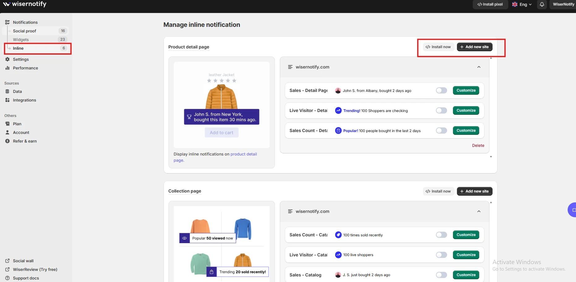
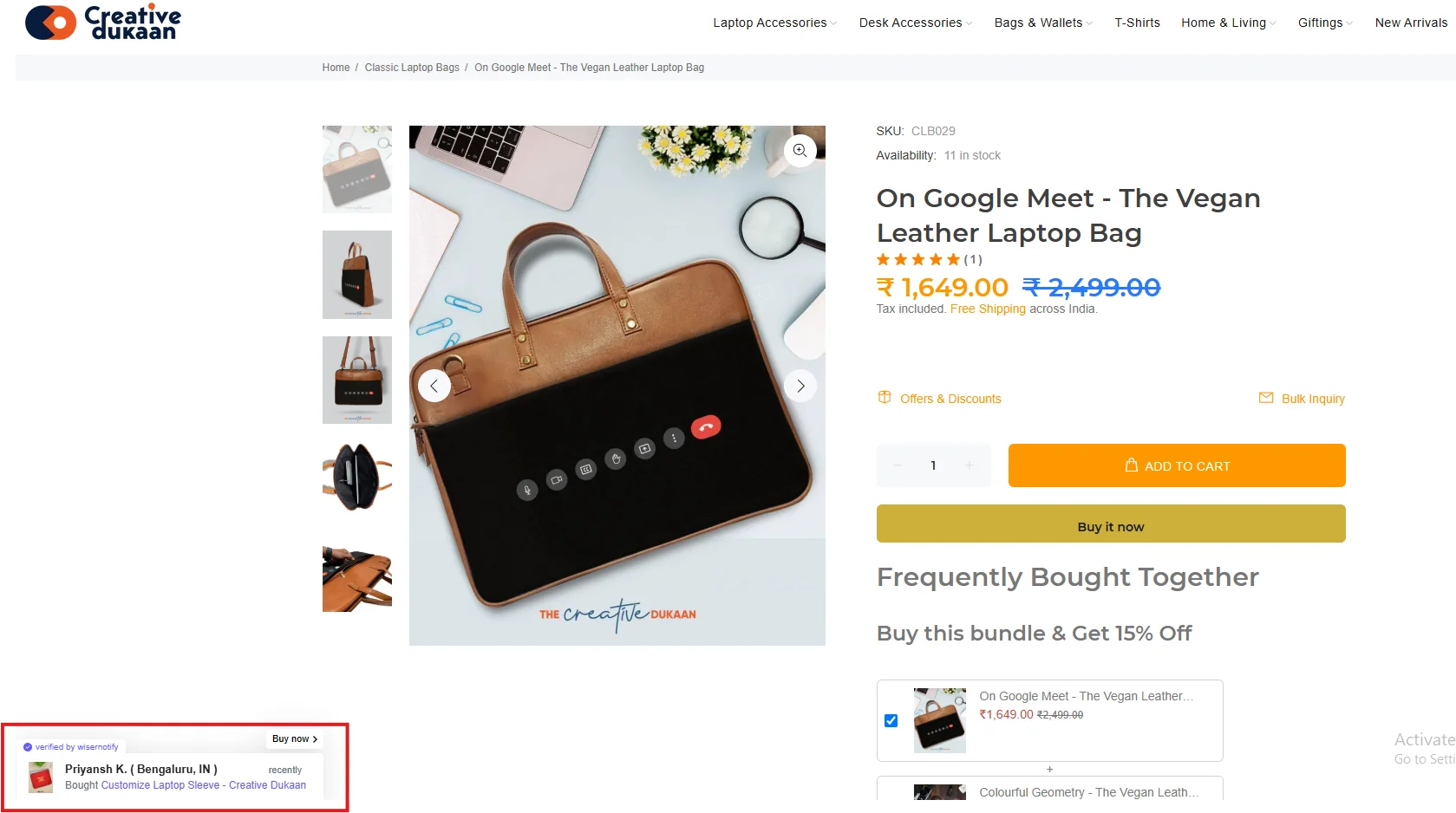
3 Best Sales Pop-up Examples

Sales Pop-up Tips for Carrd
Here are the main tips for sales pop-ups on Carrd:
1. Keep it minimal
Design your popups with simplicity in mind, using neutral tones, clear typography, and small-scale animation to fit seamlessly with your Carrd layout.
Minimalist styling helps your popup blend in without disrupting the clean aesthetic Carrd is known for. The goal is to support—not compete with—your content.
2. Use smart triggers
Trigger popups based on scroll depth, time on page, or exit intent to improve relevance.
Avoid showing notifications immediately when the page loads. Instead, use behavior-based logic to trigger popups once users are actively engaged. This improves both the timing and impact of the message.
3. Focus on key actions
Emphasize high-value moments like email signups, product purchases, or course registrations.
By highlighting meaningful actions, you reinforce what matters most to your funnel and nudge similar behaviors. This works especially well when paired with targeted CTAs.
4. Personalize with names or regions
Add real context by using real first names, cities, or product names in your popup messages.
“Ava from Toronto just joined the waitlist” feels specific and authentic, creating a stronger psychological connection than vague messaging.
5. Limit frequency
Repeated or back-to-back popups can quickly frustrate users and cause bounce rates to spike.
Set sensible limits—like one popup every 45–60 seconds—and cap the number of times a user sees notifications during a session.
6. Use mobile-friendly layouts
Design popups with mobile in mind, ensuring they’re responsive, well-placed, and easy to dismiss.
Wisernotify supports mobile optimization to help you ensure that popups don’t cover vital navigation or CTAs on smaller screens.
7. Highlight FOMO when appropriate
Drive urgency with subtle cues about limited-time offers or limited quantities.
For example, “Only 3 spots left in this course” adds scarcity and motivates quicker decisions, especially when paired with visible engagement from others.
8. A/B test popup timing and content
Try variations in your messaging, trigger logic, and design.
Use Wisernotify’s analytics dashboard to identify which configuration performs best, then refine based on results.
9. Align popup with CTA language
Consistency in messaging builds trust. If your button says “Join Now,” your popup might read “Mason just joined.”
Reinforcing the language of your CTA through your popup helps users recognize and follow the path you’ve laid out.
Sales Popup Mistakes to Avoid on Carrd
Here are some mistakes to avoid:
1. Overloading a simple site
Carrd thrives on visual simplicity, and popups should not disrupt that.
Avoid multiple concurrent popups or distracting animations. Instead, rely on brief, tasteful notifications that complement the minimalist design.
2. Interrupting your CTA
Never let popups cover or obstruct critical interface elements such as signup forms, buttons, or links.
Always test popup placement and behavior across multiple screen sizes to ensure the user’s flow is uninterrupted.
3. Using vague or generic messages
Messages like “Someone signed up” lack trustworthiness.
Be as specific as possible—use real names, products, or services to build credibility and resonate with your audience. Avoid sounding automated or anonymous.
4. Clashing with your brand style
Don’t let your popup look out of place. Match your popup’s font, colors, and styling with the rest of your Carrd page.
An off-brand popup reduces professionalism and can diminish trust in your product or offer.
5. Ignoring mobile users
Mobile traffic often accounts for over 50% of all visits.
Popups that don’t scale properly or cover essential buttons create a poor experience.
Always use mobile previews and Wisernotify’s responsive features to ensure seamless performance across devices.
Wrap-Up
Carrd helps you go live fast with beautifully simple sites. But a polished design isn’t enough if visitors don’t convert. Wisernotify adds the missing ingredient—social proof. With real-time notifications, your visitors gain the trust and urgency they need to take the next step.
Whether you’re collecting emails, selling a digital product, or promoting an upcoming launch, Wisernotify turns static landing pages into living, breathing conversion engines. It’s quick to install, easy to manage, and blends perfectly with Carrd’s aesthetic.
Install Wisernotify today and make your Carrd page not just beautiful—but effective too. Bring credibility, urgency, and trust into every scroll.
